A music venue website should help someone find a show, understand the room and arrive ready for the evening. The strongest designs make all three feel connected.
Someone searching for a particular artist needs a different starting point from a tourist choosing a memorable venue or a local looking for tonight's program. Build around those intentions. Artist discovery, calendar browsing and visitor information should lead into the same accurate event record, with the actual venue, date and performance time visible before the ticketing handoff.
These 13 examples compare landmark concert halls, independent rooms, jazz clubs and multidisciplinary arts centers. The reviews examine their captured public pages and visible navigation. They focus on presentation and planning, rather than claiming that a ticket purchase, seat selection or accessibility service was tested. Campaigns and event details change, so each image retains its actual observation date.
Before the examples
What makes good music venues website design in 2026?
Make the event record unambiguous
Keep the artist, support acts, local venue, date, doors time and performance time in clearly labeled fields. Distinguish sold-out, postponed and cancelled events from ordinary availability. For venues with several rooms or nightly sets, repeat the relevant room and time near the ticket action so a familiar brand does not become a source of confusion.
Give arrival questions a first-class place
Help people understand transport, parking, entrance locations, bag policies, food, seating and the available access arrangements. Connect these details to the relevant venue instead of assuming that a visitor knows the neighborhood. Outdoor spaces may need additional current guidance, but a weather widget alone is not an arrival plan.
Use atmosphere to support a clear next step
Show the room, audience or stage when that image explains what makes attendance special. Keep text readable over changing footage and provide an appropriate still alternative. A striking opening should still lead to the calendar, a named performance or a distinct tour route without making visitors wait through an introduction.
The collection · 13 examples
13 music venues websites worth studying
Compare how each venue balances its sense of place with practical choices. Look closely at the position of artist names, dates, room names and ticket actions, then consider whether the same structure would help your own audience.
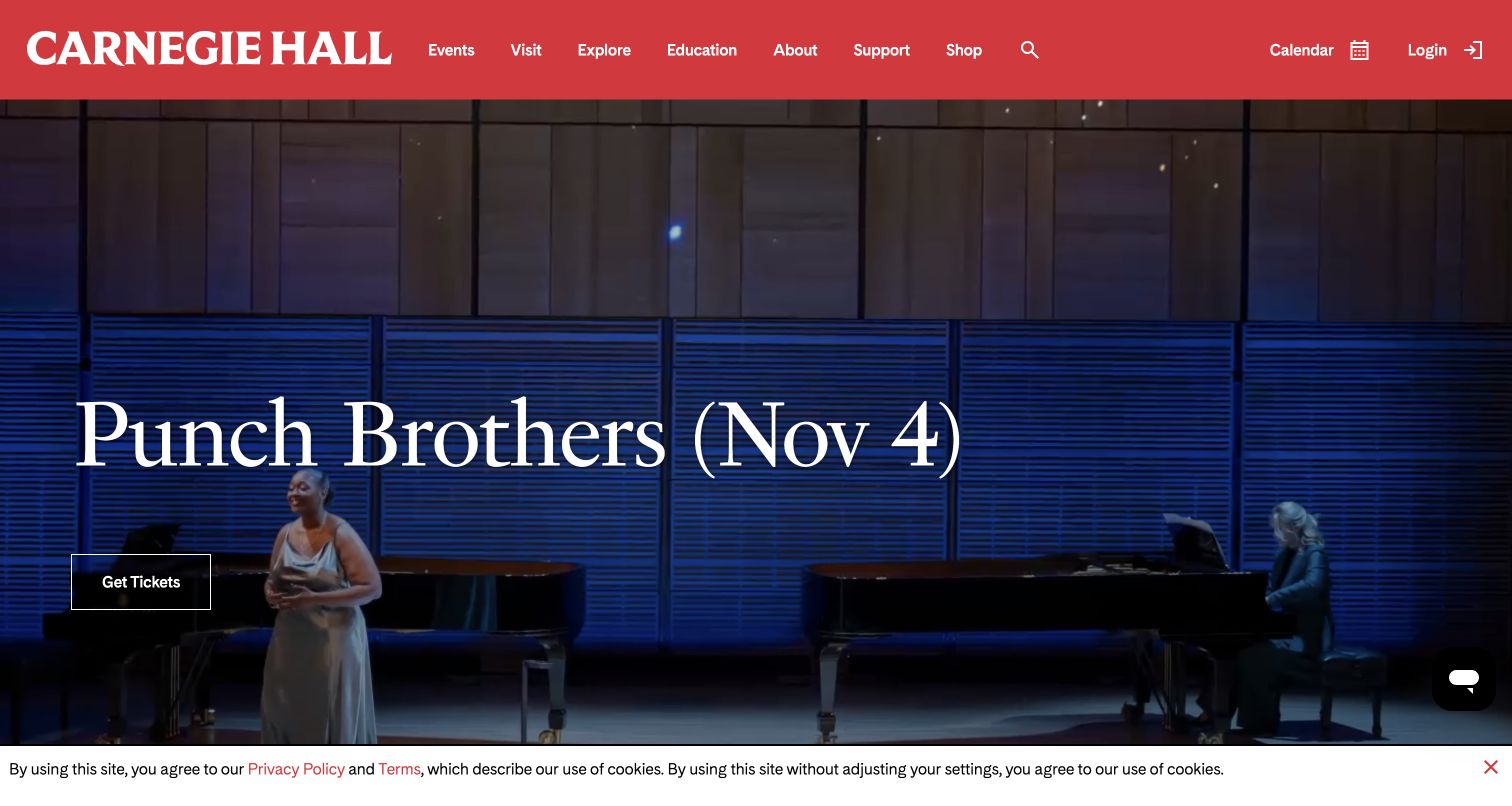
Carnegie Hall gives its red institutional identity a permanent place above the performance campaign. The captured opening promotes Punch Brothers with a large title, date and outlined ticket action over atmospheric footage. Visitors can still reach Events, Visit and Education without interpreting the featured artist. This balance is useful for a hall whose reputation attracts first-time tourists while its calendar must serve repeat concertgoers looking for a particular evening.
What you can learn
Build the event promotion as a changeable layer beneath stable navigation. Keep an artist's name, performance date and ticket route together, then connect the visit section to the practical questions a new audience member will ask before arriving.
Pros
The red masthead provides strong continuity when the featured performance changes, so a campaign never replaces the venue's identity.
Separate event, visitor and education routes acknowledge that booking a concert is only one reason to visit the site.
Cons & considerations
If the background film is bright or busy, the overlaid title and date need careful contrast testing across every frame.
If someone arrives looking for tonight's full schedule, a single featured performance should be accompanied by an obvious calendar shortcut.
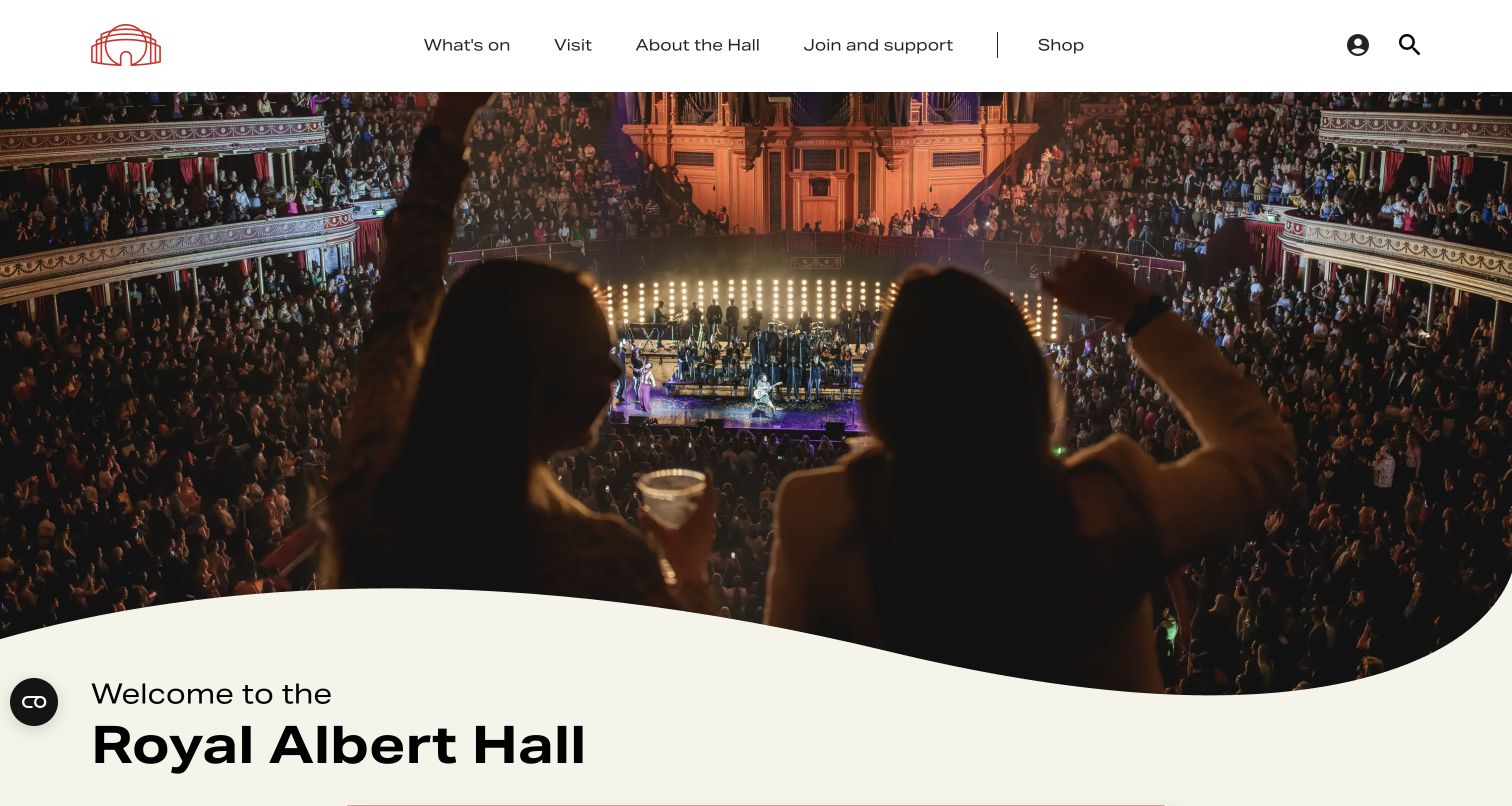
Royal Albert Hall opens with the auditorium and its audience rather than a dense list of performers. A restrained white header holds the venue mark and practical routes such as What's on and Visit, while the curved transition into the welcome section echoes the building's form. The composition makes attendance feel like a place-based experience. It is especially relevant to a venue that must introduce itself to visitors who may recognize the building before they know its programming.
What you can learn
Use a recognizable interior to establish what makes the venue special, but let the navigation answer the visitor's next question immediately. A warm welcome works best when it leads directly to dates, seating information and arrival planning.
Pros
The broad auditorium photograph communicates scale and occasion without requiring a long institutional introduction.
Short task labels in the header give new visitors a route into planning while retaining the emotional impact of the hero.
Cons & considerations
If a visitor wants a specific artist, the spacious introduction can feel slow unless search and listings are easy to reach.
If privacy and newsletter prompts appear together, they can interrupt the first impression before the visitor sees the venue.
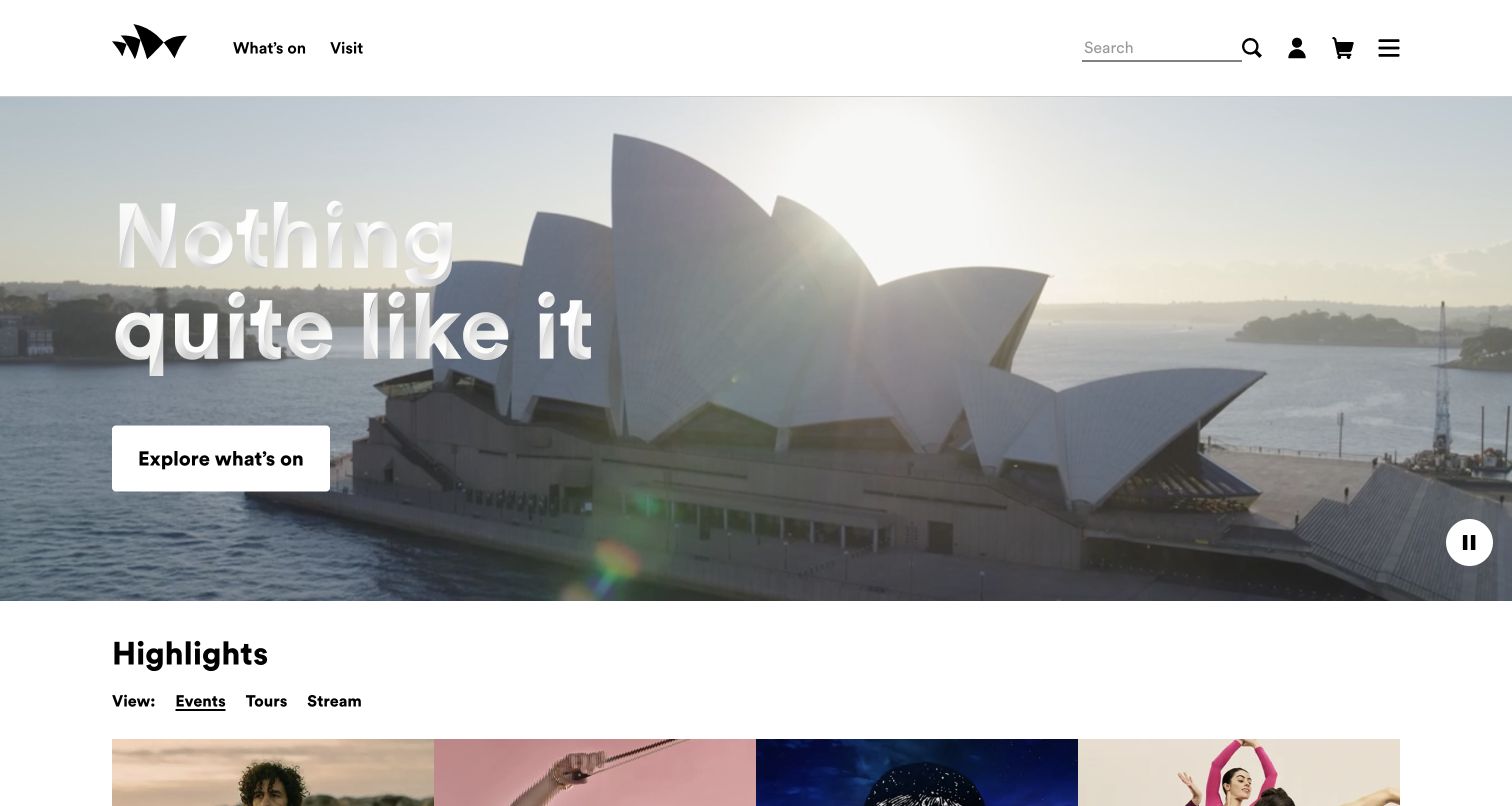
Sydney Opera House lets a sunlit harbor view and the building's sails fill the opening screen. The large expressive headline overlaps the image, while the white header keeps What's on and Visit easy to identify. Below, separate Events, Tours and Stream choices recognize several ways to experience the institution. The page uses the architecture as an invitation, then starts dividing that broad interest into useful activities instead of assuming every visitor wants a concert ticket.
What you can learn
A famous building can carry the emotional introduction, but organize the next choices around what people can actually do there. Give tours and performances their own clear paths so a destination visitor does not have to decode an arts organization chart.
Pros
The uncluttered header gives practical tasks room beside a highly expressive hero image and headline.
The event, tour and streaming distinctions help a varied audience choose a relevant form of participation.
Cons & considerations
If the headline overlaps a changing image, its placement needs checking on narrower screens and against different crops.
If immediate ticket buying is the goal, the broad destination message needs a visible route to dated event listings nearby.
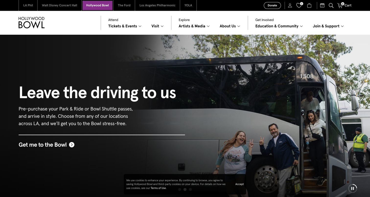
The captured Hollywood Bowl slide promotes leaving the driving to someone else, pairing a bus photograph with a direct transport action. That is a useful departure from showing only performers: getting to an outdoor concert can be a major planning hurdle. A dark text panel gives the message legibility, while the two-tier header separates the wider LA Phil venue family from Attend, Explore and participation routes for this particular destination.
What you can learn
Treat the journey to the venue as part of the event experience. When parking, shuttle services or traffic affect attendance, give that information a prominent editorial position and connect it to the visitor's chosen show rather than burying it in a long FAQ.
Pros
The transport-focused hero addresses a concrete obstacle that can matter as much as artist discovery for an evening out.
A separate organizational tier allows related venues to remain visible without replacing the Bowl's main attendance navigation.
Cons & considerations
If someone arrives to purchase a performance, a transport slide must still leave an obvious route to the event calendar.
If the upper institutional links and main navigation compete on a small screen, the venue's essential tasks should receive priority.
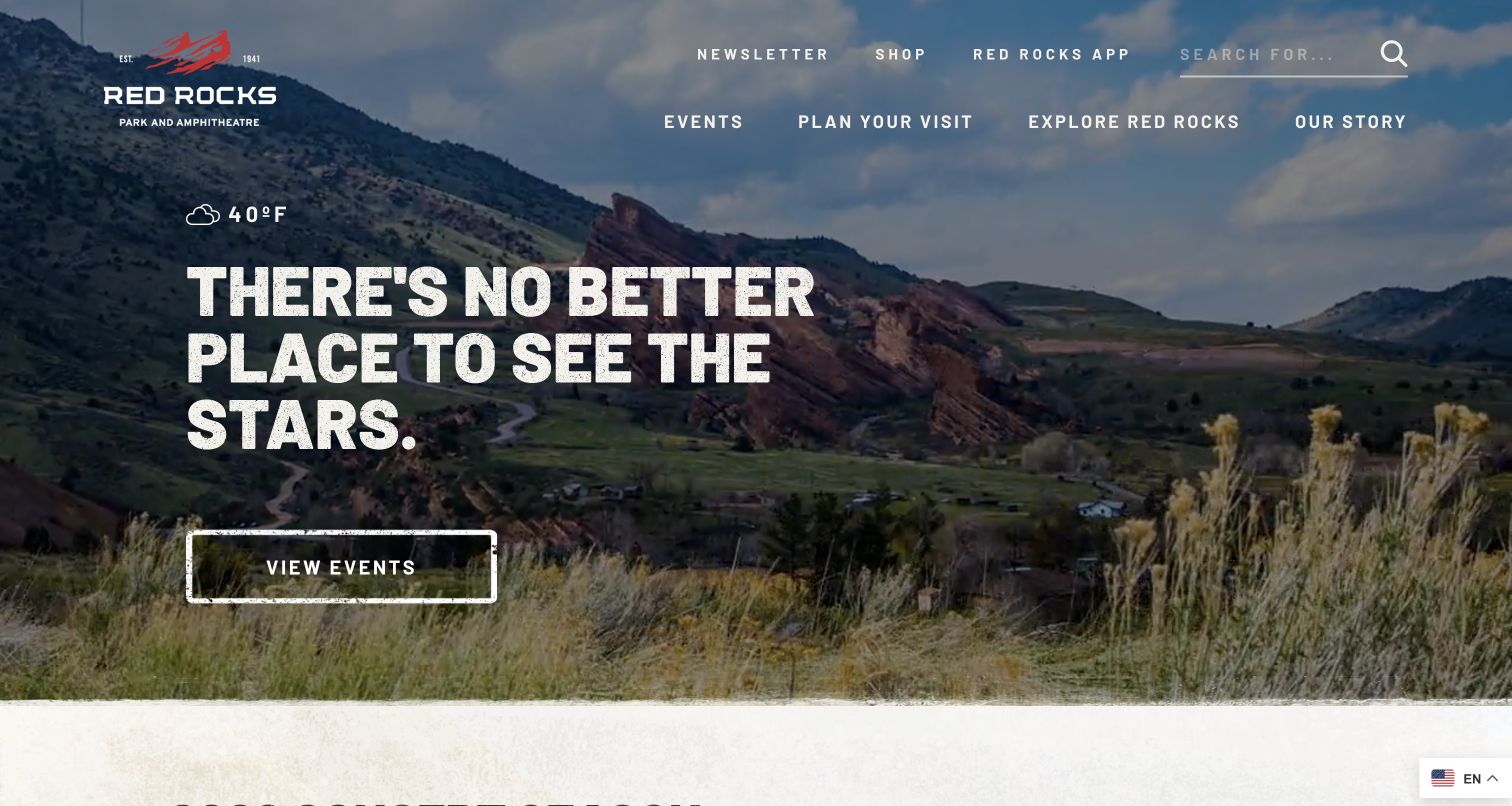
Red Rocks uses the natural amphitheatre landscape as the main visual argument for visiting. Large textured lettering and a direct View Events action sit over the image, while the header makes Events, Plan Your Visit and Explore distinct choices. A visible weather reading adds an outdoor planning cue. The page communicates that this is both a performance venue and a place to explore, which is a more useful starting point than treating every visit as the same ticketing journey.
What you can learn
Let the environment explain the venue's appeal, then separate concert attendance from general exploration. For an outdoor site, practical information such as weather, allowed items and getting there should remain easy to reach from the inspirational opening.
Pros
The landscape image supplies a specific sense of place that generic stage photography could not provide.
A literal View Events action gives the atmospheric hero a clear next step for concertgoers.
Cons & considerations
If a visitor needs safety or access details, an attractive weather snippet cannot replace a complete and current planning page.
If oversized display lettering wraps across the scenery on mobile, both the message and the ticket action need careful crop testing.
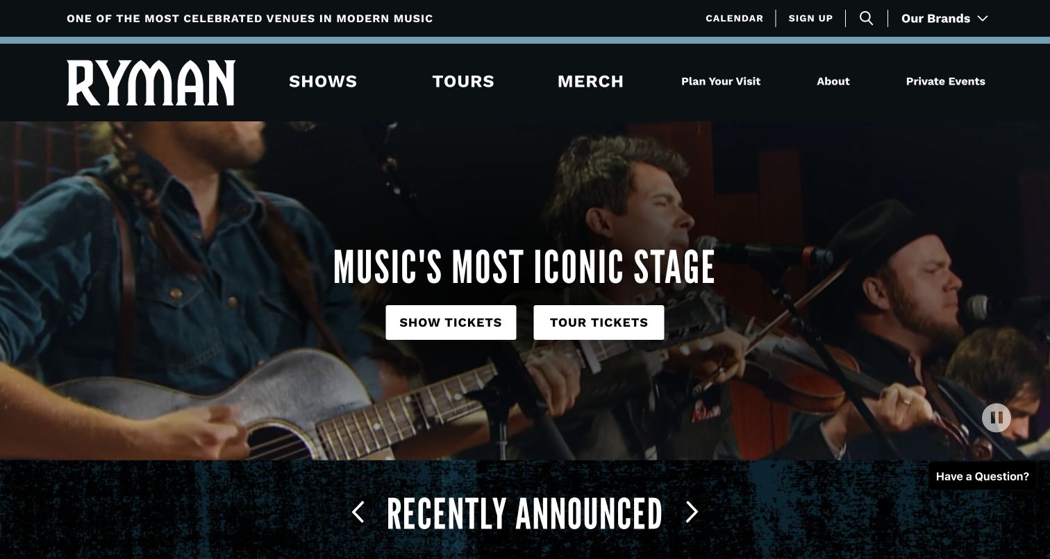
Ryman Auditorium places Show Tickets and Tour Tickets side by side beneath a short statement about the stage. The teal header, prominent wordmark and live performance footage establish the venue's character, but the most useful decision is functional: a visitor can choose a performance or a daytime tour immediately. Recently announced shows begin below the hero, keeping the homepage connected to current programming while allowing the building's history to support a separate visit.
What you can learn
Name the two experiences before asking visitors to choose a ticket. A shared booking label would make a tourist and a concertgoer do extra work; separate actions can lead into the appropriate dates, availability and visitor information from the start.
Pros
The paired ticket actions explain the distinction between touring the building and attending a show without a long introduction.
The prominent venue identity and restrained color palette hold the page together around changing live footage.
Cons & considerations
If both ticket actions receive identical emphasis, a time-sensitive headline show may need additional context to stand out.
If a signup overlay appears before visitors choose their experience, it can delay a straightforward booking task.
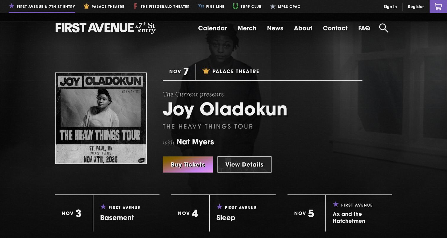
First Avenue combines a gritty monochrome visual identity with unusually useful event labeling. The captured feature names Joy Oladokun, gives a November date and identifies Palace Theatre rather than assuming the show happens at the namesake venue. Buy Tickets and View Details are separate actions. A venue switcher and calendar navigation support the wider network, making the page relevant to people choosing a performance across several rooms with different locations and expectations.
What you can learn
Whenever a promoter runs more than one room, place the actual venue beside the artist and date. Keep a details route next to the purchase action so visitors can check age restrictions, support acts or arrival information before committing to the ticketing handoff.
Pros
The featured show includes its venue, reducing the risk of a visitor confusing the promoter's brand with the event location.
Separate ticket and detail actions support both decisive buyers and people who still need practical information.
Cons & considerations
If the venue selector becomes crowded, unfamiliar visitors may need geographic or capacity context before choosing a room.
If the high-contrast photography and display type are copied too literally, a different promoter could lose its own local identity.
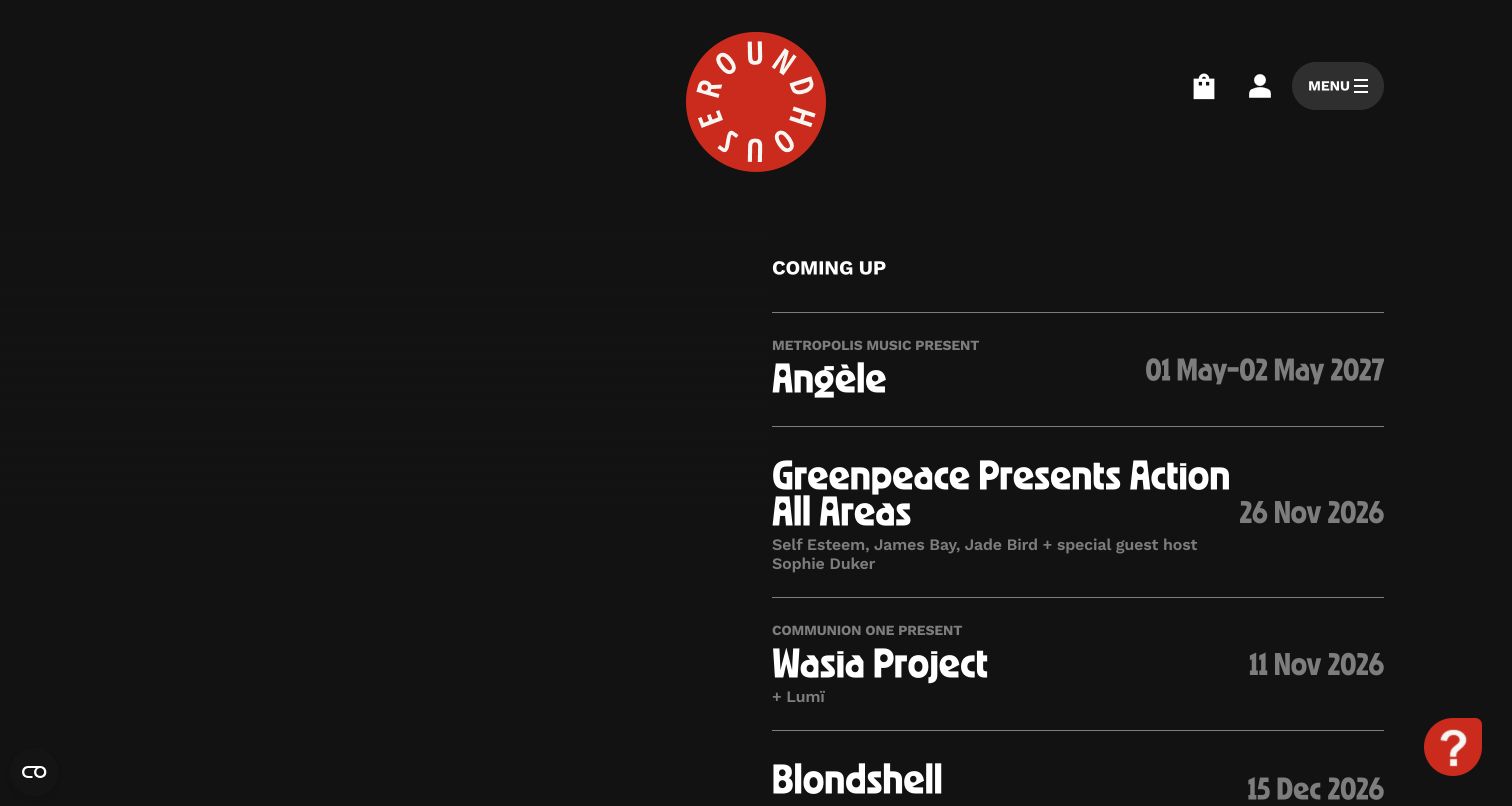
Roundhouse uses a near-black opening with a red circular mark and a compact Coming Up list. The captured view leaves substantial dark space beside event names and dates, creating a quieter presentation than the full-screen crowd videos common to venue sites. Basket, account and menu controls remain at the top. The effect depends on typography and the organization's identity, while the upcoming titles provide the main evidence that the site is an active program rather than an institutional brochure.
What you can learn
A restrained opening can work when the listing itself is clear and valuable. Make event names and dates readable before adding visual effects, and ensure the main menu gives first-time visitors a quick way to understand the venue and its wider creative activity.
Pros
The short upcoming list brings specific performances into the opening view without requiring a rotating promotional story.
A distinctive red mark and limited palette create continuity across a program that may span several genres.
Cons & considerations
If the large dark area is interpreted as missing media, visitors may hesitate; a deliberate layout should still make its content hierarchy evident.
If most navigation sits behind the menu, a newcomer may need an extra action to find visit information or the full calendar.
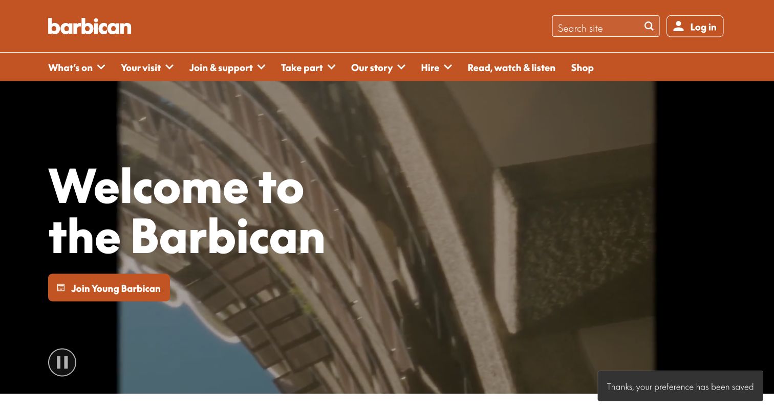
The Barbican's orange header and assertive wordmark sit above a large view of its distinctive interior. A welcome message introduces the destination, and the captured campaign points to Young Barbican rather than a single performance. The navigation and subsequent This Week content have to handle several art forms, making the site a useful example of a venue whose audience may arrive with a category, a date or simply curiosity about the building.
What you can learn
For a multidisciplinary center, keep the organizational identity consistent while allowing programs to change their message. Offer date-led discovery alongside art-form categories, and show visitor information as a shared service rather than duplicating it differently inside every department.
Pros
The vivid header provides a strong reference point above moving architectural imagery and seasonal campaigns.
The site gives membership and audience development a visible place alongside the wider cultural program.
Cons & considerations
If the opening promotion targets a specific age group, other visitors need an equally clear route to current events.
If the large background video dominates lower-powered devices, a suitable still image should preserve the same sense of place.
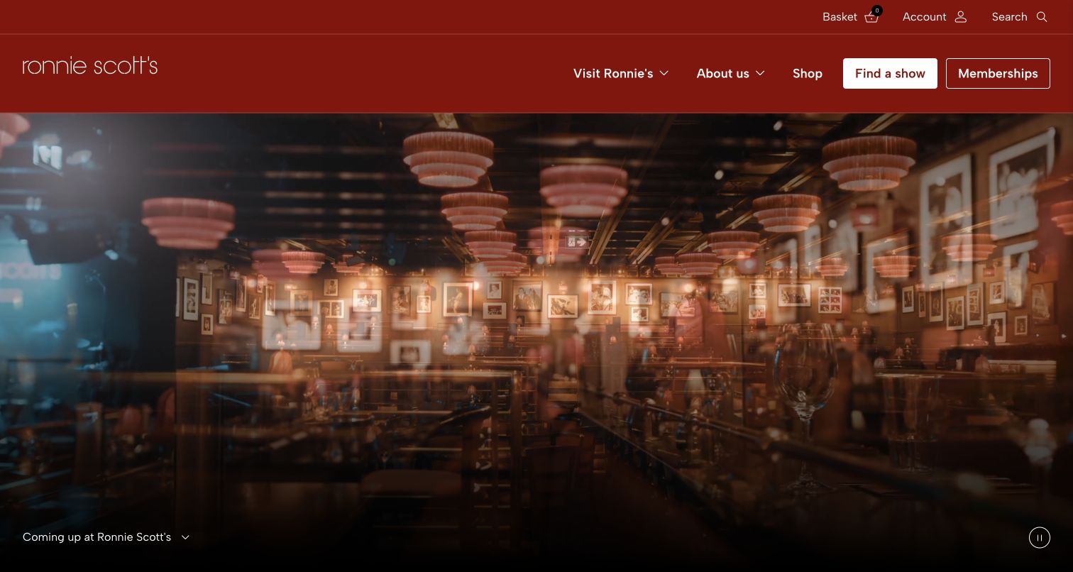
Ronnie Scott's opens with warm footage of the club interior beneath a deep red header. The hero is allowed to show the room without an oversized promotional headline, while a white Find a Show button carries the booking-oriented task. Visit Ronnie's, About, Shop and Memberships stay separate in the navigation. The page sells intimacy and atmosphere first, with Coming Up beginning below, which suits a club where the setting is part of the reason to attend.
What you can learn
When the room is the product's emotional proof, show it clearly and keep the ticket route visible outside the media. Use the visit section to explain what a first-time guest needs to know about the evening without forcing that practical material into the atmospheric hero.
Pros
The interior footage communicates a specific club experience while the uncluttered hero avoids competing blocks of promotional copy.
The contrasting Find a Show action is easy to distinguish from broader brand and merchandise navigation.
Cons & considerations
If a visitor wants a performer or date immediately, the opening room footage needs a quick connection to searchable listings.
If the video is dark on a phone screen, the experience should still communicate through a useful still and readable controls.
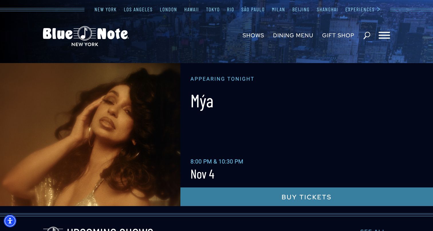
Blue Note New York pairs an artist photograph with a clear Appearing Tonight panel. The captured Mýa feature includes the date and two showtimes, with a broad Buy Tickets bar beneath. The blue city texture and location selector establish the wider Blue Note family, but the page keeps the New York performance specific. This is a practical model for visitors who are already in the city and need to decide between two seatings rather than discover a distant future tour.
What you can learn
For a venue with multiple nightly sets, make the date, local venue and individual times explicit before the ticket handoff. Keep dining information nearby when it affects the experience, but do not let a global venue family obscure the room the guest is about to book.
Pros
The artist, date and two performance times are grouped into one readable decision area instead of scattered across promotional text.
The broad purchase action gives the event feature a clear endpoint while a location selector supports the wider brand.
Cons & considerations
If a visitor switches locations, the page must clearly update the venue and times so a familiar brand does not cause a booking mistake.
If a newsletter popup appears over the event panel, it interrupts a particularly time-sensitive tonight-oriented task.
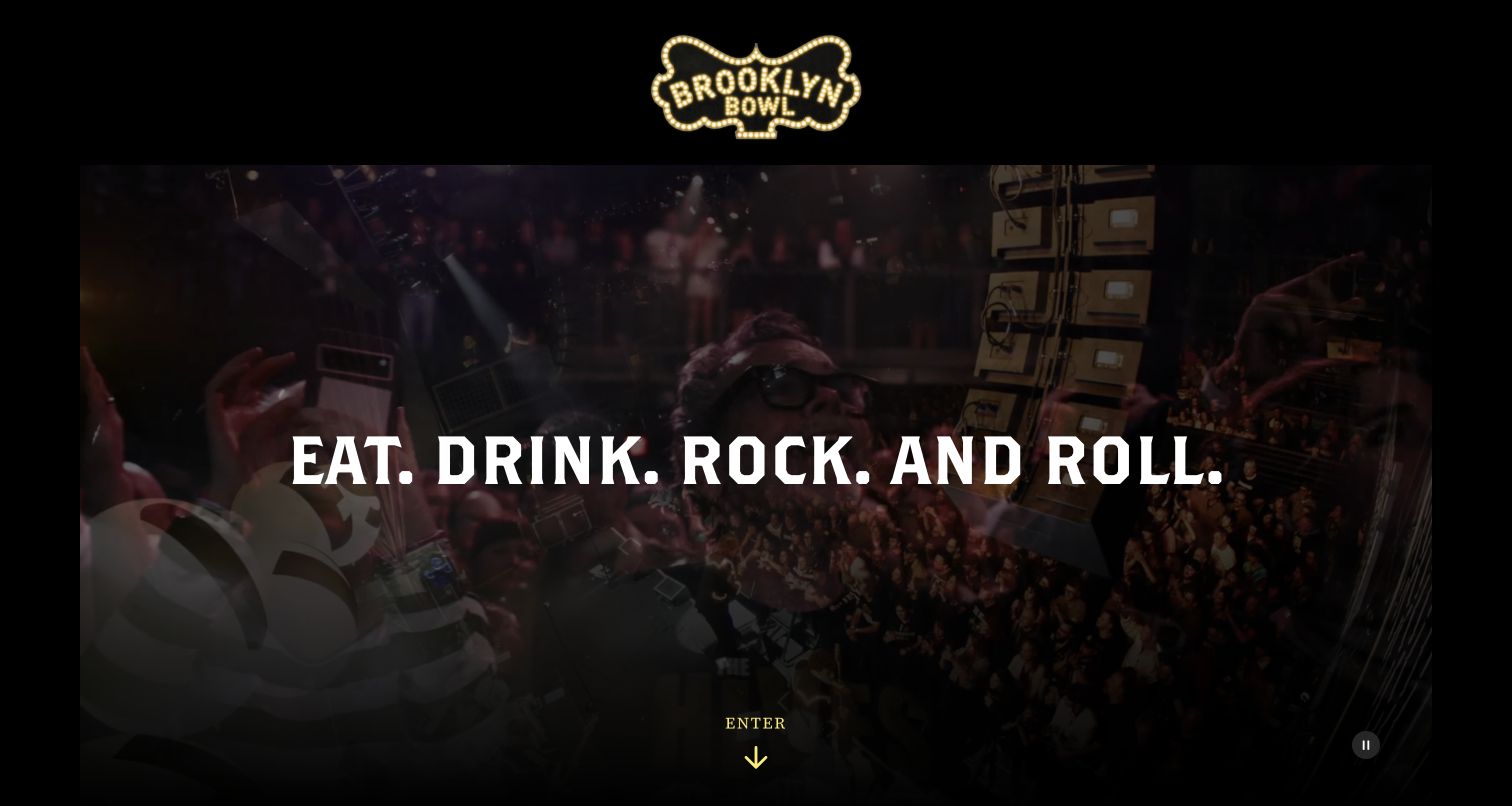
Brooklyn Bowl uses a gold marquee-style logo, a wide performance film and a short Eat, Drink, Rock and Roll message against black. The opening feels like an invitation into an entertainment brand, with an Enter action before location-specific information. Further page content offers several cities through Pick Your Lane. That structure recognizes a business where live music, food and bowling belong together, while also showing the tradeoff between atmosphere and immediate access to a local event calendar.
What you can learn
When several activities share one brand, explain their relationship in a compact introduction, then move quickly to location selection. The local page should carry the operational detail so a visitor does not confuse a national brand experience with a particular city's schedule.
Pros
The short activity-led message connects food, music and bowling without a long list of separate service descriptions.
A cohesive dark palette and marquee identity give the multi-location business a memorable opening.
Cons & considerations
If visitors already know their city, an Enter step can add friction before they reach the event they came to find.
If the location choices sit below a large video, a phone visitor may need an obvious cue that local information follows.
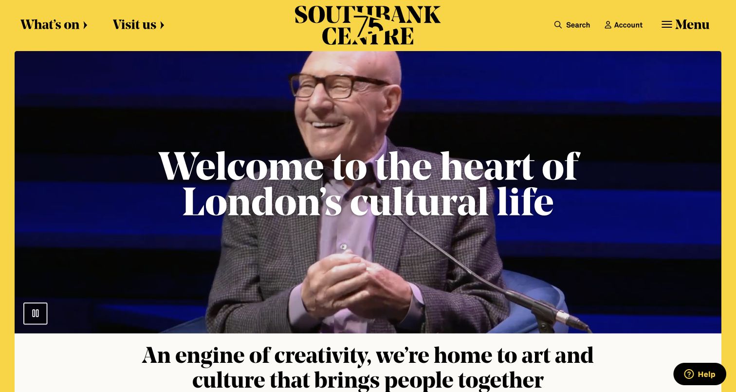
Southbank Centre combines a bright yellow masthead with large serif welcome text and a rounded video panel. What's On and Visit Us are given clear positions at the top, keeping the two most common intentions readable despite the expressive design. The opening presents cultural life rather than one headline act. It is useful for a complex destination where visitors may be choosing an event, meeting friends or planning an initial visit to several connected spaces.
What you can learn
Give a broad cultural organization a small number of plain-language entry points. An expansive welcome can communicate belonging, but the next step should help visitors choose an event or understand the place without learning internal venue names first.
Pros
What's On and Visit Us translate a complex organization into recognizable visitor tasks at the top of the page.
The yellow masthead and large typography establish a clear identity that can accommodate different campaign imagery.
Cons & considerations
If the welcome text and moving portrait occupy most of the first screen, the page needs a strong continuation into current listings.
If decorative typography becomes too large at small widths, it can push essential arrival information farther down than intended.
Write the steps for discovering a show, checking restrictions, choosing a performance, buying a ticket and arriving. Include someone who needs access information and someone who has never visited the venue. Identify where the website hands off to an external ticket provider and what context must survive that transition.
Separate venue facts from event facts
Store the address, transport routes, entrances and general facilities once for each room. Store event-specific times, age policies and artist details on the event. Establish who can override a general policy for a particular performance, and how staff check that the override appears consistently in listings, event pages and ticket links.
Prepare for changes on the day
Agree on a process for updated times, postponements, cancellations and sold-out notices. Give staff a preview and a simple way to replace a campaign without changing the underlying event record. Plan what visitors see when a ticket destination is unavailable, and keep a clear route to the venue's published support information.
The editing job behind the design
Choose systems that keep the program and ticket handoff consistent
Start with the authoritative event and ticketing systems. Decide which application owns dates, availability and venue identifiers, then connect editorial content to those records without manually duplicating operational facts. Test a representative multi-set show, an event in another room and a cancelled performance before deciding that the integration is complete.
Let the content system handle artist stories, venue photography and visitor guidance while protecting time-sensitive fields. Search and filters should reflect real audience choices such as date, genre and location. A public stack audit can reveal some frontend and delivery tools, but it cannot establish the private booking database, staffing process or service reliability.
Our WordPress website examples offer a separate look at publishing approaches. A visible platform label is evidence for that named page, not a guarantee that the same system will suit your requirements.
Before the public launch
Music venue website launch checklist
Show the actual venue, performance date and local time beside each ticket action.
Distinguish doors, showtimes and multiple nightly sets in ordinary language.
Check sold-out, postponed and cancelled states against the event owner's record.
Provide clear transport, entrance, seating and access-information routes.
Explain external ticketing handoffs and preserve the selected event context.
Test keyboard navigation, readable media overlays and mobile calendar filters without submitting real purchases.
Verify that a still image remains useful when background video does not play.
Assign an owner for day-of changes, expired promotions and visitor guidance.
These checks are a project checklist, not a performance, legal, security, or accessibility certification. Test real journeys with the people responsible for the website before making claims about the result.
Sources & editorial method
How this collection was selected and reviewed
The collection contains exactly 13 distinct official venue properties, matching the saved pre-research random target. Public pages were inspected directly and captured on November 4, 2026. Reviews are original observations of the visible design and content structure; no paid booking, account change or real form submission was performed. Captures retain their source URL, actual dimensions and attribution. Technical labels require separate public evidence and do not imply access to private venue systems.
Each example links to its actual source page. Screenshots are direct browser captures with their own capture dates; moving imagery, announcements and live designs can change. The notes describe observable design choices and conditional tradeoffs, not measured traffic, conversion results, service quality, or accessibility conformance.
Technology labels use public page metadata, asset evidence, or explicitly cited platform documentation. Platform documentation is not a complete current deployment audit. A component reference may be legacy or unused; it is not a complete backend inventory. Unknown stacks are omitted. These sites are editorial examples, not our client portfolio.
Written, Edited and Curated are separate editorial records, not timestamps advanced by a rebuild. Website designs and imagery belong to their owners. See our editorial standards or suggest a correction.
Questions worth asking
Music Venues website design questions
Should a venue homepage lead with the room or the next performance?
Use the opening to serve the dominant visitor task. A landmark room may help a newcomer understand the experience, while a club with several nightly sets may benefit from a dated artist feature. Keep the full calendar and visit information visible whichever story leads.
How should a promoter present shows across several venues?
Treat the actual room as part of every event's identity. Display its name beside the artist and date, and offer location filtering where it helps. Do not assume that a promoter's brand name tells a visitor where the performance happens.
What belongs on the venue site when tickets are sold elsewhere?
The venue site should still explain the event, practical restrictions, location and relevant attendance details. Label the ticket destination clearly and preserve the chosen event. Decide which system owns changing availability so the two sites do not contradict one another.
Can the same homepage sell performances and building tours?
Yes, if the actions identify the experiences. Separate show and tour routes can lead to different schedules and visitor expectations. Explain their relationship through the venue's story, but avoid one generic ticket button that makes people discover the distinction later.
Borrow the connection between atmosphere and useful event information. Build it with your own room, current program and a visitor journey your team can maintain.