A festival website has several seasons. It needs to support submissions, program discovery, booking, live attendance and the archive without confusing one edition with the next.
A festival's audience includes filmgoers, filmmakers, industry participants, journalists, volunteers and supporters. They may arrive at different points in the year with very different questions. Define clear routes for those intentions and give each edition its own dates, program and status. A useful archive should remain accessible without looking like a current ticket offer.
This collection reviews 25 distinct official festival properties, including specialist festivals and organizations with permanent cinemas or professional markets. The examples show public homepage and festival-landing-page choices observed on November 4, 2026. The analysis considers the visible structure and messaging; it does not claim to have purchased passes, submitted films or tested private accreditation workflows.
Before the examples
What makes good film festivals website design in 2026?
Make the edition and current phase explicit
State the year, dates and location wherever visitors begin. Change the homepage's primary message as the festival moves from submissions to program launch, ticket sales, attendance and results. Keep previous programs clearly labeled, and make sure translated pages and related market pages move through the cycle consistently.
Offer useful ways to discover the program
Let people begin with a date, title, venue, section or theme when the program's size justifies it. Connect each film to its actual screenings, language and format information. A strong still or trailer can create interest, but the listing must also help an attendee make a workable plan across venues and times.
Explain the mechanics before asking for a commitment
Keep booking guidance, pass differences, access information and venue details easy to find. Separate public tickets from professional accreditation and filmmaker submissions. When a third-party system handles the next step, name the destination and keep the chosen event or opportunity clear at the handoff.
The collection · 25 examples
25 film festivals websites worth studying
Compare the sites as examples of different festival phases and organizational models. A post-event editorial homepage, a badge-sales page and a year-round cinema program can each be effective when the visitor understands which experience is being offered.
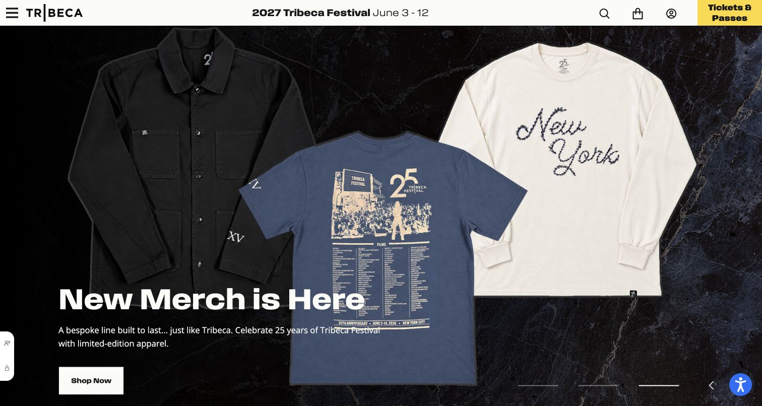
Tribeca keeps the next festival's dates and a yellow Tickets and Passes block in its white header while the main campaign changes. The captured slide promotes anniversary apparel with large product photography and a Shop Now action. This makes the homepage a year-round commercial and editorial surface, rather than a page that becomes empty after the screenings end. The persistent header still tells visitors which festival edition the organization is moving toward.
What you can learn
Separate permanent festival orientation from rotating campaigns. Dates and the booking route should remain stable while the hero can promote submissions, membership or merchandise according to the season, with a distinct action for each campaign.
Pros
The next edition's dates remain visible even when the main slide is selling an unrelated year-round product.
The high-contrast ticket block gives festival attendance a persistent place alongside account, search and shopping controls.
Cons & considerations
If a visitor expects film discovery, a merchandise-led opening can feel indirect without easy access to the festival program.
If the carousel moves quickly, a message may disappear before a visitor has finished reading its supporting copy.
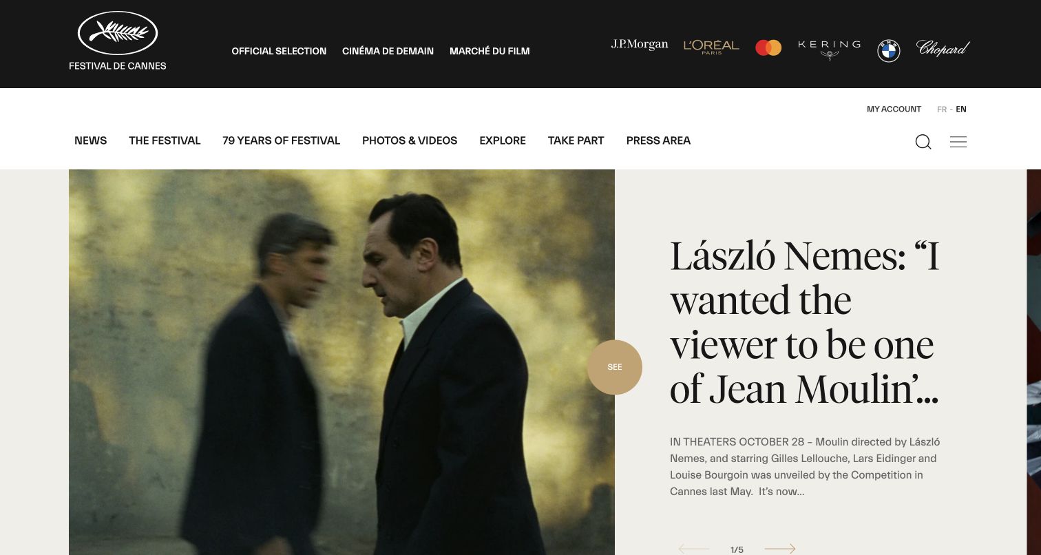
Cannes presents an interview in a split layout, with a film image on one side and large serif editorial text on the other. Its black identity band separates Official Selection, Cinéma de Demain and the market, while a second navigation tier serves news, archives, media and participation. The captured page works as an ongoing cinema publication. It gives films a life beyond the festival dates and makes the institution's accumulated material part of the experience.
What you can learn
Design the period between editions deliberately. A festival with strong editorial material can lead with interviews and releases, provided visitors still have clear paths to participation information, archives and the different professional programs.
Pros
The image-and-headline pairing gives an individual film story room to breathe instead of placing every update in a crowded grid.
Separate institutional and editorial navigation tiers help distinguish the festival, its market and its long-running archive.
Cons & considerations
If a casual visitor wants attendance information, several institutional destinations can make the correct entry point less obvious.
If a long headline is truncated, the visible excerpt must still communicate enough of the story to justify opening it.
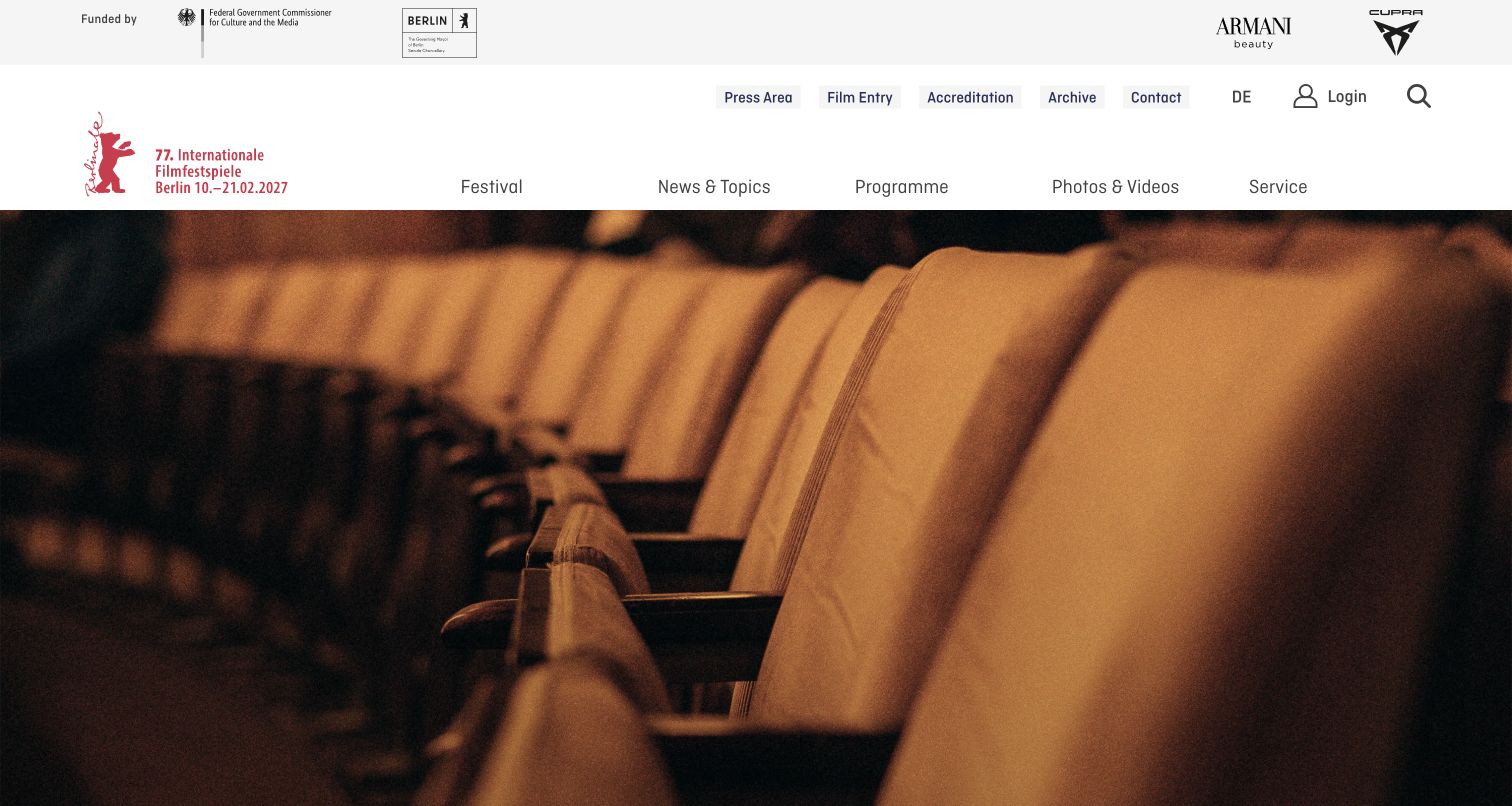
Berlinale gives press, film entry, accreditation and archive links their own utility row above the main Festival, News and Programme navigation. The captured opening shows rows of cinema seats beneath the current edition's identity, while the page content highlights accreditation and submission deadlines. This is a practical separation of professional tasks from general discovery. It also demonstrates how an off-season homepage can change emphasis without changing the festival's underlying information structure.
What you can learn
Keep professional workflows easy to locate throughout the year. Move deadlines and accreditation information into the editorial foreground when relevant, while retaining a stable program and visitor structure that can support the next edition.
Pros
Film entry, accreditation and press links are explicit rather than hidden behind a general contact or participation label.
The restrained header makes the edition identity legible beside a large, atmospheric cinema photograph.
Cons & considerations
If the hero contains only a room photograph, a newcomer may need to scroll before learning which action is currently most useful.
If sponsor, utility and main navigation rows become crowded, the mobile hierarchy must preserve the audience's essential tasks.
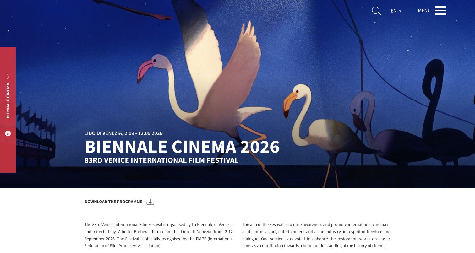
The Venice cinema page uses the edition's illustrated artwork as a full-width introduction, with the dates, location and festival name placed directly over it. A downloadable program and concise explanatory text follow immediately. The page also exposes lineup, ticket, accreditation, venue and travel routes in its content. Because the festival sits inside La Biennale's wider organization, the edition-specific heading is essential: it tells visitors which cultural program and year they are viewing.
What you can learn
Give each edition a clear identity within the parent institution. Pair the poster treatment with explicit dates and a useful summary, then make program, venue and attendance information available as ordinary links rather than relying exclusively on a PDF.
Pros
The date and location sit beside the edition name, providing context before visitors reach the institutional explanation.
The program download offers a useful companion format while practical attendance routes remain represented on the website.
Cons & considerations
If the poster is the only visual explanation, its lettering and image crop must still work on a narrow screen.
If a previous edition remains online, past-tense copy and clear year labeling are needed to prevent visitors mistaking it for current booking information.
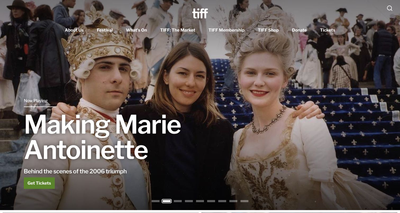
TIFF's captured homepage promotes a current screening with a large photograph, a Now Playing label and a green Get Tickets action. The navigation separates Festival from What's On, the market and membership. That structure matters outside the annual festival period: the organization still has films to show and audiences to serve. The page can act as a cinema storefront while retaining an obvious route to the larger festival, rather than forcing both experiences into the same calendar.
What you can learn
Use clear labels to distinguish annual festival programming from year-round screenings. A strong current-film feature can serve local audiences, while a persistent festival route lets travelers and industry visitors find the separate event they came for.
Pros
The Now Playing label establishes the timing and purpose of the featured film before the visitor follows the ticket action.
Festival, cinema programming and membership have distinct navigation labels that support different relationships with the organization.
Cons & considerations
If the carousel contains many films, useful titles can become difficult to compare without a nearby list or calendar.
If a visitor arrives specifically for the annual event, year-round cinema promotion should not obscure the next festival's information.
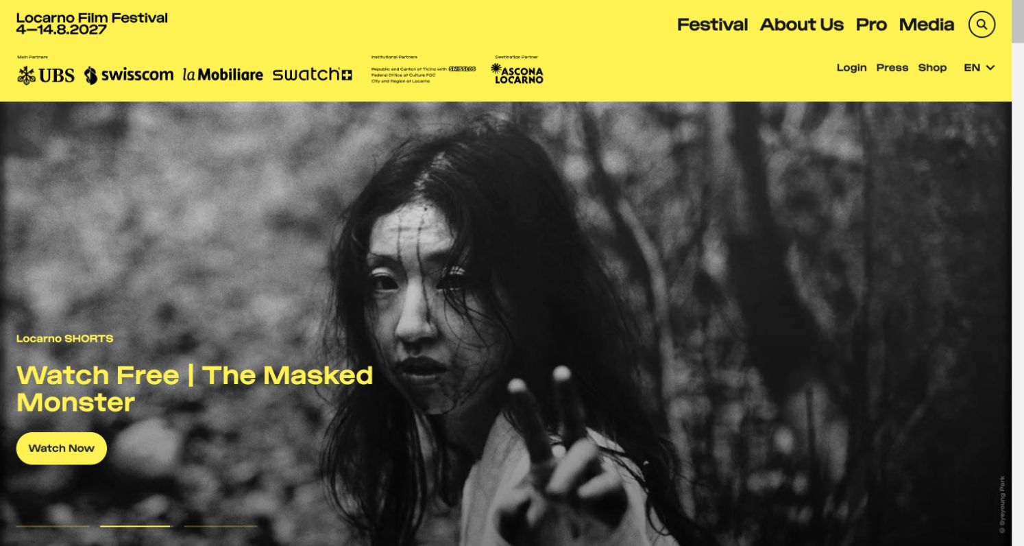
Locarno's yellow header combines the next edition's dates with short Festival, About Us, Pro and Media routes. The captured feature promotes a short film that can be watched free, using a black-and-white still and a matching yellow action. This gives people a reason to engage with the festival outside an attendance window. Sponsor marks occupy a clear band, while the public and professional sections stay recognizable as different parts of the same organization.
What you can learn
Give the audience a meaningful activity between editions, such as a curated film or recorded conversation. Keep that activity clearly labeled and preserve the next event's dates so the digital program strengthens the festival rather than replacing its identity.
Pros
The free-viewing message connects an arresting film still to an immediate audience benefit without requiring a pass purchase.
The bright, consistent identity makes both the upcoming edition and the main organizational routes easy to recognize.
Cons & considerations
If a newsletter prompt appears before the film invitation is understood, it can compete with the page's strongest reason to stay.
If professional and public offerings share a short label such as Media, the destination page needs to clarify who it serves.
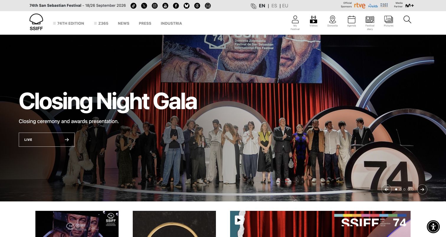
San Sebastian places its edition dates in a slim utility strip and separates organizational navigation from icons for video, the city, agenda, the festival diary and pictures. The captured hero shows the closing gala, while the page's scheduling controls offer day, venue and section choices. It is a dense but purposeful collection of routes for people following a festival in several ways. The English view also keeps language selection prominent rather than making visitors search the footer.
What you can learn
Group festival utilities by their actual use: planning a screening, exploring the city and following coverage are different tasks. After the event, label retrospective content clearly so a gala recording cannot be confused with a live upcoming broadcast.
Pros
Agenda, city information and daily coverage have visible routes alongside the main edition navigation.
Day, venue and section controls reflect how attendees narrow a large screening program in practice.
Cons & considerations
If an archived hero still uses a Live action, visitors may be unsure whether it is a recording or an imminent event.
If many icon-led utilities appear in one row, their text labels need to remain readable at smaller widths.
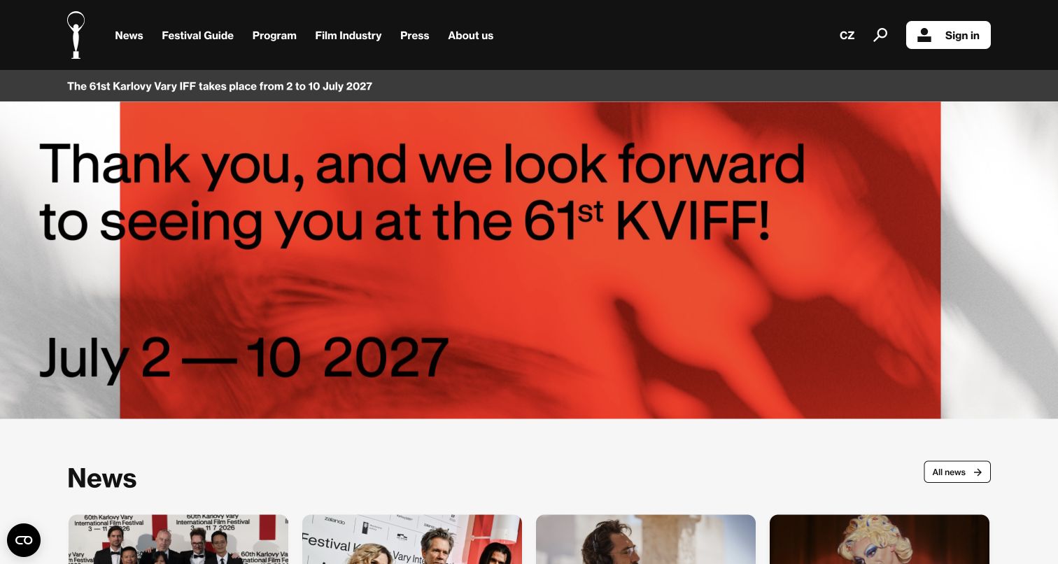
Karlovy Vary uses a black navigation bar, a separate next-edition date strip and a large thank-you campaign to signal the period between festivals. News begins immediately below. The captured page acknowledges the completed event while stating when audiences can return, rather than leaving expired ticket messaging in the lead position. Festival Guide, Program, Film Industry and Press remain visible, supporting both retrospective browsing and preparation for the next cycle.
What you can learn
Plan an explicit post-event homepage state. Replace sales urgency with a thank-you, the next confirmed dates and useful results or news, while preserving access to the completed edition for people researching films, coverage or industry participation.
Pros
The next festival dates are stated in their own strip as well as the large campaign, reducing uncertainty about the current phase.
The main navigation keeps audience guidance and professional participation separate even during the off-season.
Cons & considerations
If language editions are updated at different times, each needs an owner so translated news does not appear unexpectedly stale.
If the campaign relies on very large type, line breaks and mobile cropping require deliberate treatment to keep the dates intact.
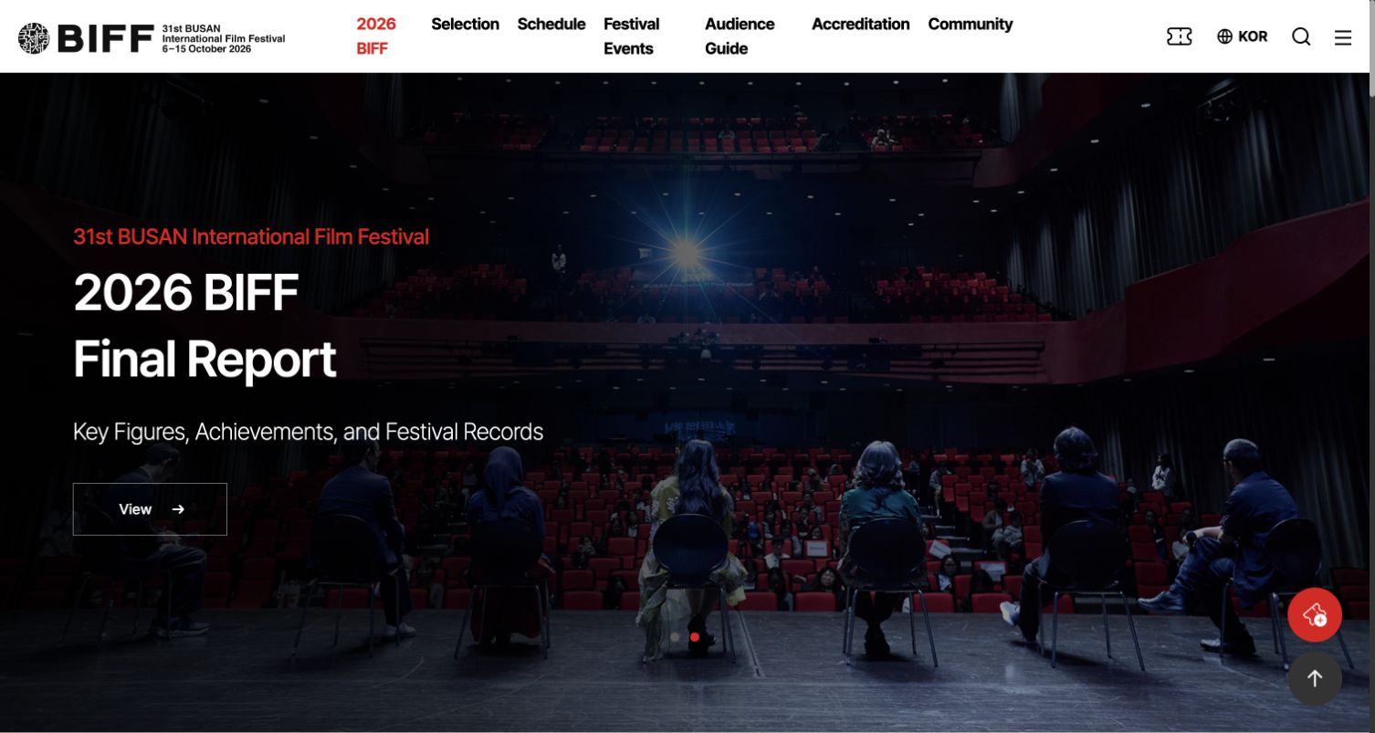
Busan's opening feature promotes a final report, with a theater photograph and a concise description of figures, achievements and records. The white header keeps Selection, Schedule, Festival Events and Audience Guide visible. The result is a useful post-event transition: the homepage can publish outcomes without dismantling the information people used to attend. A red accent ties the active edition, carousel controls and action cues to the otherwise restrained black-and-white structure.
What you can learn
Treat the end of the festival as another publication phase. Make results and reports visible while retaining the selection and schedule as an archive, with clear edition dates so visitors understand the status of what they are reading.
Pros
A dedicated Audience Guide recognizes practical visitor questions independently of film discovery and professional accreditation.
The report feature gives the completed festival a concrete next story instead of leaving the opening-night promotion untouched.
Cons & considerations
If archived schedules remain prominent, they need clear year context to prevent confusion with the next edition's availability.
If icon-only ticket and language controls are used, their accessible names and mobile presentation need particular attention.
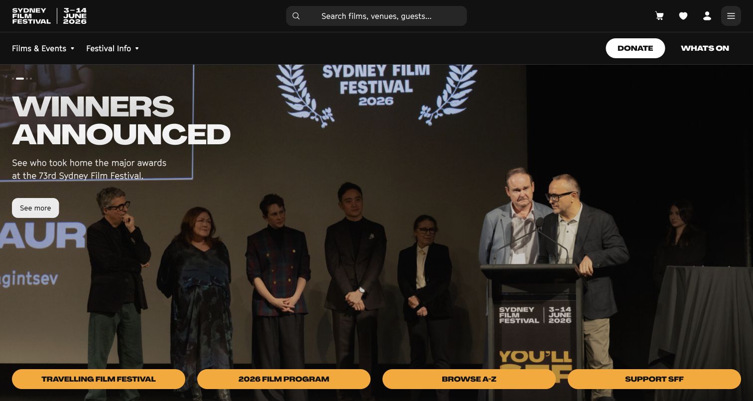
Sydney Film Festival gives search a prominent place in the black header, describing films, venues and guests as searchable subjects. The captured hero celebrates award winners, while bright lower buttons lead to the travelling festival, film program, A–Z browsing and support. This is a useful mixture of guided and direct discovery. Someone who knows a title can search, while someone following the festival beyond Sydney can choose the regional program without mistaking it for the main event.
What you can learn
Offer more than one sensible way into a program. Search, an alphabetical list and a calendar solve different needs; regional or touring activity should have its own route and explicit place information rather than sharing ambiguous event labels.
Pros
The search prompt tells visitors what kinds of entities they can look for, which is more helpful than an unlabeled icon alone.
The touring festival and main program receive distinct direct links beneath the campaign image.
Cons & considerations
If the hero remains an awards recap, the next edition's timing may need separate emphasis for people planning ahead.
If several bright actions receive equal weight, the page must still indicate which route serves first-time attendance most directly.
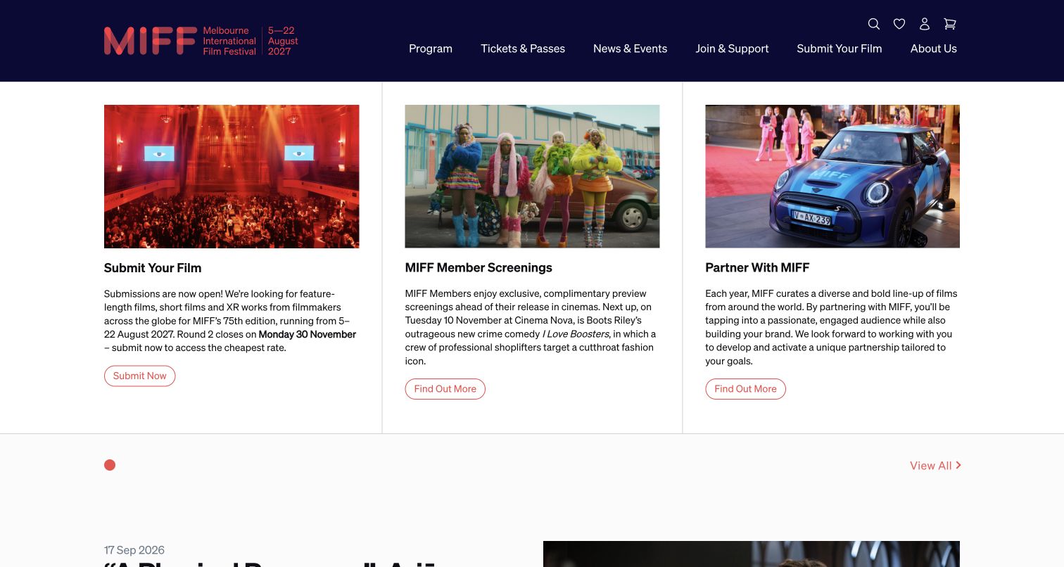
Melbourne's captured homepage opens with three equally sized cards: submit a film, attend member screenings and partner with the festival. Each has an image, a short explanation and an action. The header retains the next edition's dates and familiar program and ticket routes. This is an effective off-season composition because it gives filmmakers, local filmgoers and potential partners distinct next steps without pretending that every visitor is currently shopping for a festival screening.
What you can learn
Write the homepage around the festival's current operational phase. Parallel cards can serve several audiences when their titles identify the task, the copy explains the benefit and each action leads to an appropriate process rather than a general contact page.
Pros
The three cards distinguish filmmaker, audience and partner intentions through literal headings and different supporting imagery.
Submission timing appears in the explanatory text, giving the filmmaker action more context than a bare button.
Cons & considerations
If equal cards are used year-round, a major ticket launch may not receive enough emphasis when the festival enters sales mode.
If the copy grows unevenly, card heights and action placement need attention so the parallel structure remains easy to scan.
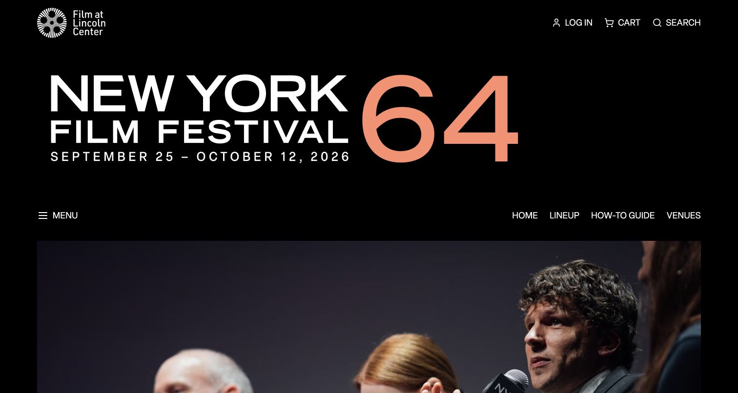
The New York Film Festival page leads with a large edition number and date range on black, then offers Home, Lineup, How-To Guide and Venues as a small dedicated navigation set. The page content moves into festival favorites screening at Film at Lincoln Center and provides schedule and film views. The large masthead preserves the festival's identity inside its parent institution, while the listing structure supports the more immediate task of choosing something to see.
What you can learn
Give the festival a clear subsite identity without duplicating the whole parent organization's navigation. A concise how-to guide and venue section can support first-time attendance, while schedule and film views let people begin with either a date or a title.
Pros
The edition number and dates are unmistakable, which helps readers distinguish this program from other events at the institution.
A dedicated How-To Guide makes the mechanics of attending part of the main festival navigation.
Cons & considerations
If the masthead occupies most of a small screen, current film choices may feel unnecessarily far away.
If festival favorites continue after the official dates, explanatory text must distinguish those screenings from the original festival run.
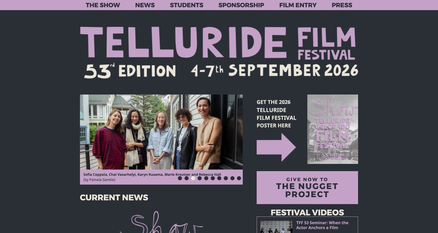
Telluride's lavender and charcoal page places its edition and dates above a compact photo carousel with visible captions and photographer credits. News begins below, while a side column promotes the poster and a local project. The navigation uses short routes for the show, students, sponsorship, film entry and press. Compared with an expansive cinematic hero, this page feels like a community publication: the people, documentation and ongoing organization are presented together.
What you can learn
An intimate festival identity can come from real participants and well-captioned photographs. Keep attribution with the image and pair the retrospective material with plain navigation for the next practical task, particularly submissions, student participation and attendance information.
Pros
Photo captions and credits add useful context to the people shown instead of treating them as anonymous decoration.
The short primary navigation acknowledges student and filmmaker participation alongside press and sponsorship.
Cons & considerations
If the page is viewed by a newcomer, an internal label such as The Show may need explanatory copy on its destination.
If the desktop side column stacks poorly on mobile, important news could be separated from the main festival context.
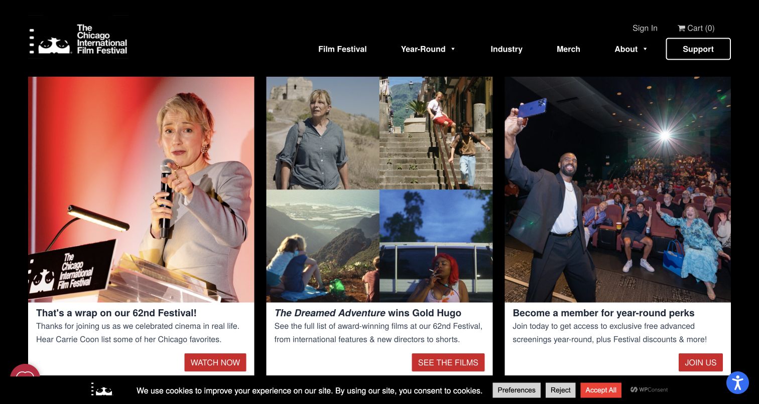
Chicago's captured page presents three large cards on black: a festival wrap-up, award-winning films and membership. Each image sits above a white text panel with a red action, making the choices easy to compare. The navigation explicitly separates Film Festival from Year-Round activity. This is a useful post-event structure because visitors can relive the event, investigate its outcomes or continue their relationship with the organization instead of encountering a stale ticket-sales homepage.
What you can learn
Build the post-festival page from distinct follow-up intentions. Give highlights, award results and ongoing participation their own cards and actions, then keep year-round programming clearly separate from the completed annual edition.
Pros
The white text panels keep descriptions readable independently of the photographs' contrast and subject matter.
The three actions turn a completed festival into clear next steps rather than a generic thank-you message.
Cons & considerations
If membership receives the same emphasis as award information, a first-time visitor may need more explanation of the ongoing benefits.
If cookie and accessibility controls overlap the lower edge, the card actions must remain reachable on smaller screens.
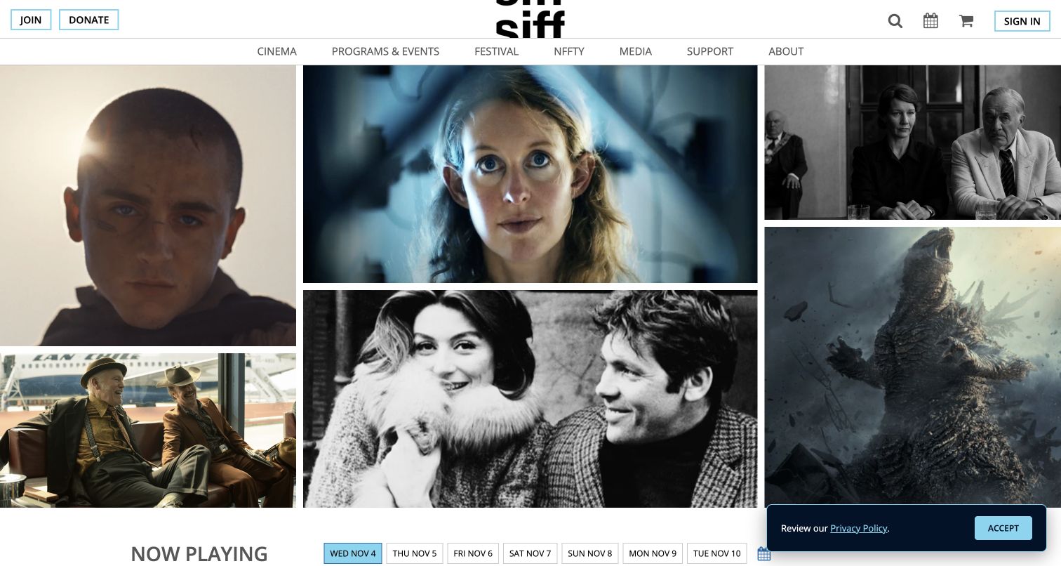
SIFF's homepage uses a mosaic of film stills beneath a restrained white header, with Now Playing and a row of dates appearing below. The navigation separates Cinema, Programs and Events, Festival and support. That hierarchy shows how a festival brand can operate as a daily cinema destination between editions. The collage creates breadth and visual interest, while the date controls begin turning that broad selection into an actionable plan for a particular day.
What you can learn
For an organization that runs cinemas year-round, make today's program useful without erasing the annual festival. Keep the two routes named clearly and let film imagery introduce the range before visitors narrow it by date, venue or title.
Pros
The varied stills communicate a broad film program without requiring a long introductory statement.
Date choices appear directly beside Now Playing, aligning the listing with the practical question of when to attend.
Cons & considerations
If the image mosaic lacks visible film titles, visitors need clear text labels or a nearby list to identify what interests them.
If the annual festival is the visitor's sole goal, it should remain easy to distinguish from ordinary cinema screenings.
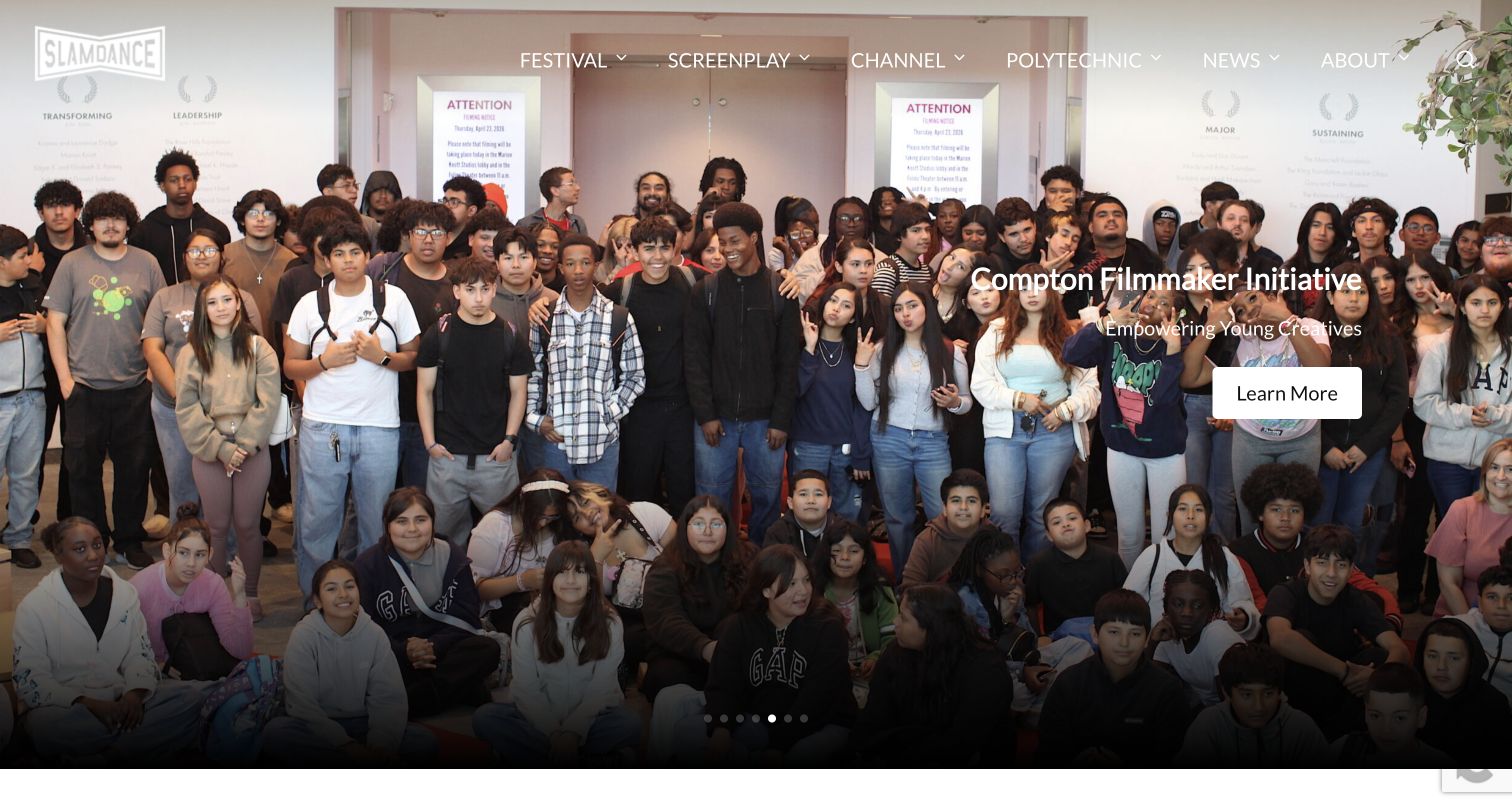
Slamdance's full-width feature shows a group of young creatives with a Compton Filmmaker Initiative message and a simple Learn More action. The header separately names Festival, Screenplay, Channel, Polytechnic and News. The page therefore introduces a wider filmmaker community rather than only the annual screening event. Its carousel also contains awards and submission updates, showing how the same visual structure can carry public programming and opportunities for people making films.
What you can learn
When a festival also develops filmmakers, distinguish its activities by purpose. A community photograph can make a program feel concrete, but the supporting copy should explain who it serves and the destination should make eligibility and next steps explicit.
Pros
The featured initiative uses an actual group photograph to connect the organization with people rather than abstract mission language.
Separate festival, screenplay, educational and viewing routes make the wider scope of the organization visible.
Cons & considerations
If light navigation sits over a bright image, its contrast must be checked for every carousel slide.
If several programs use unfamiliar internal names, new visitors may need a short explanation before choosing among them.
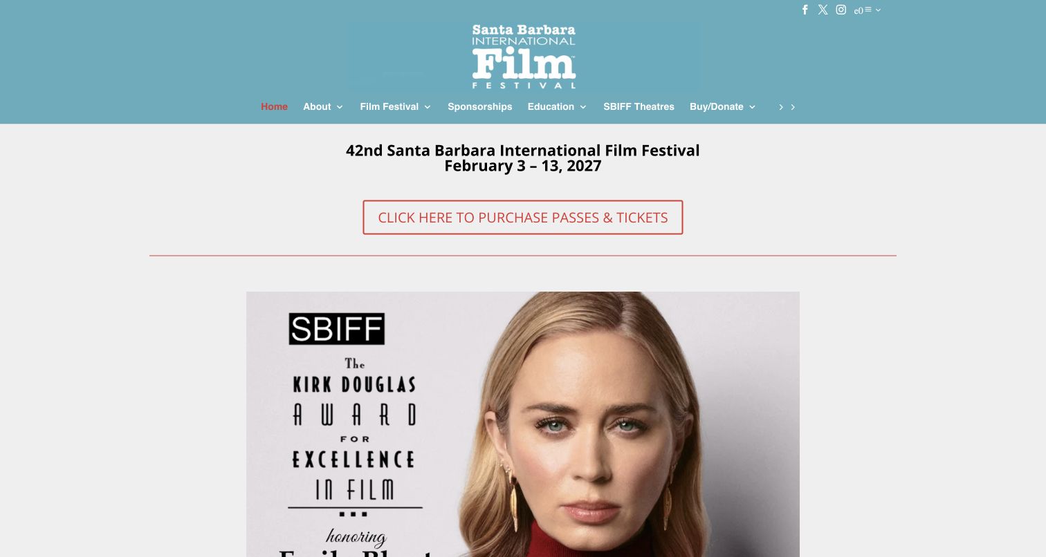
Santa Barbara's page states the next festival name and dates above a clearly outlined pass-and-ticket link. A large honoree image follows, with additional tribute events and purchase routes farther down the page. The blue header and centered logo frame a comparatively straightforward vertical layout. This makes the primary commercial task easy to find before visitors explore the personalities and award events that give the festival its public profile.
What you can learn
Put the edition dates and primary attendance route before the detailed promotional imagery. When tribute events have separate tickets or tables, label those routes consistently so visitors understand which part of the festival each purchase would cover.
Pros
The date and ticket action are visible before the large honoree artwork, providing a concrete starting point for attendance.
The simple vertical layout can accommodate successive announcements without requiring each one to compete in a carousel.
Cons & considerations
If many purchase links use Click Here phrasing, visitors may struggle to distinguish their destinations when scanning or using assistive technology.
If event artwork contains essential details, those facts should also appear as readable page text for mobile and nonvisual access.
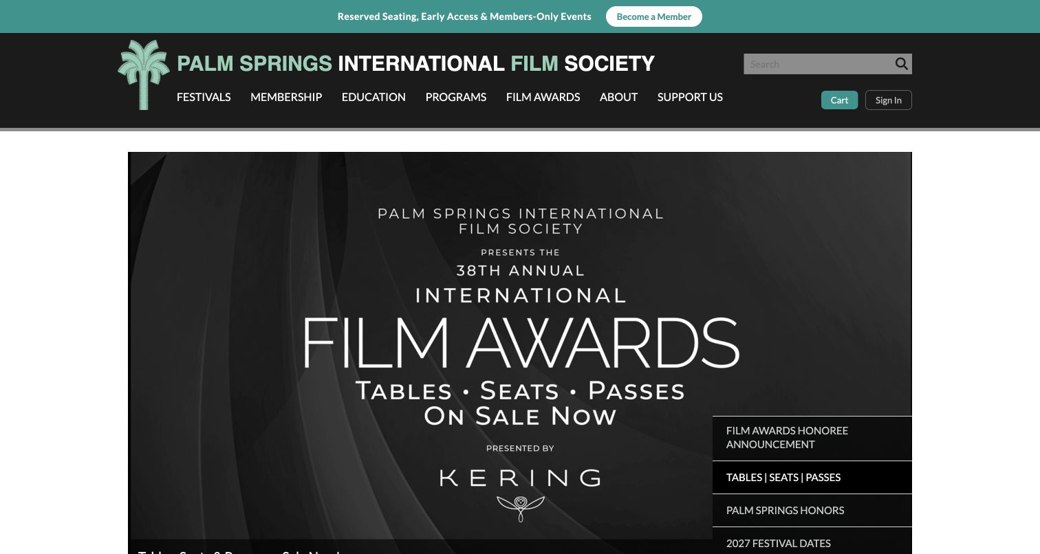
Palm Springs pairs a turquoise membership strip with a dark institutional header and a large awards campaign. A stacked list of campaign choices includes honoree news, tables and passes, festival dates and member screenings. The organization is wider than one event, so the navigation names Festivals, Membership, Education, Programs and Film Awards separately. The page's main challenge is making each offering distinct while retaining a shared identity for the society behind it.
What you can learn
When several events belong to one film society, avoid a generic ticket destination. Name the festival, awards ceremony or member program before presenting availability, and keep the society's ongoing benefits separate from one-time attendance products.
Pros
The navigation distinguishes Film Awards from Festivals, helping visitors identify different event formats under one organization.
The persistent membership strip explains a concrete relationship with the society beyond a single screening.
Cons & considerations
If awards sales dominate the hero, visitors seeking a film lineup may need a more immediate route into the appropriate festival.
If a campaign is delivered mainly as artwork, dates and ticket categories also need accessible text outside the image.
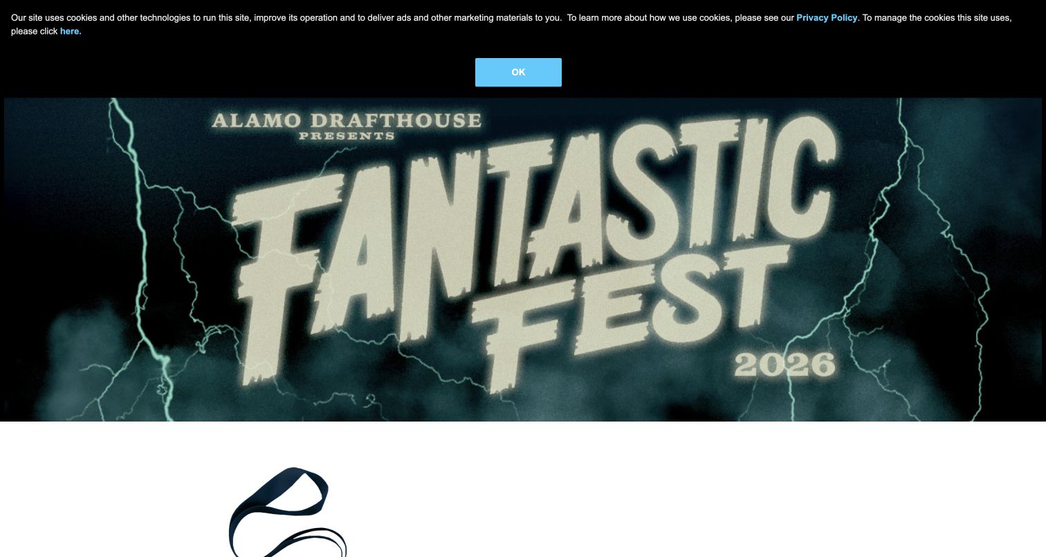
Fantastic Fest uses illustrated horror-style artwork to establish its genre identity before explaining the event and badge options. The page names the venue and dates, then describes several passes with different access levels and sold-out states. That combination is useful: the visual tone speaks to the audience, while the body content addresses the practical differences between attending the full festival and a smaller portion. It also reveals how important clear inventory status is for a limited-capacity event.
What you can learn
Let the visual language express the festival's programming taste, then make badge differences literal. Explain the period covered, reservation privileges and included activities in comparable terms, and update sold-out or historical offers promptly after the event.
Pros
The artwork communicates a specific programming identity rather than relying on a generic red-carpet image.
Badge descriptions expose meaningful access differences that attendees need to understand before choosing a pass.
Cons & considerations
If expired sales copy remains prominent after the festival, visitors may be unsure which edition is currently available to purchase.
If ticket buying requires a cookie category, the explanation should appear near the action and offer a clear support route.
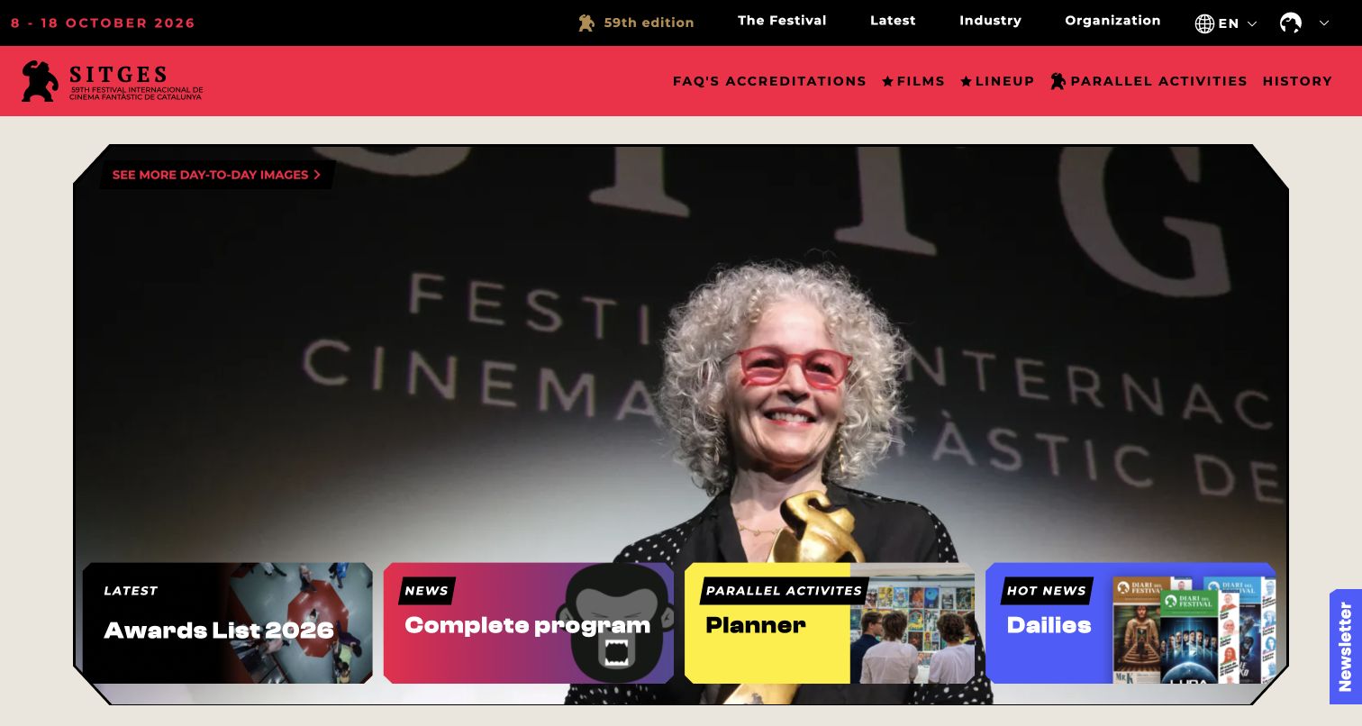
Sitges combines black and red navigation with a large event photograph and four colorful cards for award results, the complete program, a planner and daily publications. The two header levels separate institutional material from practical edition routes such as Films and Lineup. This gives a rich festival website several clear entry points without asking every visitor to begin from the same story. The distinct visual identity supports the genre focus while the cards do practical navigation work.
What you can learn
Use a small set of high-value shortcuts to organize a large festival program. Results, the complete lineup, personal planning and daily coverage deserve different destinations, with the current edition and language clearly indicated throughout.
Pros
The four colored cards distinguish important festival tools through both labels and visible placement over the main feature.
Edition-specific film routes remain separate from the broader organizational navigation.
Cons & considerations
If too many header labels and card treatments compete, the page needs careful mobile prioritization to retain a clear first task.
If a consent dialog appears in a different language from the page, visitors may find its choices harder to understand.
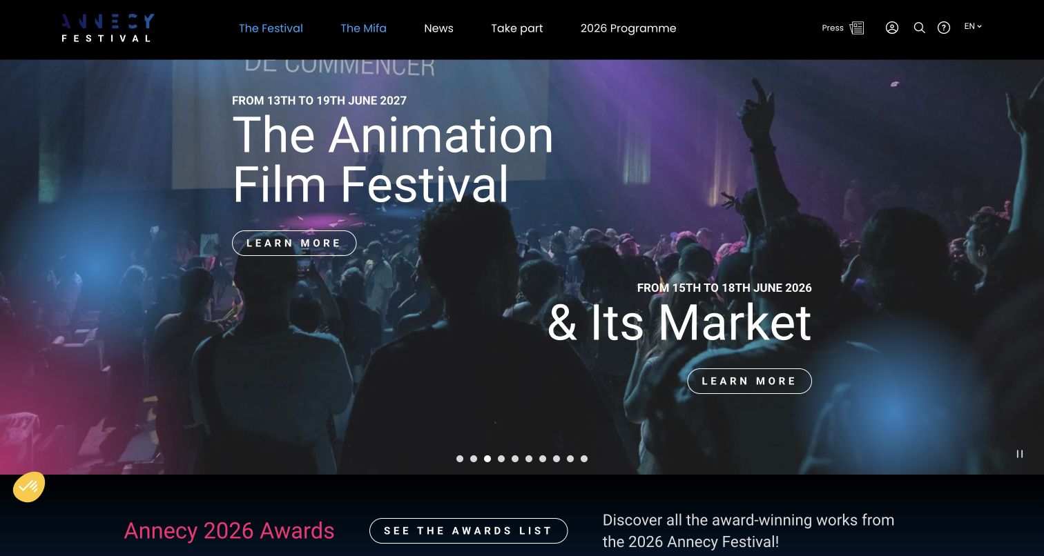
Annecy presents the animation festival and its market as two named invitations within the same large hero. Each has a date line and an outlined Learn More action, while the main navigation distinguishes The Festival and The Mifa. Awards content follows below. This shared presentation makes the relationship visible without treating the two events as interchangeable. The captured page also shows why mixed-year material needs care: the displayed festival and market dates refer to different annual cycles.
What you can learn
Related public and professional events can share a visual identity while retaining separate dates, eligibility and attendance paths. Give each a distinct label and keep their yearly updates synchronized so visitors can understand the relationship without assuming identical access.
Pros
The festival and market have separate named actions within one coherent opening composition.
The main navigation mirrors that distinction, reinforcing the difference after visitors leave the hero.
Cons & considerations
If the festival and market display different years, explanatory context is needed to prevent planning errors.
If a long carousel contains many announcements, key attendance information should also be available outside the rotating slides.
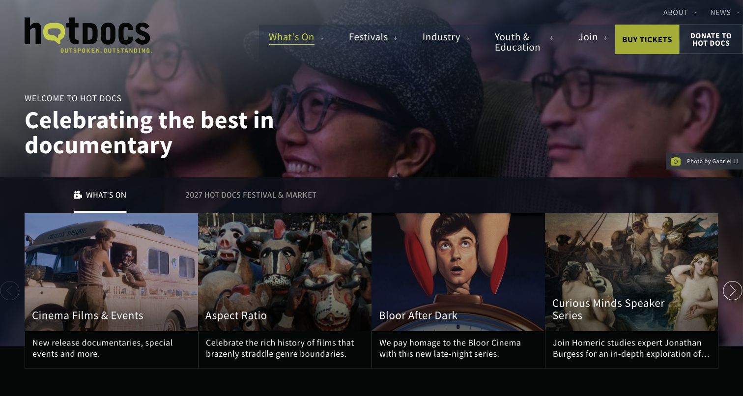
Hot Docs uses a photographed audience, a concise documentary-focused statement and a bright ticket action to introduce the organization. Below, tabs distinguish What's On from the next festival and market. The visible cards describe cinema events, a thematic series, late-night programming and talks. This helps a documentary brand feel active beyond its annual festival while keeping the future event represented as a separate destination rather than mixing all activities into one undifferentiated feed.
What you can learn
Separate the organization's current public program from next-edition planning. A small number of descriptive series cards can introduce programming variety, while the festival tab holds the date-specific information that travelers, filmmakers and professionals need.
Pros
The audience photograph supports the page's invitation to participate rather than relying solely on promotional film stills.
The tab labels distinguish immediate programming from the next festival and market in plain terms.
Cons & considerations
If tab content is hidden from the opening view, visitors may miss the next festival unless its label remains prominent.
If multiple series are unfamiliar to newcomers, each card needs enough explanatory text to communicate the viewing experience.
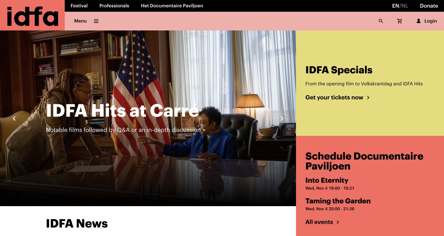
IDFA divides the opening into a large film feature and two brightly colored side panels. The captured feature promotes a discussion-oriented program, while the side panels offer festival specials and the documentary pavilion's dated screenings. A top strip distinguishes Festival, Professionals and the permanent venue. This layout is valuable because it can promote a major festival without hiding today's local program, giving visitors concrete choices based on both the event and the institution's continuing activity.
What you can learn
When annual and daily programming coexist, give them separate visible spaces. Pair promotional stories with a concise dated schedule so local visitors can make an immediate plan while festival audiences continue into the larger selection and professional information.
Pros
The side-panel schedule includes dates and times, turning a broad documentary destination into an actionable local visit.
Distinct festival and professional routes acknowledge that public audiences and industry participants need different information.
Cons & considerations
If a newsletter popup covers the large feature, it can hide the page's main invitation before visitors have evaluated it.
If the split layout stacks on mobile, the order should preserve both the festival action and time-sensitive venue schedule.
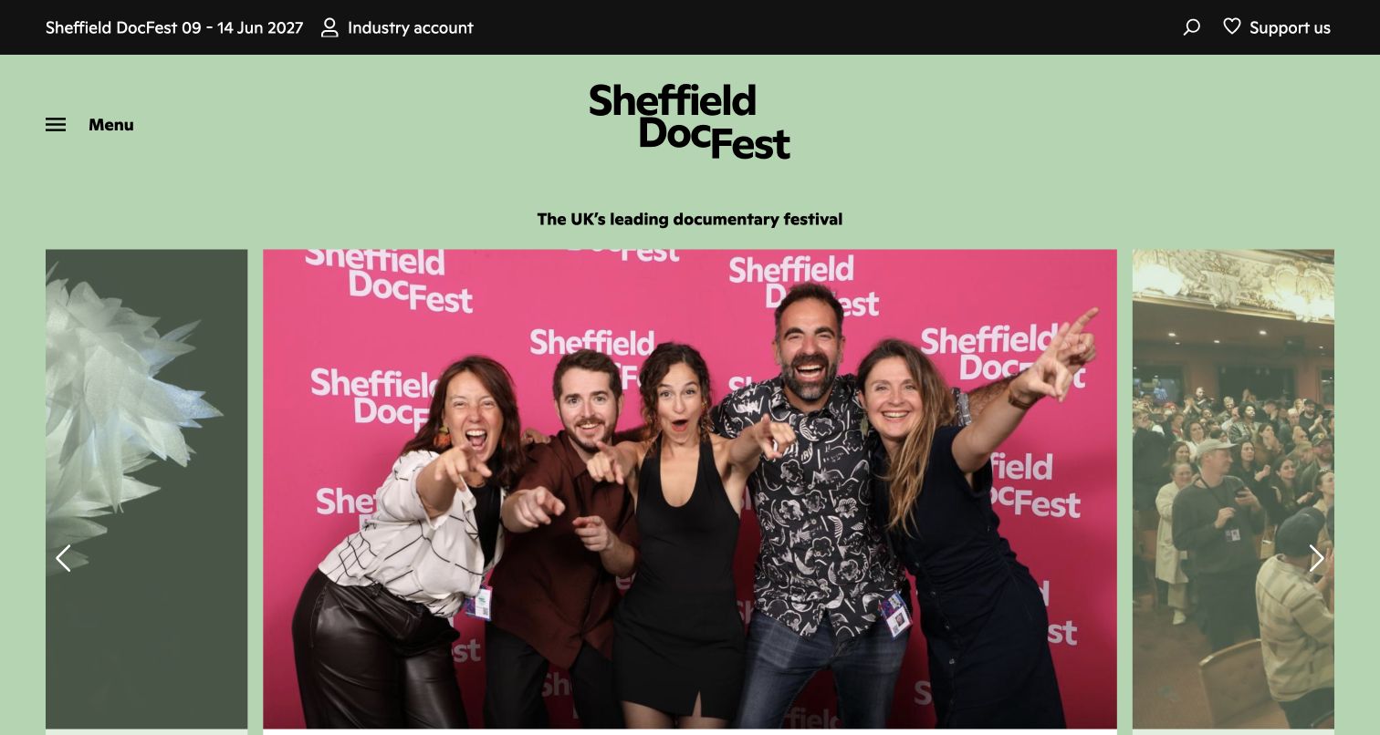
Sheffield DocFest places its next dates and industry account in a dark utility bar above a pale green identity area. A large photograph of participants leads the page, while the underlying stories cover youth jury applications, year-round screenings and film entries. The approach connects a professional documentary event with the people who participate in it. Support and industry access remain distinct, avoiding the assumption that every visitor is looking for the same kind of ticket.
What you can learn
A festival's homepage can introduce participation as well as attendance. Use specific opportunity titles and clear eligibility information on their destinations, while keeping the next festival dates and year-round screening routes visible for general audiences.
Pros
The upcoming dates remain visible in a compact utility bar above the more expressive community imagery.
Youth jury, film entry and screening stories represent different ways to participate in the organization's work.
Cons & considerations
If the hero image occupies most of the first screen, the corresponding opportunity title should be easy to find without excessive scrolling.
If the navigation relies on a menu button, new visitors need clear destination labels once they open it.
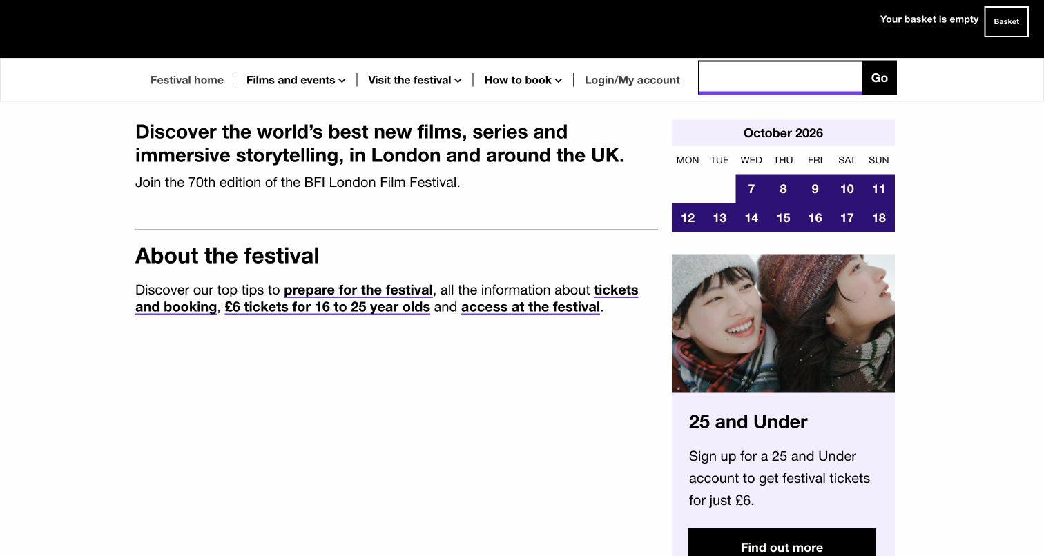
The BFI London Film Festival page favors a practical layout: navigation for films, visiting and booking sits above introductory text, a month calendar and a youth-ticket information card. Links to preparation, ticketing and access appear together before the longer program categories. The captured view is less dependent on a cinematic hero than many examples in this collection. It makes the mechanics of attending part of the introduction rather than leaving them for a separate support search.
What you can learn
Present the festival's practical structure early. Visitors planning several screenings need booking rules, calendar context, venue information and access guidance alongside discovery, especially when different audience groups have specific offers or booking arrangements.
Pros
Preparation, booking and access links are grouped near the top, supporting visitors before they commit to a screening choice.
The calendar provides a compact visual reference for the event period beside the introductory content.
Cons & considerations
If the introduction remains tied to a completed edition, the page should clearly distinguish archival information from current ticket availability.
If essential information is spread across many Find Out More links, more descriptive destination labels can make scanning easier.
Plan the festival website as a yearly publishing system
Define the edition lifecycle
Write down what the homepage should do before submissions open, during selection announcements, at ticket launch, during the festival and afterward. Decide when dates become public and who approves them. Preserve old edition URLs and label their status so search visitors can distinguish a useful archive from current attendance information.
Model films separately from screenings
A film may have several screenings, versions or associated conversations. Store its editorial description and credits separately from each scheduled occurrence, venue and ticket destination. This makes it easier to correct one time without changing unrelated records and to show a film in both a thematic collection and a date-based calendar.
Give each audience a complete path
Map the steps for a public visitor, a submitting filmmaker, an accredited professional and a volunteer. Identify eligibility, deadlines, documents and outside systems for each path. Keep forms and account actions out of generic promotional buttons, and explain what someone should prepare before leaving the public site.
The editing job behind the design
Choose tools that preserve program relationships and edition history
Choose the program and ticketing architecture before adding elaborate homepage animation. The content model should connect films, people, screenings, venues, sections and editions without duplicating them in unrelated page builders. Evaluate imported schedules and ticket links against realistic changes, including a moved screening, a cancelled event and a sold-out pass.
Separate public editorial publishing from submissions, accreditation and payment systems while making the handoffs understandable. Give editors controlled ways to update stories and campaigns, with review ownership for deadlines and attendance facts. Public frontend evidence may identify some software, but it does not establish the festival's private selection database or the reliability of its ticketing operations.
Our WordPress website examples offer a separate look at publishing approaches. A visible platform label is evidence for that named page, not a guarantee that the same system will suit your requirements.
Before the public launch
Film festival website launch checklist
Show the edition year, confirmed dates and location at each important entry point.
Distinguish current ticket offers from archived schedules, awards and recordings.
Connect each film to its actual screenings, venues and relevant format information.
Explain pass coverage, reservation rules and sold-out states before the ticketing handoff.
Provide separate routes for film submissions, accreditation, press and public attendance.
Check translations and related market pages for consistent edition dates and deadlines.
Keep booking, travel and access guidance easy to reach from film and schedule pages.
Test mobile filters, keyboard operation, image alternatives and empty results without sending real forms.
Prepare the post-event state, archive links and ownership of next-edition updates before opening day.
These checks are a project checklist, not a performance, legal, security, or accessibility certification. Test real journeys with the people responsible for the website before making claims about the result.
Sources & editorial method
How this collection was selected and reviewed
Exactly 25 distinct official festival properties were selected to match the saved random target established before research. Each published example uses a genuine direct browser capture from November 4, 2026, with its actual source URL and dimensions. Reviews describe visible public design and program structure, including off-season and year-round states. Security-gated, unreachable and persistently blank candidates were excluded. No tickets, submissions, subscriptions or accreditation forms were sent. Technology claims require their own scoped evidence and are not inferred from visual style.
Each example links to its actual source page. Screenshots are direct browser captures with their own capture dates; moving imagery, announcements and live designs can change. The notes describe observable design choices and conditional tradeoffs, not measured traffic, conversion results, service quality, or accessibility conformance.
Technology labels use public page metadata, asset evidence, or explicitly cited platform documentation. Platform documentation is not a complete current deployment audit. A component reference may be legacy or unused; it is not a complete backend inventory. Unknown stacks are omitted. These sites are editorial examples, not our client portfolio.
Written, Edited and Curated are separate editorial records, not timestamps advanced by a rebuild. Website designs and imagery belong to their owners. See our editorial standards or suggest a correction.
Questions worth asking
Film Festivals website design questions
Does a festival need a separate website for each edition?
It needs a clear edition structure, but that does not necessarily require a separate system. Keep dates, programs and status attached to the relevant year, preserve useful archive URLs and provide a clear route to the current edition. Avoid replacing historical pages with unrelated new content.
What should the homepage show between festivals?
Use the current organizational priorities: next dates, submissions, award results, interviews, year-round screenings or participation opportunities. Keep attendance information easy to find and remove expired sales urgency. The page should make the festival's current phase understandable.
Should the film program begin with a calendar or a list?
Offer the views that match the program and audience. A title list helps someone who knows the film; a calendar helps someone planning a free evening; sections and themes support discovery. Keep them connected to the same screening records so they agree about time and location.
How should a festival and its professional market share a site?
They can share identity and editorial content while retaining separate dates, eligibility and attendance routes. Label the public festival and professional market clearly. Check that yearly updates happen together and explain any differences in their schedules or access requirements.
Borrow the clarity of the festival's relationships: films to screenings, people to opportunities and each edition to its archive. Build those connections with accurate records and a publishing process that works throughout the year.