A sports-club website serves people following a match, planning a visit, buying a ticket or joining the community. Its structure should make each of those intentions easy to recognize.
The homepage changes with the sporting calendar, but supporters still need stable routes to teams, fixtures, tickets, venue information and help. A strong club identity can come from color, photography and editorial voice while the underlying navigation remains predictable. Plan for matchdays and ordinary days as distinct content states.
The examples here include professional football and rugby clubs with different approaches to editorial coverage, membership and attendance. They are design references drawn from dated public views. Scores, competition labels, campaigns and schedules shown in screenshots are observations of those pages, not independently verified current sporting information or ticket-availability guarantees.
Before the examples
What makes good sports clubs website design in 2026?
Make the next fixture understandable
Identify the team, opponent, competition, venue, date and timezone. Distinguish a fixture preview from a live match centre, a completed result and a ticket link. When several squads or sports share a page, show their identities on every event rather than relying on a color or abbreviation that only a regular supporter understands.
Keep attendance information close to tickets
Connect ticket choices with venue access, transport, accessibility information, entry requirements and support. Explain whether an action opens the club’s own service or a separate ticketing provider. Give hospitality, membership and single-event attendance distinct labels because they involve different commitments and questions.
Give club stories a maintainable hierarchy
Separate urgent match information, daily editorial coverage and longer-lived community stories. Use clear team and content-type labels before the click. A dramatic video or photograph should support that hierarchy, with readable text, motion controls and a useful fallback when the media does not load.
The collection · 14 examples
14 sports clubs websites worth studying
Compare how these clubs distribute editorial attention, fixture information and supporter tasks. The most useful pattern is the one your publishing team can keep accurate throughout the season, including quiet periods and last-minute changes.
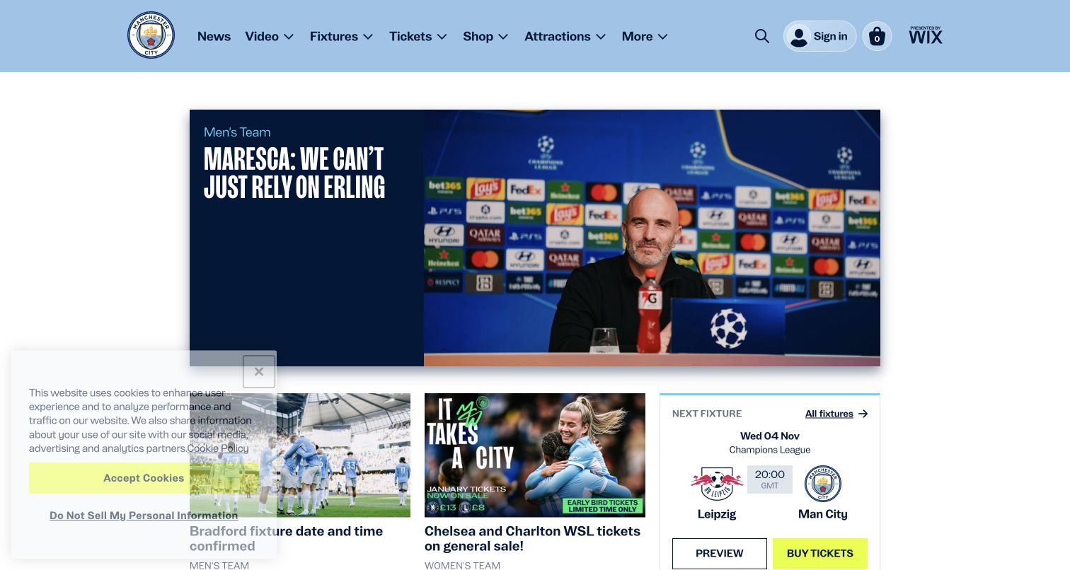
Manchester City pairs a pale-blue header with a contained lead-story card rather than a full-screen image. A dark text panel sits beside a press-conference photograph, and smaller stories appear below. The adjacent fixture panel identifies the next match and provides separate preview and ticket actions. This structure gives visitors both an editorial destination and a practical next step in the same area. The saved view retains a lower-left privacy panel, so that overlap is part of the observed experience. Sponsor presentation is kept within the header rather than replacing the club’s primary navigation.
What you can learn
Place the next fixture near the lead news, with its date, competition and action labels kept separate. A preview, a match report and a ticket purchase should look like different destinations because they answer different supporter needs.
Pros
The fixture card provides a practical counterpoint to the editorial headline.
Contained content widths make the lead story and secondary cards easy to distinguish.
Cons & considerations
The privacy panel can overlap lower editorial cards at this viewport height.
Compact fixture panels need explicit timezone and availability information on their destination pages.
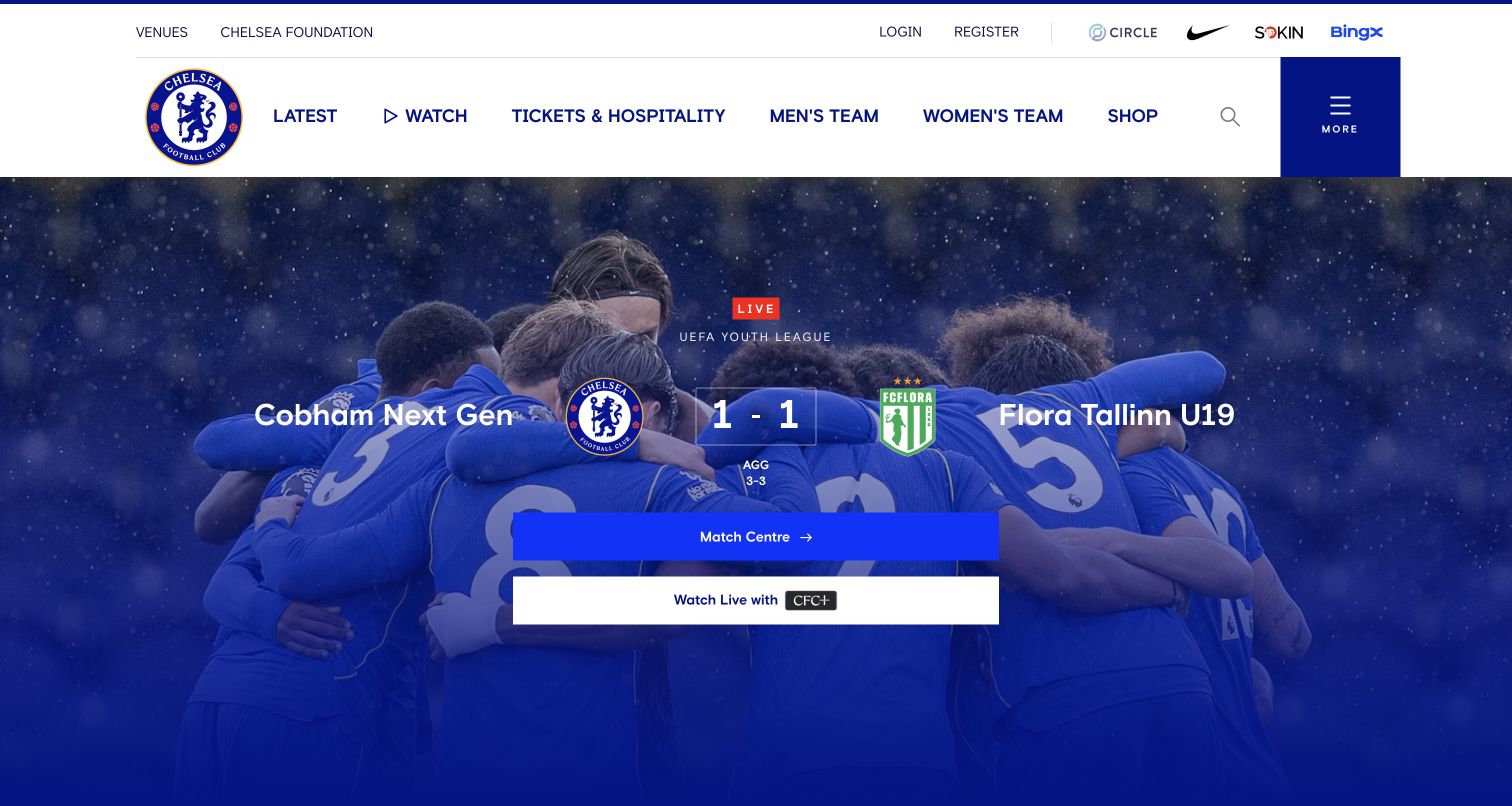
Chelsea’s observed opening centers a live youth match over a blue-tinted team photograph. Team names, score and competition occupy a strong horizontal arrangement, followed by separate match-centre and viewing buttons. The white header maintains clear routes for latest news, video, tickets and hospitality, and men’s and women’s teams. This is a useful example of an event-driven homepage state: the live information temporarily receives more prominence than a conventional news carousel. The review concerns that visible presentation, not an independent verification of the score or the availability of the viewing service.
What you can learn
Plan explicit before-match, live and after-match states. Preserve the same fixture identity and navigation while changing the primary action, and distinguish a public match centre from any viewing service with separate access requirements.
Pros
The live label, competition and score establish the immediate purpose of the hero.
Separate match-centre and viewing actions make the two destinations easier to understand.
Cons & considerations
A live state requires reliable updates and a clear fallback if data stops refreshing.
A large score-led hero still needs accessible routes for supporters visiting for unrelated fixtures or services.
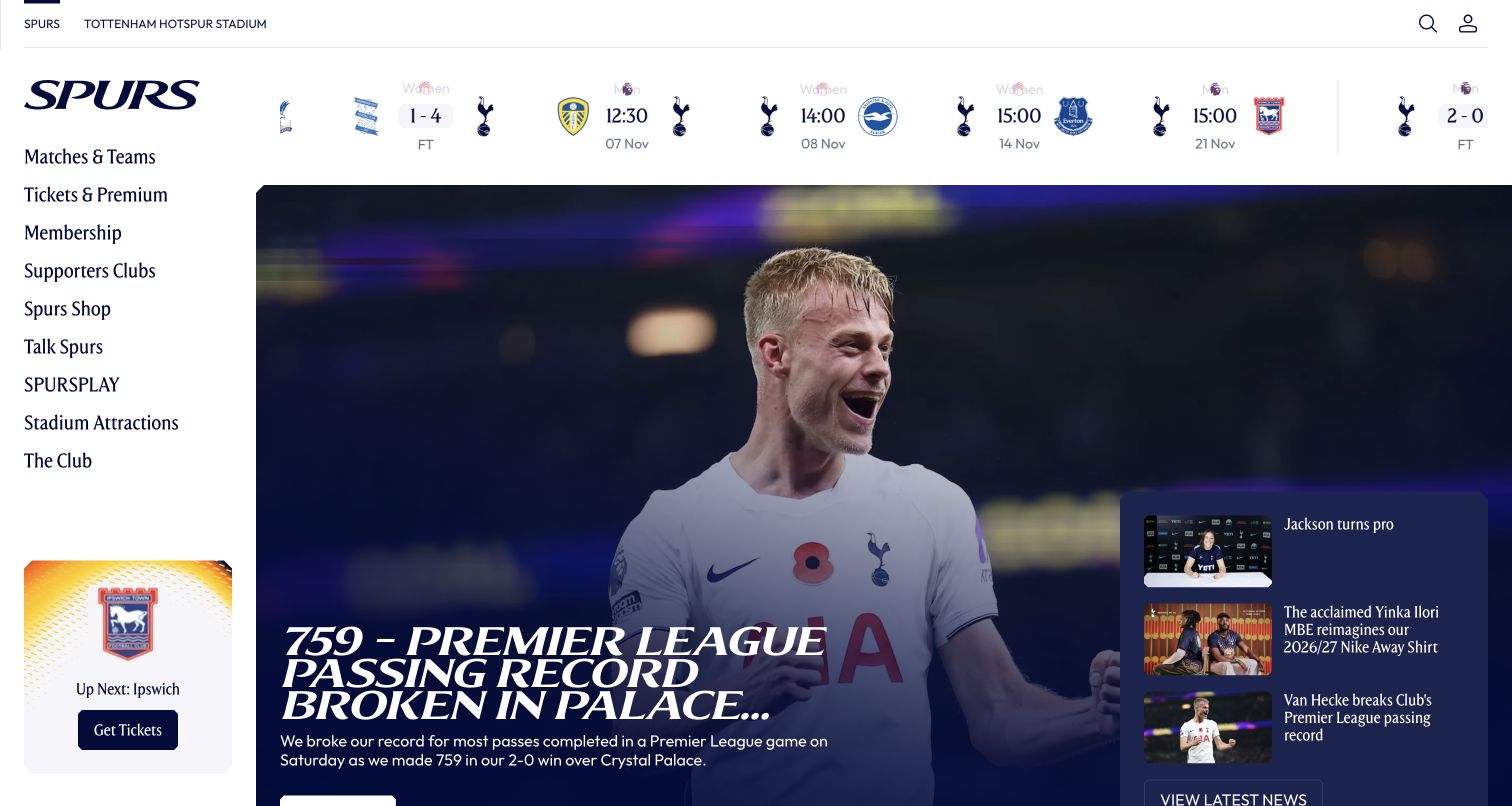
Tottenham Hotspur uses a white left sidebar for matches, tickets, membership, supporters clubs and stadium attractions. A horizontal ribbon of men’s and women’s fixtures sits above the main editorial image, while a small upcoming-ticket card anchors the lower sidebar. The lead story shares its photographic area with several compact secondary headlines on the right. This arrangement makes the club’s services continuously visible in the desktop opening and gives the fixture sequence a place separate from the news hierarchy. Its distinctiveness comes from the distribution of tasks across the page, rather than a single dramatic campaign.
What you can learn
Allocate persistent space to the tasks supporters repeat most often, then let editorial stories occupy the flexible area. A sidebar can work well on desktop, but its mobile replacement should preserve clear routes to tickets, teams and stadium information.
Pros
The sidebar exposes supporter and stadium destinations without opening a menu.
The fixture ribbon includes different teams while remaining separate from the lead article.
Cons & considerations
A wide sidebar reduces the space available for headlines and photography on smaller laptops.
Repeated fixture items and secondary stories need careful keyboard and screen-reader navigation.
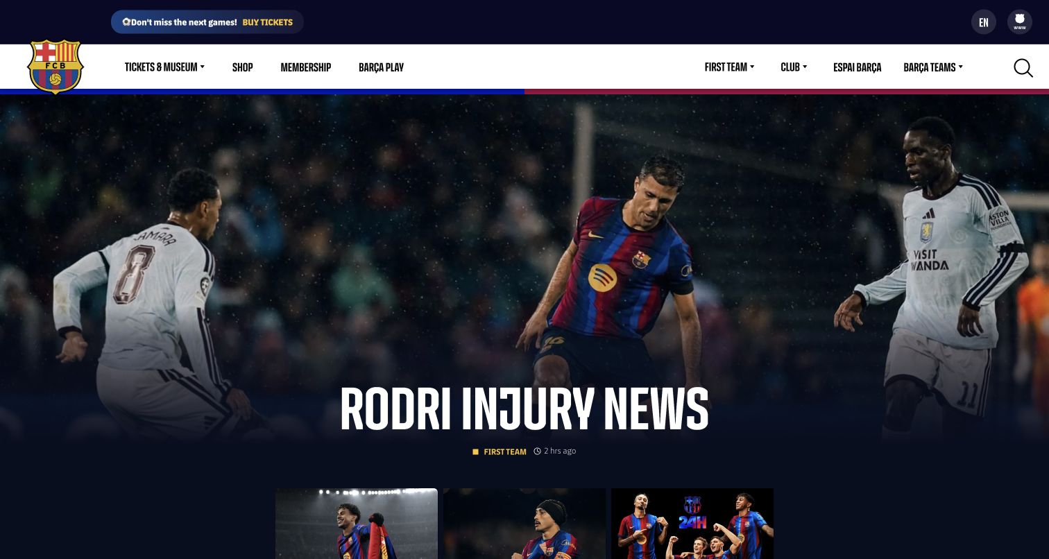
FC Barcelona divides the white header between commercial destinations such as tickets, museum, shop and membership, and sporting or club destinations on the opposite side. The club crest bridges the header and dark editorial area. A large match photograph with an overlaid headline leads into smaller story thumbnails, while a narrow top strip promotes tickets. The page’s broader team menu includes several sports, illustrating the information-architecture challenge of a club that serves more than one squad. The captured headline is a dated news state; the useful design lesson is the separation of durable navigation from changing coverage.
What you can learn
For a multi-sport organization, define a clear distinction between watching a team, visiting a venue and joining a membership program. Keep the club identity consistent across those journeys without forcing them into one undifferentiated ticket menu.
Pros
The header separates commercial tasks from team and club information.
The large crest and consistent dark palette provide continuity across changing editorial images.
Cons & considerations
Several ticket and membership promotions can compete unless their destination differences are explicit.
A large overlaid headline needs robust contrast and mobile cropping across every selected photograph.
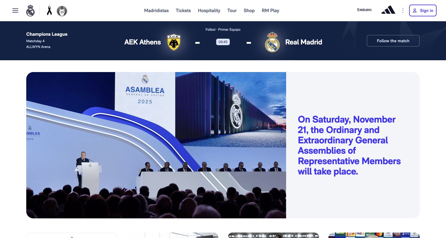
Real Madrid places a compact match strip directly beneath its white header, with competition, opponent information and a follow-the-match action. The main feature below uses a rounded split card: a large event photograph on the left and substantial text on the right. In the observed state, the featured subject concerned a representative-member assembly rather than a player or match. That choice makes the page useful for examining a club as an institution with governance and membership obligations. Tickets, hospitality, tours, shopping and media remain plainly named across the top.
What you can learn
Reserve a reliable place for the next sporting event even when the lead story serves members or institutional news. Use a text-and-image card when the message needs explanation, and link to the authoritative details rather than compressing every condition into artwork.
Pros
The match strip remains useful independently of the main editorial subject.
A separate text panel keeps the long institutional headline readable without placing it over photography.
Cons & considerations
Long headlines need responsive typesetting so the card does not become disproportionately tall.
Mixed regional language labels should be checked across navigation, fixtures and editorial components.
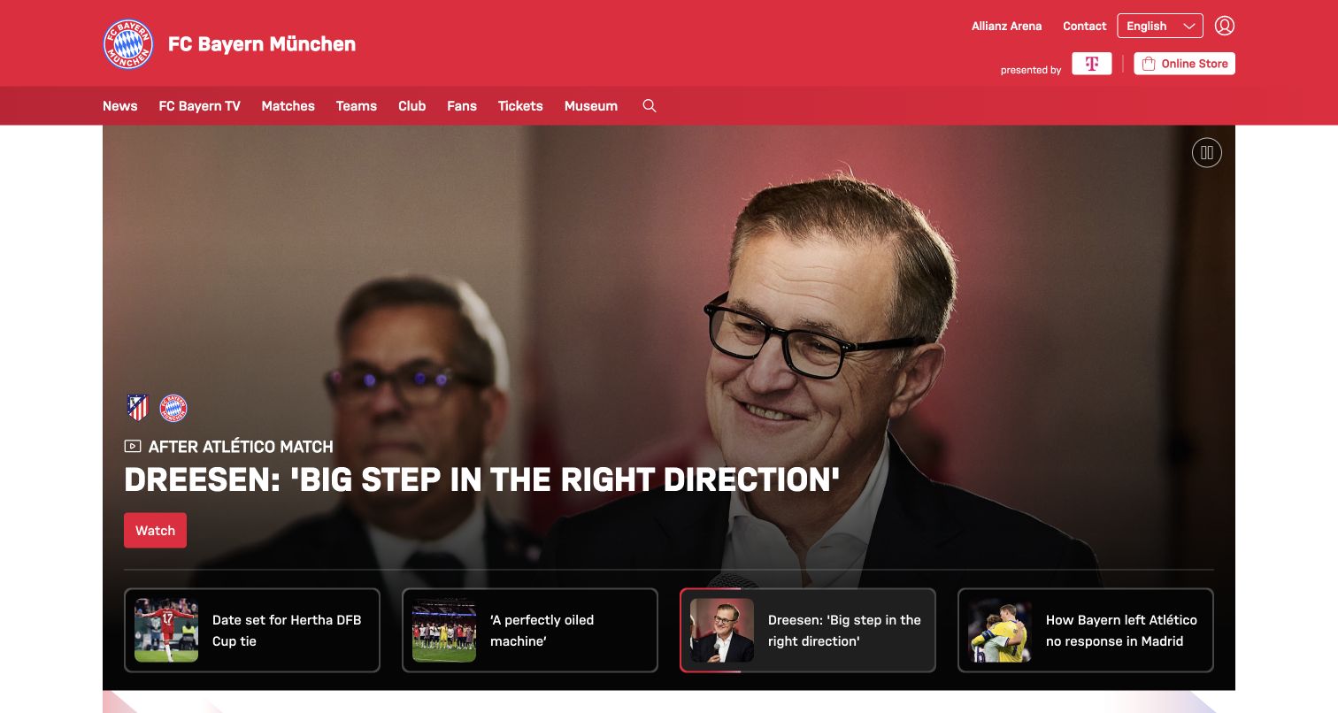
FC Bayern Munich uses a red masthead with clearly named news, television, matches, teams, club, fans and ticket destinations. The hero contains a large editorial photograph with a short content-type label, headline and action. Four visible preview cards sit along the bottom, allowing visitors to see alternative stories without relying only on anonymous carousel dots. A pause control is also visible in the upper corner of the image. Beneath this opening, the page text includes a next-match countdown and match listings. The design balances a changing editorial lead with recognizable controls and persistent sporting categories.
What you can learn
If a carousel is necessary, show meaningful previews and a visible way to pause movement. Distinguish video from text stories before the click, and keep the match schedule available through a stable route outside the rotating feature.
Pros
Preview cards disclose the other lead stories instead of hiding them behind dots alone.
The visible pause control acknowledges that motion should remain under the visitor’s control.
Cons & considerations
Several preview cards may require an alternative presentation on narrow screens.
A countdown needs a clearly defined timezone and should not be the sole source of fixture information.
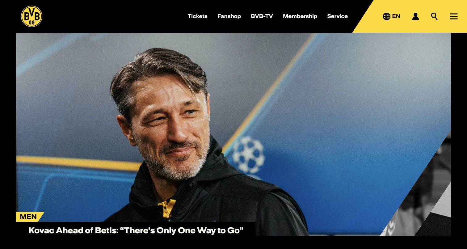
Borussia Dortmund uses black and yellow across a concise header that names tickets, the fan shop, video, membership and service. Language, account, search and the broader menu occupy a distinct yellow area. A large press-conference photograph fills the main feature, with a small team label and a headline placed along its lower edge. The opening is visually forceful but structurally simple: the brand colors frame the content while the photograph does most of the storytelling. Further page content separates news from video, preserving a recognizable editorial hierarchy beyond the first screen.
What you can learn
Use club colors to define navigation and content labels rather than applying them to every surface. Keep essential commercial and support routes explicit, and let a compact category label explain which team or section a large editorial photograph belongs to.
Pros
A concise header makes tickets, membership and service easy to identify.
The small team label provides context without competing with the main image.
Cons & considerations
A photograph-led feature can delay practical match information until the visitor scrolls.
A menu icon needs a clear accessible label and a predictable expanded structure.
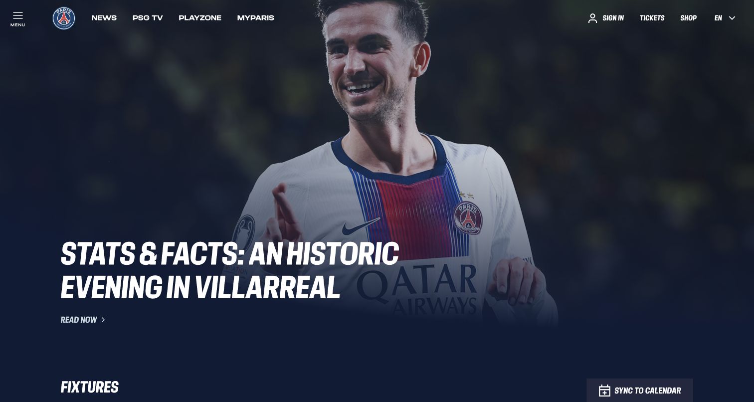
Paris Saint-Germain uses an edge-to-edge player photograph beneath a compact transparent header. A large italic headline sits in a darkened part of the image with a simple reading action beneath it. The next section begins with fixtures, and the observed page text distinguishes men’s football, women’s football and handball. News, video, fan membership, tickets and shopping remain available in the top navigation. The opening demonstrates how a strong media identity can lead into a broader club structure, provided the fixture section gives each team enough context to avoid confusing supporters.
What you can learn
Pair an immersive editorial opening with a clearly labeled fixture system. When several sports or squads share the homepage, include the team or discipline on every event and make the route to the full schedule easy to find.
Pros
The dark image treatment creates a strong reading area for the large headline.
The fixtures section recognizes multiple sporting programs rather than assuming one first team.
Cons & considerations
Transparent navigation must maintain contrast as lead images and crops change.
Abbreviated team labels can be unclear to occasional visitors unless expanded in accessible text.
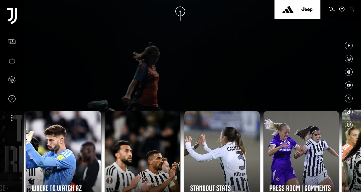
Juventus gives the opening a dark, cinematic treatment, with a background video and a horizontal row of large editorial cards at the bottom. The club mark occupies the upper-left corner, while sponsor marks and utility icons sit across the top and sides. The cards mix match viewing information, previews and women’s-team coverage, so the visible stories perform much of the navigation work. This is a distinctive media-led composition, but the relatively icon-heavy surrounding controls also show where expressive brand design can demand more interpretation from a first-time visitor seeking a straightforward service.
What you can learn
Let editorial cards explain their content type and destination in plain language, especially when surrounding navigation uses icons. Provide motion controls and a useful static fallback so the sporting identity survives without depending on continuous background video.
Pros
Large photographic cards give individual stories a substantial and recognizable target.
The visible editorial mix includes both match logistics and different team coverage.
Cons & considerations
Icon-only controls can be harder to interpret than named tickets or team links.
Background motion and a horizontal card stream need careful performance and keyboard-navigation review.
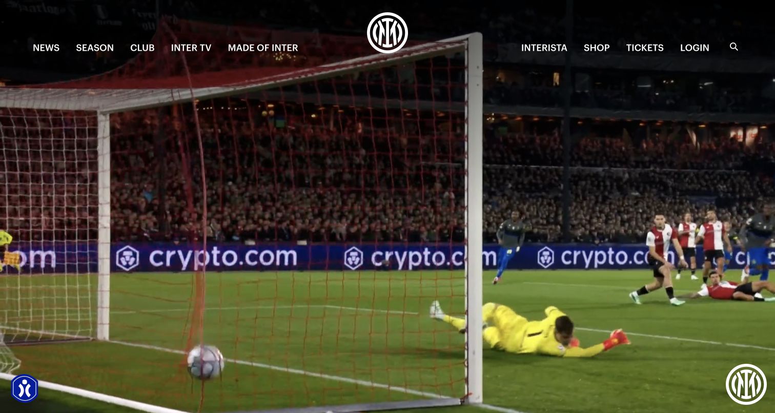
Inter uses match footage as the entire background of its first screen, with a centered club emblem and a compact row of navigation links overlaid near the top. News, season, club, video, shopping and tickets are available without a large explanatory panel. In the observed view, the footage itself carries the emotional introduction; the page text below supplies highlights and current headlines. A merchandise promotion was dismissed before the final capture, leaving the sporting presentation unobstructed. The example is valuable for considering when atmosphere can lead and when practical information must receive a more persistent visual position.
What you can learn
Treat background footage as an optional enhancement to a complete navigation system. Give fixtures, tickets and team information reliable text routes, and ensure that pausing or failing to load the video still leaves a useful opening screen.
Pros
The centered emblem and restrained overlay navigation keep the club identity immediately visible.
Named season and ticket routes remain available over the immersive footage.
Cons & considerations
A first screen dominated by video may postpone the next fixture or headline detail.
Navigation contrast needs checking throughout the moving footage, not only on one selected frame.
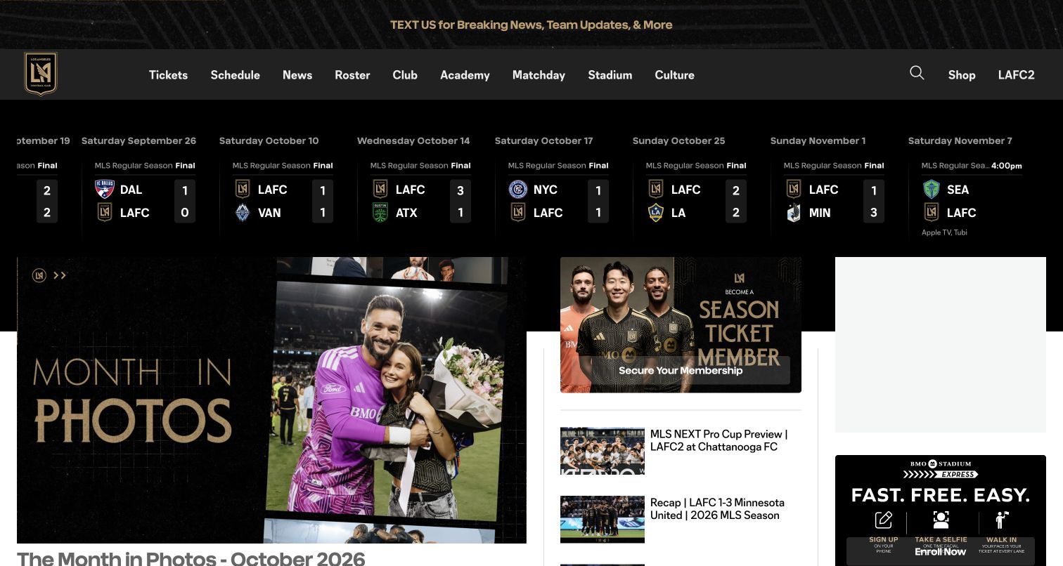
Los Angeles FC uses a black-and-gold header with direct routes for tickets, schedule, roster, matchday and stadium information. A horizontal results-and-fixtures strip spans the page before the main content grid. The lead photographic story occupies the left, while a season-ticket membership panel and smaller articles create a second column. An additional rail contains advertising or service space. The page therefore presents several levels of supporter engagement at once: follow the latest match, read a club story, consider membership or plan a visit. The visual hierarchy is useful, though the overall density requires care.
What you can learn
Organize club homepages by the supporter’s next task. Keep schedules and matchday logistics close to news, and give membership a distinct card with its own explanation rather than making it compete as an unrelated overlay.
Pros
The main navigation includes practical stadium and matchday destinations alongside news.
A dedicated membership card gives recurring attendance its own visible entry point.
Cons & considerations
A long fixture ribbon can become difficult to scan without clear current-event positioning.
Advertising or service slots should reserve space without creating large unexplained gaps.
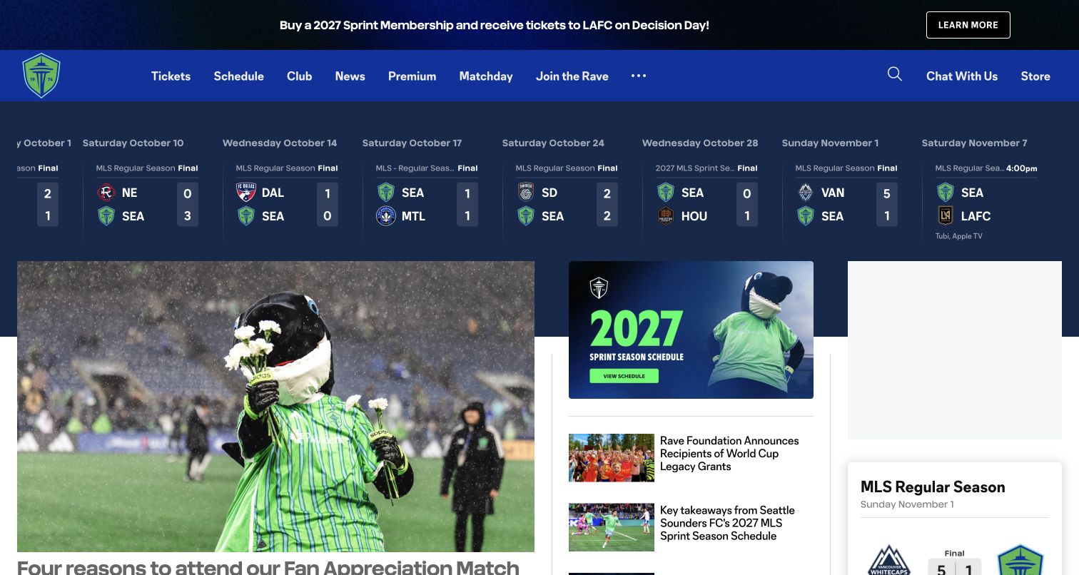
Seattle Sounders FC uses a blue header with green club accents, then places a results-and-fixtures ribbon above its editorial grid. A top membership message has its own learn-more action, while the main image promotes a supporter-oriented match story. The neighboring column introduces a future schedule and community news, and the navigation includes matchday, premium options and a direct chat route. This arrangement gives the club’s community activity a place beside competitive results. It also illustrates how a shared multi-column pattern can feel specific through club colors, photography and the selection of supporter services.
What you can learn
Give community stories and practical attendance information a durable place beside results. A membership promotion should explain the season or package it concerns, while fixture cards should remain understandable without requiring the visitor to decode internal competition abbreviations.
Pros
Community coverage appears near the lead story rather than being isolated in a distant section.
Matchday, premium and assistance routes address different kinds of visitor planning.
Cons & considerations
A dense schedule ribbon needs a clear distinction between completed and upcoming matches.
Membership messages and future-season labels require careful maintenance as the calendar changes.
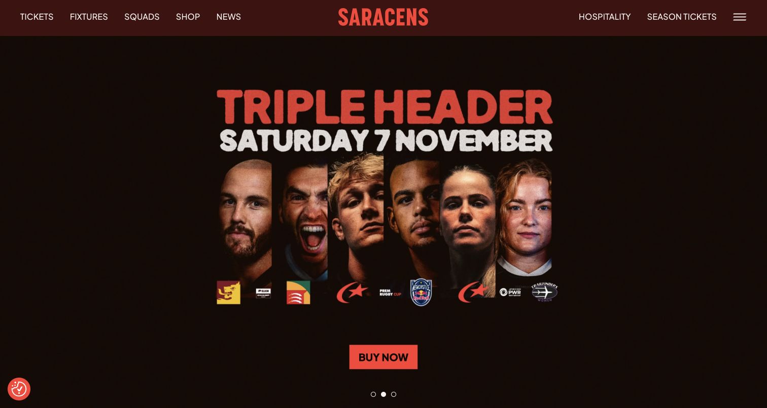
Saracens uses a compact dark-red header with tickets, fixtures, squads and shopping on one side of the wordmark, and hospitality and season tickets on the other. The observed hero is a coordinated event poster showing several players, a prominent date and a single purchase action. Its typography and limited palette create a strong campaign identity without adding many separate interface panels. Below the opening, the page text introduces the next fixture, club news and women’s rugby coverage. The design makes a specific attendance proposition prominent while retaining ordinary routes for supporters seeking team or season information.
What you can learn
An event-led hero should answer what is happening, when it takes place and where the next step leads. Keep the date as editable content and give routine fixtures, squads and season-ticket information stable navigation outside the campaign.
Pros
The campaign combines players, date and a clear attendance action in one coherent composition.
Hospitality and season tickets remain distinct from the immediate event promotion.
Cons & considerations
Text-heavy campaign artwork needs a readable mobile version and equivalent accessible text.
A rotating event poster requires an owner to remove or replace it promptly after the event.
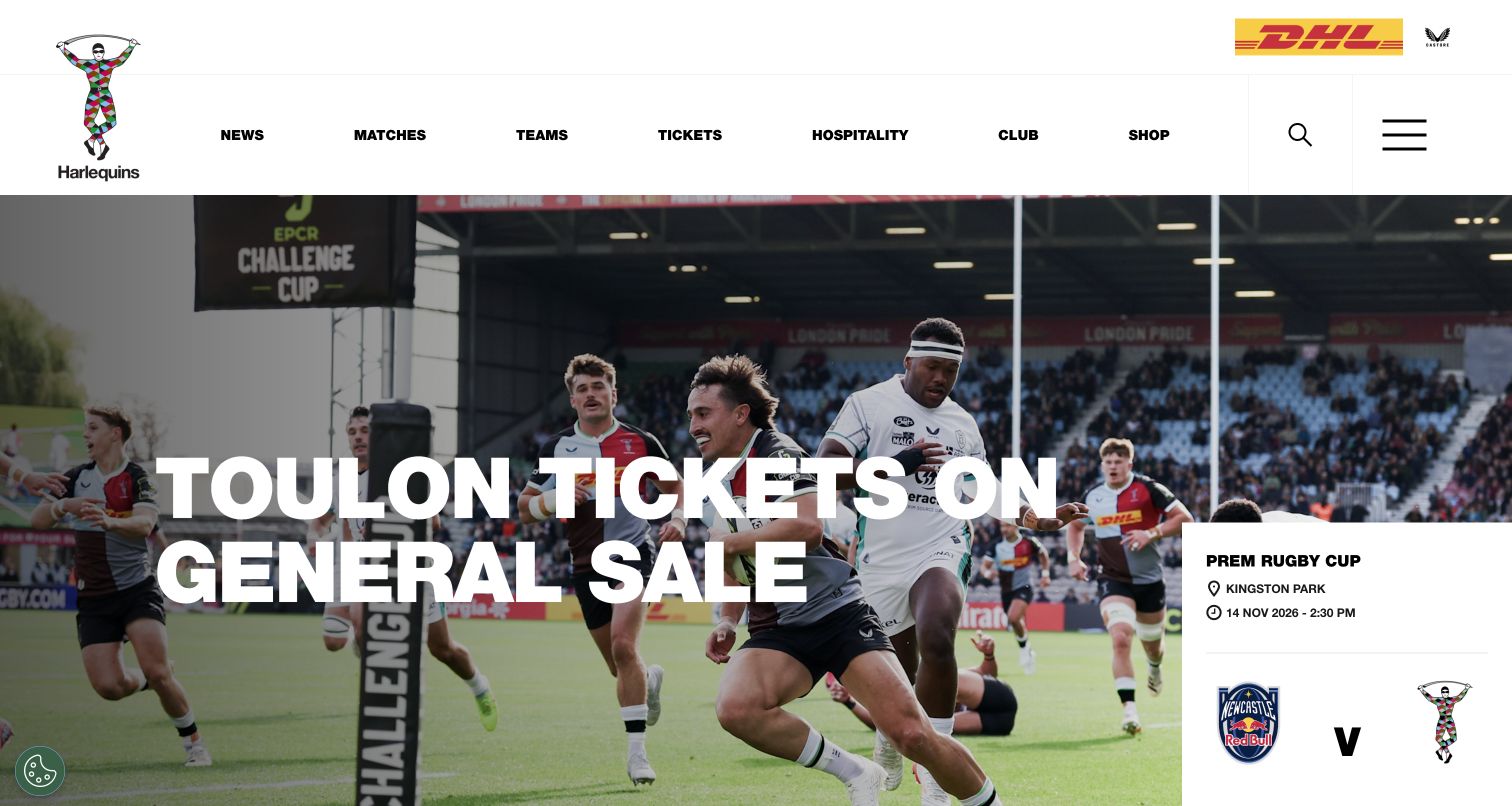
Harlequins places a generous white header above a large action photograph and an oversized ticket headline. The main navigation names news, matches, teams, tickets, hospitality and the club, while search and a broader menu occupy separate controls on the right. A white fixture card overlaps the lower-right area of the hero and includes competition, venue, date and the participating teams. This is a useful alternative to a purely atmospheric sports homepage because practical match information remains visible within the opening composition. The card and headline should still make clear when they refer to different events.
What you can learn
Give event logistics their own readable panel rather than embedding every detail in a photograph. Maintain an explicit relationship between the promoted story and the fixture card so visitors understand which match each action or date belongs to.
Pros
The fixture card exposes venue and date information in a clear text-based structure.
A straightforward header keeps tickets and hospitality easy to identify.
Cons & considerations
An oversized headline can cover important photographic content on narrower viewports.
A nearby fixture card may be mistaken for the promoted event unless the relationship is labeled clearly.
Plan for the whole season and every supporter task
Define before, during and after-match states
Specify what the main fixture component shows before kickoff, during play, after the result and after a postponement. Give each state a clear primary action and an update owner. Preserve the event’s URL so articles, calendars and supporter messages continue to point to the same authoritative record as its status changes.
Separate sporting data from editorial presentation
Store the fixture identity, participating teams, venue and time in structured records. Let previews, highlights and reports reference the same event instead of copying its details into unrelated cards. Define a fallback when a data provider is delayed, and make manual corrections traceable so the homepage does not silently disagree with the full schedule.
Walk through an unfamiliar supporter’s visit
Start with someone who has never attended the venue. Check whether they can identify the right team and match, understand the ticket route, find accessibility and travel information, and reach help. Then repeat the review for a member and a remote supporter. These journeys reveal which destinations deserve permanent navigation rather than a temporary campaign tile.
The editing job behind the design
Choose publishing and event tools with clear ownership
The important integration is the relationship between fixtures, teams, editorial content and ticketing. A club may use different systems for each, but the public interface should retain consistent names and dates. Define which system owns every field and how changed kickoff times, sold-out events or postponed fixtures reach the website. Test the fallback experience as well as the normal feed.
Give editors reusable story and campaign components with explicit expiry and scheduling controls. Video, statistics, advertising and membership services should load without preventing access to basic match or venue information. Publicly observed scripts or vendor case studies describe only the evidenced part of that system; they do not reveal every private club, ticketing or supporter database.
Our WordPress website examples offer a separate look at publishing approaches. A visible platform label is evidence for that named page, not a guarantee that the same system will suit your requirements.
Before the public launch
Sports-club website launch checklist
Check team names, venue, date, timezone and status across fixture cards and the full schedule.
Test preview, live, completed, postponed and unavailable-data states with controlled records.
Distinguish match-centre, viewing, ticket, hospitality and membership destinations.
Keep travel, accessibility, entry and supporter-help information close to attendance routes.
Check image crops, headline contrast, captions and motion controls on desktop and mobile.
Review carousels, fixture ribbons and expanded navigation with a keyboard and assistive technology.
Use test ticketing or inquiry environments instead of completing real transactions during QA.
Assign owners for fixture corrections, campaign expiry, emergency notices and third-party handoffs.
These checks are a project checklist, not a performance, legal, security, or accessibility certification. Test real journeys with the people responsible for the website before making claims about the result.
Sources & editorial method
How this collection was selected and reviewed
Fourteen distinct official club properties were selected from direct public browser observations made on November 4, 2026. The collection includes football and rugby clubs and preserves each selected capture URL, date and dimensions. Reviews focus on visible editorial hierarchy, fixture presentation and supporter navigation. No memberships, ticket purchases, account registrations or real inquiries were completed. Captured sports data is treated as page content at the observation time, and technical associations require separate public evidence.
Each example links to its actual source page. Screenshots are direct browser captures with their own capture dates; moving imagery, announcements and live designs can change. The notes describe observable design choices and conditional tradeoffs, not measured traffic, conversion results, service quality, or accessibility conformance.
Technology labels use public page metadata, asset evidence, or explicitly cited platform documentation. Platform documentation is not a complete current deployment audit. A component reference may be legacy or unused; it is not a complete backend inventory. Unknown stacks are omitted. These sites are editorial examples, not our client portfolio.
Written, Edited and Curated are separate editorial records, not timestamps advanced by a rebuild. Website designs and imagery belong to their owners. See our editorial standards or suggest a correction.
Questions worth asking
Sports Clubs website design questions
Should the homepage always lead with the next match?
Not necessarily. A major club announcement or community story may deserve the lead position. Keep a clearly labeled next-fixture component or schedule route available so the editorial choice does not remove the practical information many supporters came to find.
How should a club with several teams organize fixtures?
Use explicit team or sport labels on every fixture and offer a clear filter or separate schedule. Preserve the selected context when a visitor moves to a match page. Avoid relying only on abbreviations, crests or color to distinguish teams.
Is a background video necessary for a sports website?
No. A strong photograph and well-organized match information can communicate the club effectively. Use video when it adds something specific, provides motion controls and has an accessible static fallback. The basic navigation and fixture details should remain useful without it.
What should happen when ticketing is provided elsewhere?
Explain the destination and preserve enough event context that the supporter knows they reached the right match. Keep club contact and attendance information available. Test links and error states without making a real purchase, and assign ownership for updates when the provider changes an event URL.
Let the club’s identity create connection, then make fixtures, attendance and support dependable. A clear structure and an accountable publishing process matter throughout the season, not only on the day a redesign launches.