An instrument store needs more than attractive gear photography. Its website should help people compare specific equipment, understand service options and find a dependable next step.
A first-time player, a school buyer and a working musician may arrive with very different questions. One needs guidance about an instrument family; another needs a purchase-order process; a third may search for an exact model or replacement part. Build the catalog around those real distinctions, while keeping lessons, rentals, repairs and store visits easy to find.
These examples range from broad music retailers to specialist guitar and electronic-equipment stores. Compare their search prominence, category labels, campaign structure and service routes. The reviews examine the observed public interface and dated photographs; they do not test checkout, endorse financing, authenticate an instrument or verify the quality of a retailer’s advice.
Before the examples
What makes good musical instrument stores website design in 2026?
Make exact equipment easy to find
Support model names, manufacturer spellings, common abbreviations and instrument families in search. Use categories that match how players distinguish equipment, such as electric and acoustic guitars, pedals, amplification or recording. Give visitors a clear way to move from a broad department to the characteristics that materially affect compatibility or use.
Describe the actual item being offered
New stock, used instruments, vintage pieces, demonstration units and B-stock need distinct records. Where the item is unique, associate its photographs, serial number, condition notes, included accessories and relevant measurements with that specific listing. Avoid letting a generic manufacturer image imply that it depicts the individual instrument a customer will receive.
Give service needs their own routes
Lessons, rentals, repairs, trade-ins and showroom appointments are separate tasks from buying a product. Explain which locations provide them, what information a visitor should prepare and whether the next action is an inquiry or a confirmed booking. Keep contact details close to these decisions, especially when suitability depends on advice from a specialist.
Look at how each storefront balances equipment discovery with exact-item search and practical assistance. Borrow the relationship between those elements, then build the catalog and service information around your own inventory and staff processes.
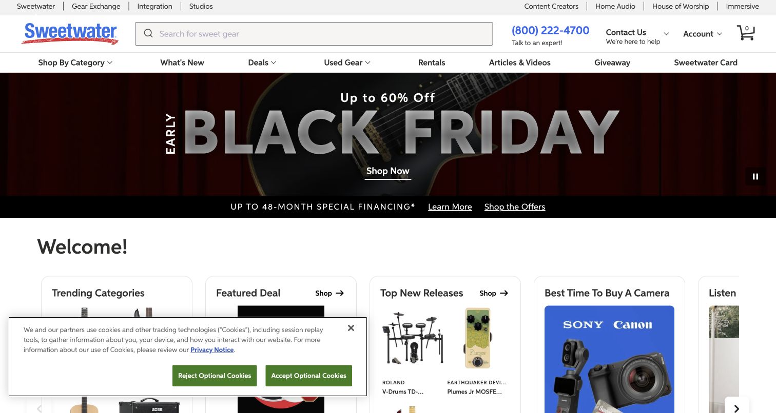
Sweetwater places a broad search field alongside its recognizable blue identity and a visible telephone contact. The opening combines a dark guitar campaign with smaller routes into trending categories, deals and recent releases. That arrangement supports a musician who already knows a model number while still giving an undecided visitor several concrete starting points. Used equipment, rentals and editorial material appear as distinct navigation choices. The compact privacy panel occupies part of the lower corner in this capture, but the main catalog structure remains visible.
What you can learn
For a large instrument catalog, give exact-item search the clearest position and put human help nearby. Then use a small number of discovery cards to serve shoppers who need ideas without making everyone enter through a promotional campaign.
Pros
The large search field provides an obvious route for specific brands and model names.
Visible assistance and separate used-equipment navigation acknowledge different purchase needs.
Cons & considerations
Several promotional routes can compete unless their labels explain distinct destinations.
A lower-corner privacy panel can overlap discovery cards at shorter viewport heights.
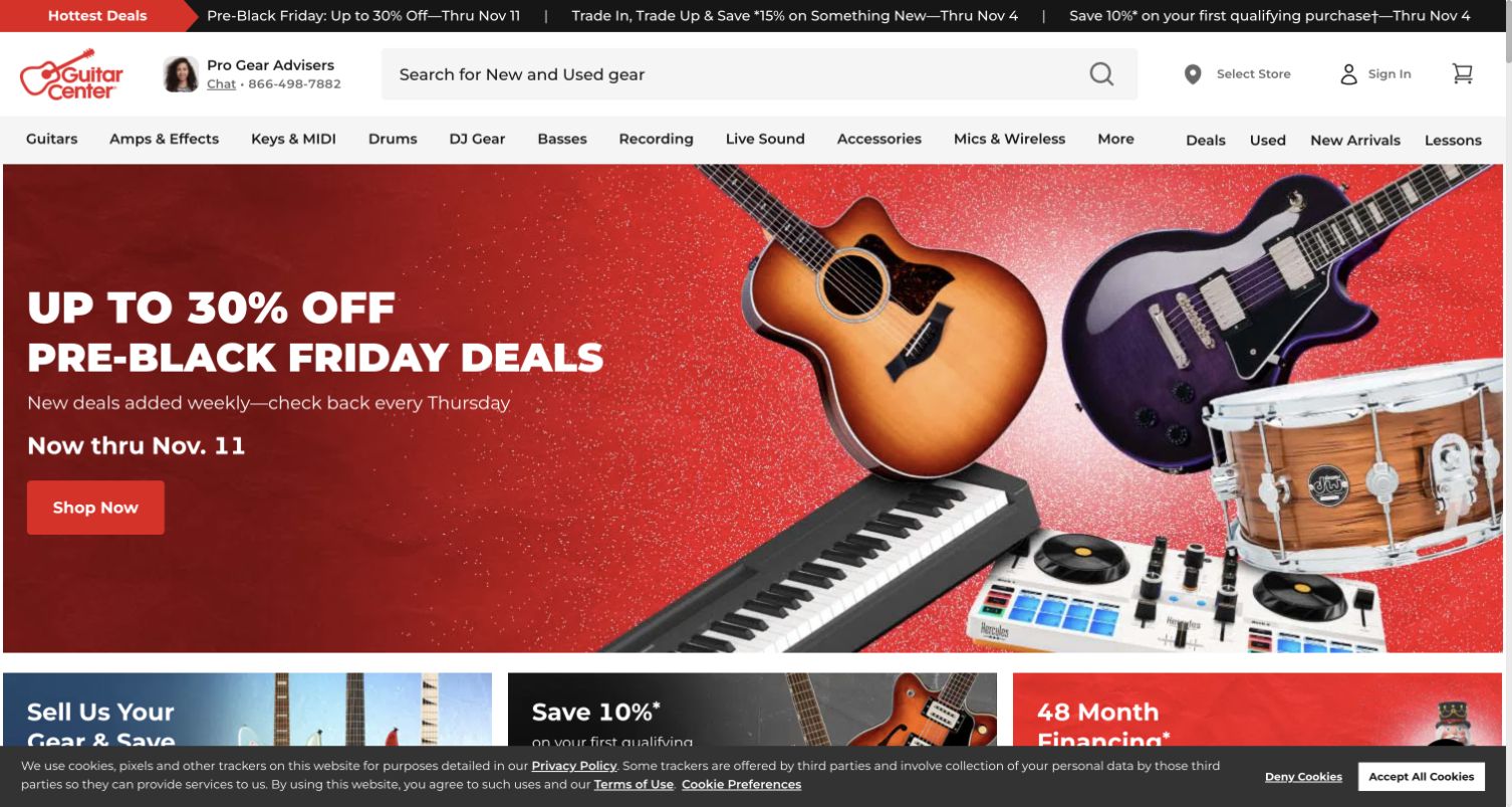
Guitar Center uses a red seasonal hero with multiple instruments grouped on the right and a direct shopping action on the left. Above it, a broad search field explicitly accommodates new and used gear, while the category navigation names familiar instrument families. Lessons and used equipment receive their own routes rather than being buried within a brand campaign. The resulting page feels like a wide department store: the promotion supplies a timely entrance, while the header remains a practical directory for returning customers with a specific task.
What you can learn
Let the campaign change while keeping the store taxonomy predictable. A lessons inquiry, a used-instrument search and a new-product purchase should each have a plainly named entrance that survives seasonal homepage redesigns.
Pros
The instrument collage communicates range without requiring a long introductory paragraph.
Search and category links remain available above the campaign for purposeful shoppers.
Cons & considerations
A broad seasonal offer needs a landing page that makes qualifying products and conditions clear.
Promotional and privacy overlays need careful timing so they do not obscure the first shopping decision.
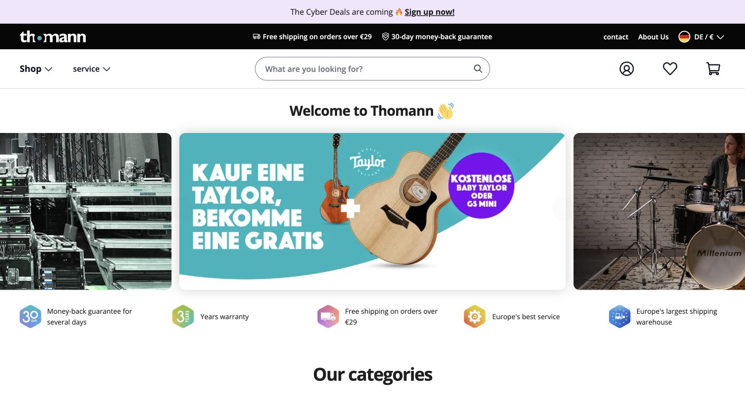
Thomann combines a centered search field with a large row of photographic campaign tiles and a service-information strip immediately below. A guitar feature receives the central position, while adjacent tiles suggest additional departments. The header stays comparatively restrained, allowing the images and category labels to do most of the orientation work. The observed page resolved to the German regional route and displayed a mixture of translated interface text and German campaign artwork. That regional context matters when evaluating how consistently an international storefront communicates its offers.
What you can learn
Design international campaigns as editable content with a defined language and region. Preserve a stable category structure and put service details in a consistent place so a translated headline does not become the only guide to the shopping journey.
Pros
A prominent central search field suits a catalog with many precise product names.
The separate service strip gives reassurance its own visual layer beneath the imagery.
Cons & considerations
Text embedded in artwork can remain in a different language from the surrounding interface.
A carousel of campaigns can require extra effort to compare options if several tiles rotate.
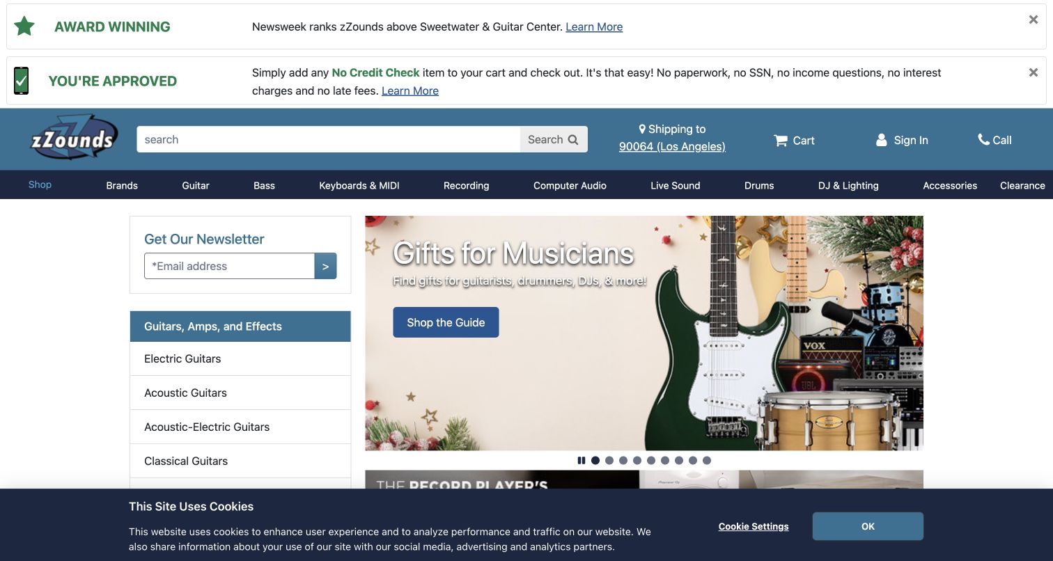
zZounds gives the desktop opening a persistent category list on the left and a large holiday campaign on the right. The blue masthead contains a broad search field, with a darker navigation row separating product families from the surrounding promotions. Several award and payment messages appear above the main shopping area, creating a visibly dense introduction. This is useful as a directory-led example: shoppers can begin with guitars, keyboards or recording equipment without interpreting the hero. The newsletter box and promotional strips also demonstrate how quickly secondary objectives consume vertical space.
What you can learn
Use a persistent category directory when breadth is a major selling point, but rank reassurance messages by relevance. Keep payment terms and promotional details readable on their destination pages rather than allowing every message to compete with catalog access.
Pros
The left-hand directory makes equipment families continuously visible in the desktop opening.
The search field remains distinct from the large promotional artwork.
Cons & considerations
Stacked reassurance and offer banners delay the beginning of the main merchandise area.
Newsletter and privacy elements can make the first screen feel more crowded on smaller displays.
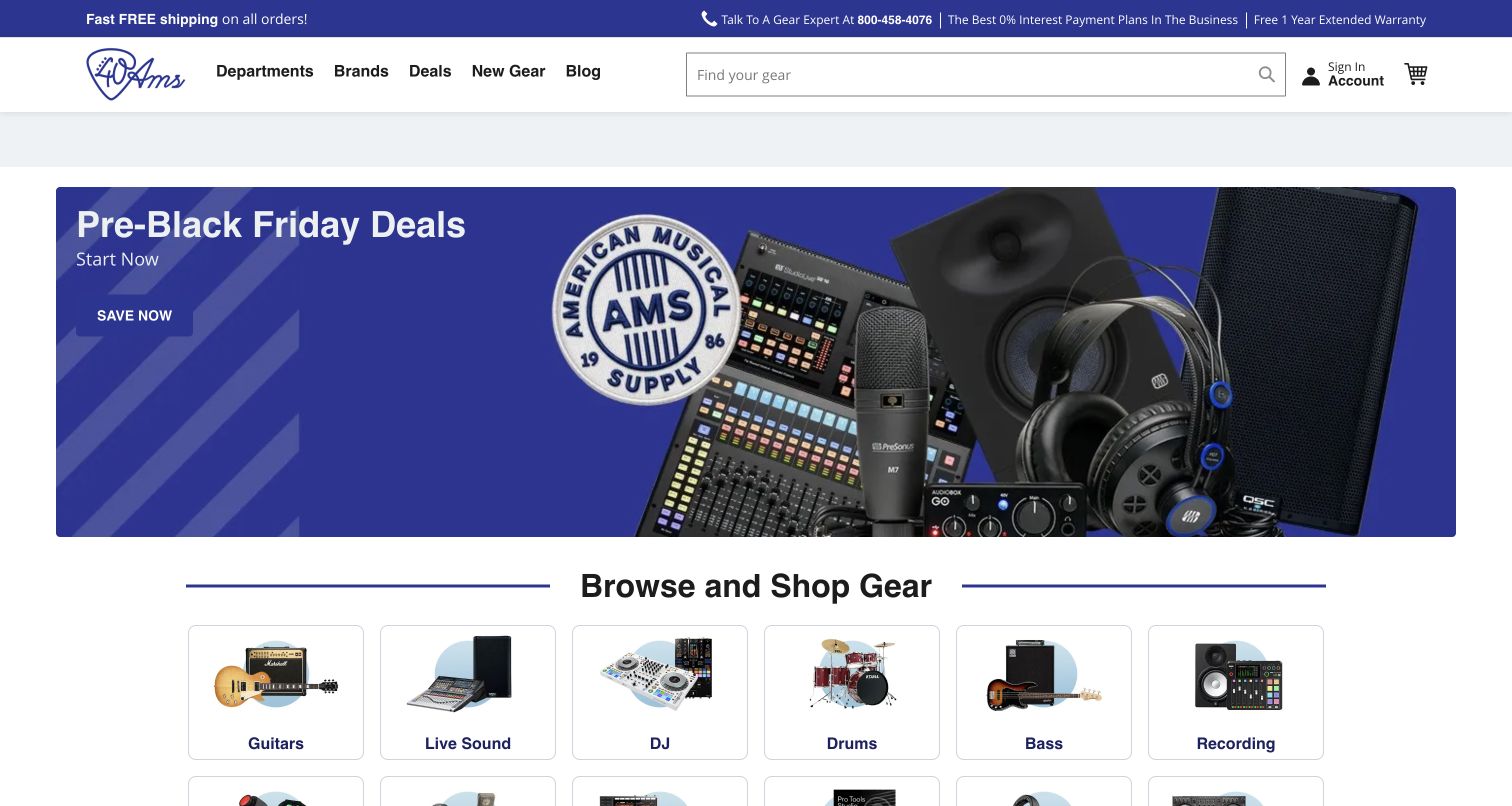
American Musical Supply pairs a white search header with a blue campaign showing microphones, a mixer and keyboard equipment. The composition puts the message and action on one side while the gear itself explains the scope of the promotion. Immediately beneath, boxed category tiles begin to turn the broad offer into specific browsing choices. A telephone assistance route is visible in the header, and the navigation keeps familiar departments available. The opening therefore moves from timely promotion to durable catalog organization without requiring a visitor to scroll through several unrelated brand stories.
What you can learn
Follow a broad equipment campaign with tangible product-family choices. Consistent category photography and literal labels can turn promotional interest into a useful next step, especially for visitors who recognize an instrument but do not yet know its model.
Pros
The hero shows several kinds of equipment while retaining a clear area for the message.
Category tiles provide an immediate transition from the offer to ordinary browsing.
Cons & considerations
A mixed equipment montage needs careful mobile cropping to keep the advertised range understandable.
A large sale headline should be accompanied by clear exclusions and availability on the linked collection.
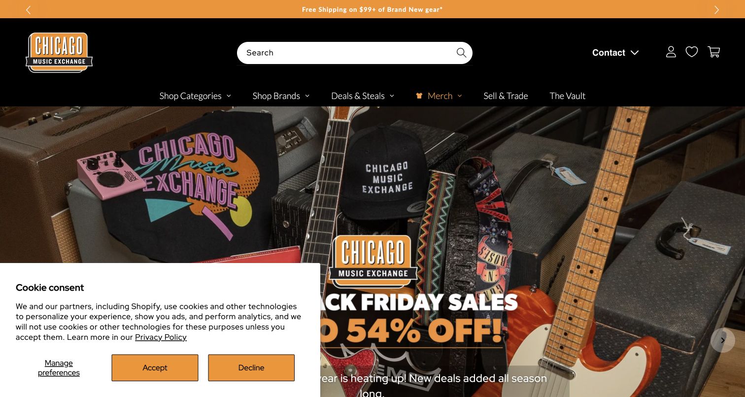
Chicago Music Exchange uses a substantial black masthead, orange accent strip and large rounded search field before revealing a dark photograph filled with guitars and amplifiers. The image communicates the atmosphere of a specialist shop rather than isolating one mass-market product. Navigation separates brands, merchandise, selling or trading equipment and the vault, suggesting several reasons to visit beyond an ordinary purchase. The lower-left privacy panel is part of this observed opening. The strongest transferable element is the relationship between the store personality and a practical, highly visible search tool.
What you can learn
A distinctive physical shop can supply the visual character of an online store. Pair that atmosphere with direct routes for buying, trading and researching equipment so enthusiasts can act on their interest without decoding a purely editorial homepage.
Pros
The packed equipment photograph immediately conveys a specialist inventory and store setting.
Selling and trading receive named navigation routes alongside the shopping catalog.
Cons & considerations
Dark, detailed photography needs strong contrast wherever text or controls overlap it.
The tall masthead leaves less room for the first product or collection choices on a laptop.
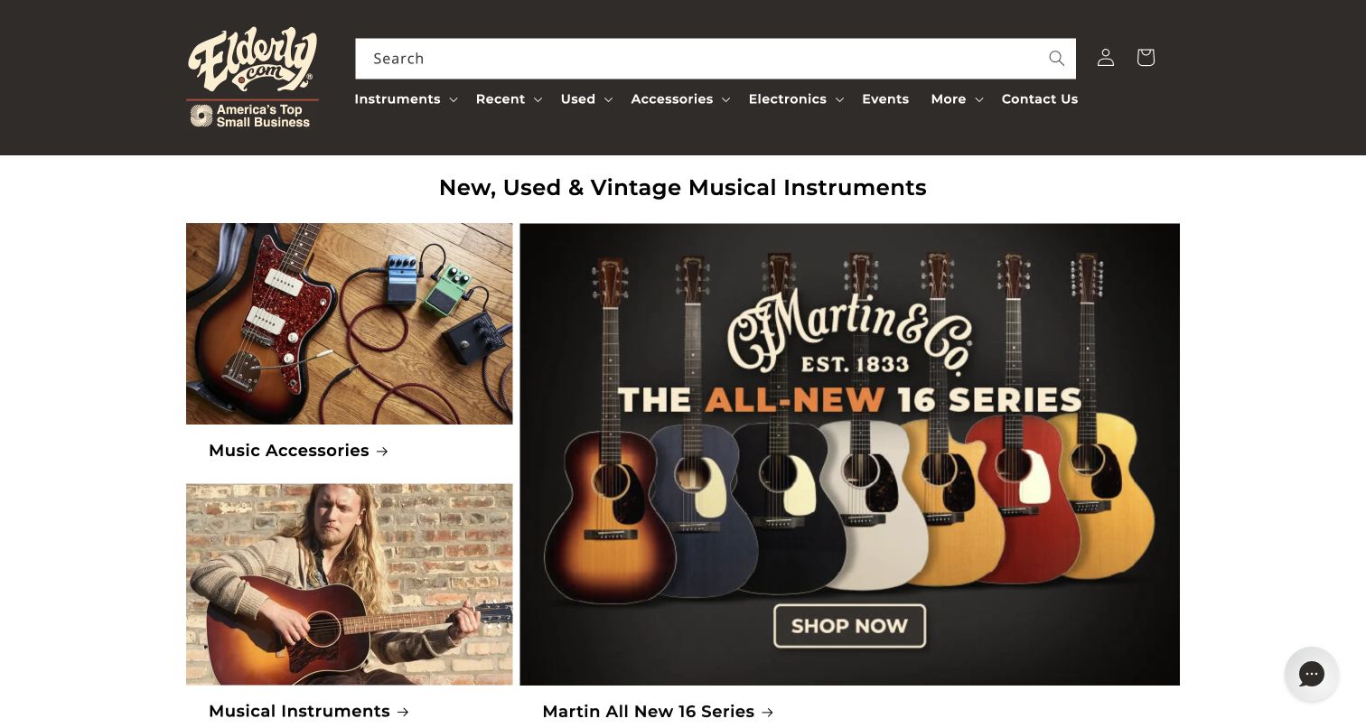
Elderly Instruments presents a warm brown masthead with a broad search field, then combines a prominent guitar launch with smaller accessory and musician photographs. The opening is more like a set of editorial windows than a single full-screen advertisement. New, used and vintage positioning is explicit, and community-oriented routes sit alongside the inventory. The person playing an instrument introduces context and scale that isolated product cutouts cannot provide. This balance helps the site communicate both a specialist retail assortment and the culture around playing, collecting and caring for instruments.
What you can learn
Give each part of a homepage mosaic a distinct job: one can introduce a product, another can show its use, and another can lead to a practical category. Keep condition and availability as structured product facts beyond the editorial introduction.
Pros
The varied image sizes create a clear lead story without hiding secondary shopping routes.
Warm color and performance imagery give the store a recognizable musical setting.
Cons & considerations
A mosaic needs a deliberate mobile reading order so smaller cards do not become disconnected fragments.
New, used and vintage products require precise condition details after the initial category choice.
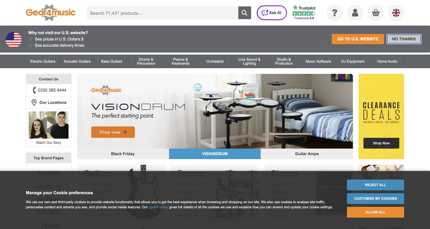
Gear4music places a broad equipment navigation beneath its grey-and-orange header and search field. A home electronic-drum feature occupies the center of the opening, flanked by a contact panel and a clearance promotion. That three-part arrangement exposes assistance and value-oriented browsing without forcing either into the main campaign image. The observed page also included a regional suggestion and a bottom privacy strip. Those layers are useful reminders that international shopping introduces extra interface decisions before the product journey begins, even when the underlying catalog structure is straightforward.
What you can learn
Treat region selection and customer support as part of the storefront architecture. Make their purpose clear and avoid allowing them to obscure the instrument categories or the selected campaign, particularly when a shopper arrives on a compact screen.
Pros
Separate side panels keep assistance and clearance routes visible beside the main product story.
Literal equipment departments support browsing without prior knowledge of a promotional collection.
Cons & considerations
Regional and privacy messages can add multiple decisions before a visitor reaches merchandise.
The three-column opening needs restructuring on phones rather than simple shrinking.
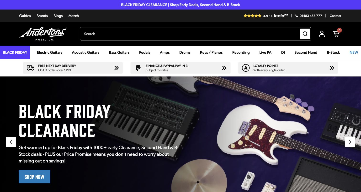
Andertons gives electric guitars, acoustic guitars, basses, pedals and amplifiers distinct positions in its navigation. A purple sale strip and a black search masthead establish the palette before a coordinated product montage fills the hero. Second-hand and B-stock routes remain visible beside the ordinary departments, making condition-based browsing part of the main store structure. A service-information band separates navigation from the campaign. The page demonstrates how a retailer can express a strong promotional identity while retaining the fine-grained categories that knowledgeable musicians use to narrow their search.
What you can learn
Build the primary taxonomy from the distinctions customers actually make. Separate pedals from amplifiers and used stock from new products when those choices affect comparison, then let campaign artwork occupy a stable space below that dependable structure.
Pros
Detailed equipment categories reduce the need to open a generic shop menu first.
The coordinated purple and black palette connects the offer strip to the main campaign.
Cons & considerations
Many narrow categories require a carefully designed mobile menu to remain easy to scan.
Used and B-stock routes need clear condition definitions on the resulting listings.
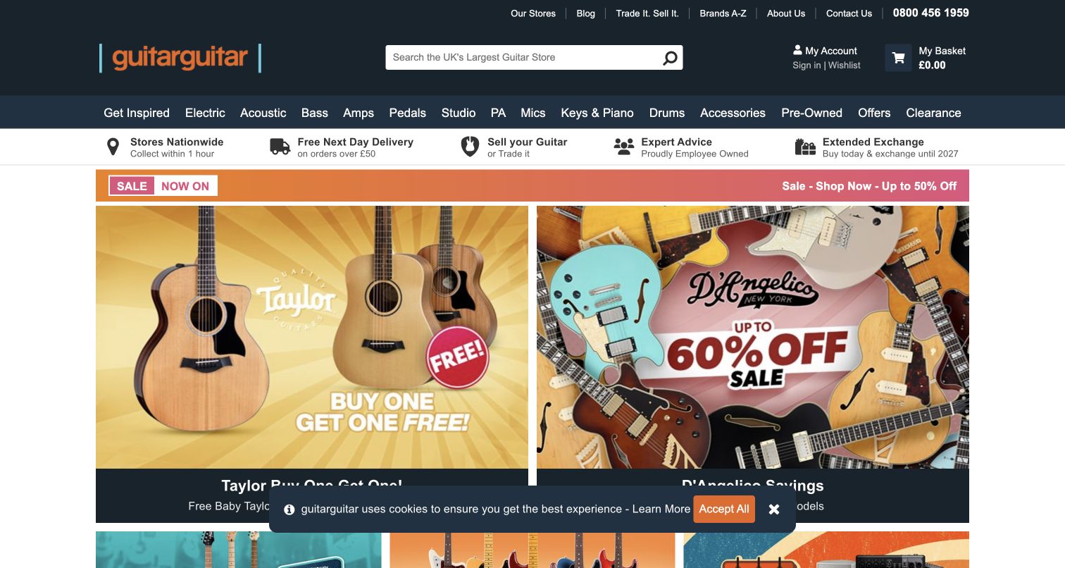
guitarguitar places a prominent search field in a dark blue masthead, followed by product categories and a row of service icons. The service row distinguishes store access, collection, delivery, selling equipment and advice before the merchandise campaign begins. Two large adjacent brand panels then present different guitar stories using yellow and pink backgrounds. The pairing creates a deliberate comparison of editorial entrances rather than a single dominant sale banner. The two campaigns give the store room to feature different guitar identities while the service row explains how shoppers can get practical help.
What you can learn
Use service links to explain how an online store connects to real locations and staff. When presenting two campaigns side by side, give each a clear destination and preserve an intentional order when the panels stack on a phone.
Pros
Service icons expose useful shopping options before the visitor commits to a product route.
Contrasting campaign colors make the two featured guitar stories visually distinct.
Cons & considerations
Multiple header bands consume space that might otherwise show product details earlier.
Brand-led panels still need literal instrument categories for visitors unfamiliar with those brands.
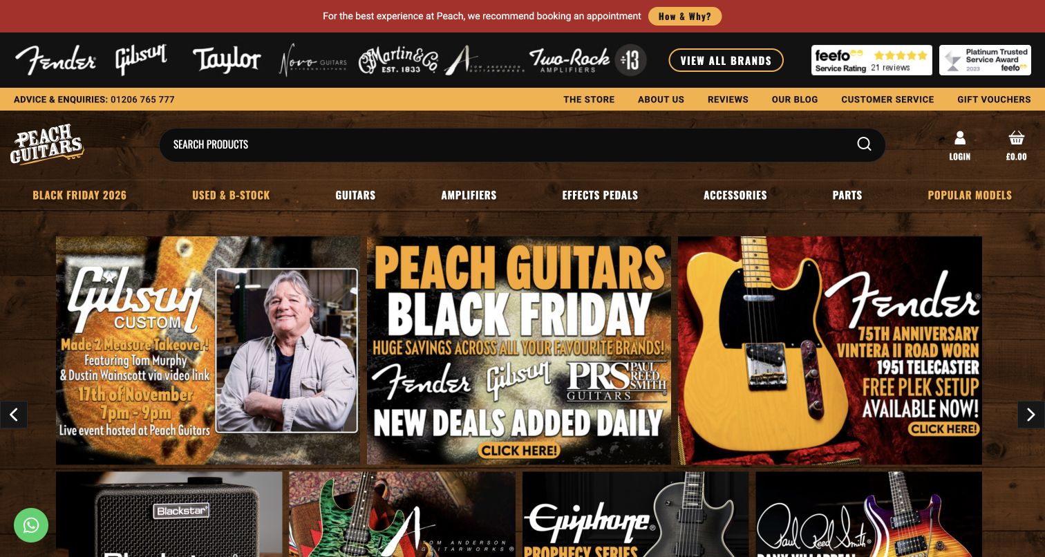
Peach Guitars uses a woodgrain background, yellow accents and a row of manufacturer logos to establish a strongly specialist identity. An appointment notice appears at the top, making the conditions for visiting the physical store visible before browsing. Below the search and navigation, a compact grid mixes an event, seasonal offers and manufacturer campaigns. The visual density resembles a knowledgeable shop wall filled with options. It is distinctive, but the number of layers also makes this a useful example for deciding which operational information deserves permanent prominence and which promotions can move lower.
What you can learn
Put essential showroom access information where visitors will see it before planning a trip. Then limit competing campaign modules and use a consistent hierarchy so the store’s character supports, rather than obscures, the choice of instrument or service.
Pros
The appointment notice addresses a practical question about visiting the showroom.
Manufacturer imagery and guitar-focused campaigns quickly establish the store’s specialty.
Cons & considerations
A tall stack of notices, logos and navigation delays the main merchandise content.
Woodgrain and bright accents need careful contrast testing around smaller text and borders.
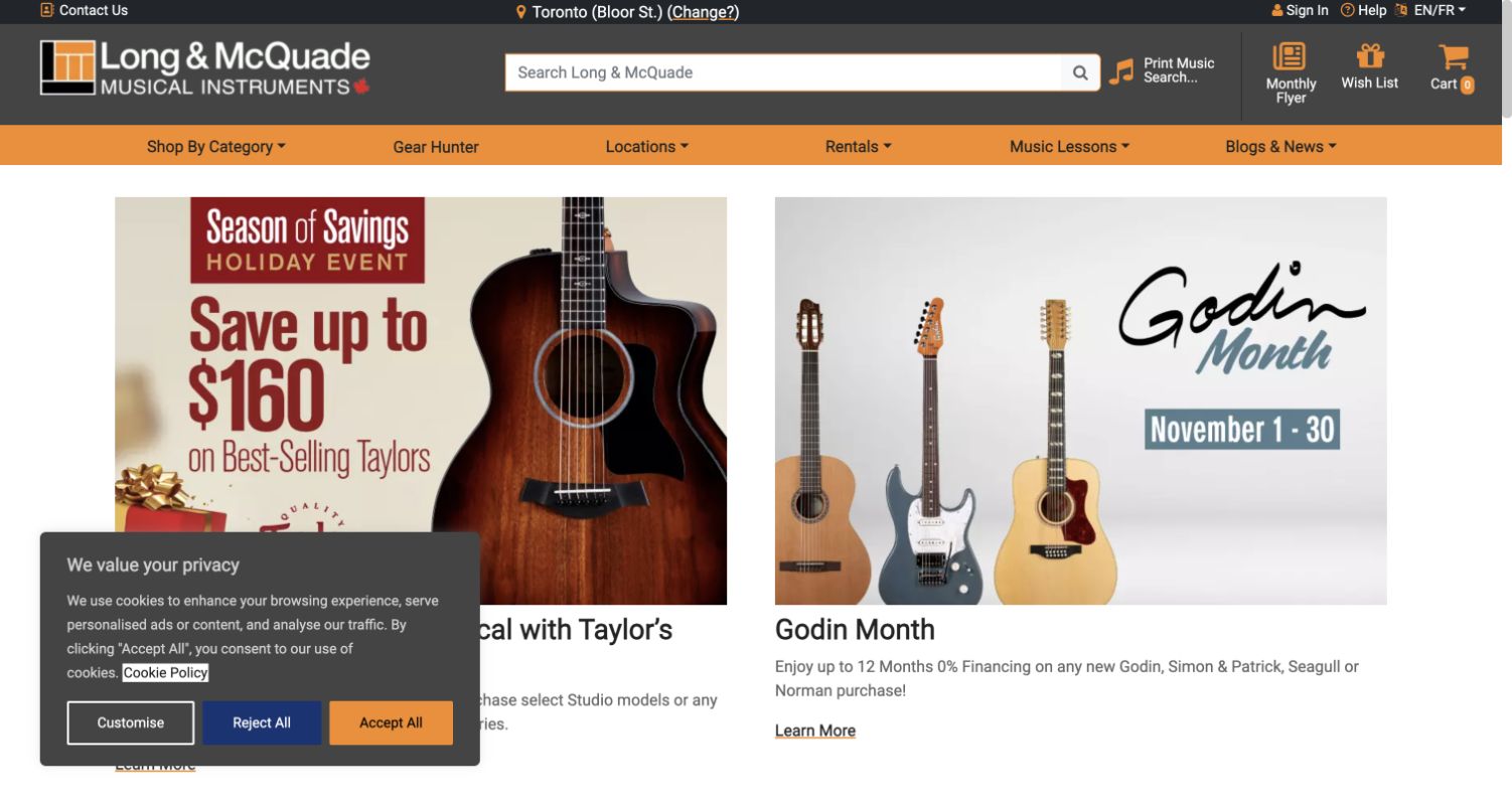
Long & McQuade combines a grey-and-orange header with a visible selected store and a broad product search. Lessons, rentals, print music and flyers appear as separate routes rather than being collapsed into the merchandise catalog. In the opening content, two similarly sized promotional panels introduce guitar brands with images and explanatory text beneath. The structure communicates that the business supports ongoing musical activity as well as individual purchases. A lower-corner privacy panel appears in the capture, while the paired campaigns provide an orderly transition from local service information to product discovery.
What you can learn
Make the selected location visible whenever it changes service availability or shopping options. Treat rentals, lessons and sheet music as first-class tasks, and explain the local handoff instead of assuming every visitor is buying a new instrument online.
Pros
Store context is visible near the search and main navigation.
Separate service routes accommodate learners and renters as well as equipment buyers.
Cons & considerations
A selected location must be easy to change and should not imply availability without checking stock.
Equal-size campaign panels need descriptive headings so visitors can distinguish their destinations quickly.
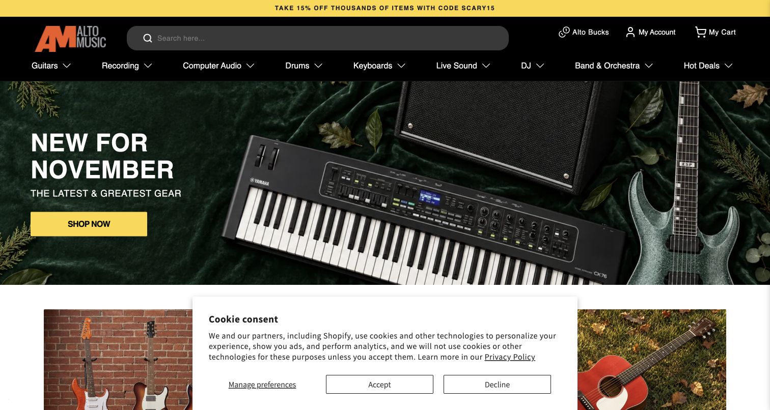
Alto Music sets a broad rounded search field within a black header and uses a yellow promotional strip to introduce the current offer. The navigation names instrument and recording departments, while the green autumn hero combines several equipment types with a bright call to action. Smaller photographic panels begin below the main feature. The page uses color to separate the seasonal campaign from the permanent store controls, which helps the campaign feel changeable without making the overall storefront unfamiliar. A compact privacy panel occupies the lower center of the observed view.
What you can learn
Define a permanent header system and let seasonal color live mainly in the campaign area. For a mixed instrument and studio catalog, use familiar department names so the montage inspires discovery without becoming the only explanation of what is sold.
Pros
The large search field remains prominent despite the colorful campaign beneath it.
Department navigation spans both playing instruments and recording-related shopping tasks.
Cons & considerations
A multi-product montage can lose important equipment details when cropped for mobile.
A centered privacy panel may cover secondary campaigns unless enough space is reserved.
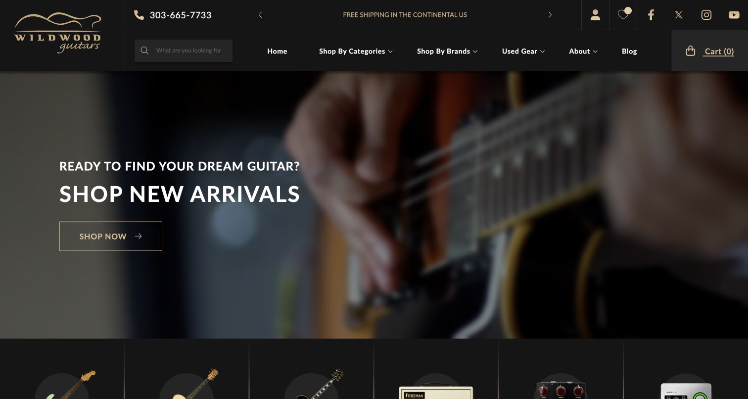
Wildwood Guitars uses a black-and-gold identity with search and straightforward catalog navigation above a close photograph of a guitar being played. A new-arrivals headline overlays the image, while product-category imagery begins below. The observed page text also exposed instrument-specific details such as serial numbers, weight and condition in its catalog material. That makes the page useful for a retailer whose stock is not interchangeable: atmosphere draws attention, but precise individual records are needed to support a serious comparison. The opening avoids the many competing offer strips seen on larger department-store sites.
What you can learn
When each instrument is a distinct item, connect editorial discovery to an individual product record. Keep serial number, condition, weight and the exact photographed instrument together so a compelling performance image leads to an accurate buying decision.
Pros
A restrained palette gives the performance photograph and arrival message room to stand out.
The catalog context acknowledges details that matter when comparing individual guitars.
Cons & considerations
Text over a close photographic crop needs checking whenever the campaign image changes.
A broad new-arrivals entrance should offer filters before the inventory becomes difficult to scan.
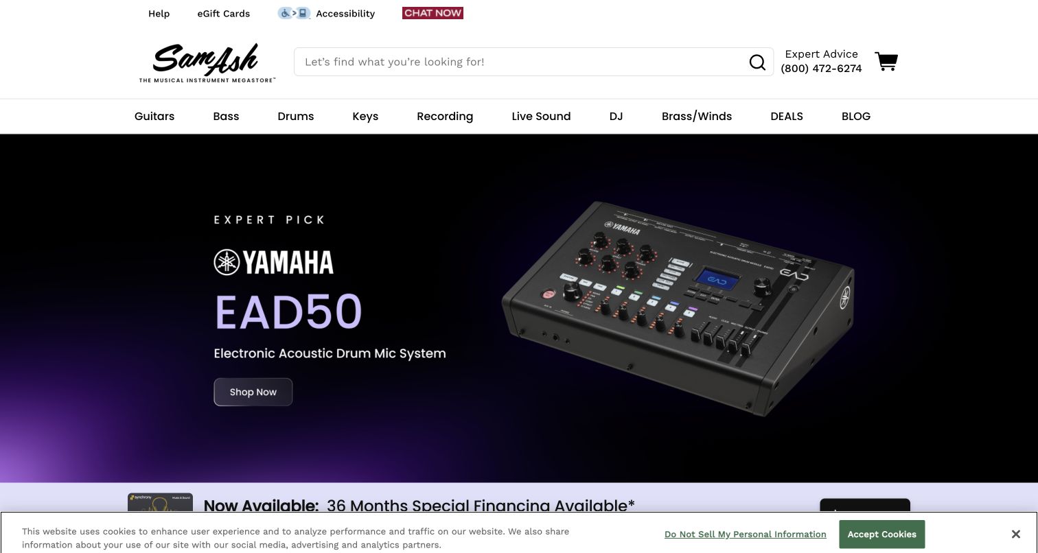
Sam Ash gives the opening a generous white header, a broad search field and visible expert telephone assistance. Familiar instrument categories sit above a dark purple-and-black campaign centered on a specific drum-microphone product. Service messages begin underneath, providing a second layer after the main story rather than surrounding it with multiple side promotions. The focused hero contrasts with the breadth of the catalog navigation: the page can promote one item while still making the wider store understandable. A small bottom privacy bar is visible in the recorded desktop view.
What you can learn
A broad retailer can use a narrow product story when the navigation remains explicit. Keep assistance close to search and place service explanations in a separate band so the main campaign does not have to carry every reassurance message.
Pros
Generous spacing separates search, assistance and category navigation clearly.
A single product campaign provides a coherent focal point within a broad store.
Cons & considerations
A specialized featured product may not match a beginner’s reason for visiting.
Service claims need accessible detail pages rather than relying only on short homepage assurances.
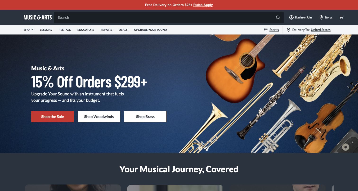
Music & Arts places shopping, lessons, rentals, educator services and repairs together in its main navigation. The opening campaign combines brass, strings and guitar imagery with distinct shopping actions, making the range legible without a long introduction. Beneath the campaign, a service-oriented section begins to connect those categories into a broader musical journey. The page is especially useful for examining how an instrument retailer can serve people who need guidance or ongoing support. Its structure acknowledges that choosing a first instrument, renting one and arranging maintenance are different tasks with different information needs.
What you can learn
Map the customer’s musical activity before designing the shop menu. Give lessons, rentals and repair services their own clear paths, and explain eligibility, location and next steps on those pages instead of treating every visit as an immediate merchandise purchase.
Pros
The primary navigation visibly includes education, rental and repair tasks.
Multiple instrument families make the campaign relevant beyond one narrow enthusiast category.
Cons & considerations
Several campaign actions need a clear priority when the layout becomes a single mobile column.
Service pages must distinguish inquiries from confirmed bookings and explain local availability.
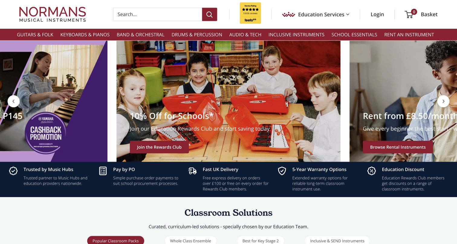
Normans combines a white-and-burgundy search header with routes for education services, school essentials and inclusive instruments. A classroom image places children and instruments in a recognizable use setting, while a service strip introduces school purchasing and payment information. This is a different shopping context from an enthusiast browsing a personal guitar: a teacher may need a coordinated set of instruments, a purchase order process and dependable administrative details. The homepage makes that audience visible while retaining ordinary equipment categories. A school-oriented service strip reinforces the audience by keeping administrative purchasing needs close to the equipment categories.
What you can learn
Design institutional shopping around the buyer’s workflow as well as the equipment. Make school ordering, support and product suitability easy to find, and keep claims about accessibility or learning outcomes specific to documented product information.
Pros
Education and school-oriented routes make the intended professional audience explicit.
Classroom photography connects the inventory to a concrete setting of use.
Cons & considerations
Institutional payment information needs clear eligibility and process details beyond a short strip.
Classroom imagery should not substitute for product dimensions, age suitability or inclusion information.
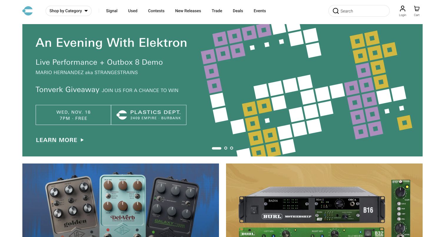
Perfect Circuit uses a minimal white header with a teal symbol, compact category controls and search. Its opening campaign is a green geometric event announcement with a clear date, location and learning route, followed by equipment feature tiles. Navigation also exposes editorial content, used gear, trading and events. The result positions the store as a place to discover electronic-music practice, not simply a list of synthesizers. The dated event is useful as a design observation; its details should not be treated as an evergreen promise about what a future visitor will find.
What you can learn
Use workshops and editorial material to explain an unfamiliar equipment category, but give dated events an owner and an expiry plan. Keep a direct product route available for returning musicians who already know the tool they want.
Pros
A restrained header lets the distinctive event artwork remain the main focal point.
Editorial, used-equipment and trade routes broaden the store’s discovery options.
Cons & considerations
Event-led homepages need prompt updates when registration or the event date passes.
Abstract campaign graphics should be paired with literal labels explaining the instrument or activity.
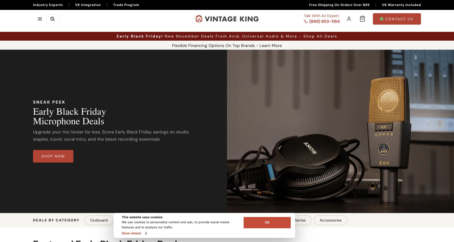
Vintage King places a centered wordmark and expert contact information in a spacious white header. The dark split hero pairs a microphone photograph with a large serif promotional headline, and a row of deal-by-category choices begins below. Integration, trade and consultant routes appear in the surrounding navigation, framing the store as a source of project assistance as well as individual products. The main category menu is compact, so the first screen depends more heavily on search and the featured story than a fully exposed department list. The captured opening includes a small privacy notice near the bottom.
What you can learn
When equipment is part of a larger studio project, connect product discovery to clearly scoped consultation. Explain what the advisory or integration service covers, while keeping direct category and search routes available for straightforward replacement purchases.
Pros
The split hero separates a readable promotional message from detailed product photography.
Consultation and integration routes acknowledge purchasing decisions involving multiple pieces of equipment.
Cons & considerations
A compact category menu adds a step for visitors who prefer scanning departments.
Service positioning needs concrete process information so consultation does not feel like an unspecified sales handoff.
Map a beginner, an expert and an institutional buyer
Write a short journey for each relevant audience. A beginner may need an explanation of required accessories; an expert may need precise specifications; a teacher may need a quote or purchase-order workflow. Identify where those journeys share product data and where they require different guidance. Do not make one generic promotional page answer every question.
Separate catalog facts from campaign copy
Maintain structured fields for model, variant, condition, stock, compatibility, included items and fulfillment. Let seasonal pages reference those records rather than duplicate them. Give each sale, event or manufacturer campaign an end date and owner so expired offers cannot remain the main entrance to an otherwise accurate catalog.
Design the handoff to a person or a location
Decide what happens after a repair inquiry, lesson request, trade-in estimate or showroom appointment. Show response expectations and location context before the form. Preserve the relevant product or service reference during that handoff so the visitor does not have to describe the same instrument repeatedly. Use test records when checking these flows.
The editing job behind the design
Choose tools around inventory and service accuracy
Begin with the source of truth for stock and product details. A standard commerce system may suit repeatable new products, while individually photographed used instruments need item-level records and reliable removal when sold. Search, filters and comparison tools should expose useful musical distinctions without presenting unsupported compatibility claims as facts.
Connect location information, rental or lesson availability and staff inquiries only where the operational process supports it. Keep campaign editing independent from stock synchronization, and assign responsibility for both. A third-party review, payment or recommendation widget should have a clear purpose; its presence on a public page does not establish the retailer’s complete technical architecture.
Our WordPress website examples offer a separate look at publishing approaches. A visible platform label is evidence for that named page, not a guarantee that the same system will suit your requirements.
Before the public launch
Instrument-store website launch checklist
Test search with model numbers, alternative spellings and common instrument terms.
Check new, used, vintage and B-stock labels against the actual inventory record.
Match unique-item photographs, condition notes and included accessories to the item being sold.
Explain location-dependent rentals, lessons, repairs, collection and showroom visits.
Check unavailable variants, sold items and accessory compatibility without completing a real purchase.
Keep promotion conditions, delivery information and return details accessible before payment.
Review category navigation, search suggestions, image controls and privacy panels on a phone and keyboard.
Assign owners for inventory updates, service information, campaign expiry and customer inquiries.
These checks are a project checklist, not a performance, legal, security, or accessibility certification. Test real journeys with the people responsible for the website before making claims about the result.
Sources & editorial method
How this collection was selected and reviewed
This collection contains 19 distinct official instrument and music-equipment storefronts reviewed through direct browser observations on November 4, 2026. Each selected example retains its actual capture URL, timestamp and dimensions. Regional redirects and language context remain part of the record. Reviews analyze visible shopping and service presentation; no purchases, financing applications, account creation or real service requests were submitted. Public technology evidence is recorded separately and does not infer hidden systems.
Each example links to its actual source page. Screenshots are direct browser captures with their own capture dates; moving imagery, announcements and live designs can change. The notes describe observable design choices and conditional tradeoffs, not measured traffic, conversion results, service quality, or accessibility conformance.
Technology labels use public page metadata, asset evidence, or explicitly cited platform documentation. Platform documentation is not a complete current deployment audit. A component reference may be legacy or unused; it is not a complete backend inventory. Unknown stacks are omitted. These sites are editorial examples, not our client portfolio.
Written, Edited and Curated are separate editorial records, not timestamps advanced by a rebuild. Website designs and imagery belong to their owners. See our editorial standards or suggest a correction.
Should instrument stores lead with categories or a promotion?
Either can work when search and familiar categories remain easy to reach. A promotion can introduce a new product or seasonal collection, but it should not become the only route to a broad inventory. Keep the catalog structure stable as campaigns change.
What makes a used-instrument listing useful?
Show the actual item with clear condition notes, included accessories and identifying details where appropriate. Explain any relevant repairs or modifications using verified business records. A stock photograph and a general condition label rarely answer the questions that distinguish one used instrument from another.
How should lessons and rentals fit into an online store?
Give them clearly named routes and explain their locations, eligibility, process and next step. They can share instrument information with the catalog while using different booking or inquiry workflows. Make it clear whether a visitor is requesting information or confirming a service.
Does every instrument store need a comparison tool?
No. Clear specifications and a manageable catalog may be sufficient. A comparison tool becomes useful when customers repeatedly weigh the same structured characteristics across several products. Keep the fields accurate and explain unfamiliar terms rather than displaying a large table simply because the platform supports one.
Build the storefront around accurate equipment records, clear musical categories and help your team can actually provide. Let the photography create interest while the product and service information supports the decision.