An electronics storefront should turn a crowded assortment into a clear decision about model, compatibility, total cost and support.
Some visitors arrive with an exact model number; others only know the problem they want to solve. A useful store supports both. Search and structured categories should lead to comparable product information, while guides explain unfamiliar terms without hiding specifications behind promotional language.
The collection spans specialist shops and manufacturer-owned stores. Compare how their navigation, product images, campaign areas and service routes serve different catalog sizes. A design review is not an independent product test, a price comparison or a guarantee of stock, compatibility or advertised performance.
Before the examples
What makes good electronics store website design in 2026?
Help exact searches and open-ended browsing coexist
Support model numbers, product families and common descriptions in search. Use filters that match the category: screen size for displays, mount or sensor format for cameras, connection types for accessories. A filter is useful only when its values are complete, consistently named and correctly applied to the catalog.
Make differences between configurations visible
Keep variant names, specifications, included accessories and optional extras close to the price. Distinguish new, refurbished and open-box condition explicitly. Show what changes when the customer selects another capacity, processor, lens kit or bundle rather than relying on nearly identical product images.
Explain fulfillment and ownership after purchase
Separate delivery, collection, installation and setup services. State the applicable region and who provides support. Make returns, warranty terms and compatibility assistance easy to find before payment, with a clear alternative if a postcode check or third-party service is unavailable.
The collection · 12 examples
12 electronics store websites worth studying
Look at how focused manufacturers simplify their opening compared with multi-brand stores. The useful lesson is how each interface connects the first impression to a practical comparison and a supported purchase.
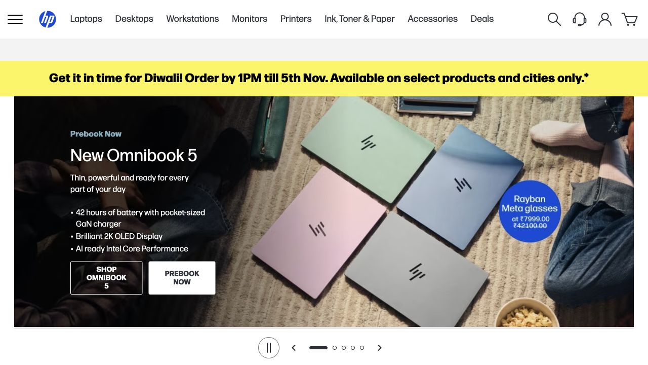
HP’s retained India store capture uses a literal product navigation row for laptops, desktops, workstations, monitors, printers and supplies. A yellow delivery announcement sits above a laptop campaign with short feature bullets and separate shopping and preorder buttons. The product photograph shows several colors from above, while a small offer badge adds another commercial message. The layout keeps browsing categories available even when the main area promotes a launch. The November 2 screenshot is regional and dated; this review does not repeat its delivery deadline, pricing or battery claim as a current verified fact.
What you can learn
Keep hardware categories and support access stable while launches change. Distinguish preorder from available stock, and place technical claims beside the product details and assumptions that qualify them rather than relying only on promotional artwork.
Pros
Literal category labels help shoppers enter with a known equipment need.
Shopping and preorder actions have different labels instead of sharing an ambiguous button.
Cons & considerations
Delivery notices, bundles and launch claims can compete for attention above the fold.
Feature bullets do not replace a comparison of configurations, ports and included accessories.
Earlier cited evidence retained; no current scan result. References may be embedded or legacy—not a complete backend inventory.
Platform source: Primary platform or implementation reference. Adobe documents the HP Asia-Pacific commerce platform and specifically describes its India Click & Collect implementation. Scope: Do not label the US store, corporate homepage or every HP region as Adobe Commerce. Confirm current runtime on this regional shop. The association applies to the named public property; it is not a complete technology inventory or an edition/version audit. Platform evidence is separate from the direct website screenshot and is not a complete current infrastructure audit.
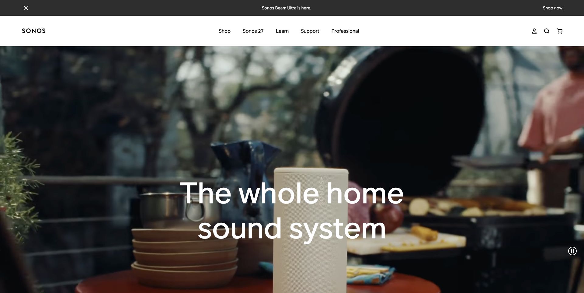
Sonos’ existing US capture shows a speaker within a domestic scene, with a large statement about a whole-home system. The white header separates Shop, Learn, Support and Professional, while an announcement strip identifies a specific product launch above it. This makes the homepage a broad introduction to how the range fits into everyday surroundings rather than a dense electronics catalog. The retained image was captured November 2. The current source-text fetch returned a rate limit, so the visual review deliberately refers to that earlier captured state and does not claim a fresh live interaction test.
What you can learn
Explain the system-level use case, then provide a clear route to product compatibility and setup requirements. For connected audio, the customer needs to understand how a proposed device fits existing equipment as well as how it looks in a room.
Pros
Learning and support have clear positions alongside shopping.
The room scene provides scale and placement context for the featured speaker.
Cons & considerations
A broad system headline leaves individual model differences below the opening.
Large white text over moving imagery needs contrast and reduced-motion checks.
Public source checked November 3, 2026. References may be embedded or legacy—not a complete backend inventory.
Platform source: Official Next.js showcase. The official Next.js showcase features this named website; the captured public page also exposes Next.js assets. Platform evidence is separate from the direct website screenshot and is not a complete current infrastructure audit.
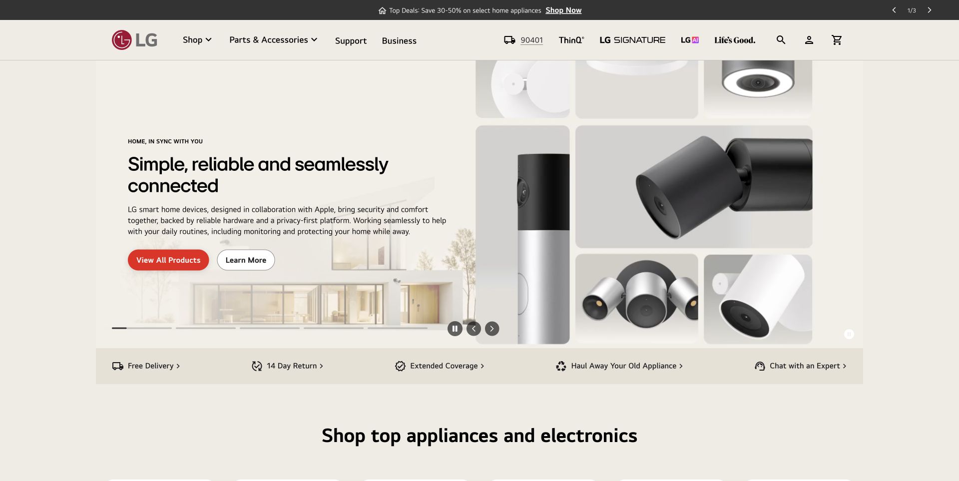
LG’s retained US storefront screenshot pairs explanatory copy with a collage of connected-home devices. Two buttons distinguish viewing products from learning more, so shoppers can choose between a catalog task and an explanation. A compact service strip below the hero surfaces delivery, returns, coverage, haul-away and expert help. The header also separates parts, support and business routes from the shop. This November 2 capture demonstrates how practical ownership information can sit near a brand campaign. It does not independently verify the campaign’s connectivity, privacy or reliability claims, and it does not test those products.
What you can learn
For unfamiliar electronics, provide a short explanation and a direct catalog route without forcing every visitor through the same story. Make installation, compatibility and support responsibilities as visible as the headline benefit when planning product pages.
Pros
Two differently labeled actions serve explanation and comparison tasks.
Ownership and service topics appear close to the main product introduction.
Cons & considerations
A collage can obscure the relative size and individual role of each device.
General connected-home claims need precise compatibility details beyond the opening screen.
Public source checked November 3, 2026. References may be embedded or legacy—not a complete backend inventory.
Platform source: Official Next.js showcase. The official Next.js showcase features this named website; the captured public page also exposes Next.js assets. Platform evidence is separate from the direct website screenshot and is not a complete current infrastructure audit.
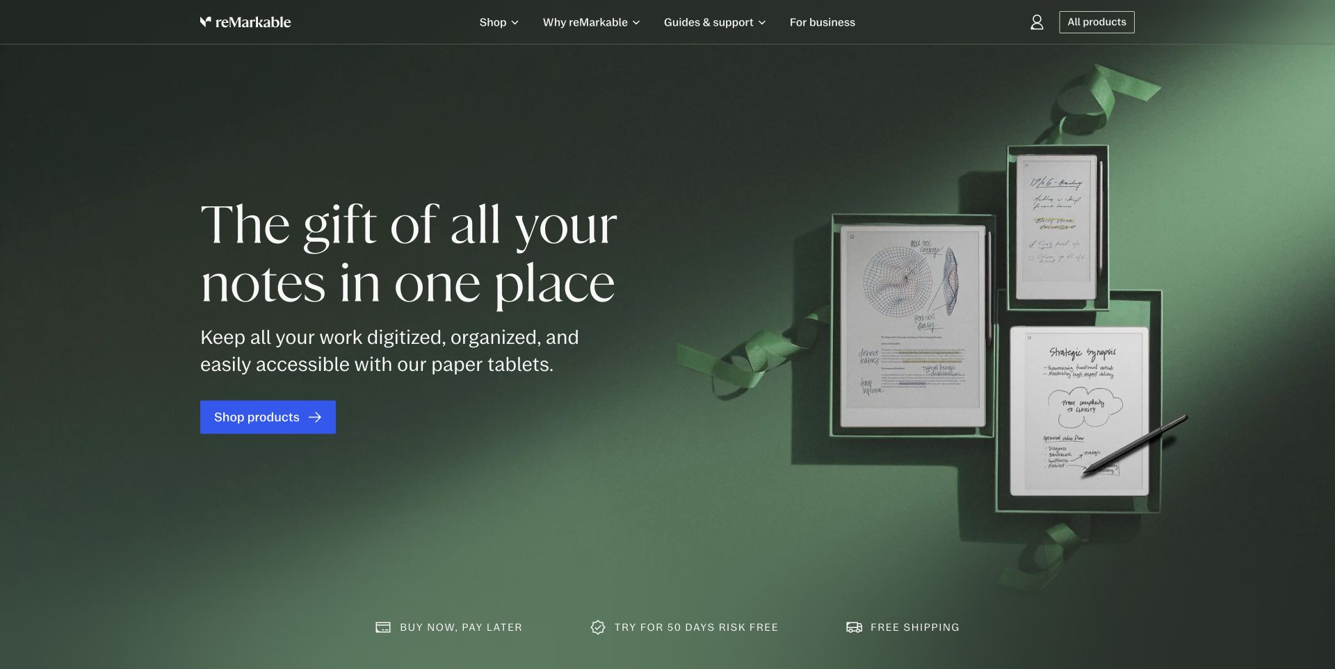
reMarkable’s retained storefront capture arranges several paper tablets in gift-like boxes beside a large serif introduction. The supporting sentence explains a note-taking use case, and a blue shopping button stands apart from the dark green scene. The header keeps reasons to choose the product, guides, support and business information separate. A row of purchase-related topics sits below the hero. This is a useful model for a narrow electronics range because the opening explains the category before asking shoppers to compare models. The screenshot is from November 2; its promotional terms are historical visual content, not current offers verified here.
What you can learn
Explain what the device is for before listing every specification. Then make model differences, compatible accessories, software requirements and ongoing costs easy to compare so the attractive introduction can lead to an informed purchase.
Pros
The product family is visible beside a readable explanation.
Support and business routes remain accessible outside the main shopping action.
Cons & considerations
The gift composition makes detailed model comparison a later task.
Promotional purchase statements need maintained terms and a clear connection to eligible products.
Public source checked November 3, 2026. References may be embedded or legacy—not a complete backend inventory.
Platform source: Official platform or first-party project source. Sanity association is scoped to reMarkable’s website and composable commerce content experience. The source is linked for its implementation description; no case-study performance figures are adopted as this review’s own findings. Platform evidence is separate from the direct website screenshot and is not a complete current infrastructure audit.
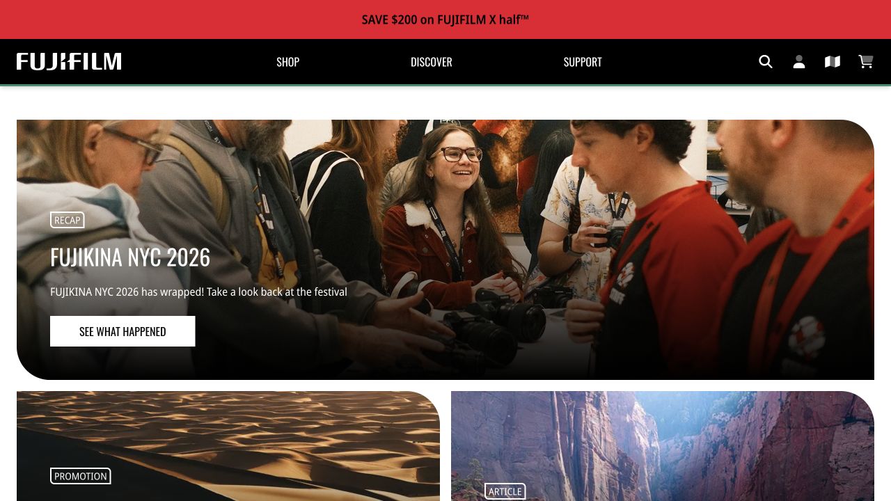
Fujifilm’s retained US shop screenshot leads with a photography-event recap showing people handling cameras. A prominent button invites visitors into the recap, while Shop, Discover and Support remain clear in the black header. Below the hero, the next cards identify their roles as a promotion and an article. This demonstrates a specialist electronics store using community material as part of product discovery without disguising every block as a sale. The November 2 image documents that editorial arrangement; the design review is not an endorsement of the event, a camera model or a promotional saving.
What you can learn
Separate editorial, promotional and support content through clear labels. Enthusiasts may enjoy community stories, but a buyer with a model number should still find stock, specifications and compatible lenses without navigating through an event recap.
Pros
The three main navigation roles make shopping, exploration and assistance distinct.
Card labels explain whether the next block is editorial or promotional.
Cons & considerations
A community-led hero delays direct product comparison.
Large image cards need meaningful alternative text and compact layouts for smaller screens.
Earlier cited evidence retained; no current scan result. References may be embedded or legacy—not a complete backend inventory.
Platform source: Primary platform or implementation reference. Hyvä's 2026 live-site showcase directly lists this US Fujifilm storefront. The association applies to the named public property; it is not a complete technology inventory or an edition/version audit. Platform evidence is separate from the direct website screenshot and is not a complete current infrastructure audit.
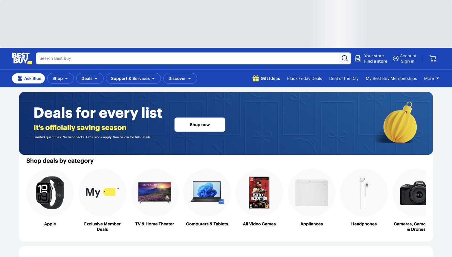
Best Buy makes the search field the longest element in its blue header, while store selection, account access and the cart remain separate targets. Beneath the header, a wide seasonal campaign has one white shopping button and a short qualification line. The next section switches from campaign language to circular product images for categories such as computers, televisions, headphones and cameras. That change in scale gives visitors an alternative to following the promotion. The captured view also contains an empty advertising area above the navigation, showing the space a large retail page may reserve before its own shopping content begins.
What you can learn
Give customers who know a model number a prominent search route, then support less specific shopping with concrete category imagery. Keep campaign exceptions readable and avoid allowing reserved advertising space to push the store's useful controls too far down.
Pros
The wide search field is easy to locate within a busy, recognizable header.
Product-led category shortcuts explain the assortment without requiring the full menu.
Cons & considerations
The reserved area above the header reduces the amount of shopping content visible at first.
A horizontally clipped category row makes some options depend on scrolling or carousel controls.
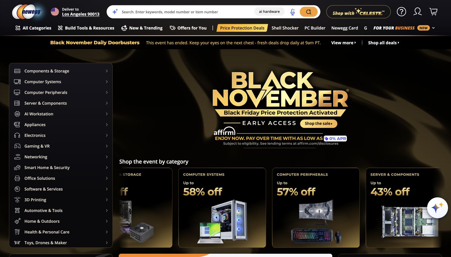
Newegg's dark storefront keeps a long category rail beside the seasonal promotion. Components, computer systems, peripherals, networking and other equipment remain visible while the main area promotes an event. The search hint explicitly welcomes keywords, model numbers and item numbers, and the header separately exposes a PC Builder route. Gold accents connect the campaign, selected navigation and search control. Product cards begin below the large event title, so the page supports both broad bargain browsing and shoppers who already understand the hardware taxonomy. The category rail and the cards use the same vocabulary, helping shoppers connect the navigation to the merchandise shown beside it.
What you can learn
A specialist catalog can keep its technical navigation visible while running a strong campaign. Organize categories around the distinctions customers actually use, and preserve a direct model-number search path rather than forcing every visit through a promotion.
Pros
The persistent category rail exposes substantial catalog depth immediately.
Search and build tools offer routes for technically informed shoppers.
Cons & considerations
Several promotion and financing messages compete with the actual product choices.
The dense dark layout demands careful contrast and spacing checks at narrower widths.
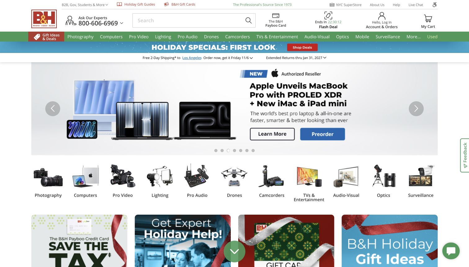
B&H places its expert telephone route beside the logo and search field, making help part of the store's primary presentation. A green department bar spans photography, computing, professional video, lighting and audio, while a second row repeats many of those departments through recognizable product images. The captured carousel separates learning more from preordering, which suits equipment that may need explanation before a purchase decision. Shipping and return messages occupy a slim strip above the campaign. The page is information-dense, but consistent alignment keeps service, navigation and promotional material in distinct horizontal bands.
What you can learn
For expensive or specialized electronics, make expert assistance as discoverable as the cart. Separate educational and transactional calls to action, and give customers visual department shortcuts without hiding the more precise text taxonomy.
Pros
Expert assistance is visible before a customer enters a product page.
The campaign offers distinct learning and purchase-oriented next steps.
Cons & considerations
Repeated department navigation adds useful choice but also consumes considerable vertical space.
A rotating campaign needs accessible controls and stable content for people trying to compare the message.
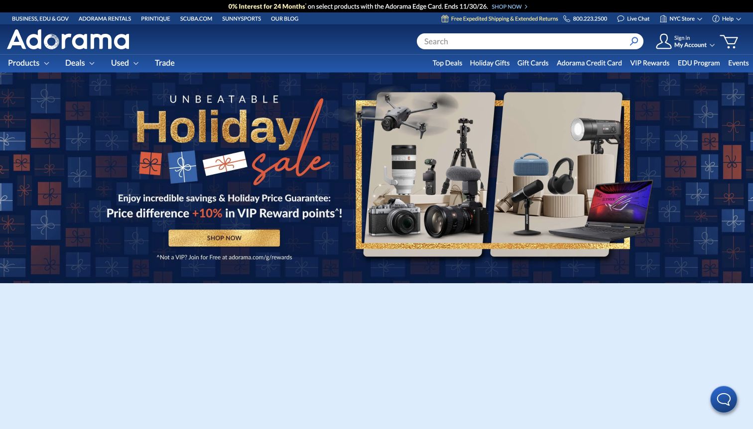
Adorama combines a large blue wordmark and search field with compact routes for products, deals, used equipment and trade-ins. Its seasonal hero groups a camera, lens, drone, microphone and computer into one composition, communicating a broad creative-equipment assortment without separate category tiles in the opening view. A contrasting gold shopping button sits below the main offer. Business, rentals, printing and other specialist destinations occupy a thinner utility row above the store navigation. The captured page is campaign-heavy, with boxed product photography providing a more concrete visual counterweight to the large seasonal headline.
What you can learn
Use a coordinated product composition to introduce a broad creative catalog, but preserve clear alternatives for customers considering used equipment or trade-ins. Keep specialist service destinations available without giving every utility link equal weight to the main shopping route.
Pros
Used and trade-in routes are visible alongside ordinary product shopping.
The hero shows several distinct equipment families in one coherent composition.
Cons & considerations
Multiple narrow promotional and utility strips make the header feel crowded.
The large campaign leaves detailed category and product comparison farther below the initial view.
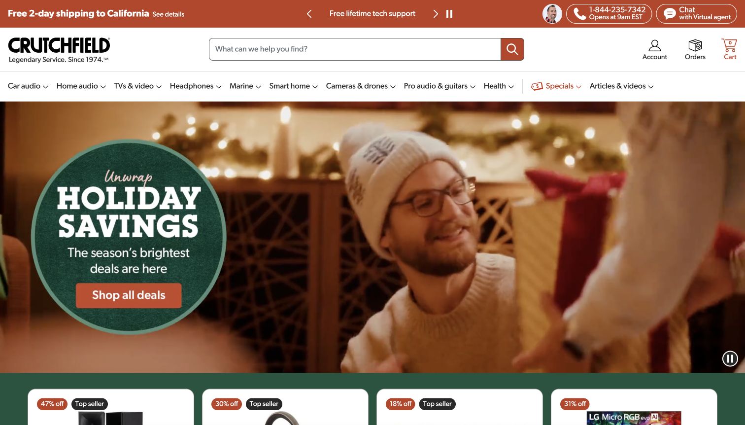
Crutchfield places shipping, support and contact options in a warm-colored strip above a simple logo-and-search header. Its main navigation divides equipment by use, including car audio, home audio, marine and professional audio, rather than presenting one undifferentiated electronics catalog. The opening campaign uses a domestic listening scene with a contrasting circular offer panel and a clear shopping button. Product cards are already entering the bottom of the capture. The warm accent color repeats across the service strip, search button and hero action, connecting practical assistance with the more atmospheric campaign.
What you can learn
When a purchase depends on compatibility or installation, keep advice and use-based categories close to search. Lifestyle photography can explain context, but follow it quickly with equipment choices and preserve a clear route to expert support.
Pros
Use-based navigation reflects the different contexts in which audio equipment is installed.
Support and contact options remain visible above the campaign.
Cons & considerations
The large animated campaign can delay visitors who want specifications immediately.
Several service claims share a small rotating strip, so each message may not remain visible long enough to read.
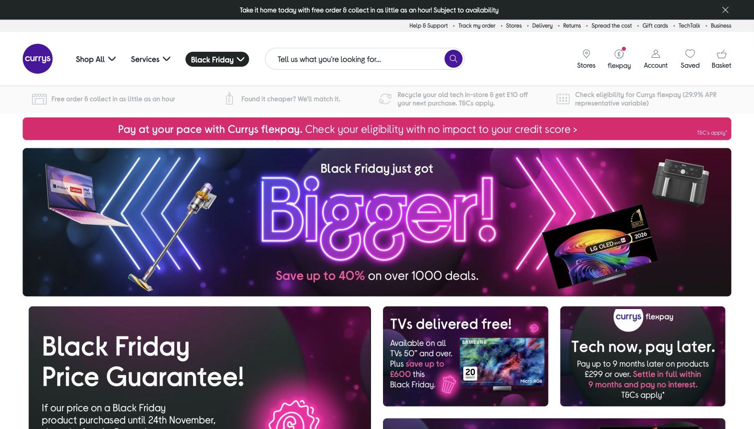
Currys uses a restrained white header with a purple logo, rounded search field and simple Shop All, Services and Black Friday controls. A thin utility row holds delivery, returns, stores and support. Below it, the page combines a large neon-styled campaign with smaller cards for a price guarantee, televisions and payment options. The coordinated purple and pink palette links these different messages, while separate panels keep them from becoming a single wall of text. Collection and service information are visible before the main campaign, showing how a retailer can connect online browsing with physical-store fulfillment.
What you can learn
A broad electrical retailer should make fulfillment and after-sale help easy to find without burying product discovery. Use a consistent campaign palette across modular cards, then distinguish each card through a concrete topic and a clear destination.
Pros
Collection, delivery and support routes are discoverable near the top of the page.
The modular campaign layout can accommodate several distinct shopping messages.
Cons & considerations
Financing and promotion panels compete for attention before individual products appear.
Light service-strip text needs careful contrast review against its pale background.
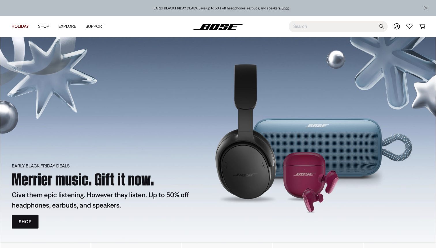
Bose keeps its main navigation to Holiday, Shop, Explore and Support, with a centered wordmark and search on the right. A large, cool-toned hero groups headphones, a speaker and earbuds against metallic decorative shapes. The product scale and generous empty space distinguish this opening from a crowded electronics marketplace. The offer and black shopping button sit together at the lower left, while the header's promotion strip provides a second route to the sale. The screenshot is a dated seasonal campaign, so the review concerns its information hierarchy rather than endorsing the displayed discount or product specifications.
What you can learn
A focused electronics assortment can use fewer navigation choices and larger product photography. Keep the offer, explanation and next step together, while leaving support visible for customers comparing ownership and setup needs.
Pros
The restrained navigation makes the brand's principal shopping and support routes easy to scan.
Different product families remain recognizable within one uncluttered hero composition.
Cons & considerations
The oversized campaign postpones specifications and side-by-side product comparison.
Repeating the sale message above and within the hero uses space that could explain selection criteria.
Choose the attributes shoppers actually compare for each category. Normalize units, name variants consistently and identify the authoritative source for specifications. Model compatibility relationships separately from broad marketing tags so a recommendation does not silently imply that two products work together.
Test realistic comparison tasks
Ask someone to find a known model, choose between two configurations and identify an accessory that fits an existing device. Observe where they lose context or cannot interpret a difference. Test empty search results and unavailable variants as carefully as the featured product path.
Connect promises to operational systems
Document where stock, delivery estimates, store availability and service slots come from. Decide how stale information is handled and who responds to an order problem. Keep promotion dates and bundle contents editable without allowing a campaign to contradict the product record.
The editing job behind the design
Choose systems around catalog and inventory needs
A large electronics catalog may need a product information system and search that understands structured attributes. A small specialist range may be easier to maintain inside one commerce platform. Evaluate representative products, variant counts, search behavior and staff editing tasks before choosing infrastructure based on another retailer’s scale.
Treat stock, fulfillment, payments and service bookings as separate responsibilities with explicit failure states. Public page evidence can identify parts of a storefront, but it does not reveal every warehouse or business system. Keep technical claims scoped to the actual observed property and retain dated evidence when an audit is blocked.
Our WordPress website examples offer a separate look at publishing approaches. A visible platform label is evidence for that named page, not a guarantee that the same system will suit your requirements.
Before the public launch
Electronics store launch checklist
Test exact model searches, synonyms, missing results and useful category filters.
Verify specifications, units, variant differences and included accessories.
Make condition, region, warranty and compatibility limitations clear.
Confirm prices, bundle contents, stock and fulfillment messages agree.
Test comparison tables, wide specification rows and zoom on a phone.
Check keyboard use, focus order, search suggestions and error messages.
Verify support and returns routes after a completed test purchase.
These checks are a project checklist, not a performance, legal, security, or accessibility certification. Test real journeys with the people responsible for the website before making claims about the result.
Sources & editorial method
How this collection was selected and reviewed
The examples are distinct official electronics retail properties, including regional manufacturer stores. Each review refers to the actual captured page and its original observation date. The analysis covers visible navigation, product presentation, campaign structure and service routes. Performance, price and stock claims are not treated as independently tested facts, and technical claims require separately recorded public evidence.
Each example links to its actual source page. Screenshots are direct browser captures with their own capture dates; moving imagery, announcements and live designs can change. The notes describe observable design choices and conditional tradeoffs, not measured traffic, conversion results, service quality, or accessibility conformance.
Technology labels use public page metadata, asset evidence, or explicitly cited platform documentation. Platform documentation is not a complete current deployment audit. A component reference may be legacy or unused; it is not a complete backend inventory. Unknown stacks are omitted. These sites are editorial examples, not our client portfolio.
Written, Edited and Curated are separate editorial records, not timestamps advanced by a rebuild. Website designs and imagery belong to their owners. See our editorial standards or suggest a correction.
Questions worth asking
Electronics Store website design questions
Should every electronics product have a comparison table?
Use comparison where customers are choosing between genuinely comparable products. Keep common attributes aligned and explain unfamiliar terms. A table full of empty cells or incomparable specifications adds work without helping the decision.
How should a store display compatibility?
Use explicit supported models, standards and relevant limitations from a reliable product source. Let visitors check an existing device when useful. Do not treat a shared connector shape or a related category as proof that a product will work.
Are manufacturer stores useful references for multi-brand retailers?
Yes, particularly for explaining product families and individual devices. A multi-brand retailer also needs neutral comparison, consistent specifications and clear distinctions between similar model names. The catalog size should determine how much navigation and filtering are needed.
What should happen when an item is out of stock?
Make the status explicit, preserve the product information and explain any available notification or alternative. Distinguish a confirmed restock date from an estimate. Do not let a promotional link imply that a sold-out configuration is immediately available.
Use visual hierarchy to make technical information easier to act on. Accurate product records and dependable support matter as much as the launch campaign.