A meal-delivery website should make the practical arrangement clear: what arrives, what preparation remains, which meals can be chosen, where delivery is available, and how the next order is managed.
Ingredient kits, prepared meals, frozen products, and services tied to an appliance involve different routines. Make that format clear before promoting a plan. Show representative dishes and explain the preparation, equipment, storage information, portion basis, and ordering pattern relevant to the actual service. A visitor should not have to begin checkout to discover what the product requires.
These twenty-eight examples use menu browsing, chef stories, product photography, pricing entrances, delivery-area checks, and plan-selection flows in different combinations. The guide compares those interfaces. Captured nutrition, health, savings, convenience, and promotional claims are not adopted as findings about the service; the practical lesson is how to present verifiable information and make the customer’s choices understandable.
Before the examples
What makes good meal delivery services website design in 2026?
Explain the format before the promise
State whether customers receive ingredients to cook, meals to reheat, frozen products, or another defined format. Show what is included and what equipment or preparation remains. Distinguish estimated hands-on work from any other timing shown. Use real product examples so the opening message describes an ordinary order rather than only an unusually styled campaign meal.
Connect the menu to the relevant delivery context
Make the menu’s week, region, availability, and portion basis understandable. If a postcode check is needed, explain why and show a useful result for both supported and unsupported areas. Preserve that context through browsing and checkout so someone does not select meals from a menu that cannot be delivered to their address.
Make ingredients and category meanings inspectable
Keep the applicable ingredient, allergen, portion, preparation, and nutrition information accessible from the meal record where the service provides it. Define the criteria behind dietary and preference labels. Keep those labels distinct from individualized suitability or health claims, and give customers a clear route to the business’s published information and support team.
Show the ongoing order alongside the first order
Explain the ordinary price basis, quantity, delivery charge where applicable, frequency, and relevant change deadlines before enrollment. Distinguish an introductory promotion from subsequent orders. Give customers clear controls for editing, skipping, pausing, or canceling according to the actual service, with a confirmation that identifies which order or plan was affected.
The collection · 28 examples
28 meal delivery services websites worth studying
Compare how each service explains the relationship between food, preparation, menu choice, delivery, and account management. A chef-led prepared-meal service and an ingredient kit may share a useful page hierarchy while requiring very different product details and ordering controls.
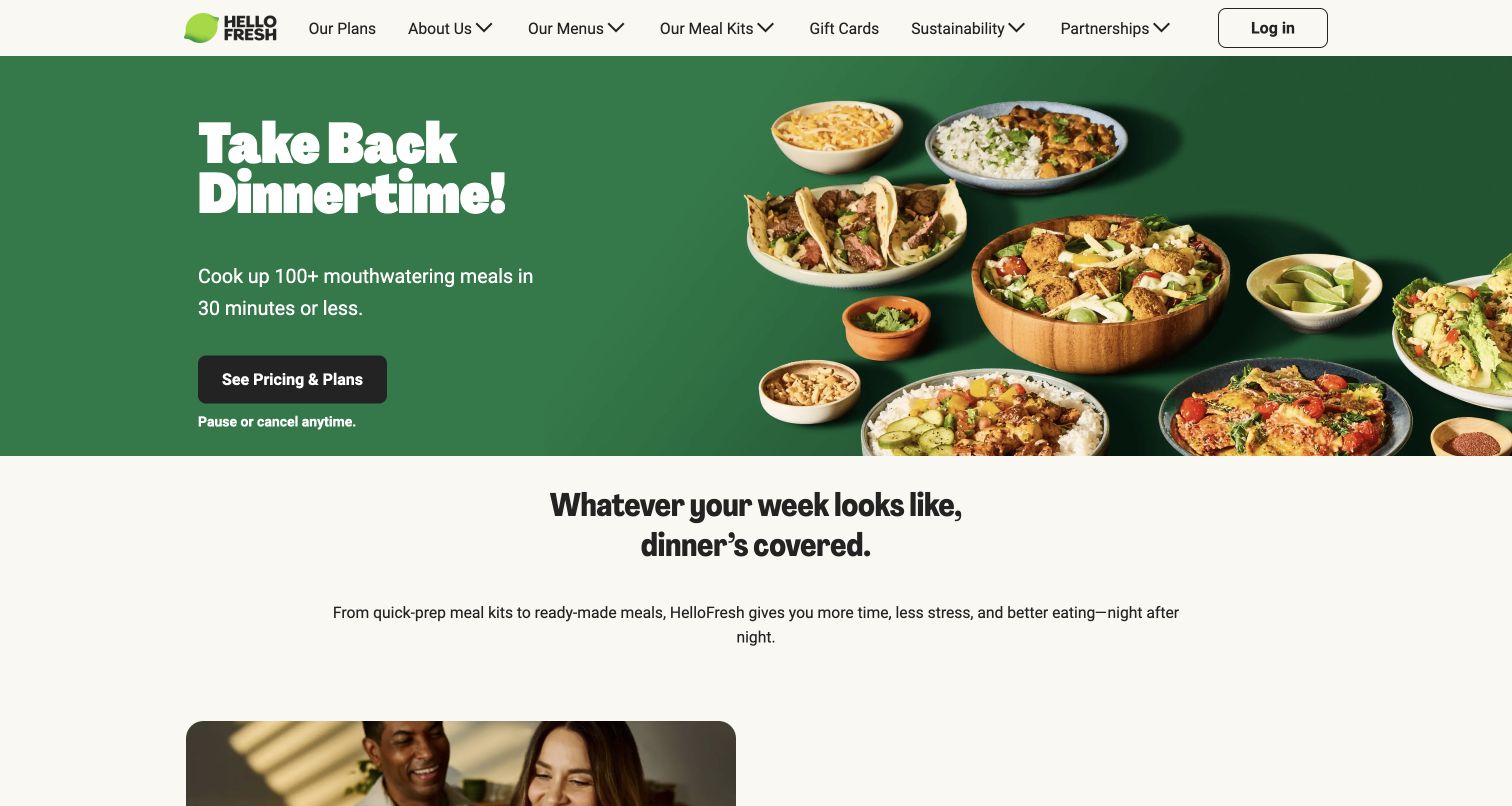
HelloFresh pairs a green text panel with plated food, making the meal itself the dominant visual evidence for a convenience-focused headline. The pricing-and-plans button is easy to identify, and a short pause-or-cancel note appears directly beneath it. Navigation separates plans, menus and explanations of the service. Lower content distinguishes meal kits from ready-made options. The page gives a new visitor both an appetite cue and a clear next step, while leaving detailed comparison for the plan and menu routes.
What you can learn
Place preparation effort, plan access and subscription flexibility close together. Those three facts answer different questions: whether the food appeals, how it fits the household's routine and what ongoing commitment the visitor is considering.
Pros
The split composition gives both the food photograph and the plan action a defined space.
A flexibility note near the primary button addresses a common subscription concern before the next step.
Cons & considerations
A broad convenience headline still needs concrete preparation times at the individual recipe level.
Visitors comparing kits with prepared meals may need the distinction earlier than the lower explanatory section.
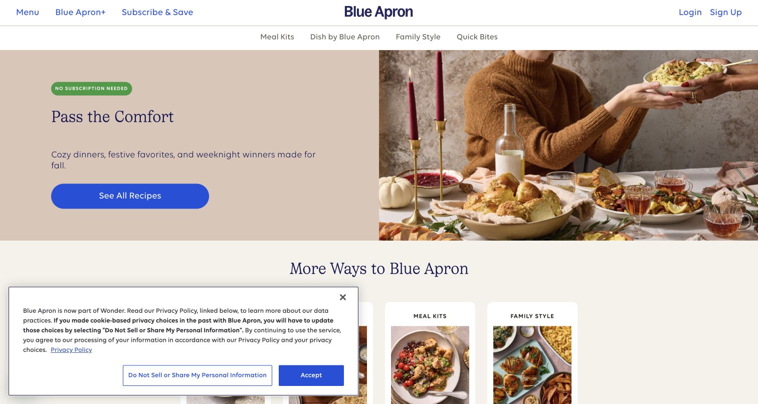
Blue Apron's opening combines a warm holiday-table photograph with a comfort-focused headline on a pale background. A visible no-subscription message sits near the recipe action, changing the expected ordering story for visitors accustomed to recurring meal boxes. The header distinguishes meal kits, prepared dishes, family options and quick bites. Recipe content includes preparation time and serving information. The useful pattern is the connection between a specific meal format and the level of commitment, rather than treating every food purchase as the same subscription funnel.
What you can learn
Explain the ordering model in the opening if it differs from category expectations. Let visitors inspect recipes and preparation effort before asking them to commit, and keep optional repeat ordering distinct from a requirement to subscribe.
Pros
The no-subscription message makes an important purchase condition visible beside the main recipe route.
Several meal formats receive separate navigation labels rather than being collapsed into one generic menu.
Cons & considerations
Multiple food formats need consistent serving and preparation labels to remain comparable.
Seasonal table styling can make everyday portions and packaging less obvious in the initial view.
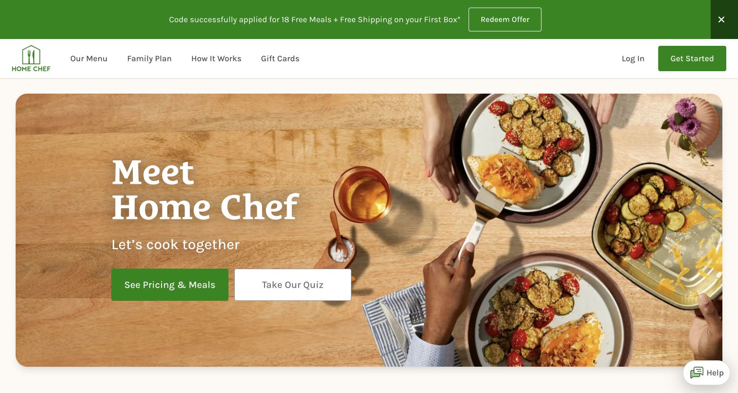
Home Chef places a plated meal on a wood tabletop opposite a large introduction to the service. Its green pricing-and-meals button has more visual weight than the outlined quiz action beside it. The header keeps Menu, Family Plan and How It Works accessible. This is a useful choice architecture: visitors can move toward concrete plans immediately or choose a guided route if they need help. The page later explains customization and preparation options, supporting different levels of cooking effort within the same brand.
What you can learn
Offer a recommendation quiz as a secondary path with a clear purpose. A customer who already knows their household size or preferred cooking style should still be able to inspect menus and plans without completing an extra discovery exercise.
Pros
The button hierarchy makes direct meal exploration the primary action and the quiz an optional aid.
The family-plan route acknowledges a common household need in familiar language.
Cons & considerations
The quiz's benefit should be explained so visitors understand what they will receive for the extra effort.
A styled plate alone does not clarify which ingredients arrive prepared and which steps remain for the customer.
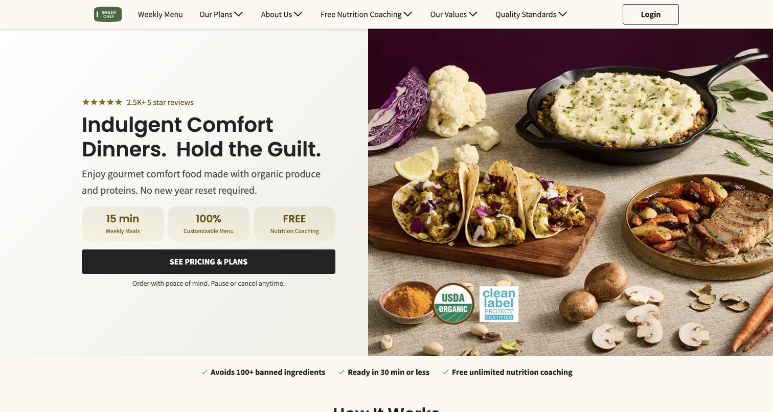
Green Chef divides the hero into a text-led panel and a carefully arranged meal-and-ingredient photograph. Three compact benefit tiles interrupt the text before a dark pricing-and-plans button, making the proposition more scannable than a long paragraph. The header includes weekly menus, nutrition coaching and quality standards as separate destinations. These routes are valuable because claims about ingredients and support need explanation beyond a badge. The design creates a concise introduction, though several different benefits compete within the same narrow decision area.
What you can learn
Use brief benefit tiles to help scanning, then connect each substantial claim to a fuller explanation. Keep a meal's preparation requirements separate from optional coaching or ingredient standards so customers can assess each part of the service on its own terms.
Pros
Compact benefit blocks give the visitor several concrete reasons to continue without a dense introductory paragraph.
Quality standards and coaching have named navigation routes for readers seeking supporting detail.
Cons & considerations
Multiple badges can appear equally important even when they describe very different aspects of the service.
The page's nutrition and certification language requires its own evidence and should not be treated as verified by visual review.
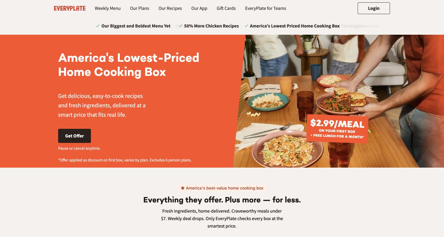
EveryPlate uses a vivid orange panel to foreground affordability, while a food photograph occupies the other side of the hero. A large offer action is accompanied by smaller text explaining the introductory scope. The visual emphasis is deliberately commercial: price and the first-box proposition arrive before a detailed description of cooking. Menu and service information remain available through the navigation. This example is useful for studying how a strong value message can attract attention while still needing careful placement of the conditions that qualify it.
What you can learn
When introductory pricing leads, put the ordinary cost and offer conditions within the same decision journey. Make clear what the first delivery contains, how later orders are priced and where shipping or serving choices change the total.
Pros
The orange field and large value statement establish a clear visual priority immediately.
Offer qualification appears near the action rather than being represented only by a distant legal link.
Cons & considerations
Promotional prices can dominate the memory of the page even when a visitor notices the smaller conditions.
A value-led introduction still needs recipe examples and preparation expectations to establish everyday suitability.
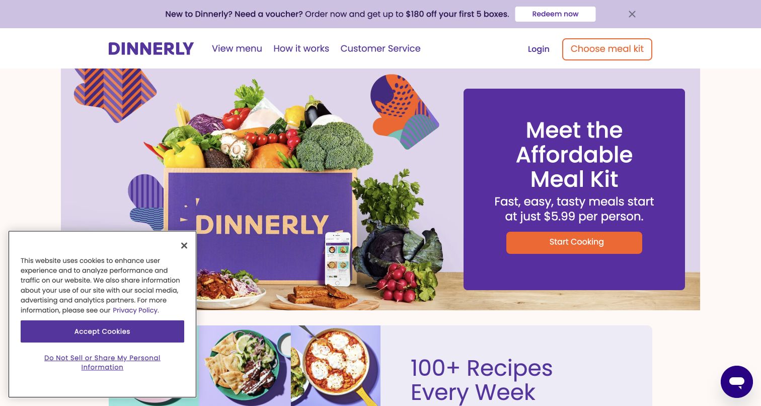
Dinnerly shows its branded box with produce beside a purple panel introducing an affordable meal-kit proposition. An orange action creates a strong contrast against the darker background, and the top navigation keeps menu and service explanation concise. The next visible section points toward recipe variety. Unlike a purely plated-food hero, the box helps communicate delivery as part of the product. The starting-price statement remains prominent, so the next page needs to explain the plan size and shipping assumptions that sit behind that figure.
What you can learn
Show the delivered format when it helps explain the service, but accompany starting prices with a clear path to a complete order total. A box photograph can establish the concept; recipe detail must still explain the cooking work that remains.
Pros
The package and ingredients make the meal-kit format understandable without relying entirely on descriptive copy.
A small set of navigation choices supports menu browsing and service questions without excessive branching.
Cons & considerations
A starting price is difficult to compare until serving counts, order size and delivery charges are known.
The captured cookie notice occupies part of the lower viewport and interrupts the transition into recipe content.
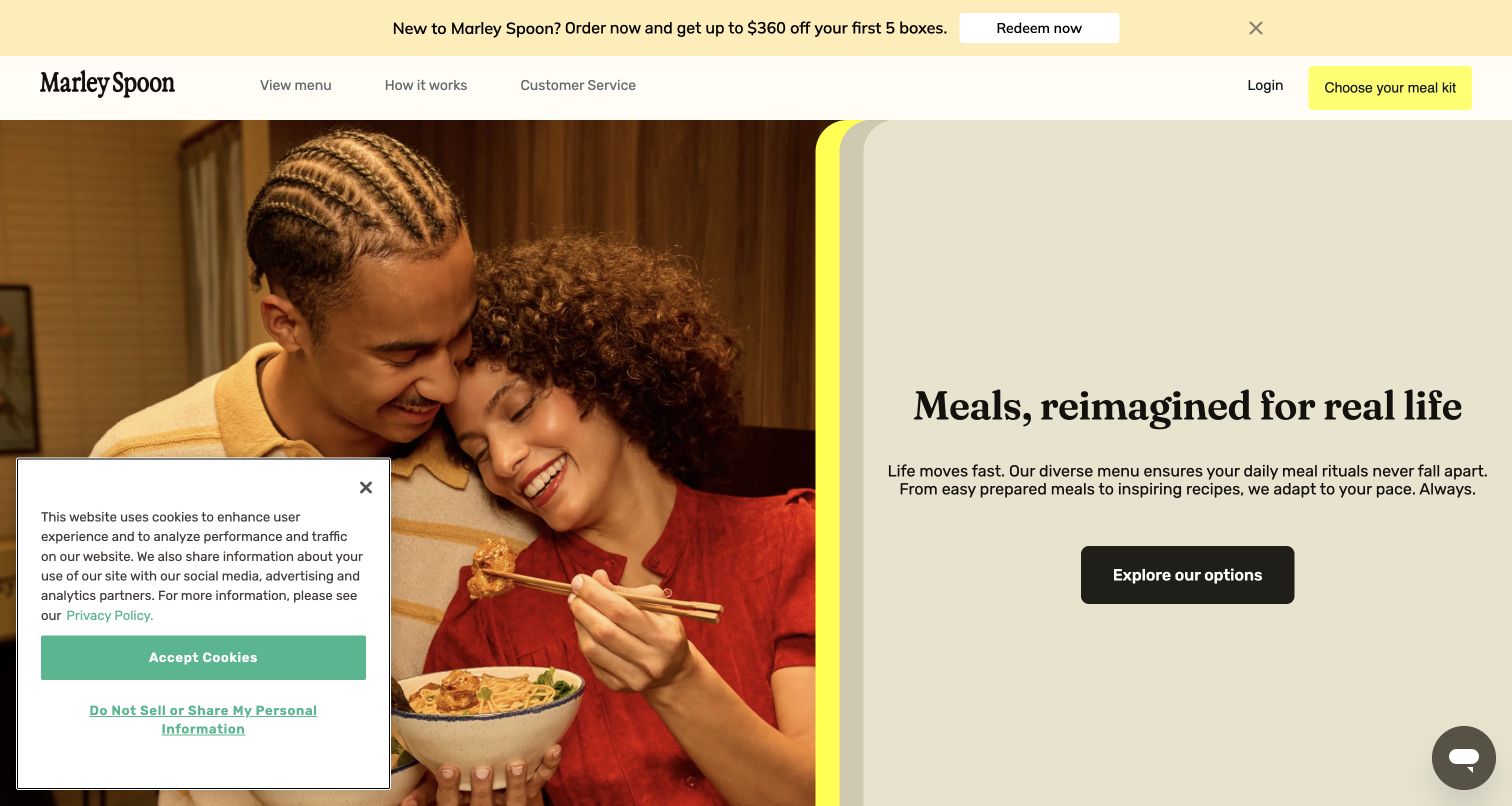
Marley Spoon pairs people eating at a table with a pale text panel about meals fitting real life. The black exploration button is visually simple, and the header limits itself to menu, service explanation and customer help. Lower content expands the proposition into breakfast, lunch, prepared options and dinner. The page therefore uses an ordinary social moment to introduce a broader routine, rather than relying only on a single plated dish. The breadth becomes useful when the different formats retain clear preparation and portion information.
What you can learn
Organize a broad meal service around occasions as well as recipes. Show whether each option is ready to eat, ready to heat or requires cooking, so the visitor can build a realistic week rather than just an attractive collection of dishes.
Pros
The dining photograph relates the service to a recognizable daily situation.
The concise navigation gives menu exploration and practical service questions equal visibility.
Cons & considerations
A broad promise about everyday meals can obscure differences in preparation effort across the range.
Multiple occasions require consistent portion and storage labels if shoppers are to combine them confidently.
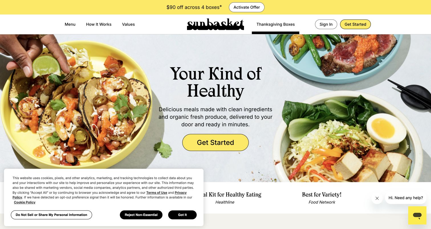
Sunbasket arranges several colorful plates around a centered headline and a yellow Get Started button. The food surrounds rather than sits behind the text, preserving a relatively quiet reading area. Its header gives Menu, How It Works and Values clear positions around the brand mark, while seasonal boxes have their own route. Further down, the page distinguishes kits from premade meals and outlines the weekly process. That combination helps bridge appetite-driven browsing with the practical question of how much cooking the customer wants to do.
What you can learn
If a service sells more than one preparation format, identify the difference explicitly and early. Use the food photograph to create interest, then show the steps from choosing meals to storing, preparing and managing the next delivery.
Pros
The centered text area keeps the main message readable despite a large surrounding food composition.
Separate menu and process links support both food-first browsing and questions about how delivery works.
Cons & considerations
A generic Get Started label tells less about the next screen than a specific menu or plan action would.
The privacy panel in the capture covers part of the lower food and supporting-content transition.
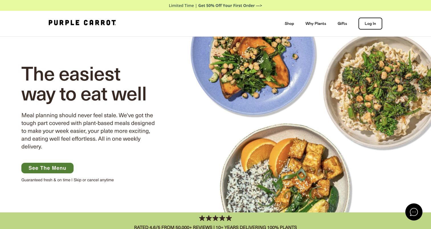
Purple Carrot gives most of the left side to a plain explanation of its weekly plant-based service, while three different dishes fill the right. The green See the Menu button is followed by a short delivery and cancellation statement. Below the opening, named meals carry protein, fiber or preparation labels. The useful design move is to connect a broad plant-based identity to actual dishes and a menu route. The page offers several ways to judge suitability without requiring the visitor to begin by interpreting a complex plan name.
What you can learn
Make dietary positioning concrete through recognizable meals and consistent labels. Keep the menu available before registration, and explain the delivery model separately from claims about nutritional completeness or individual health outcomes.
Pros
The three plates demonstrate visual variety within one clearly defined food category.
A menu-specific button gives visitors a concrete, low-ambiguity next step.
Cons & considerations
Strong nutrition claims require supporting information beyond appealing photography and summary badges.
A weekly delivery promise still needs clear cutoffs and cancellation timing in the service explanation.
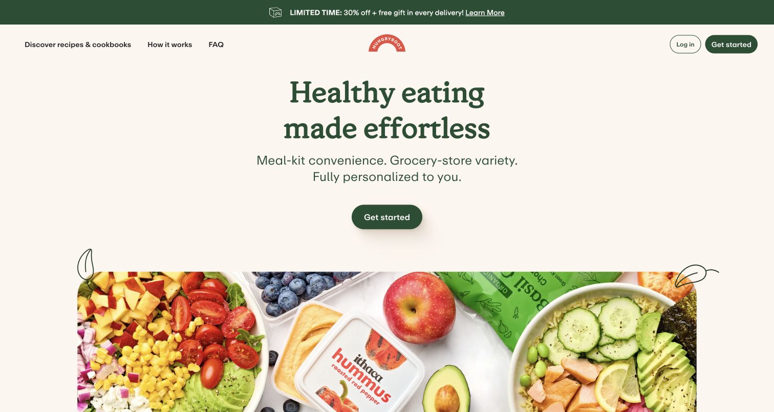
Hungryroot begins with a centered headline above a wide photograph containing both prepared food and packaged groceries. The short description links meal-kit convenience with grocery variety, and the primary button leads into its introductory quiz. Lower sections explain the sequence: answer questions, receive a proposed cart, then eat through the week. This process story is important because the product is not simply a fixed box of dinners. It helps visitors understand why the service asks questions, though the actual assortment and cost still need an accessible preview.
What you can learn
Explain what personalization will do before requesting preferences. Show the relationship between answers, recommended products and editable choices, and preserve a browsing route for people who want to assess the food before sharing information.
Pros
The mixed grocery photograph accurately communicates a broader assortment than dinner kits alone.
Numbered process sections make the recommendation model easier to understand than an unexplained quiz button.
Cons & considerations
A quiz-led entry can create friction for visitors who first want to inspect prices or sample meals.
Personalization language should clarify which choices remain under the customer's control after recommendations appear.
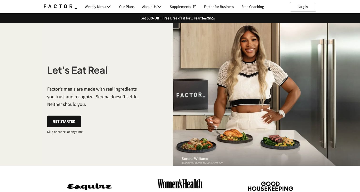
Factor's opening places Serena Williams beside several meals, with a pale text panel and a dark Get Started button to the left. The short headline emphasizes recognizable ingredients, while a cancellation note appears below the action. Weekly Menu and Our Plans remain visible in the header, alongside separate business and coaching routes. The celebrity provides immediate recognition, but the page's practical role is still to explain the prepared-meal offer and lead shoppers toward actual weekly choices rather than leaving the endorsement to carry the whole argument.
What you can learn
Use a recognizable person to focus attention, then make the product's format and next step explicit. Keep endorsements separate from meal-level facts such as ingredients, portions and heating instructions, which the shopper needs regardless of who appears in the campaign.
Pros
The split layout gives the endorsement and ordering message distinct visual areas.
Weekly Menu and Our Plans remain directly available for visitors who prefer concrete comparison.
Cons & considerations
The hero devotes substantial space to the spokesperson rather than a close view of the delivered packaging.
A simple Get Started action needs a transparent plan page to resolve price and recurring-order details.
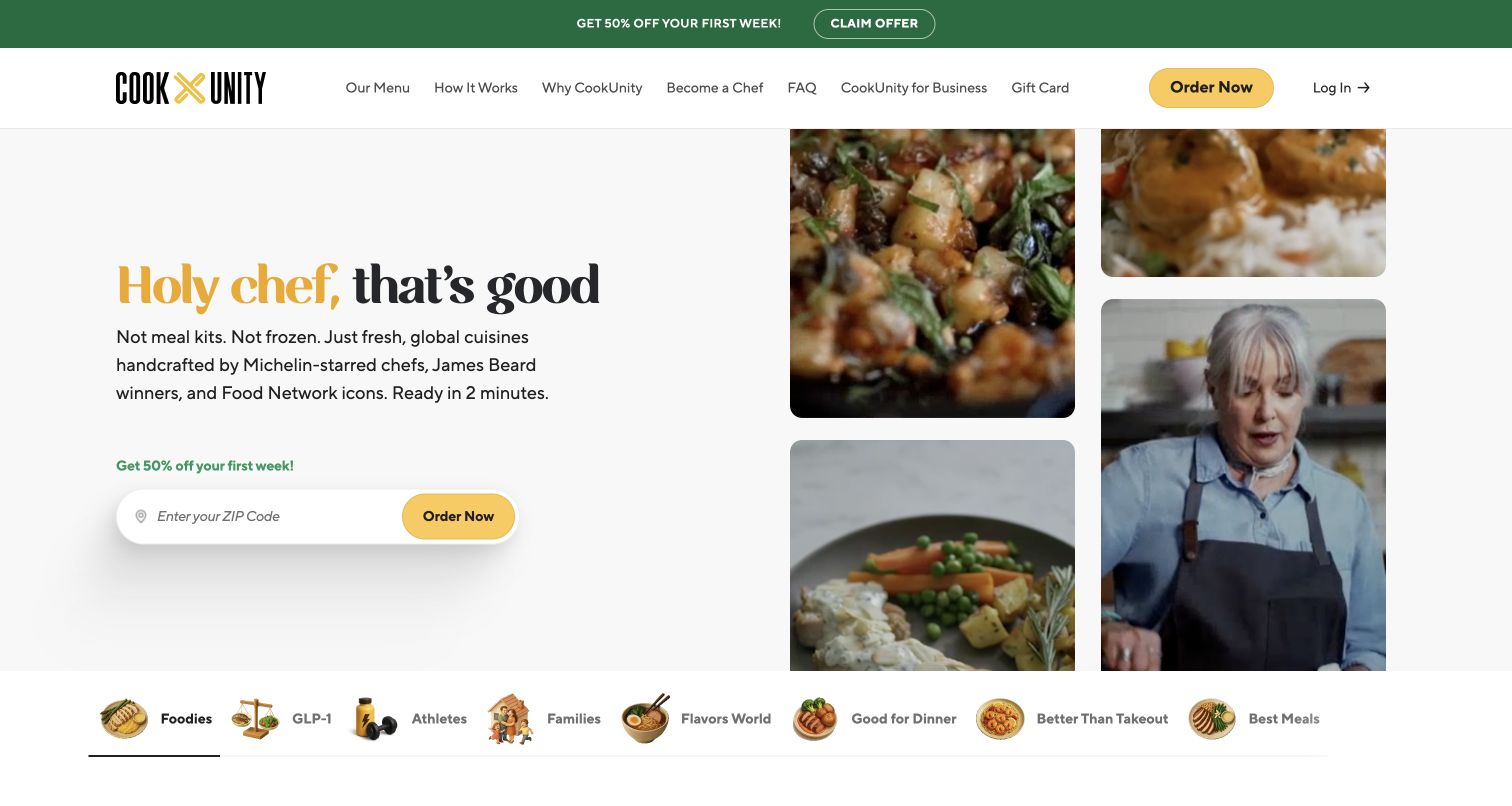
CookUnity places a playful chef-focused headline beside a collage of cooking and food imagery. A ZIP-code field sits within the primary ordering action, while the header also offers a public menu and service explanation. Lower meal cards name both the dish and its chef, turning the headline's emphasis into a repeatable content pattern. Audience tabs provide another discovery route. The page is distinctive because it makes authorship part of the food presentation, although availability and menu differences still depend on the delivery area.
What you can learn
If individual makers distinguish the service, carry their identity into the product cards and supporting stories. Explain why location is requested and let the availability check return a useful answer before asking for unnecessary personal details.
Pros
Chef names on meal cards give the brand's people-focused promise a concrete expression.
A ZIP-code field signals that delivery coverage is a practical prerequisite to ordering.
Cons & considerations
Audience categories can overlap and may be less useful than ingredients or preparation filters for some shoppers.
Prominent chef credentials should link to meaningful context rather than function as unexplained prestige labels.
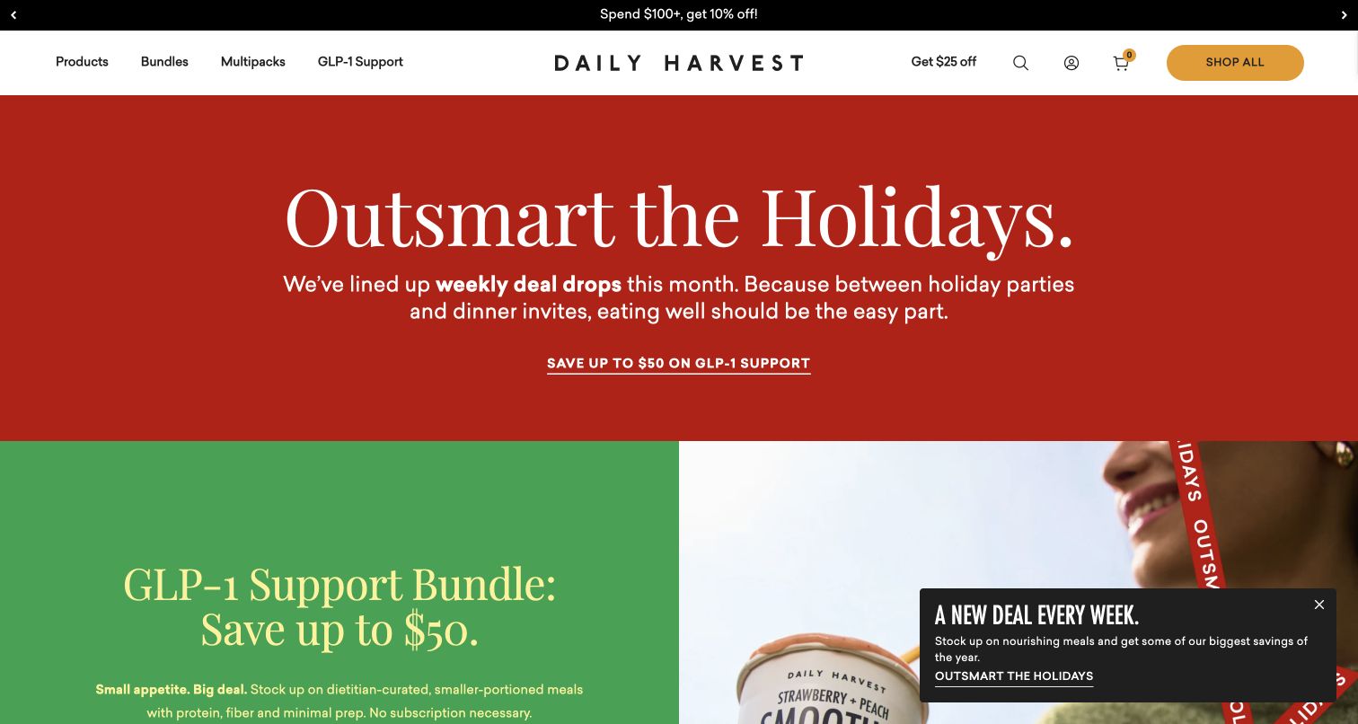
Daily Harvest opens with a red holiday panel and an oversized serif headline, followed by a green section introducing a featured bundle. The header keeps Products, Bundles, Multipacks and Shop All visible. This is a campaign-first storefront rather than a simple weekly-plan landing page. Lower content returns to product collections and building a box. The strong color blocks make the promotion memorable, but they also mean that visitors must move beyond the opening to understand the complete range and how individual products fit into an order.
What you can learn
Give seasonal bundles a distinct editorial space while preserving a direct all-products route. Explain the difference between buying a curated bundle and assembling a box, including minimum quantities and whether repeat delivery is optional.
Pros
Large contrasting color fields make the campaign hierarchy clear without relying on a crowded product collage.
Separate bundle and product routes accommodate shoppers seeking either guidance or control over the assortment.
Cons & considerations
The first screen prioritizes a specialist promotional bundle over the broader product range.
Health-oriented bundle language needs careful substantiation and should not be treated as a general promise of results.
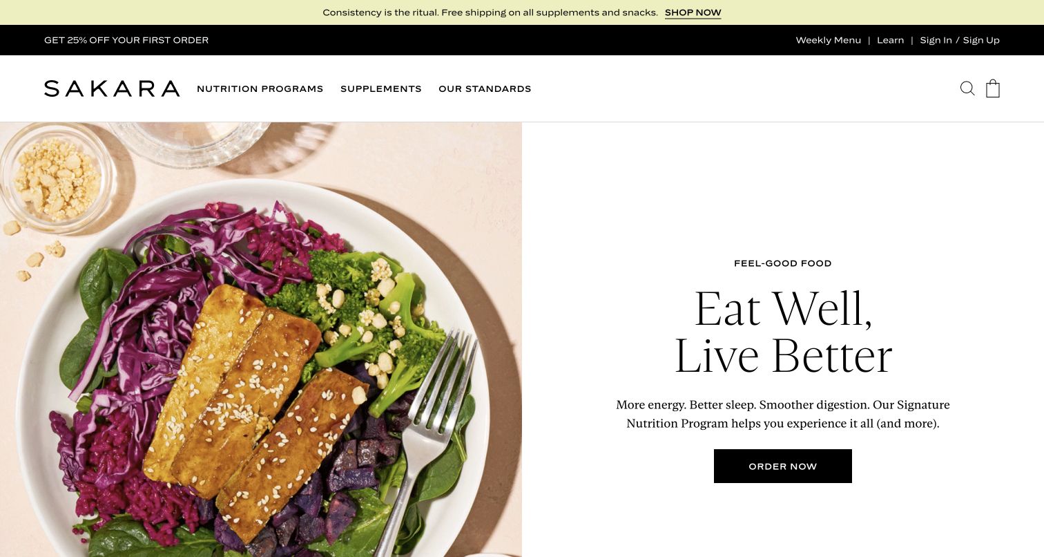
Sakara pairs a close overhead meal photograph with a spacious white text panel, using restrained serif typography and a black ordering button. The main navigation distinguishes nutrition programs, supplements and standards; a separate utility row exposes the weekly menu and educational material. This separation matters because a meal program and a packaged supplement are different purchases. The visual system is calm and premium, though the broad wellbeing language in the hero provides less immediate practical detail than the menu and program-comparison routes elsewhere on the site.
What you can learn
Keep different product types visibly distinct when one brand sells both meals and wellness products. Let the program page explain delivery, portions and preparation, while any health-related statements receive appropriate supporting context rather than relying on the design's premium tone.
Pros
The generous white panel makes the short introduction and ordering action easy to locate.
Weekly-menu and program-comparison routes help visitors move from broad positioning to concrete choices.
Cons & considerations
The initial wellbeing claims do not explain the exact contents or schedule of a meal program.
Multiple promotional strips above the header reduce the space available for the main food photograph.
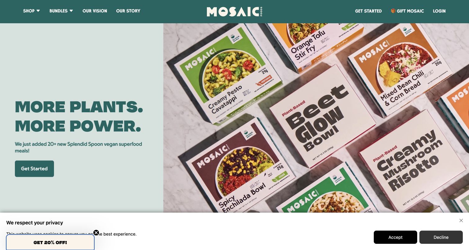
Mosaic's captured hero promotes an expanded plant-based range through a photograph of several labeled meal packs. The left panel uses a short headline and a single action, while a dark green header keeps Shop, Bundles, Vision and Story visible. Other hero panels describe individual dishes and family meals, and the page explains the service below. The packaging-led view is useful because it shows the format customers will receive, although an assortment photograph cannot replace readable ingredient, portion and heating information for each item.
What you can learn
When expanding a catalog, show enough real packaging or dishes to make the addition tangible. Connect the announcement to a filtered range, and distinguish single-portion meals, family dishes and bundles before the customer starts assembling an order.
Pros
Visible meal packs give the range announcement a concrete product basis rather than a purely abstract promise.
Shop and Bundles offer different paths for shoppers choosing individual meals or a ready-made assortment.
Cons & considerations
A rotating hero can hide a particular announcement before a visitor has finished reading it.
The captured lower privacy strip and offer teaser compete with the transition into the rest of the page.
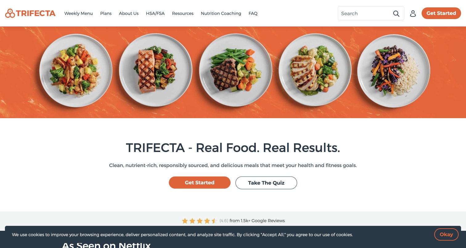
Trifecta places five plates across an orange background, then follows with a centered headline, a short description and two actions. Get Started is filled orange, while the quiz is outlined, preserving a clear priority. The header includes weekly menus, plans, coaching and FAQs. The repeated plate scale makes the assortment feel systematic rather than incidental. That presentation suits a routine-oriented service, but claims about results still need to be separated from the visible facts a customer can evaluate, such as meal contents and preparation.
What you can learn
Present the assortment consistently when shoppers care about planning a repeatable routine. Offer guidance as an optional route, and ensure menu details—not a broad outcome claim—provide the basis for comparing portions, ingredients and suitability.
Pros
The row of similarly framed plates communicates variety while retaining a consistent visual format.
The filled and outlined buttons distinguish direct ordering from the optional quiz.
Cons & considerations
General health-and-fitness language cannot tell an individual visitor whether a meal meets their needs.
The page includes several supporting service routes that need clear boundaries between meals, coaching and educational material.
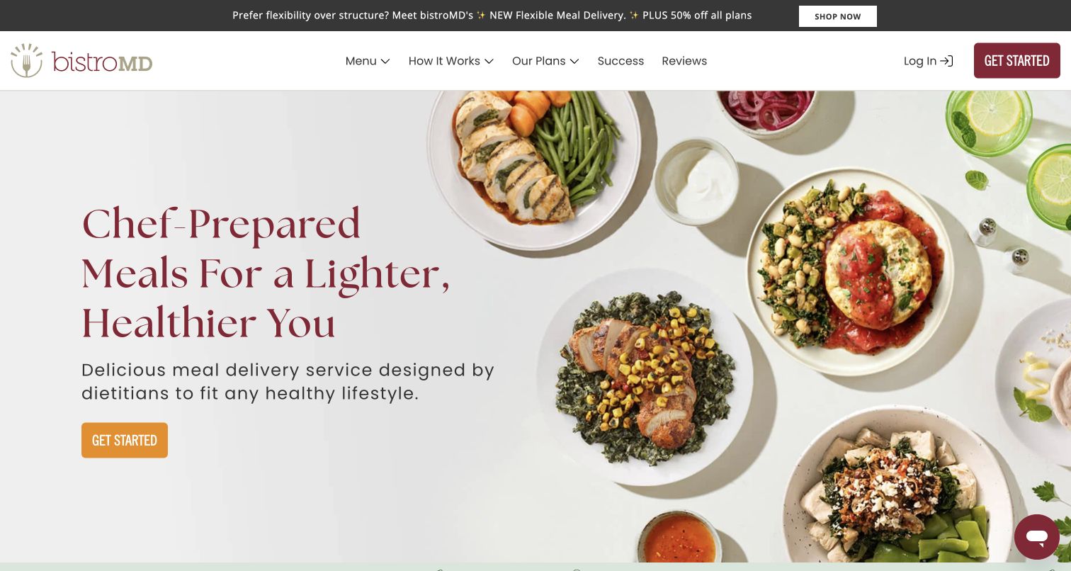
BistroMD uses a large serif headline beside a spread of plated meals, with a small warm-colored button below the introductory copy. Navigation separates menu, process, plans, success stories and reviews. Lower on the page, category tabs organize several program use cases. The composition creates a calm entry to a more complex service, but the practical content must do substantial work after the hero: visitors need to distinguish a meal's actual ingredients and portions from the broader health goal used to name its program.
What you can learn
For a specialist food service, make program categories useful without suggesting that a label answers every personal suitability question. Provide meal-level information, clear service terms and a route to qualified support where the service genuinely offers it.
Pros
The spacious split layout lets the food and introductory message remain legible independently.
Program categories provide a way to organize a large assortment around different browsing intentions.
Cons & considerations
A health-outcome headline needs more context than the photograph or testimonials can supply.
A small hero button may be visually overshadowed by the large headline and surrounding plates.
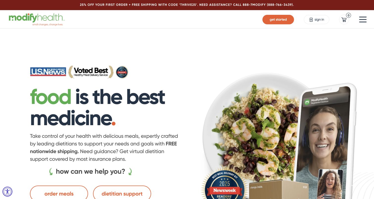
ModifyHealth places a meal next to an image of a video consultation, then offers separate order-meals and dietitian-support actions. The pairing makes the two parts of the service visible in one screen. A short statement introduces delivery and support, while a compact header concentrates on getting started, signing in and the cart. The page's most useful pattern is the explicit split between obtaining food and seeking professional guidance. Its health-focused headline and displayed recognition marks still require their own supporting explanations beyond the interface review.
What you can learn
If a service includes both products and advice, give each a clearly labeled route and explain any separate eligibility, scheduling or payment requirements. A combined hero can introduce the relationship without implying that every meal order includes a consultation.
Pros
Two named actions distinguish meal ordering from dietitian support at the point of entry.
The food-and-video pairing visually explains why the brand offers more than a conventional meal catalog.
Cons & considerations
A very compact desktop header may require an extra menu step to reach detailed service information.
The medical framing should not obscure the need to inspect ingredients and the actual scope of the support service.
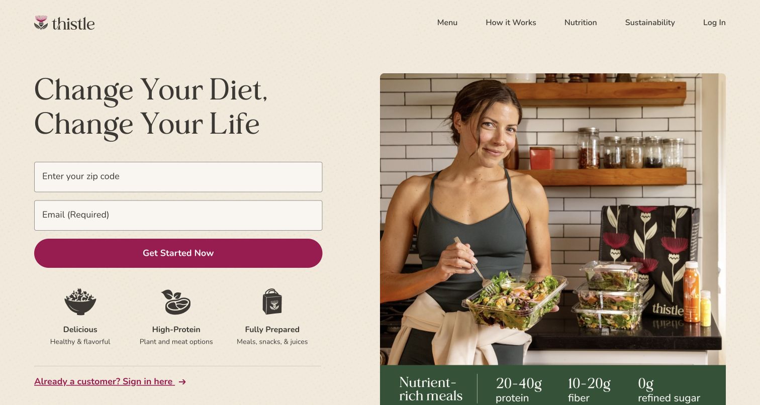
Thistle places ZIP-code and email fields beneath a large headline, beside a photograph of someone eating a salad in a kitchen. Three compact benefit icons summarize the food and preparation format, while the header keeps Menu, How It Works, Nutrition and Sustainability visible. The form gives the opening a direct conversion focus, and the adjacent image shows the containers and drinks as part of an everyday routine. The practical tension is the email request: a visitor may want to establish availability before beginning a marketing relationship.
What you can learn
Explain the purpose of each field at the start of a delivery journey. Geography may be essential to show availability, while contact details may serve a different purpose; keep that distinction clear and offer a public menu where feasible.
Pros
The kitchen scene includes delivered containers, helping connect the styled meal to the actual service format.
The three benefit icons communicate preparation and assortment details without a long block of copy.
Cons & considerations
Requesting email alongside the ZIP code can feel premature to a visitor still comparing services.
High-level nutrition figures need meal-specific context before they become useful for individual choices.
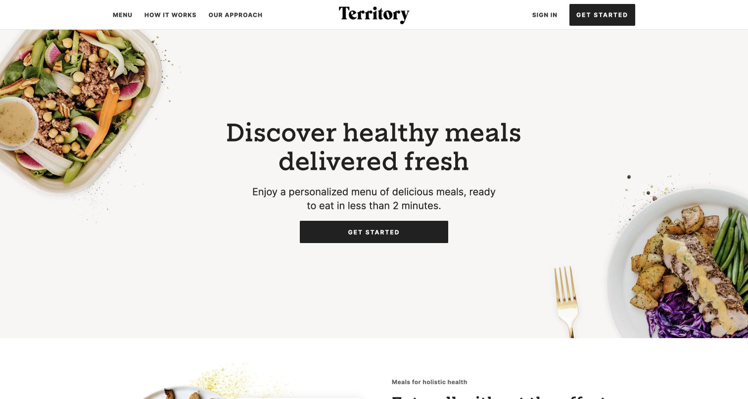
Territory leaves a wide central area for its headline, short preparation statement and dark action button, with meals entering from opposite corners. The header is equally restrained, offering Menu, How It Works and Our Approach. Farther down, a dish is attributed to its maker and accompanied by nutrition information, and the page explains the role of local chefs. This structure moves from a simple service proposition to a more specific account of where the meals come from, rather than packing every differentiator into the opening.
What you can learn
Give a marketplace-style food service a simple first explanation, then make the maker relationship concrete on the meal cards. Keep regional availability and nutritional details attached to the individual dish instead of implying uniformity across the whole network.
Pros
The generous center space makes the service message readable without placing text directly over food.
Maker attribution adds a specific human source to the broader chef-network story.
Cons & considerations
The generic initial action provides little indication of whether the next step is menu browsing or registration.
A regional chef network needs clear delivery-area context before visitors assume every displayed dish is available to them.
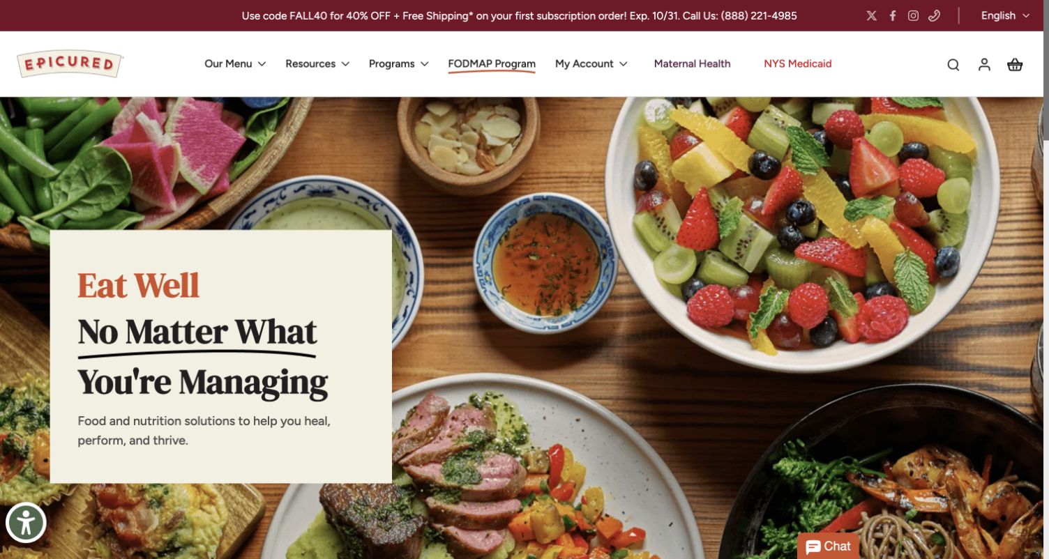
Epicured sets a pale text block over an overhead spread of meals, creating a contained reading area within a busy food photograph. The main navigation separates menu, resources, programs and specific service routes. Below, familiar categories such as breakfast, entrées, sides and soup make the assortment approachable. The captured promotional strip still names an October deadline even though the observation is from November, a useful reminder that campaign maintenance is part of interface quality. The review concerns the presentation, not the suitability of the food for a condition.
What you can learn
Keep specialist positioning compatible with ordinary food browsing. Let customers find a meal type quickly, then provide the detailed ingredients and program context needed for a careful decision. Assign ownership to dated promotions so expired messaging does not undermine trust.
Pros
The solid text panel preserves readability against a detailed overhead food scene.
Familiar meal-type categories reduce the learning required to explore a specialist catalog.
Cons & considerations
The visible expired promotional date creates uncertainty about whether the offer is still valid.
Broad health-oriented copy needs more precise meal and program information before a shopper can assess suitability.
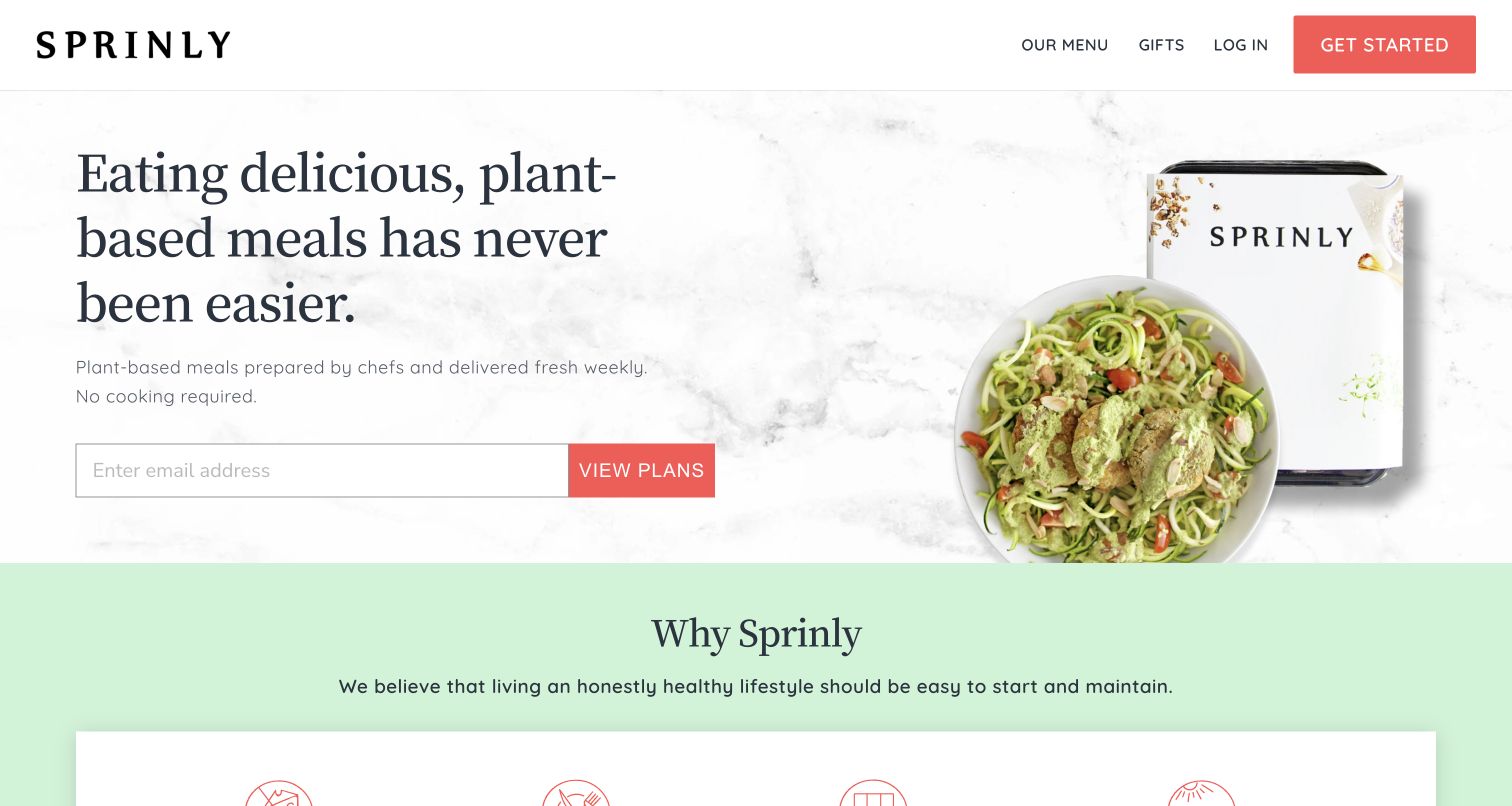
Sprinly presents a large statement about plant-based meals beside a dish and a branded tray, using a light marble background and a coral action. The supporting copy makes the weekly delivery and no-cooking format explicit. An email field appears in the main plan-entry area, while Our Menu remains available in the header. The following section expands the proposition through short benefits and a step-by-step process. The page is focused, but the early email request makes the separate menu route especially important for visitors who are still evaluating the service.
What you can learn
Use the opening to establish food category, delivery rhythm and preparation effort in plain terms. If contact information is requested early, give undecided visitors a clear way to inspect the menu and plans before they provide it.
Pros
The dish and branded tray connect the finished meal to its delivered format.
Weekly delivery and no-cooking requirements are stated directly rather than left to inference from photography.
Cons & considerations
An email field in the primary plan route may add friction for comparison-stage visitors.
A narrow plant-based proposition still needs explicit allergen and ingredient details for individual meals.
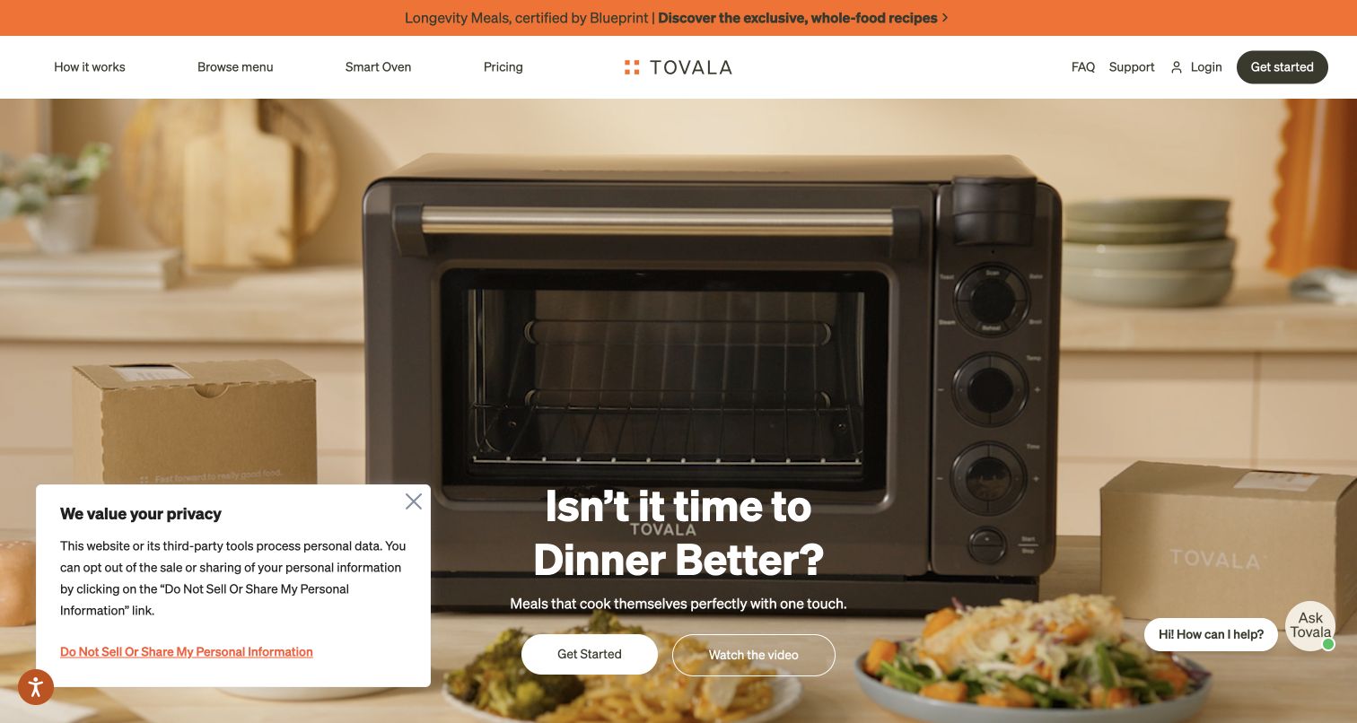
Tovala makes its smart oven the central object in the hero, with a meal and delivery boxes around it. The headline and two actions sit across the lower portion of the video. Navigation includes Smart Oven and Pricing alongside the menu and process routes. The page then explains delivery, brief preparation, scanning and cooking in four numbered steps. That sequence is particularly useful here because the customer's decision includes both a recurring food service and an appliance workflow, rather than only choosing dishes to reheat.
What you can learn
When equipment is part of the service, show it immediately and explain the complete workflow. Separate the device purchase, meal pricing and ongoing order controls so customers understand what they need and which commitments continue after the first delivery.
Pros
The large oven image makes the appliance's role difficult to miss.
Numbered steps turn a potentially unfamiliar scan-and-cook process into a comprehensible sequence.
Cons & considerations
A video-led opening needs a stable readable state for visitors who pause motion or use reduced-motion settings.
The combined appliance and food proposition requires more pricing explanation than a conventional prepared-meal service.
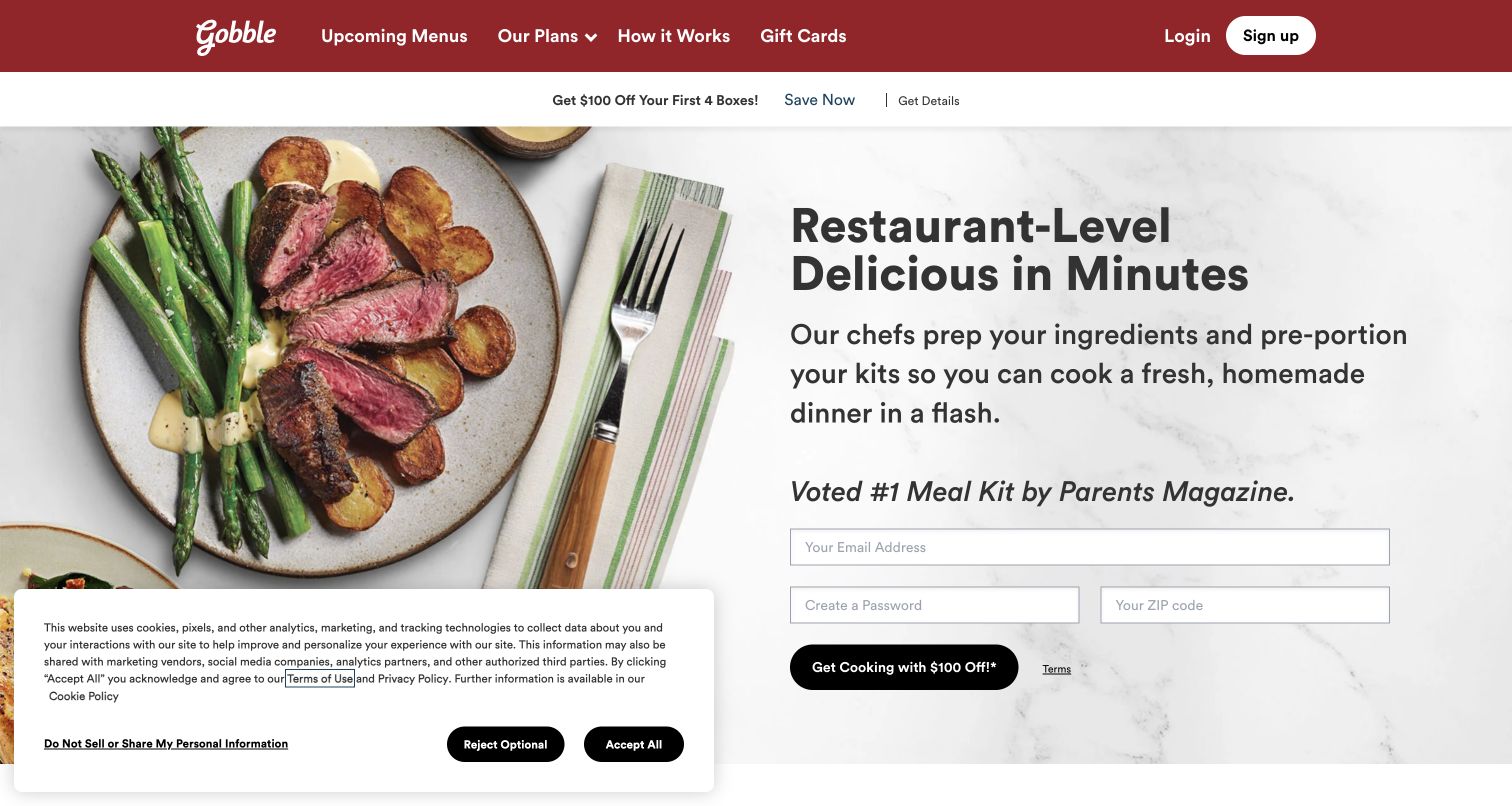
Gobble shows a plated steak dinner beside a direct explanation that its chefs prepare and portion the ingredients before delivery. The opening contains email, password and ZIP-code fields, making registration part of the hero rather than a later step. Navigation still provides upcoming menus and an explanation of the process. Below, Classic, Lean & Clean and Vegetarian plans divide the offer. The valuable distinction is the description of work already completed by the service; the customer still cooks, so the page must make that boundary understandable.
What you can learn
Describe exactly which cooking tasks the service removes and which remain. Let visitors inspect recipes before they create an account, and keep time estimates connected to the actual preparation steps rather than using speed as an unexplained slogan.
Pros
The introductory copy explains prepped ingredients in concrete terms, distinguishing the offer from ready-made meals.
Upcoming menus provide a direct route for shoppers who want to evaluate dishes before registration.
Cons & considerations
Placing password creation in the hero asks for a substantial commitment before detailed comparison.
Different plan labels need consistent preparation, serving and price information to support a fair side-by-side choice.
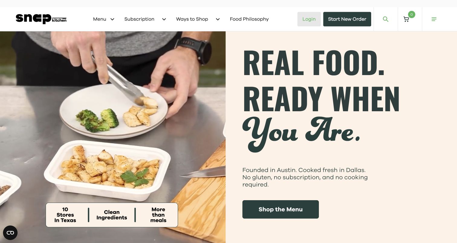
Snap Kitchen pairs footage of a meal being plated with oversized typography and a concise statement about its Texas origins and prepared-food format. A dark menu button sits below the explanation, while the header separates Subscription, Ways to Shop and Food Philosophy. A small panel overlays the preparation footage with store and ingredient messages. The page connects the food to a visible process and local presence, but the blend of stores, delivery and subscription options needs clear follow-through so visitors understand which shopping route applies to them.
What you can learn
If a food business supports several fulfillment methods, organize them as explicit choices. Show the preparation process to make the product tangible, then clarify location coverage, pickup, shipping and optional repeat orders before the customer starts selecting meals.
Pros
Preparation footage demonstrates the food's physical format rather than relying only on a finished lifestyle scene.
Ways to Shop and Subscription are separate navigation routes, acknowledging different purchase preferences.
Cons & considerations
A location-focused message can leave national-delivery visitors uncertain until coverage is explained.
Ingredient claims on a short overlay need a fuller source and meal-level detail elsewhere in the purchase path.
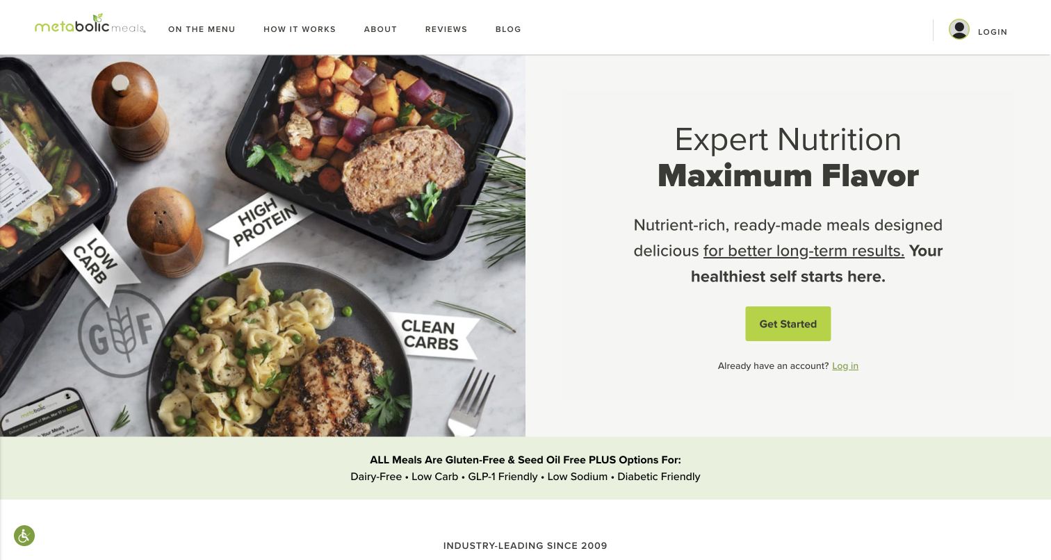
Metabolic Meals places ready-meal trays beside plated dishes, with small visual labels emphasizing different food attributes. The right side carries a concise nutrition-and-flavor message, a green Get Started button and a returning-customer login link. The header keeps the menu and service explanation visible. A pale strip below lists several dietary options. The combination shows both the delivered and served formats, which helps close the gap between a polished food photograph and the practical product a customer will store and heat.
What you can learn
Show packaging and serving presentation together when customers need to understand the prepared-meal format. Treat dietary categories as discovery aids, then supply ingredients, portions and preparation instructions on each dish rather than letting the category label do all the work.
Pros
Trays and plates in the same photograph connect the delivery format with the finished eating experience.
The menu route remains prominent for visitors who want to compare food before beginning a plan.
Cons & considerations
Several dietary labels in one strip can appear more definitive than the individual meal information supports.
Broad language about long-term results should not replace specific, checkable descriptions of the meals.
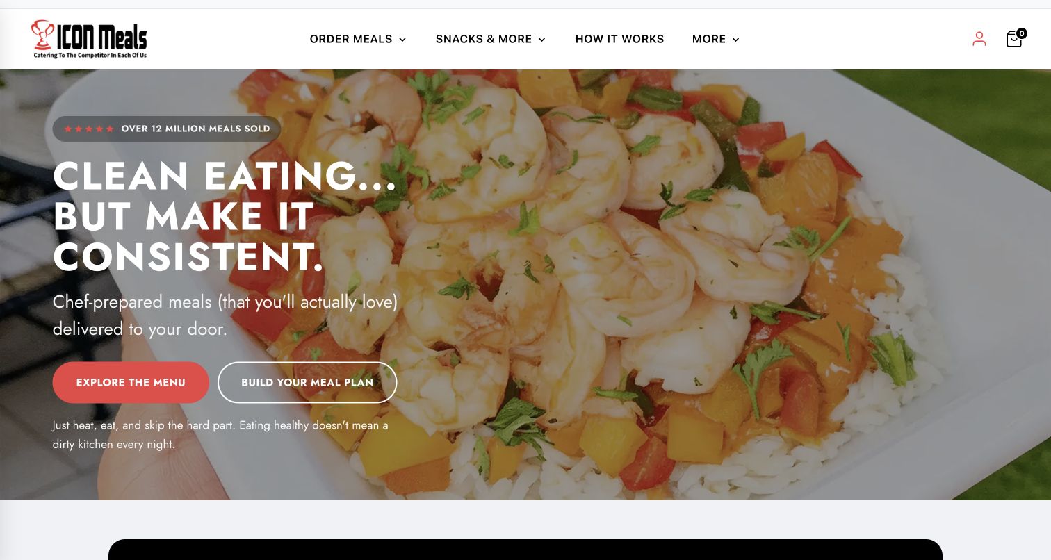
ICON Meals overlays a large close-up food photograph with a short consistency-focused message. A filled red button opens the menu, while an outlined action offers plan building. The supporting sentence clarifies the heat-and-eat format. Lower content addresses different audiences and links one group toward custom meals. This creates two distinct entry modes: inspect what is available or begin constructing a routine. The structure is useful when the business serves both occasional orders and shoppers who repeatedly organize meals around specific preferences.
What you can learn
Separate browsing from plan construction when both are legitimate customer tasks. Keep customization options understandable and explain what changes when someone selects a plan, including quantities, recurring delivery and the ability to edit future choices.
Pros
The two hero actions use clear verbs that distinguish exploring meals from building a plan.
The preparation sentence makes the ready-made format understandable without a separate process diagram.
Cons & considerations
Large white text over a detailed meal photograph needs contrast checks across every responsive crop.
Audience labels may overlap, so ingredient and meal-format filters remain necessary for precise discovery.
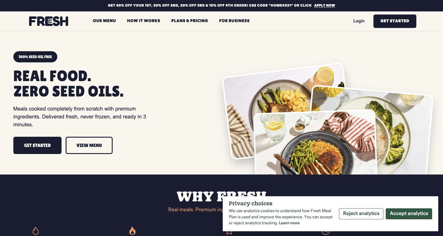
Fresh Meal Plan uses a cream background, dark typography and a staggered collage of plated meals. The hero leads with an ingredient-standard claim, then states that meals arrive fresh and require brief heating. Two actions offer getting started or viewing the menu, and the header exposes Plans & Pricing explicitly. Lower sections organize meal preferences and explain the process. The design is compact and concrete, although the strong standard-led headline should be supported by specific ingredient information rather than treated as a substitute for it.
What you can learn
Pair a distinctive product standard with practical ordering facts and a public menu. Explain the standard consistently at meal level, and let customers compare quantities and prices before deciding whether the service belongs in their weekly routine.
Pros
Plans & Pricing is named directly in the header, reducing ambiguity about where cost information lives.
The filled and outlined actions preserve both a direct ordering route and a lower-commitment menu preview.
Cons & considerations
A sweeping ingredient claim needs verification across sauces, add-ons and changing recipes.
The tiered promotional strip introduces several discounts that may require careful explanation as orders progress.
Build a meal record that can survive weekly changes
Define fields for dish identity, photographs, ingredients, applicable allergen information, portion basis, preparation instructions, availability, and category criteria. Assign owners for review and updates. Preserve the relationship between the record a customer selected and the confirmed order, especially when a menu changes or a substitution becomes necessary.
Map the customer calendar
Document menu publication, selection deadlines, payment events, preparation, dispatch, and delivery as the business actually operates them. Use those events to write interface messages. Test a first order, a returning customer, an edited box, a skipped week, and a late change request so the interface can explain exactly what remains possible.
Separate preference questions from commitments
Use a quiz only when its answers improve a meaningful choice. Explain whether each answer filters the menu, changes a recommendation, or affects the plan. Keep a route to inspect meals and plan details, and make the point of enrollment clear. A completed quiz should not leave the customer uncertain about whether an order exists.
Design the exceptions before launch
Plan unavailable dishes, unsupported addresses, missed selection deadlines, delivery problems, and failed payments with the responsible operational teams. Preserve the customer’s selected meals and address where appropriate. Give an authoritative order state and support route instead of a generic success message or a retry that could produce a duplicate order.
The editing job behind the design
Choose ordering tools that stay connected to menu and fulfillment
Treat the menu catalog, subscription or order system, delivery eligibility, and customer account as connected responsibilities. Evaluate the platform with actual weekly changes and region-specific availability rather than a static sample menu. The product record shown before checkout should match the confirmed order, and customer edits should reach the system that controls fulfillment. Define what the interface displays when those systems disagree or an update is delayed.
Keep marketing campaigns separate from the authoritative meal facts, order deadlines, and account state. Editors should be able to change a homepage without altering the meaning of a customer’s plan. Add recommendations, quizzes, chat, and analytics only when they have a clear purpose and maintenance owner. Public-page stack observations do not establish the service’s complete fulfillment backend or prove that an account action has completed.
Our WordPress website examples offer a separate look at publishing approaches. A visible platform label is evidence for that named page, not a guarantee that the same system will suit your requirements.
Before the public launch
Meal delivery website launch checklist
Explain the delivered format, required preparation, equipment, and portion basis.
Keep meal photos, ingredients, applicable allergen information, and preparation details connected to the correct meal record.
Define the meaning and source of dietary, preference, and nutrition labels.
Show the relevant menu date, delivery region, and item availability.
Test supported and unsupported addresses without losing the visitor’s context.
Distinguish introductory offers from the ordinary plan price and delivery terms.
Make order frequency, change deadlines, and available account controls understandable before enrollment.
Confirm which order or plan is affected by an edit, skip, pause, or cancellation.
Test unavailable meals, substitutions, failed payments, and uncertain confirmations with authorized test data.
Review menus, plan selectors, quantity controls, forms, and account actions on phones and with keyboard navigation.
Assign owners for meal data, category claims, delivery information, customer support, and recurring-order behavior.
These checks are a project checklist, not a performance, legal, security, or accessibility certification. Test real journeys with the people responsible for the website before making claims about the result.
Sources & editorial method
How this collection was selected and reviewed
The collection uses twenty-eight distinct official meal-delivery properties captured on November 4, 2026, preserving source URLs, actual capture dates, dimensions, and attribution. Reviews examine the visible public pages, including meal presentation, navigation, plan entrances, and delivery explanations. No orders, subscriptions, account changes, or meal trials were performed. The collection does not verify nutrition or health outcomes, promotional savings, delivery performance, or individual dietary suitability; technical claims require separate evidence.
Each example links to its actual source page. Screenshots are direct browser captures with their own capture dates; moving imagery, announcements and live designs can change. The notes describe observable design choices and conditional tradeoffs, not measured traffic, conversion results, service quality, or accessibility conformance.
Technology labels use public page metadata, asset evidence, or explicitly cited platform documentation. Platform documentation is not a complete current deployment audit. A component reference may be legacy or unused; it is not a complete backend inventory. Unknown stacks are omitted. These sites are editorial examples, not our client portfolio.
Written, Edited and Curated are separate editorial records, not timestamps advanced by a rebuild. Website designs and imagery belong to their owners. See our editorial standards or suggest a correction.
Questions worth asking
Meal Delivery Services website design questions
What should a meal-delivery homepage explain first?
Make the service format and ordinary next step clear. Show whether the customer will cook ingredients, reheat a prepared meal, use a particular appliance, or receive another format. Then connect representative dishes with menu browsing, delivery availability, and plan details.
Should visitors see a menu before creating an account?
Provide enough current, representative information for a useful decision. If availability depends on delivery location, explain the postcode check and use its result to show the relevant menu. Avoid presenting a generic dish selection as a promise that every item is available to every visitor.
How should a site describe dietary preferences?
Define what each label means and keep the applicable ingredient and product information easy to inspect. Explain what a preference filter changes. Do not turn a broad category into a promise of individual suitability or an unsupported health outcome; route detailed questions to the service’s published information and appropriate support.
What makes subscription controls understandable?
Show the current plan, next order, relevant deadline, and consequence of each available action. Distinguish editing a box from skipping an order or ending a plan. After a change, provide a confirmation that identifies what changed and whether any already-committed order remains.
Does every meal-delivery site need a personalization quiz?
No. A straightforward menu and clear filters may answer the customer’s questions. Use a quiz when its answers produce useful, explainable choices, keep the result editable, and make enrollment separate and explicit.
How should introductory offers be presented?
Place the offer alongside the ordinary price basis, applicable quantity, delivery details, and what happens afterward. Keep conditions readable near the relevant decision. The interface should help customers understand their actual order rather than requiring them to infer ongoing terms from a promotional headline.
Borrow a clear menu or plan-selection pattern, then connect it to accurate meal records, delivery context, and account controls that reflect the order the customer will actually receive.