A grocery homepage has to connect everyday shopping with local availability. Clear store context matters as much as an attractive seasonal campaign.
Someone checking tonight’s opening hours, someone planning a delivery order, and someone looking for a holiday meal arrive with different deadlines. A useful grocery website identifies those tasks before introducing its full range of departments, recipes and services. Store choice, fulfillment method and offer dates should remain understandable as the visitor moves between them.
Supermarkets also vary in their online operating model. Some sell a full basket, others hand ordering to a partner, and others mainly support an in-person trip. Compare references with that distinction in mind. A shopping list is not a reserved order, and a national promotional image does not establish stock at a particular branch.
Before the examples
What makes good grocery store website design in 2026?
Establish the shopper’s store context
Show which store or service area controls the information on the page. Explain when choosing a branch changes prices, stock, opening hours or fulfillment. Provide a clear way to revise that choice, and retain it consistently across the weekly ad, product information and ordering handoff. Never make a campaign look locally available before the required context is known.
Keep recurring shopping tasks easy to reach
Search, weekly offers, store details and the relevant ordering route need stable positions across campaigns. Separate groceries, prepared meals and catering when they have different lead times or checkout systems. A returning shopper should be able to reach the practical task without dismissing a succession of promotional overlays.
Give promotions a complete content record
Each offer needs a product, quantity or unit basis, dates, location scope and any eligibility conditions. Build those fields into the publishing process instead of baking every detail into artwork. Plan the expired state and unavailable-product destination before launch, especially for time-sensitive holiday ordering.
The collection · 22 examples
22 grocery store websites worth studying
Compare store-led supermarkets, specialist grocers, discount chains and food-focused retailers by how they support the next shopping task. Treat regional settings and capture dates as part of each example.
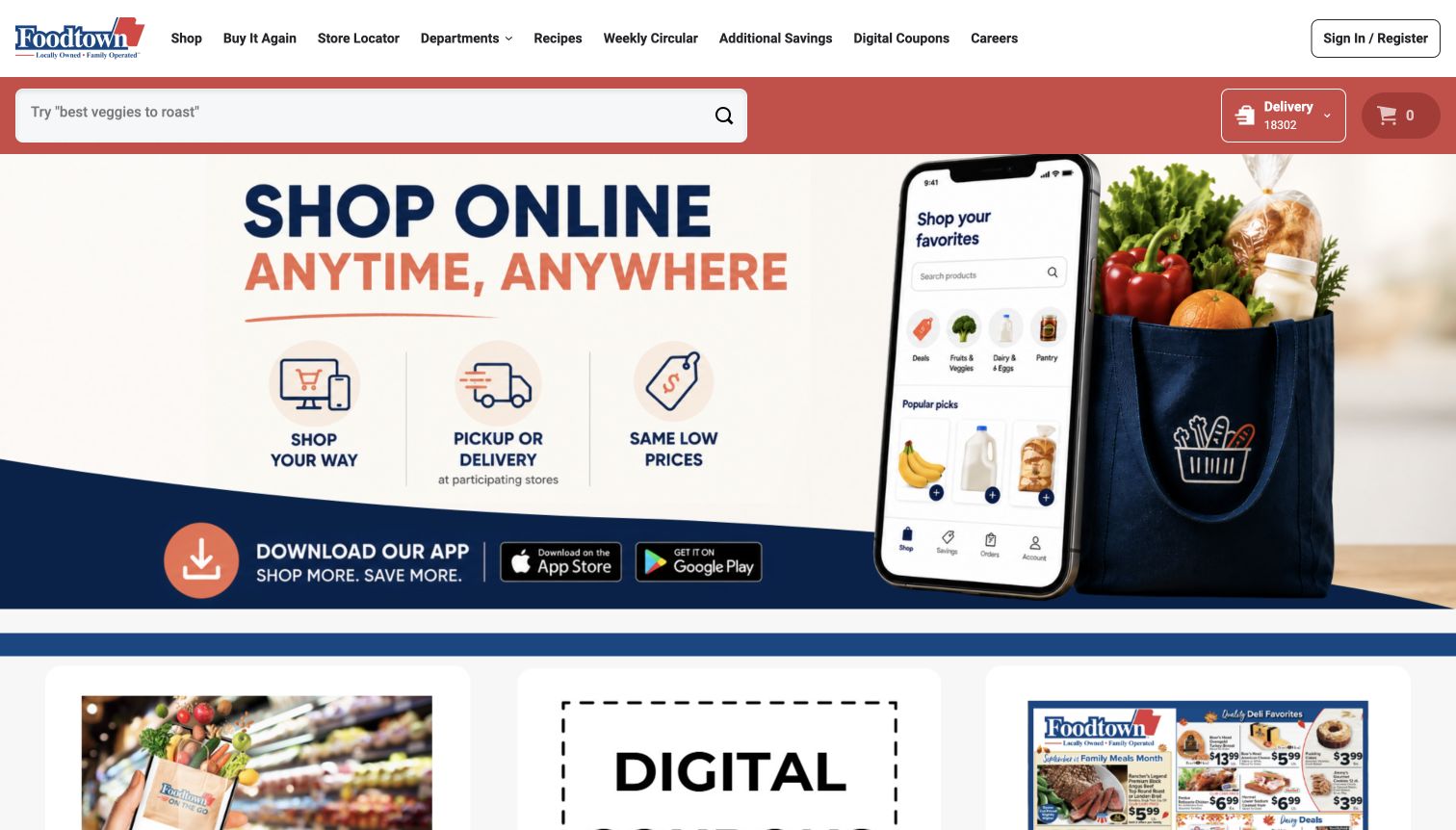
Foodtown’s homepage pairs a large phone illustration and grocery bag with three short explanations of online shopping benefits. The red search strip remains separate from the promotional artwork and includes delivery context and cart access. Above it, the navigation provides departments, recipes, the circular and coupons, while sign-in stays at the far right. Lower cards continue into familiar savings and meal-planning tasks. The page makes its digital-shopping offer clear, but the hero is predominantly embedded artwork with several messages and app badges competing for attention. This Foodtown serves New Jersey, New York and Pennsylvania; it is distinct from the Houston Food Town example in this collection.
What you can learn
Explain a new shopping channel with concrete tasks, then let persistent search and fulfillment controls carry the actual workflow. Ensure important artwork text has an accessible equivalent and clarify which stores support pickup or delivery.
Pros
Search and delivery context stay visible above the large introductory graphic.
The navigation includes direct circular and coupon destinations.
Cons & considerations
Several benefits and app badges compete inside one dense hero image.
Pickup and delivery availability still require store-specific confirmation.
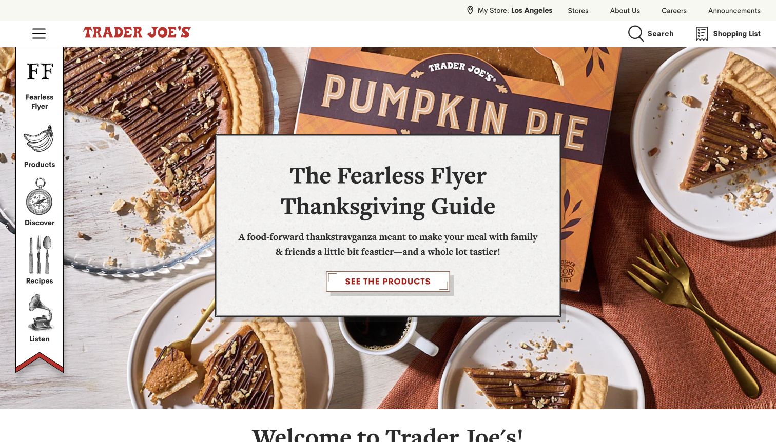
Trader Joe’s places a textured white message card over a large pumpkin-pie photograph, using serif typography and a restrained red action to introduce its Thanksgiving guide. The unusual vertical navigation rail uses illustrated icons for the flyer, products, discovery, recipes and podcast. Search and the shopping list remain in a slim horizontal header, with store context above. The result feels like a food publication with practical shopping tools attached. It makes seasonal discovery inviting, but a visitor looking for a conventional checkout is not shown one in the first screen. The image and review describe the captured guide rather than current product availability.
What you can learn
Let editorial personality support recognizable tasks. Keep search, store information and list-building predictable, and explain the difference between collecting shopping ideas and placing an order. Illustrated navigation still needs clear text labels.
Pros
The solid central card protects text from the detailed food photograph.
Distinctive illustrated links remain paired with readable destination names.
Cons & considerations
The vertical rail takes space from the hero and needs a different compact-screen treatment.
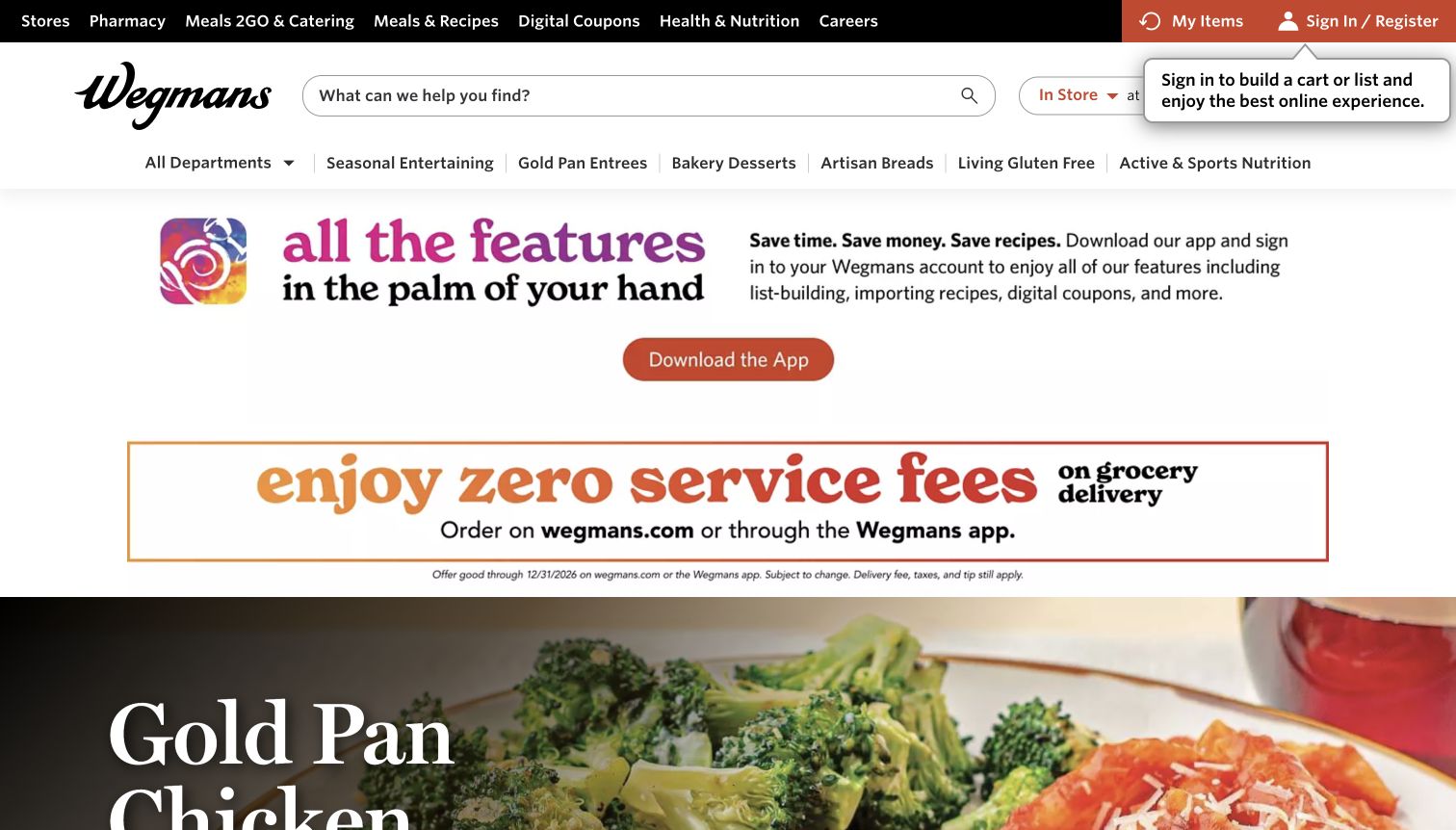
Wegmans gives its search field a wide central position and places shopping mode, store context and list access nearby. The upper utility row separates pharmacy, catering, recipes and coupons. In the captured page, an app promotion and a delivery-fee message occupy most of the space above the featured meal photograph. Product cards further down include pack sizes, prices, unit prices and list controls. This is a task-rich structure, but the promotional bands delay the food itself. A sign-in tooltip also overlaps the shopping context in the first screen. The review does not test ordering or establish that the displayed prices apply to another branch.
What you can learn
Keep persistent shopping controls prominent while limiting how much vertical space service campaigns consume. Price and unit information belong in real product fields, and sign-in prompts should not obscure the store or fulfillment state.
Pros
The wide search field is immediately available for known-product shopping.
Product records expose both package prices and unit comparisons.
Cons & considerations
App and delivery promotions push the meal campaign below most of the first viewport.
The sign-in tooltip competes with store-context controls.
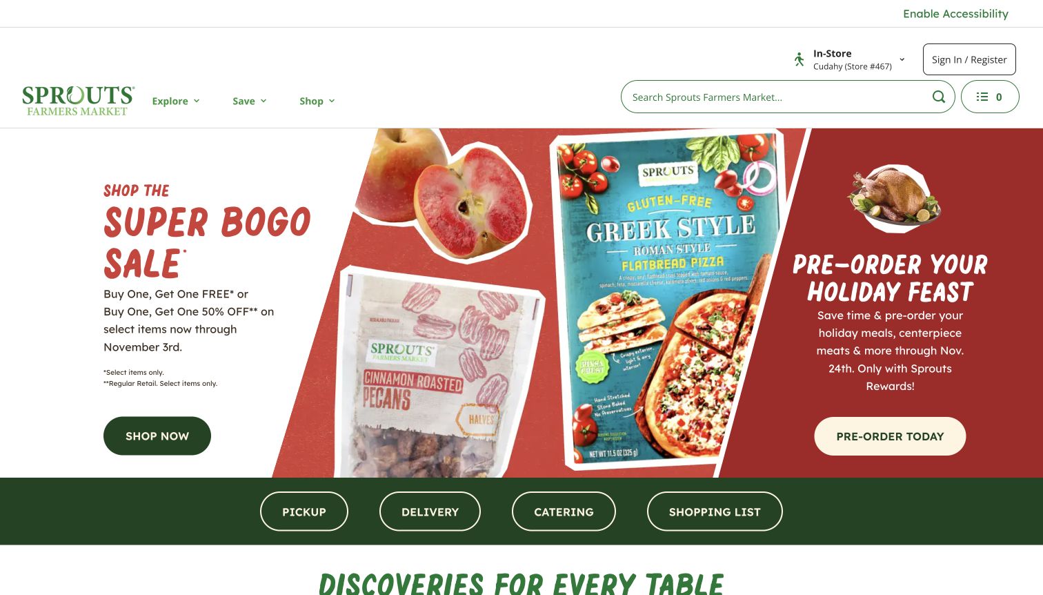
Sprouts divides the hero into a sale message, product packaging and a holiday-preorder panel. The visual uses warm red artwork with green and cream action buttons, while the header retains search and an in-store context. A dark green strip immediately below offers pickup, delivery, catering and a shopping list as four separate actions. This is particularly useful because those tasks can involve different lead times and expectations. Dates and membership qualifications appear in the campaign copy rather than being left entirely to a later page. The density of adjacent promotions nevertheless demands careful scanning, and the smallest qualifications are much less prominent than the offer headline.
What you can learn
Name the shopping mode before sending visitors into an order flow. Give each promotion an explicit date and eligibility record, then test that the small conditions remain readable alongside the large visual promise.
Pros
The four shopping-mode buttons communicate distinct operational journeys.
Sale and preorder panels include visible timing information.
Cons & considerations
Two competing campaigns divide attention within the same hero.
Small eligibility text is visually subordinate to the large discount wording.
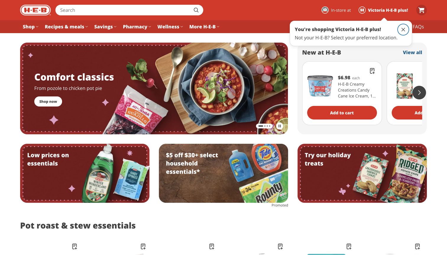
H-E-B combines a broad meal campaign with a narrower new-products carousel in the same row. In the captured state, a pozole photograph and a comfort-food message sit beside an ice-cream card with a price and Add to cart button. Smaller promotional tiles below mix household offers and seasonal food. The red header gives search a familiar position and keeps the selected store visible. A store-confirmation tooltip makes the local context explicit, although it overlaps nearby navigation. The page moves quickly from inspiration to products rather than reserving the first screen for one full-width photograph. The review does not verify inventory, checkout or local pricing.
What you can learn
Use different card sizes to distinguish broad meal inspiration from a specific purchasable item. Keep sponsored promotions labeled, and make store confirmation helpful without allowing it to cover essential controls.
Pros
Product price and cart action appear near the opening campaign.
The selected store is visible beside the shopping mode.
Cons & considerations
Several offer tiles create a busy hierarchy for a first-time visitor.
The store-confirmation tooltip overlaps header content in the captured state.
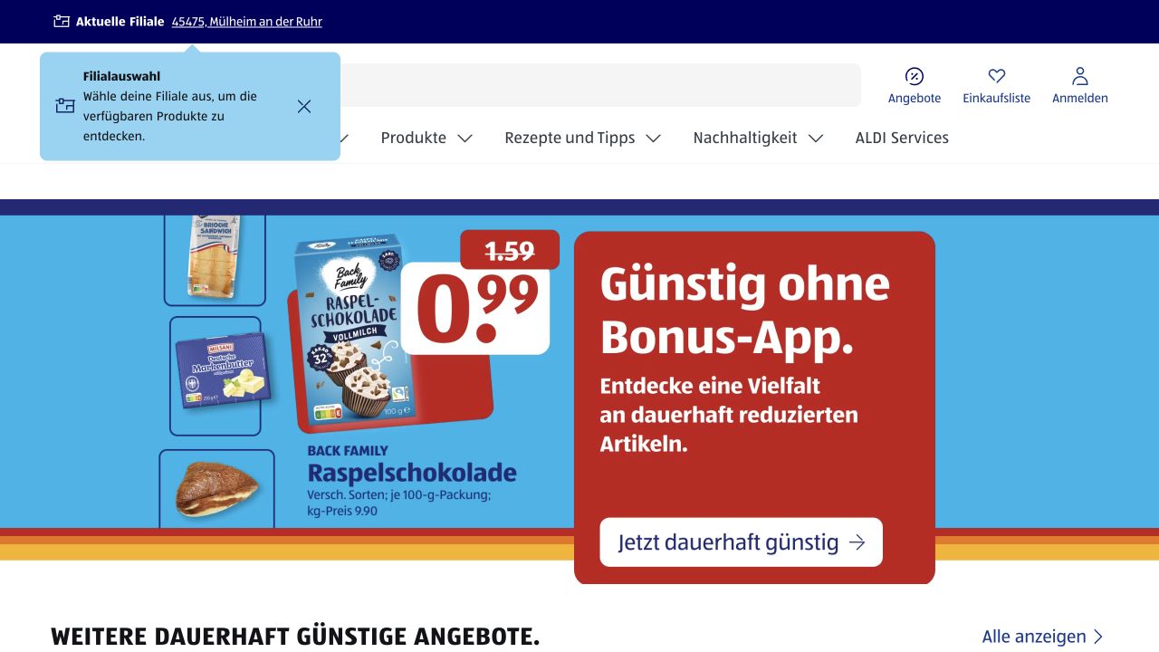
ALDI SÜD gives the promotional price most of the visual emphasis, using a large red offer panel and a product photograph against a blue field. Above it, the header keeps search, offers and the shopping list accessible. A selected-store strip and a pale store-selection notice introduce the local context that grocery shopping requires. The capture therefore shows two related layers: a highly visible national value proposition and the quieter task of identifying the relevant branch. The prominent chocolate price is easy to spot, while its unit detail and previous price require closer reading. This is a review of the captured page, not a check of local inventory or current offer availability.
What you can learn
Keep store context visible around seasonal price artwork, then give the campaign a clear destination. Treat quantities, unit prices and dates as readable content rather than expecting a shopper to extract every condition from the largest number. A store-selection notice should help establish context without masking the navigation people need next.
Pros
Search and shopping-list controls remain separate from the changing hero promotion.
The price, product image and campaign action form an immediately recognizable shopping message.
Cons & considerations
The location notice occupies header space and competes with nearby controls in this captured state.
Small price qualifications are substantially less prominent than the main discount figure.
Public source checked November 3, 2026. References may be embedded or legacy—not a complete backend inventory.
Platform source: Official Nuxt showcase. Nuxt's own showcase links this named ALDI SÜD Germany property. The association applies to this public experience, not its product runtime, payment systems, or every website owned by the organization. Platform evidence is separate from the direct website screenshot and is not a complete current infrastructure audit.
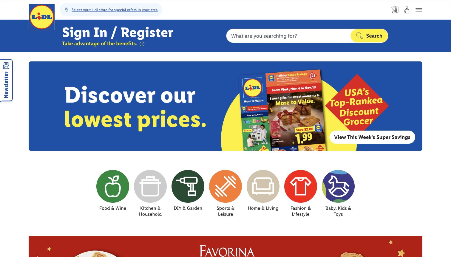
Lidl US uses its blue-and-yellow palette to make the weekly savings message unmistakable. A wide banner shows the current flyer and a direct action to view offers, while large circular category icons introduce food, household goods, garden items and other merchandise. Search is prominent in the blue header, and store selection appears in a smaller strip above it. The lower page distinguishes current-week offers from upcoming ones. This supports planning around changing stock and dates, although the large sign-in invitation competes with the public savings content. The flyer artwork carries details that are much smaller than its headline, so visitors still need a readable offer destination.
What you can learn
When weekly turnover defines the shopping experience, make current and upcoming periods explicit. Treat flyer artwork as an invitation to structured offer information, and keep location selection understandable before showing locally dependent prices.
Pros
Large labeled icons make the breadth of merchandise easy to recognize.
Current and upcoming offer tabs establish a useful time distinction.
Cons & considerations
The sign-in invitation occupies substantial header space before the offers.
Fine details inside flyer artwork require a clearer follow-on view.
Visible tech stack
Referenced on the public page
OneTrust
Public source checked November 3, 2026. References may be embedded or legacy—not a complete backend inventory.
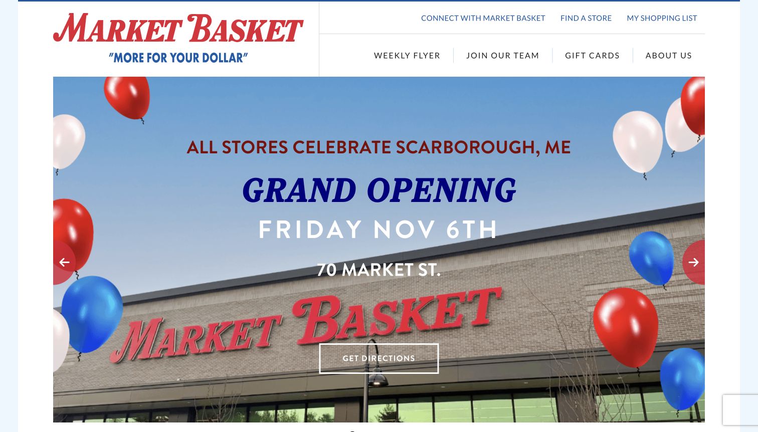
Market Basket’s captured hero announces a new store with a building photograph, balloons, a large opening date and a directions button. The header keeps the weekly flyer, store finder and shopping list separate from the changing carousel. Below the hero, the page identifies the flyer’s date range and offers both digital and classic versions. That combination gives a local event an appropriate place without making it the only useful destination. The oversized announcement fills most of the viewport, however, so routine weekly shopping information starts further down. The capture records the announced opening campaign; it does not independently establish the store’s operating status.
What you can learn
Use event campaigns with explicit dates and practical directions, then maintain stable routes for repeat shoppers. Offer alternate flyer formats when useful, but make their dates and purposes clear so customers do not mistake an old document for the current week.
Pros
The announcement pairs a specific date and address with a directions action.
Digital and classic flyer routes accommodate different browsing preferences.
Cons & considerations
The large local event takes precedence over the weekly-shopping task.
A carousel can hide other important announcements from the first captured view.
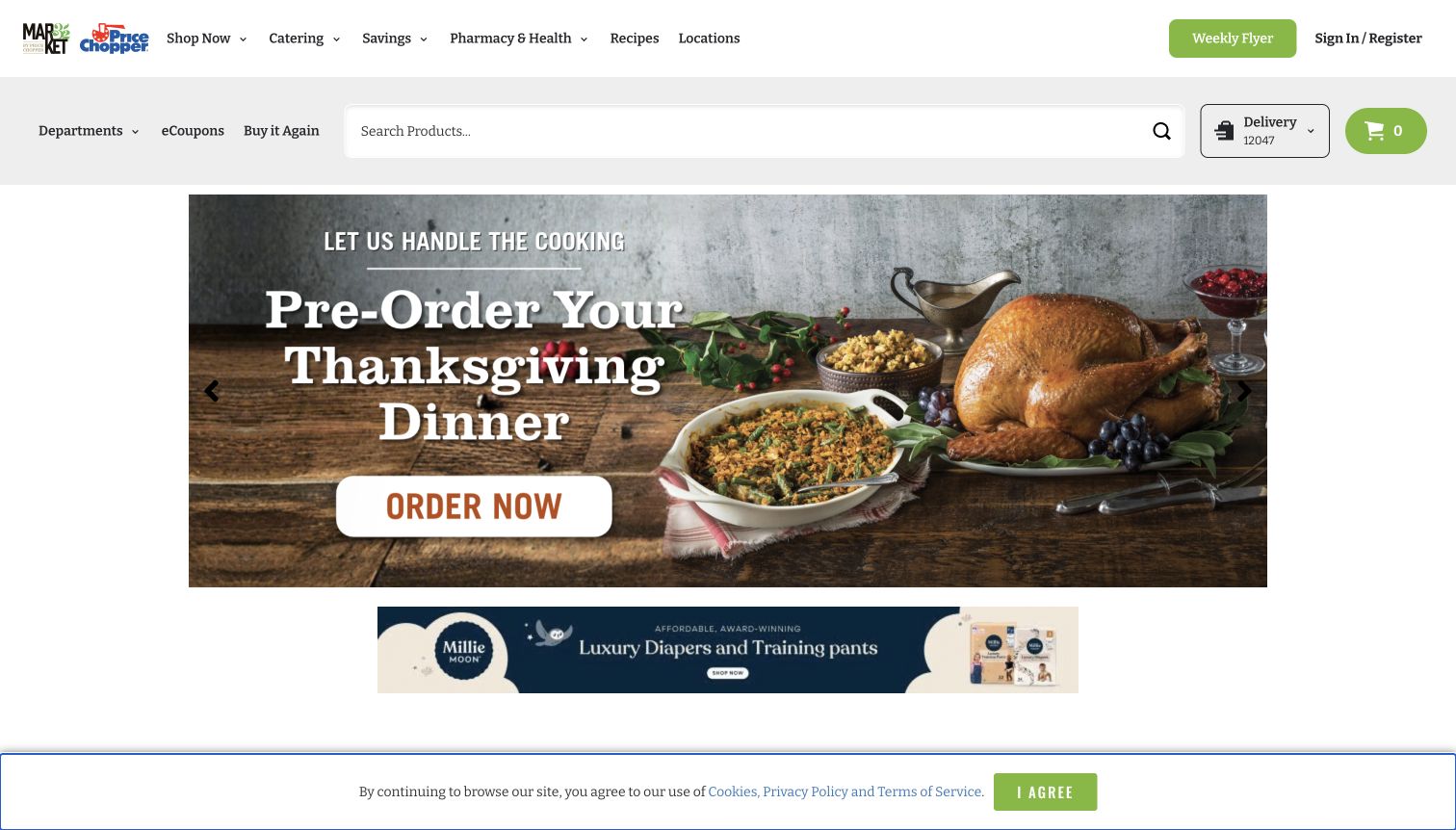
Market 32 and Price Chopper share a header that names shopping, catering, savings, pharmacy, recipes and locations. A second gray row provides departments, coupons, repeat purchases, a wide search field and delivery context. The central campaign then promotes a Thanksgiving dinner preorder with a large food photograph and an order action. The composition distinguishes a special meal occasion from the everyday search tools around it. A smaller advertising banner follows beneath. A slim legal notice remains at the bottom of the captured viewport without covering the meal campaign. The image does not provide meal portions, collection deadlines or proof that an order can be fulfilled at a particular store.
What you can learn
Place scheduled meal campaigns inside a stable grocery interface, but make their distinct deadlines and collection rules explicit at the destination. Keep small advertisements and notices subordinate to the primary shopping task.
Pros
The wide search field remains accessible outside the seasonal campaign.
The preorder wording signals a different expectation from immediate grocery stock.
Cons & considerations
Multiple header rows increase the space required before the food offer.
The first-screen meal message lacks portions and collection timing.
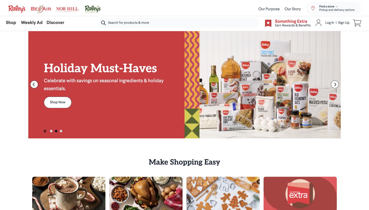
Raley’s presents several related store logos along the top, then places a large search field beside shopping, the weekly ad and discovery. The captured hero combines a red text panel with an arrangement of own-brand holiday ingredients. A simple shopping button leads from the seasonal message into the assortment, and visible pause and slide-position controls make the carousel manageable. Below, cards organize warm drinks, prepared dinners, baking and member offers. The range feels coherent because packaging and color carry through the campaign. The multiple brand marks and loyalty message also create a dense header, and a visitor still needs to establish which store and fulfillment options apply.
What you can learn
When several store brands share an experience, preserve their identity without obscuring local shopping context. Give seasonal collections clear category routes and keep loyalty offers distinct from the ordinary product catalog.
Pros
The campaign connects a seasonal task with identifiable product packaging.
Pause and slide controls remain visible beneath the message.
Cons & considerations
Several brand marks and the loyalty block make the header comparatively dense.
The hero does not establish local availability or fulfillment conditions.
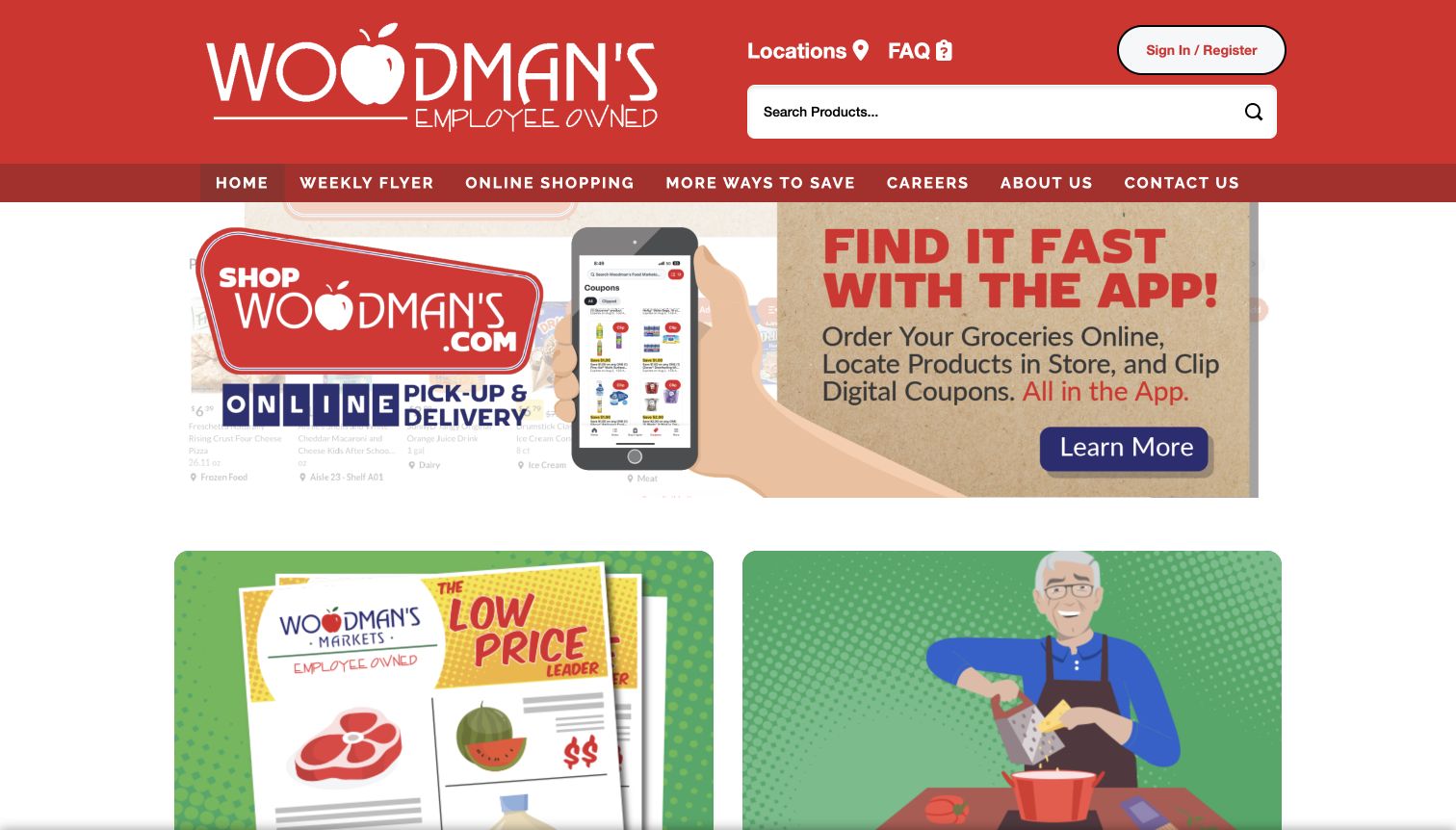
Woodman’s uses a strong red header with a large logo, product search, locations and account access. The captured slide promotes its app through a phone illustration and short explanations of online ordering, in-store product location and coupons. Below, large illustrated tiles lead to the weekly ad, recipes and other practical services. The design is direct and service-oriented, with the online-shopping destination also named in the navigation. The hero’s several lines of artwork text and phone-screen detail are harder to scan than the simple tile labels below it. The captured image shows a changing promotional area, so the persistent service navigation is the more reliable part of the experience.
What you can learn
Use a public grocery homepage to explain the purpose of a separate shopping service, then make the handoff explicit. Keep the key tasks available as ordinary text links and ensure promotional artwork does not carry the only explanation.
Pros
Locations and product search receive prominent positions in the header.
Large service tiles offer straightforward alternatives to the hero campaign.
Cons & considerations
The app artwork packs several tasks and small interface details into one image.
A changing campaign can make the first-screen service message inconsistent between visits.
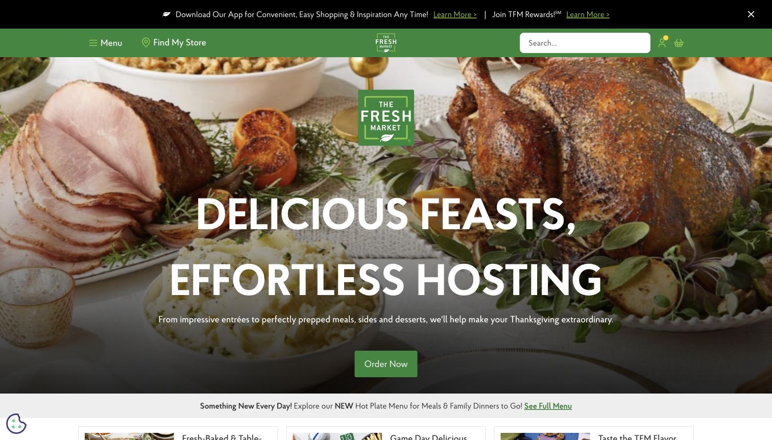
The Fresh Market fills the opening view with a prepared holiday table, a large white hosting message and one green order action. A compact green header contains the menu, store finder and search, while a black strip above promotes the app and rewards. The page then introduces hot meals, party platters, own-brand groceries and weekly features. Store selection is explicitly required to view local feature prices. The design is persuasive about the occasion and the relief of prepared food, but the first screen gives little detail about portions, deadlines or pickup. Those questions must be answered in the destination behind the order button.
What you can learn
Let occasion photography establish the meal context, then make ordering requirements concrete before checkout. Maintain a reliable store selector and distinguish prepared-meal orders from an ordinary grocery basket when their rules differ.
Pros
The single hero action gives the seasonal campaign a clear next step.
Weekly-feature copy acknowledges that prices depend on the selected store.
Cons & considerations
The large hosting message postpones portions and order deadlines.
App and rewards promotion add a second layer above the food campaign.
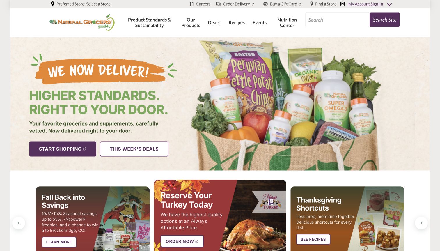
Natural Grocers introduces delivery with a grocery bag containing produce, pantry items and supplements. The left side uses a pale background, a short delivery message and two contrasting buttons for shopping and weekly deals. Above it, store context and delivery links occupy a utility row while products, recipes, events and nutrition content sit in the main navigation. Below, smaller promotional cards introduce turkey reservations and seasonal recipes. The layout makes the new service easy to find and shows the breadth of the assortment, but several educational and commercial destinations compete in the header. Product-standard claims remain the brand’s statements rather than findings of this design review.
What you can learn
When adding delivery to an established store site, explain the new route without displacing existing weekly offers or local information. Label external shopping handoffs and keep specialist educational content distinguishable from the transactional catalog.
Pros
Shopping and weekly deals have separate, plainly labeled hero buttons.
The utility row preserves store selection and the delivery route.
Cons & considerations
Long navigation labels increase the amount of scanning required in the header.
The delivery-led first screen does not yet explain service-area or order conditions.
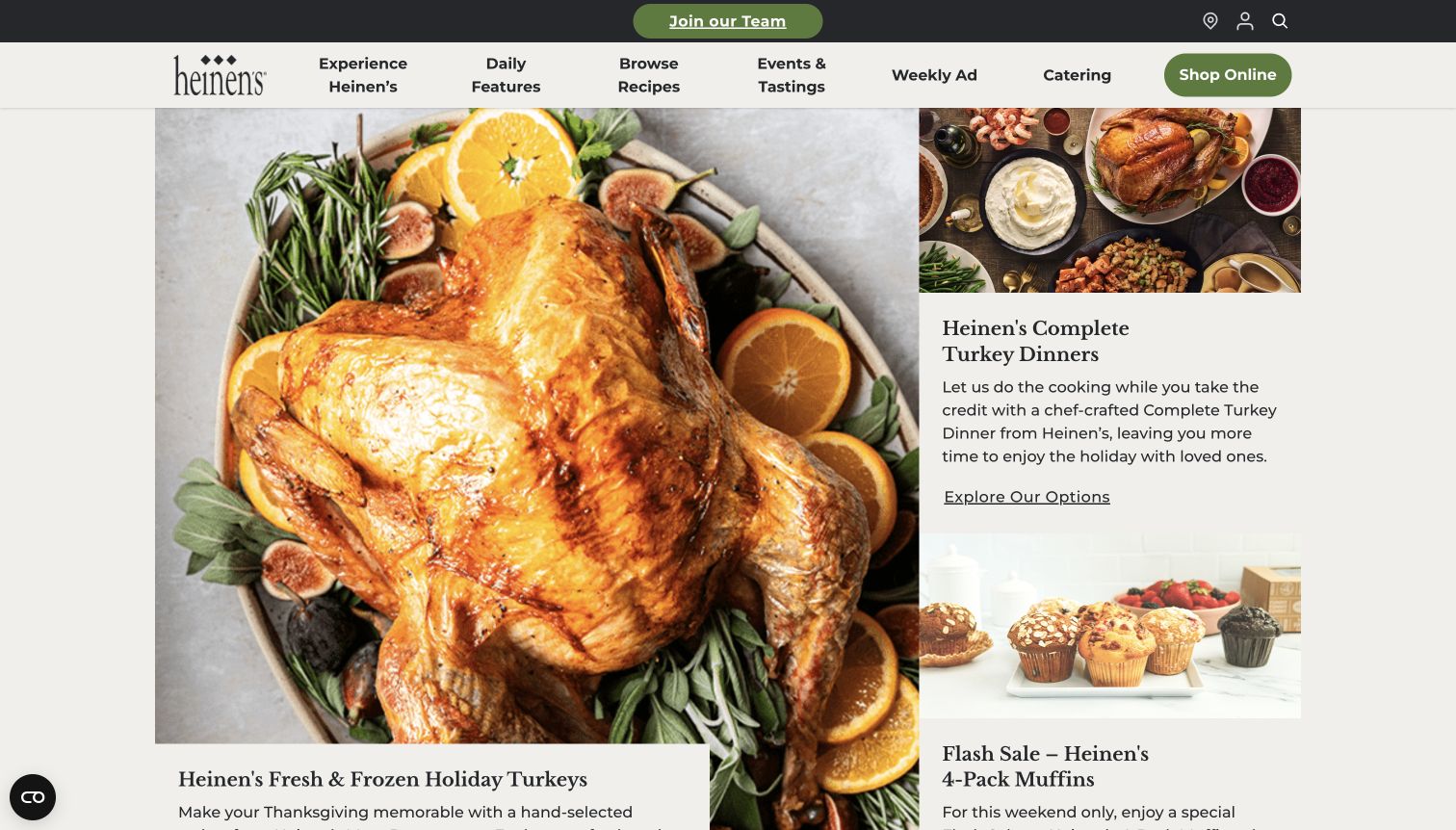
Heinen’s uses an asymmetric grid rather than a single full-width promotional slide. A large turkey photograph occupies the left, while smaller cards on the right introduce a complete dinner and a muffin offer. Serif headings and a restrained cream background make the layout feel editorial. The navigation names recipes, events, the weekly ad, catering and online shopping, so several practical routes remain visible. The distinction between buying a turkey and ordering a complete meal is useful, although the large image pushes the left card’s explanatory text to the bottom of the first viewport. Prices and ordering deadlines are not established by this opening composition.
What you can learn
Give related food offers separate cards when their preparation and ordering expectations differ. Balance image height with the text needed to explain the purchase, and make the destination clarify quantities, lead times and local availability.
Pros
Turkeys and complete dinners receive distinct editorial cards.
Recipes, catering and the weekly ad remain named navigation destinations.
Cons & considerations
The dominant photograph delays its own explanation until below the fold.
Similar exploration labels provide less buying-state detail than more specific actions could.
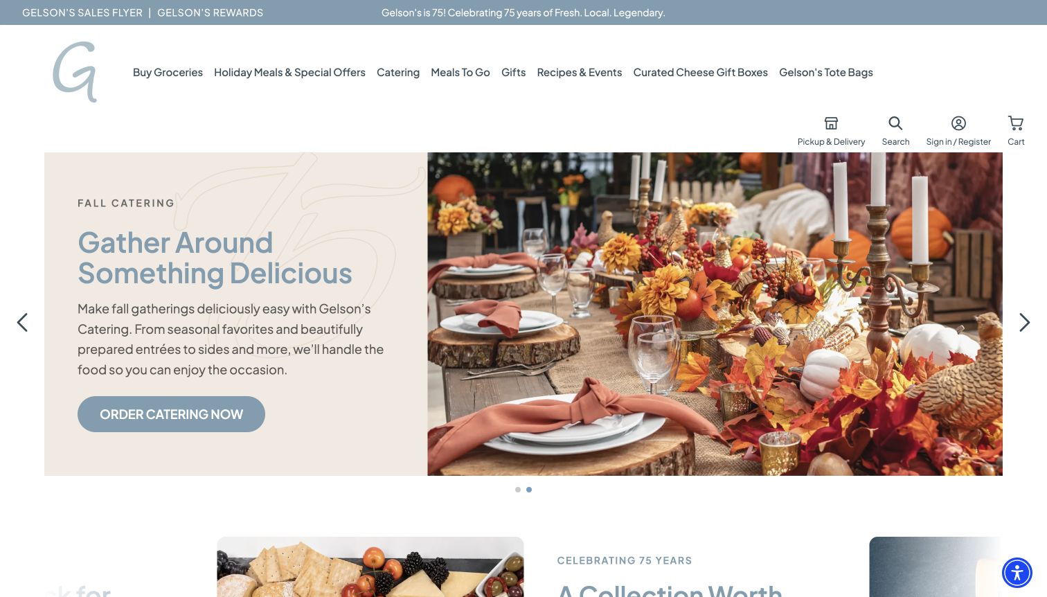
Gelson’s places a softly colored text panel beside a photograph of a decorated autumn table. The captured slide promotes catering with a dedicated order button, while the navigation separately names groceries, holiday meals, catering and meals to go. A smaller utility strip carries the sales flyer and rewards links. This arrangement respects the fact that a grocery basket and an event order are different tasks. The light blue and cream palette feels calm, but the large header and many long category names consume considerable space. Another visible campaign in the page content includes holiday pickup dates and an order deadline, details that should stay attached to the relevant offer.
What you can learn
Group services according to how customers actually order them, then give each campaign its own timing and fulfillment explanation. Keep broad premium imagery subordinate to clear distinctions between a normal shop, prepared food and a scheduled event order.
Pros
The header explicitly separates catering, groceries and prepared-meal routes.
The solid text panel gives the campaign a readable area beside photography.
Cons & considerations
The broad header postpones the hero and adds vertical overhead.
Long adjacent category labels make the navigation harder to scan quickly.
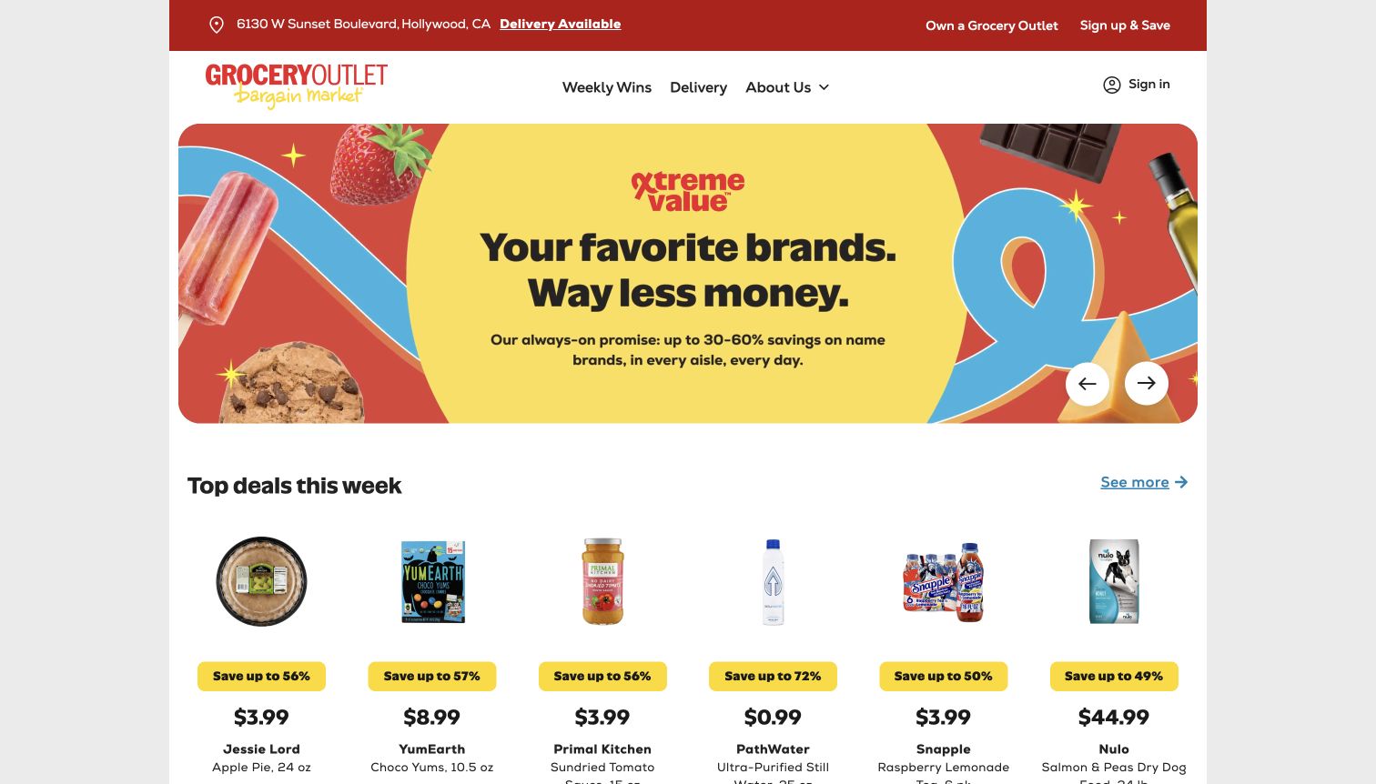
Grocery Outlet uses a yellow-centered promotional panel with bright product cutouts and a strong value message. A red utility strip identifies the selected store and delivery availability, while the main navigation stays relatively short. Immediately beneath the hero, a row of products shows prices and percentage-saving badges. That progression connects a broad price promise to concrete examples without requiring a visitor to navigate through a separate editorial story. The selected-store context matters because the assortment is not presented as universal. The hero’s comparison claim and the individual savings percentages are brand-provided figures; this review assesses their presentation rather than validating the underlying comparisons.
What you can learn
Place local context near price messaging and show product-level information soon after a broad value statement. Explain comparison bases and availability in the offer destination, and keep the route to delivery partners distinct from the in-store deal list.
Pros
The selected store and delivery state remain visible at the top.
Product prices appear directly beneath the opening value campaign.
Cons & considerations
Large savings badges can outweigh the smaller package and qualification details.
The broad comparison promise needs supporting context beyond the hero.
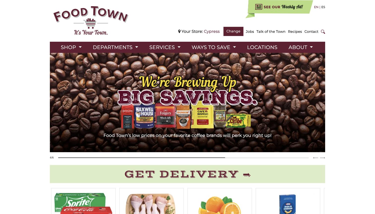
Houston’s Food Town uses a spacious logo header, a visible preferred-store control and English/Spanish links above a burgundy navigation bar. The captured hero promotes coffee savings through a dense product collage and large outlined lettering. A broad delivery strip follows, then product cards show package details and offer prices. The page records a validity range for those deals, which makes the weekly content more useful than an undated savings claim. The broad header and illustrated campaign take considerable space before the actual prices appear. This is the Houston-area Food Town business, separate from the Foodtown group serving the northeastern states.
What you can learn
Keep local-store context and language access easy to find, then connect promotional artwork to a dated, readable offer list. Explain delivery separately from in-store specials, especially when services differ by branch.
Pros
The preferred-store control and language links are visible in the header.
The deal list provides product quantities and a clear validity period.
Cons & considerations
The tall header delays the first concrete product offers.
The detailed coffee collage competes with its overlaid text.
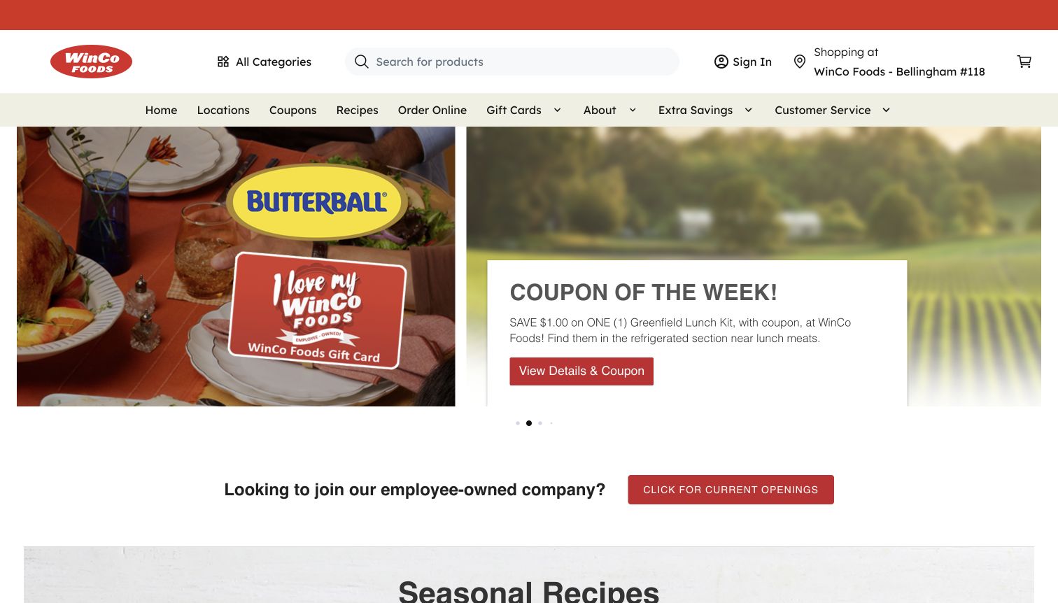
WinCo’s captured homepage combines a promotional image with a white coupon card over a soft photographic background. The card identifies a particular lunch-kit offer, states the saving and points to details. A prominent search field and selected-store control sit in the header, with locations, coupons, recipes and ordering in a separate navigation row. Below the campaign, a recruitment strip precedes seasonal recipes. The page consequently serves customers and job seekers within the same composition. Its coupon message is more specific than a generic discount slogan, but the adjacent promotional artwork and moving slide system make the opening hierarchy less settled than a static product grid.
What you can learn
Give a coupon enough detail to identify the product and the next verification step, then keep store context nearby. Separate recruitment and customer tasks visually, and ensure changing promotions retain a clear, accessible route to their conditions.
Pros
The coupon card names the product and the exact saving being promoted.
Search, store context and practical shopping destinations remain visible.
Cons & considerations
Adjacent promotions compete with the coupon for attention.
Recruitment content interrupts the progression from shopping offers to recipes.
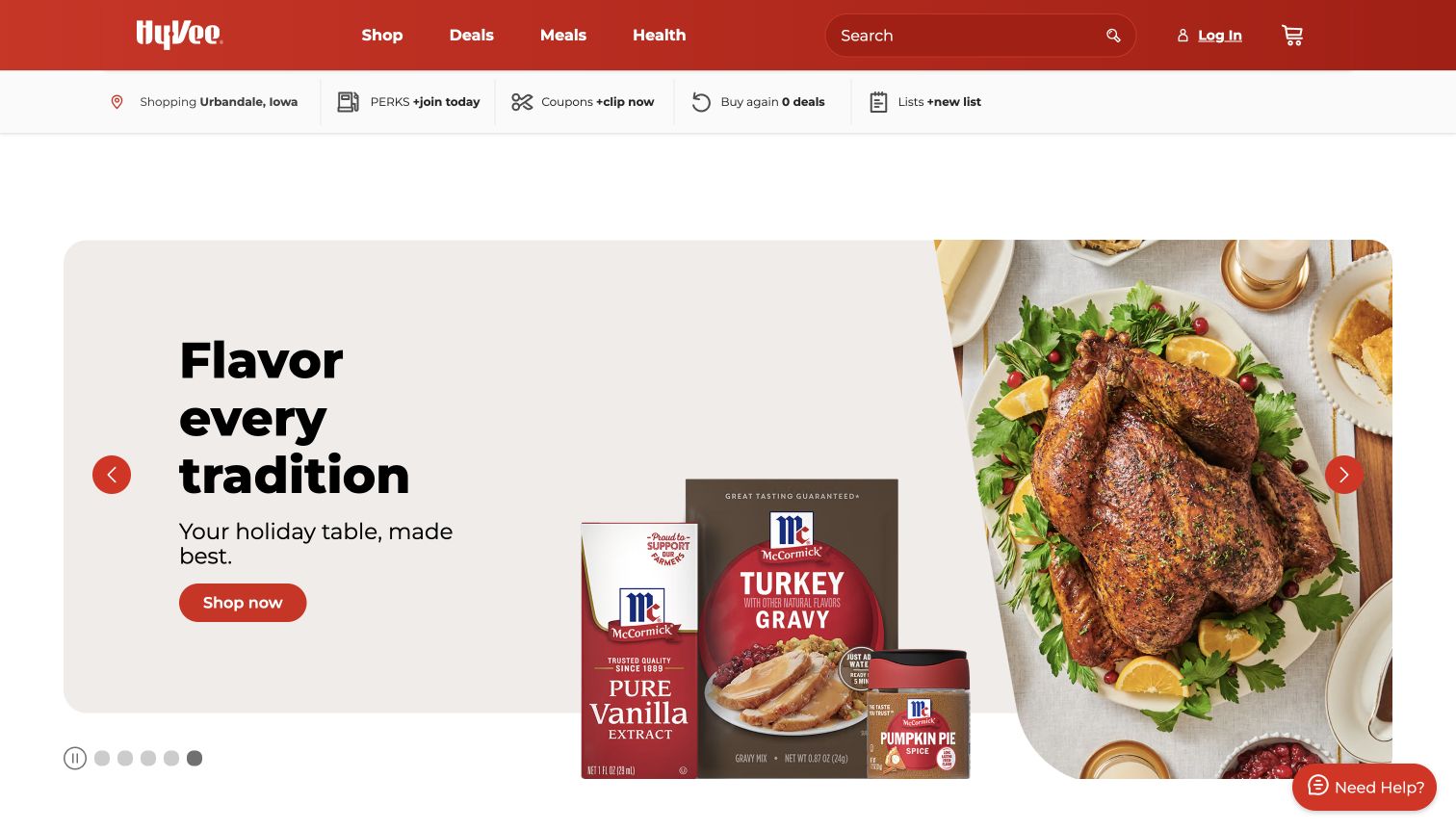
Hy-Vee reduces its main navigation to Shop, Deals, Meals and Health, with search and account controls on the same red bar. A second row holds the selected store, loyalty, coupons and lists. The captured hero promotes holiday cooking through a food photograph and identifiable packaged ingredients, with a plain Shop now action. Carousel controls include a pause button and position indicators. Below, the page organizes products through tabs such as deals and trending, with prices and login-to-add controls. The structure is straightforward, but a broad white gap above the hero and the large campaign image postpone the product grid in the first viewport.
What you can learn
Use a small number of task categories for a broad supermarket service, then expose store and loyalty context without overwhelming them. Give carousels visible controls and keep the route from a campaign to actual products clear.
Pros
Four short top-level labels make the main navigation easy to scan.
Pause and position controls are visible beneath the hero carousel.
Cons & considerations
Large spacing and campaign height delay the first product comparisons.
Repeated loyalty and account prompts add complexity for a visitor who is only browsing.
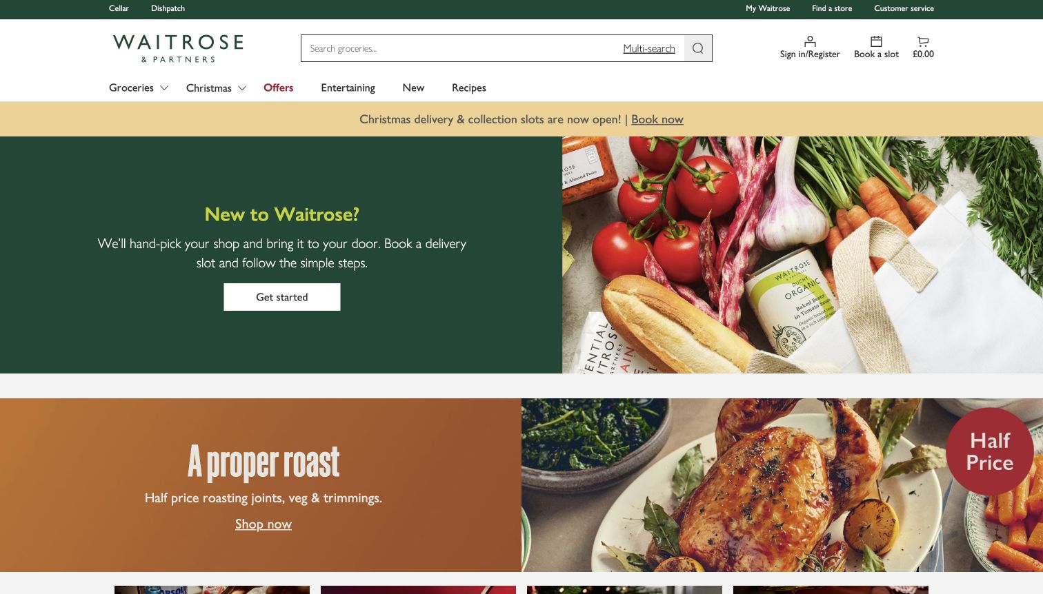
Waitrose gives search, multi-search, slot booking and the trolley stable positions in a clean white header. The first campaign uses a dark green text panel beside groceries and explains how a new customer begins delivery shopping. A yellow strip above highlights seasonal collection and delivery slots. The next visible section moves directly into a meal offer with a food photograph and a clear category destination. This sequence supports onboarding and promotion without blending them into one message. It also asks a first-time visitor to distinguish registration, booking and shopping as separate steps. The capture does not verify slot availability or a particular delivery area.
What you can learn
Explain the sequence of an online grocery order before asking customers to build a large basket. Keep booking, search and trolley controls stable, and give promotional meal offers their own destinations and conditions.
Pros
Slot booking remains directly accessible beside account and trolley controls.
The new-customer panel explains the delivery journey in simple language.
Cons & considerations
Several introductory and seasonal messages compete before category browsing begins.
Registration and booking need clear sequencing so visitors know which task comes first.
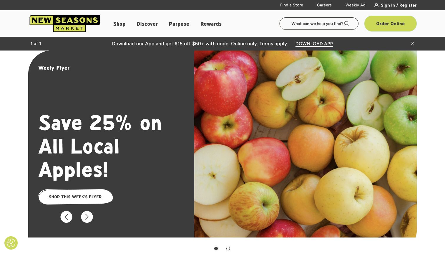
New Seasons Market uses a dark text panel and a close photograph of mixed apples to promote a local-produce discount. The large rounded lettering and white flyer button give the campaign a friendly, highly readable character. Shop, Discover, Purpose and Rewards sit in the main navigation, while the store finder and weekly ad occupy the utility row. An app offer adds another strip above the hero. Further content connects seasonal recipes and producer stories with buying routes. The design gives local food a distinct editorial identity, although the first-screen offer still needs its flyer destination for dates and full conditions. A typographical error in the small flyer label is visible in the captured state.
What you can learn
Connect local storytelling to a practical offer destination and maintain the campaign’s dates as structured content. Review small labels as carefully as the large headline, and keep app promotion from obscuring the store and weekly-shopping tasks.
Pros
The solid dark panel provides strong contrast for the offer and flyer action.
Store and weekly-ad routes remain visible outside the changing campaign.
Cons & considerations
The app strip adds another promotional layer before the main offer.
The small flyer label contains a visible copy error in this capture.
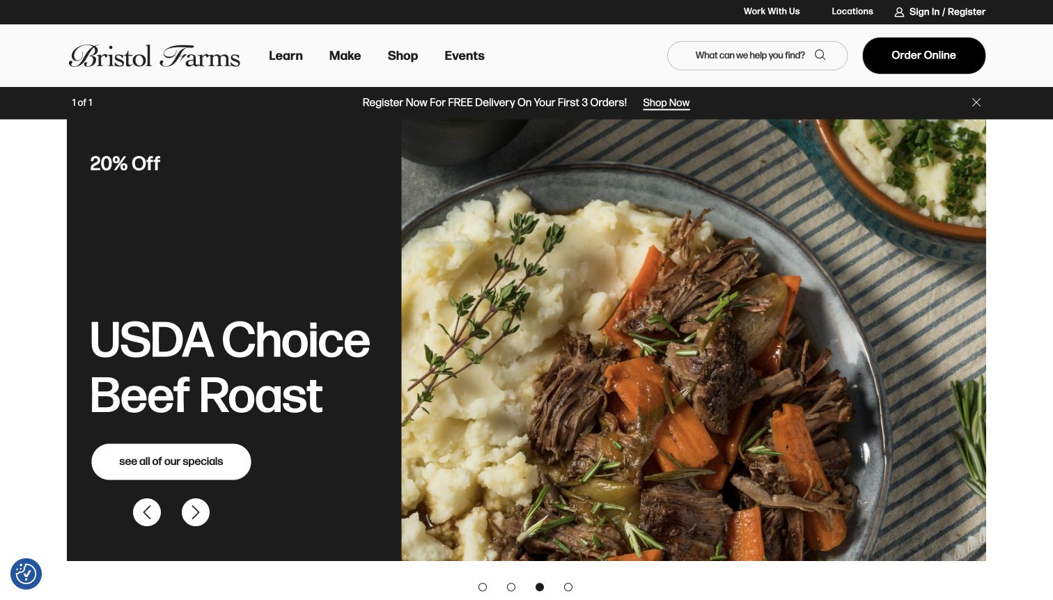
Bristol Farms uses four short navigation labels—Learn, Make, Shop and Events—above a large split campaign. In the captured slide, a black panel names a beef-roast promotion and a white action leads to the specials, while the right side shows a plated meal. Store locations and account access stay in a narrow utility row. The broad image and restrained palette make the food the focal point, but the offer’s detailed qualifications live beyond the hero. A delivery-registration strip introduces an additional route. The page also contains holiday ordering and recipe content, so the editorial labels need to communicate their practical destinations clearly.
What you can learn
Use concise navigation only when the destination remains understandable to a new shopper. Keep promotional prices and dates in maintained content, and label document or external ordering destinations so the next step is predictable.
Pros
The solid black campaign panel gives the product name strong contrast.
The short navigation avoids an exhaustive list of grocery departments.
Cons & considerations
Learn and Make are less explicit than conventional shopping-task labels.
The first-screen promotion omits the fuller conditions supplied by its destination.
Document in-store planning, pickup, delivery, catering and seasonal meal orders separately. Identify which system owns stock, slot availability, payment, substitutions and support at each step. Label external partner destinations clearly and test what happens when a shopper arrives without a supported address or an available time slot.
Create a durable local store page
Give every branch maintained opening hours, address, contact details, service availability and clear directions. Design exceptional hours and temporary service changes as real content types. Let location pages remain useful even when an ordering service is unavailable, and check that search results lead to the appropriate branch rather than a generic campaign.
Make food content useful in context
Connect recipes, meal ideas and product stories to sensible shopping routes without implying inventory that has not been checked. Explain servings, preparation expectations and ingredient substitutions where relevant. Assign editorial owners to seasonal pages so a past holiday deadline cannot remain the dominant action after the occasion.
The editing job behind the design
Choose systems around local catalog and fulfillment ownership
Decide whether the site is a store information service, an online grocer or a combination before selecting the frontend. Product data, store prices, loyalty eligibility and fulfillment slots often have separate owners. A maintainable integration contract is more useful than adopting the stack of a much larger supermarket merely because its homepage looks polished.
Public evidence may identify a CMS, frontend framework or ordering partner without revealing inventory, pricing or warehouse systems. Keep those scopes separate. Test cache behavior when a customer changes stores, define useful failure messages, and provide an operational owner for each feed rather than leaving editors to repair incorrect stock with page copy.
Our WordPress website examples offer a separate look at publishing approaches. A visible platform label is evidence for that named page, not a guarantee that the same system will suit your requirements.
Before the public launch
Grocery website launch checklist
Verify every branch address, phone number, regular hours and exceptional-hours workflow.
Check how selecting a store changes offers, prices and service availability.
Test mobile search, categories, weekly ad access and shopping-list behavior.
Confirm ordering handoffs identify pickup, delivery or catering and their lead times.
Review offer dates, quantities, unit prices and membership qualifications.
Test unavailable slots, unsupported locations and expired seasonal campaigns.
Check keyboard navigation, zoom, meaningful image alternatives and form errors.
Assign owners for local data, promotional content, redirects and integration failures.
These checks are a project checklist, not a performance, legal, security, or accessibility certification. Test real journeys with the people responsible for the website before making claims about the result.
Sources & editorial method
How this collection was selected and reviewed
The research compares official grocery properties and distinguishes national promotion, store-specific information and ordering services. Only directly captured pages with recorded dates and original visual observations are eligible for the final collection. Prices, inventory, checkout and fulfillment performance are not independently verified by a homepage review.
Each example links to its actual source page. Screenshots are direct browser captures with their own capture dates; moving imagery, announcements and live designs can change. The notes describe observable design choices and conditional tradeoffs, not measured traffic, conversion results, service quality, or accessibility conformance.
Technology labels use public page metadata, asset evidence, or explicitly cited platform documentation. Platform documentation is not a complete current deployment audit. A component reference may be legacy or unused; it is not a complete backend inventory. Unknown stacks are omitted. These sites are editorial examples, not our client portfolio.
Written, Edited and Curated are separate editorial records, not timestamps advanced by a rebuild. Website designs and imagery belong to their owners. See our editorial standards or suggest a correction.
Questions worth asking
Grocery Store website design questions
Should a grocery homepage require a store selection immediately?
Require it when the next information depends on location, and explain why. A visitor seeking general brand information or a store finder may not need the same interruption. Test the journey with both a first-time visitor and someone returning to a known branch.
Can recipes and editorial stories support grocery shopping?
Yes, when they answer a practical question and provide a clear next step. Keep the recipe itself usable, explain ingredient quantities and avoid treating a recipe link as a promise that every ingredient is in stock locally.
Should delivery and catering use the same route?
Only when their operational rules really match. Catering may have different menus, deadlines, pickup details and support. The interface should expose those differences before customers start an order.
Do these examples demonstrate successful grocery operations?
They demonstrate visible website choices and scoped public evidence. Reliable stock, pricing, delivery, accessibility and customer service require separate operational and user testing.