Chocolate photography creates desire. A useful shop also explains what is inside the box, who it suits and how it will reach the recipient.
A customer choosing a single-origin bar is making a different decision from someone sending a birthday assortment or ordering gifts for an entire team. Let those intentions shape the catalog. Product type, flavor, box size, occasion and gifting services should work together without making shoppers understand every collection name before they can choose.
These 23 examples span specialist makers, established confectioners and international gift retailers. Compare their product storytelling, seasonal campaigns, packaging photography and paths into ordinary or corporate gifting. The reviews examine public design and presentation; they do not taste the products, verify ingredient claims, certify sourcing practices or establish delivery performance. Regional storefronts and capture dates remain attached to each example.
Before the examples
What makes good chocolate shops website design in 2026?
Show the chocolate as well as the packaging
Pair the gift-ready box with a clear view of its contents. State the piece count or weight, the included varieties and whether an assortment can change. For bars and tasting sets, explain flavor and origin in language that helps a customer compare choices. Beautiful wrapping should support the decision rather than leave the actual product to guesswork.
Make ingredient information product-specific
Keep ingredient lists and the manufacturer's allergen statements connected to the exact product or selected assortment. Explain where shoppers can find current information when recipes or selections vary. Broad labels, dietary filters and a brand story should not stand in for the details of the item a customer is considering. Assign an owner to review those records whenever the product changes.
Treat gifting and delivery as part of the product
Explain gift messages, wrapping, recipient addresses, dispatch timing and destination restrictions before the final checkout steps. Distinguish an estimated arrival from a guaranteed service where the business actually offers one. If warm-weather handling or particular delivery days affect the order, present the applicable conditions near the buying decision rather than only in a seasonal banner.
The collection · 23 examples
23 chocolate shops websites worth studying
Look at how each shop connects the appetizing close-up, the finished gift and the practical purchase information. A maker's origin story and a large retailer's occasion navigation can both be useful when they help someone choose a particular product.
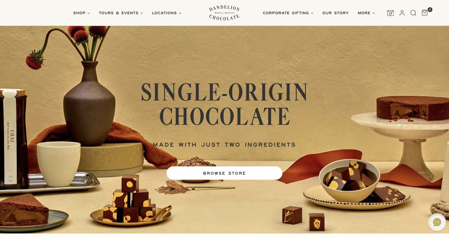
Dandelion arranges drinking chocolate, confections and a sliced cake around a large single-origin headline. The warm tabletop palette ties very different product shapes together without hiding the individual items. A white Browse Store button sits in the middle of that arrangement, while tours, locations and corporate gifting remain available in the header. The page then expands into ingredient explanation, favorite products and visits. This makes the homepage useful as an introduction to the maker's range. The two-ingredient statement is the site's own positioning; shoppers still need the ingredients for each particular confection rather than assuming every pictured item shares the same recipe.
What you can learn
Give a broad chocolate range one understandable starting point, then separate bars, confections and café products in the shopping structure. Use ingredient language at the correct product scope so a simple brand promise does not replace the information on an individual item.
Pros
A varied serving scene shows the breadth of the range without a dense product grid.
Visits and corporate gifts have visible routes alongside ordinary shopping.
Cons & considerations
The central campaign does not provide immediate price or pack-size comparison.
A broad ingredient headline needs clear qualification when the range includes filled chocolates and baked goods.
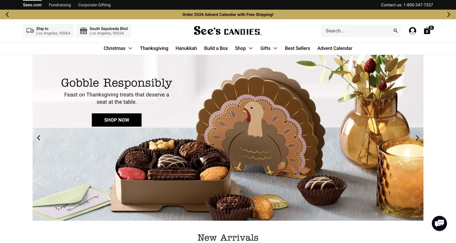
See’s uses a Thanksgiving assortment to show both the decorative turkey box and the chocolates inside. The Shop Now action sits on a pale area of the photograph, distinct from the busy product detail. Above it, named holidays share the navigation with Build a Box, Shop, Gifts and Best Sellers. The header also exposes shipping and store context, which matters when a customer is deciding how to receive a gift. The captured carousel has a visible pause control. This is a useful example of combining seasonal discovery with routes that remain meaningful to customers who already know their favorite candies.
What you can learn
Keep seasonal collections separate from permanent buying tasks such as building an assortment or finding a store. Photograph the open box as well as its presentation so gift shoppers can understand both the recipient's first impression and the contents.
Pros
Open packaging makes the assortment visible while preserving the gift presentation.
Build a Box is promoted as a direct navigation choice rather than hidden inside a category.
Cons & considerations
Several holiday and shopping labels can compete for attention as the range expands.
Shipping and store context need to stay clear when visitors change locations or fulfillment methods.
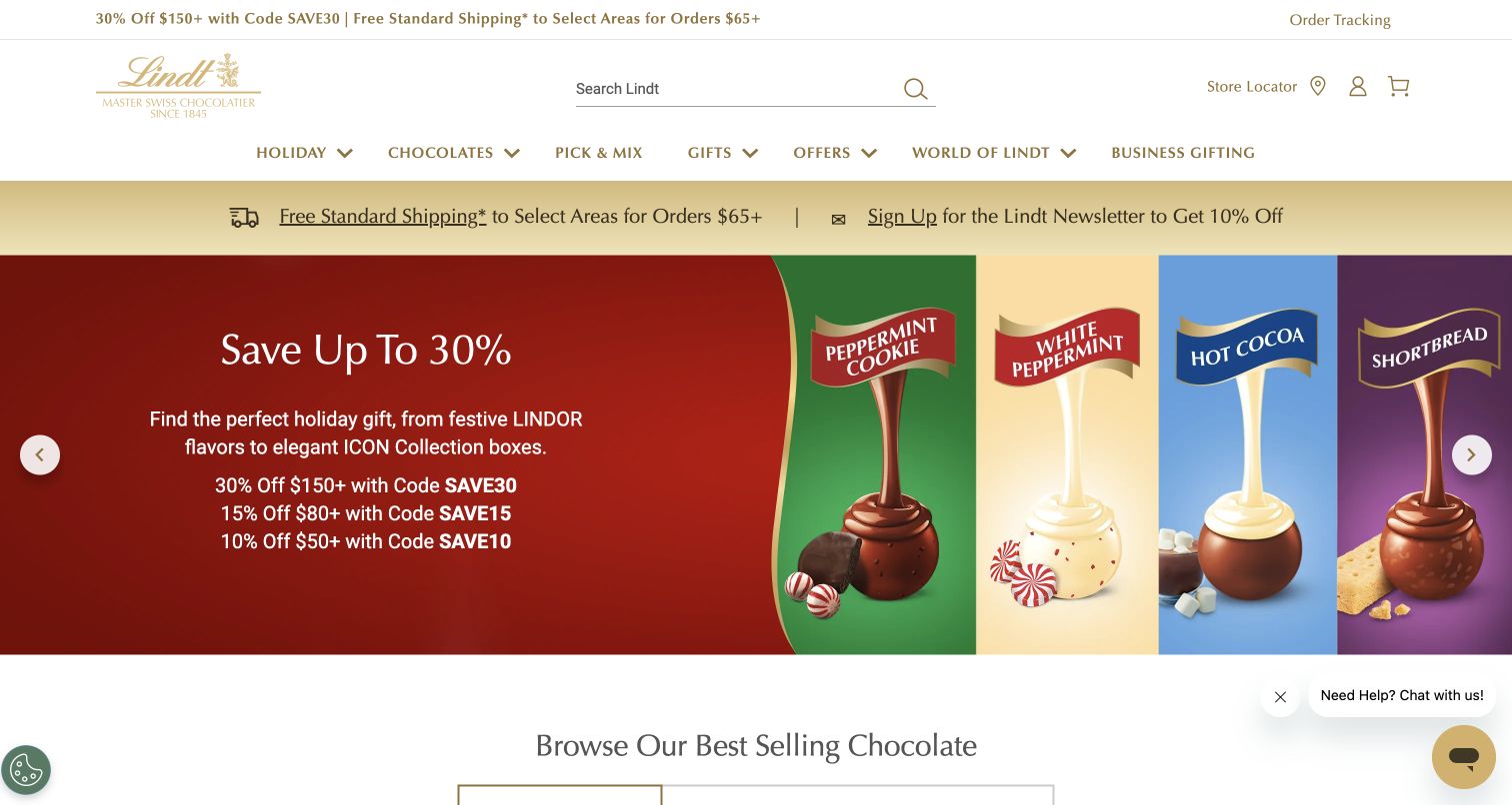
Lindt’s US storefront keeps search prominent above a navigation row containing Chocolates, Pick & Mix, Gifts and Business Gifting. In the captured campaign, four truffle flavors are separated into colored panels with an exposed filling illustration. The neighboring offer panel is visually distinct, allowing the product family to remain recognizable even in a promotional layout. Below the hero, a best-selling-chocolate heading begins the shopping content. The offer figures are a dated campaign detail, not a recommendation about current value. The transferable pattern is the combination of familiar product navigation and a visually legible explanation of variety.
What you can learn
When many items share a shape, use consistent flavor photography and clear labels to explain the differences. Preserve search and a permanent assortment-building route so a seasonal promotion does not become the only way into the catalog.
Pros
Flavor panels give similar-looking truffles a clear visual distinction.
Search, store access and Pick & Mix are easy to identify in the header.
Cons & considerations
Multiple promotional strips consume space before individual products appear.
Campaign illustrations need supporting product details for ingredients, quantities and the exact assortment.
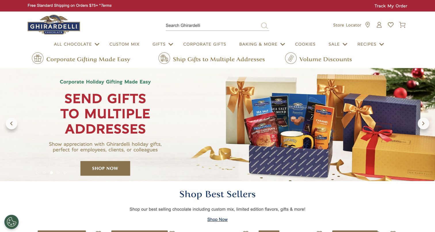
Ghirardelli makes a specific gift-buying task the center of its captured homepage: sending gifts to multiple addresses. A photograph of boxes, tins and packaged chocolate shows the kind of assortment involved, while the main action directs visitors toward the gifting offer. A service row repeats corporate gifting, multiple addresses and volume discounts above the hero. The permanent navigation still includes All Chocolate, Custom Mix, Gifts and Baking & More. The page demonstrates how a seasonal storefront can address a complicated buying situation without making shoppers infer the service from product photography. No multi-address purchase flow was submitted during this review.
What you can learn
Give business buyers a clear route with its own quantity, personalization and fulfillment explanation. Let that route share the brand's product imagery while keeping ordinary shopping categories visible for customers buying a single box.
Pros
The headline identifies a concrete buying task rather than a vague seasonal theme.
A separate service row highlights operational reasons to use the corporate route.
Cons & considerations
Repeated gifting messages may dominate the opening for visitors shopping for themselves.
The promise requires a clear explanation of address entry, order review and delivery estimates further into the route.
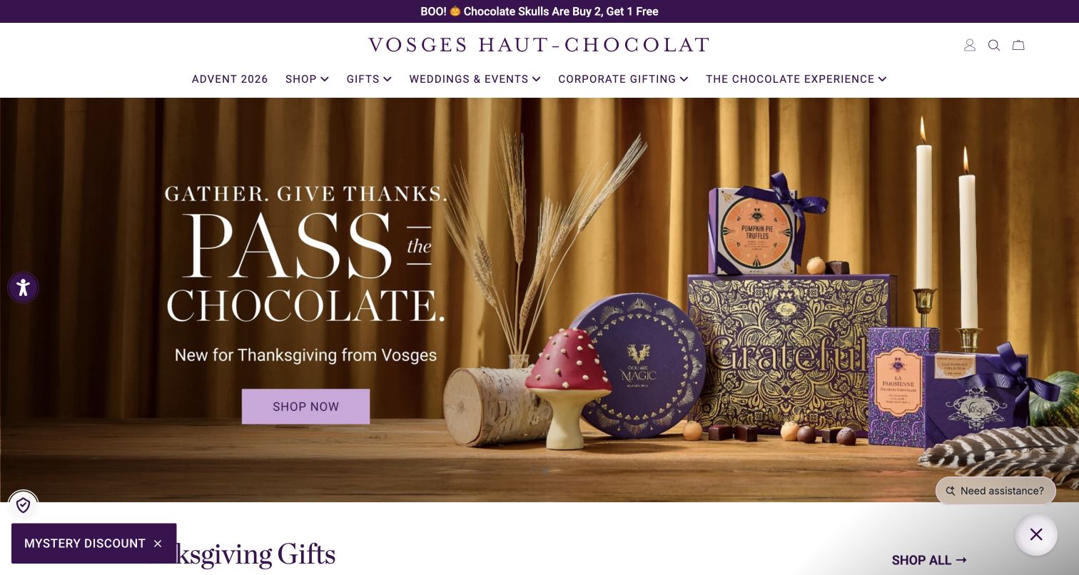
Vosges stages patterned gift boxes, a mushroom-shaped confection and small chocolates against a curtain and candlelit tabletop. The purple packaging and lavender shopping button create a consistent identity across the photograph and interface. The captured Thanksgiving message gives the scene an occasion, while navigation separates general gifts, weddings and events, and corporate gifting. A product section begins immediately underneath. The design's strongest lesson is that packaging can communicate the intended ceremony of a gift before the visitor reads a detailed description. Its rich scene is a visual reference, not evidence about taste, ingredient quality or how much chocolate each box contains.
What you can learn
Show the complete gifting experience when packaging is a meaningful part of the offer. Follow the campaign with a straightforward explanation of contents, portions and delivery so decorative presentation supports a practical choice.
Pros
Packaging, props and interface colors form a coherent gift presentation.
Occasion-specific navigation separates personal, event and business purchases.
Cons & considerations
The ornate scene makes individual contents harder to compare at a glance.
Small persistent promotional controls can compete with the main shopping action near the viewport edge.
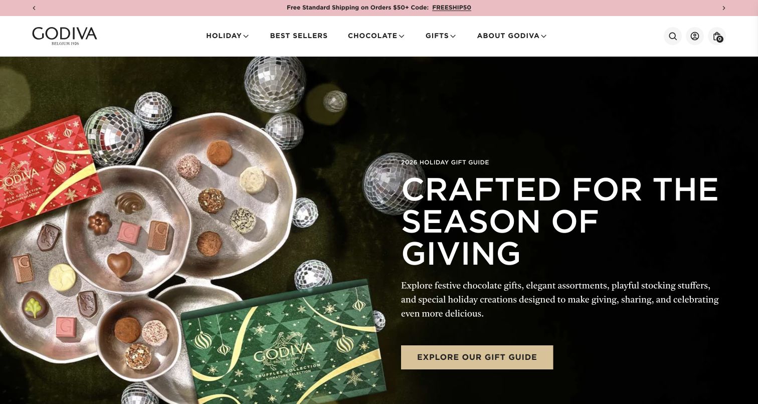
GODIVA places truffles and molded chocolates on silver trays next to red and green gift packaging. The right side of the hero is dark and comparatively quiet, providing space for the gift-guide headline, short introduction and gold action button. This composition shows both what is inside the gift and how the boxes are presented. The header uses a small set of broad categories, including Best Sellers, Chocolate and Gifts. The page continues into priced seasonal products. The gift-guide destination offers an editorial entry point for undecided shoppers, while the permanent categories provide a shorter route for people with a known product in mind.
What you can learn
Pair an editorial gift guide with direct categories and best sellers. Use the campaign image to show the actual chocolates as well as their packaging, then let product records explain quantities, flavors and purchase conditions.
Pros
A quiet text area protects the readability of the headline and main action.
Unwrapped chocolates and gift boxes communicate complementary information.
Cons & considerations
The large campaign delays side-by-side comparison of individual products.
A gift guide needs a clear organizing principle to help visitors narrow choices rather than adding another browsing layer.
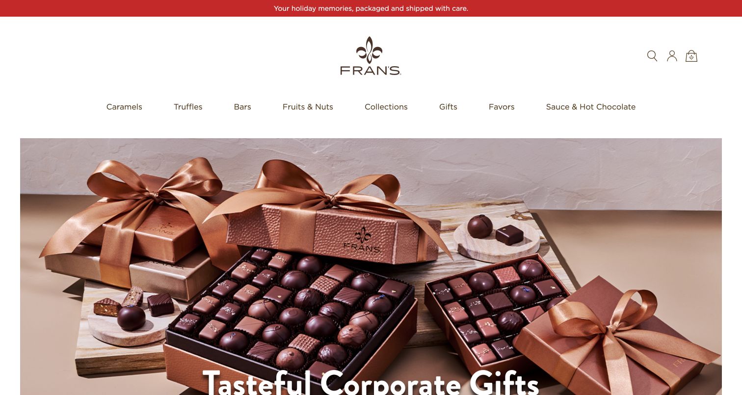
Fran’s leaves generous white space around its centered logo and a single row of product categories. Caramels, Truffles, Bars, Fruits & Nuts and Sauce & Hot Chocolate use familiar names that explain the range. The large photograph below displays open chocolate boxes beside closed packages tied with satin ribbons. In this desktop capture, the corporate-gifting headline begins near the bottom of the viewport, so the visual presentation arrives before the full message. The design illustrates a calm way to present premium packaging while retaining ordinary product language. It also shows why hero height and text placement should be considered together across screen sizes.
What you can learn
Use plain category names even when the visual identity is luxurious. Check that a large campaign photograph leaves enough space for its headline and next step on common laptop screens, rather than assuming a tall desktop view.
Pros
Product categories make the range understandable without learning collection names.
Open and wrapped boxes show both assortment detail and presentation.
Cons & considerations
The tall header and photograph push part of the campaign message below this viewport.
The image alone cannot explain box sizes, contents or available customization.
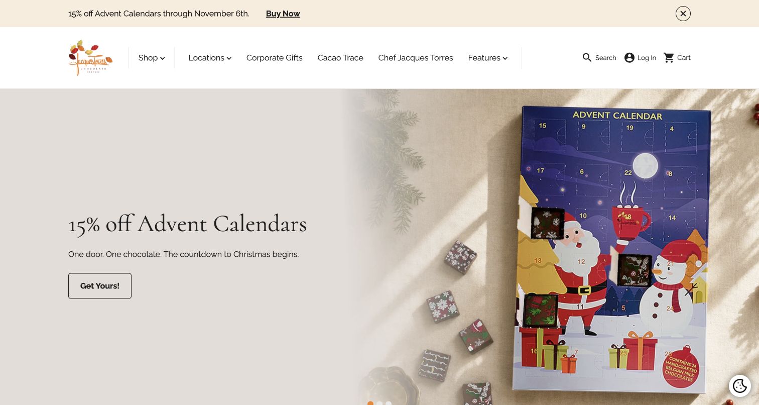
Jacques Torres gives an advent calendar most of the hero's right side, while the left has a short seasonal heading, a one-line explanation and a small outlined action. The box is shown open, with several chocolates and wrappers visible around it. Above the campaign, navigation separates shopping, locations, corporate gifts, cacao information and the chef's story. The resulting page connects a specific product with the maker behind it without making the introductory paragraph lengthy. A dated promotional message appears in both the announcement strip and hero. The design lesson is the focused product presentation, rather than the particular discount shown in this capture.
What you can learn
For a limited release, show the actual package and enough of the contents to explain the format. Keep its shopping action close to that image and make the maker's background available without forcing it into the main sales message.
Pros
The open calendar explains the product format more clearly than a closed-box image alone.
The short copy and separated action create a readable campaign entry.
Cons & considerations
Repeating the same promotion in two areas uses space that could answer a product question.
A seasonal centerpiece needs an easy onward route for shoppers seeking year-round favorites.
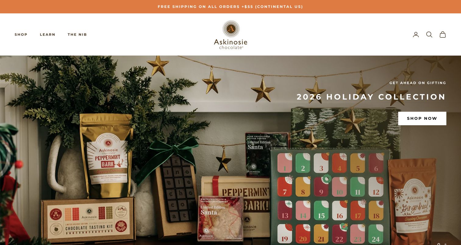
Askinosie places its holiday collection in a domestic scene of greenery, hanging stars, drinking-chocolate pouches and boxed gifts. The collection title and white Shop Now button occupy the upper-right area, while the products fill the remaining photograph. A restrained header groups the site under Shop, Learn and The Nib. The page then presents individual bars with origin and flavor names, followed by routes into cocoa origins and factory visits. This gives the seasonal campaign a wider context without crowding the header. The maker's sourcing statements remain first-party claims; the visual review evaluates how the information is presented, not the underlying supply chain.
What you can learn
Connect seasonal merchandising to stable product records and a separate learning area. Let origin and ingredient explanations remain available beyond the holiday campaign, and give sourcing claims a clear supporting destination.
Pros
A simple header keeps the large seasonal assortment from making the page feel crowded.
Product, origin and factory-visit routes address different reasons to explore the maker.
Cons & considerations
White campaign copy over detailed photography needs crop and contrast checks.
Broad Shop and Learn headings require well-organized menus as the catalog grows.
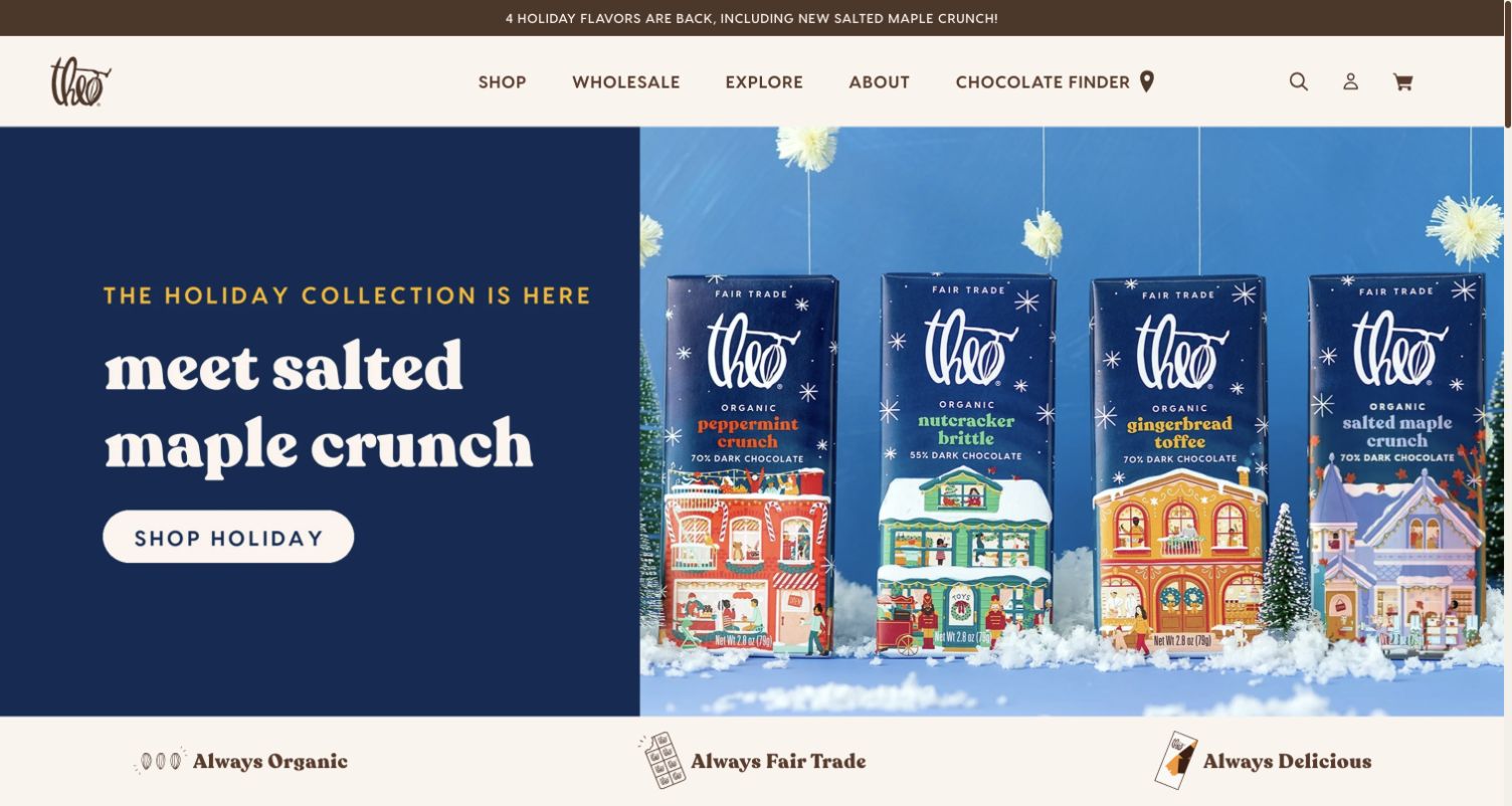
Theo's holiday hero displays four upright bars against a blue setting, with the featured salted-maple flavor named in a contrasting left-hand panel. The packaging uses related illustrations and a consistent format, making the products read as a family while retaining their individual labels. A short Shop Holiday action provides the next step. The header includes a Chocolate Finder alongside the shop and background sections, and a row of brand commitments follows the hero. The page offers a useful way to introduce new flavors without losing the identity of the existing range. Certification language shown on packaging and the page should be checked at the product level when purchasing.
What you can learn
Use consistent pack photography to make a flavor range comparable, then emphasize the one new item through the headline. Keep the complete collection accessible so visitors can choose a familiar alternative without restarting their search.
Pros
Aligned bars make the collection and flavor differences easy to scan.
The separate text panel keeps the main message readable against the colorful packaging.
Cons & considerations
A broad collection action adds another step for shoppers seeking the specific featured flavor.
Brand-level commitment labels need supporting details and appropriate product scope.
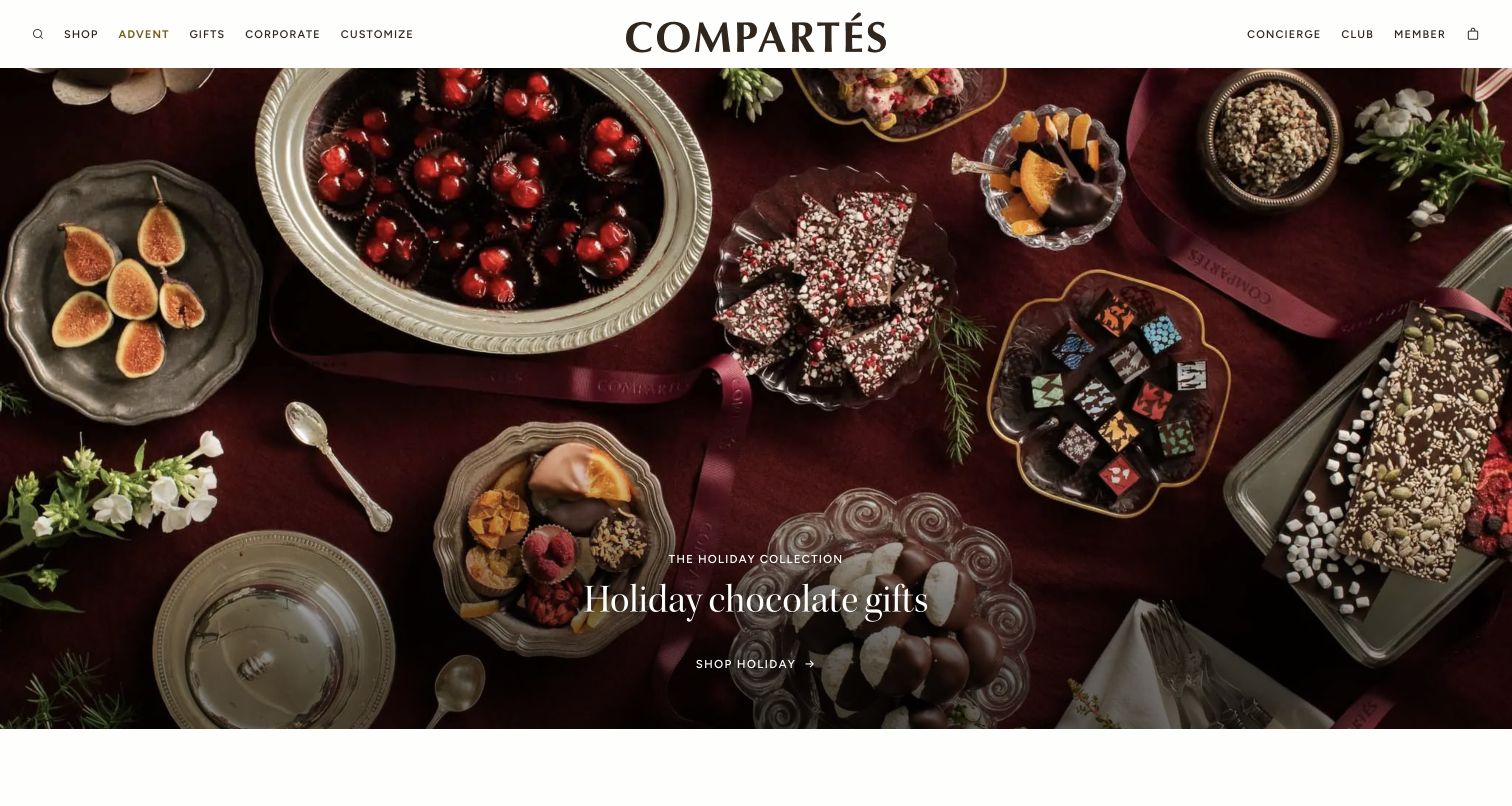
Compartés fills its opening with a carefully arranged overhead spread of dipped fruit, decorated bars, small chocolates and serving pieces. The subdued red cloth and metallic trays create a common setting for products with very different finishes. A small holiday headline and shopping link sit near the lower center rather than covering the food. The compact header gives separate access to gifts, corporate orders and customization. This is an example of using art direction to communicate variety and occasion at once. The next product sections are important because the hero itself does not label the items or explain which combination a shopper would receive.
What you can learn
Let a campaign photograph establish the atmosphere, then connect it to clearly named and priced products. For a diverse assortment, show the contents and packaging on individual product pages so the editorial scene does not leave the actual order ambiguous.
Pros
The overhead arrangement shows a broad variety of chocolate forms and finishes.
Corporate and customization paths are visible beside ordinary gift shopping.
Cons & considerations
Small hero copy may be easy to overlook within the detailed composition.
Unlabeled items in a styled scene require a clear connection to purchasable products.
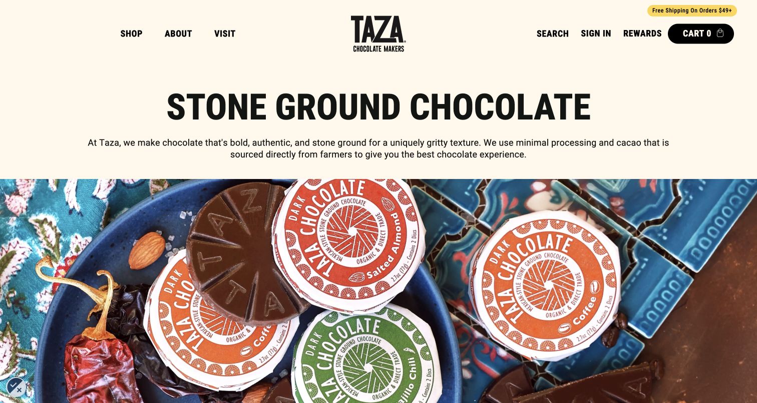
Taza starts with a direct Stone Ground Chocolate heading and a short explanation of the textured product. Beneath it, circular wrapped discs and exposed chocolate sit among colorful dishes and recognizable flavor ingredients. The relatively plain text area gives the photograph a clear purpose: it illustrates the range after the visitor has been told what makes it distinctive. Shop, About and Visit are the main navigation choices. This is particularly useful for a product whose texture may differ from a buyer's expectations. The page explains the intended experience before relying on packaging alone to convey it.
What you can learn
If a production method creates an unusual texture or flavor, explain that difference in ordinary language before asking for a purchase. Use close product views to support the explanation, and retain precise ingredient and size information in the catalog.
Pros
The opening tells visitors what distinguishes the product without a long brand story.
Exposed discs and wrapped products connect the chocolate to recognizable packaging.
Cons & considerations
The large photograph pushes the main shopping action beyond this captured opening.
A process-led introduction still needs straightforward navigation for returning customers looking for a specific flavor.
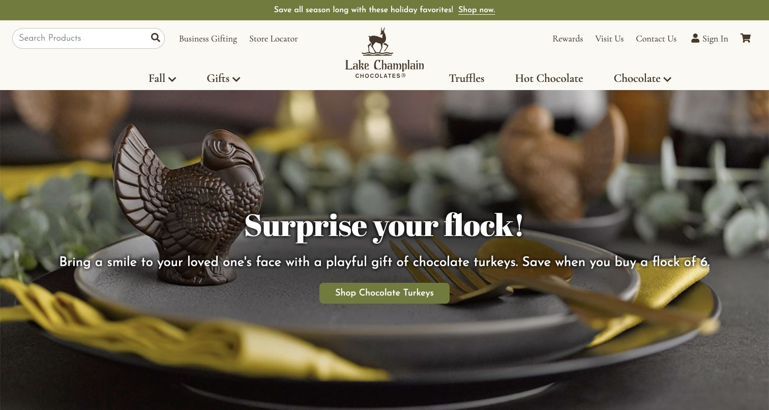
Lake Champlain Chocolates places a molded turkey on a dining plate, with another figure blurred in the background. The product is not isolated on white: the table setting helps explain the occasion and the role of the chocolate as a small gift or place-setting detail. A centered headline and Shop Chocolate Turkeys button make the destination explicit. Above the image, search, business gifting and the store locator remain visible, with Fall, Gifts, Truffles, Hot Chocolate and Chocolate forming the main categories. The captured page demonstrates how an ordinary seasonal object can carry a clear shopping story without an elaborate scene of many unrelated products.
What you can learn
Photograph occasion-specific chocolate in a plausible use setting, then label the product directly in the action. Add dimensions, weight and packaging details on the destination page so a lifestyle photograph does not become the only guide to scale.
Pros
A single molded product remains visually distinct within the table setting.
The action names the chocolate type instead of using a generic invitation.
Cons & considerations
Centered text over a photograph needs careful treatment at narrower crops.
A styled plate gives context but cannot reliably communicate the product’s exact size.
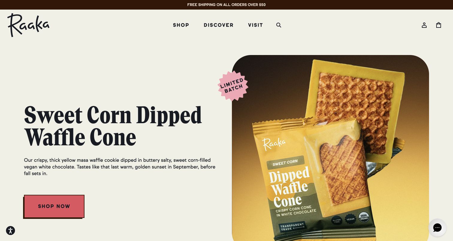
Raaka gives a sweet-corn dipped waffle cone a large product photograph beside a direct descriptive headline. The open wrapper reveals the chocolate coating and the waffle texture, while the copy explains the combination in concrete terms. A pink Shop Now button stands apart from the pale background, and a small badge marks the item as a limited batch. The header reduces navigation to Shop, Discover and Visit. This layout gives an unfamiliar flavor enough explanation to be understood without turning the homepage into a long article. The image and text support product comprehension; they do not establish the taste claims as independently tested results.
What you can learn
When introducing an unusual confection, show its cross-section or uncovered form and explain the ingredients in the same view. Give the visitor one direct product route, while keeping the full shop available for those who prefer a familiar choice.
Pros
An open wrapper exposes texture and connects the product to its packaging.
The short description explains an unusual flavor combination next to the purchase route.
Cons & considerations
A single limited-batch hero may not represent the maker’s wider chocolate range.
A generic Shop Now label is less descriptive when separated from its surrounding product context.
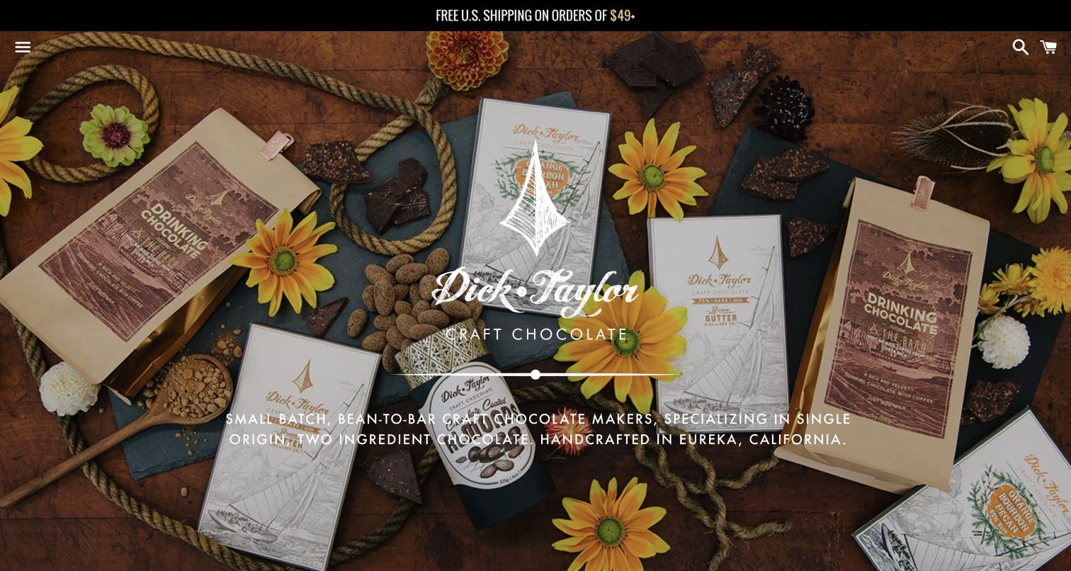
Dick Taylor's opening photograph combines chocolate bars, drinking-chocolate pouches, flowers, cacao beans and rope on a wooden surface. A large white mark and short bean-to-bar statement overlay the center. The products' illustrated packaging shares the same craft character as the surrounding props. Navigation is compressed to a menu icon, with search and cart at the opposite corner. This prioritizes the maker's identity over immediate category comparison. The page is useful as a reference for expressing a small production brand through a consistent scene, while also illustrating the tradeoff between an immersive opening and a plainly visible route into the catalog.
What you can learn
Build a coherent visual world around the actual packaging and product. Give visitors a clearly labeled shopping route as well, especially when the opening relies on a menu icon and brand statement rather than a prominent product action.
Pros
The photographed products and illustrated packaging reinforce the same craft identity.
Search and cart stay available despite the minimal navigation treatment.
Cons & considerations
A menu icon conceals product categories until the visitor opens it.
White text over a detailed photograph needs contrast checks across the full responsive crop.
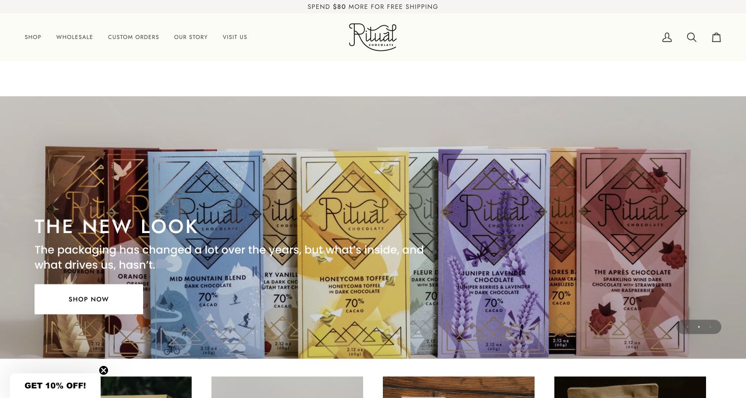
Ritual presents a row of differently colored chocolate bars under a headline introducing a new look. The flavor wrappers remain visible enough to communicate that the collection contains distinct products, while repeated geometric details tie them together. The message explains that the packaging has changed and provides a direct Shop Now action. A compact header retains wholesale, custom orders, the maker's story and visits. The photographed lineup offers a useful pattern for announcing a redesign without treating it as an abstract branding exercise. The products themselves carry the announcement, and customers can still connect the new appearance with familiar flavor names.
What you can learn
When packaging changes, show the new range together and explain what customers should recognize. Keep product names stable and searchable, and make any actual recipe or size changes explicit rather than letting a visual refresh imply continuity.
Pros
A complete lineup makes the relationship among the new packages easy to see.
Custom orders and wholesale remain separate from the ordinary shopping path.
Cons & considerations
White copy crosses several differently colored wrappers and needs careful contrast review.
A packaging-led message leaves product quantities and prices to the subsequent shopping pages.
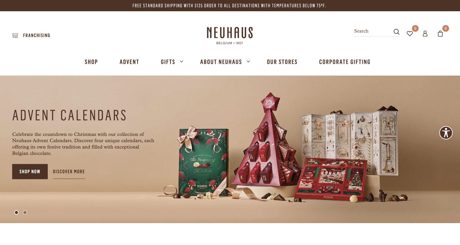
Neuhaus places several advent-calendar formats together against a muted background, leaving a distinct area for the description. A filled Shop Now button and quieter Discover More link offer different next steps from the same campaign. The US header also puts a temperature condition in its shipping message, making a practical chocolate-delivery concern visible before checkout. The photograph emphasizes the packaging formats rather than opening every calendar to show its contents. This is a useful design reference for a range where presentation varies substantially across products. The review concerns the visible hierarchy and information placement, not a test of the calendar contents or shipping performance.
What you can learn
Separate learning about a collection from browsing its available products when both tasks matter. Put important chocolate-delivery constraints near the shopping route, and make sure every package format has clear contents and quantity information on its own page.
Pros
The paired actions support both exploratory and purchase-ready visitors.
The opening shipping message acknowledges a condition that can affect chocolate delivery.
Cons & considerations
Packaging silhouettes alone do not explain how the contents differ among calendars.
Two neighboring actions need clearly different destinations to avoid an unnecessary extra step.
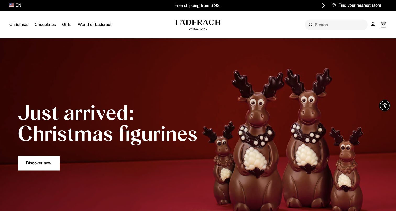
Läderach's US homepage pairs a short Christmas-figurines message with several chocolate reindeer against a dark red background. The figures are shown at different sizes, with visible decorative details and enough space around them to keep the composition legible. A white Discover Now button provides a single next step. The header retains familiar Chocolates and Gifts links, search and store access. Compared with a crowded assortment scene, this layout concentrates attention on one product form. It is effective as a visual introduction, though the photograph cannot replace explicit dimensions or an explanation of which figure sizes are actually sold.
What you can learn
For sculpted chocolate, let a clean silhouette and a close enough image show the workmanship. Follow the campaign with explicit dimensions, weight, packaging and variant names so the visual size comparison is not mistaken for a complete product specification.
Pros
The restrained background makes the figures and their decorative details prominent.
A single action keeps the seasonal message easy to follow.
Cons & considerations
The image does not establish absolute size despite showing several figures together.
A broad Discover Now label needs a predictable product destination for shoppers with limited time.
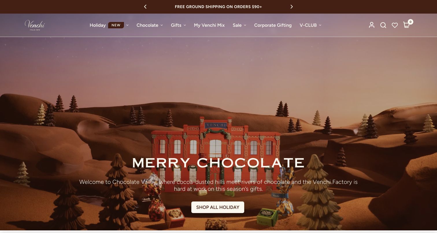
Venchi's US opening uses a changing holiday scene: during inspection it moved between gift packaging and a stylized chocolate landscape with a miniature factory. The selected capture records the landscape frame, with a white seasonal headline and a Shop All Holiday action in the lower part of the image. The translucent navigation remains over the scene, offering Chocolate, Gifts, My Venchi Mix and Corporate Gifting. This gives a campaign substantial atmosphere while keeping the shopping action consistent. The moving presentation was observed as part of the page; the review does not infer its implementation technology from the animation or screenshot.
What you can learn
If a campaign uses motion, keep the headline and destination stable while the imagery changes. Test every frame behind navigation and text, and provide an accessible way to reduce or stop motion without losing the route into the products.
Pros
A persistent shopping action anchors an otherwise changing seasonal scene.
Mix-building and corporate-gifting routes remain available in the main navigation.
Cons & considerations
Text over changing imagery needs testing against the least readable frame, not just the preferred one.
The atmospheric scene offers less immediate product comparison than a static assortment grid.
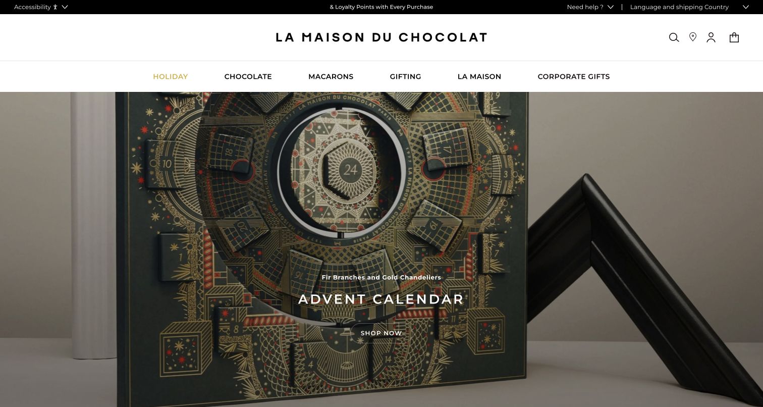
La Maison du Chocolat's US homepage centers a large, intricately illustrated advent calendar in an architectural setting. The packaging dominates the image, while a small seasonal descriptor, Advent Calendar heading and Shop Now link overlay the lower middle. The white header separates Chocolate, Macarons, Gifting and Corporate Gifts, keeping the broader range accessible. The composition treats the package as an object worth examining in its own right. That makes it a useful reference for a visually distinctive gift, but the product destination still needs to explain the chocolates inside, the size of the calendar and the practical conditions for delivery.
What you can learn
Give a distinctive gift object enough photographic space to show its details, then link directly to a complete product record. Keep broad shopping categories visible so a dramatic seasonal object does not obscure the rest of the store.
Pros
The large photograph exposes the detail of the calendar’s construction and illustration.
The header clearly separates chocolate, macarons and different gifting routes.
Cons & considerations
Small overlay text can be overshadowed by the intricate packaging behind it.
A closed-calendar image leaves the flavor assortment and individual portions unexplained.
Visible tech stack
Referenced on the public page
Prismic asset service
Public source checked November 4, 2026. References may be embedded or legacy—not a complete backend inventory.
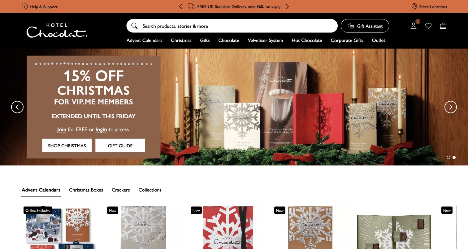
Hotel Chocolat's UK storefront places a seasonal campaign above a tabbed set of product categories, including Advent Calendars, Christmas Boxes, Crackers and Collections. The opening photograph shows several package formats, while the left panel contains the campaign message and separate Shop Christmas and Gift Guide actions. A large search field occupies the header, alongside a Gift Assistant control and permanent chocolate categories. Unlike a full-height campaign that postpones shopping, this captured view already reveals the start of the product selection. The regional shipping and membership offer are dated UK page details, not a promise about other markets or future promotions.
What you can learn
Let a campaign introduce the season without consuming the entire shopping entrance. Follow it with a small, understandable set of product categories, and provide direct search for visitors who already know the chocolate or gift they want.
Pros
Product categories and the beginning of a shopping grid are visible beneath the campaign.
Search has enough prominence to support a large catalog.
Cons & considerations
Membership promotion adds conditions that need to remain clear beside the offer.
Search, gift assistance, a guide and category tabs can feel repetitive if their purposes are not distinct.
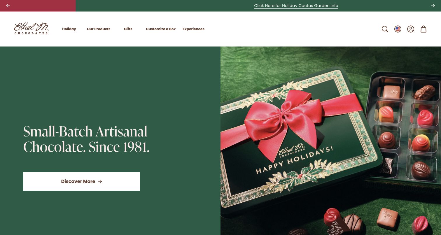
Ethel M places a green holiday tin, its red ribbon and an open tray of individual chocolates beside a solid green text panel. The short heritage statement and broad white Discover More action remain readable because they do not compete with the product detail. The main navigation names Our Products, Gifts, Customize a Box and Experiences, reflecting both retail and visit-oriented tasks. This layout shows the outside and inside of a gift in one coherent composition. The design provides an accessible visual starting point for learning about the assortment, while the destination pages must still explain the exact pieces, quantities and customization choices.
What you can learn
Use a solid text area when the product photograph already contains fine detail. Show both the wrapped gift and its contents, then keep customization and experiences as explicit routes with their own practical explanations.
Pros
The solid color panel gives the headline and action a consistently readable background.
The open tray complements the decorated tin instead of repeating the same packaging view.
Cons & considerations
The general heritage message says less about the featured assortment than a product-specific description would.
Discover More is less explicit than an action that names the collection or shopping task.
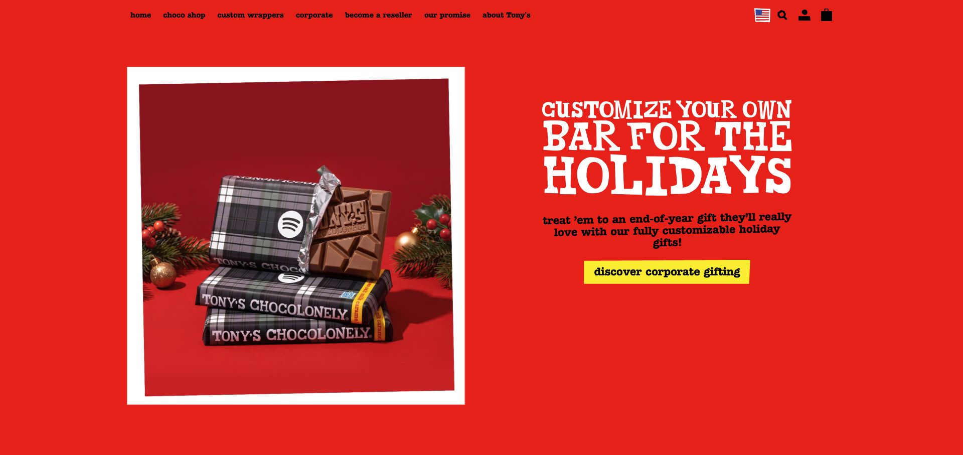
Tony’s Chocolonely's US storefront uses a bright red opening with oversized white lettering and a yellow corporate-gifting action. On the left, a wrapped chocolate bar carries a recognizable branded example, with part of the chocolate visible beside the wrapper. This makes the customization proposition tangible before a visitor enters a design tool. The main navigation gives custom wrappers and corporate orders their own labels rather than hiding them under general gifts. The page continues into gift templates with package weights and prices. This review evaluates the presentation of personalization; no wrapper upload, design submission or purchase was made.
What you can learn
Show a representative finished personalized product before asking someone to start configuring it. Then explain artwork requirements, minimum quantities, proof approval and delivery timing within the customization route so the visual promise connects to a workable order.
Pros
A finished wrapper example communicates the customization offer immediately.
Corporate gifting and custom wrappers are clear navigation choices.
Cons & considerations
The oversized display lettering needs careful responsive treatment to avoid overwhelming smaller screens.
A single branded example cannot explain print limitations or the range of permitted customization.
Plan the chocolate shop around the gift and the recipient
Build a complete product record first
Define the required fields for product name, weight, piece count, flavors, ingredients, manufacturer statements, packaging and storage guidance. Link photographs to the correct size and assortment. Decide how seasonal substitutions or changing recipes are approved and communicated so a campaign never promises a box that the fulfillment team cannot supply.
Map single gifts and larger orders separately
Write the steps for buying a bar, sending a wrapped gift, assembling a custom box and arranging a corporate order. Larger orders may need several recipient addresses, artwork review, quantity thresholds or staff assistance. Explain those requirements before collecting details, and identify when a quote or proof is still needed rather than implying immediate fulfillment.
Connect the seasonal calendar to real operations
Plan campaign launch dates, available stock, customization cutoffs and delivery messages with the people packing the orders. Prepare a replacement message for sold-out assortments and expired holiday deadlines. Give editors a way to retire a seasonal promotion while preserving a useful product or category destination for search visitors.
The editing job behind the design
Choose commerce tools that preserve assortment and fulfillment accuracy
Start with the operational complexity of the catalog. Standard products may fit an ordinary commerce setup, while build-a-box selections, personalized wrappers, subscriptions and multiple recipient addresses require more careful integration. Test the actual combinations the business sells, including unavailable choices, changed quantities and the relationship between packaging and the selected contents.
Keep product facts, stock and shipping rules in their authoritative systems, then let the content layer explain the craftsmanship and gifting experience. Corporate inquiries and custom artwork should have a clear owner and review process. Public website evidence can identify some frontend tools, but it cannot establish private inventory systems, manufacturing practices or the reliability of a delivery promise.
Our WordPress website examples offer a separate look at publishing approaches. A visible platform label is evidence for that named page, not a guarantee that the same system will suit your requirements.
Before the public launch
Chocolate shop website launch checklist
Show the actual contents, packaging, piece count or weight for every purchasable size.
Check ingredient and manufacturer allergen statements against the current product record.
Explain any assortment variation or substitution before the customer orders.
Test gift messages, wrapping choices and recipient-address handling with non-submitted test data.
Make customization minimums, proof steps and lead times clear for larger orders.
Check destination restrictions, dispatch dates and applicable warm-weather conditions.
Distinguish recurring subscriptions from one-time purchases wherever the option appears.
Review mobile product images, keyboard controls and readable filter labels.
Assign owners for seasonal deadlines, sold-out alternatives and supporting sourcing claims.
These checks are a project checklist, not a performance, legal, security, or accessibility certification. Test real journeys with the people responsible for the website before making claims about the result.
Sources & editorial method
How this collection was selected and reviewed
The collection contains exactly 23 distinct official chocolate storefronts, matching the saved random target selected before research. The examples were inspected through their public pages and captured directly on November 4, 2026. Each review retains the observed regional URL, actual capture date, dimensions and attribution. The analysis considers visible navigation, imagery, product presentation and gifting routes. No real purchase, subscription, corporate inquiry or recipient-data submission was made. Product quality, ingredient accuracy and ethical claims were not independently audited, and technical labels require separately recorded public evidence.
Each example links to its actual source page. Screenshots are direct browser captures with their own capture dates; moving imagery, announcements and live designs can change. The notes describe observable design choices and conditional tradeoffs, not measured traffic, conversion results, service quality, or accessibility conformance.
Technology labels use public page metadata, asset evidence, or explicitly cited platform documentation. Platform documentation is not a complete current deployment audit. A component reference may be legacy or unused; it is not a complete backend inventory. Unknown stacks are omitted. These sites are editorial examples, not our client portfolio.
Written, Edited and Curated are separate editorial records, not timestamps advanced by a rebuild. Website designs and imagery belong to their owners. See our editorial standards or suggest a correction.
Questions worth asking
Chocolate Shops website design questions
Should a chocolate shop organize products by flavor or occasion?
Use the choices that match the catalog and audience. Chocolate type, flavor and format help people buying for themselves, while occasion, recipient and budget can help gift buyers. Connect these routes to the same product records so the details remain consistent whichever path someone takes.
What should a chocolate gift page show before checkout?
Show the contents, size, packaging, price and available gifting options, with a clear route to current product information. Explain delivery conditions that affect the order and whether a selected date is an estimate or a specific service commitment. Do not make the customer reach payment before discovering a significant restriction.
How can a maker explain cocoa origin without overwhelming the shop?
Give the product a concise origin and flavor description, then link to a fuller account of the maker's sourcing and process. Keep the scope of each claim clear and identify supporting records where available. The story should help a customer understand the bar, rather than replacing the product's practical details.
Does every chocolate store need a build-a-box tool?
No. A clear selection of accurately described assortments may serve customers well. Add a custom-box tool when the business can maintain the choice inventory, explain limits and fulfill the resulting combinations. Test unavailable pieces, quantity rules and the final contents summary before launching it.
How should corporate gifting differ from an ordinary product page?
Explain quantity requirements, customization, artwork approval, lead times and delivery arrangements in a dedicated path. Identify whether the next step produces a quote, a proof or an order. Ask only for the information needed at that stage and give the customer a clear contact for coordination.
Borrow the relationship between the chocolate, its story and the finished gift. Build it with accurate product records, your own photography and a fulfillment process that can deliver what the page describes.