A cruise website needs to connect an appealing travel experience with the details that make an itinerary understandable. Search, voyage information and help should work together from the first visit.
Travelers may start with a destination, a departure port, a preferred ship or simply a period when they can get away. Others already have a booking and need practical information about their trip. A useful cruise website gives these intentions distinct routes while keeping the same voyage facts consistent across campaigns, search results and detail pages.
This collection compares official cruise properties across large ocean ships, smaller vessels, river journeys and expeditions. The dated captures show how each site introduces its product and organizes discovery. The reviews examine visible design and saved public page content; promotional prices, countdowns, result counts and inclusion claims are observations of those pages, not current offers or independently verified travel guarantees.
Before the examples
What makes good cruise lines website design in 2026?
Distinguish destination from departure
Label where a voyage travels separately from the port where it begins and ends. Make dates, duration, ship and travel party easy to understand without requiring every visitor to complete a long form immediately. If the operator offers different formats, such as river and expedition journeys, explain those choices before they constrain the search results.
Give each sailing a dependable information record
Connect the route map, day-by-day itinerary, embarkation details, ship, accommodation choices and departure date to the same sailing record. Distinguish time at sea from time in port and identify where activities or transfers require an additional choice. Keep updates traceable so a campaign card cannot continue showing facts that have changed on the itinerary page.
Explain the fare before asking for commitment
State the currency, pricing basis, occupancy assumptions and applicable departure clearly. Separate included services from optional additions and promotional credits. Give the visitor access to the relevant fare conditions and support route at the point of comparison, rather than expecting a large savings headline to explain the eventual booking total.
The collection · 22 examples
22 cruise lines websites worth studying
Compare the placement and wording of each voyage finder, the relationship between campaign imagery and itinerary facts, and the routes offered to travelers who need advice. A memorable opening works best when the next planning decision is equally clear.
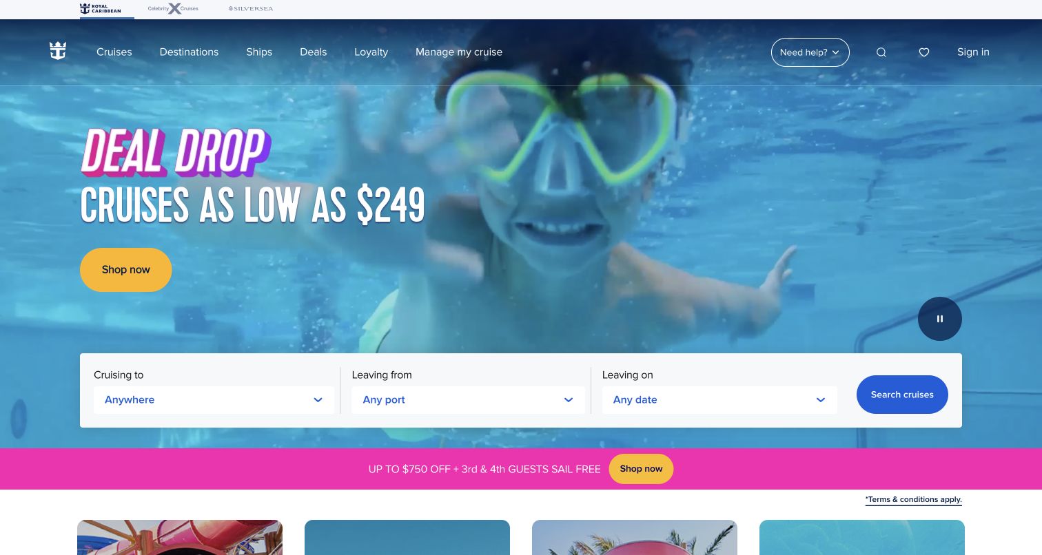
Royal Caribbean places a large underwater family scene behind a concise promotional headline and yellow shopping button. A white search panel spans the lower part of the hero, separating destination, departure port and departure date into three explicit choices. The header keeps ships, destinations, deals and existing-booking management available above the campaign. A further offer strip appears below, while a visible pause control sits over the moving imagery. The composition is useful because it connects an emotional picture of the holiday with practical travel inputs before the visitor has to leave the first screen.
What you can learn
Let the hero establish the experience, then give travelers a direct way to narrow the itinerary. Keep destination and embarkation port distinct, since where a guest wants to visit is not necessarily where they can conveniently begin the voyage.
Pros
The search panel gives each major travel choice a clear label and a generous target.
A separate booking-management route serves guests who have already purchased.
Cons & considerations
Several simultaneous offers can make it difficult to understand which conditions apply to a selected sailing.
Overlay navigation and promotional text need contrast checks throughout the background video.
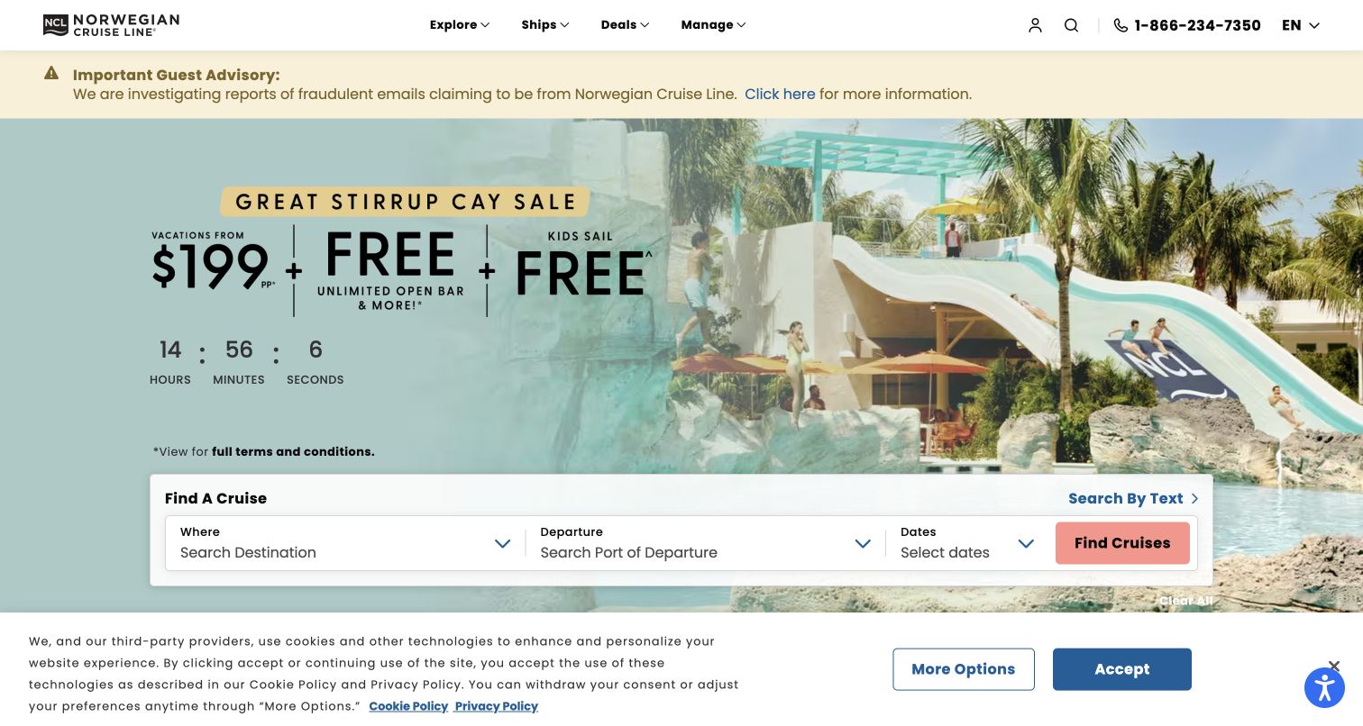
Norwegian Cruise Line uses a compact white header with a visible telephone number, then gives a guest advisory its own pale strip above the campaign. The main image shows a waterside recreation setting beside large offer typography and a countdown. A white finder panel distinguishes destination, departure port and dates, with an additional text-search route. The captured privacy notice occupies the bottom edge without hiding the central search fields. This opening demonstrates several competing information types: operational communication, time-sensitive promotion and itinerary selection each receive a different visual treatment.
What you can learn
Reserve an identifiable area for guest advisories so they do not look like another promotion. Keep the itinerary finder independently usable, and offer text search when travelers may arrive with a specific ship, destination or voyage already in mind.
Pros
The advisory strip is visibly separate from the sales campaign.
Text search complements the structured destination, port and date fields.
Cons & considerations
A countdown and several offer claims can dominate attention before a traveler understands the voyage.
A persistent bottom privacy notice reduces the space available for content on shorter screens.
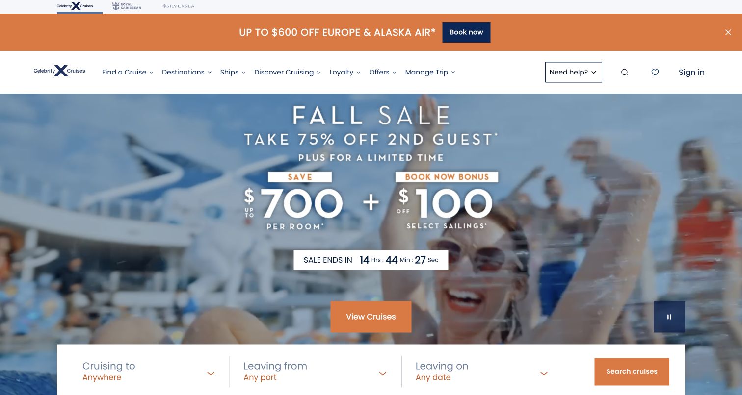
Celebrity Cruises stacks a narrow brand-family strip, an orange air-travel promotion and a white navigation row above its main campaign. The hero pairs poolside footage with large offer amounts, a countdown and an orange cruise action. Along its lower edge, the itinerary finder separates destination, departure port and departure date. The header also distinguishes discovering cruising from managing an existing trip. The page is a useful study in promotional hierarchy: several messages can coexist, but they need different scopes and clear destination pages so the visitor can understand how an air offer relates to a cruise offer.
What you can learn
When promoting flights and cruises together, explain the relationship between those components before booking. Preserve one stable itinerary search and give each promotion a precise landing page with its own eligibility, travel dates and included services.
Pros
The permanent navigation separates research, offers and trip management.
Consistent orange actions connect the promotion to an obvious next step.
Cons & considerations
Multiple promotional bands push the search form toward the bottom of the opening view.
Large savings figures need nearby explanations of the fare basis and applicable sailings.
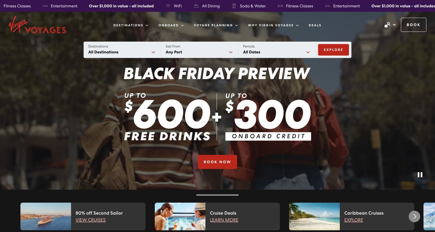
Virgin Voyages uses dark lifestyle imagery, red actions and oversized campaign typography, with a purple strip describing included onboard services at the top. The destination, embarkation-port and date controls sit above the large offer, so visitors can begin searching without first scrolling through the sales message. A horizontal row of smaller discovery cards follows the hero, offering additional routes into deals and destinations. The navigation distinguishes onboard life from voyage planning. This structure makes the brand character visible while still acknowledging that itinerary research and understanding the onboard experience are separate tasks.
What you can learn
Put the search controls where they remain easy to find even during a large campaign. Explain the onboard proposition through a dedicated information route, and keep included services separate from promotional credits that may depend on a particular booking.
Pros
The finder appears before the largest promotional headline in the visual reading order.
Onboard experience and voyage-planning categories address different stages of research.
Cons & considerations
A repeating inclusion strip and background motion can create competing movement in the first screen.
Credits, included services and discounts need clear distinctions beyond large campaign numbers.
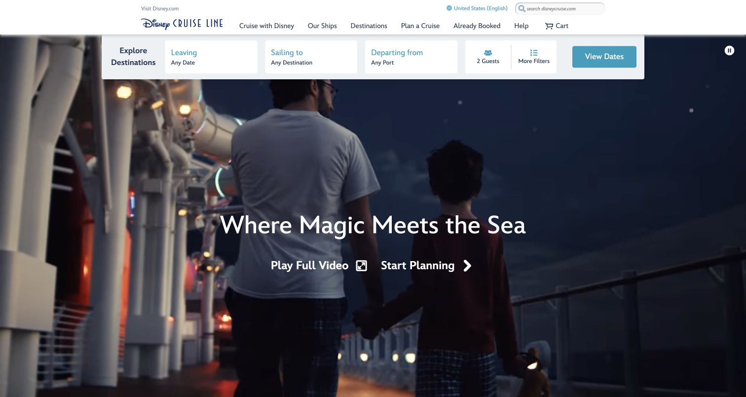
Disney Cruise Line places its search controls directly beneath a compact white header. Date, destination and departure port are joined by a visible guest-count control and a route to further filters. Below, the hero shows an adult and child on a ship’s deck, with separate actions for a full video and trip planning. The navigation also includes an already-booked section, making the site useful beyond initial discovery. The opening uses a family scene to express the experience while the form introduces the travel party early, an important distinction from search panels that ask only where and when.
What you can learn
Include the travel party when it materially changes available accommodation or results. Let visitors choose between learning about the experience and starting a practical plan, while keeping existing guests on a direct route to their own trip information.
Pros
Guest count is visible alongside the main itinerary criteria.
Video viewing and planning are presented as different actions with different purposes.
Cons & considerations
A large cinematic opening needs a useful static fallback and accessible motion controls.
Additional guest or cabin rules should be explained in the form rather than left for a later surprise.
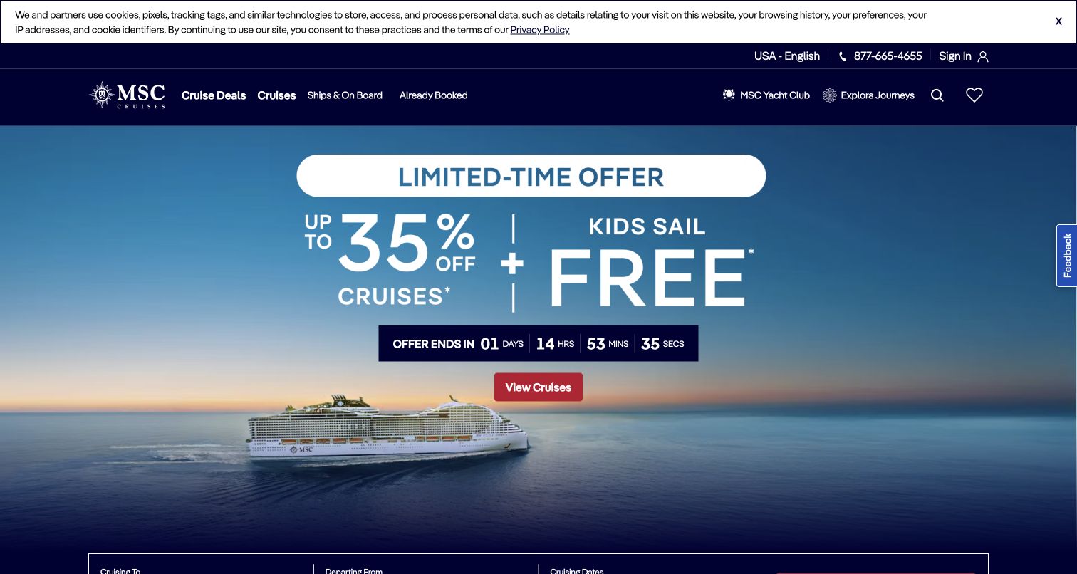
MSC Cruises uses a dark-blue header above a ship-at-sea campaign, with large centered offer typography and a countdown as the dominant elements. The main cruise action sits immediately beneath the offer, while the search panel only begins at the lower edge of the captured viewport. Navigation distinguishes cruise deals, general cruises, ships and onboard information, and already-booked guests. A privacy strip sits above the header and a feedback control occupies the right edge. The design clearly prioritizes the campaign, making it useful for considering how much first-screen space to allocate to inspiration versus direct itinerary filtering.
What you can learn
If a promotion leads the homepage, keep a persistent route to unrestricted cruise search. Explain what the offer covers on the linked results page, and make the ordinary itinerary tools easy to reach for travelers whose dates or destination do not qualify.
Pros
A single central action gives the promotional hero an unmistakable next step.
Already-booked guests have a named navigation destination separate from sales content.
Cons & considerations
Large campaign typography delays the full search controls below the first viewport.
Countdown-led offers require precise expiry behavior and clear terms when the campaign changes.
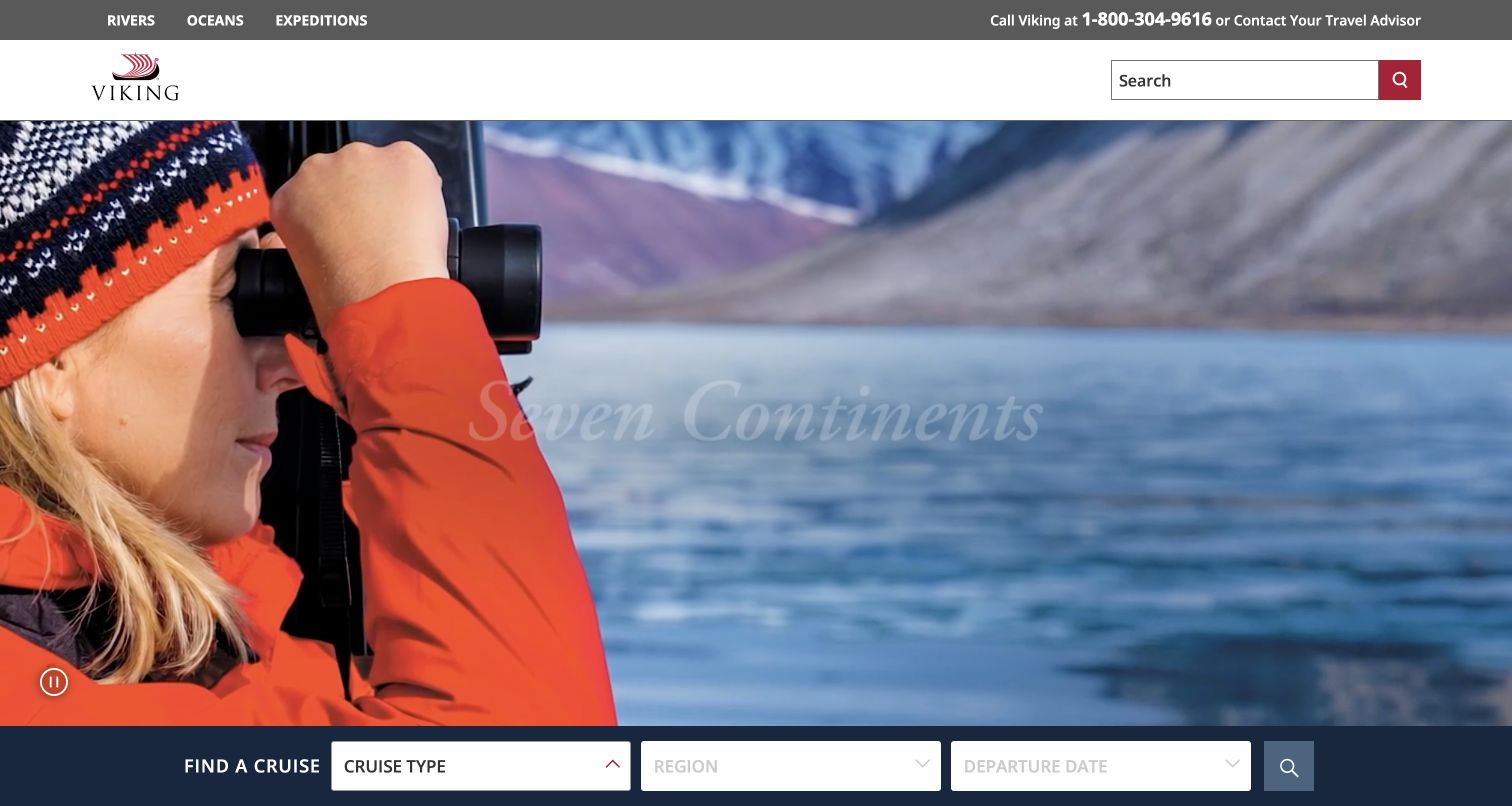
Viking separates rivers, oceans and expeditions in a slim top navigation, with a telephone or travel-advisor route on the opposite side. A broad white header carries the logo and a conventional site-search field. The hero shows an expedition traveler looking through binoculars toward a coastal landscape, and a dark finder bar sits along its bottom. That finder begins with cruise type before region and departure date. The order is a meaningful design choice: it asks visitors to identify the kind of voyage before narrowing the geography, helping distinguish substantially different travel experiences under one brand.
What you can learn
When one brand offers several voyage formats, explain those formats early and make the selection visible throughout search. A river journey, an ocean voyage and an expedition should share navigational consistency without hiding their different planning requirements.
Pros
The top-level voyage types make the breadth of the brand easy to understand.
The finder’s sequence reflects a meaningful distinction before asking for detailed travel choices.
Cons & considerations
Visitors unfamiliar with the cruise types may need a short comparison before choosing.
Light text over changing landscape footage needs a persistent contrast treatment.
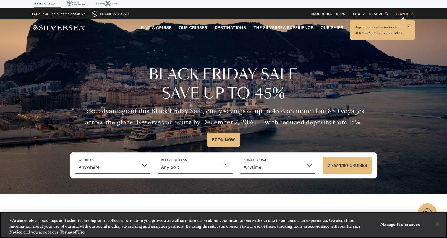
Silversea uses a dark utility bar for expert telephone help, brochures, editorial content and sign-in, followed by navigation over a destination-and-ship photograph. The centered campaign includes a headline, explanatory paragraph and booking action rather than relying on a savings figure alone. A white finder panel below asks for destination, departure port and date, and its action displays a result count in the observed state. A small sign-in prompt and bottom privacy strip remain visible. The page offers both guided and independent routes, though the several layers make careful space management important.
What you can learn
Give travelers enough context to understand a promotion before sending them into search. Pair self-service itinerary tools with visible expert help, and keep any result count synchronized with the selected filters rather than treating it as permanent marketing copy.
Pros
The campaign paragraph adds context beyond a headline and a single price claim.
Brochure and expert-contact routes support visitors who need more information before selecting a voyage.
Cons & considerations
Account prompts and privacy notices can compete with already dense header content.
White text over a detailed harbor image needs careful contrast and responsive line lengths.
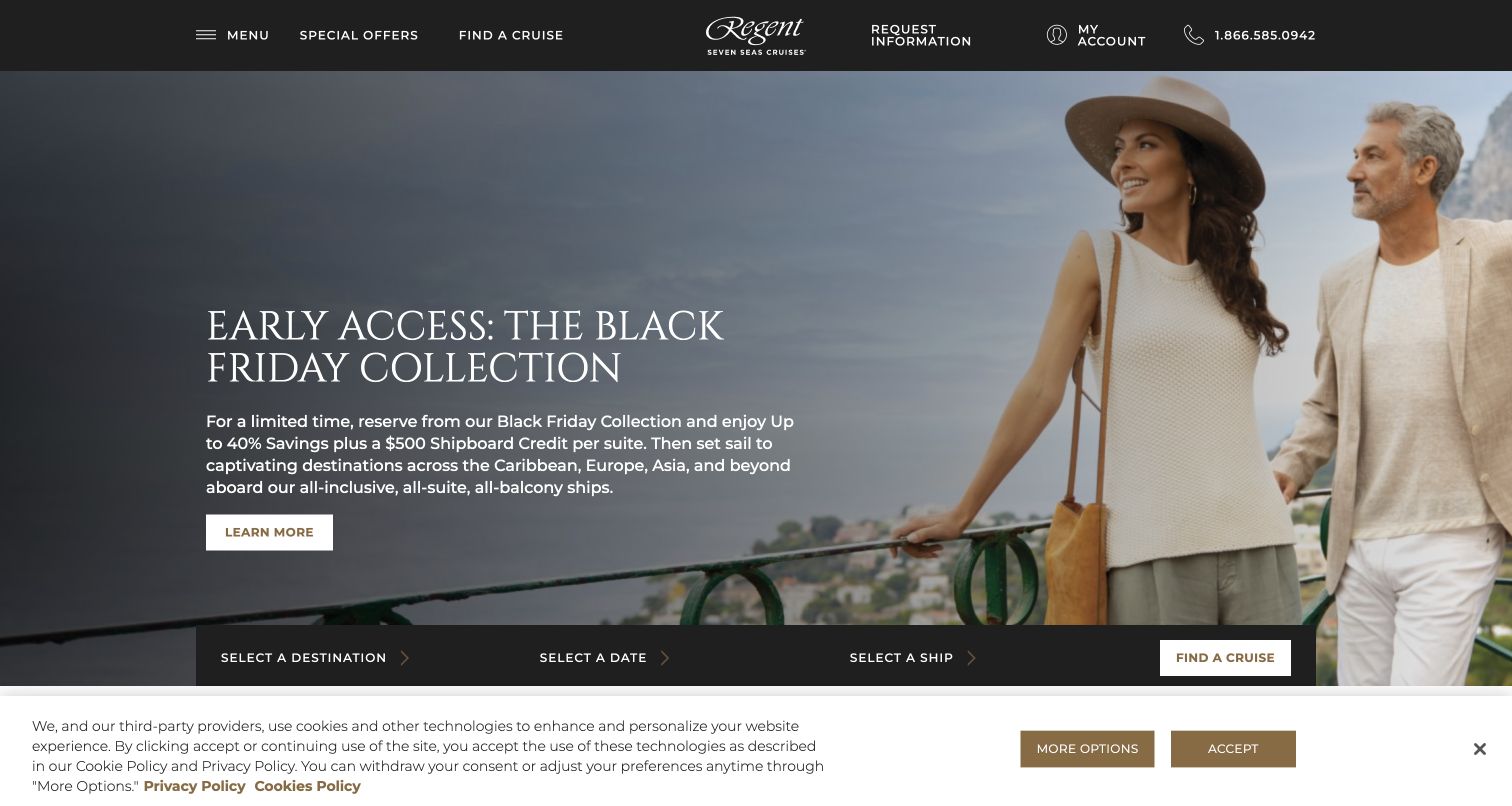
Regent Seven Seas Cruises uses a restrained black header with the wordmark centered between cruise discovery and assistance routes. The hero places a couple on the right, leaving a darkened reading area for a serif headline, explanatory paragraph and learn-more action on the left. A compact finder at the bottom asks for destination, date and ship. This differs from forms that prioritize departure port and reflects a useful alternative for travelers who already have a vessel preference. The captured bottom privacy strip also shows how a low-positioned finder can compete with persistent notices.
What you can learn
Choose search fields according to the decisions your customers actually make. If ship preference is important, expose it early while retaining access to itinerary and port details. Use the campaign paragraph to explain the offer without turning the entire opening into fine print.
Pros
The photograph leaves a deliberate area for readable campaign copy.
A ship filter accommodates travelers comparing the onboard product as well as the destination.
Cons & considerations
The low finder position is vulnerable to overlap from privacy or support panels.
A compact primary menu may require an extra step to discover destination and onboard-information categories.
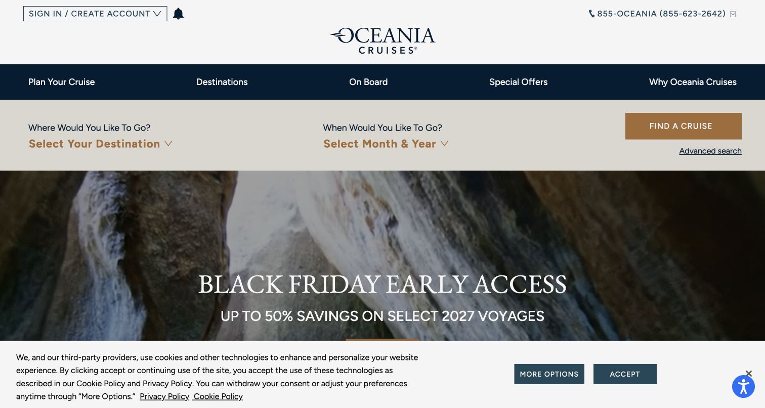
Oceania Cruises places its logo in a generous white masthead and separates the main categories into a dark navigation band. A broad pale search strip follows immediately, asking where the traveler wants to go and which month and year they prefer. An advanced-search link sits beneath the main cruise action. Only then does the photographic campaign begin. The ordering makes travel criteria more prominent than the promotional artwork and offers a clear path for both simple and detailed searches. In the captured view, a large bottom privacy notice covers part of the campaign rather than the primary search controls.
What you can learn
Place durable search criteria ahead of seasonal imagery when visitors commonly arrive with a destination or approximate month in mind. Offer advanced search as a clearly named continuation, and preserve their earlier selections when they move into the fuller form.
Pros
The primary search remains visible before any large campaign artwork.
An explicit advanced-search route acknowledges travelers with more detailed requirements.
Cons & considerations
The tall masthead and separate navigation band consume substantial vertical space.
Broad destination and month choices need well-organized results to avoid an overwhelming first list.
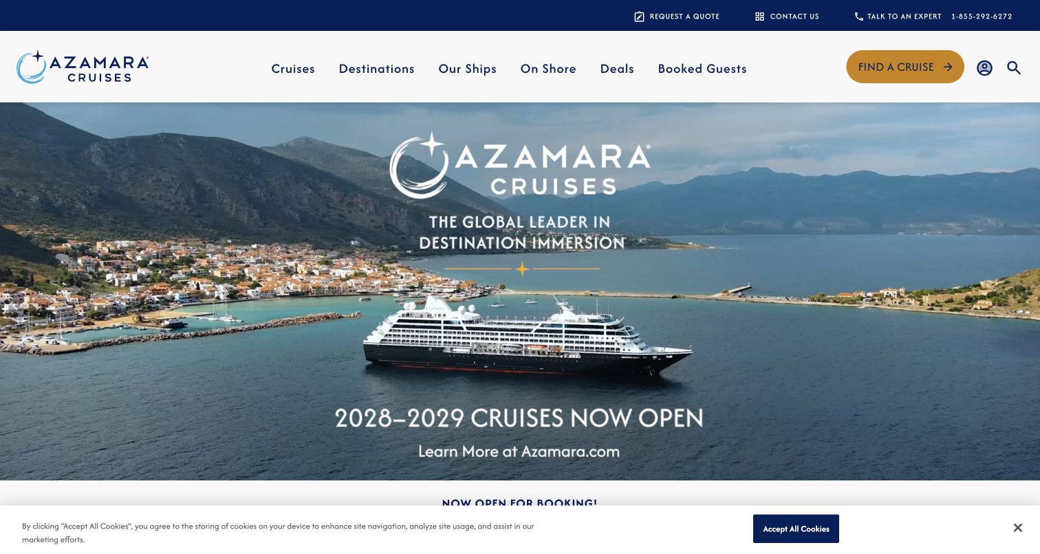
Azamara uses a narrow utility strip for quote requests, contact and expert telephone assistance, then a spacious white navigation row with a prominent cruise-finder button. The large campaign image shows a ship beside a coastal town and announces a future voyage release. The menu gives shore experiences their own category and distinguishes booked guests from new shoppers. The saved page text below the hero includes featured itineraries with dates, route maps and price context. Together, these elements connect the destination story to a more specific voyage record without requiring the opening image to carry every detail.
What you can learn
Use a new-season campaign to introduce a collection, then connect it to dated itinerary records with maps and clear route names. Keep quote requests available as an alternative, and preserve the selected voyage when a traveler asks for help.
Pros
Quote, contact and expert-help routes are distinct from the main cruise-finder action.
A dedicated shore category reinforces the role of destinations beyond the ship itself.
Cons & considerations
A large future-season announcement needs a clear route for travelers seeking nearer departures.
Text embedded within campaign imagery should have an equivalent readable text presentation.
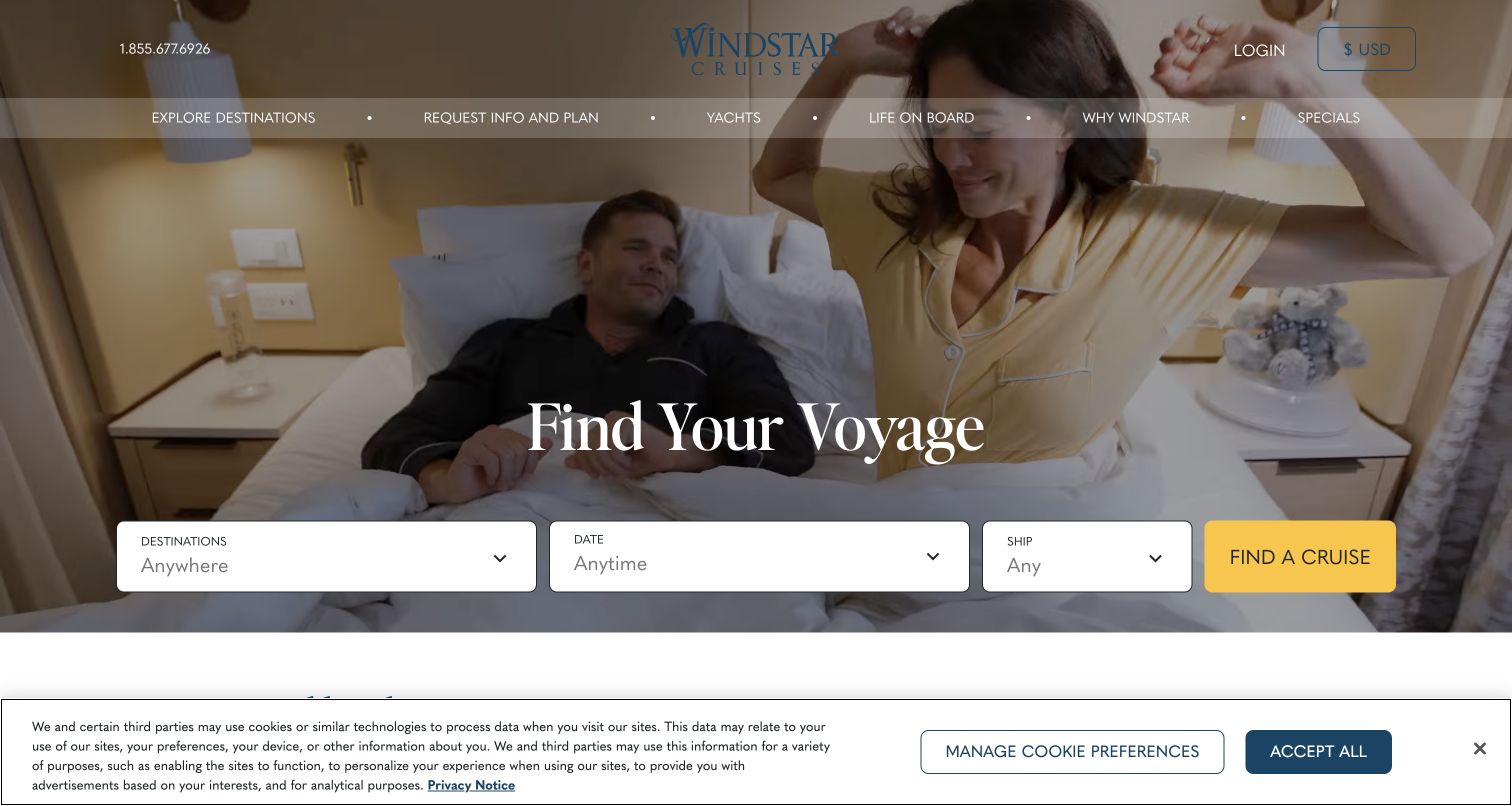
Windstar Cruises centers its wordmark above a translucent navigation band, with telephone contact and currency context at the top. The hero shows an onboard cabin scene rather than an exterior ship or distant destination. A short voyage-finding headline leads directly into large destination, date and ship controls with a yellow search action. The main navigation separates destinations, planning information, yachts and onboard life. This composition makes the accommodation experience part of the first impression while preserving a practical route to sailings. A bottom privacy strip is visible but sits below the main search panel in this capture.
What you can learn
Show onboard life when it helps explain the product, but pair that image with clear itinerary controls. If travelers can choose a ship, keep the vessel selection connected to accurate cabin, facilities and route information on the subsequent pages.
Pros
Large finder fields remain visually distinct from the detailed cabin photograph.
Ship choice and onboard-life navigation help connect the journey with the vessel experience.
Cons & considerations
Translucent navigation needs contrast checking against every selected background scene.
A lifestyle photograph alone cannot communicate cabin dimensions, accessibility or included features.
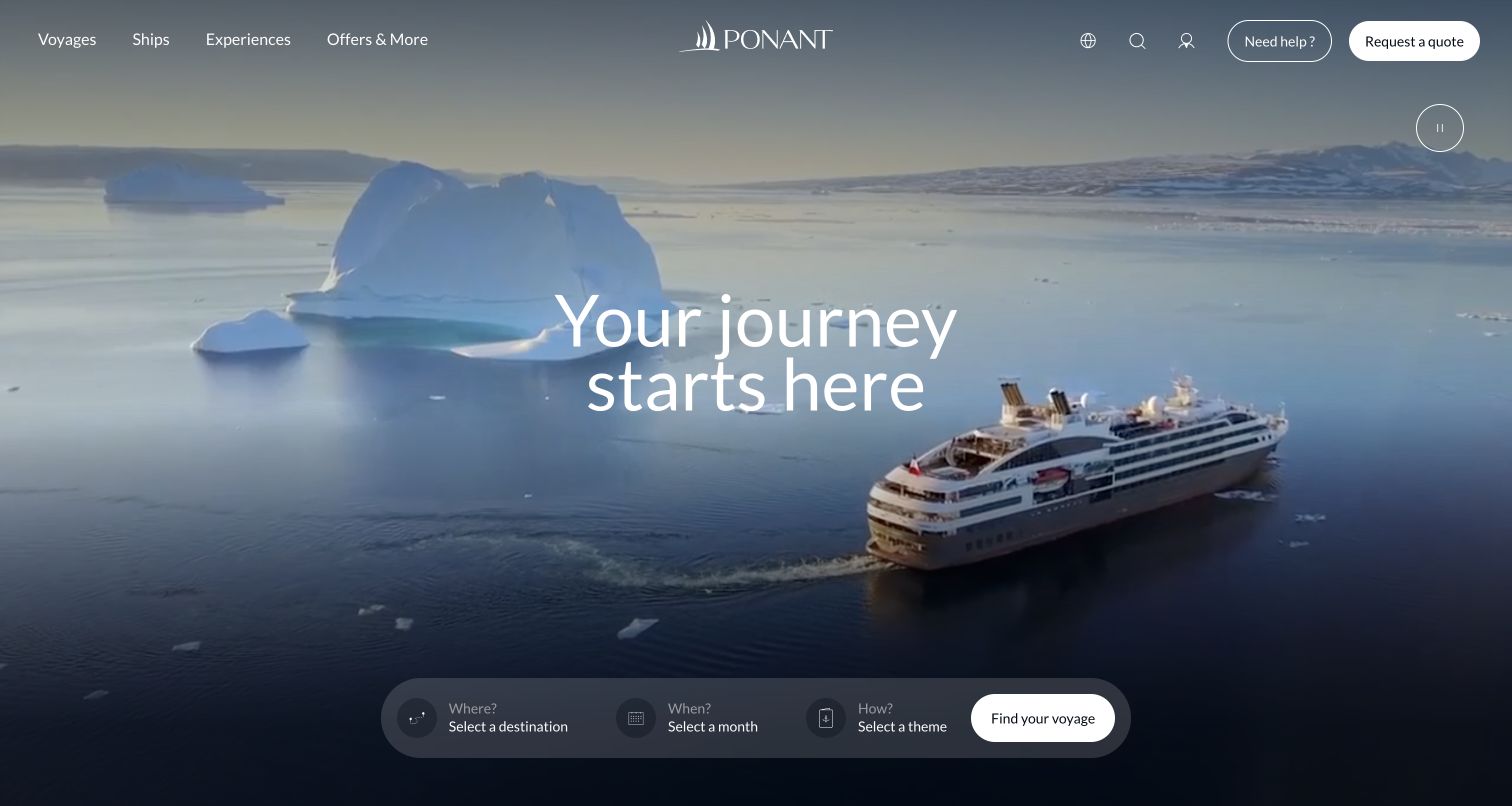
Ponant uses a full-screen scene of a ship traveling among icebergs, with a concise centered headline and a restrained navigation row above. A rounded finder sits near the bottom, asking where, when and how, with the final choice described as a theme. Help and quote-request controls remain visible in the upper-right corner, and a large pause control is separated from the search area. The opening gives the landscape room to communicate the experience, while the theme field introduces a discovery dimension beyond geography and departure date. It is a useful pattern for trips whose subject or activity matters to selection.
What you can learn
Use thematic filters only when they represent meaningful differences between voyages. Explain their labels in plain language, connect each theme to specific itinerary content, and retain practical date and destination choices for visitors who already know where they want to travel.
Pros
The theme field provides an additional way to explore beyond destination alone.
Help, quote requests and motion control are visibly separate from the main finder.
Cons & considerations
The short heading gives little practical context without the surrounding search and navigation.
A small translucent finder needs careful text contrast and touch-target sizing on phones.
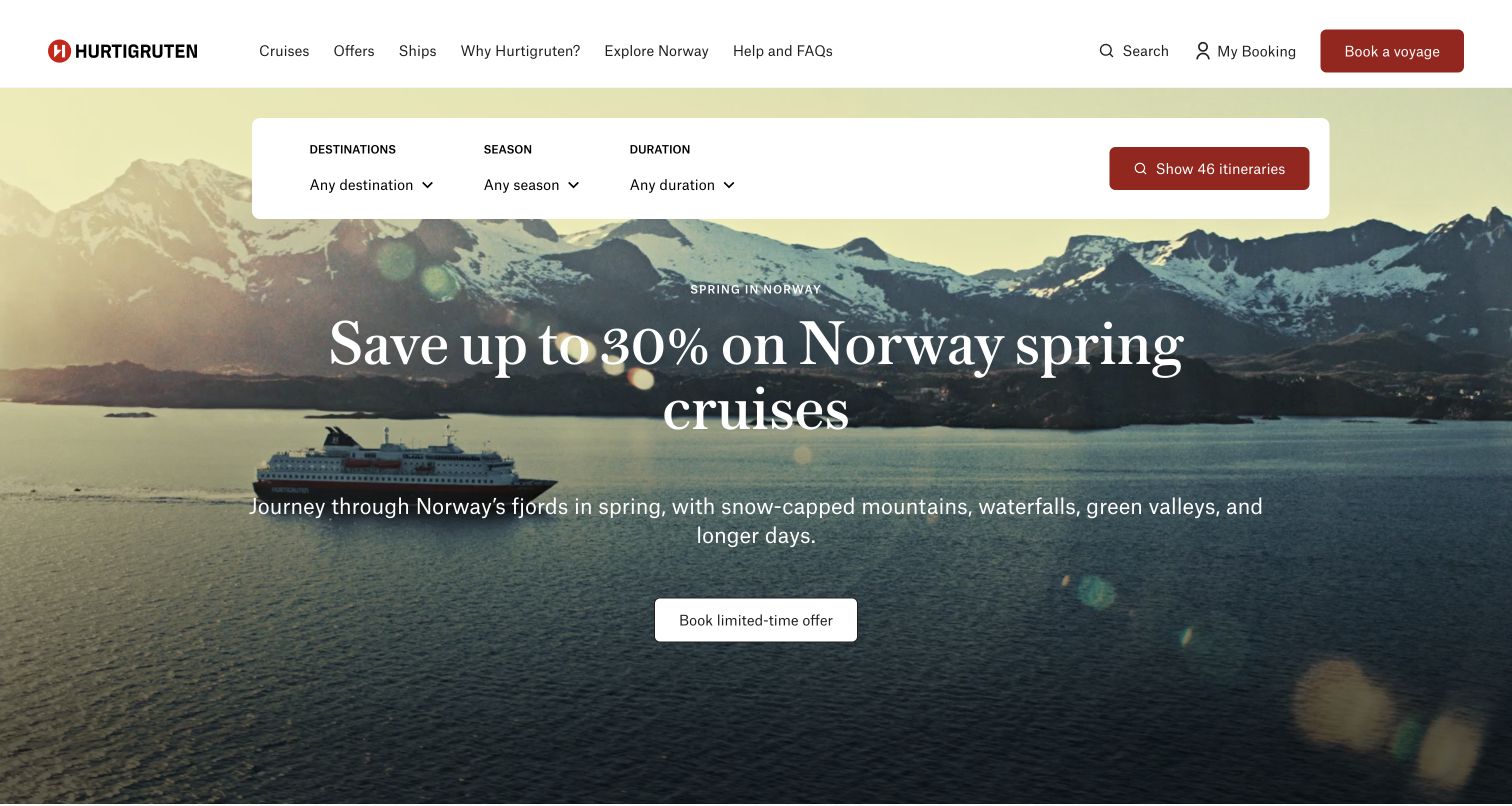
Hurtigruten places a wide white finder near the top of its landscape hero, using destination, season and duration as the three visible criteria. The campaign below focuses on spring travel in Norway, with a ship, snow-lined mountains and a separate offer action. The header names ships, reasons to choose the operator, Norway information and help, while booking management has its own route. The saved page text also distinguishes different voyage formats beneath the opening. The design makes season a first-class planning choice and connects the promotional scene to a specific regional context instead of a generic ocean holiday.
What you can learn
When the travel experience changes substantially by season, make season visible in discovery and explain what differs. Pair evocative scenery with duration and itinerary information so travelers can compare a route’s practical shape as well as its atmosphere.
Pros
Season and duration appear directly in the initial search controls.
Help and existing-booking access remain separate from the promotional voyage action.
Cons & considerations
Seasonal imagery should not imply that weather or natural phenomena are guaranteed.
An itinerary count requires clear behavior when filters produce few or no matching journeys.
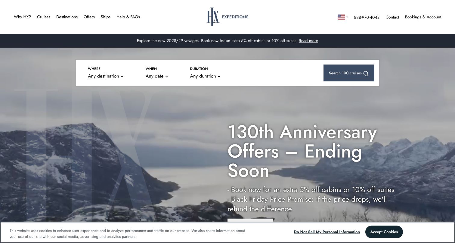
HX Expeditions uses a spacious white header with the brand centered between discovery categories and assistance or account routes. A narrow announcement strip introduces a future-season offer, while the main hero carries a different anniversary promotion over mountainous scenery. The white finder sits above the campaign text and asks for destination, date and duration. Its action includes a visible result count. This layout gives the essential search an independent position despite several commercial messages. The captured privacy strip covers the bottom edge, illustrating why important controls should not depend entirely on the lowest part of a tall hero.
What you can learn
Keep the expedition finder independent from temporary campaign copy and give duration equal importance when trips vary widely in length. Distinguish future-season announcements from current promotions so travelers can tell which dates and accommodations each message concerns.
Pros
The finder remains above the largest promotional text and is easy to identify.
Destination, date and duration provide a practical starting structure for expedition research.
Cons & considerations
Concurrent announcement and anniversary offers can create ambiguity about their relationship.
Large overlaid text and a bottom privacy notice can leave little room for supporting details.
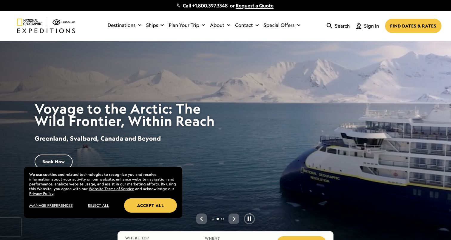
National Geographic–Lindblad Expeditions pairs a white navigation bar with a black telephone-and-quote strip above it. The captured hero shows an expedition ship against snowy mountains and identifies an Arctic journey with a supporting line naming several regions. A yellow dates-and-rates action remains prominent in the header, while the story itself has a separate booking button. Previous, next and pause controls are visible near the bottom of the hero. A privacy panel overlaps the lower-left area in this view. The structure distinguishes broad expedition storytelling from the more concrete task of finding a departure and fare.
What you can learn
Name the practical output of a search action when it helps travelers understand the next page. A dates-and-rates route can sit beside editorial destination stories, provided both lead to the same accurate trip records and preserve their regional context.
Pros
The header action clearly describes access to departure dates and pricing information.
The supporting regional line makes the featured expedition more specific than the photograph alone.
Cons & considerations
A lower-left privacy panel can overlap the hero’s main action and supporting text.
Carousel navigation needs accessible labels and should not move focus as stories change.
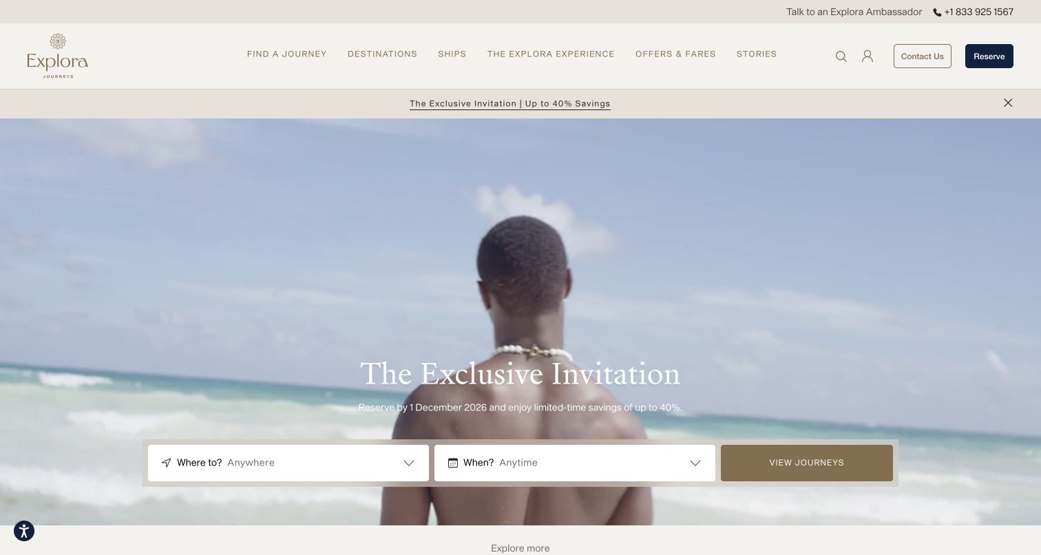
Explora Journeys uses warm neutral colors and a spacious header, with contact and reservation actions separated at the right. A narrow promotional strip precedes a beach scene and a restrained centered campaign headline. The finder asks only where and when before offering to show journeys, keeping the opening decision relatively simple. The navigation gives ships, the onboard experience, fares and editorial stories their own places. This design places more emphasis on mood and a small number of choices than on an extensive form. Its usefulness depends on the next results page revealing the details that the simplified opening intentionally postpones.
What you can learn
A two-field finder can provide a welcoming start when visitors are still exploring. Carry those choices into results, then expose duration, vessel, accommodation and fare details progressively rather than forcing the traveler to restart with a different search.
Pros
The limited initial fields make the starting task easy to understand.
Contact and reservation controls remain distinct within the calm header composition.
Cons & considerations
Small campaign and navigation text may become difficult to read over bright imagery or on phones.
A simplified finder needs strong result filters for travelers with more specific requirements.
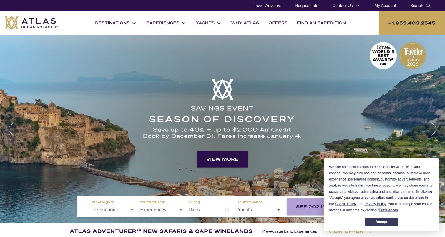
Atlas Ocean Voyages combines purple and gold branding with a white navigation row and a large telephone block. The hero shows a coastal destination behind a campaign title, explanatory offer text and a centered action. A finder below includes destinations, experiences, dates and yachts, giving visitors four different ways to narrow the collection. Award badges sit in the upper-right image area, while a privacy panel overlaps the lower-right finder in the saved view. The page is useful for comparing how experience-based travel can be organized, and for seeing the space pressure created when promotions, credentials and search share one hero.
What you can learn
If experiences and vessels materially distinguish voyages, make those dimensions searchable with clear descriptions. Reserve enough space for the finder to remain usable alongside notices, and link any displayed award to its specific source and scope rather than relying on a badge alone.
Pros
Experience and yacht fields support discovery beyond a destination-and-date search.
The telephone contact has a prominent, visually distinct place in the header.
Cons & considerations
The privacy panel obscures part of the finder and its action in this capture.
Awards, offers and multiple search criteria can compete for attention within one image area.
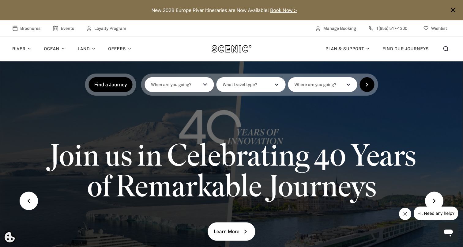
Scenic uses separate utility and primary-navigation rows, with brochures, events, loyalty and booking management above the river, ocean and land categories. A pill-shaped finder sits high in the hero, asking when, which travel type and where. The main campaign uses very large serif typography over a divided travel image, with a distinct learn-more action below. A top announcement adds another future-itinerary route. The page demonstrates how several travel formats can share one discovery system while remaining visible as separate categories. It also shows the vertical space required when utility services, campaign messaging and a search form all receive prominent treatment.
What you can learn
Model travel format explicitly when one brand sells several kinds of journey. Keep the selected type connected to appropriate destinations and dates, and place brochures and booking support in stable navigation rather than making them depend on the current campaign.
Pros
River, ocean and land categories make the different journey formats visible.
The finder precedes the largest campaign headline and remains a separate visual component.
Cons & considerations
Multiple header bands reduce the space available for the main content on shorter screens.
Very large headline typography needs deliberate mobile wrapping and must not crowd search controls.
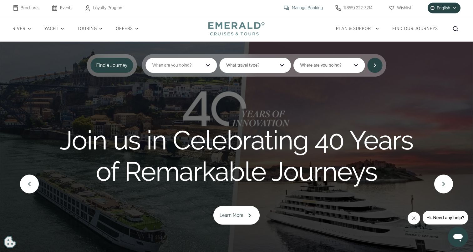
Emerald Cruises uses a white header and muted green accents, with river, yacht and touring categories arranged around the centered wordmark. Brochures, events, booking management and a wishlist appear in a utility row. The hero juxtaposes river and yacht imagery beneath an anniversary campaign, while a rounded finder asks for timing, travel type and destination. The visible ship images reinforce the same distinction introduced by the navigation. This makes the opening useful for a traveler deciding between formats, although the large anniversary message contains less practical itinerary information than the search controls surrounding it.
What you can learn
Use imagery and taxonomy to explain the same product distinctions. If river and yacht journeys differ in route, accommodation or pace, carry those labels consistently from the homepage through results and detail pages so the visitor can make a coherent comparison.
Pros
The paired vessel imagery supports the river-and-yacht distinction in the navigation.
Booking management and wishlist access are separated from initial journey discovery.
Cons & considerations
A broad anniversary campaign needs an explicit connection to useful itinerary information.
A chat prompt and carousel controls should be checked for overlap with lower-page actions on mobile.
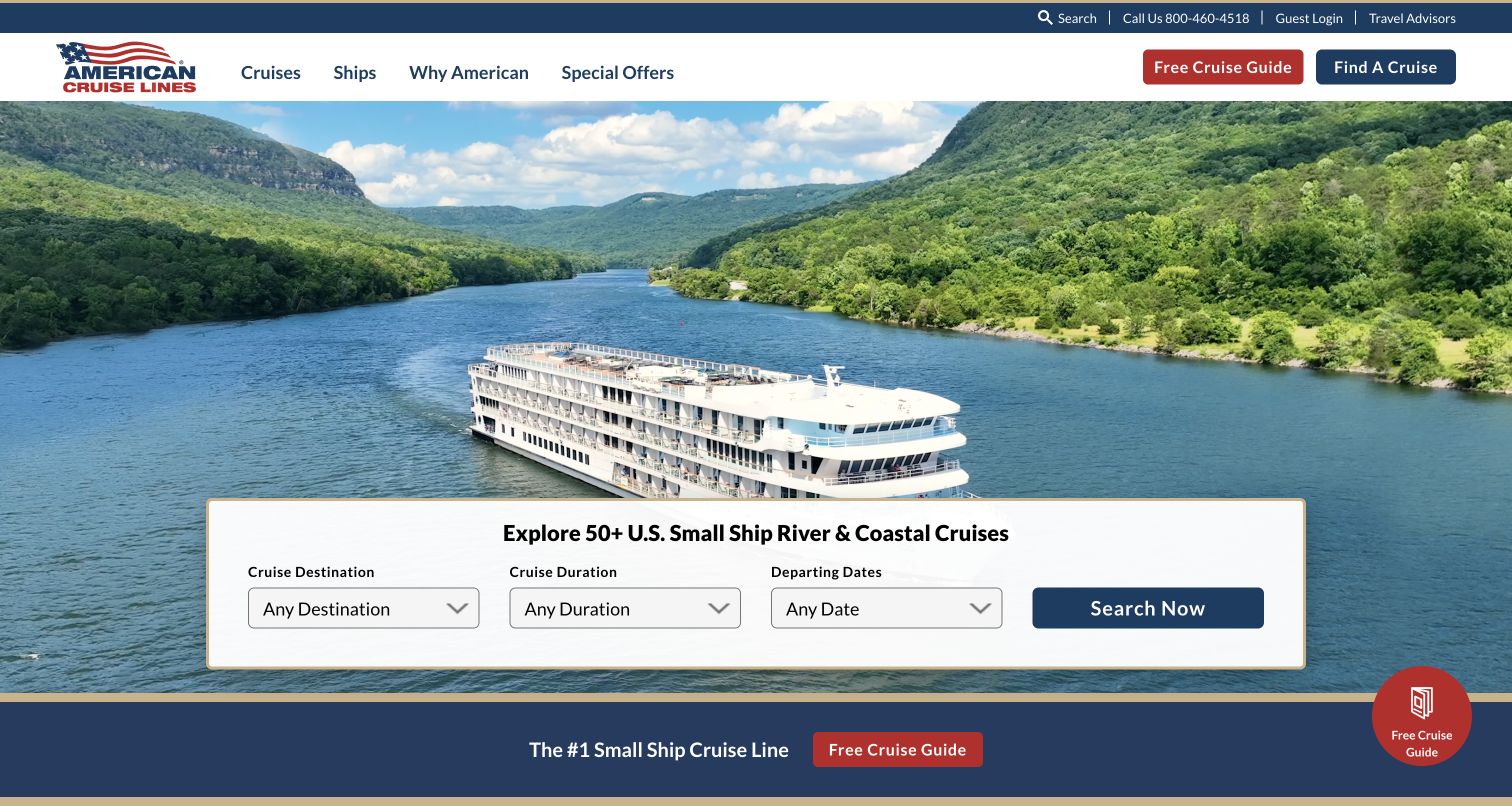
American Cruise Lines uses red, white and blue branding above a large photograph of a ship on a wooded river. A white finder panel names the U.S. river-and-coastal focus and exposes destination, duration and departure-date fields. The saved form text includes recognizable regional choices and duration bands, giving the search a concrete planning structure. The header separates ships and special offers from the main cruise categories, while brochure requests appear in several places around the opening. The page communicates both the vessel setting and the geographical scope before a traveler has to inspect an individual itinerary.
What you can learn
State the geographic and voyage scope near the finder, then use destination regions and duration bands that help travelers narrow their options. Offer a brochure as a complementary research route while preserving direct access to current itinerary details.
Pros
The finder clearly identifies the regional river-and-coastal focus of the collection.
Duration bands provide a useful filter for travelers planning around available time.
Cons & considerations
Repeated brochure actions can compete with the primary itinerary-search task.
A vessel photograph needs accompanying ship and accommodation details before it supports a meaningful comparison.
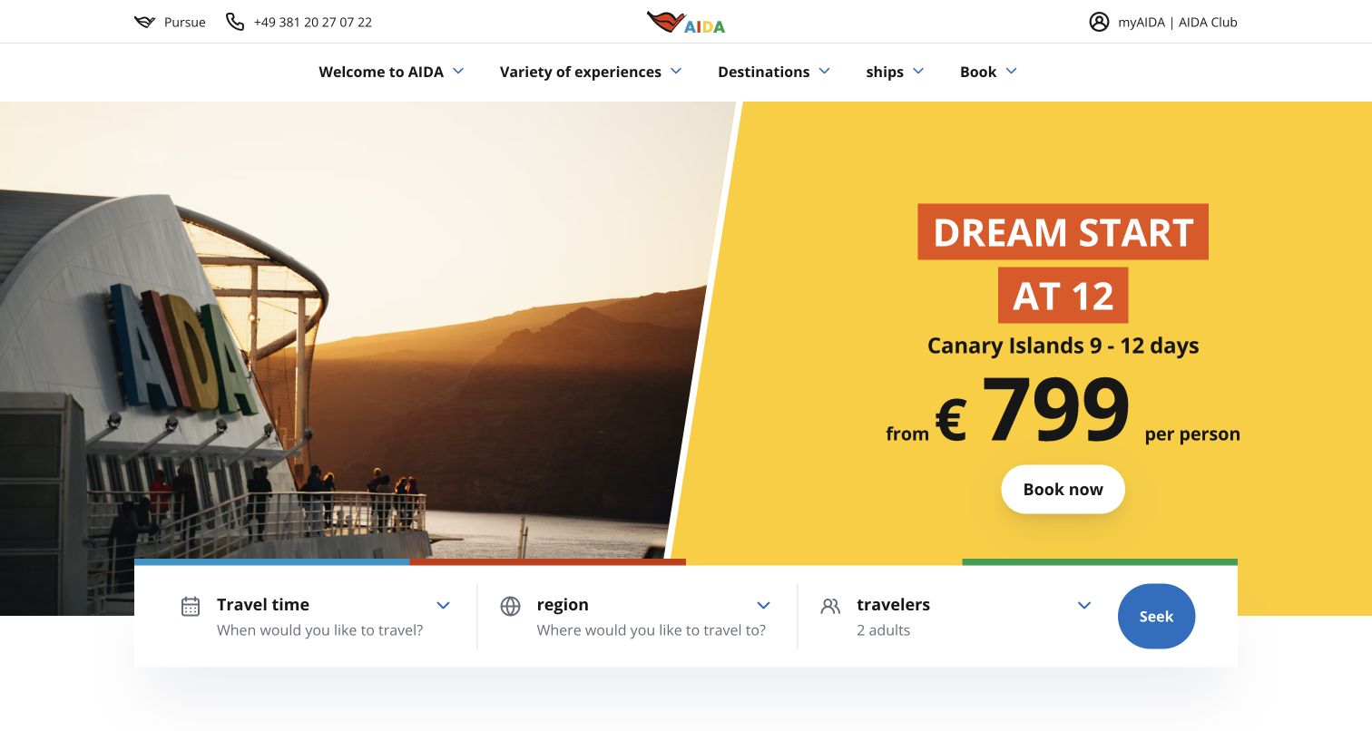
AIDA Cruises divides the hero between a ship photograph at sunset and a bright yellow offer panel. The panel keeps the destination, trip length and per-person price presentation together, with a booking action beneath. A white finder overlaps the lower edge and separates travel time, region and travelers, showing the party size before search. The header remains relatively restrained despite the colorful campaign. This saved view was automatically translated into English by the browser on the German AIDA property, so its interface wording is a translated observation rather than evidence of an official English-language version.
What you can learn
Keep the traveler count visible when it affects fare or cabin selection, and place the offer’s destination and duration beside its price. For localized sites, test the original language and supported translations separately because automatic browser translation can change labels and line breaks.
Pros
The split composition gives price context a solid background separate from the photograph.
The finder includes traveler count alongside region and timing.
Cons & considerations
A per-person starting price needs clear occupancy, departure and fare-condition context on the linked offer.
Automatically translated labels can be awkward or inconsistent and should not be treated as authored interface copy.
Plan the journey from discovery to a specific sailing
Map the main starting points
Write short scenarios for a destination-led traveler, someone tied to a departure port, a guest choosing a particular ship and a customer returning to manage an existing booking. Identify the information each needs first. Use that work to decide which search fields belong on the homepage and which can appear later as result filters.
Define the itinerary and fare data model
List the fields that must remain consistent across search, maps, promotions and booking. Include route, dates, duration, ship, cabin category, guest assumptions, currency, availability and fare inclusions. Record which system owns each field and how updates propagate. Give uncertain or unavailable information an explicit state instead of filling the gap with a misleading default.
Design both independent and assisted planning
Some travelers will compare sailings themselves; others will request a quote, read a brochure or speak with an adviser. Preserve the selected voyage and travel criteria when they change routes. Explain what a request will produce and whether a reservation has actually been made. Use test records and approved test environments when checking inquiry and booking handoffs.
The editing job behind the design
Choose systems that keep voyage information consistent
Start with the relationship between itinerary content, sailing inventory and booking. Editorial tools should let a team promote a destination without duplicating authoritative dates, cabin details or availability. Search should read structured voyage data and retain selected filters when a visitor opens an itinerary and returns. Define graceful behavior for missing images, unavailable departures and delayed inventory responses.
Treat maps, video, brochures, account access and adviser inquiries as supporting services with clear owners. They should enhance research without blocking basic itinerary information. Monitor the handoff to any separate booking provider and make its destination recognizable. Public technology evidence can establish a specific website component or implementation relationship; it does not reveal every private reservation or passenger-management system.
Our WordPress website examples offer a separate look at publishing approaches. A visible platform label is evidence for that named page, not a guarantee that the same system will suit your requirements.
Before the public launch
Cruise website launch checklist
Check that destination, embarkation port and disembarkation port are labeled distinctly.
Verify dates, duration, ship and route details against the authoritative sailing record.
Show the fare currency, pricing basis, guest assumptions, included services and optional additions clearly.
Test no-results, unavailable-departure and changed-itinerary states without making a real reservation.
Preserve selected dates, party size and filters when moving between results, itinerary pages and assistance.
Keep booked-guest help, accessibility information and practical travel details easy to find.
Review date selectors, guest controls, maps, menus, motion and privacy panels on phones and with a keyboard.
Assign owners and expiry dates to seasonal offers, countdowns, brochure versions and future-season announcements.
Confirm that quote requests and booking-provider links retain the correct sailing context.
These checks are a project checklist, not a performance, legal, security, or accessibility certification. Test real journeys with the people responsible for the website before making claims about the result.
Sources & editorial method
How this collection was selected and reviewed
The collection contains 22 distinct official cruise properties represented by genuine public browser captures made on November 4, 2026. Original reviews were written from those saved images and their accompanying public DOM observations, preserving the source records and capture dates. AIDA is explicitly represented by a browser-translated English view of its German property. The review process did not complete purchases, submit quote requests, create accounts or assess private reservation systems. Prices, availability, promotional claims and travel conditions require confirmation on the operator’s current authoritative pages.
Each example links to its actual source page. Screenshots are direct browser captures with their own capture dates; moving imagery, announcements and live designs can change. The notes describe observable design choices and conditional tradeoffs, not measured traffic, conversion results, service quality, or accessibility conformance.
Technology labels use public page metadata, asset evidence, or explicitly cited platform documentation. Platform documentation is not a complete current deployment audit. A component reference may be legacy or unused; it is not a complete backend inventory. Unknown stacks are omitted. These sites are editorial examples, not our client portfolio.
Written, Edited and Curated are separate editorial records, not timestamps advanced by a rebuild. Website designs and imagery belong to their owners. See our editorial standards or suggest a correction.
Questions worth asking
Cruise Lines website design questions
Which fields belong in a cruise homepage search?
Choose the fields that reflect the operator’s main planning decisions. Destination and timing are common starting points; departure port, duration, ship, voyage type or guest count may also be important. Keep the opening manageable and provide clear filters for the details deferred to results.
How can a cruise page make a starting price understandable?
Show the currency, per-person or per-cabin basis, guest assumptions and the departure or accommodation to which it applies. Distinguish the fare from optional services and promotional credits. Link the relevant conditions beside the offer and keep the displayed information synchronized with the booking source.
Should river, ocean and expedition voyages share one finder?
They can share a consistent interface if the travel type remains explicit and the available filters suit each format. Explain the differences before forcing a choice, and carry the selected type into results. Avoid showing a generic field that has a different meaning for each voyage category.
What makes a cruise itinerary page useful beyond a route map?
A map helps orient the traveler, but it should be accompanied by readable day-by-day information, ship and accommodation details, ports, dates, inclusions and practical support. Explain where plans may change and provide a clear route to the authoritative booking or assistance service.
How should the site serve guests who have already booked?
Give them a plainly named route that does not require navigating new-sales campaigns. Explain what they can manage, where their booking information lives and how to get help. Keep public practical information available where possible so basic questions do not become unnecessary account-navigation tasks.
Use the imagery to help travelers imagine the experience, then make the voyage specific. Consistent itinerary records, clear fare context and dependable help turn an attractive cruise homepage into a useful planning tool.