A luggage store should make it easy to understand what a bag holds, how large it is, how it works, and which version is available. Travel campaigns create interest; concrete product information helps someone choose.
A suitcase, a weekend bag, and a commuter backpack answer different needs. Organize the store around those practical distinctions before asking shoppers to learn collection names. Keep size, weight, construction, organization, and available colors easy to compare, with enough photographs to understand the product beyond its appearance in a travel scene.
These thirteen examples range from broad travel-goods catalogs to focused premium brands. Their public pages use lifestyle photography, gift campaigns, collection stories, feature demonstrations, and direct product categories in different combinations. Use the collection to study those relationships; a screenshot does not verify durability, warranty outcomes, environmental claims, or whether a bag will be accepted for a particular journey.
Before the examples
What makes good luggage stores website design in 2026?
Make dimensions and capacity understandable
Keep external measurements, weight, capacity, and relevant expanded dimensions in a consistent product record. State the unit and measurement method, including how protruding parts are treated. Show a bag beside a person or familiar object while retaining the actual measurements. A suggestive trip label should help discovery without replacing precise product information.
Show the parts that affect everyday use
Plan photographs and short demonstrations of the interior, opening, handles, wheels, pockets, straps, and closures where relevant. Show how a laptop compartment or packing system is accessed. Keep useful details available as still images and text so a moving hero or demonstration video is not the only way to understand the product.
Keep variants, sets, and personalization explicit
Treat size, color, finish, and customization as distinct choices with clear price and availability changes. For a set, list every included item and its selected variant. Explain the relevant lead time and return conditions before an order is placed, especially where personalization or a mixed-availability bundle changes the ordinary purchase flow.
The collection · 13 examples
13 luggage stores websites worth studying
Compare how each store moves from a travel or gift story to recognizable product categories and specific bag choices. Pay particular attention to scale, feature explanation, the clarity of size names, and the visibility of customer support around the campaign.
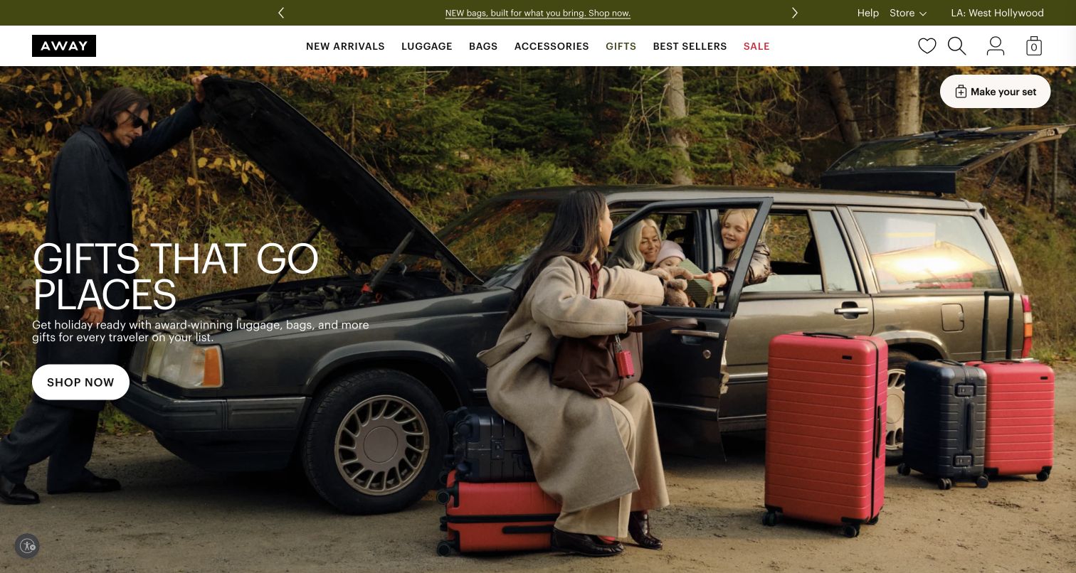
Away opens with a family beside a car on an autumn road trip, placing several suitcases inside a recognizable travel situation. A large gift headline and a white shopping button occupy the quieter left side of the photograph. The header keeps familiar product categories available above the campaign. Farther down, product names, colors and features return the visitor to concrete merchandise. The opening establishes an occasion before asking shoppers to compare individual models.
What you can learn
Give lifestyle photography a practical job: show the bag beside people, vehicles or other objects that help communicate its use. Follow the story with dimensions and model comparisons so an attractive scene leads to an informed choice.
Pros
The road-trip scene provides useful context for several case sizes without a technical diagram.
The shopping button remains distinct from the photograph and the small set-building prompt.
Cons & considerations
A gift campaign can delay direct size comparison for a shopper who already knows the required capacity.
White text over photography needs checking whenever the image or mobile crop changes.
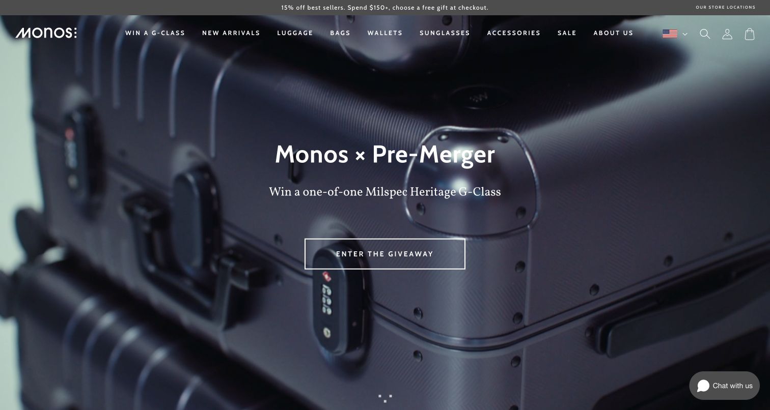
Monos uses a close view of a case and lock as the backdrop for a collaboration giveaway. The centered campaign message gives the opening a single focal point, while the header preserves access to luggage and other product families. The broader page separates carry-on, check-in, hybrid and aluminum ranges. This creates a useful distinction between the current brand event and the lasting catalog, although the first call to action serves the giveaway rather than a suitcase purchase.
What you can learn
Treat collaborations as an optional route through the store. Maintain recognizable size and construction categories nearby, and make comparison available for shoppers who arrive with a practical requirement rather than an interest in the campaign.
Pros
The restrained composition gives the collaboration a clear visual identity without crowding the hero.
Distinct range names provide several ways to narrow a broad luggage assortment.
Cons & considerations
A giveaway button adds a detour for visitors whose immediate goal is choosing luggage.
Named ranges still need plain explanations of weight, construction and size differences.
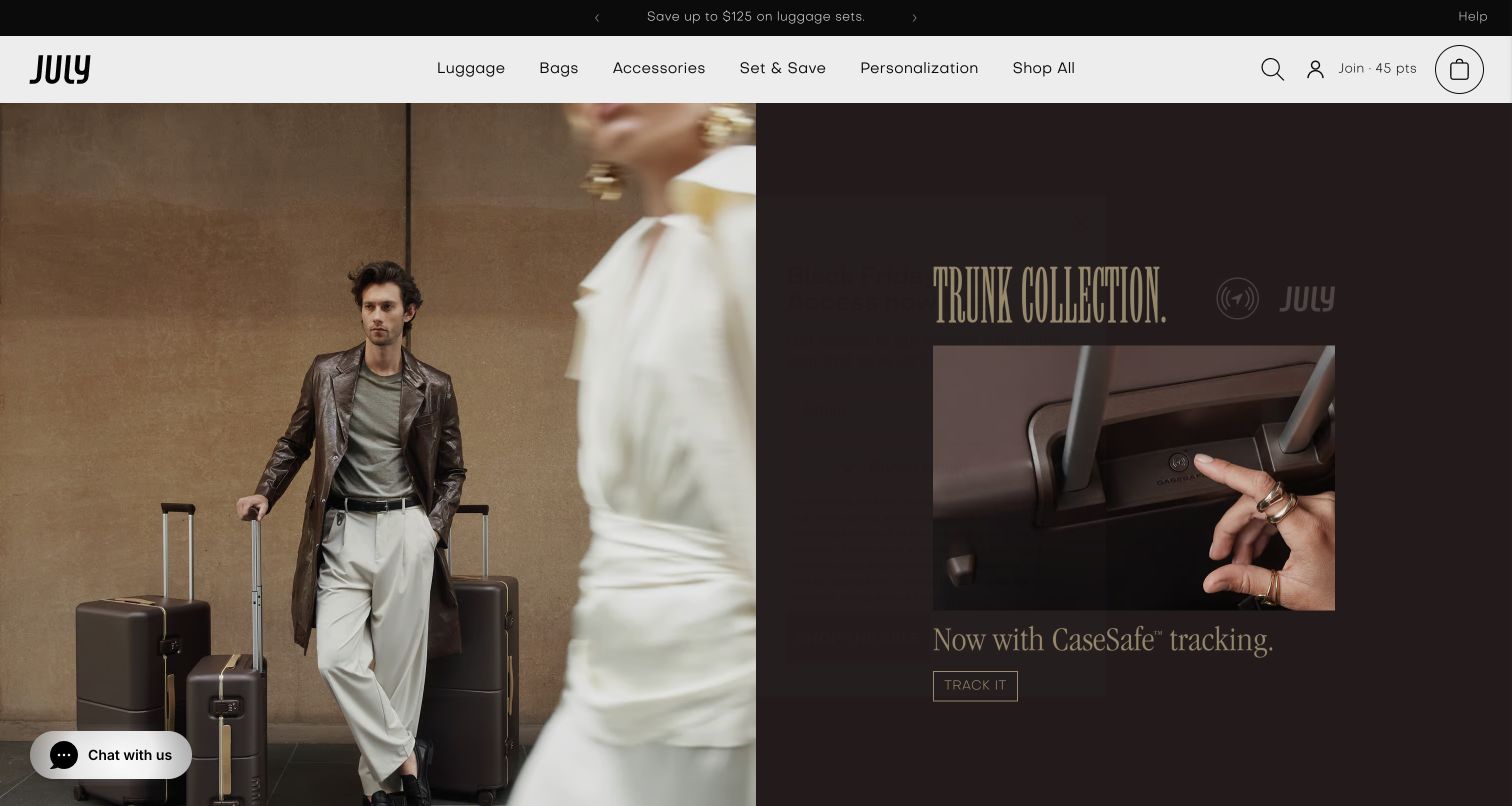
July divides the opening between a traveler with brown luggage and a closer product-focused campaign panel. This lets the same screen communicate both the look of the collection and the feature being promoted. The white header includes luggage, bags, accessories, sets and personalization. Product cards further down supply prices and color choices. The visual treatment is restrained and dark, giving the merchandise room, but the two promotional areas ask the visitor to decide which story to follow first.
What you can learn
When a feature is central to a launch, pair its close-up with a view of the complete bag in use. Give each panel a specific purpose and explain compatibility or limitations on the destination page before someone selects a model.
Pros
Two photographic scales connect the product's overall appearance with a more detailed feature story.
Personalization and sets have explicit navigation routes rather than being buried in generic shopping.
Cons & considerations
Parallel campaign panels can compete when both contain equally prominent calls to action.
Dark imagery requires careful contrast checks for small labels and navigation at phone widths.
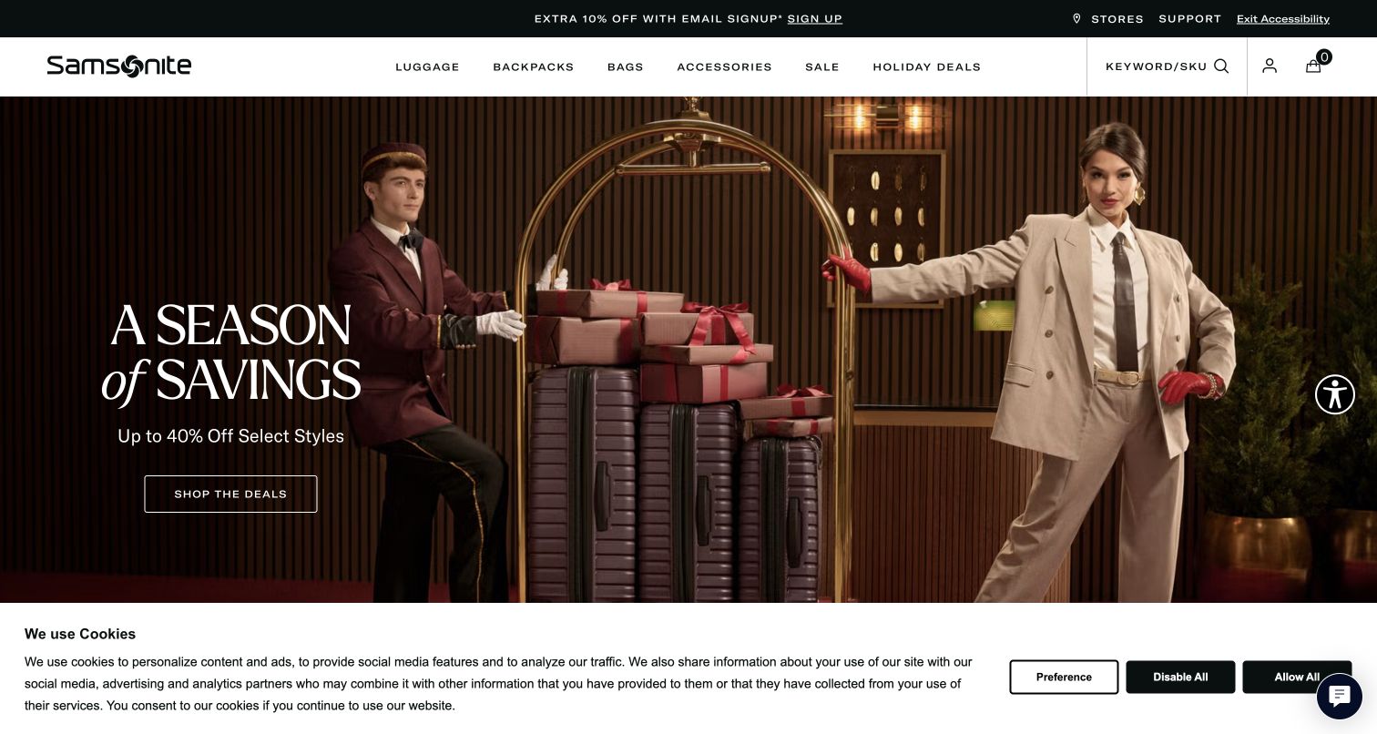
Samsonite frames its seasonal promotion around a hotel arrival scene, with a traveler, luggage and bellhop providing immediate product context. The offer sits on the left, while a substantial header exposes categories and a keyword or SKU search. Below the hero, product cards make the sale concrete through named models, prices and discounts. The page balances a broad campaign with tools for returning shoppers, though the combination of savings messaging and a persistent privacy strip adds density to the first screen.
What you can learn
A large assortment needs a fast route for customers who already know a model number. Pair campaign browsing with direct search, and keep sale pricing connected to a specific variant so the promotional promise survives the transition to the product page.
Pros
The keyword and SKU search recognizes that some luggage buyers arrive with a precise product in mind.
Named product cards translate the general sale message into comparable merchandise.
Cons & considerations
Several offer details compete with the travel photograph and can make the opening feel busy.
A prominent discount should not replace clear dimensions, weight and included features on the product route.
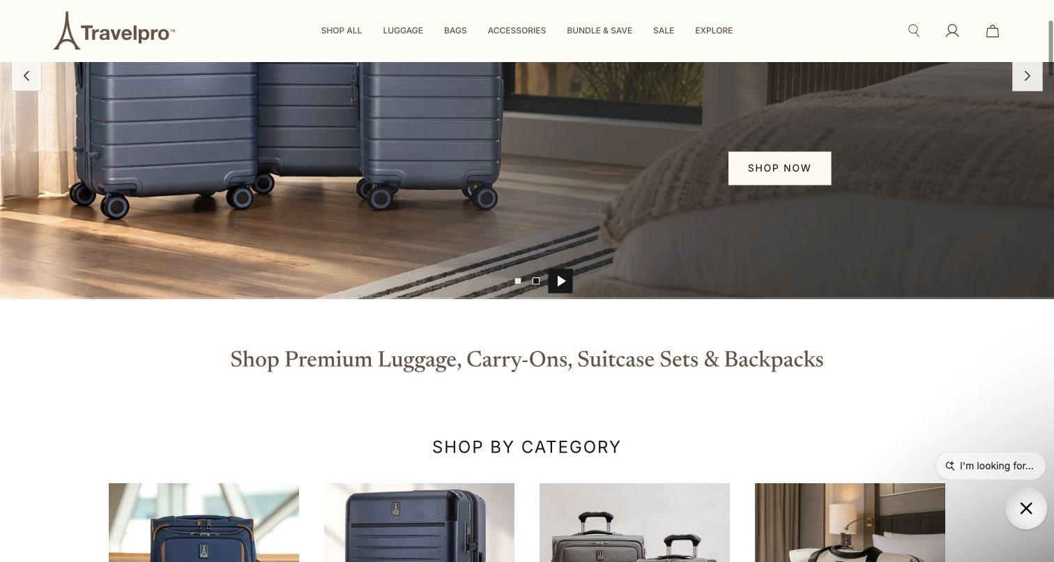
The captured Travelpro view sits at the transition between its luggage hero and a category section. A persistent white header holds the store navigation while the lower portion introduces shopping by category with product imagery. The page distinguishes carry-on and checked luggage, sets, totes, backpacks and accessories, and it also offers a separate aviation-professional route. That structure gives shoppers a vocabulary based on the job the bag must perform rather than requiring them to begin with a branded collection name.
What you can learn
Design the boundary below the hero as deliberately as the hero itself. A useful category section should answer what the shopper can buy and which branch matches their trip, while specialist audiences receive a clearly labeled path of their own.
Pros
The category transition creates a concrete next step after the opening campaign image.
Aviation-professional navigation acknowledges a distinct use case without forcing every shopper through it.
Cons & considerations
The captured view is below the top of the hero, so it does not represent the complete initial screen.
Category pictures still need consistent scale and labels to distinguish similarly shaped cases.
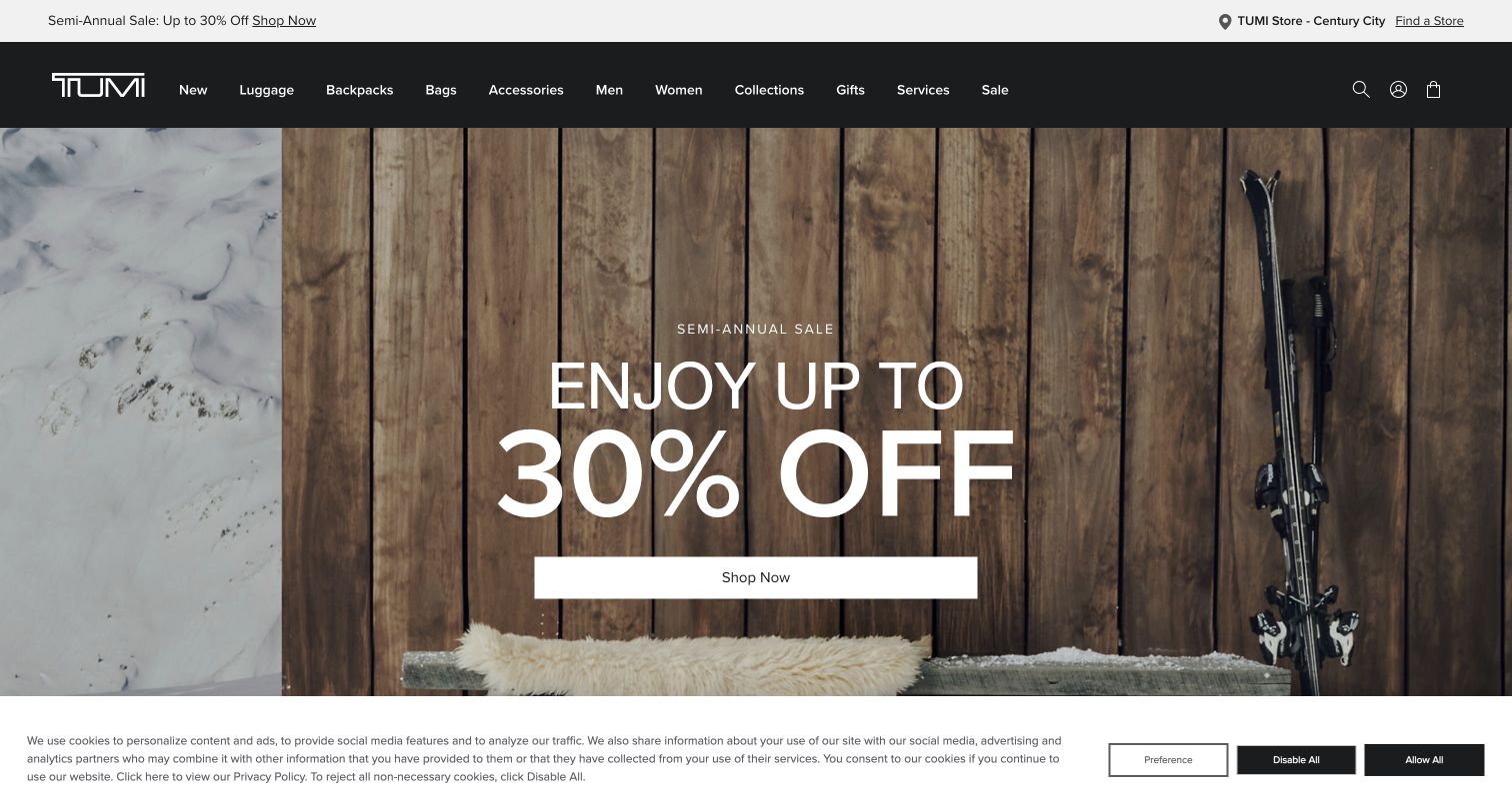
TUMI places a large seasonal sale message over a wood-and-ski setting, with a broad shopping action below it. The dark header separates product categories from services, while store access remains easy to find. Lower sections organize the assortment through categories and collections, and the support area includes repair, replacement and airline guidance. The opening is commercially direct, but the service structure is the more transferable pattern for expensive products that customers expect to maintain across many trips.
What you can learn
Make the ownership journey visible alongside the purchase journey. Repair information, store support and travel guidance can reduce uncertainty, provided each route explains the actual process rather than relying on a broad promise of premium service.
Pros
The sale hierarchy makes the current campaign easy to understand at a glance.
Service and store routes support questions that cannot be answered by a product photograph alone.
Cons & considerations
Large promotional typography leaves little room for comparing the construction of individual pieces.
A carousel of named collections may require additional explanation for visitors unfamiliar with the brand.
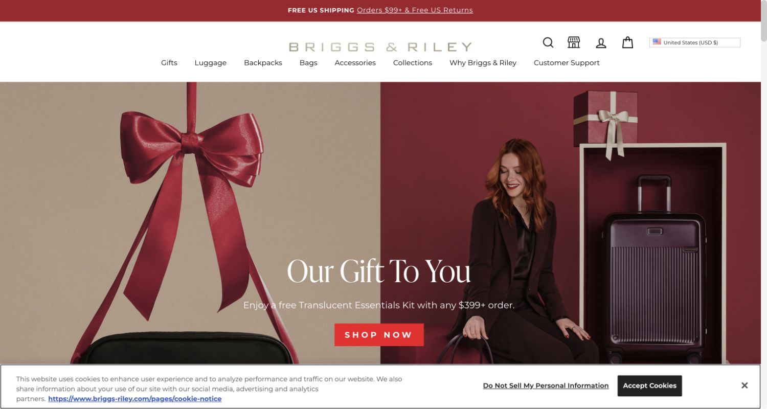
Briggs & Riley combines two holiday photographs: a small bag tied with a bow and a traveler beside purple luggage. A centered gift promotion gives the pairing a shared purpose, with its spending condition placed near the action. The header also makes brand explanation and customer support explicit destinations. Product innovations appear farther down. The result connects a seasonal incentive to a more durable service story, although the central offer temporarily takes priority over the differences between case families.
What you can learn
A promotional gift should clarify eligibility where the offer is introduced. Preserve direct access to product construction and support information so a customer can assess the underlying purchase independently of the temporary incentive.
Pros
The two images show both a gift-sized item and larger travel luggage in one composition.
Customer support has a named place in the primary navigation, making aftercare easier to discover.
Cons & considerations
The promotion's threshold requires careful reading and should remain visible after a shopper selects products.
Campaign imagery alone does not establish what makes one luggage line more suitable than another.
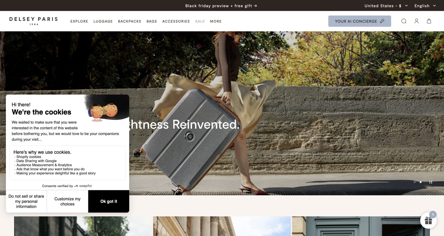
Delsey's opening shows a traveler carrying a silver case up stone steps, with a short lightness-focused headline centered across the image. The photograph makes the case's profile and relationship to the person easy to see. The page later separates carry-on, checked luggage and sets, then presents new arrivals with product variants. A concierge control and a privacy panel add extra interface elements around the image, illustrating how service tools can compete with an otherwise spare campaign composition.
What you can learn
Use a styled photograph to introduce the product, then quickly provide the measurements and weight needed to evaluate it. Keep optional assistance compact enough that shoppers can still see both the merchandise and the route into the catalog.
Pros
The side-on case and human figure provide a useful visual relationship between product and traveler.
Familiar luggage categories make the assortment approachable beyond the campaign headline.
Cons & considerations
A lightness claim needs an actual product weight before a visitor can compare alternatives reliably.
The captured privacy panel and concierge control occupy space that would otherwise reveal more of the hero.
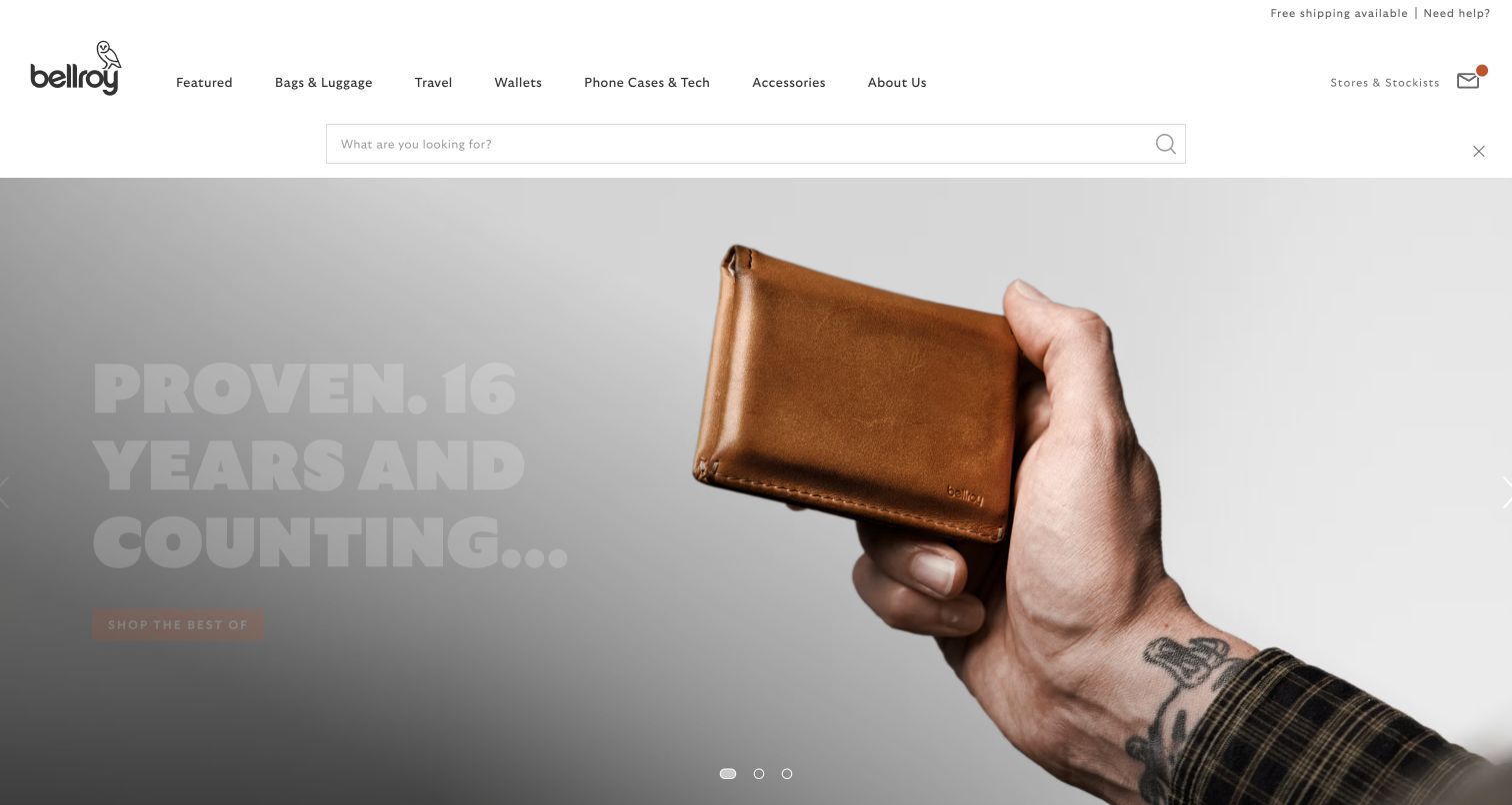
Bellroy's captured homepage focuses on a hand holding a brown wallet, with large longevity-themed typography layered into the photograph. Luggage is not the featured object, but the header provides a Bags & Luggage route alongside travel and other carry categories. This is a useful mixed-catalog example: the brand can tell one focused material story while preserving paths to different product families. The tradeoff is that a first-time luggage shopper must use navigation to move beyond the wallet-led campaign.
What you can learn
A store can feature a small accessory without losing larger travel products if category labels remain literal and easy to scan. Use the campaign to express brand character, then let the navigation resolve the visitor's specific buying task.
Pros
The close photograph communicates material and handling rather than showing an isolated object alone.
The Bags & Luggage label makes a broader assortment discoverable from a non-luggage campaign.
Cons & considerations
The opening does not itself demonstrate the store's suitcase or travel-bag range.
Oversized background type can become less readable or more obstructive when the photograph is cropped narrowly.
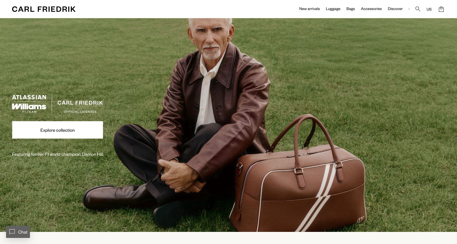
Carl Friedrik introduces a collaboration through a portrait of Damon Hill seated outdoors beside a brown leather weekender. Partnership marks and a single collection action sit within the image, while the white header remains restrained. The catalog below returns to luggage lines and product cards with material, color and price information. The hero feels closer to an editorial feature than a comparison grid, using a recognizable person and a specific bag to give the collection a coherent point of view.
What you can learn
If a partnership leads the homepage, make the merchandise as legible as the partner. Follow the portrait with a concise explanation of the collection and product choices, so the association supports rather than substitutes for the customer's evaluation.
Pros
A single bag within the portrait keeps the collaboration connected to an identifiable product.
The plain header provides a stable shopping frame around the more atmospheric photograph.
Cons & considerations
The opening does not reveal the practical distinctions between luggage materials or sizes.
Visitors who do not recognize the collaborator may need more product context before the campaign becomes meaningful.
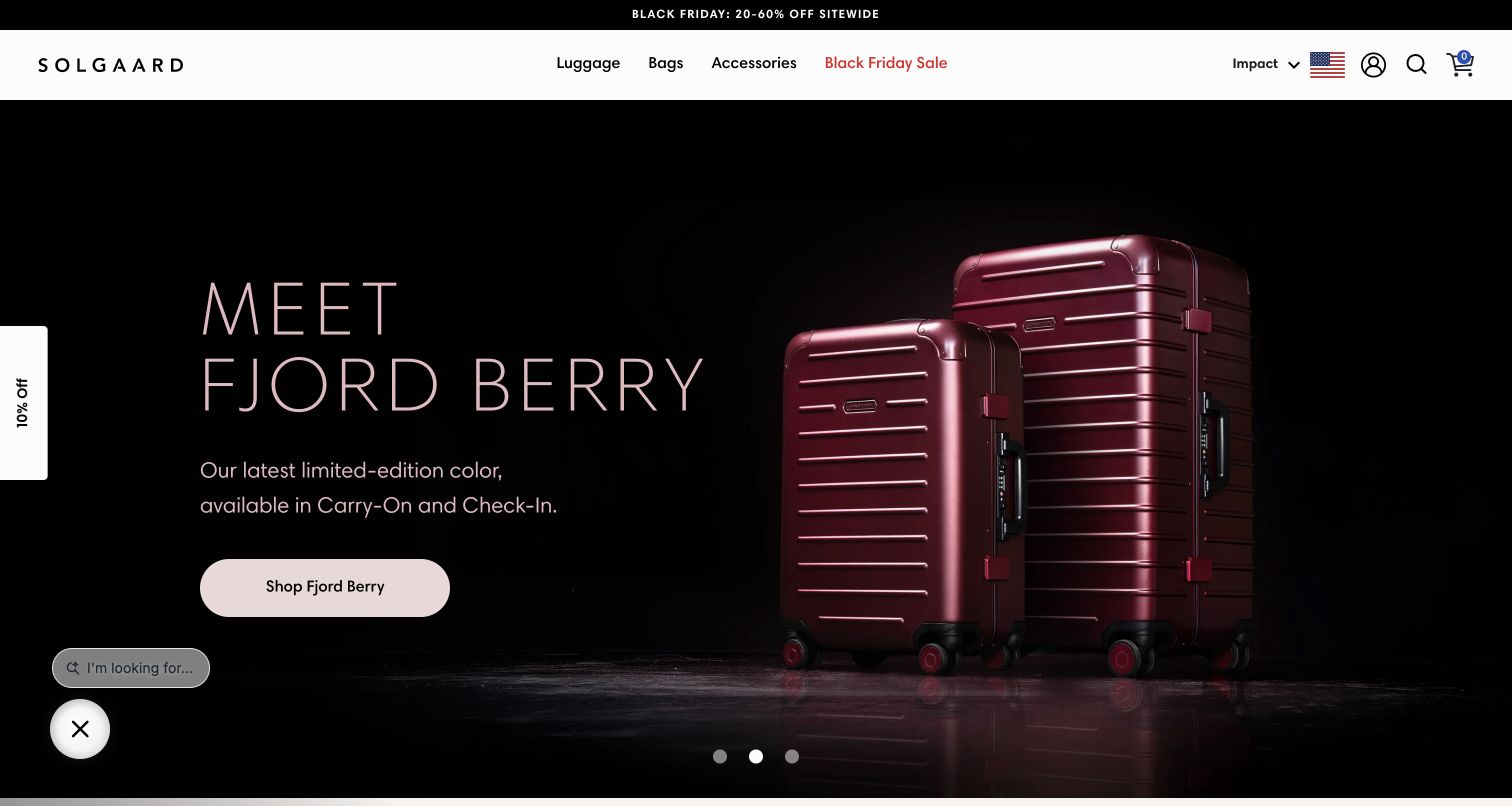
Solgaard places a carry-on and a larger checked case side by side against a dark background for its burgundy color launch. The headline, brief description and rounded shopping button sit on the left, leaving the two silhouettes unobstructed. The white navigation and sale strip contrast sharply with the hero. The visible pairing makes the color story concrete across sizes, while the wider page provides comparison and storage-feature routes for shoppers who need more than the finish to make a decision.
What you can learn
Introduce a color or finish with a small, deliberate set of products that demonstrates how it appears across the range. Keep size comparison and functional details close enough that the new color does not become the only visible difference.
Pros
The two cases show a meaningful size relationship while maintaining a consistent finish and lighting.
A short description connects the campaign to carry-on and checked formats instead of relying on the color name alone.
Cons & considerations
Dark-on-dark product edges need checking across screens and brightness settings.
The sale strip, side offer teaser and chat control create several competing secondary messages.
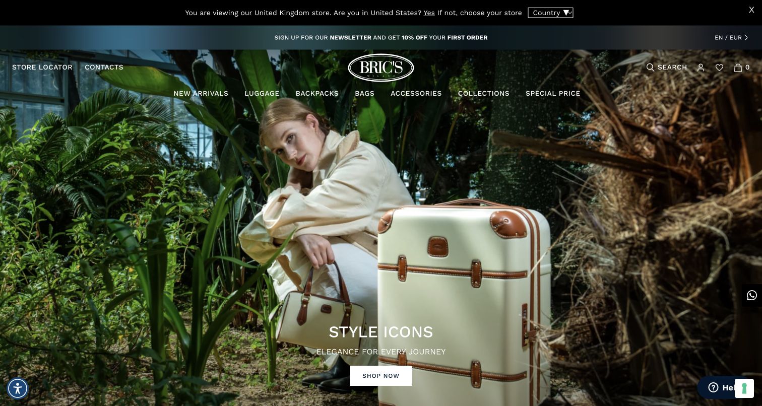
Bric's uses a greenhouse scene to display a cream suitcase with brown trim beside a coordinating tote. The image supports a style-oriented campaign, while the navigation exposes more practical distinctions such as material, hard and soft cases, expandable formats and sizes. A geographic store notice remains visible above the header in the captured session. That notice matters because the same attractive collection may lead to different regional availability, pricing and service expectations depending on the storefront a shopper has reached.
What you can learn
Let the campaign introduce a coordinated look, but organize the catalog with the physical distinctions customers actually compare. Make the active region explicit before purchase, especially when a familiar brand operates several country stores with different fulfillment rules.
Pros
The suitcase and tote demonstrate how a coordinated travel set can look in use.
Material and construction routes provide alternatives to browsing solely by collection name.
Cons & considerations
A regional storefront notice adds a decision before the visitor can confidently assess availability.
White navigation laid over detailed greenery needs careful contrast and responsive-crop review.
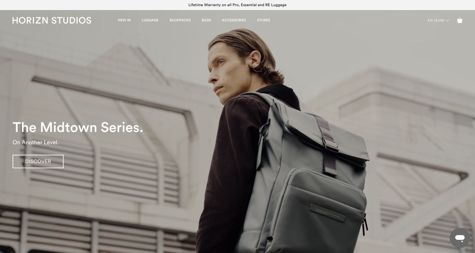
Horizn Studios opens with a gray backpack worn in an urban setting, using a muted palette and a short series headline. The header stays sparse over the photograph, with a warranty message above it. The broader navigation distinguishes luggage sizes, series and models, including front-pocket formats and a comparison route. As with other mixed carry catalogs, the featured item establishes the brand's visual language while the navigation does the work of directing a suitcase shopper toward the right family.
What you can learn
Use series names only after providing an understandable way to compare them. A customer may appreciate a restrained campaign but still need plain distinctions about capacity, access and construction before choosing between similarly named luggage lines.
Pros
The worn backpack shows proportion and use more clearly than an isolated product cutout would.
The comparison route helps translate several named luggage series into a practical buying decision.
Cons & considerations
The homepage's featured backpack does not immediately show the suitcase assortment.
A broad warranty message needs a nearby explanation of coverage, exclusions and the service process.
Plan the luggage store around comparison and ownership
Create a specification template for every product family
Define the required fields for suitcases, backpacks, duffels, and accessories separately. Record the source and owner of each measurement and feature statement. Use a consistent unit system and explain any conversion. Test the template on the largest, smallest, expandable, and most configurable products before designing comparison tables.
Map discovery routes without forcing a travel stereotype
Offer useful routes such as product type, size, intended carrying method, or key feature. If you use trip-length or airline-fit language, explain its basis and scope and link to the relevant current source. Preserve ordinary filters for people whose packing needs do not match a simplified travel scenario.
Make the product photography brief repeatable
Specify an exterior view, open interior, useful scale reference, and close detail for each product family. Keep color presentation consistent and identify the selected variant. Plan narrow-screen crops for campaign photography, and retain the original files and usage permissions so later additions do not require copying another brand’s visual work.
Connect the purchase to aftercare
Make care instructions, warranty terms, repair options, replacement parts, and support routes easy to locate where the business offers them. Distinguish the company’s documented policy from broad campaign language. Plan how an owner identifies the model and receives help after the original seasonal product page has changed.
The editing job behind the design
Choose commerce tools that preserve product and variant accuracy
Start with the catalog structure: sizes, colors, regional availability, sets, accessories, and personalization. Test the commerce platform against a real mixed-size set and an unavailable variant before committing to a highly customized product selector. Keep inventory and price changes connected to the selected item, and preserve that selection when a shopper opens comparison, support, or shipping information.
Let editors update travel stories and gift campaigns while maintaining one authoritative source for specifications and ownership policies. Search, recommendations, product reviews, store locators, and personalization tools should each solve a defined task. Record their data source and maintenance owner. Public resource observations can identify some visible integrations but do not reveal every inventory, order, or fulfillment system behind a storefront.
Our WordPress website examples offer a separate look at publishing approaches. A visible platform label is evidence for that named page, not a guarantee that the same system will suit your requirements.
Before the public launch
Luggage store website launch checklist
Check external dimensions, weight, capacity, and measurement notes against the product record.
Show the exterior, interior, useful scale, and relevant handles, wheels, pockets, or closures.
Keep the selected size, color, price, stock status, and image consistent throughout the purchase path.
List each item and variant included in a set or bundle.
Explain personalization, lead times, and applicable return conditions before checkout.
Give any carrier-fit, material, durability, or environmental claim a maintained source and appropriate scope.
Test comparison tables, variant controls, image galleries, and filters with a keyboard and on narrow screens.
Review campaign crops, text enlargement, notices, chat, and sticky purchase controls together.
Keep shipping, care, warranty, repair, and contact information connected to the relevant product and region.
Assign owners for specifications, stock, policies, source claims, and seasonal campaigns.
These checks are a project checklist, not a performance, legal, security, or accessibility certification. Test real journeys with the people responsible for the website before making claims about the result.
Sources & editorial method
How this collection was selected and reviewed
The collection uses thirteen distinct official travel-goods storefronts captured on November 4, 2026, with their source URLs, actual capture dates, dimensions, and attribution retained. Reviews examine visible navigation, product presentation, campaigns, and shopping routes. Regional context and captured notices remain part of the observed state. No orders, warranty requests, or product-performance tests were performed; technical associations require separately recorded evidence.
Each example links to its actual source page. Screenshots are direct browser captures with their own capture dates; moving imagery, announcements and live designs can change. The notes describe observable design choices and conditional tradeoffs, not measured traffic, conversion results, service quality, or accessibility conformance.
Technology labels use public page metadata, asset evidence, or explicitly cited platform documentation. Platform documentation is not a complete current deployment audit. A component reference may be legacy or unused; it is not a complete backend inventory. Unknown stacks are omitted. These sites are editorial examples, not our client portfolio.
Written, Edited and Curated are separate editorial records, not timestamps advanced by a rebuild. Website designs and imagery belong to their owners. See our editorial standards or suggest a correction.
Questions worth asking
Luggage Stores website design questions
Should a luggage homepage begin with products or a travel campaign?
Either can work when the shopping route is clear. A campaign can establish the brand’s travel context, while product cards help compare a focused range. Keep recognizable categories and search available so visitors do not need to understand a collection story before finding a suitable type of bag.
How can a store make bag size easier to understand?
Combine actual measurements with an open-interior view and a useful scale reference. Explain the units and what is included in the measurement. Keep expanded and unexpanded sizes distinct where relevant, and avoid treating a photograph or a suggested trip length as a substitute for the specifications.
How should a product page describe carry-on suitability?
Identify the exact product dimensions and the basis and scope of any compatibility statement. Provide a route to the relevant current carrier information instead of implying that a category name guarantees acceptance on every journey. Keep the responsibility for maintaining that statement clear within the business.
What should shoppers see before choosing a luggage set?
List the included products, sizes, colors, price, availability, and any delivery differences. Let the shopper review and correct every selection before adding the set. A visually coordinated photograph should not leave the contents or individual variants ambiguous.
How much aftercare information belongs on a product page?
Give a concise route to the relevant care, warranty, repair, and contact details. Explain the actual policy and service process rather than relying on a broad longevity slogan. Keep those resources findable after a collection or seasonal campaign is retired.
Borrow a useful way to connect travel imagery and product choice, then build it with accurate specifications, consistent variants, and support information your team can maintain.