An airline homepage has to welcome someone imagining a holiday while giving a traveler with a flight today a much faster route.
Searching for fares, checking in, finding a booking and reading an operational notice are different tasks with different urgency. A useful interface keeps them identifiable instead of allowing destination campaigns to consume every available space. Country, language and currency also affect the journey and should be understandable.
These examples concern public airline websites and their visible entry points. The collection does not compare fares, operational reliability, route availability or passenger policies. Regional versions and booking systems can differ, so each capture should be read in its recorded market and date context.
Before the examples
What makes good airline website design in 2026?
Separate the new trip from the trip already booked
Give flight search, booking management, check-in and flight status distinct labels. Do not make a traveler with a confirmation code navigate through destination inspiration. Keep relevant service notices close enough to these tasks to be found without turning every visit into an alert wall.
Make the search state understandable
Show origin, destination, journey type, dates, travelers and payment mode clearly. Explain flexible dates or points search when those options change the results. Preserve entered information during ordinary corrections and provide useful guidance when a route or date cannot be selected.
Keep promotional context attached to the offer
A tempting fare needs its applicable market, journey assumptions and conditions. Put baggage and fare-family comparisons where travelers choose between them. Avoid scattering essential limitations across unrelated footer pages or implying that a headline amount is a confirmed price for every visitor.
The collection · 21 examples
21 airline websites worth studying
Study the balance between a booking tool, destination storytelling and practical trip management. A quieter campaign treatment may be right when operational tasks dominate; an expansive destination image still needs a dependable path to those tasks.
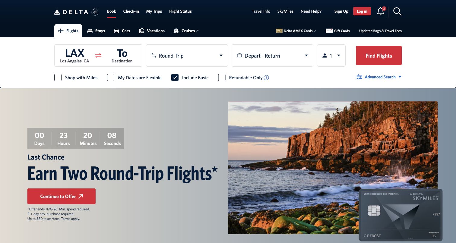
Delta gives the first major content band to flight search, with large route, journey, date, and passenger controls ending in a red action. The dark header separates booking from check-in, trip management, and flight status. A second navigation row expands into hotels, cars, vacations, and cruises without displacing the selected flight tab. Beneath the form, a scenic coastal photograph supports a credit-card campaign with a countdown and another red button. The visual contrast keeps the functional search area readable, but the prominent promotional offer competes for attention once the visitor looks below it. The visible fare and flexibility checkboxes make several preferences discoverable before a search.
What you can learn
Put the core travel task ahead of promotional content, then distinguish the search action from campaign actions. Expose useful fare preferences without making the initial form feel like an advanced configuration screen.
Pros
Large search controls make route and travel dates easy to locate.
Trip-management links remain clearly separated from the new-booking workflow.
Cons & considerations
Two strong red actions divide attention between booking and a card campaign.
The countdown and eligibility fine print add complexity unrelated to choosing a flight.
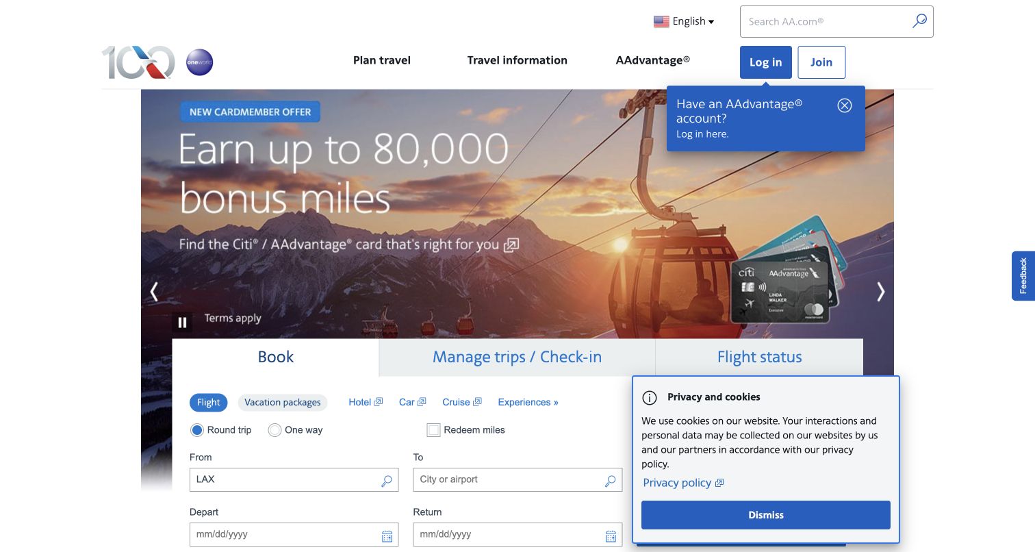
American Airlines places a large mileage promotion behind a white task panel. Book, manage trips/check-in, and flight status form a clear top-level division, followed by smaller choices for flights and other travel products. The visible form uses labeled origin, destination, and date fields with simple trip-type controls. In this capture, however, a login tip overlaps the upper campaign and a privacy panel covers the lower-right booking area. Those overlays make it impossible to assess the full form from this frame and illustrate how several individually helpful prompts can interrupt the main task. The campaign image and loyalty offer receive substantial space before the booking details.
What you can learn
Preserve a clear hierarchy between booking, managing, and tracking travel. Review the combined effect of notices and account prompts so that optional guidance does not cover the fields people came to complete.
Pros
Large task tabs distinguish the three principal travel journeys.
Visible field labels keep the booking form understandable without relying on icons.
Cons & considerations
The cookie panel obscures part of the booking interface in this capture.
The login tip and large promotion compete with the primary booking task.
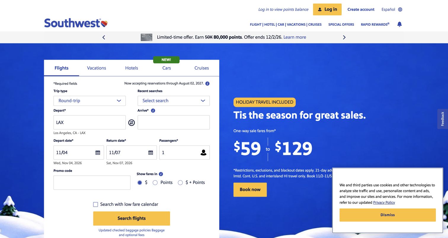
Southwest places a tall white search card on the left of a vivid blue seasonal campaign. The card groups travel products into tabs and exposes trip type, route, dates, passenger count, a promo code, and cash or points options. This gives travelers substantial control before submitting anything, although the number of fields creates a dense first impression. A cookie notice remains over the lower-right corner of the campaign in the supplied screenshot. The actual search card is largely visible, but the overlay limits assessment of the complete promotional composition and adds a third yellow action.
What you can learn
Group common booking choices into a consistent card and use helper text where abbreviated dates or loyalty options could be ambiguous. Keep promotional and notice actions visually subordinate to the flight search.
Pros
Cash, points, and flexible-calendar options are visible near the booking fields.
The white search card stays legible against the saturated campaign background.
Cons & considerations
The long form asks visitors to scan many choices before starting.
The cookie panel and repeated yellow buttons increase competition for attention.
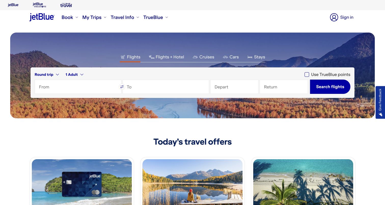
JetBlue puts its booking bar inside a rounded scenic hero, using the photograph as context rather than placing promotional copy over the fields. Product tabs sit above the form, and trip type, passenger count, and points redemption remain visible around the route and date controls. A strong blue search button anchors the right edge. Below the hero, a separate offers heading introduces three image cards, giving promotions their own place after the main task. The captured page feels orderly because the search strip is unobstructed. Its compactness does leave some explanation to placeholder text, and the offer cards continue below the viewport.
What you can learn
Give booking and inspiration separate visual zones. A restrained scenic background can establish a travel mood while a solid form surface protects readability and keeps the search action obvious.
Pros
The flight form remains the clearest action within the scenic hero.
Offer cards begin in a distinct section instead of covering the search controls.
Cons & considerations
Several fields depend on brief placeholder labels for their initial explanation.
The visible offer images provide limited detail before the visitor scrolls.
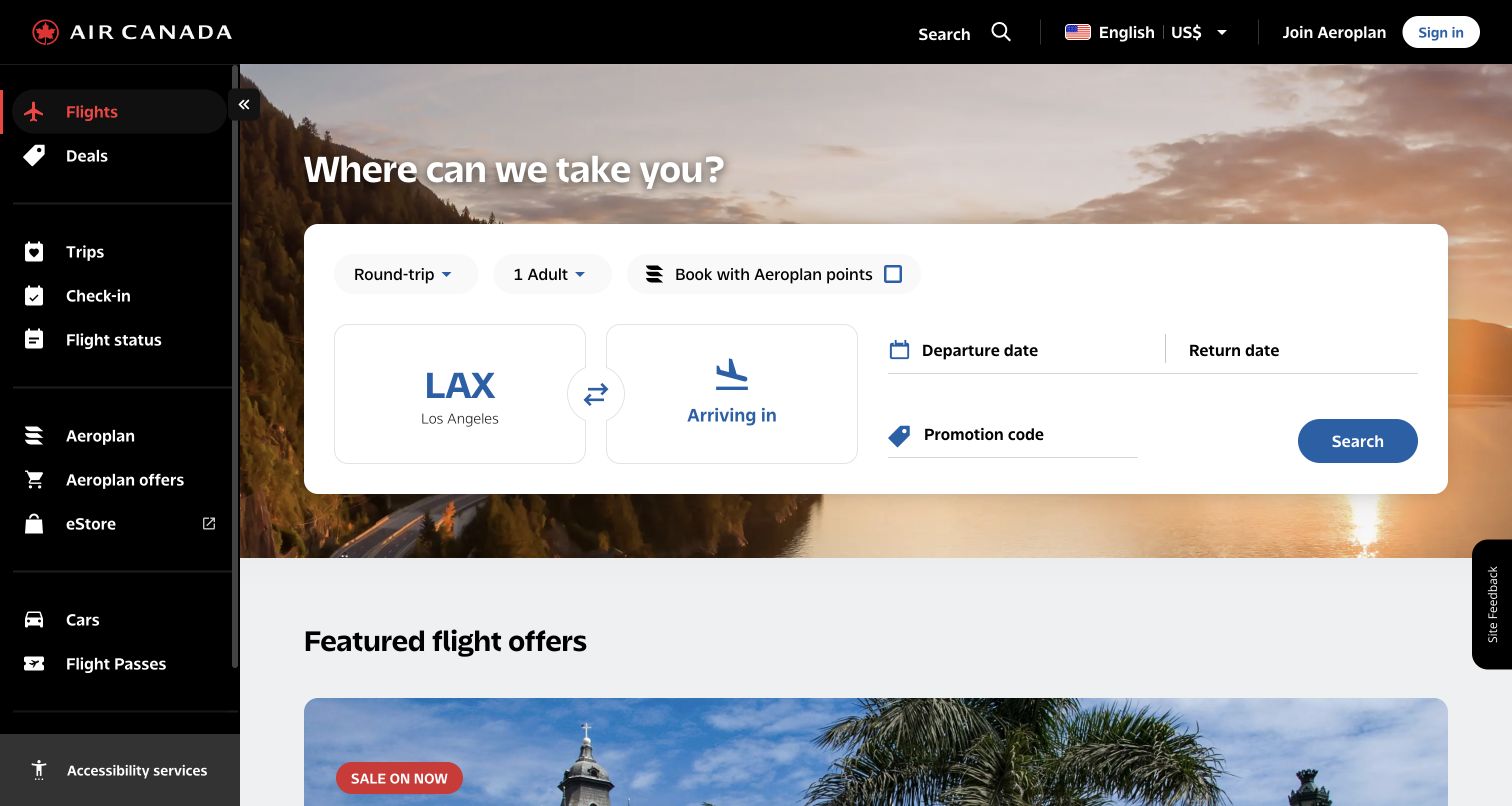
Air Canada uses a black vertical navigation rail to separate flights, deals, trips, check-in, flight status, and loyalty destinations. The selected Flights item receives a red accent, while the central hero contains a large white booking card over sunset scenery. Oversized route tiles give origin and destination particular prominence; dates and a promotion code occupy a quieter right-hand area. The points option sits alongside trip type and passenger count, making the booking mode visible before the traveler enters details. This structure feels closer to an application than a conventional promotional homepage, although the wide sidebar takes substantial horizontal space and adds many destinations before a first search.
What you can learn
Use persistent navigation when visitors repeatedly return for operational tasks. Keep the selected task unmistakable and reserve the largest content surface for the information needed to complete it.
Pros
The sidebar makes check-in and flight status easy to distinguish from booking.
Large route tiles establish a clear starting point inside the search card.
Cons & considerations
The persistent rail reduces the width available to the main content.
Numerous loyalty and ancillary links add scanning work for first-time visitors.
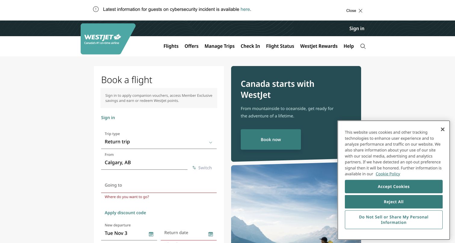
WestJet presents booking as a vertical sequence in a white card, with sign-in guidance above the trip type and route fields. A neighboring teal campaign panel introduces Canadian destinations, followed by photography. The header places common travel tasks in one horizontal row, and a separate service-update strip sits above the brand navigation. In the captured form, the destination field displays a red prompt while the departure and return-date area reaches the bottom edge. A large cookie panel covers much of the right-hand campaign, so this frame cannot show its full composition. The generous spacing helps separate fields, but the form’s height keeps the eventual submission control outside the visible area.
What you can learn
A vertical form can make individual questions easier to follow, but check the first-screen experience as a whole. Keep essential route fields and the next action visible where practical, including when notices are open.
Pros
Distinct field groups give the booking sequence a clear reading order.
Common service tasks are labeled plainly in the header.
Cons & considerations
The cookie panel substantially obscures the campaign in this capture.
The tall form pushes completion controls below the visible area.
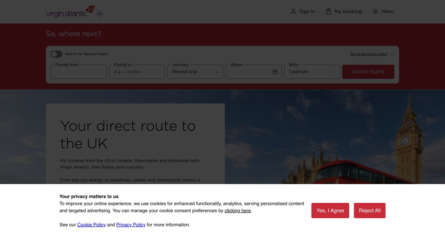
Virgin Atlantic’s visible page has a restrained header and a red band containing the flight-search row. Origin, destination, journey type, dates, and traveler count sit in a single line ending with a search action. Below, a white text card introduces UK travel over a London photograph. The supplied screenshot is dominated by an open cookie-consent state: a dark scrim dims the page, and a full-width white notice occupies the bottom portion. Its accept and reject buttons are both easy to identify, but the underlying destination content is only partly readable. This review therefore assesses the visible structure and the consent interruption, not an unobstructed homepage.
What you can learn
Design consent as part of the first visit rather than treating it as an afterthought. Preserve enough context for people to understand the page beneath the notice and return easily to the booking task.
Pros
A single booking row presents the main journey details in a familiar order.
Consent acceptance and rejection are both visibly available in the open notice.
Cons & considerations
The dark scrim reduces readability of the entire page in this capture.
The bottom notice conceals much of the destination introduction.
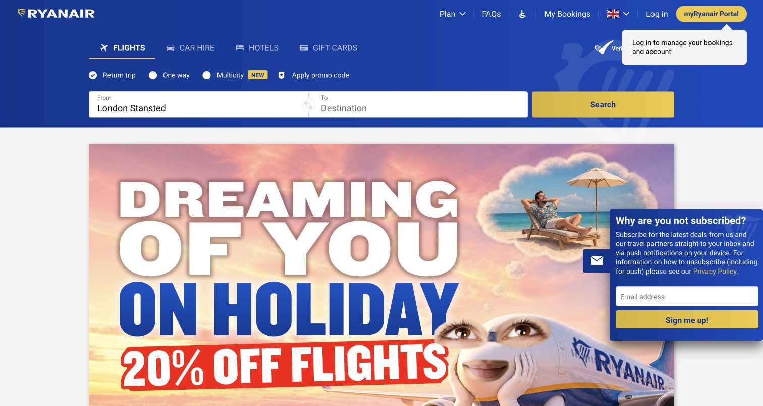
Ryanair’s blue header gives the initial search an unusually compact shape: origin and destination share one long white strip, followed by a yellow button. Trip type and a promo-code option sit above, while flights remain selected among several travel-product tabs. The campaign below uses enormous lettering, a bright discount treatment, and playful travel imagery. This creates a strong brand impression, but the first view contains an account tooltip and a subscription panel that overlaps the campaign’s right side. Dates and traveler details are not exposed in this captured starting state, so the image does not establish how the next stage works. The promotion is visually much louder than the small explanatory navigation.
What you can learn
A short first step can reduce the amount of information presented at once. Make the next stage predictable, and prevent newsletter or account prompts from competing with the route-selection task.
Pros
The route strip and contrasting search button are easy to locate.
Trip-type choices remain visible without expanding the form into several rows.
Cons & considerations
The subscription panel overlaps a substantial portion of the campaign.
Oversized promotional lettering competes with the quieter booking and help controls.
Public source checked November 3, 2026. References may be embedded or legacy—not a complete backend inventory.
Platform source: Observed first-party page or linked application asset. The public page loads this Angular application bundle, which contains the ng-version runtime marker and version 21.2.22. Observed on 2026-11-02; retained source evidence, not a new November 4 runtime audit. Platform evidence is separate from the direct website screenshot and is not a complete current infrastructure audit.
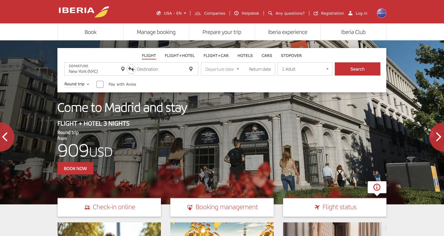
Iberia layers a wide white booking panel over a Madrid streetscape, using red accents to connect the search action with the site’s header and promotional button. Travel-product tabs run across the top of the form, while route, dates, passenger count, trip type, and Avios redemption remain visible together. The destination campaign occupies the middle of the frame with a package description and price treatment. Three large cards along the lower edge provide check-in, booking management, and flight-status shortcuts, reinforcing the operational links already available above. Its density is the main tradeoff: two navigation rows, product tabs, a complete form, a campaign, and service cards all ask for attention within one screen.
What you can learn
Provide clear routes for existing reservations alongside new bookings. Use consistent visual emphasis for task actions, and check that destination promotions do not make the overall first view too crowded.
Pros
Large service shortcuts make check-in and booking management easy to recognize.
The white search surface protects field readability over detailed photography.
Cons & considerations
Several layers of navigation create a dense initial scanning task.
Campaign pricing and multiple red actions compete with the main flight search.
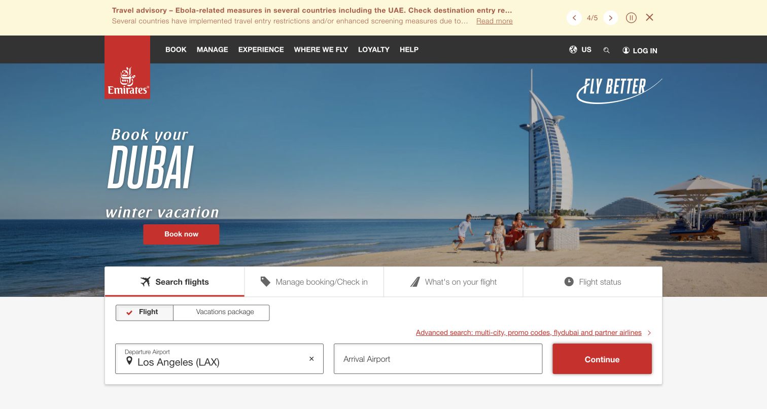
Emirates gives its opening hero to a Dubai beach scene, with a red promotional action and a recognizable vertical brand mark. A dark navigation bar organizes booking, management, experience, destinations, loyalty, and help. Beneath the scenery, a white task panel separates flight search from booking management, onboard information, and flight status. The initial form asks for departure and arrival airports before a prominent Continue button, while an advanced-search link covers more specialized journeys. A separate advisory strip occupies the top of the frame and includes navigation and pause controls, giving operational information its own channel. The destination hero places practical controls lower on the page.
What you can learn
A staged search can keep the opening form compact if the next action clearly signals continuation. Give travel advisories a distinct place and retain direct access to time-sensitive tasks such as check-in and flight status.
Pros
Task tabs distinguish booking from post-booking information and management.
A short route-entry step avoids showing every search option immediately.
Cons & considerations
The large hero pushes booking controls toward the lower part of the viewport.
The first stage does not explain the remaining information required before results.
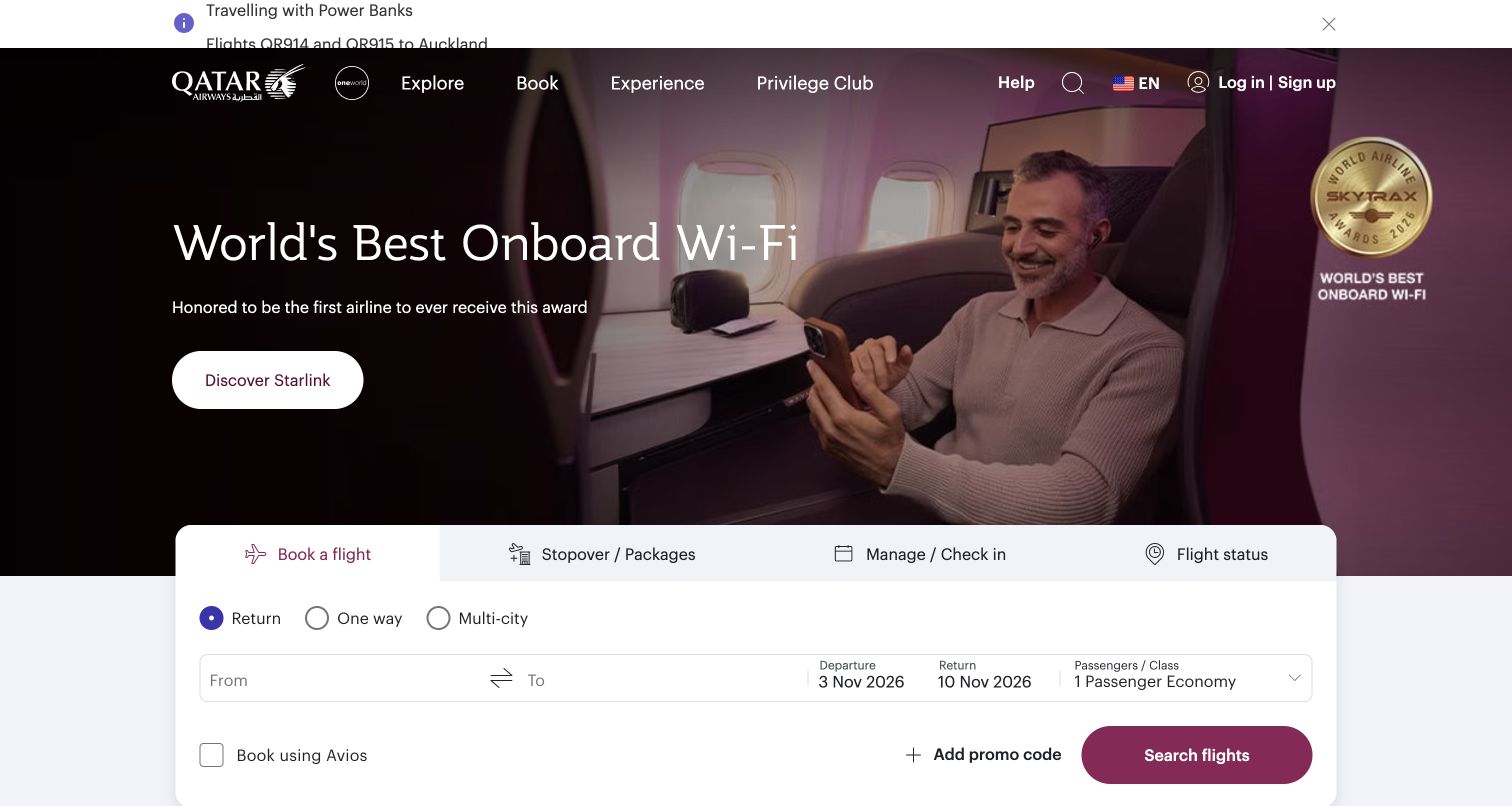
Qatar Airways places a service campaign above a large white booking card. A passenger photograph occupies the right side, while a darkened left area gives the headline and white action button a readable base. The award badge is part of the observed promotion, not an independently verified conclusion of this review. Below, tabs distinguish booking, stopover packages, managing a trip, and checking flight status. Return, one-way, and multi-city controls sit above the route and date fields, with a burgundy search button providing a clear endpoint.
What you can learn
Keep campaign discovery separate from the passenger's immediate task. A stable trip-tools card can support both new bookings and existing reservations while a changing hero tells a service or destination story.
Pros
The white booking card clearly separates practical controls from the photographic campaign.
Existing-trip tasks have visible tabs alongside the new-flight booking route.
Cons & considerations
The top alert area and large campaign push the booking controls toward the lower edge.
Several journey types and supplementary options make the form relatively dense before search.
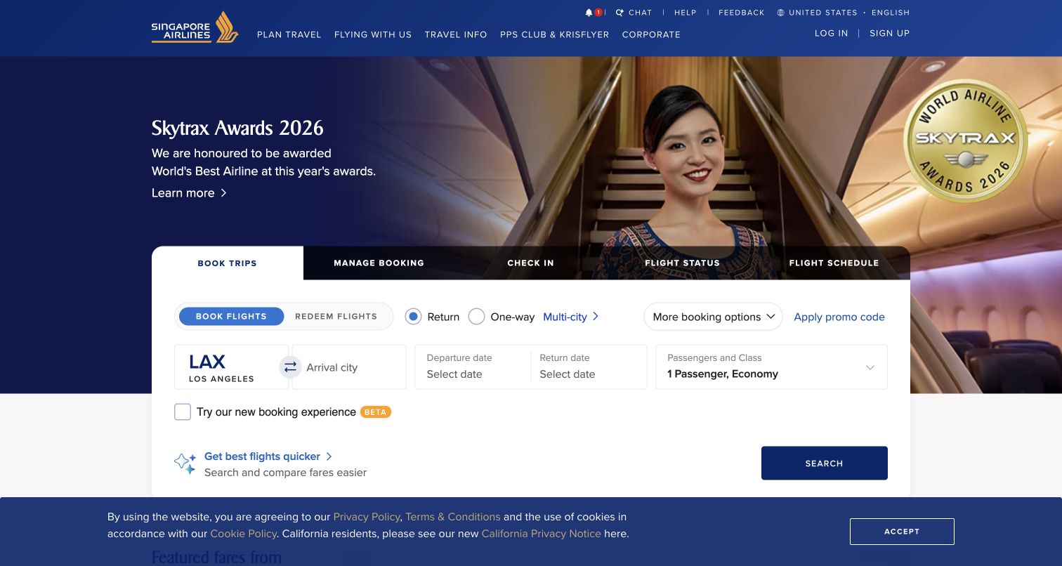
Singapore Airlines overlays a broad white trip panel on a blue-and-gold campaign featuring cabin imagery and an awards message. The review treats that message as marketing copy rather than independently verifying the award. Five dark tabs distinguish booking, managing a reservation, check-in, flight status, and schedules. Within the active panel, booking and redemption have separate controls, followed by journey type, route, dates, and passenger information. An optional beta-booking checkbox introduces another choice. A cookie banner remains across the bottom of the captured page.
What you can learn
Use consistent layers to separate major passenger tasks from the options within each task. When introducing a new booking experience, explain the choice without allowing it to distract from the essential route-and-date sequence.
Pros
The major trip-management tasks are explicitly named in a prominent tab row.
Booking and redemption are distinguished before a traveler enters the flight details.
Cons & considerations
Several option rows increase the reading effort before the main search action.
The persistent cookie banner reduces the usable vertical space in the observed opening.
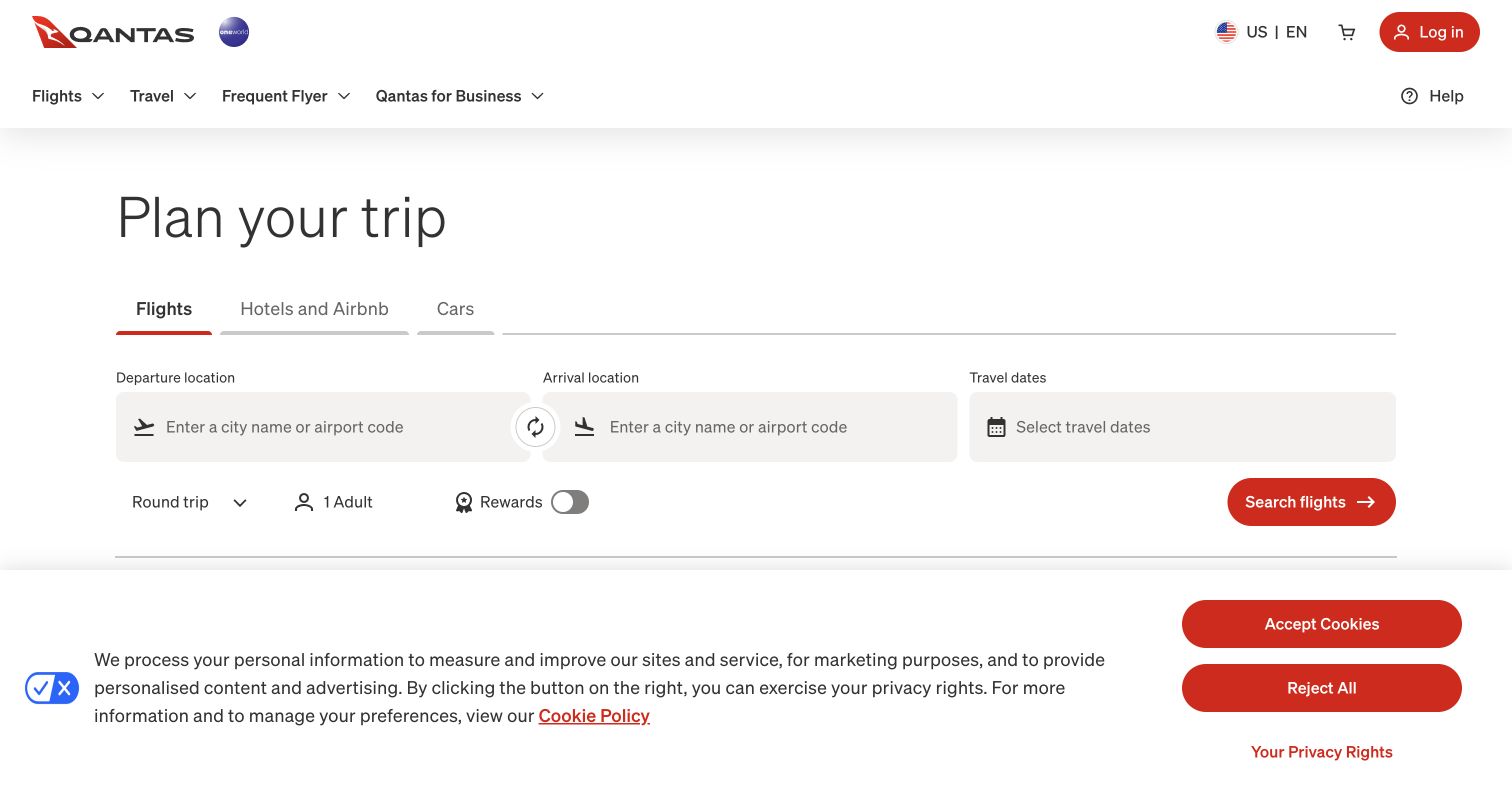
Qantas presents a sparse trip-planning entrance with a large heading and three travel-product tabs. The active Flights tab uses a short red underline, while departure, arrival, and travel-date fields span the central row. Trip type, passenger count, and a rewards toggle occupy a secondary line, leaving the red search button easy to identify. The white background and pale field surfaces keep attention on the form rather than a campaign photograph. A substantial cookie notice covers the lower part of the captured viewport, with red acceptance and rejection actions.
What you can learn
A booking entrance can be distinctive through typography, spacing, and action color without relying on a large promotional image. Keep optional settings subordinate to the core itinerary fields, and account for consent interfaces when evaluating available screen space.
Pros
Clearly labeled itinerary fields establish a simple left-to-right search sequence.
The red search action stands out within an otherwise restrained visual palette.
Cons & considerations
The large consent panel competes with the booking action through similar red buttons.
The opening provides little destination inspiration for travelers who have not chosen a route.
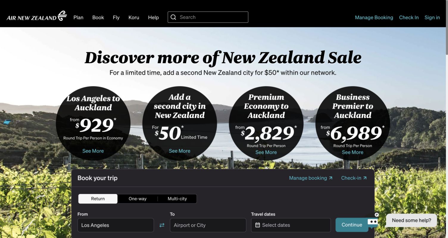
Air New Zealand combines a vineyard-and-harbor photograph with a large sale heading and four black promotional circles. Each circle separates a route, add-on, or cabin offer through large figures and a small detail link. These are captured promotional figures, not current fare recommendations. A dark booking panel begins below, keeping route and date controls visually separate from the scenic campaign. The black header includes a visible search field and direct links to managing bookings and checking in, supporting visitors who already have a trip.
What you can learn
Use destination imagery to support a specific travel proposition, then distinguish the offer categories before sending travelers into search. Keep booking management visible so the sales campaign does not dominate every passenger's journey.
Pros
The circular offer modules make different route and cabin propositions easy to distinguish.
Existing-booking and check-in links remain visible in the primary header.
Cons & considerations
Four prominent price circles create a busy first screen before the booking form.
Offer conditions and the complete search panel extend beyond the captured opening view.
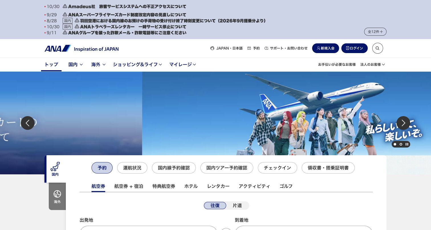
The captured ANA entrance is Japanese, with a multi-line notice area above the logo and two navigation levels. A wide blue campaign carousel pairs aircraft imagery with travelers, while a large white task panel overlaps its lower edge. Rounded controls separate passenger activities, and another row introduces flight and related travel-product categories. Domestic and international areas are distinguished by vertical tabs on the left. This review assesses the visible hierarchy and composition; it does not stand in for an English-language booking journey or a completed reservation.
What you can learn
For a broad airline portal, make the grouping logic consistent across notices, navigation, and transactional tools. A localized interface needs its own review with fluent users, particularly when several service categories appear before the itinerary fields.
Pros
The overlapping white task panel remains distinct from the colorful campaign carousel.
Domestic and international categories have a dedicated visual position beside the booking area.
Cons & considerations
The notice list and multiple navigation rows consume considerable space above the form.
The dense Japanese-language entrance requires separate localized usability testing beyond this visual review.
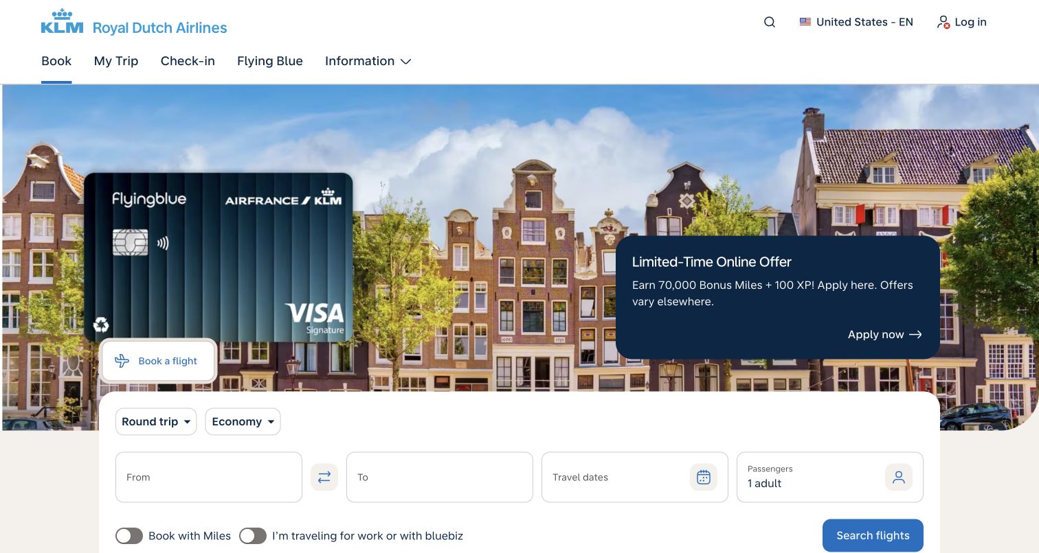
KLM places a loyalty-card promotion over a photograph of Amsterdam-style canal houses. A dark blue offer panel and large card graphic dominate the campaign, while the white booking card overlaps its lower edge. The top navigation names Book, My Trip, Check-in, Flying Blue, and Information, keeping common passenger tasks close together. Round-trip and cabin selectors sit above the route, dates, and passenger fields. Miles and business-travel toggles appear on the following line. The credit-card promotion is an observed design element, not a financial recommendation.
What you can learn
When a commercial partnership occupies the hero, preserve an unmistakable path to the airline's main task. Separate the offer action from flight search and keep existing-trip navigation stable across changing campaigns.
Pros
The main navigation uses concise labels for familiar passenger tasks.
The booking card groups core itinerary fields in a clear horizontal sequence.
Cons & considerations
The oversized card promotion receives more initial attention than destination or fare discovery.
The lower booking options sit close to the bottom edge of the captured viewport.
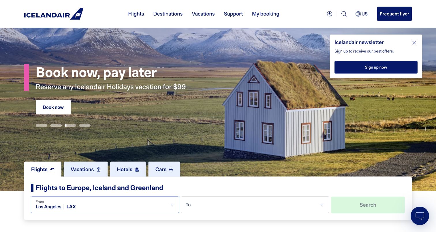
Icelandair uses a landscape of mountains, fields, and a turf-roofed building to establish a strong sense of place. A white headline, pink accent bar, and compact booking action sit over the photograph. Beneath the campaign, Flights, Vacations, Hotels, and Cars tabs lead into a wide white search panel. The observed flight state shows a departure location, destination field, and pale search button. A newsletter invitation remains open in the upper-right corner, while a chat launcher occupies the opposite lower corner.
What you can learn
Destination imagery can make an airline entrance memorable when the booking task stays structurally simple. Coordinate newsletter, chat, and campaign promotions so they do not compete with the route-selection flow or obscure the travel proposition.
Pros
Distinctive landscape photography gives the page a clear geographic identity.
Travel-product tabs provide an understandable division between flights and related purchases.
Cons & considerations
The newsletter overlay adds a competing action above the booking experience.
The captured initial search state does not yet expose the complete date-and-passenger sequence.
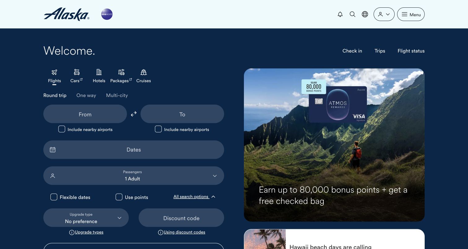
Alaska Airlines uses a dark blue canvas with a booking workspace on the left and a large promotional card on the right. Flight, car, hotel, package, and cruise icons establish the product categories before the trip-type controls. Rounded fields stack route, dates, and passengers vertically, with nearby-airport, flexible-date, points, upgrade, and discount options visible below. Check-in, Trips, and Flight status remain near the top. The right-hand credit-card campaign is an observed promotional element, not a recommendation or verification of its offer.
What you can learn
A two-column layout can give search and promotion separate zones. Preserve that separation while deciding which advanced options deserve immediate exposure; frequent travelers and first-time visitors may need different amounts of control at the start.
Pros
The booking workspace receives a substantial, clearly defined part of the first screen.
Nearby-airport and flexible-date options are visible without a hidden advanced-search dialog.
Cons & considerations
Numerous optional controls make the initial flight-search form long and visually dense.
Muted field surfaces and secondary labels need careful contrast checking against the dark background.
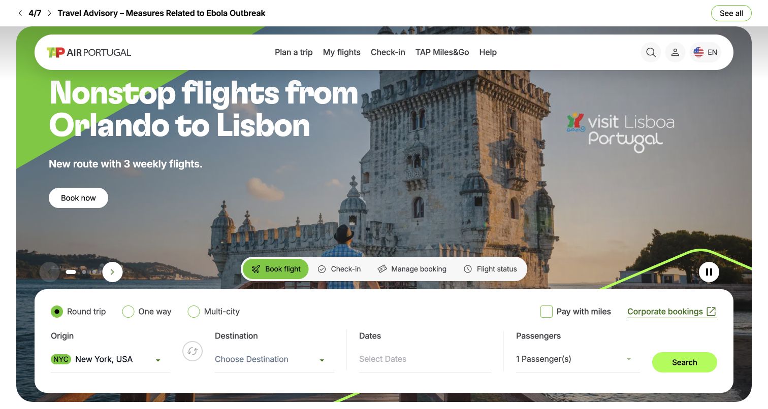
TAP frames its destination campaign inside a large rounded container, with a white pill-shaped navigation bar near the top. A Lisbon landmark fills the background, while a large route announcement and compact booking action sit on the left. Bright green accents connect the campaign geometry, active booking tab, and search button. A floating task strip separates booking, check-in, managing a reservation, and flight status. The white itinerary panel below exposes trip type, origin, destination, dates, passengers, and a miles option. A separate travel-advisory strip remains above the campaign.
What you can learn
Use one accent consistently to connect promotional and transactional parts of the page. Keep operational notices separate from destination storytelling, and preserve familiar passenger-task labels even when the campaign introduces a new route or service.
Pros
The bright green active states and search action establish a coherent visual hierarchy.
The floating task strip keeps existing-trip services visible above the itinerary fields.
Cons & considerations
Several rounded layers create a relatively busy composition around the booking form.
The large route announcement competes with the separate advisory and passenger-task navigation.
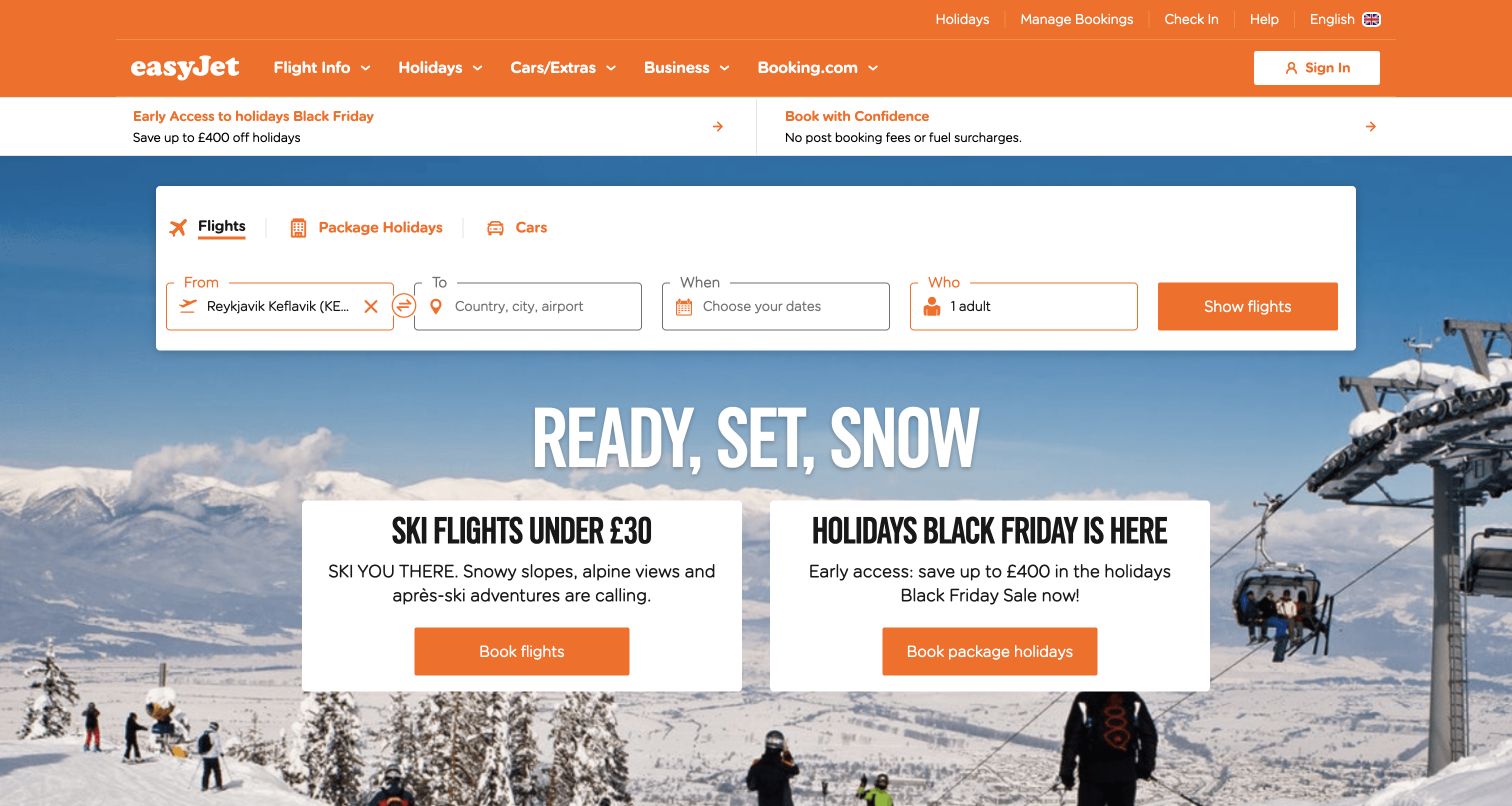
easyJet places its white booking panel high in the viewport, ahead of a large ski-season campaign. Flight, package-holiday, and car tabs share the panel, followed by a compact From, To, When, and Who sequence and an orange search action. The orange brand header reinforces the same visual vocabulary. Below the form, two white promotional cards separate flight and package-holiday offers against snowy photography. The captured offers are campaign content rather than current price guidance. The observed departure field is already populated, but its origin is not established by the screenshot.
What you can learn
Put the practical search task before the seasonal message, then give distinct product offers their own cards. Plain-language field labels can simplify scanning, provided the next steps still explain airport choices, dates, passengers, and fare conditions clearly.
Pros
The booking panel appears before the campaign headline and remains easy to locate.
Separate promotional cards distinguish flights from package holidays without merging their actions.
Cons & considerations
Repeated orange actions across navigation, search, and campaign cards divide visual priority.
The compact departure field truncates the selected airport name in the captured state.
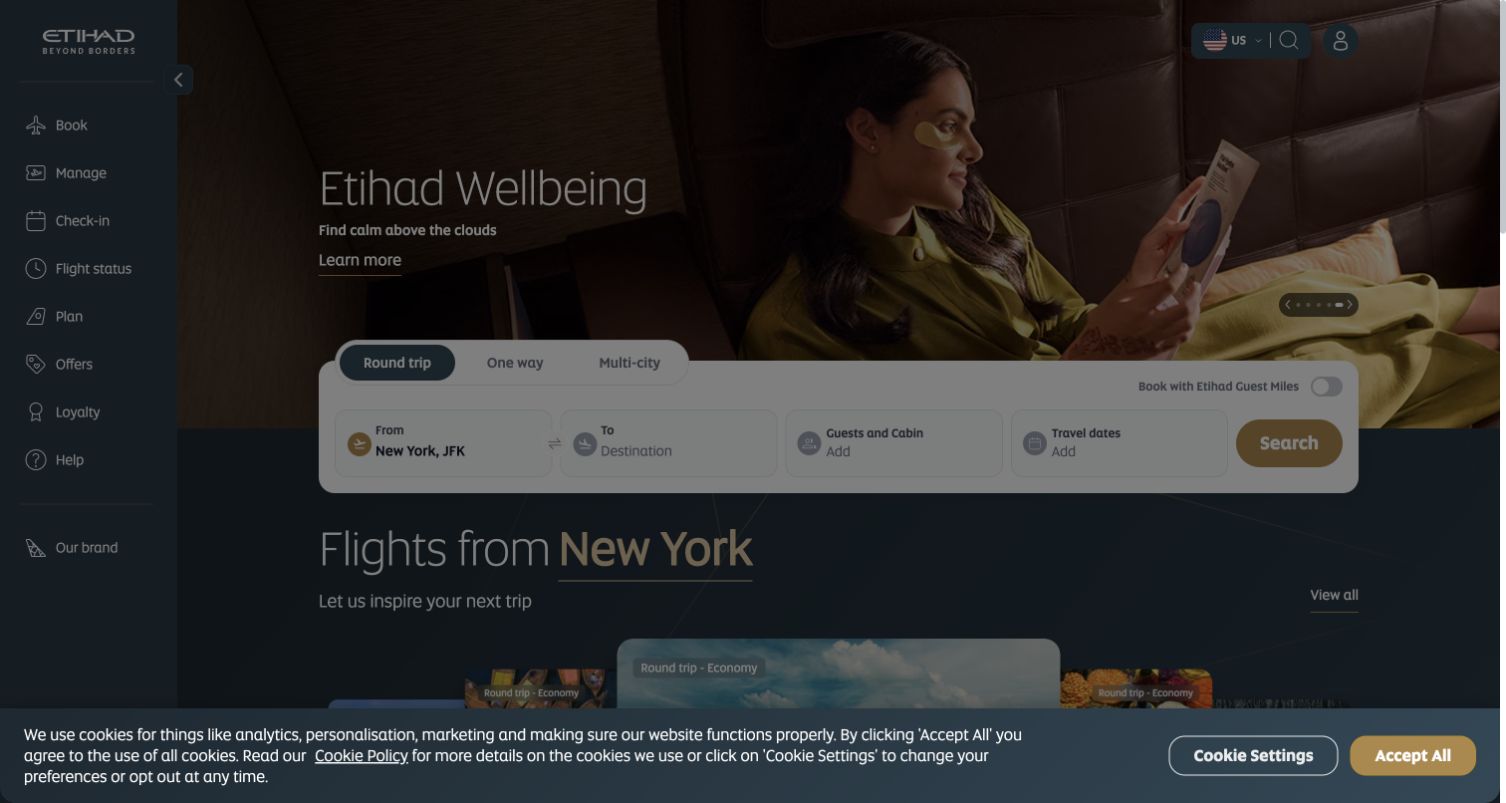
Etihad's captured page uses a vertical sidebar for booking, managing a trip, check-in, flight status, planning, offers, loyalty, and help. A wide wellbeing campaign sits beside it, with a compact booking strip overlapping the lower hero. Route, guests and cabin, dates, and a gold search action form one horizontal sequence. Destination inspiration begins below. The entire main page is visibly dimmed by an unresolved cookie-consent layer in this capture, so this is a review of that observed entrance state rather than an unobstructed booking experience.
What you can learn
Persistent task navigation can help travelers return to familiar actions, but first-visit overlays must be evaluated as part of the real interface. Preserve a clear relationship between consent choices and the underlying page instead of assuming the ideal promotional view is always visible.
Pros
The sidebar assigns common passenger tasks a consistent and explicit location.
The booking strip groups the essential itinerary fields into a compact sequence.
Cons & considerations
The unresolved consent layer substantially reduces visibility of the main page in the capture.
The narrow sidebar and compact form require careful responsive and keyboard evaluation beyond this still image.
Plan for the journey before, during and after booking
Map the most time-sensitive tasks
Identify what visitors need during a disruption, on the day of travel and when planning far ahead. Define responsible owners for service notices, status information and support links. Test whether these routes remain discoverable when a large promotion or consent dialog is present.
Treat regional choice as part of the product
List the market, language and currency combinations the airline actually supports. Preserve the traveler’s context when changing region where possible, and explain a change when it cannot be preserved. A geolocation guess should not trap someone in an unsuitable version.
Design realistic search and handoff failures
Plan messages for no routes, unavailable dates, expired sessions and interrupted transfers into the booking engine. Give travelers a way back without losing all context. Use authorized test environments for transaction checks; a homepage design review should not create real bookings.
The editing job behind the design
Coordinate public content with reservation and trip systems
The public site, flight search, booking engine, loyalty service and operational information can be separate systems. Document which system owns each fact and where a handoff occurs. A consistent visual shell helps, but it does not remove the need to test authentication, market context and failure recovery.
Cache promotional content differently from information that must reflect current trip conditions. Establish publishing ownership for notices and translations. Keep important travel tasks available through clear links and readable text when decorative media or optional scripts fail.
Our WordPress website examples offer a separate look at publishing approaches. A visible platform label is evidence for that named page, not a guarantee that the same system will suit your requirements.
Before the public launch
Airline website launch checklist
Verify booking, manage-trip, check-in and flight-status routes for supported markets.
Check origin and destination controls with keyboard input and assistive labels.
Review date, traveler and points-mode errors without making real reservations.
Keep fare assumptions and promotional limits attached to their offers.
Test consent, notices and regional selection on short and narrow screens.
Assign publishing and escalation owners for operational notices and broken handoffs.
These checks are a project checklist, not a performance, legal, security, or accessibility certification. Test real journeys with the people responsible for the website before making claims about the result.
Sources & editorial method
How this collection was selected and reviewed
The collection uses distinct official airline properties and records the regional page captured. Reviews concern visible navigation, search entry and information hierarchy, not a completed booking or an assessment of airline service. Prices, schedules and policies are time-sensitive and are not recommendations in this design guide.
Each example links to its actual source page. Screenshots are direct browser captures with their own capture dates; moving imagery, announcements and live designs can change. The notes describe observable design choices and conditional tradeoffs, not measured traffic, conversion results, service quality, or accessibility conformance.
Technology labels use public page metadata, asset evidence, or explicitly cited platform documentation. Platform documentation is not a complete current deployment audit. A component reference may be legacy or unused; it is not a complete backend inventory. Unknown stacks are omitted. These sites are editorial examples, not our client portfolio.
Written, Edited and Curated are separate editorial records, not timestamps advanced by a rebuild. Website designs and imagery belong to their owners. See our editorial standards or suggest a correction.
Questions worth asking
Airline website design questions
Should the homepage start with a destination photograph or flight search?
Make flight search and existing-trip tasks easy to reach whichever visual approach leads. The appropriate emphasis depends on actual traveler needs; a large photograph should not displace urgent trip controls.
Can all journey tools use one generic search box?
Flight availability, booking retrieval and flight status require different information. Give their modes clear names and relevant fields so travelers understand which task they are performing.
How should an airline present a country selector?
State the current market and language, let the visitor change them intentionally, and explain any effect on currency or booking context. Avoid repeatedly resetting the choice based only on a location guess.
Does a design review confirm the booking process works?
No. A public opening screenshot shows only that surface. Full booking, payment, account and disruption flows need their own authorized testing and operational review.
Keep the next trip and the current trip equally understandable. Let reliable task labels, honest offer context and clear market choices support the visual identity.