A learning catalog should help someone choose a plausible next step, with enough detail to understand what studying will involve.
A learner browsing an evening hobby class has different questions from someone comparing a professional certificate or an employer selecting staff training. Start by separating those intentions. A list of thousands of courses is less useful when subject, experience level and learning format are difficult to compare.
These public websites illustrate catalog discovery, instructor presentation and enrollment messaging. They are design references, not an assessment of teaching quality, credential recognition or employment outcomes. Distinct brand websites can share a parent company; the collection does not imply independent ownership.
Before the examples
What makes good e-learning company website design in 2026?
Show the commitment before the enrollment button
Give each course a consistent description of level, prerequisites, estimated study time, delivery format and access period. Distinguish a short course from a sequence, subscription library or degree. Put important limits near the decision instead of expecting learners to discover them after registration.
Let people start from a goal or a subject
Some visitors know the software or language they want to learn; others know only the task they want to accomplish. Provide useful routes for both, with understandable filters and a way to recover from no results. Keep individual study and organization purchasing recognizable as different journeys.
Explain who teaches and what learners produce
Instructor experience, a sample lesson and a concrete project description provide context that a large enrollment number cannot. Label partner institutions and the issuer of any credential accurately. Explain assessment and support without suggesting that a homepage logo guarantees recognition or results.
The collection · 16 examples
16 e-learning company websites worth studying
Compare how these learning brands introduce a subject, reveal course details and distinguish casual exploration from a longer commitment. A featured lesson and a searchable catalog solve different problems; the strongest combination depends on the size and variety of the offering.
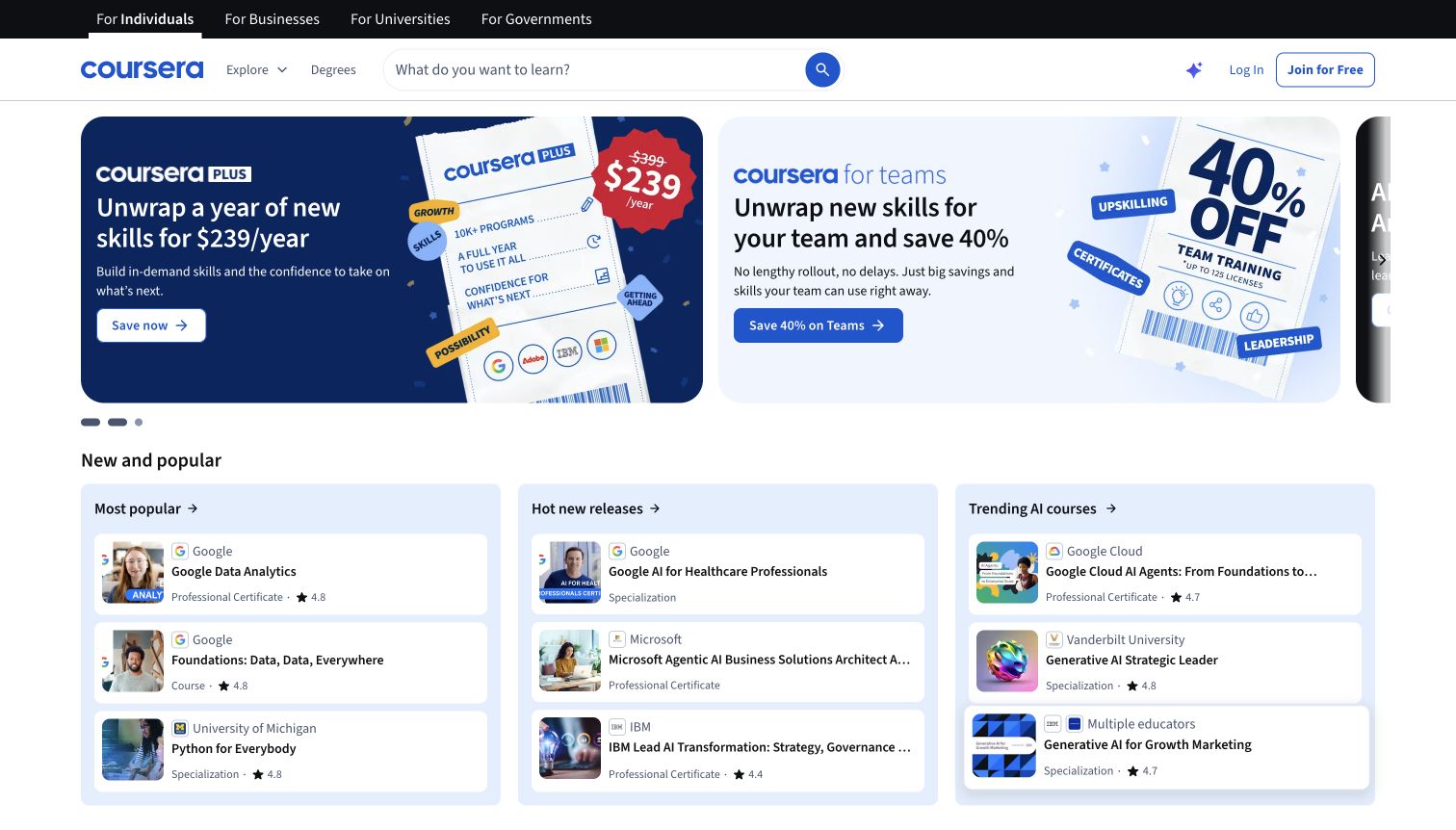
Coursera separates audience routes in a black strip, then gives catalog search a wide position beside Explore and Degrees. Two large promotional cards occupy the opening, with the next card partly visible at the right. Beneath them, three pale-blue columns organize popular courses, new releases and AI subjects. Each white course row pairs a small image with a provider, title, learning format and sometimes a rating. The screenshot was taken after the initial loading placeholders resolved and the ordinary privacy banner was dismissed, so the comparison structure is visible.
What you can learn
Make the first useful shortlist easy to compare even when campaigns lead the page. Consistent provider and format labels help distinguish a course from a certificate without requiring a new page for every item. Keep the general search independent from seasonal promotions and avoid hiding important title words behind narrow cards.
Pros
A persistent search field gives visitors a route beyond the current offers.
Provider names and learning formats repeat consistently across the three discovery columns.
Cons & considerations
Two large discounts compete before a learner has identified a suitable subject.
Several long course titles truncate, limiting comparison within the compact rows.
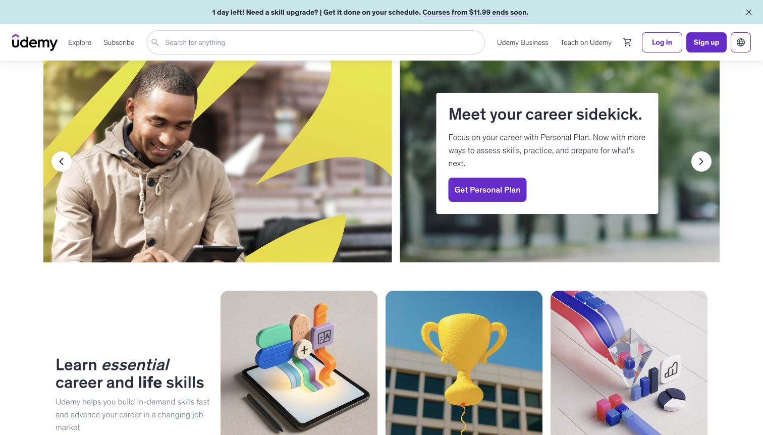
Udemy’s opening combines a large learner photograph with a separate white message panel on a blurred image. Purple actions distinguish the personal-plan offer from the wide neutral search field in the header. The next section introduces skill categories through oversized illustrations, including a trophy and a colorful data diagram. Explore and Subscribe sit near the logo, while teaching and business routes occupy the right side of the header. The promotional strip at the very top adds urgency, but the main image and message remain readable.
What you can learn
Give a subscription campaign its own clear destination while retaining an obvious catalog route for visitors who want one subject. The large category illustrations establish tone, but accompanying labels must explain the difference between topics, credentials and learning plans. A photographed learner should support that decision instead of replacing meaningful course information.
Pros
The header search remains prominent across the full catalog.
The white campaign panel keeps the headline and action distinct from the photography.
Cons & considerations
The opening emphasizes a paid plan before showing individual course details.
Large category images consume substantial space before their comparison information appears.
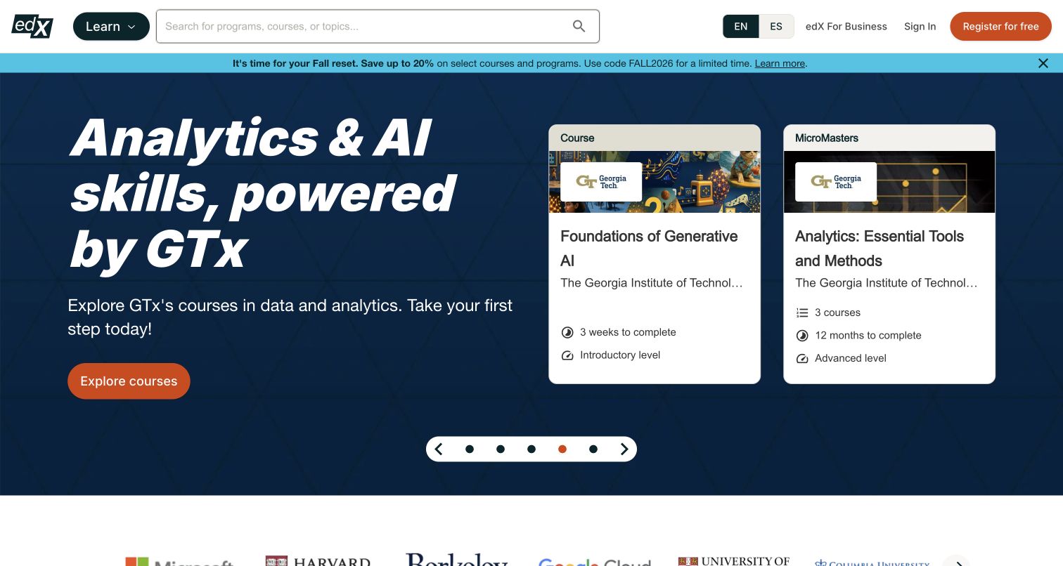
The captured edX homepage gives a Georgia Tech analytics campaign most of the opening, with a large italic heading on a dark blue field. Two pale cards sit beside the introduction: one represents an introductory course and the other a longer advanced program. Their labels, duration and level make the difference visible without opening either item. A broad search field remains in the white header, separate from the promotional carousel. The orange course action is easy to distinguish from the surrounding text, while the discount strip adds another message above the campaign.
What you can learn
Use a featured topic to teach visitors how the catalog is organized. Comparable metadata can clarify the commitment before enrollment, but the campaign should preserve an obvious route to subjects outside the promotion. Check the card hierarchy with long institution names; the captured institution line is truncated even though the partner identity appears elsewhere.
Pros
Course and program cards expose different study durations and levels in a common layout.
The header search remains a direct route beyond the featured analytics campaign.
Cons & considerations
The large carousel and discount strip compete for attention before a learner has chosen a goal.
Truncated institution text requires another reliable place to confirm the full provider name.
Public source checked November 3, 2026. References may be embedded or legacy—not a complete backend inventory.
Platform source: Official Algolia customer implementation case. Official Algolia case specifically identifies edx.org and its search and discovery work. The public course-marketplace entrance is shown without asserting the technology behind linked learning platforms or enrolment systems. This is an attributed case-study association reviewed on 2026-11-03, not a current homepage-backend or full-stack audit. Platform evidence is separate from the direct website screenshot and is not a complete current infrastructure audit.
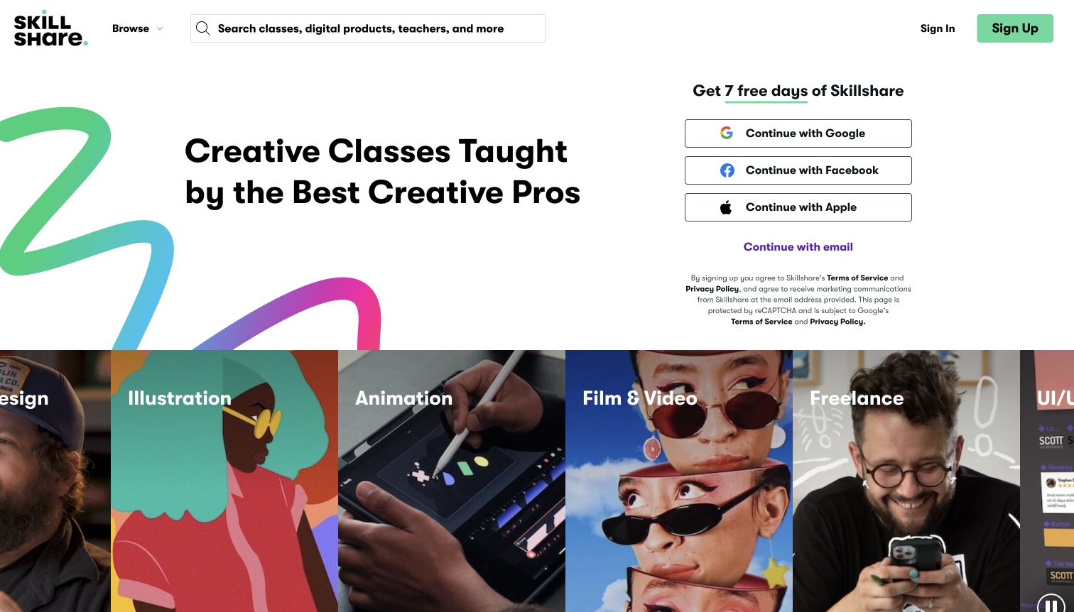
Skillshare uses a bold black heading on white, with a loose multicolor stroke filling the left edge. The right column presents a trial invitation and separate Google, Facebook, Apple and email routes. Below, a continuous band of large photographic and illustrated panels labels disciplines such as illustration, animation, film and freelance work. A broad header search explicitly includes classes, digital products and teachers, making the available content types clear. The design presents a creative community through imagery without requiring a dense catalog in the first screen.
What you can learn
Make the relationship between discovery and registration explicit. A visible Browse route and descriptive search can support visitors who are not ready to start a trial. When several content formats share one search, keep their result labels distinct so a class, a downloadable product and an individual teacher do not look interchangeable.
Pros
Large discipline labels make the creative range legible at a glance.
The search prompt explains that discovery includes teachers and products as well as classes.
Cons & considerations
Registration choices receive more space than a sample lesson or membership explanation.
The horizontal image band clips neighboring disciplines at the viewport edges.
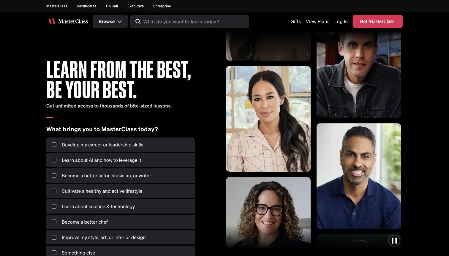
MasterClass places a tall white headline and a learning-goal questionnaire on a black background. Rectangular instructor portraits occupy the right half in a staggered arrangement, connecting the service’s personality to real people. The questionnaire lists career, AI, creative, health and other interests as large separate rows. A Browse control and search field remain in the header, and a smaller top navigation distinguishes certificates, executive and enterprise offers. A visible pause control acknowledges the moving portrait presentation rather than leaving motion entirely uncontrolled.
What you can learn
A guided starting point can reduce a broad library to a manageable choice, provided browsing remains available. Keep the questionnaire’s selection and continuation rules understandable, and make sure an uncertain visitor can explore without committing to a learning identity. Instructor imagery should be accompanied by practical lesson details farther into the journey.
Pros
Large interest rows translate a wide catalog into familiar motivations.
Search and Browse offer alternatives to the questionnaire.
Cons & considerations
The question list extends beyond the captured viewport before its continuation action.
Portraits convey personality but do not explain lesson depth or required preparation.
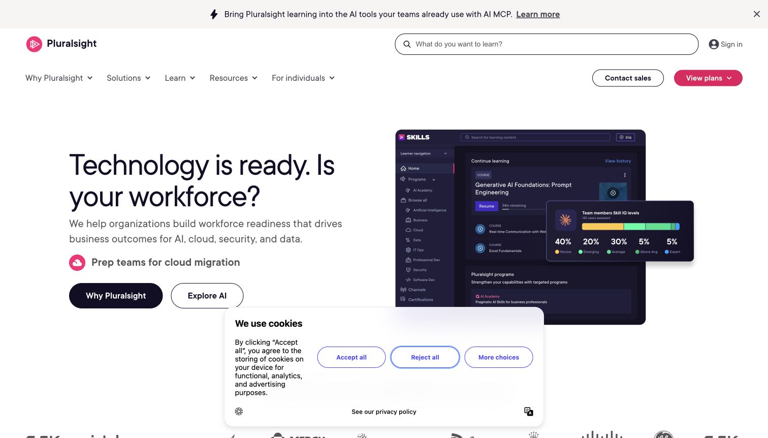
Pluralsight’s white homepage uses a restrained dark headline about workforce readiness and a large product-interface illustration. The illustration shows a learning dashboard with an overlapping team-skill distribution panel. Search spans much of the upper header, and a second navigation row separates solutions, learning, resources and individual plans. Two hero actions distinguish the company explanation from its AI offer. The captured first-visit state includes a lower consent panel; it leaves the headline readable but obscures part of the product illustration and the next section.
What you can learn
An interface preview can make a training service concrete without exposing private learner records. Explain what the preview represents and preserve a clear route for people whose needs differ from the enterprise message. Assess the first screen with real consent UI present, since an otherwise generous layout can lose useful space to that additional decision.
Pros
The product illustration connects the workforce message to a tangible learning interface.
Individual learners have an explicit route alongside the organizational navigation.
Cons & considerations
The consent panel interrupts the lower hero and prevents an unobstructed product view.
Two navigation rows plus a promotional strip delay the main proposition.
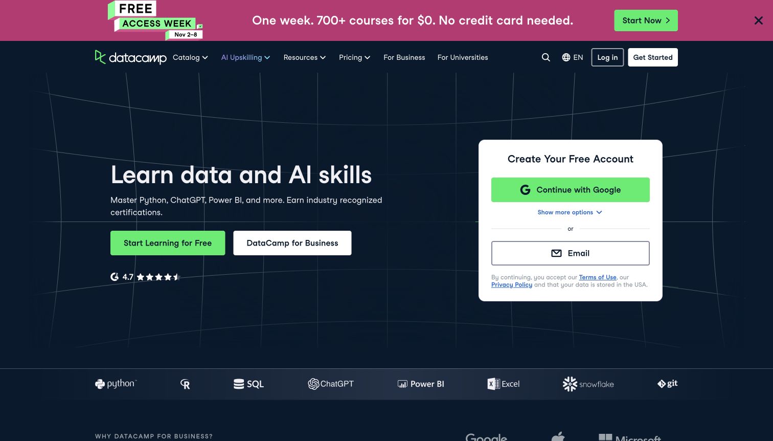
DataCamp uses a dark navy field with fine curved grid lines behind its learning proposition. Bright green marks the individual learning action and the Google registration option, while a white business action provides a separate route. A rounded white account card sits to the right and exposes email as an alternative. Along the bottom, named tool logos communicate subject coverage, including Python, SQL and Power BI. The promotion above the header adds a temporary free-access message, but the main content remains organized into two legible columns.
What you can learn
A narrow subject promise can reduce explanation, but registration still needs context. Separate organizational inquiries from individual enrollment and keep the general catalog available before account creation. Tool logos should label what can be studied; they should not imply a visitor has already chosen a course or that every topic belongs to the same credential.
Pros
Individual and business actions are visually distinct in the main hero.
Named tool marks provide concrete subject cues beneath the broader data and AI message.
Cons & considerations
Account creation is emphasized before a visible sample course comparison.
The temporary banner creates a second prominent green action above the main proposition.
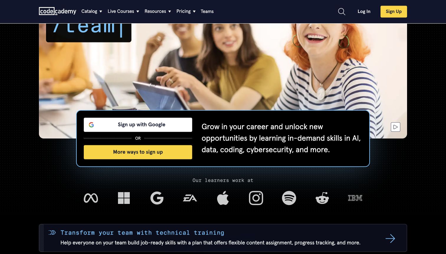
Codecademy combines a dark interface, a large learner photograph and a black signup panel outlined with a bright accent. The captured view shows the panel’s Google and alternative signup routes beside a short explanation of career-oriented skills. A row of familiar employer marks follows under a clearly attributed learner-employment label. The navigation keeps Catalog, Live Courses, Resources, Pricing and Teams separate. The decorative hero animation was paused through its visible control; the screenshot illustrates the lower hero and the transition into the employer and team-training sections.
What you can learn
Connect a broad personal-development message to a concrete next action without treating every visitor as ready to register. Keep learning format and pricing routes visible above the campaign. If employer logos appear, state the precise relationship so visitors do not mistake learner workplaces for customers, accreditors or promises of employment.
Pros
The signup panel keeps the action and short benefit explanation together.
The employer row includes a label that clarifies the relationship being presented.
Cons & considerations
The photographic hero requires considerable vertical space before course details.
Signup receives greater prominence than a sample exercise or catalog preview in this view.
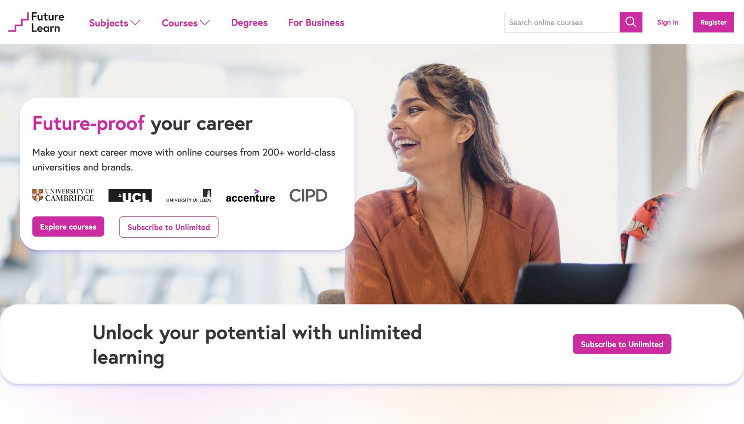
FutureLearn places a white rounded message card over a warm photograph of people learning together. Magenta highlights the opening phrase, navigation labels and primary course action. University and organization marks sit inside the same card rather than being separated into a distant credibility strip. A second white panel immediately below introduces the unlimited subscription and repeats its action. Subjects, Courses, Degrees and For Business remain clearly named in the top navigation, while the search field provides a direct route to a particular interest.
What you can learn
Keep institutional context close to the learning proposition, then explain what each relationship means on the relevant course page. The visitor should be able to distinguish a catalog, a degree program and a subscription without decoding brand imagery. Repeated subscription prompts work best when they add new information about commitment or access.
Pros
The main message remains readable on a solid card instead of directly over the photograph.
Named navigation separates short courses, degrees and organizational learning.
Cons & considerations
The unlimited offer repeats within the first screen without much additional detail.
Partner marks alone do not explain which organization teaches or awards each course.
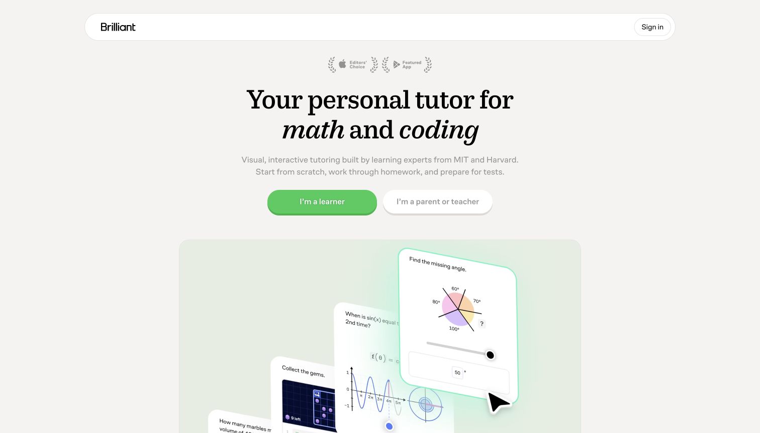
Brilliant uses an unusually spare opening: a narrow rounded header, a centered serif headline and two large audience buttons. Green identifies the learner route, while a white alternative addresses parents and teachers. The next visual shows mathematics questions and a cursor on layered cards, suggesting the shape of the interaction without making the homepage itself a lesson. Small app-recognition marks sit above the heading. The neutral background and generous spacing create a markedly different pace from the dense promotional catalogs elsewhere in this collection.
What you can learn
An audience choice is useful when it leads to meaningfully different information. Parents and teachers may need supervision, suitability and purchasing context that learners do not. Preserve those distinctions after the first click, and make sure quiet secondary copy still has sufficient contrast. A product demonstration should explain the process without claiming verified learning outcomes.
Pros
Two plainly named audience routes reduce the initial decision to a familiar distinction.
The mathematical interaction illustration makes the tutoring concept more concrete.
Cons & considerations
Much of the supporting text and recognition imagery is visually subdued.
The opening does not expose a subject catalog or detailed pricing comparison.
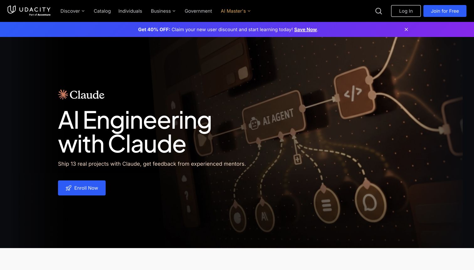
Udacity gives a single AI-engineering program the full hero, using a dark diagram-like background and a large light headline. The supporting line describes projects and mentor feedback, while a blue enrollment action stays isolated beneath it. A separate gradient promotion strip appears above the campaign. The header distinguishes Catalog, Individuals, Business and Government, preserving access to audiences outside the featured program. The screenshot was taken after dismissing a signup promotion and choosing required cookies only; no enrollment or account action was submitted.
What you can learn
A concentrated program campaign can make the next step obvious, but its landing page must substantiate prerequisites, workload and support. Keep broad catalog navigation visible for visitors who are not interested in the launch. The use of an AI product name here describes course subject matter; it does not prove the public website runs on that product.
Pros
The large headline, supporting promise and single hero action create a clear hierarchy.
Audience-specific navigation remains available above the program campaign.
Cons & considerations
The first viewport provides little comparison with other learning paths.
The discount strip adds urgency before the full program commitment is explained.
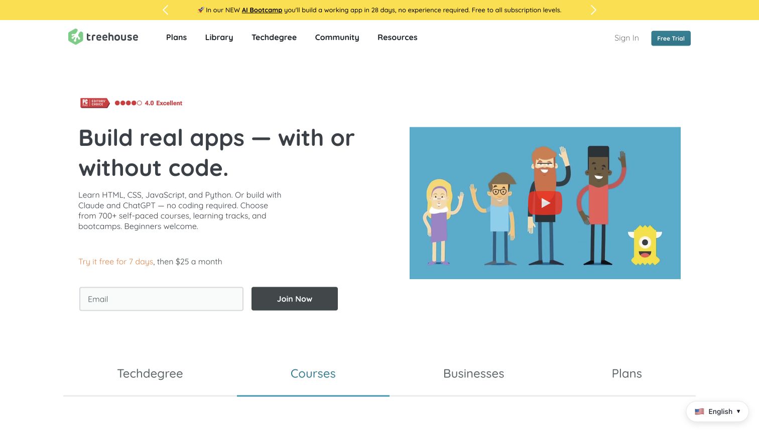
Treehouse’s opening uses a simple two-column layout with a rounded, informal headline and an illustrated video thumbnail. The copy names programming languages and AI tools while explicitly welcoming beginners. A short trial-and-price line sits above an email field and Join Now button. Plans, Library, Techdegree, Community and Resources remain separate header destinations. Along the lower edge, a tab-like row introduces Techdegree, Courses, Businesses and Plans, giving the page another way to divide its offers without a crowded grid of individual lessons.
What you can learn
Plain language and an optional introduction can reduce anxiety for newcomers. Keep price and trial terms near the action, and clearly explain how a subscription differs from a longer program. Tool names should clarify what students learn; visitors should not have to infer whether coding knowledge is required from a photograph or a technology badge.
Pros
The visible trial line provides commitment context beside the email action.
The headline directly acknowledges both coding and no-code interests.
Cons & considerations
Several program categories appear before their differences are explained.
An introductory video thumbnail does not replace a text description of lesson structure.
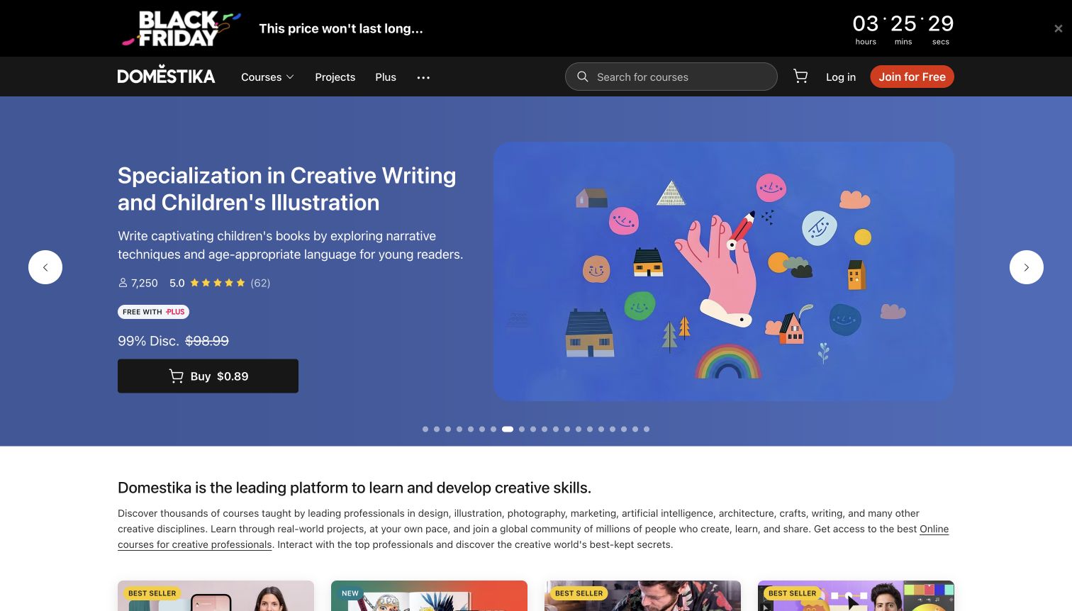
Domestika’s captured carousel features a writing and illustration specialization on a blue field, with a colorful collage of drawing, reading and craft motifs. The text column includes the subject, a short description, learner and rating indicators, a membership badge and a purchase action. A black sale banner with a timer occupies the top, while search and the Courses, Projects and Plus routes sit below it. After the ordinary privacy dialog was rejected, the feature and the introductory marketplace explanation became unobstructed.
What you can learn
A course feature can combine emotional appeal with practical comparison information, but purchase and membership pricing need a clear relationship. Keep the meaning of badges, discounts and included access understandable before checkout. A carousel with many items should retain direct subject discovery so visitors do not need to wait for the right topic to appear.
Pros
The feature includes meaningful subject and learner context alongside its illustration.
The header exposes both course discovery and community projects.
Cons & considerations
The countdown, discount and membership badge create several overlapping price signals.
Numerous carousel indicators make the range of featured items difficult to scan.
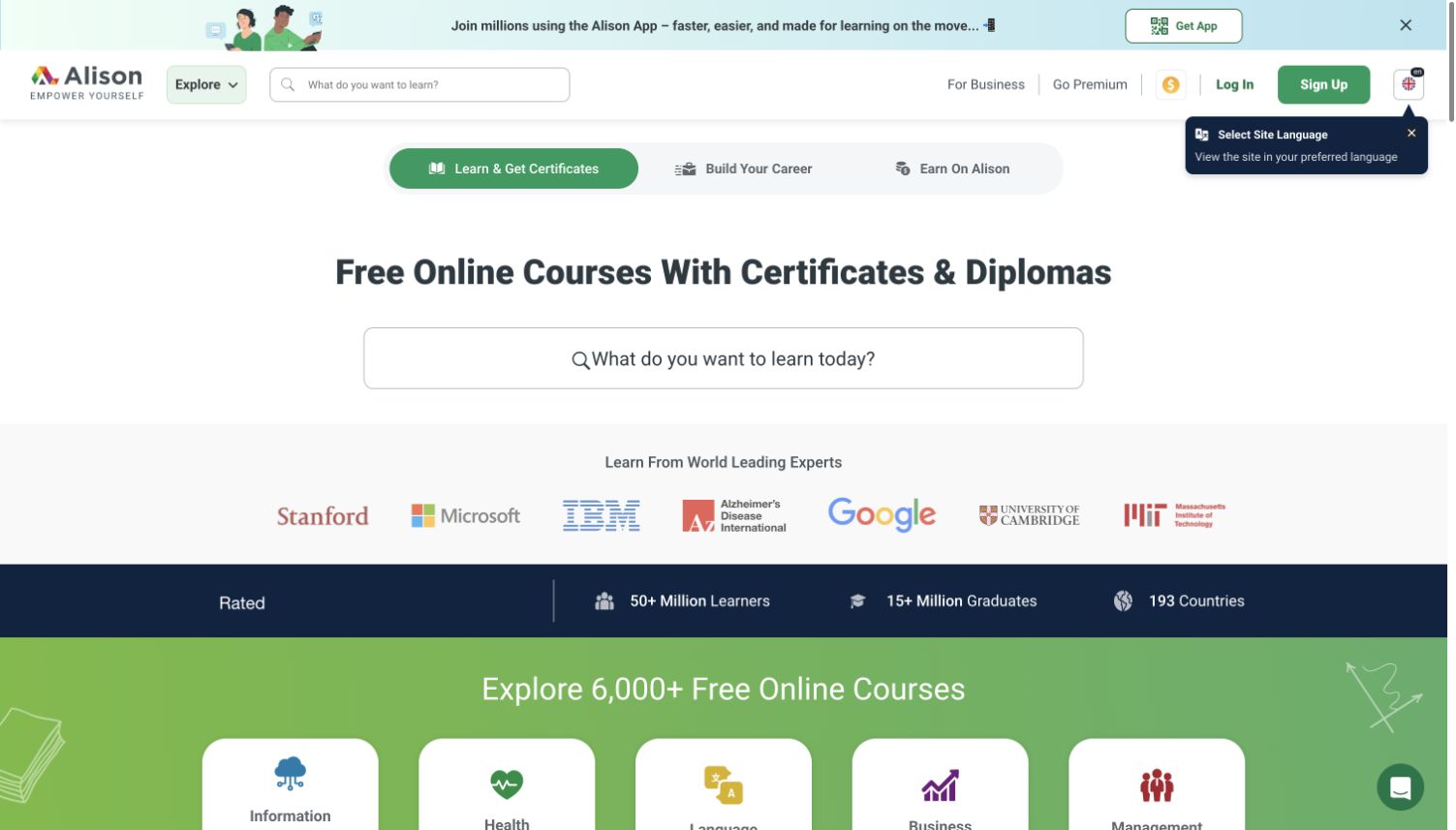
Alison puts an oversized search field directly under a centered headline about certificates and diplomas. Three rounded audience/task tabs above it separate learning, career building and earning on the platform. The next band presents institutional and organization marks, followed by a dark statistics strip and a green introduction to subject categories. The header offers a second, smaller search field along with business, premium and account routes. The result is a functional, text-led opening whose primary activity is immediately recognizable.
What you can learn
Search can lead a broad catalog when the surrounding page explains what kinds of results are available. Distinguish free learning access from paid documents or other services wherever that distinction matters. Keep partner labels precise, and ensure subject categories remain useful to beginners who do not yet know the right search term.
Pros
The central search field is difficult to miss and uses a plain-language prompt.
Learning and career-related tasks are separated into named routes.
Cons & considerations
Two search fields in the same viewport may feel redundant.
The institutional marks require more context than their appearance alone can provide.
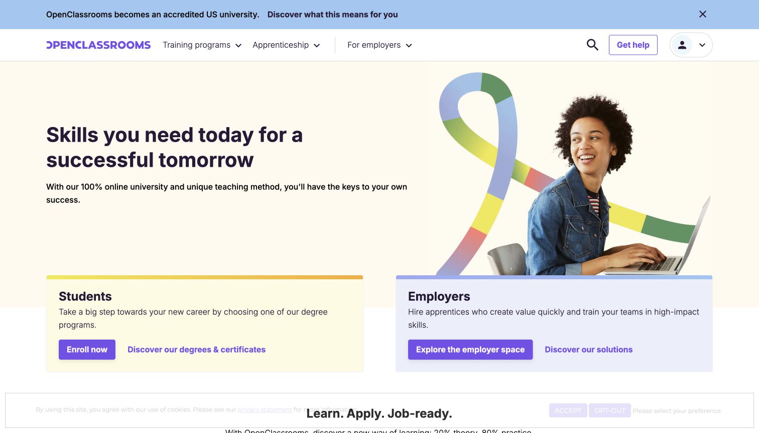
OpenClassrooms pairs a cream hero with a learner photograph and a large looping multicolor graphic. A broad headline and short supporting statement occupy the left, while two pastel cards overlap the lower edge of the hero. The cards clearly label Students and Employers and provide different actions for each audience. The header separately names training programs, apprenticeship and employer routes, with a compact help action. A blue announcement strip adds institutional news above the navigation without merging it into the main campaign.
What you can learn
When one organization serves learners and employers, make that split visible before either audience enters the wrong funnel. Give each card a useful explanation and action rather than relying only on its title. Institutional or accreditation announcements should lead to precise supporting information, while the homepage remains understandable without accepting those statements as proof of outcomes.
Pros
The two audience cards explain distinct purposes with their own actions.
A visible help route supports visitors who need assistance before enrollment.
Cons & considerations
Multiple links inside each audience card compete with the primary action.
The general skills promise needs more specific program information farther into the journey.
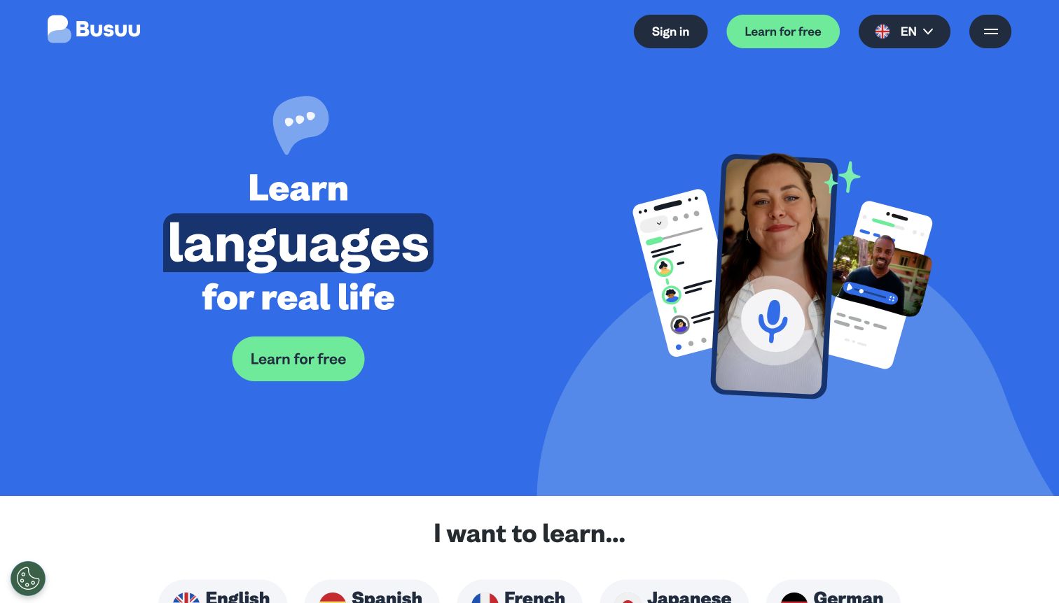
Busuu uses a saturated blue hero with a short stacked headline and a green learning action. A phone-shaped photograph of a speaker sits beside smaller message and community illustrations, making conversation the visual theme. The same learning action appears in the compact header, together with sign-in, language selection and a menu. At the bottom of the capture, a white section begins the language-choice list. The opening stays focused instead of trying to fit every language, feature and subscription option above the fold.
What you can learn
Use a clear first step, then quickly translate a broad promise into a concrete language choice. Illustrations can explain speaking and community features, but they should not stand in for information about levels, lesson formats or paid access. Keep the interface language control distinct from the language someone wants to study.
Pros
The contrasting action is prominent without a crowded form.
Conversation imagery connects the service to practical communication rather than abstract achievement.
Cons & considerations
Most subject choices sit below the large hero.
The minimal header hides broader product and subscription information behind the menu.
Define fields for subject, level, prerequisites, format, language, duration, instructor, price basis and next available start. Decide which values are estimates and which are fixed. Reuse the same record in search, landing pages and comparison views so the learner does not receive contradictory information.
Write the first-week experience
Explain what happens after enrollment, whether learning begins immediately, and how assignments, feedback or live sessions work. Show a real sample that the team has permission to publish. Make account requirements and device expectations visible before a prospective learner invests time in signup.
Give the catalog an expiration process
Assign owners for outdated software versions, retired courses, changed instructors and enrollment deadlines. Keep an honest update date for learning material. When a course closes, provide a useful explanation and relevant alternatives rather than leaving an apparently available enrollment action.
The editing job behind the design
Connect catalog publishing to the learning service
The public catalog and the learning management system may have different responsibilities. Decide where course information is authoritative and how publishing updates reach search and enrollment. Avoid maintaining prices or start dates manually in multiple systems.
Evaluate search using actual learner questions, misspellings and prerequisites. Confirm how account creation, subscriptions and paid access connect, and provide clear support when a handoff fails. A marketing screenshot cannot establish the reliability or accessibility of the private learning environment.
Our WordPress website examples offer a separate look at publishing approaches. A visible platform label is evidence for that named page, not a guarantee that the same system will suit your requirements.
Before the public launch
Online learning website launch checklist
Confirm course titles, prerequisites, language, format and time estimates with the teaching team.
Identify the credential issuer and approved wording for any recognition claims.
Check prices, renewal terms, access periods and enrollment availability across all entry points.
Test catalog filters and no-result states with realistic learner questions.
Review keyboard navigation, captioned samples, text alternatives and small-screen comparisons.
Assign an owner for closed courses, outdated lessons and support during enrollment handoffs.
These checks are a project checklist, not a performance, legal, security, or accessibility certification. Test real journeys with the people responsible for the website before making claims about the result.
Sources & editorial method
How this collection was selected and reviewed
The collection focuses on distinct official public websites of online learning businesses. Reviews describe the captured marketing and catalog surfaces; they do not evaluate private lessons, learning outcomes, credential acceptance or completion rates. Capture dates identify the observed version, and brand properties may share corporate ownership.
Each example links to its actual source page. Screenshots are direct browser captures with their own capture dates; moving imagery, announcements and live designs can change. The notes describe observable design choices and conditional tradeoffs, not measured traffic, conversion results, service quality, or accessibility conformance.
Technology labels use public page metadata, asset evidence, or explicitly cited platform documentation. Platform documentation is not a complete current deployment audit. A component reference may be legacy or unused; it is not a complete backend inventory. Unknown stacks are omitted. These sites are editorial examples, not our client portfolio.
Written, Edited and Curated are separate editorial records, not timestamps advanced by a rebuild. Website designs and imagery belong to their owners. See our editorial standards or suggest a correction.
Questions worth asking
E-Learning Company website design questions
Should learners choose a subject or a career goal first?
Offer both when the catalog supports both intentions. A person searching for a particular tool should not have to choose a career path, while a beginner may need a guided starting point rather than an unfamiliar list of subjects.
What belongs on every course card?
Include a meaningful title, format, level and enough time or price context to compare relevant options. Do not force every detail into the card; link to a consistent course page for prerequisites, assessment, access and support.
Are instructor names enough to establish credibility?
Names need context. Describe relevant teaching or professional experience, show an appropriate sample and explain what the learner will practice. Use only supported statements and approved institutional relationships.
Should enrollment require an account immediately?
Let visitors understand the offer before asking for registration. Explain why an account is required when it becomes necessary, and make the return path clear if someone wants to compare courses first.
Build the catalog around a learner’s decision: what to study, what preparation is needed and what the commitment includes. Let clear course records carry that explanation across the whole journey.