A toy store can be playful while still explaining who a product is for, what is included and how it can be bought.
Toy shopping includes several different tasks: choosing an unfamiliar gift, finding a requested character, replacing a missing part or following a collector release. Age, interests, budget and brands offer different routes into the same catalog. A strong store helps the buyer choose a route without turning the homepage into an exhaustive menu.
Specialist retailers, educational suppliers and manufacturer stores also carry different expectations. A dramatic collector preorder should not imply the same immediate availability as an everyday toy. The examples are useful for merchandising and information design, not as independent evidence of product safety, learning benefits or sales performance.
Before the examples
What makes good toy store website design in 2026?
Provide several understandable routes into the catalog
Use age, play interest, brand and gift budget where they genuinely help customers. Keep the labels consistent between navigation and product records. Do not make a shopper know an internal franchise or product-series name before they can find a useful gift, and avoid duplicating every category across several overlapping menus.
Explain the physical product behind the image
Show dimensions, contents, recommended age, required batteries or accessories and relevant warnings in maintainable fields. Make it clear when photographs include props or multiple items sold separately. Review educational and developmental claims with the business instead of converting a colorful category label into an unsupported promise.
Separate ordinary purchases from special releases
Preorders, limited drops, customization and store collection need distinct expectations. State dates and eligibility at the relevant decision point. Provide a useful sold-out destination and an understandable alternative when a campaign expires rather than leaving the homepage attached to an unavailable product.
The collection · 25 examples
25 toy store websites worth studying
Compare broad toy retailers, independent shops, educational specialists and collector storefronts by the questions their navigation and product presentation answer.
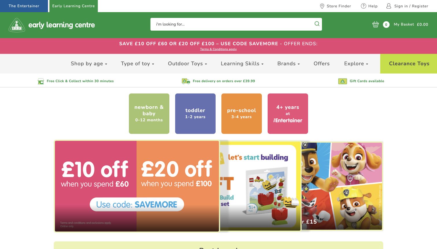
Early Learning Centre uses four colored age cards for newborns, toddlers, preschoolers and older children. The older-child card explicitly points to The Entertainer, making the relationship between the stores visible instead of silently mixing the two catalogs. Its green header contains a broad search field and basket, while navigation includes learning skills as well as toy type, brands and offers. Fulfillment promises sit above the age cards, and a multicolored discount campaign fills the next row. The developmental labels are useful for new parents and gift buyers, but the stacked offer bar, navigation and service strip delay the actual merchandise. A promotional modal initially repeated the same discount campaign and was dismissed for the saved view.
What you can learn
Use developmental stages as meaningful browsing choices, supported by activity or learning-skill routes. Make any move to a related storefront explicit, and avoid repeating the same offer in both an interrupting modal and the primary page content.
Pros
Age cards combine numeric ranges with understandable developmental labels.
The older-child route clearly names the related store it leads to.
Cons & considerations
Repeated promotional layers consume space before product discovery.
The initial modal duplicates a campaign already visible on the homepage.
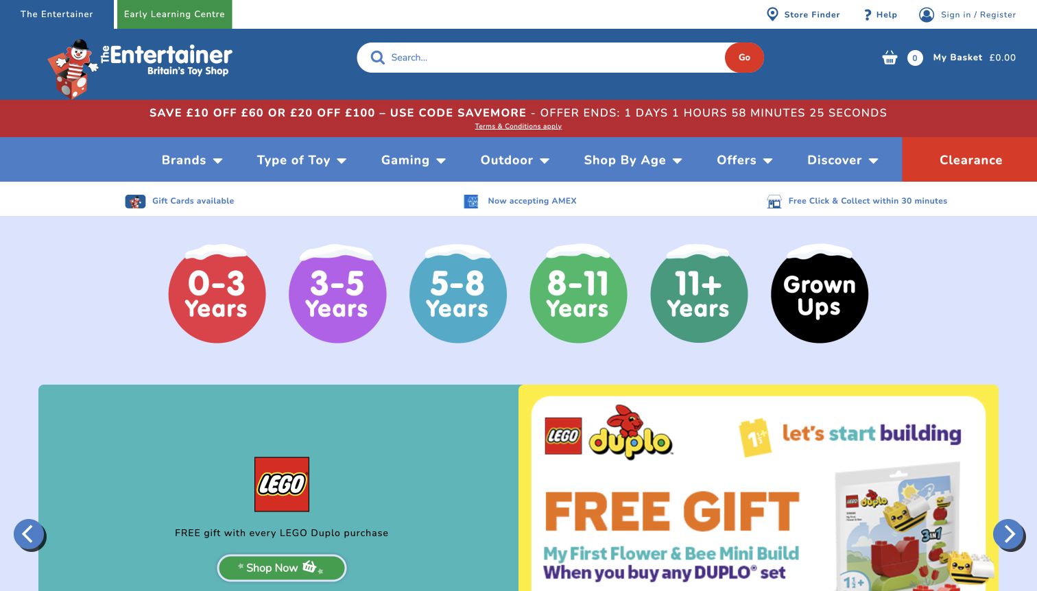
The Entertainer places six colorful age circles immediately below its fulfillment strip, including a clearly labeled grown-up route. This gives uncertain gift buyers a concrete starting point before the seasonal LEGO campaign. Its blue header keeps a large search field, basket and store finder visible, while a separate navigation row offers brands, toy types, gaming and outdoor products. The inspected page also distinguishes collection and delivery promises. The hierarchy is useful, but several stacked announcement strips and a countdown compete with the age selector. The campaign artwork communicates an incentive quickly, although its qualifying details are much smaller than the headline. The screenshot records the promotion shown during inspection rather than confirming its continuing availability.
What you can learn
Give gift buyers a familiar first filter such as age, then preserve direct routes for people who already know a brand or product. Keep delivery qualifications readable and limit competing promotional bands above the main choice.
Pros
Large labeled age circles make the first decision easy to scan.
Search, basket and fulfillment information remain close to the catalog navigation.
Cons & considerations
Several header bands use valuable space before the merchandise.
The campaign conditions are less prominent than its gift incentive.
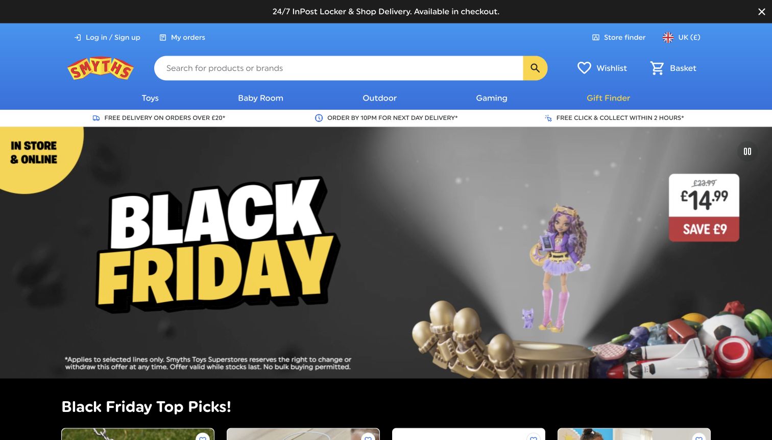
Smyths uses a blue search header and a narrow category row above a dark Black Friday campaign. The captured promotion gives one doll a large current price, crossed-out comparison price and saving, making the commercial message unusually concrete. A separate strip lists delivery and click-and-collect options, while the page continues into top-pick product cards with prices and ratings. This structure serves shoppers who arrive with a budget or an urgent gift deadline. The animation includes a visible pause control, which is valuable in a visually active hero. However, the top announcement, service strip and campaign all ask for attention, and the broad promotional headline does not explain which products or dates qualify without further reading.
What you can learn
Pair a promotional price with the exact item and comparison basis, then keep fulfillment details close to the purchase journey. Provide pause controls for moving campaigns and ensure that important offer conditions remain available as readable text.
Pros
The promoted item has a clear current price and visible saving.
A pause control gives visitors a way to stop the animated hero.
Cons & considerations
Multiple announcement layers compete with the product offer.
Campaign eligibility requires more attention than the large sale headline suggests.
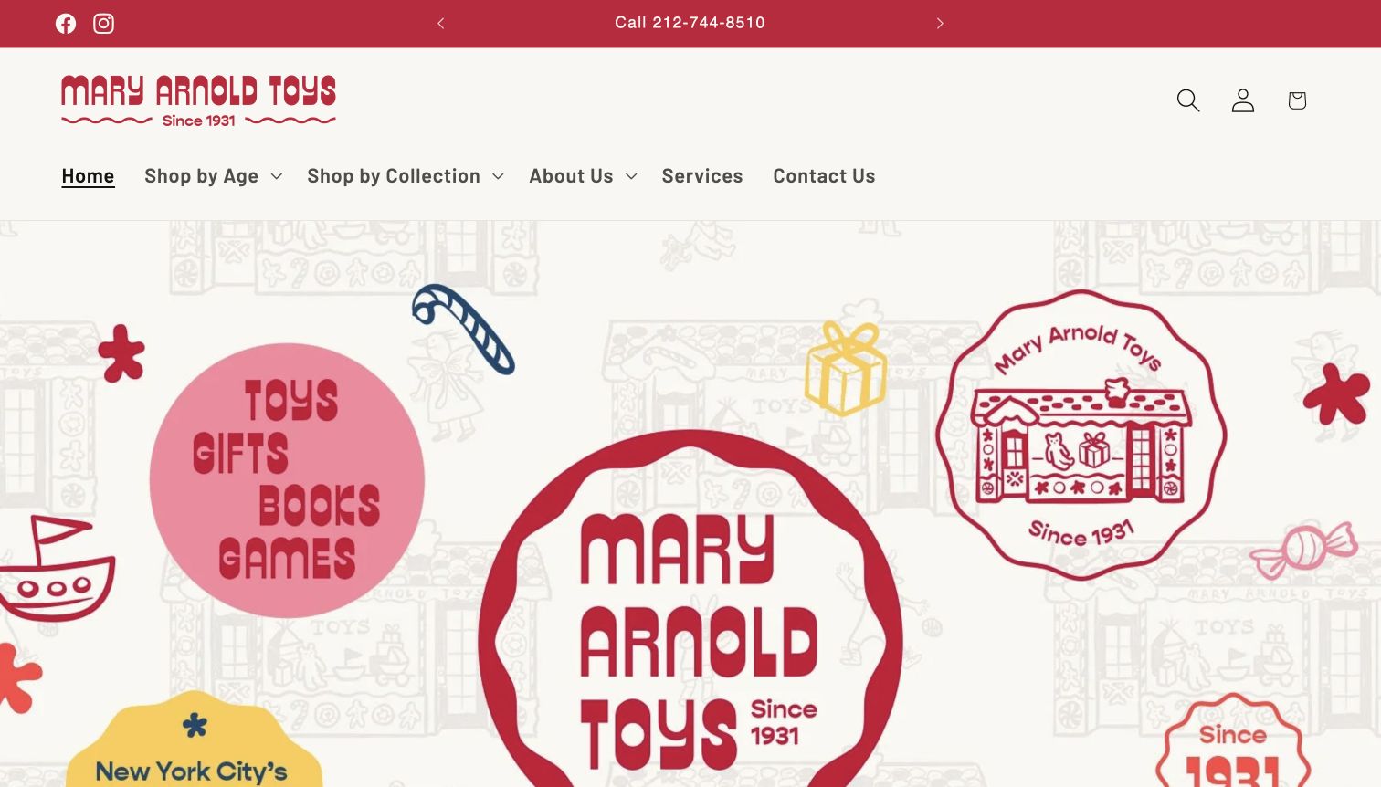
Mary Arnold Toys uses a warm off-white background, red lettering and illustrated storefront motifs to establish a neighborhood-shop personality. A phone number appears in the announcement strip, and the main navigation includes age, collection, services and contact routes. The inspected page then offers age bands from babies to adults, merchandise categories and product prices. Service content includes personal shopping, gift wrapping, delivery and shipping, making the store’s human assistance part of the browsing experience. The large opening artwork repeats the name and founding-year message several times, however, and contains no obvious primary shopping action in the captured viewport. Visitors who already understand the brand have to use the menu or scroll to reach the practical selection tools.
What you can learn
Translate local service into concrete online routes, such as gift advice and wrapping details. Use distinctive illustration to establish identity, but reserve enough opening space for a clear catalog or gift-finding action.
Pros
Phone, service and contact routes make personal assistance easy to find.
Age browsing spans both children and adult gift recipients.
Cons & considerations
The oversized identity artwork postpones the merchandise.
Repeated branding takes space that could clarify the next shopping step.
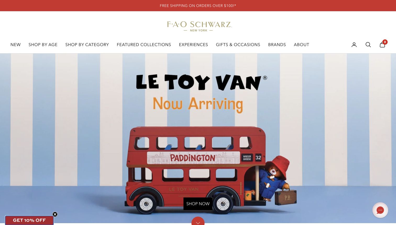
FAO Schwarz uses a centered gold wordmark and a broad white navigation area before introducing a Paddington toy bus in a staged Le Toy Van scene. The red vehicle and black shop button stand out against pale blue stripes, so the product photograph carries most of the visual identity. The menu separates age, category, featured collections, experiences and gifts, acknowledging that visitors may be planning a store visit as well as an online purchase. Further down, age bands include adults and product cards expose prices. The large opening scene is memorable, but it does not explain the featured range or price without another step. A newsletter teaser and chat bubble remain at the bottom corners after the full-screen signup was dismissed.
What you can learn
Use one strong product scene to establish character, while keeping gift and visit-planning routes distinct. A campaign destination should explain the pictured collection, and persistent promotional widgets should leave the main action unobstructed.
Pros
The restrained background makes the featured toy and shop action prominent.
Experiences and gift shopping have separate navigation destinations.
Cons & considerations
The opening scene provides little price or collection detail.
Newsletter and chat widgets add competing corner controls.
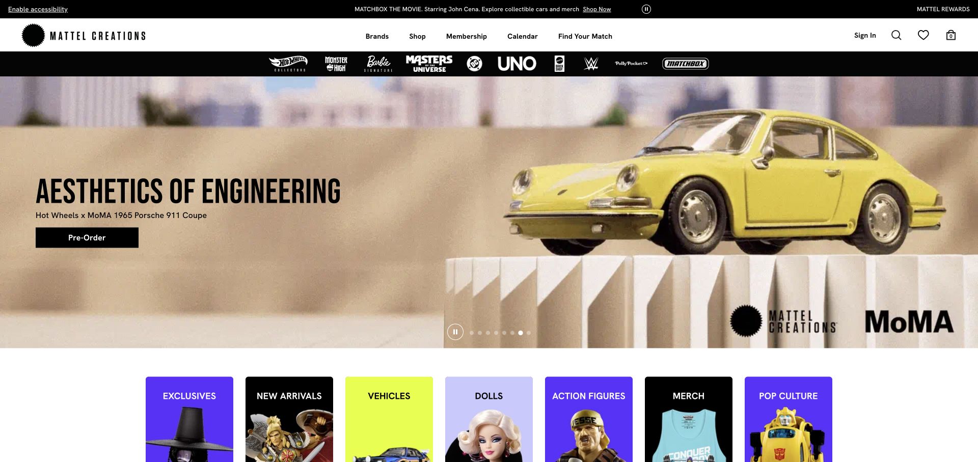
Mattel Creations places a pale, gallery-like Porsche miniature campaign beneath a compact shopping header and a dark strip of recognizable toy-franchise logos. The car has enough space to read as the object of attention, and the black preorder button describes the immediate buying state. Below the hero, colorful tiles reopen the wider catalog through exclusives, new arrivals, vehicles, dolls and other groups. That progression supports a visitor following a specific release while still offering paths for someone browsing the collection. The precise Hot Wheels and MoMA product identification gives the collaboration context. The screenshot does not establish delivery dates, membership eligibility or whether the item remains available.
What you can learn
Give a special release its own presentation while preserving predictable routes to ordinary product categories. A preorder action should lead to explicit dates and conditions, and a collector-focused hero should be supported by product details that explain scale, contents and intended audience. Keep the broader catalog useful after the featured release ends.
Pros
The preorder label communicates a different purchase expectation from an ordinary immediate-stock button.
Franchise logos and category tiles offer two distinct ways to explore beyond the hero.
Cons & considerations
The collector campaign provides little first-screen guidance for a general gift buyer selecting by age or budget.
Several header bands precede the hero, so the same hierarchy needs deliberate compression on smaller screens.
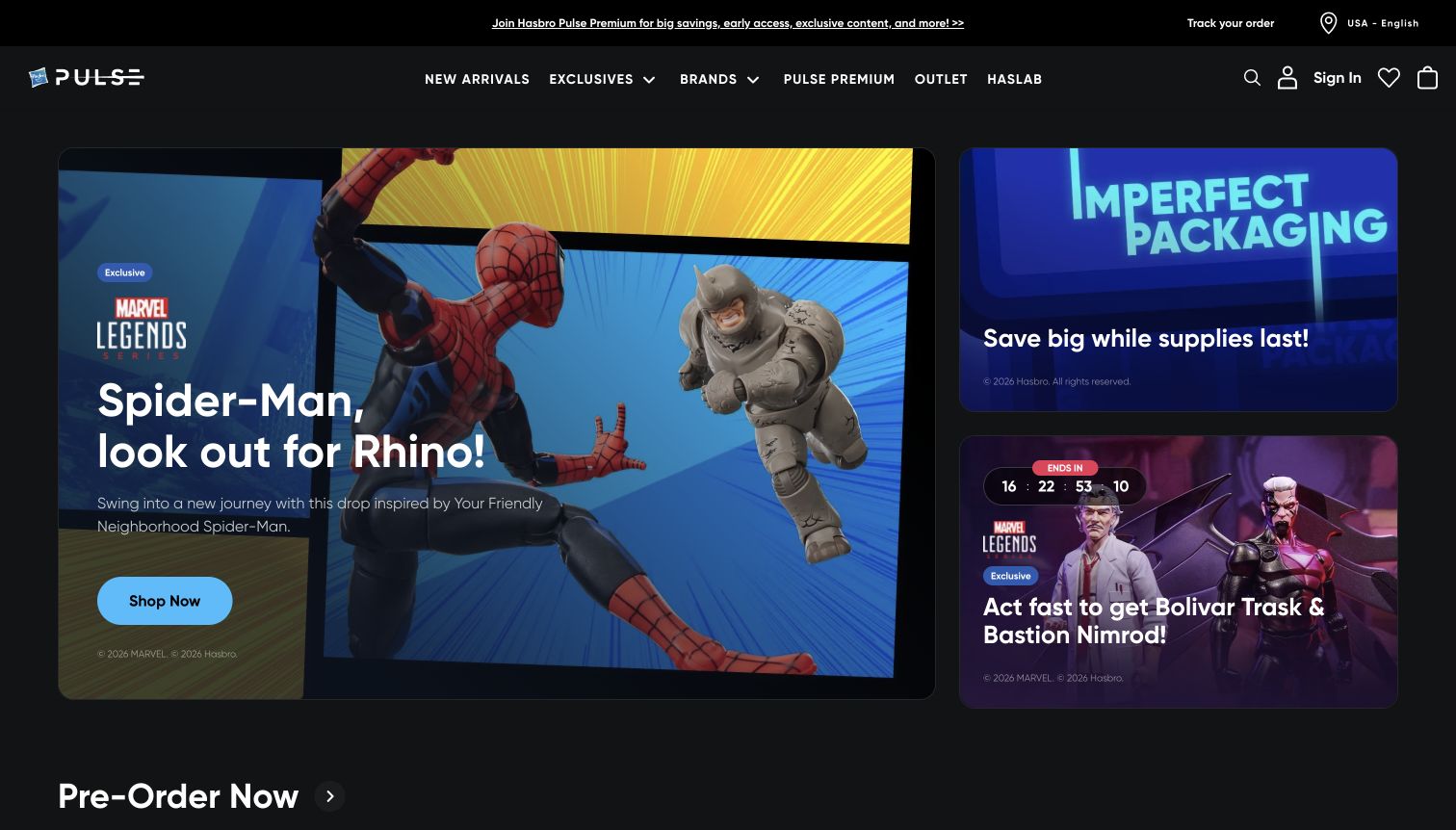
Hasbro Pulse uses a dark storefront and an asymmetric three-card hero. A large Spider-Man and Rhino panel has a blue shop button, while smaller cards advertise imperfect packaging and a timed exclusive release. New arrivals, exclusives, brands, membership, outlet and HasLab appear as distinct top-level routes. Below the campaign, separate preorder and now-shipping destinations clarify an important collector distinction. The layout assumes familiarity with franchises and product-release culture, which makes it efficient for enthusiasts but less explanatory for occasional gift buyers. Small supporting text and a countdown sit on detailed character artwork, so the strongest visual emphasis goes to urgency and imagery rather than fulfillment or product specifications.
What you can learn
Treat preorder availability and ready-to-ship inventory as different customer expectations. Collector imagery can lead, but stock condition, release timing and membership benefits need plain explanations near the relevant product rather than relying on franchise recognition.
Pros
Preorder and now-shipping routes establish a useful fulfillment distinction.
The grid gives one launch clear priority while preserving secondary campaigns.
Cons & considerations
Dense character artwork reduces the prominence of supporting copy.
Franchise and membership terminology asks more of first-time gift buyers.
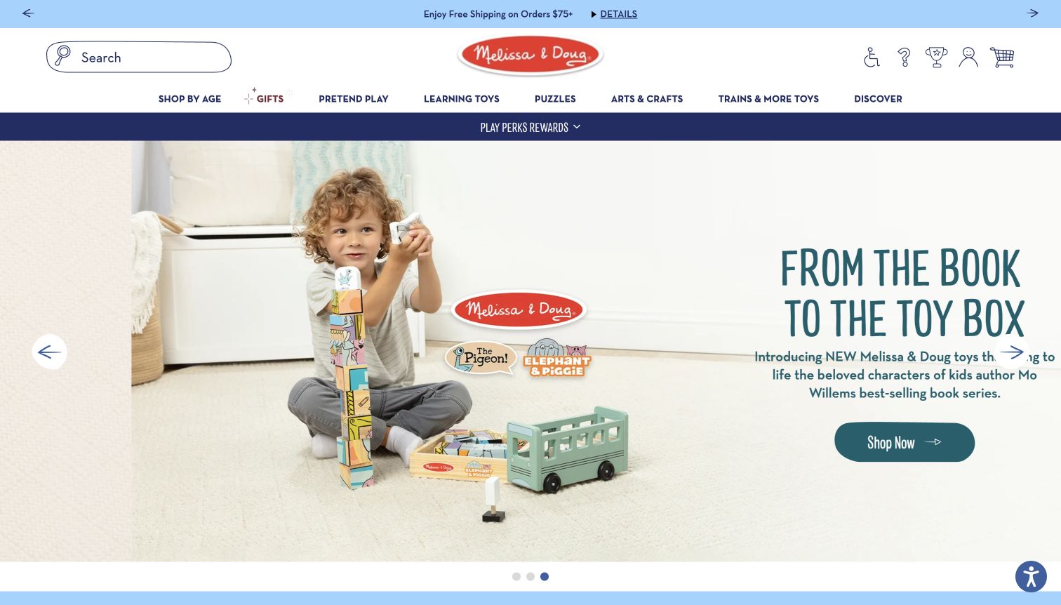
Melissa & Doug combines a child playing with wooden blocks and a bus with a book-to-toy collaboration message. The scene demonstrates scale and use, while the white room leaves space for a teal headline and shop button. Search sits prominently at the upper left, and the main menu groups pretend play, learning toys, puzzles, arts and crafts, trains and gifts. Age shopping is also available as a separate route. This makes the brand story approachable without requiring a visitor to understand the complete product range. In the captured desktop view, however, the right-hand supporting copy reaches the viewport edge and is clipped. Carousel arrows and pagination indicate additional campaigns, but visitors can miss their content if they stay on the opening frame.
What you can learn
Show a toy in use when scale and play behavior matter, then provide age and activity categories for practical selection. Test every carousel frame at real viewport widths so promotional copy and controls remain fully visible.
Pros
The photograph explains how the toy participates in play.
Activity categories use recognizable language for adults shopping for children.
Cons & considerations
Supporting hero copy is clipped at the right edge in the captured view.
Important campaigns depend on carousel timing or manual navigation.
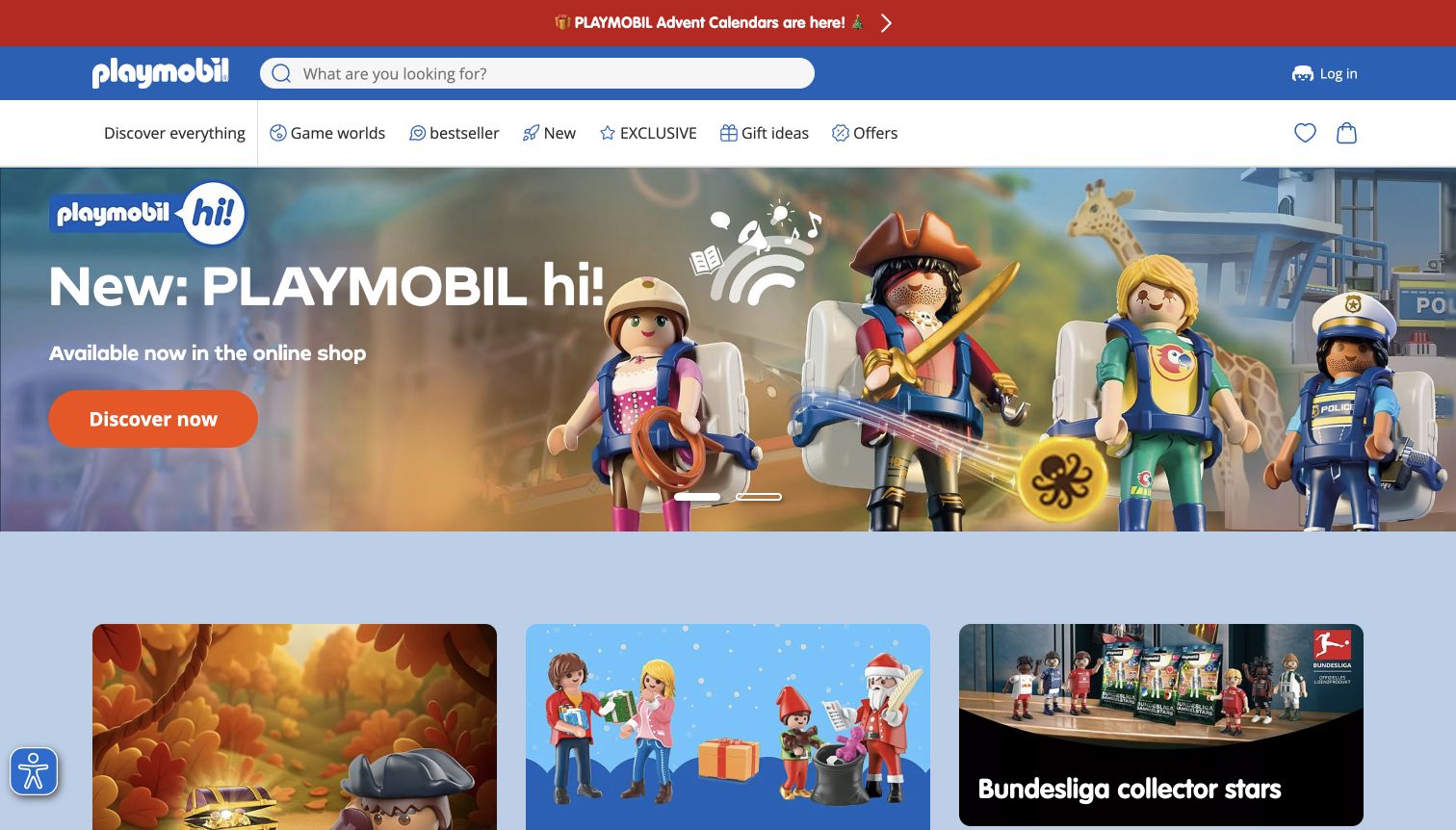
The inspected Playmobil Germany route presents a blue search header, a white shopping menu and a large Playmobil hi! campaign with several figures. An orange discovery button contrasts strongly with the image, and lower tiles expose exclusives, gift ideas and a football collection. The public page offers familiar shopping routes such as new products, bestsellers and offers alongside play-world navigation. This creates both practical and imaginative ways into the catalog. The captured rendering displayed English labels on the German route; this review therefore describes that observed state without treating it as proof of another regional storefront. The hero makes the characters recognizable, but it offers little explanation of the new line beyond availability. Several different campaigns begin immediately beneath it.
What you can learn
Pair imaginative product worlds with dependable catalog shortcuts. Keep regional context visible, explain what makes a new range different, and connect image-heavy banners to accessible descriptions instead of relying on character recognition alone.
Pros
The bright discovery action is easy to locate against the scene.
New products, bestsellers and offers complement the themed browsing routes.
Cons & considerations
The new-line campaign offers little functional explanation in the first view.
Several lower campaigns compete before the visitor has selected a play world.
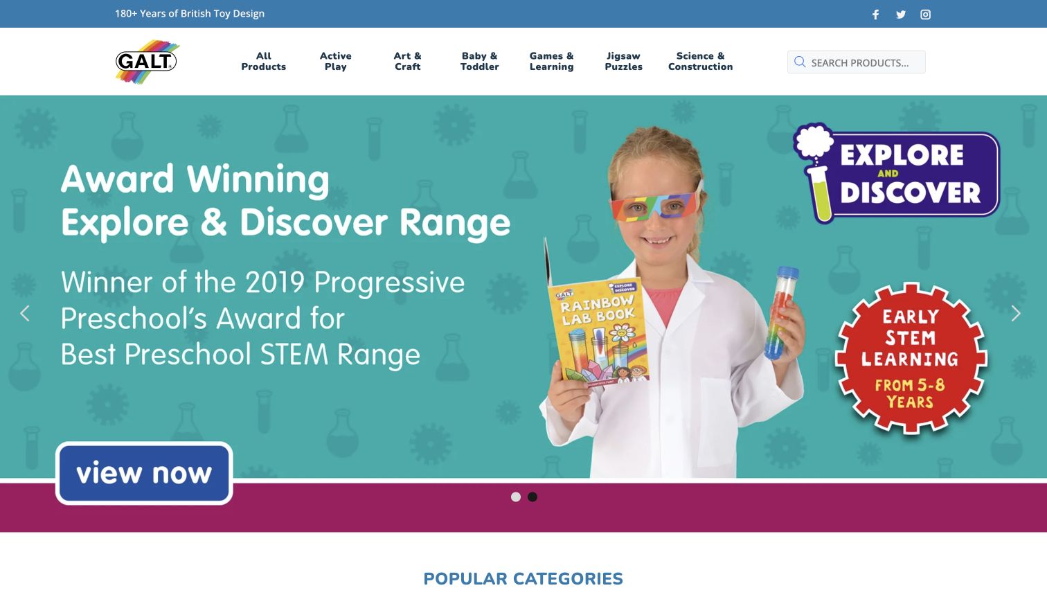
Galt Toys US places activity-oriented categories across a compact header: art and craft, baby and toddler, games and learning, puzzles, and science and construction. The captured turquoise hero shows a child holding a science-kit book and describes an award-winning educational range. Below it, the page provides popular categories and fine-grained age links, including several three-month infant bands. This is helpful when developmental fit matters more than a character license. The prominent award claim is dated 2019 in the artwork, so it should not be mistaken for a current award. The inspected DOM also contains a generic software-template sentence near the featured marble-run area, a visible content-quality weakness. Some age links point to a different storefront hostname.
What you can learn
Match educational categories to the questions adults ask about play, and keep age ranges precise where useful. Audit inherited theme copy and dated claims regularly, and maintain a consistent destination structure for catalog filters.
Pros
Activity categories describe the kind of play before asking for a product choice.
Fine infant-age bands support more specific developmental browsing.
Cons & considerations
An old award dominates the hero without a more recent context.
Template copy and alternate-host age links weaken the otherwise coherent catalog presentation.
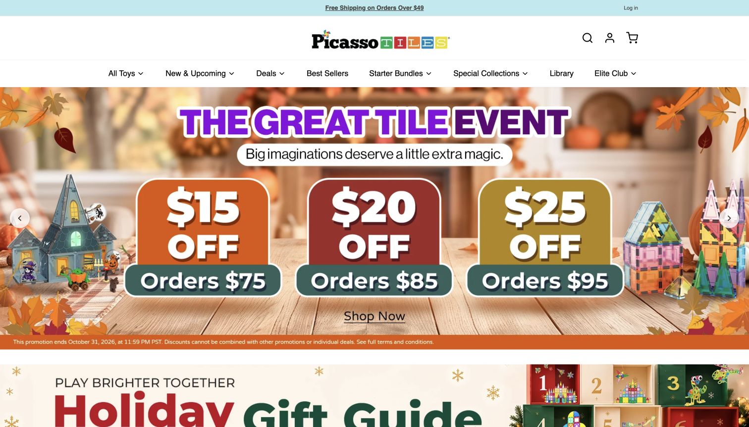
PicassoTiles uses a centered wordmark and compact white navigation above a large seasonal promotion. Three color-coded panels show different discount thresholds, with magnetic tile buildings placed around the offer. Starter bundles, bestsellers, special collections and a library have their own menu routes, while lower content introduces building stages, product families and answers to common questions. This supports a category in which visitors need to understand the difference between a starter set, expansion and alternative building system. The captured hero’s fine print says the promotion ends October 31, 2026, although the capture was made November 4 UTC. That mismatch is a concrete content-maintenance problem; this review does not describe the displayed discounts as currently valid.
What you can learn
Make a specialized catalog understandable through starter paths, compatibility information and age guidance. Campaign expiry must be part of publishing operations, so an old discount image cannot outlive the terms printed inside it.
Pros
Starter bundles and product-family routes provide useful entry points for new buyers.
Three offer tiers are visually separated and show their spending thresholds.
Cons & considerations
The captured homepage still displays a promotion past its printed end date.
Large promotional artwork delays explanation of how the building systems differ.
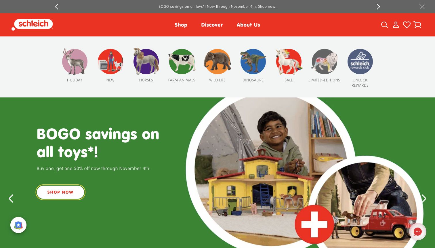
Schleich uses a red header and a horizontal row of circular product categories before the main campaign. Horses, farm animals, wildlife and dinosaurs appear as recognizable figures with text labels; holiday, sale and limited editions sit alongside them. The captured green campaign pairs children playing with figures and a buy-one-get-one-half-off message, using a white shop button. The page includes an explicit end date and exclusions in its supporting offer copy. This makes browsing by a favorite animal straightforward, although the category row takes a substantial share of the first viewport. A newsletter popup initially covered the store and was dismissed before this capture. Rewards, seasonal offers and the core catalog all compete for prominent positions.
What you can learn
Use recognizable product silhouettes to help shoppers find an interest quickly, but keep text labels and a clear category structure. Promotions should state their calculation and exclusions, while signup requests should leave a direct path to browsing.
Pros
Labeled animal images make major collections recognizable at a glance.
Offer copy explains the discount mechanism and its validity window.
Cons & considerations
The large category strip pushes product detail further down the page.
The initial newsletter interruption delayed access to the storefront.
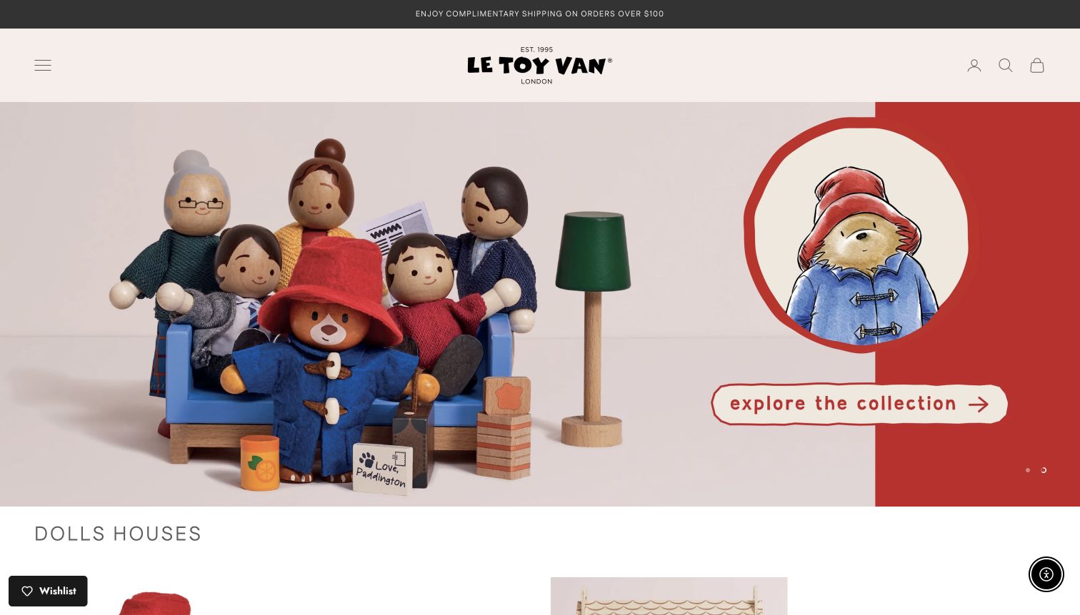
Le Toy Van opens with a carefully arranged Paddington family scene, showing wooden figures, a sofa, lamp and small accessories against a warm neutral background. The illustrated character and collection invitation occupy the right side, while the toys retain enough detail to communicate their material and scale. A very compact header uses a hamburger menu, centered wordmark and utility icons. Below the hero, a dolls-house section introduces individual products and larger bundles with prices and some review counts. The calm presentation supports a premium impression, but hiding the entire main catalog behind a menu adds a step for first-time visitors. Much of the hero invitation is embedded in artwork, and the initial newsletter popup interrupted the otherwise quiet layout.
What you can learn
Let close product staging communicate craftsmanship, then make practical browsing equally accessible. Expose meaningful categories and readable campaign links, and ensure that high-priced bundles clearly distinguish included pieces from separately sold accessories.
Pros
The staged scene conveys the toys’ scale and tactile character.
The product listing distinguishes individual pieces from larger house bundles.
Cons & considerations
The desktop hamburger hides the main catalog choices.
Artwork-driven hero messaging is less flexible than a separate text and action layer.
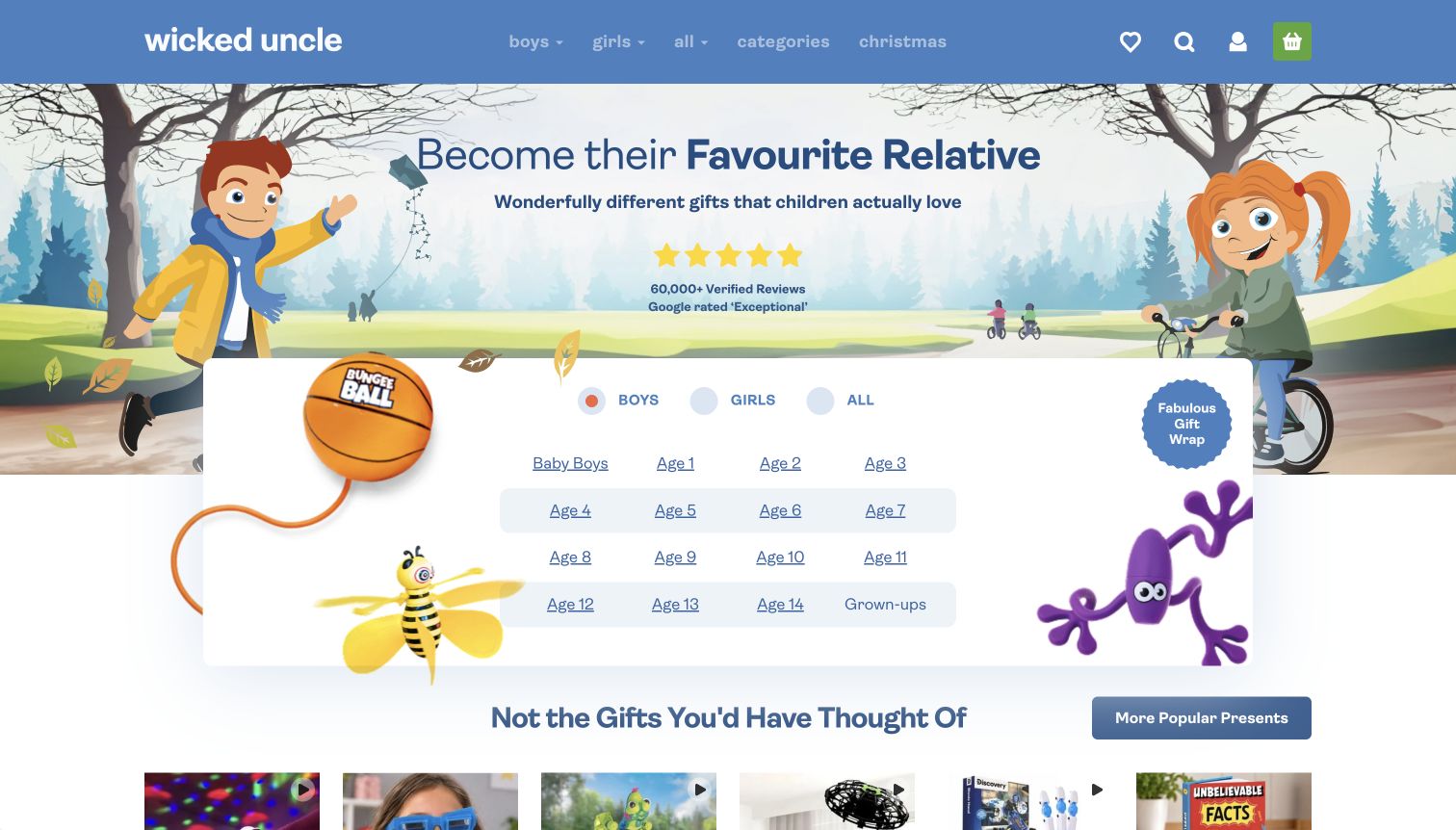
Wicked Uncle frames its opening page around becoming a favorite relative, using illustrated children and a compact promise about unusual gifts. The central white card presents a grid of individual ages, from babies through grown-ups, with boys, girls and all options above it. A gift-wrap badge reinforces the gifting task. Product recommendations and prices begin immediately below the finder, so the page moves from uncertainty to a concrete shortlist. The age links are readable and direct, but boys is selected in the inspected default state, which can narrow discovery before a visitor expresses a preference. The large review-count claim is presented as site marketing; this inspection did not independently verify the rating or its methodology.
What you can learn
Design the opening choice around what a gift buyer actually knows: age, interests and occasion. Keep an inclusive all-products route obvious, and support confidence claims with accessible detail rather than letting a large rating substitute for product information.
Pros
The age grid offers precise entry points without requiring brand knowledge.
Gift wrapping and priced recommendations support the complete gifting task.
Cons & considerations
The default gender selection may narrow browsing too early.
The prominent review claim needs a clear supporting destination and scope.
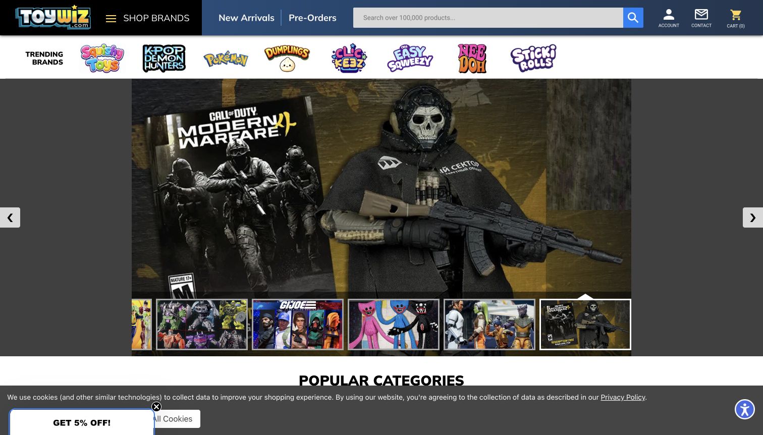
ToyWiz places a long search field in a blue-and-black header beside new arrivals and preorders. A separate strip of trending brand logos introduces the breadth of the catalog, while the main carousel uses large product artwork and visible thumbnail previews. The captured frame promotes a Call of Duty collectible, with neighboring thumbnails revealing other franchises. This is efficient for collectors who recognize the imagery, but the first screen contains little plain-language guidance for a casual gift buyer. The site showed both a newsletter flyout and a bottom cookie strip during inspection. The saved storefront view follows dismissal of the flyout; the cookie strip remains visible. Neither the screenshot nor this review verifies stock, release dates or ordering.
What you can learn
Support a deep collector catalog with prominent search and explicit preorder navigation. Keep promotional overlays from blocking the merchandise, and supplement franchise artwork with readable product, price and availability information at the destination.
Pros
Search and preorder browsing remain prominent in the persistent header.
Thumbnail previews reveal alternate carousel campaigns without waiting for rotation.
Cons & considerations
The newsletter interruption and remaining cookie strip compete with the store content.
Large franchise artwork provides little orientation for an unfamiliar shopper.
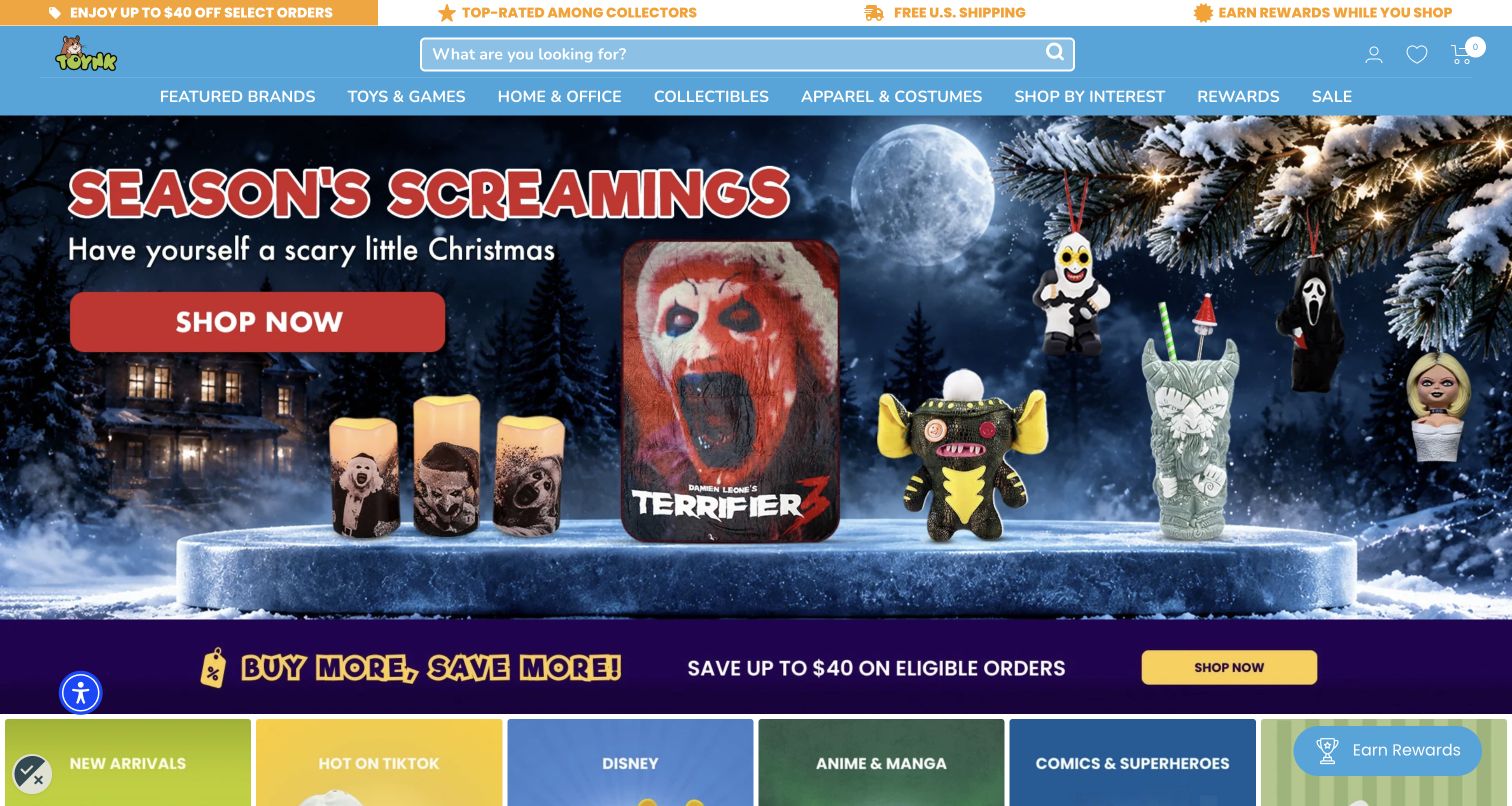
Toynk introduces its assortment through a theatrical seasonal scene, with collectible objects arranged around a snowy cabin and oversized red lettering. The unusually wide search field remains easy to find above that spectacle. Navigation separates toys and games from collectibles, home goods, costumes, and shopping by interest, making the broader pop-culture offer visible. This is a useful reference for a retailer that serves adult fans as well as toy buyers. The opening prioritizes campaign excitement over comparing individual products or prices.
What you can learn
Keep exact-item search accessible when a licensed assortment spans many product types. Interest navigation can connect related merchandise, while ordinary category links give practical shoppers a more direct route than the illustrated promotion. Give each promotional strip a distinct purpose.
Pros
Wide search field supports shoppers arriving with a specific franchise, character, or product in mind.
Interest and merchandise categories accommodate the visible mix of collectibles, clothing, home goods, and toys.
Cons & considerations
Stacked promotional bands and saturated artwork compete for attention around the main shopping action.
The first screen offers less guidance by child age than stores organized around developmental stages.
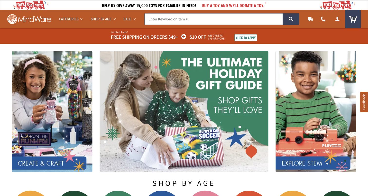
MindWare places three clear shopping routes across the opening: creative activities, a holiday gift guide, and STEM gifts. Photography shows children using recognizable objects, giving the promotional categories more substance than abstract learning claims alone. The orange header includes a large field that accepts keywords or item numbers, a practical detail for customers using a printed catalog. Age-based gift links begin directly beneath the hero, and the page continues into science, building, games, books, and puzzles. This review concerns the public storefront, not the educational effectiveness of its products.
What you can learn
Offer complementary ways into a broad toy assortment: an activity for the interested child, an age for the uncertain gift buyer, and an item number for someone who already has a selection. Preserve these routes during seasonal campaign changes.
Pros
The three-part opening presents distinct creative, gift, and STEM destinations without requiring carousel navigation.
Keyword and item-number search acknowledges both digital browsing and catalog-driven shopping habits.
Cons & considerations
Donation messaging, shipping offers, discounts, and the hero all request attention near the top.
A promotional email modal appeared on the initial visit, interrupting evaluation before product selection.
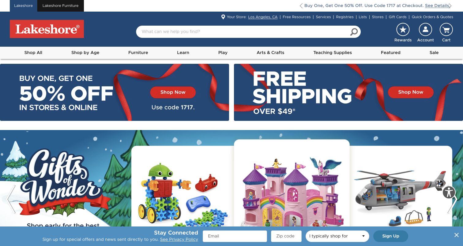
Lakeshore uses a large search field and a structured category bar to manage a catalog that extends beyond toys. Shop by Age sits beside furniture, learning, play, arts and crafts, and teaching supplies. Utility links expose resources, registries, and ordering help before the seasonal merchandise begins. The captured homepage places two substantial offer panels above a winter gift presentation, using navy and red to connect promotion with the brand. The result serves several shopping intentions, although the practical breadth also creates a busy opening for a casual gift shopper.
What you can learn
When families and educators share a storefront, make their shopping routes legible before asking them to interpret campaign imagery. Separate service utilities from merchandise categories, and preserve the search field as the common shortcut across both audiences.
Pros
Age and activity links coexist with furniture and teaching supplies without hiding the wider catalog.
Resources, registries, and quick-order utilities support visitors who arrive with an established purchasing task.
Cons & considerations
Large offer panels push the first seasonal product presentation farther down the desktop page.
A persistent newsletter bar occupies the bottom edge and competes with the visible merchandise.
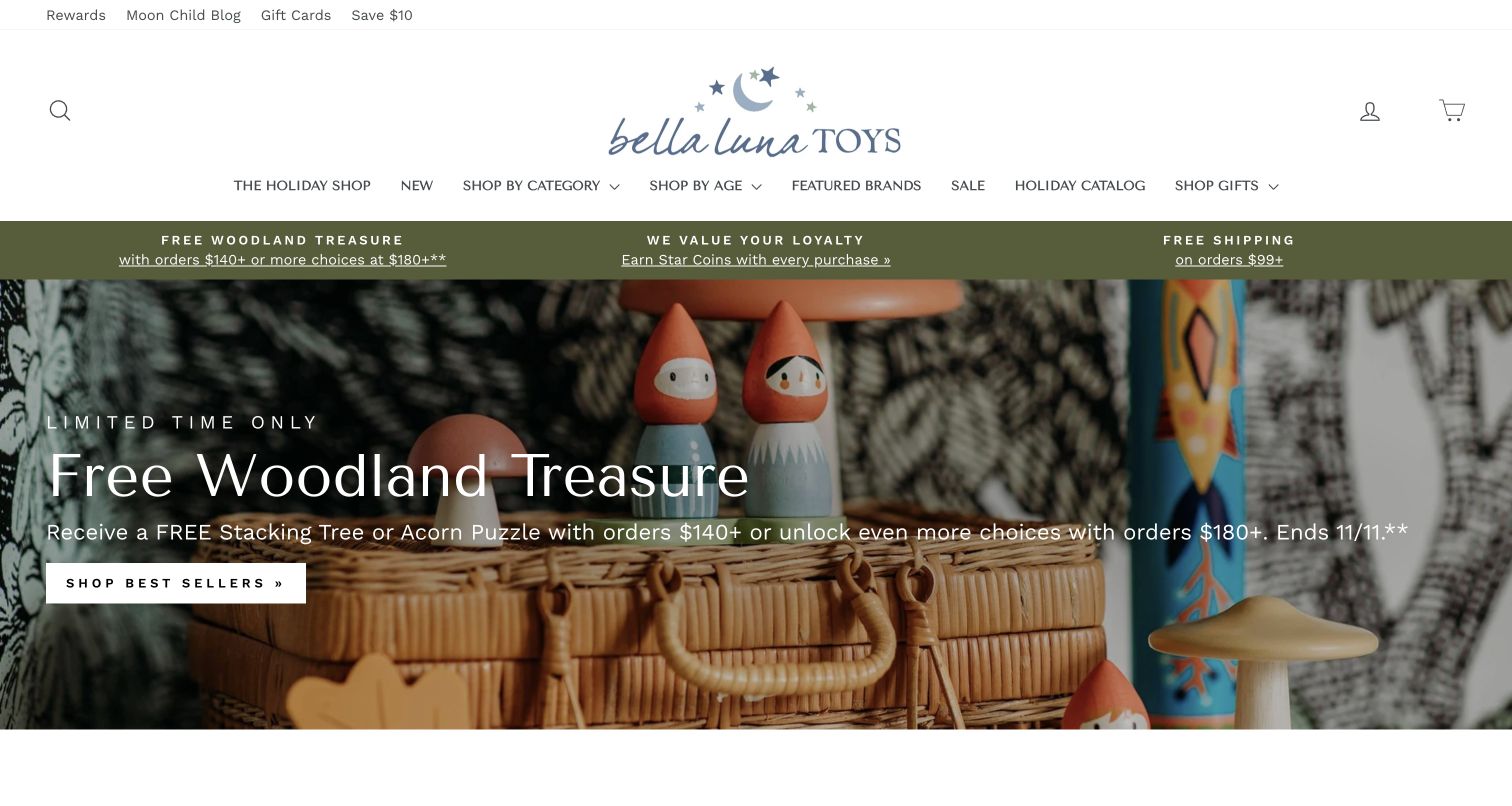
Bella Luna Toys pairs a handwritten moon-and-stars identity with generous white space and restrained navigation. The opening photograph arranges wooden woodland figures, foliage, and a woven basket into a cohesive scene. An olive service strip connects the header to the earthy imagery, while a simple white button identifies the campaign action. Category, age, and brand links remain available above the photograph. The site presents a natural and Waldorf-oriented retail identity; the visual review does not independently establish product materials, safety, or learning outcomes.
What you can learn
A tightly art-directed photograph can express a specialist assortment before a visitor reads detailed product copy. Keep practical age and category navigation close to that expression so the aesthetic does not become the only way to understand what the store sells.
Pros
The muted palette and woodland composition give the store a consistent, immediately recognizable presentation.
Age, category, and brand routes provide useful alternatives to the featured seasonal promotion.
Cons & considerations
The tall identity area consumes space that could otherwise introduce individual products sooner.
Offer qualifications share a photographic background with the headline, making the smaller details less prominent.
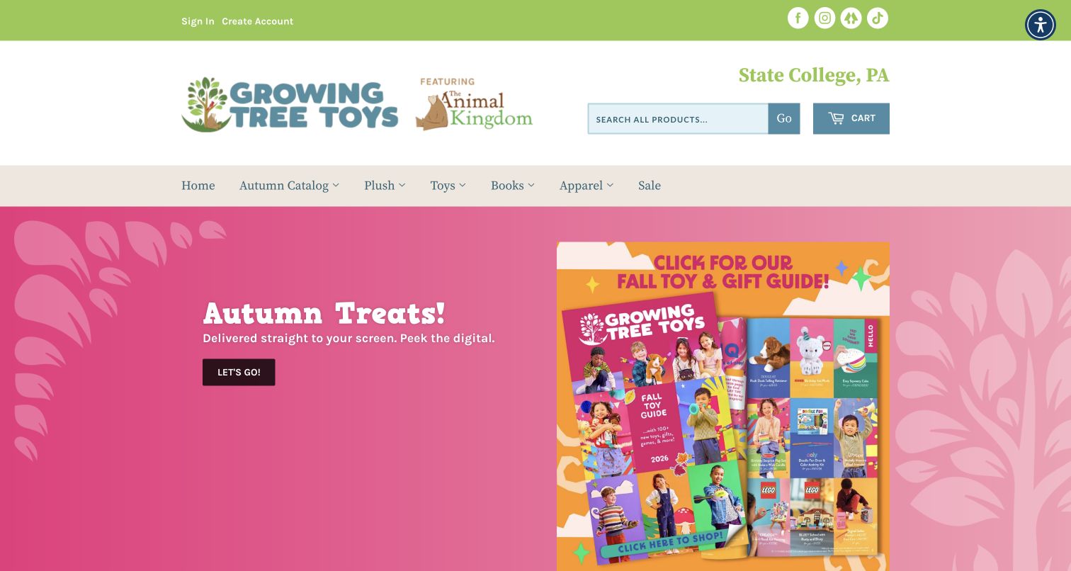
Growing Tree Toys keeps its State College identity visible in a large white masthead that also introduces The Animal Kingdom. The main navigation is compact and literal: plush, toys, books, apparel, sale, and the autumn catalog. A pink seasonal panel uses tilted catalog covers and toy illustrations to promote browsing the current collection. Search and cart controls sit beneath the location details, while store information and hours appear in the page content. The homepage feels like a local retailer extending its familiar printed catalog into a web storefront.
What you can learn
Use the store name and location to establish continuity with the physical shop, then provide clear merchandise paths for visitors who do not want to open a catalog. A digital catalog works best as one entrance alongside direct product discovery.
Pros
Visible location information gives the otherwise broad toy assortment a specific local retail identity.
Short, familiar category labels make the navigation easier to scan than a long promotional menu.
Cons & considerations
The oversized masthead delays the point where the seasonal selection becomes visible.
The catalog-led hero gives less immediate product or age guidance than a browsable merchandise grid.
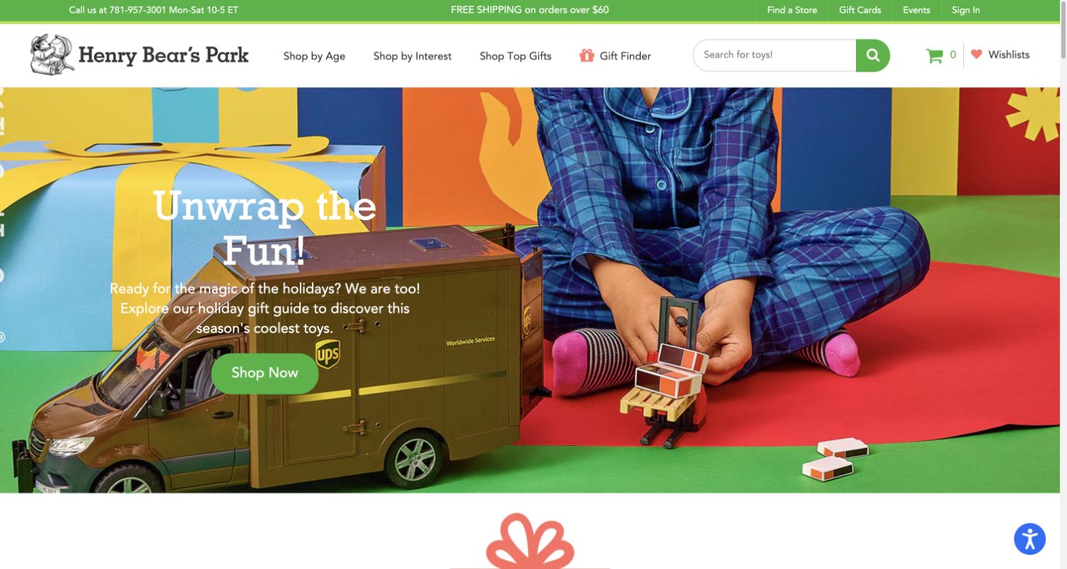
Henry Bear’s Park combines an illustrated bear identity with a bright gift-box scene and a child playing with a large model vehicle. The header makes Shop by Age and Shop by Interest equally prominent, then adds Top Gifts and a distinct Gift Finder link. A wide search field remains beside those routes. The page continues into age bands that extend from babies to adults, followed by seasonal merchandise and staff selections. This structure communicates that the store can help an uncertain gift buyer as well as someone looking for an exact toy.
What you can learn
Expose the different facts a gift buyer might know: age, interests, or simply a need for suggestions. A named finder makes that help easier to recognize, while visible search keeps the same homepage useful for repeat customers with a specific request.
Pros
Age, interest, and gift-finder routes provide several understandable starting points for uncertain shoppers.
Store, event, and contact utilities preserve the connection to the retailer’s physical community.
Cons & considerations
White campaign text competes with bright packaging and activity in the underlying photograph.
The large hero postpones direct comparison of product names, prices, and available choices.
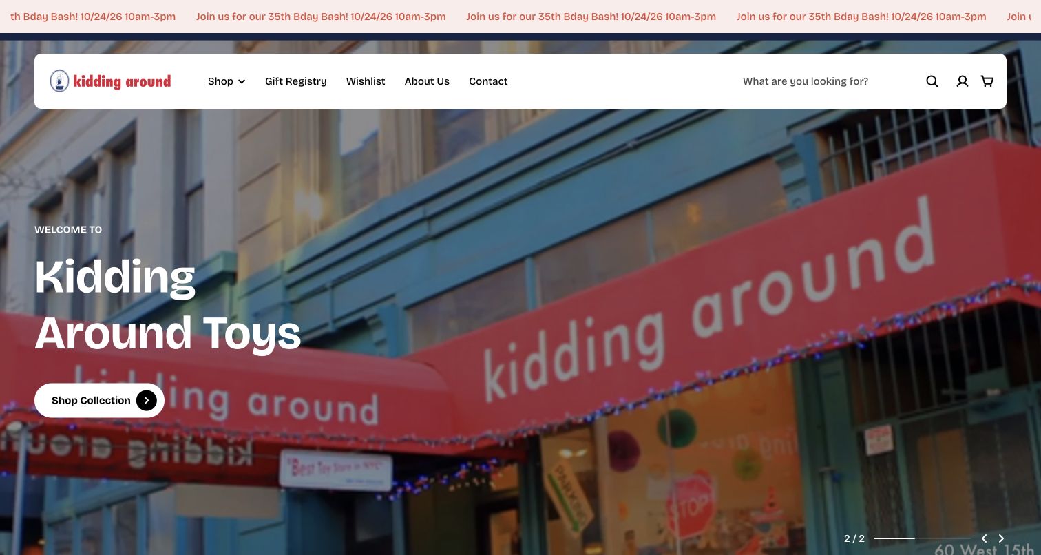
Kidding Around introduces the store with a full-width photograph of its red awning and blue facade. A rounded white navigation panel floats over that image, giving the shop a distinct physical presence before merchandise appears. Shop, Gift Registry, Wishlist, About Us, and Contact remain visible, and a large collection button provides the primary next step. Staff-picked products follow below. The captured November 3 Pacific visit still displayed an October 24, 2026 birthday announcement in the top strip, a concrete example of dated promotional copy needing retirement after its event.
What you can learn
Storefront photography can make an independent retailer feel specific and approachable without borrowing a large-chain visual style. Pair that personality with direct shopping and registry links, and assign an expiry date to event announcements so old celebrations do not become permanent navigation furniture.
Pros
The actual storefront provides a memorable sense of place before visitors reach the product assortment.
Registry and wishlist links accommodate gift planning alongside ordinary browsing and store information.
Cons & considerations
The October 24 event notice remained visible after that date in the captured visit.
A photographic hero occupies most of the opening, leaving product categories and prices below it.
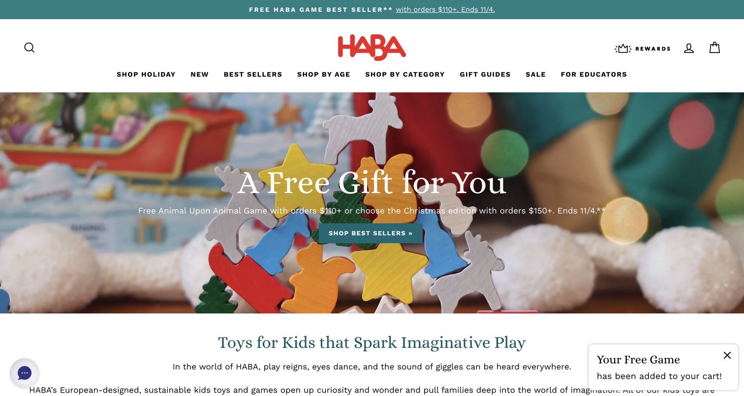
HABA USA places its red logo in a spacious white header above a compact black category menu. Age, category, gift guides, and educator links remain available while the main promotion shows colorful wooden animal pieces against a softly lit seasonal background. A teal shopping button repeats the color of the promotional strip, giving the scene a clear action. The page’s visual language favors tactile products and imaginative play. The review evaluates that presentation only; material, developmental, and safety statements require their own product evidence.
What you can learn
Keep enduring discovery routes visible while rotating a seasonal incentive. A single accent color can connect the offer strip and primary button without making every menu item promotional. Ensure automated promotional messages explain their conditions without covering the browsing experience.
Pros
Age, gift-guide, and educator routes make different shopping intentions visible in the main navigation.
Close product photography helps convey the assortment more concretely than a campaign headline alone.
Cons & considerations
The free-gift promotion takes precedence over showing a range of individually priced products.
An automatic gift-status toast appeared during the visit and added another competing promotional message.
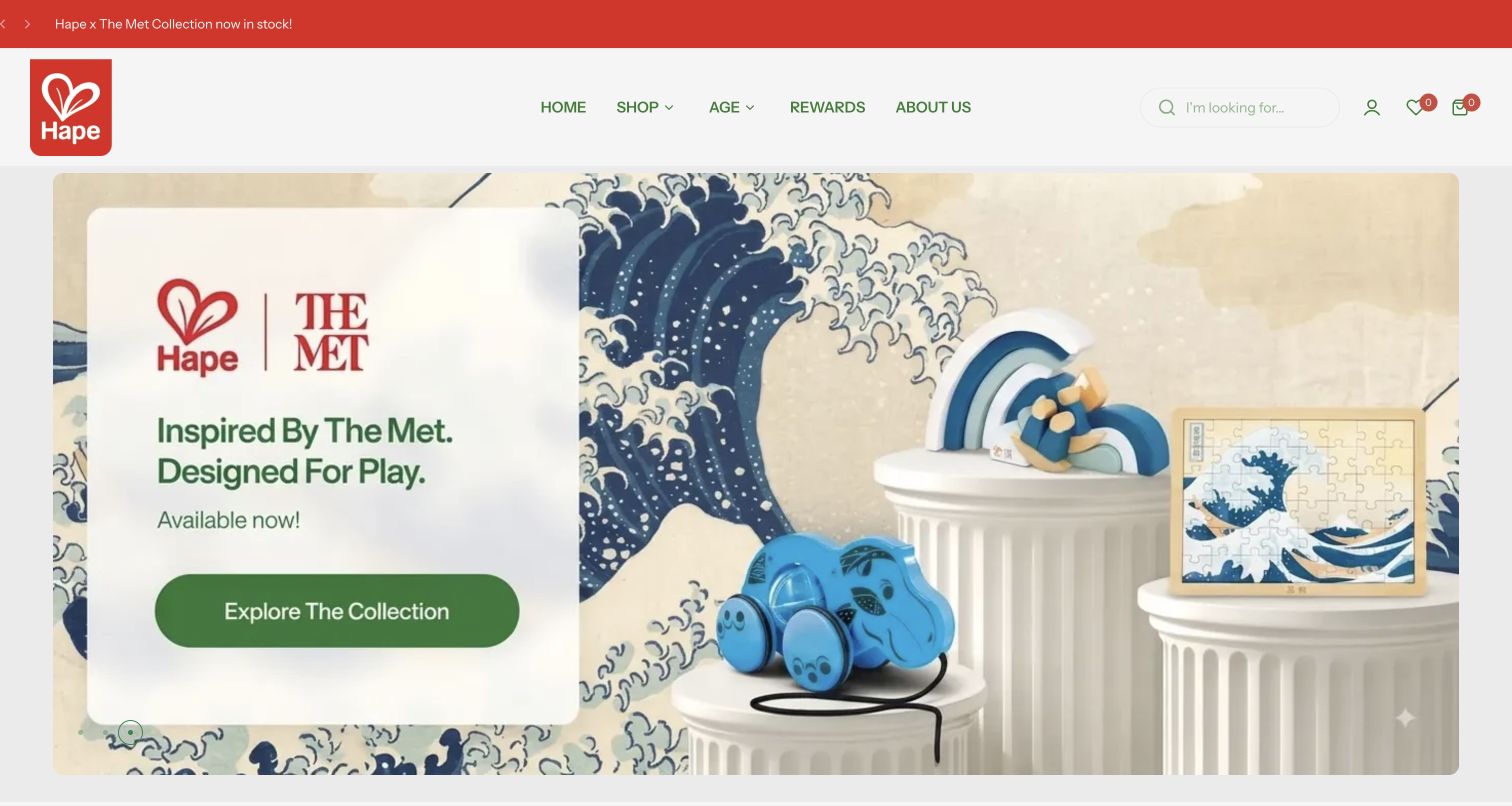
Hape’s captured homepage centers on its collection with The Met, presenting a wave motif behind a puzzle, pull toy, and stacking toy. A white text panel separates the message and green collection button from the detailed artwork. The red brand mark and announcement strip remain distinct from the muted cream and blue campaign palette. The header offers Shop and Age beside rewards and company information, while age groups and best sellers continue farther down the page. This is a public merchandising presentation, not an independent assessment of the products’ educational or material claims.
What you can learn
A collection launch becomes easier to understand when several related products share one visual story. Place the explanatory text on a quiet surface and keep everyday age browsing available, so shoppers can move beyond the collaboration without learning an unusual navigation system.
Pros
The separated text panel keeps the collection description readable against intricate campaign artwork.
A concise main menu retains age browsing beside the more expressive collaboration presentation.
Cons & considerations
The large single-collection hero gives limited immediate visibility to the rest of the toy range.
Individual prices and product comparisons require moving beyond the opening campaign view.
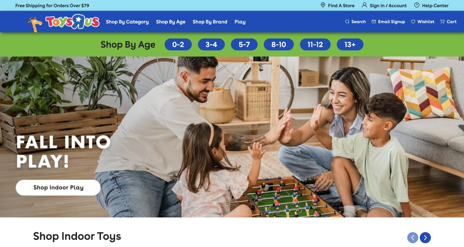
Toys R Us puts six blue age buttons on a green band directly beneath the main navigation, making recipient age available before the large seasonal image. The hero shows a family around a tabletop game and points to indoor play with one white button. Category, age, and brand menus provide additional routes, while store finding and help sit in the utility strip. The page then introduces an indoor-toy carousel with visible product names and prices. Bright brand colors organize the interface without requiring the visitor to interpret an unfamiliar editorial concept.
What you can learn
Place a high-confidence shopping decision, such as recipient age, above the campaign when it applies to most of the assortment. Use the hero to suggest an activity, then connect that inspiration to concrete merchandise with recognizable names and prices.
Pros
Age ranges are immediately visible and do not require opening a menu first.
Category and brand routes complement the age selector for visitors who already know their preference.
Cons & considerations
The family photograph occupies most of the first screen before individual products appear.
The following product carousel shows only part of the selection at once, adding navigation to comparison.
Plan the gift journey and the known-product journey
Test the catalog with realistic shopping questions
Try finding a modestly priced birthday gift, a specific building set, a toy for a stated age range and a product available for local collection. Include someone who does not recognize the brands. Record where age, theme and budget filters disagree or produce an unhelpful empty result.
Build product records that survive seasonal campaigns
Maintain age guidance, dimensions, contents, compatibility, stock state and care information independently of promotional imagery. Design an ordinary product card, a preorder, an exclusive and an unavailable item. Give editorial staff clear fields for offer dates and eligibility so campaigns can be removed without damaging the catalog.
Connect the online shop with real services
If the store offers gift wrap, wishlists, registries, events, assembly help or replacement parts, explain how each works and who supports it. Local stores need accurate hours and collection details. Keep those practical routes usable when the homepage is dominated by a holiday promotion.
The editing job behind the design
Choose commerce tools around product data and service needs
Start with the size and structure of the catalog, stock management, shipping, pickup and any preorder or customization requirements. A supported commerce platform may cover many of these needs, while a separate frontend adds maintenance and release responsibilities. Choose architecture from the retailer’s operating model rather than the visual style of a global toy brand.
Treat recommendation, review, wishlist, loyalty and gift-registry integrations as separate services with named owners. Public evidence can identify storefront scripts or image delivery without establishing warehouse or checkout architecture. Test unavailable services and preserve core product information even when an optional personalization tool fails.
Our WordPress website examples offer a separate look at publishing approaches. A visible platform label is evidence for that named page, not a guarantee that the same system will suit your requirements.
Before the public launch
Toy store website launch checklist
Test age, interest, brand and budget routes with real products and empty results.
Verify product dimensions, contents, age guidance and required accessories.
Make preorder, customization and ordinary stock states visibly distinct.
Review promotional dates, membership eligibility and sold-out destinations.
Check shipping, collection, gift wrap and returns explanations.
Validate store hours, event dates and local service details.
Review mobile menus, keyboard access, image alternatives and filter controls.
Assign catalog, campaign, integration and customer-service owners.
These checks are a project checklist, not a performance, legal, security, or accessibility certification. Test real journeys with the people responsible for the website before making claims about the result.
Sources & editorial method
How this collection was selected and reviewed
The research uses official toy storefronts across retail, educational and collector categories. Every published example must have a direct browser capture with its original date and a review grounded in that image. The collection does not test checkout, prove educational outcomes or certify toy safety.
Each example links to its actual source page. Screenshots are direct browser captures with their own capture dates; moving imagery, announcements and live designs can change. The notes describe observable design choices and conditional tradeoffs, not measured traffic, conversion results, service quality, or accessibility conformance.
Technology labels use public page metadata, asset evidence, or explicitly cited platform documentation. Platform documentation is not a complete current deployment audit. A component reference may be legacy or unused; it is not a complete backend inventory. Unknown stacks are omitted. These sites are editorial examples, not our client portfolio.
Written, Edited and Curated are separate editorial records, not timestamps advanced by a rebuild. Website designs and imagery belong to their owners. See our editorial standards or suggest a correction.
Questions worth asking
Toy Store website design questions
Is shopping by age enough for a toy store?
Age can narrow a catalog, but interests, budget, brand and product type often answer different questions. Use a manageable set of routes and ensure the product information supports the labels.
Can collector stores be useful references for children’s toy shops?
They can demonstrate release calendars, brand organization and preorder communication. Adapt those ideas to the actual audience; a collector-focused campaign is not a substitute for age guidance and practical gift information.
Should every product image show the toy in use?
A useful product page often needs both clear isolated views and contextual images. Explain what is included, preserve details at small sizes and avoid letting props or multiple products create uncertainty about the purchase.
How should a sold-out campaign behave?
Keep its status clear and offer a relevant collection, availability notification or future-release route when appropriate. Do not retain an urgent purchase instruction that leads only to an unavailable item.