Pet food websites work best when owners can identify the relevant range, understand its practical differences and find a clear buying route.
Pet owners may arrive with a known recipe, a new puppy or kitten, a format preference, or a question they need to discuss with a veterinarian. Those situations call for different routes. Species, life stage, format and ordering model form a more useful foundation than a succession of broad quality slogans.
A food brand may sell directly, offer subscriptions, distribute through retailers or maintain a veterinary range. The website should make those distinctions explicit. This guide concerns content and interface choices; it does not assess nutritional suitability or validate a manufacturer’s health and ingredient claims.
Before the examples
What makes good pet food brand website design in 2026?
Make the range understandable before recommending a product
Organize the catalog by species, life stage and format using consistent terms. Show whether a product is a complete food, a topper, a treat or a supplement. Avoid presenting every concern as a separate overlapping collection when the same product record could explain the relevant distinctions more clearly.
Put useful product information beside the purchase route
Prepare consistent ingredient, feeding, pack-size, storage and handling information with the brand’s qualified reviewers. Explain recurring orders and trial offers where they appear. Give veterinary ranges a clearly marked route and do not let marketing copy imply that an online selector replaces professional advice.
Explain how the customer actually buys
Label direct purchase, a personalized plan, a retail stockist and a subscription as different actions. A store finder should describe its coverage and avoid promising live inventory unless that data is available. A plan quiz should explain the information requested and allow people to understand the offer before submitting personal details.
The collection · 15 examples
15 pet food brand websites worth studying
Compare subscription food services, multi-range manufacturers and retail-led brands through their catalog structure, explanation of food formats and routes to purchase.
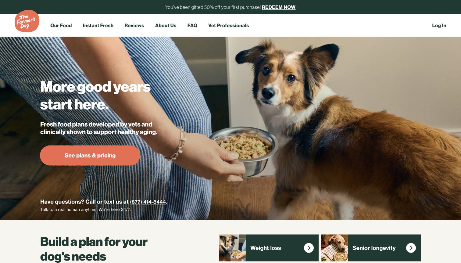
The Farmer’s Dog uses a full-width photograph of a person feeding a dog to make the service feel like an ordinary household routine. A short white headline sits over the image, with a coral plans-and-pricing button that is more visually prominent than the secondary navigation. The header offers separate routes for food formats, reviews, company information and questions. Below the hero, the page starts organizing plans around different dog needs. That sequence moves from an emotional introduction toward a more practical choice. A phone-help message is useful reassurance at the point where the visitor might hesitate to begin a questionnaire. The first screen does not itself show the recurring cost or the information required to produce a plan.
What you can learn
Use one clear entry point for personalization, but explain its effort and pricing model nearby. Keep a direct route to food details and practical support so visitors can assess the offer before committing to the plan flow.
Pros
Coral action styling makes the plans-and-pricing route easy to distinguish from the header links.
A visible phone-help route supports visitors who need clarification before starting a plan.
Cons & considerations
The first-screen promise is broader than the product and recurring-price detail visible there.
Need-based plan cards require careful explanation so marketing categories do not appear to be clinical assessments.
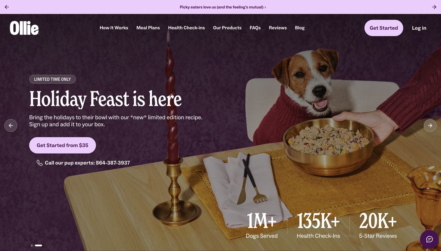
Ollie’s captured homepage leads with a holiday table scene and a large announcement for its seasonal feast. The purple header keeps meal plans, products, health check-ins and reviews available while the hero offers a clear starting-price action. A telephone support line appears beside that action rather than being reserved for the footer. Beneath the image, a compact row of service milestones introduces social proof before the visitor encounters more detailed content. The combination feels warmer than a conventional bag-and-price product grid, but the featured seasonal meal is not the same thing as an explanation of the regular subscription. The capture shows a particular campaign state; other slides and later promotions can change what a new visitor sees first.
What you can learn
Seasonal merchandising works best when it shares a stable frame with the everyday service. Put the starting price in context and keep ordinary meal-plan information accessible when the featured recipe or campaign changes.
Pros
The hero pairs its starting-price action with an accessible human-support route.
Meal plans and products remain named destinations in the main navigation.
Cons & considerations
A limited seasonal recipe can distract from understanding the normal recurring offer.
The introductory price alone does not explain quantities, renewal costs or delivery frequency.
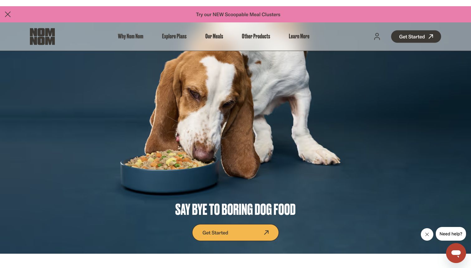
Nom Nom places a large dog eating from a bowl against a dark blue background, then overlays an oversized condensed headline near the bottom of the image. The yellow Get Started button gives the composition a clear destination even though the photograph occupies most of the screen. A slim pink strip introduces another food format, while the header separates meal exploration, plans and other products. Further down, the page explains the service with a short sequence of steps. The initial view is consequently strong on appetite and personality, with operational explanation deferred to the next section. A small help widget stays available without taking over the hero. The image does not establish the price, portion size or delivery terms of a plan.
What you can learn
Pair an expressive hero with a compact explanation of what the customer will do next. Distinguish browsing meals from building a plan so two similar-looking entry points do not create uncertainty about their destinations.
Pros
The yellow primary action remains conspicuous against the dark hero photograph.
Named meal and plan navigation provides alternatives to the main conversion button.
Cons & considerations
The large image leaves little first-screen room for recipe or price comparisons.
Explore Plans and Get Started need distinct destination explanations to avoid redundant choices.
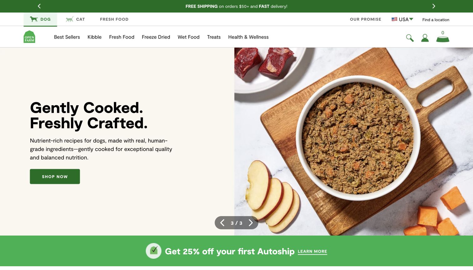
Open Farm gives its product range two levels of navigation: species and brand information in the main header, then familiar food formats in a second row. In the captured slide, a cream text panel announces gently cooked food beside a close photograph of a prepared bowl and ingredients. The green action button matches the brand color and sits in an otherwise restrained text area. A visible slide counter identifies the hero as one of several campaigns. A separate autoship strip introduces a recurring-order offer below it. This structure makes the breadth of the catalog visible before a shopper enters a category, but it also places several sales messages close together. The ingredient imagery communicates presentation; it does not independently verify sourcing or food claims.
What you can learn
Use consistent format names to reduce catalog uncertainty, then give the current campaign a specific destination. Keep introductory subscription offers separate from the explanation of recurring terms and avoid relying on ingredient photography as evidence.
Pros
Species and format labels offer two useful ways into a broad product catalog.
The store-finder route remains visible for customers who prefer retail purchase.
Cons & considerations
Two navigation rows and promotional strips create a dense upper portion of the page.
A generic Shop Now label gives less destination detail than the featured recipe headline could support.
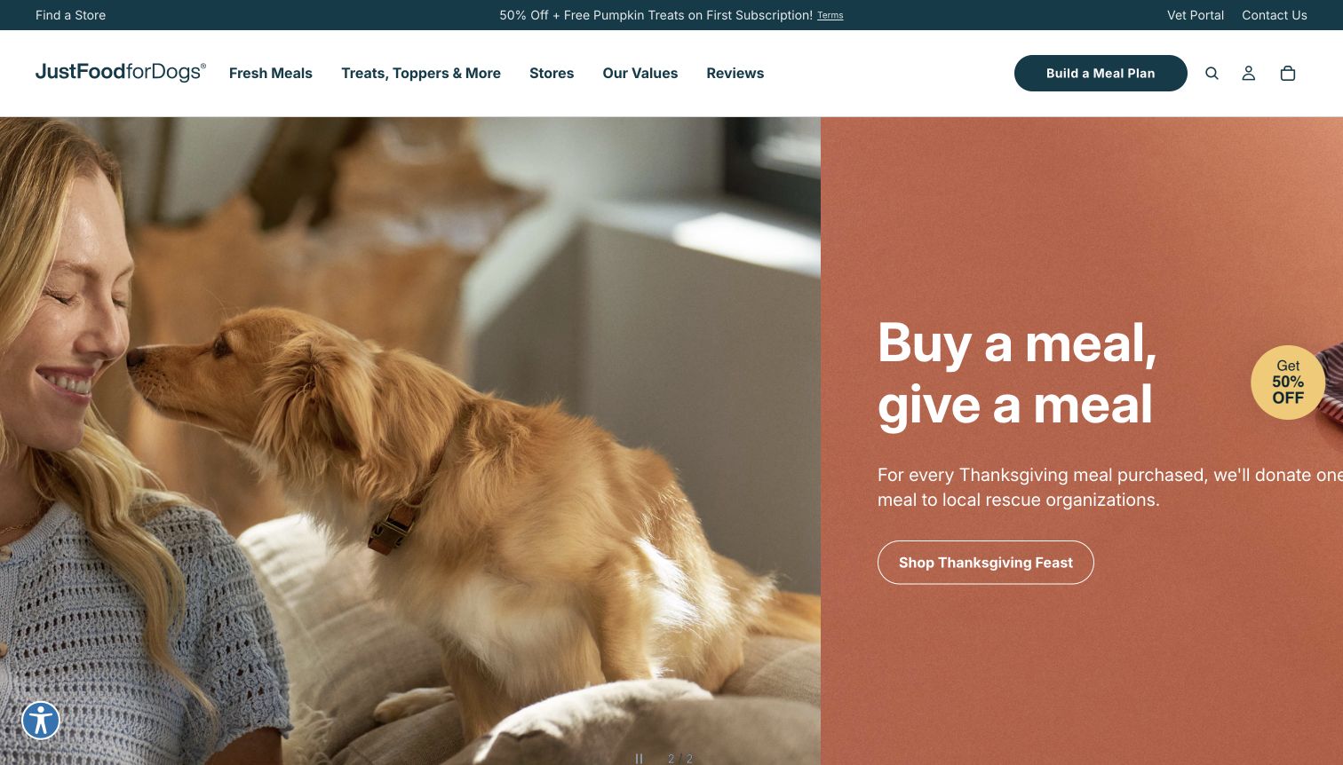
JustFoodForDogs uses a teal utility header and a distinct meal-plan action above a wide seasonal campaign. The photographed person and dog occupy the left side, while a terracotta panel promotes a Thanksgiving meal and a related giving message on the right. Below the campaign, the page distinguishes fresh frozen, shelf-stable and more specialized product routes rather than presenting the entire range as one undifferentiated food offer. The overall structure balances a personalized-plan service with ordinary browsing. In the captured desktop view, the far-right portion of the campaign copy sits close to the viewport edge, making the layout feel less comfortable than the roomy photograph. A small discount badge adds another purchase prompt. The campaign’s charitable message is presented as brand copy, not independently verified activity.
What you can learn
Give seasonal storytelling a bounded panel that preserves readable margins at real viewport sizes. Keep everyday product-format routes and the plan entry point stable, and explain specialized ranges without letting a campaign overwhelm practical product information.
Pros
The meal-plan action is visibly separated from the general shopping navigation.
Food-format categories help distinguish several different kinds of purchase.
Cons & considerations
The right-hand campaign copy approaches the captured viewport edge and loses breathing room.
Seasonal giving, meal planning and the floating discount compete for the visitor’s next action.
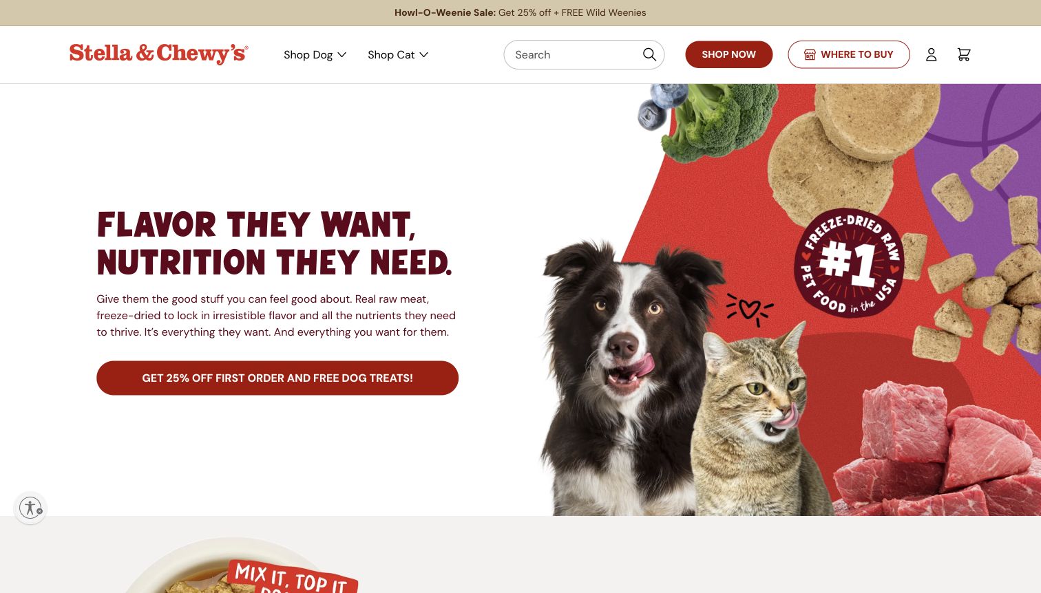
Stella & Chewy’s divides the first screen between a large burgundy headline and a colorful collage of pets, food pieces and ingredients. The white text area gives the message a readable base even as the right-hand image uses a busy red-and-purple composition. Dog and cat shopping routes appear in the header alongside search, a direct shop action and Where to Buy. A seasonal offer strip and an offer-led hero button make promotions especially prominent. The page also exposes product choices and subscription controls further down, indicating that the homepage leads toward a more detailed buying decision. The screenshot records one automatically selected campaign variant. Its visual claims and badges are part of the brand’s presentation, not independent evidence about nutritional performance or market rank.
What you can learn
When a brand serves multiple buying channels, name them explicitly and keep their visual roles distinct. Use a lively collage to establish personality, while ensuring the product, size and recurring-order decisions remain readable and unambiguous.
Pros
Direct shopping and the retailer finder are both available in the main header.
A solid light panel protects the headline from the busy campaign artwork.
Cons & considerations
The collage, claim badge and seasonal offer create several competing focal points.
The lengthy promotional action carries less simple destination information than a product-specific label.
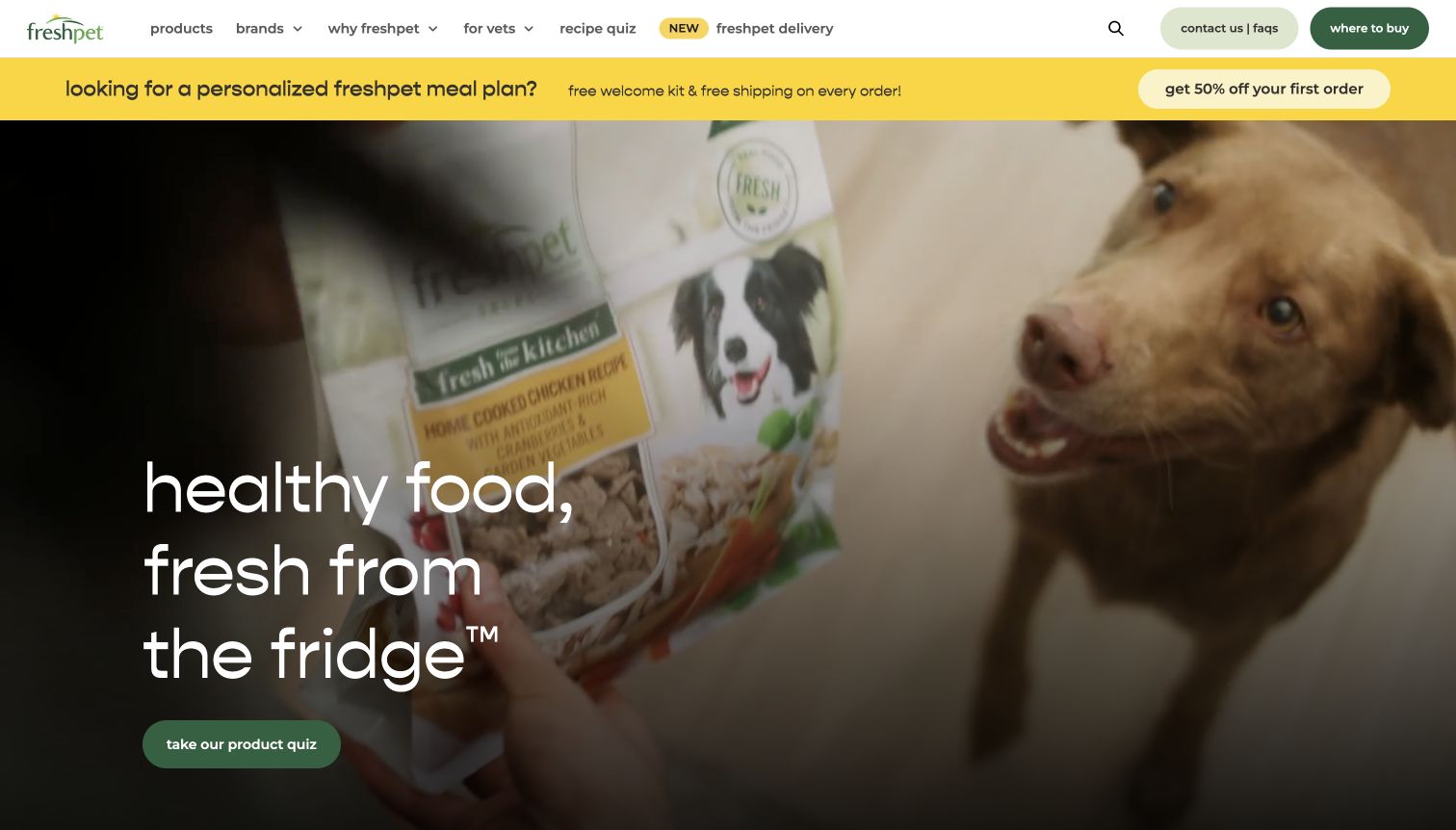
Freshpet makes the refrigerator central to its first-screen message, using oversized white words over a moving lifestyle scene. The captured frame shows a dog and a package, while a green recipe-quiz button offers a clear route into product selection. The header contains products, brands, a separate delivery destination and a prominent buying route. That distinction matters for a business whose products can be found through more than one channel. A delivery discount strip introduces an additional offer without replacing the main navigation. The page feels focused on helping someone understand the format and choose a recipe, rather than beginning with a dense product grid. However, the full-screen image leaves little visible space for pack sizes, storage detail or price information.
What you can learn
Explain a distinctive product format in plain language, then let visitors choose between product discovery and a known buying channel. Keep essential storage and purchasing information accessible beyond the emotional first impression, and review text contrast across moving footage.
Pros
The refrigerated-food message gives the brand a clear first-screen product distinction.
Recipe selection and delivery remain separately labeled routes.
Cons & considerations
Moving hero footage can vary the contrast behind the oversized white text.
The large visual postpones practical comparisons such as pack size and price until later in the journey.
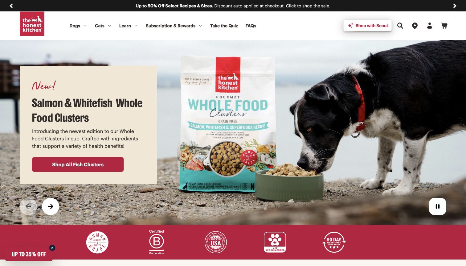
The Honest Kitchen promotes a salmon-and-whitefish recipe with a cream text card over a seaside scene of a dog eating beside the package. The red action names the fish-cluster collection, giving more direction than a generic shopping button. A sale strip sits above the white navigation, while a red band of brand assurances appears below the hero. The carousel includes visible previous, next and pause controls, a useful detail when the main campaign can change automatically. Dog, cat, subscription, rewards and quiz routes remain available in the header. The presentation combines an identifiable product launch with a substantial set of promotional and trust messages. Those messages are visible claims to investigate on their own terms, not findings established by the design review.
What you can learn
Use a stable text card to keep recipe names and actions legible over photography. Give a changing hero a pause control, and make claim badges useful through explanatory destinations instead of treating them as self-explanatory proof.
Pros
The action identifies the featured food collection rather than merely saying Shop Now.
Visible pause and directional controls give visitors control over the hero carousel.
Cons & considerations
Sale messaging, a new-product label and multiple assurance badges compete around the same image.
Several header routes require careful grouping to remain manageable on narrower screens.
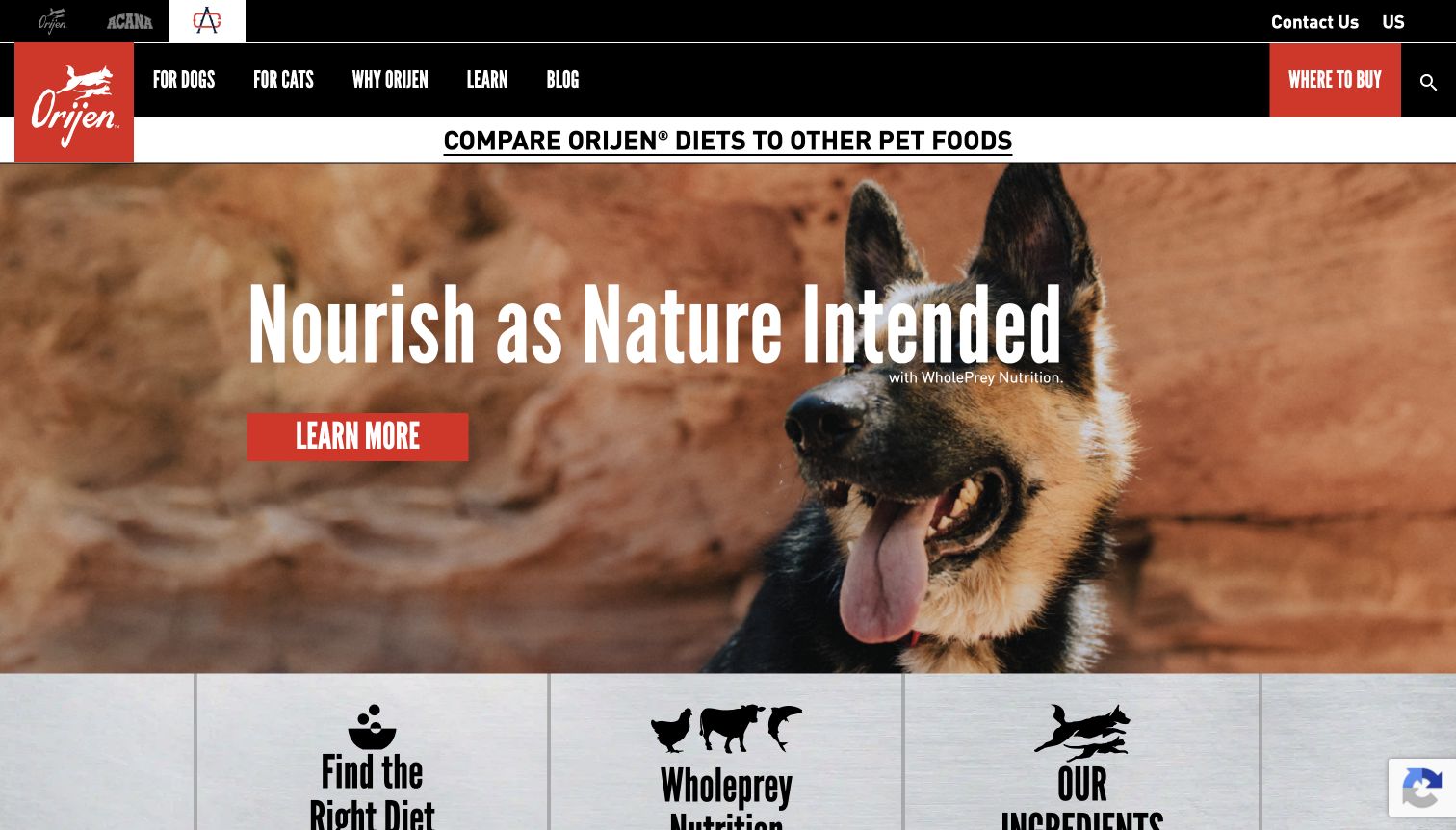
ORIJEN places a dog in an outdoor landscape beneath a dark navigation area and overlays a large white statement about its nutrition philosophy. A red Learn More action matches the logo and provides the primary route out of the hero. Below, separate tiles introduce finding a diet, the brand’s food concept and ingredients. That progression moves from a broad brand position toward more concrete research tasks. The header preserves dog, cat and retailer routes, while a small strip of related company brands adds a second layer of orientation. The captured page therefore functions as a brand and product-information gateway rather than a first-screen price comparison. The review concerns how claims are presented and organized; it does not establish their dietary validity.
What you can learn
Follow an abstract brand promise with clearly different tasks that help visitors investigate it. Keep retailer access conspicuous and use specific action labels where possible, especially when the first screen otherwise contains little product-level detail.
Pros
Diet discovery and ingredient information are presented as distinct follow-on routes.
Where to Buy remains accessible in the main navigation.
Cons & considerations
The generic Learn More action does not reveal the depth or type of information ahead.
Related-brand links add header complexity for visitors who only want the ORIJEN catalog.
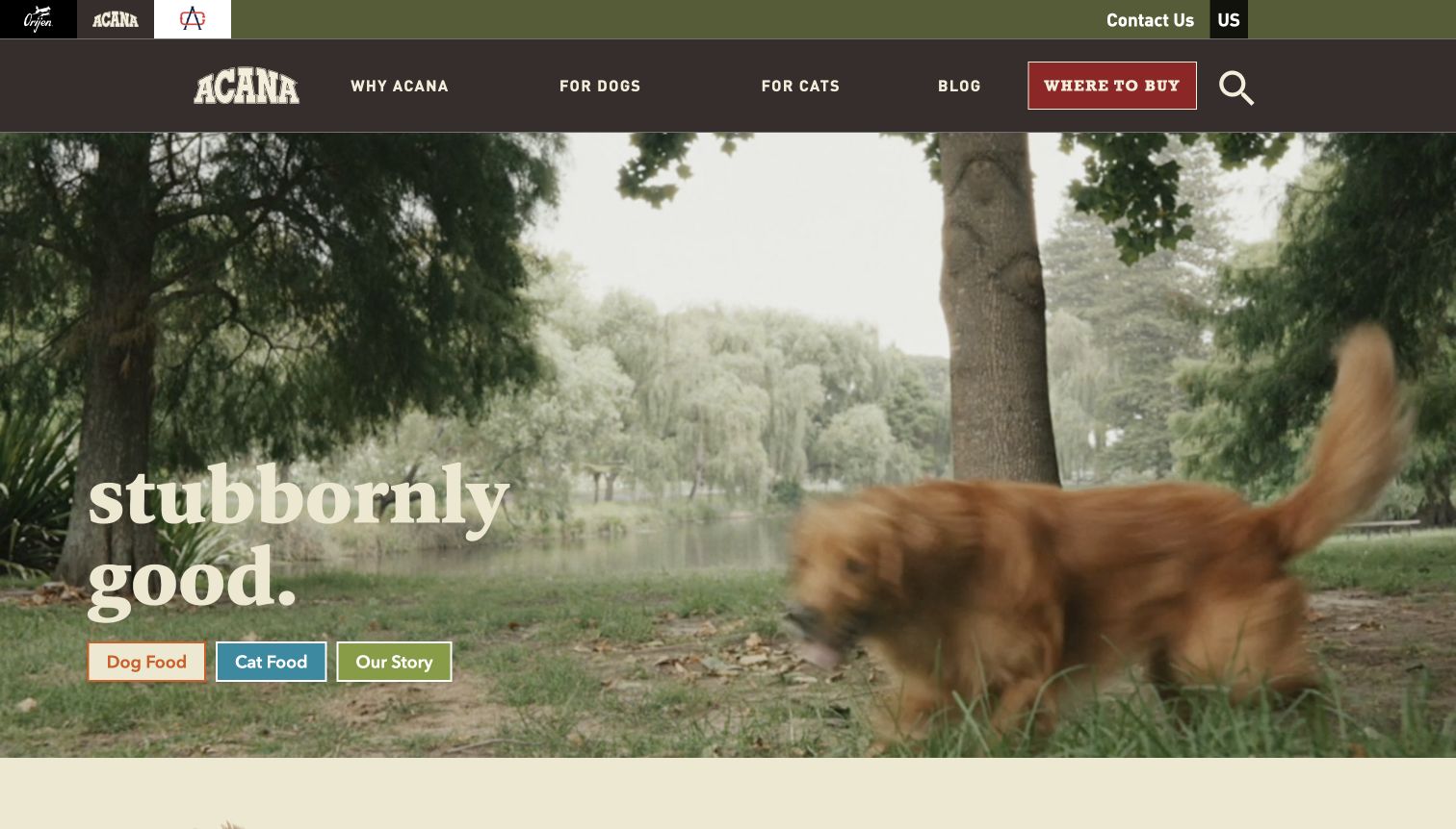
ACANA uses a park video as the dominant homepage surface, with a large cream serif statement placed low on the left. Immediately beneath it are three compact buttons for dog food, cat food and the brand story. This arrangement turns a broad emotional message into recognizable destinations without requiring a visitor to open the navigation. The brown header repeats the species routes and gives Where to Buy its own red treatment. Related-brand marks appear in a thin strip above. The captured video frame contains motion blur around the dog, which conveys activity but provides little detail about the food itself. Product formats and further catalog information appear in the page content below. This is a gateway to research and buying options rather than a complete first-screen product explanation.
What you can learn
Let lifestyle imagery establish tone, then place plain-language catalog routes directly beside the message. Test the entire range of video frames for readability, and preserve enough space below the hero for product details to become the obvious continuation.
Pros
Dog food, cat food and company story are clearly distinguished in the hero actions.
The retailer route has a strong, consistent place in the header.
Cons & considerations
Motion in the hero can blur the focal subject and vary the background behind text.
The first screen offers little information about recipes, pack sizes or product differences.
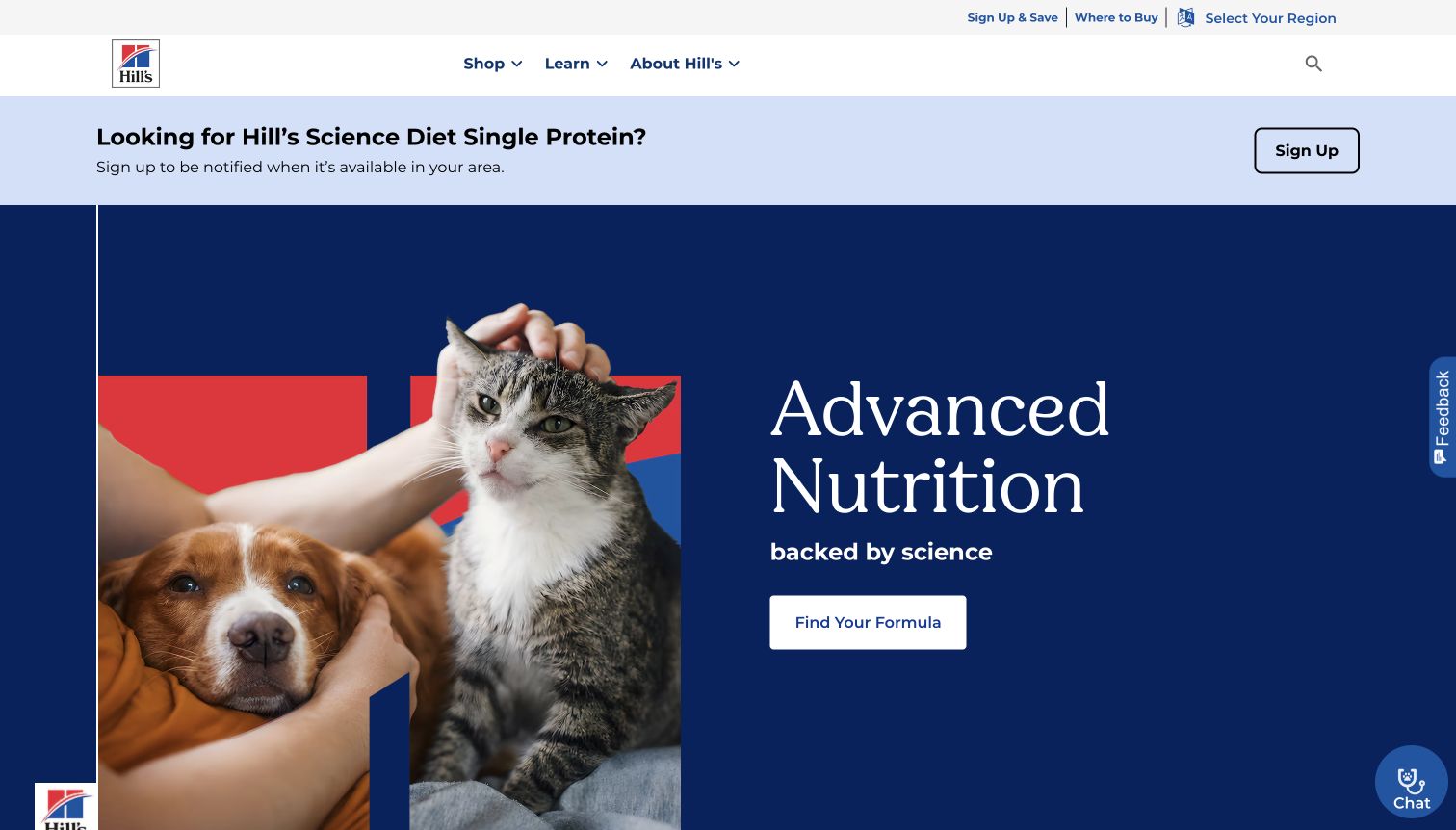
Hill’s uses a dark blue hero with a dog-and-cat photograph on the left and a large nutrition statement on the right. A white Find Your Formula button provides a direct action beneath the message. The simple Shop, Learn and About navigation leaves substantial space around the header, while utility links handle buying locations and region selection. Above the hero, a separate pale announcement invites interest in a specific new range. That division allows a timely product update to coexist with the broader product-finder journey. The page’s visual hierarchy is clear once the ordinary overlay is dismissed, although the announcement consumes a meaningful portion of the first screen. The science-oriented wording is the brand’s positioning; this visual review does not validate a product or a recommendation.
What you can learn
Give a complex catalog one understandable discovery action, then keep new-range announcements in a separate, visibly bounded area. Explain what a formula finder can and cannot determine, and maintain direct catalog routes for visitors who already know their product.
Pros
The white formula-finder button has strong contrast against the dark hero.
Three short main navigation labels keep the header comparatively easy to scan.
Cons & considerations
The large announcement reduces the visible space available for the main catalog message.
A finder-centered journey still needs an obvious alternative for shoppers seeking a known recipe.
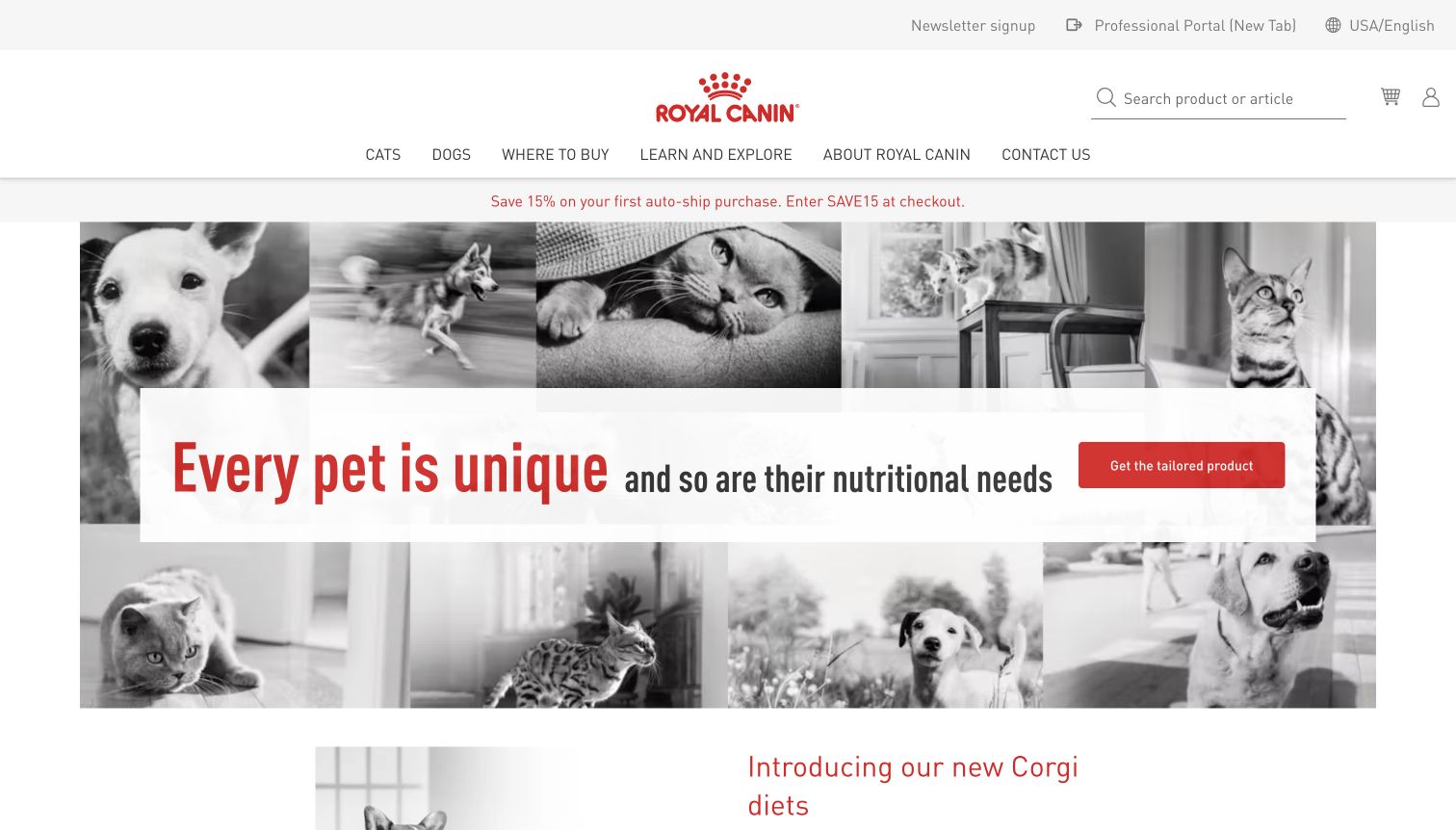
Royal Canin centers a red logo in a spacious white header and places a wide white message panel across a mosaic of black-and-white pet photographs. The composition reinforces variety while keeping the main statement readable. A red tailored-product action supplies the central next step, with dog and cat routes in the navigation above. Search and buying-location links remain available, and a modest promotional strip introduces an autoship offer. Below the hero, the page begins presenting a more specific breed-focused range. This creates a progression from a general claim about individual needs to a structured product-discovery task. The generous spacing feels calm, but it also means the header takes a substantial amount of vertical room before the visitor reaches catalog detail.
What you can learn
Use a visually consistent image system to communicate range without presenting an overwhelming grid of products. Make the finder’s criteria and limitations understandable, and ensure the spacious desktop header compresses gracefully so the primary action remains easy to reach.
Pros
The white central panel preserves text legibility across a busy photographic mosaic.
The tailored-product action gives the broad brand message an identifiable next step.
Cons & considerations
The tall header postpones practical product information in the first viewport.
Small navigation and search controls receive much less emphasis than the central campaign.
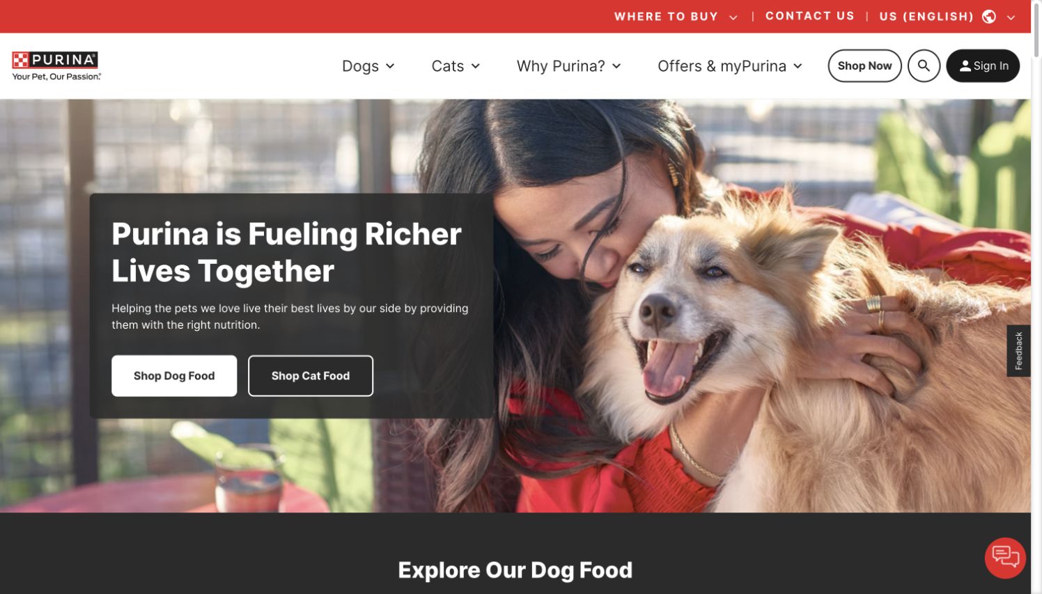
Purina places a person embracing a dog across most of the homepage hero and overlays a dark translucent text panel on the left. The white dog-food button and outlined cat-food button establish two straightforward shopping routes beneath a broad relationship-focused headline. The header repeats the species split and adds a shop action, search and sign-in, while a red utility bar holds buying-location and contact links. Immediately below, the page begins a dog-food exploration section. The layout is useful as an umbrella-brand gateway because a visitor can start with species before learning individual product families. It is less useful for immediate recipe or price comparison, since the first screen is largely devoted to the brand relationship and navigation.
What you can learn
Give an umbrella brand a small number of clear first choices, then make the next category level explain meaningful product distinctions. Keep account and loyalty routes subordinate to shopping and information tasks, and maintain a readable text backing over photography.
Pros
The dog and cat buttons offer explicit destinations without requiring menu exploration.
The dark text panel keeps the headline legible over the lifestyle photograph.
Cons & considerations
Several shopping and account controls compete in the header before the catalog is visible.
The relationship-led hero leaves product families and price information below the first screen.
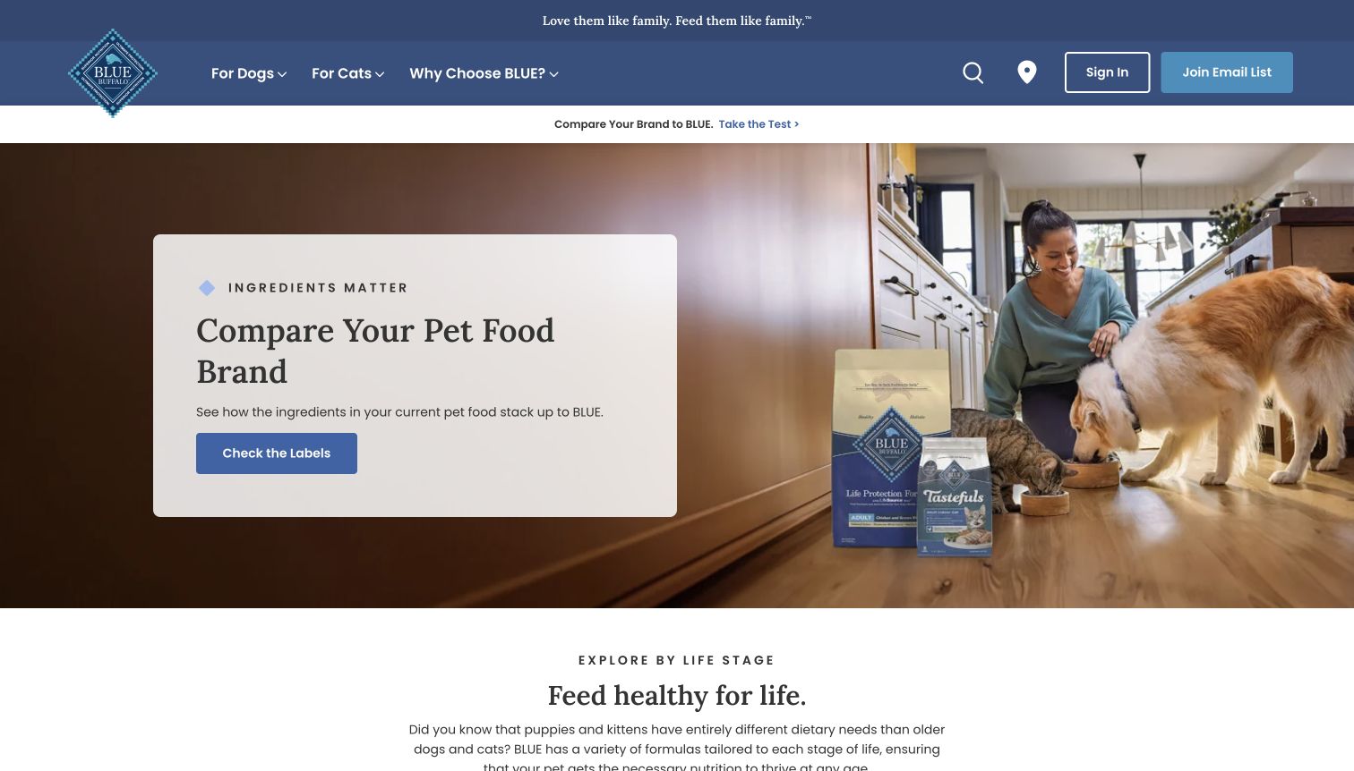
Blue Buffalo makes comparing pet-food labels the central task of its homepage. A pale card overlays a kitchen photograph and contains a short headline, an explanation and a blue Check the Labels action. Dog and cat product packages appear within the scene, tying the otherwise domestic image to the catalog. The blue header limits primary navigation to species and brand information, while a smaller comparison strip repeats the featured task. Below the hero, life-stage navigation offers a different way to choose products. This is a useful example of connecting a brand argument to an interactive research destination, though the repeated comparison message occupies space that could introduce more practical buying information. The site’s ingredient claims remain manufacturer statements rather than conclusions from this review.
What you can learn
When comparison is the main conversion path, explain the criteria and make the underlying labels accessible. Offer species and life-stage routes alongside it so customers who already know what they need can bypass the persuasive introduction.
Pros
The solid text card gives the comparison action a clear, readable setting.
Life-stage routes introduce a practical catalog structure beneath the campaign.
Cons & considerations
The comparison message appears in both the narrow strip and the hero, reducing first-screen variety.
A comparison-led journey requires transparent criteria to avoid obscuring important product differences.
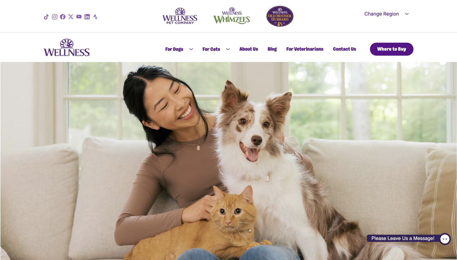
Wellness opens with a large, uncluttered photograph of a person with a dog and cat. Unlike many food storefronts, the captured hero carries no prominent overlaid purchase button; the strongest visible action is Where to Buy in the navigation. Two header rows accommodate social links, related brands, region selection and the main catalog routes. Below the photograph, the page introduces product discovery with dog and cat tabs and separate cards for dry food, wet food, toppers, treats and supplements. That structure can help explain a broad range once the visitor scrolls, but the first viewport spends most of its space establishing mood. A small message widget provides support access. Ordinary newsletter and cookie overlays were dismissed before keeping the capture.
What you can learn
If a hero is primarily atmospheric, make its continuation into useful catalog content obvious. Group related brands and social links carefully, and ensure product-format navigation appears early enough that visitors understand what the business offers without a long exploratory scroll.
Pros
The main navigation preserves clear species routes and a prominent retailer action.
Product-format cards below the hero provide distinct entry points into a broad range.
Cons & considerations
The large image offers little first-screen explanation of specific products or differences.
Two header rows devote substantial space to related brands and social destinations.
Create a product model covering species, life stage, format, pack sizes, ingredients, feeding guidance and relevant handling information. Have responsible subject-matter reviewers approve the fields and terminology. Test several awkward records, including a topper, a veterinary item and a product available in multiple package sizes.
Write a transparent decision journey
Document what a finder or plan quiz asks, how its result is produced, and what limitations need to be visible. Keep marketing personalization distinct from clinical assessment. Design a usable path for someone who already knows the product and does not want to repeat a questionnaire.
Show ownership of the ongoing relationship
Subscription customers need understandable delivery intervals, renewal charges, change deadlines and cancellation routes. Retail customers need reliable stockist information and a clear support channel. Publish practical answers about storage, transitions and damaged deliveries only after the business has approved them.
The editing job behind the design
Match catalog, subscriptions and distribution to the operating model
A straightforward direct store, a customized recurring plan and a retailer-focused brand site have different requirements. Evaluate product variants, recurring billing, geographic selling, stockist data and editorial approvals before choosing a platform. The website should not depend on a quiz vendor for basic product information that the brand needs to maintain independently.
Audit analytics, personalization, subscriptions and retailer tools by their specific purpose and information exchanged. Observing a commerce script on a public page does not establish how recipes are formulated or how orders are fulfilled. Keep marketing technology evidence separate from food claims, and make service failures visible without losing the product information.
Our WordPress website examples offer a separate look at publishing approaches. A visible platform label is evidence for that named page, not a guarantee that the same system will suit your requirements.
Before the public launch
Pet food website launch checklist
Check species, life stage, food format and product role on every representative record.
Verify pack sizes, ingredients and feeding information with the responsible reviewers.
Distinguish complete food, treats, toppers, supplements and veterinary ranges.
Explain subscriptions, renewal prices, delivery intervals and cancellation clearly.
Test a known-product purchase separately from any personalization quiz.
Validate store-finder coverage and qualify inventory information accurately.
Review mobile navigation, text size, keyboard focus, form labels and errors.
Assign owners for product updates, professional review, stockists and support.
These checks are a project checklist, not a performance, legal, security, or accessibility certification. Test real journeys with the people responsible for the website before making claims about the result.
Sources & editorial method
How this collection was selected and reviewed
Official brand sites provide the source material for catalog and buying-route research. The final visual collection requires a genuine, dated browser capture and a distinct original review for every example. Website observations do not validate nutritional claims, feeding suitability, clinical outcomes or subscription fulfillment.
Each example links to its actual source page. Screenshots are direct browser captures with their own capture dates; moving imagery, announcements and live designs can change. The notes describe observable design choices and conditional tradeoffs, not measured traffic, conversion results, service quality, or accessibility conformance.
Technology labels use public page metadata, asset evidence, or explicitly cited platform documentation. Platform documentation is not a complete current deployment audit. A component reference may be legacy or unused; it is not a complete backend inventory. Unknown stacks are omitted. These sites are editorial examples, not our client portfolio.
Written, Edited and Curated are separate editorial records, not timestamps advanced by a rebuild. Website designs and imagery belong to their owners. See our editorial standards or suggest a correction.
Questions worth asking
Pet Food Brand website design questions
Should every pet food brand use a quiz?
Use one only when its questions help make a meaningful distinction and the business can explain the result. Provide direct catalog access for returning customers and describe the limits of a recommendation.
How should veterinary products be presented?
Keep the range and its intended route clear, using wording approved by the responsible professionals. An attractive product selector should not imply that a website has diagnosed an animal or replaced veterinary advice.
What belongs on a subscription landing page?
Explain what arrives, the format and quantity, how pricing is calculated, delivery intervals, renewal terms and how to change or stop the plan. A promotional introductory price should not carry the entire explanation.
Can a design review establish that a pet food is better?
No. It can assess the clarity of the website’s visible explanation and purchasing routes. Product quality and nutritional suitability require evidence outside a visual website review.