A dealership website should help a visitor find a relevant vehicle, understand where it is, and choose a useful next step. Campaigns work best when inventory, location, and service information remain easy to reach.
A local franchise dealership and a national dealer group have different starting problems. The local site can lead with its address, departments, and available stock. The group site must help visitors choose a region, brand, or dealership before a large inventory count becomes useful. Design that distinction into the search and navigation rather than leaving it for a later phone call.
These twenty-five examples show inventory filters, brand gateways, service shortcuts, local contact information, promotional campaigns, and assisted-search entrances. The reviews assess public interface choices. Captured prices, offers, stock counts, awards, and financing-related statements are dated page content, not independently verified recommendations or evidence of an individual vehicle’s condition.
Before the examples
What makes good car dealerships website design in 2026?
Keep inventory tied to a real vehicle and location
Use a consistent record for model, year, trim, condition category, price context, mileage, photographs, location, and availability status. Carry that identity from search to detail to inquiry. If a vehicle becomes unavailable, explain the change and provide relevant alternatives without silently replacing the selected vehicle or leaving an active inquiry button on stale stock.
Separate buying, selling, and service
A person comparing cars, requesting a trade estimate, and booking maintenance needs different information and a different completion state. Give each a literal entrance. Keep service department hours and contact information distinct from sales, and identify whether a submitted request is confirmed or awaiting a staff response.
Make geography part of the search
Show the selected region or dealership alongside results, especially when a group spans many locations. Explain distant inventory, transfer options, or delivery context where applicable to the business. Let visitors correct a location assumption easily, and preserve the choice when they return from a vehicle detail or external tool.
The collection · 25 examples
25 car dealerships websites worth studying
Compare the roles each opening performs: local showroom, multi-brand inventory search, regional gateway, service entrance, or online retail journey. Borrow the relationships between controls and information rather than copying a campaign, stock claim, or dealership promise.
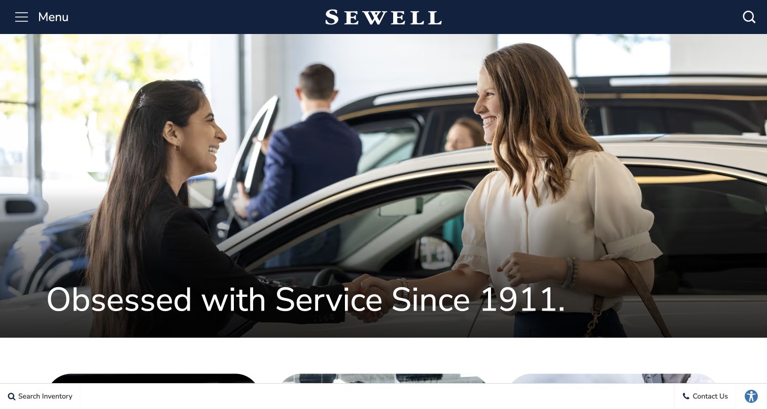
Sewell opens with a staff-and-customer photograph, a centered wordmark, and a large service statement. The dark header keeps only menu and search visible, while a slim lower utility bar offers inventory search and contact. The composition presents the dealership relationship before a specific vehicle or promotion. It is a useful alternative to an inventory-heavy opening, provided the practical shopping route remains easy to discover.
What you can learn
If service is the differentiator, show the people and setting behind it while retaining a direct inventory route. Test the minimal header with first-time visitors who may not know the group or its locations.
Pros
The human interaction gives the service message a concrete visual subject rather than relying on a generic vehicle photograph.
The lower inventory shortcut provides a practical task route alongside the broad brand introduction.
Cons & considerations
A hidden main menu adds a step for visitors seeking brands, locations, service, or other specific information.
The large opening image needs a deliberate phone crop so the people and service statement remain understandable together.
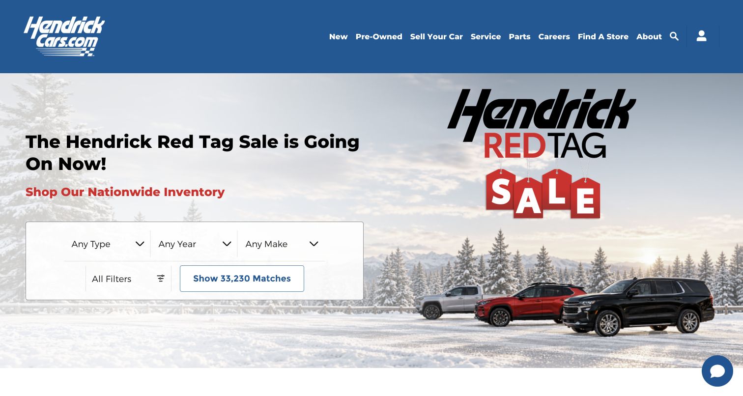
Hendrick places a compact inventory form within its seasonal sale hero. Type, year, and make are the initial choices, followed by an all-filters route and a button showing the captured match count. A blue header separates new vehicles, pre-owned stock, selling, service, parts, and store discovery. The campaign supplies atmosphere, while the form gives shoppers a useful starting point without requiring them to choose a dealership first.
What you can learn
Choose a small initial filter set and make its result understandable before adding more fields. Keep a route to location selection and explain whether results span the group or one store.
Pros
The form translates the broad nationwide-inventory message into a concrete search action in the same area.
The navigation distinguishes shopping from service and selling, supporting visitors with different goals.
Cons & considerations
Large group-wide counts need accurate updates and clear location context so the number does not imply nearby availability.
The detailed seasonal artwork should remain secondary when the form becomes a vertical stack on mobile.
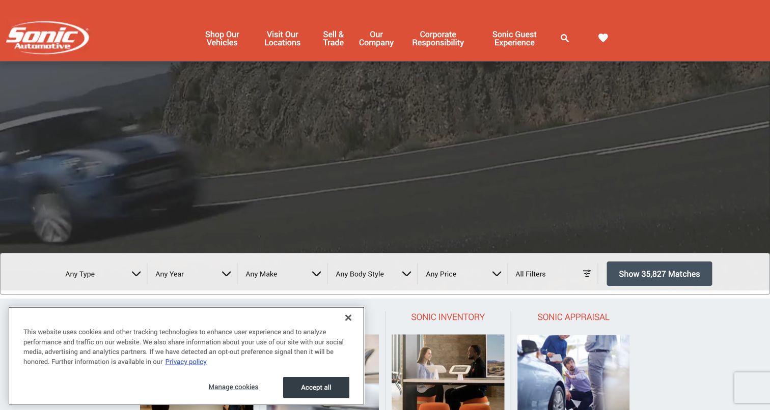
Sonic Automotive uses a bright corporate header above a dark moving-vehicle scene. A full-width filter bar follows, offering type, year, make, body style, price, and additional filters before the result action. Lower cards introduce inventory and appraisal. The saved view also contains a privacy notice over part of that lower content. The important pattern is the separation between atmospheric branding and a plainly structured search surface.
What you can learn
Give inventory search a solid, stable background and preserve its state as visitors refine the results. Test the bar together with notices and chat so the essential action remains reachable on short screens.
Pros
The broad filter row supports several shopping approaches without forcing a model choice at the outset.
Distinct inventory and appraisal sections acknowledge that buying and selling are different visitor tasks.
Cons & considerations
A long horizontal filter row needs a purposeful mobile sequence rather than compressed labels and controls.
The captured privacy notice covers lower cards, illustrating why overlay placement should be reviewed against real content.
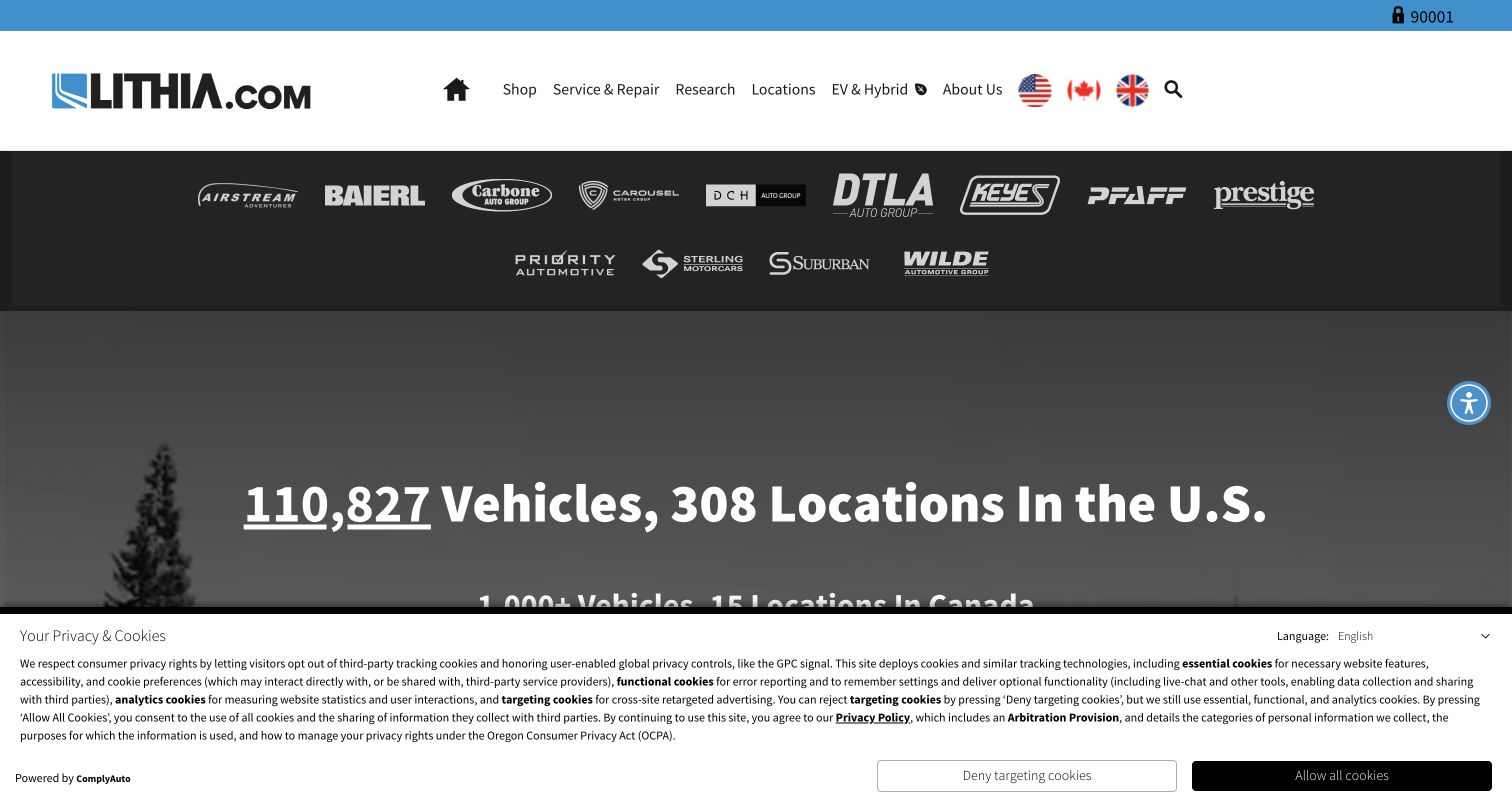
Lithia's opening places the corporate identity and main tasks above a band of dealership-group logos. A large count statement below communicates the scale of vehicles and locations shown at capture time. Country flags and a location indicator add geographic context. The saved privacy notice occupies much of the lower screen, leaving the navigation and network presentation visible. This is a corporate gateway pattern rather than a focused single-dealership inventory entrance.
What you can learn
Use a network overview only when it helps visitors find the right local destination. Connect group scale to clear country, location, and inventory routes, and keep current counts tied to an owned data source.
Pros
The logo band helps explain the relationship between the parent organization and familiar regional dealership identities.
Shopping, service, research, and location routes remain distinct in the main navigation.
Cons & considerations
Scale claims alone do not answer whether a suitable vehicle is available near a visitor's location.
A substantial notice can conceal the next step, so the first-visit composition needs testing at short viewport heights.
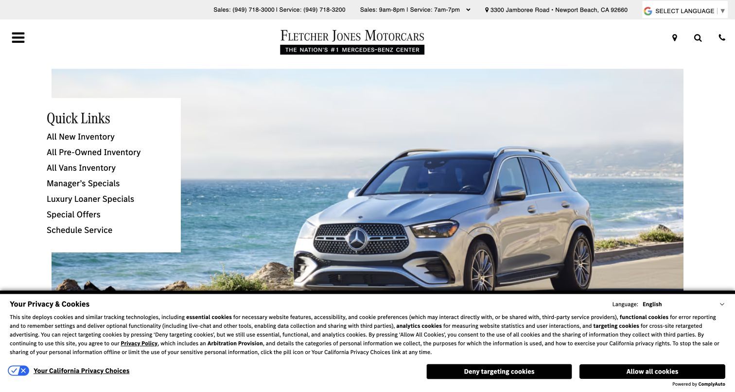
Fletcher Jones Motorcars combines a restrained identity area with detailed contact information and a large Mercedes-Benz photograph. A white quick-links panel overlays the left side, listing new, pre-owned, vans, specials, and service. The panel gives concrete destinations to an otherwise image-led opening. A lower privacy notice is visible in the capture. The design shows how a luxury presentation can retain practical navigation without relying entirely on a concealed menu.
What you can learn
Select quick links from actual dealership tasks and keep their labels literal. Preserve sales and service contact distinctions, and test whether notices or mobile crops push the most useful link below the opening view.
Pros
The plain white panel gives inventory and service links a stable reading surface separate from the vehicle photograph.
Separate sales and service numbers and hours help visitors choose the appropriate team before calling.
Cons & considerations
Several similar offer links require clear destination content so shoppers can distinguish specials from ordinary inventory.
The long lower notice reduces the visible vehicle area and may compete with quick links on a smaller screen.
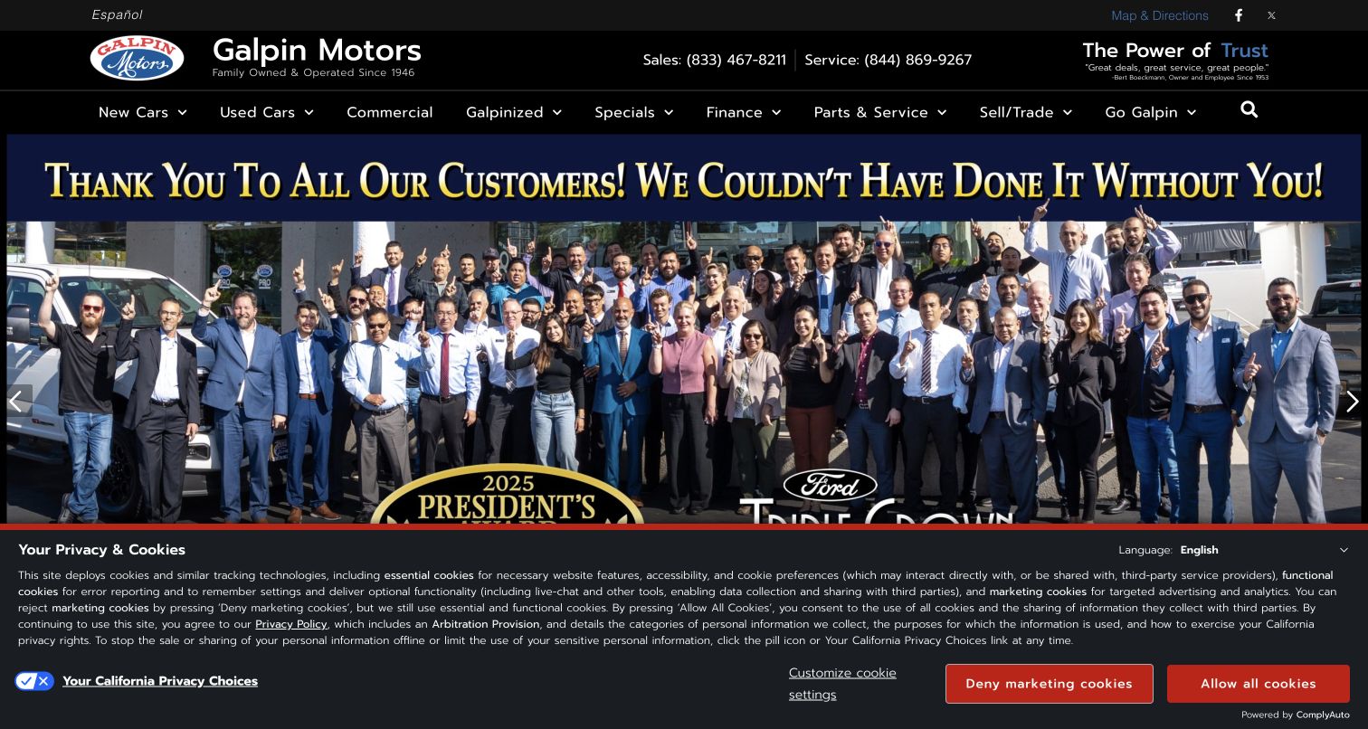
Galpin Motors combines a dense black header with a large team photograph and a customer-thank-you campaign. Sales and service phone numbers remain visible, while the navigation separates new, used, commercial, specials, finance, parts, service, and selling. The page makes the staff and dealership identity prominent rather than leading with a vehicle filter. A substantial privacy notice covers the lower campaign area in the saved view.
What you can learn
Use staff photography to explain the business, then keep the next shopping and service steps literal. Support any awards or historical claims with maintained source information rather than letting campaign artwork become the only explanation.
Pros
The group photograph gives the brand a visible human presence and a recognizable dealership setting.
Distinct sales and service contacts help route visitors before they open a menu or begin an inquiry.
Cons & considerations
The dense navigation needs a careful mobile hierarchy so specialist services do not become an undifferentiated list.
Large campaign lettering and a bottom notice can leave little room for the actual people or next action on short screens.
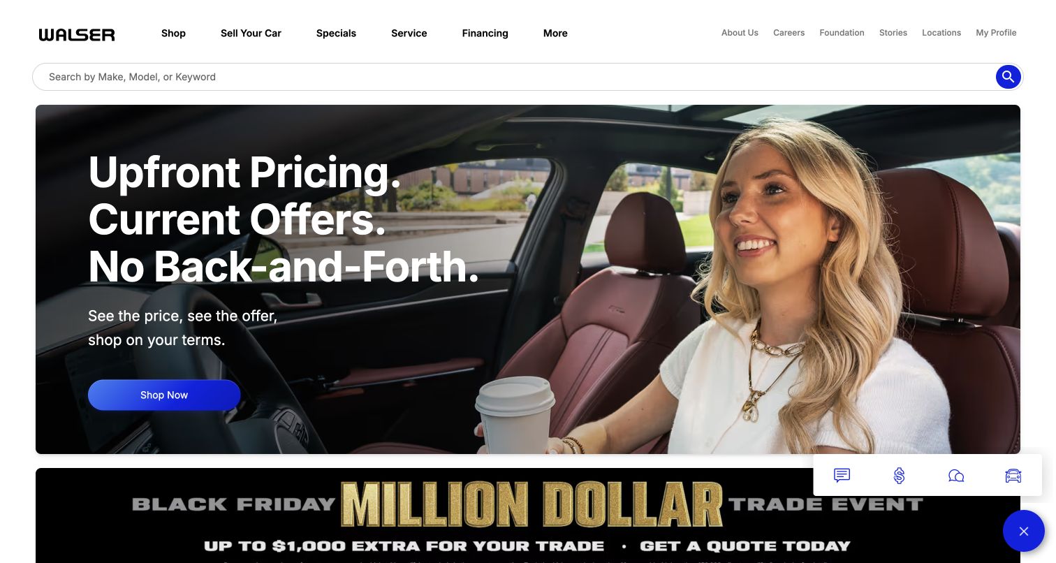
Walser places a broad keyword search beneath a restrained white navigation row. The hero pairs a driver photograph with a large pricing message and a blue shopping action. A separate trade-event campaign begins below, while a small utility panel occupies the lower right. The layout connects the group’s stated shopping approach with an immediate route into inventory. The review assesses that presentation, without independently verifying pricing promises or the captured promotion.
What you can learn
Translate a pricing position into useful inventory information and clear next steps. Keep ordinary search prominent, explain offer conditions where shoppers evaluate vehicles, and separate a trade campaign from the main purchase path.
Pros
The full-width search supports visitors who know a make, model, or keyword before reading the campaign.
The large headline and single shopping action create a clear primary message within the photographic hero.
Cons & considerations
A second promotional band can compete with the main promise if every campaign receives similar visual emphasis.
The floating utility panel needs readable labels and collision testing so it does not obscure offer details on phones.
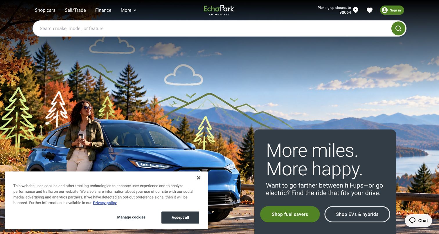
EchoPark combines a prominent keyword search with a seasonal vehicle photograph and a dark campaign card. The card offers separate routes for fuel-saving vehicles and electric or hybrid options. Pickup location, saved items, and account access sit above. The saved view includes a lower-left privacy notice and a chat control on the opposite side. The strongest pattern is the use of visitor goals alongside conventional make-and-model search.
What you can learn
Offer goal-based routes only when their underlying inventory rules are clear. Preserve the selected pickup location and explain how a category was defined so shoppers can understand what the resulting list includes.
Pros
Search and goal-based buttons provide different useful entrances for visitors with specific models or broader needs.
The visible pickup context helps connect a broad catalog to a practical regional shopping decision.
Cons & considerations
Category names such as fuel savers require transparent criteria rather than relying on a persuasive campaign phrase alone.
The notice and chat occupy both lower corners, making the remaining campaign actions important to test on narrow screens.
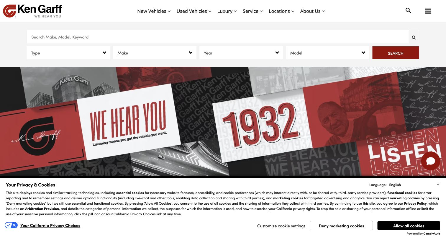
Ken Garff places keyword search and four structured filters immediately below the header. The brand campaign then appears as a red, black, and white collage of history, buildings, and listening-related messages. New, used, luxury, service, and location routes remain in the navigation. The saved privacy notice covers the lower portion of the campaign. Search is given practical priority even while the group’s identity receives a large visual treatment.
What you can learn
Put the inventory entrance before a brand campaign when many visitors arrive ready to search. Test keyword and structured filters as complementary routes, keeping location and selected values visible when the results page opens.
Pros
The search region has a plain background and clear separation from the detailed campaign collage below.
Service and location routes remain available for visitors whose task does not involve shopping for a vehicle.
Cons & considerations
Four filters and a keyword field can feel redundant unless their relationship and resulting state are clearly explained.
A busy brand collage needs a simpler mobile composition when a notice further reduces the visible page area.
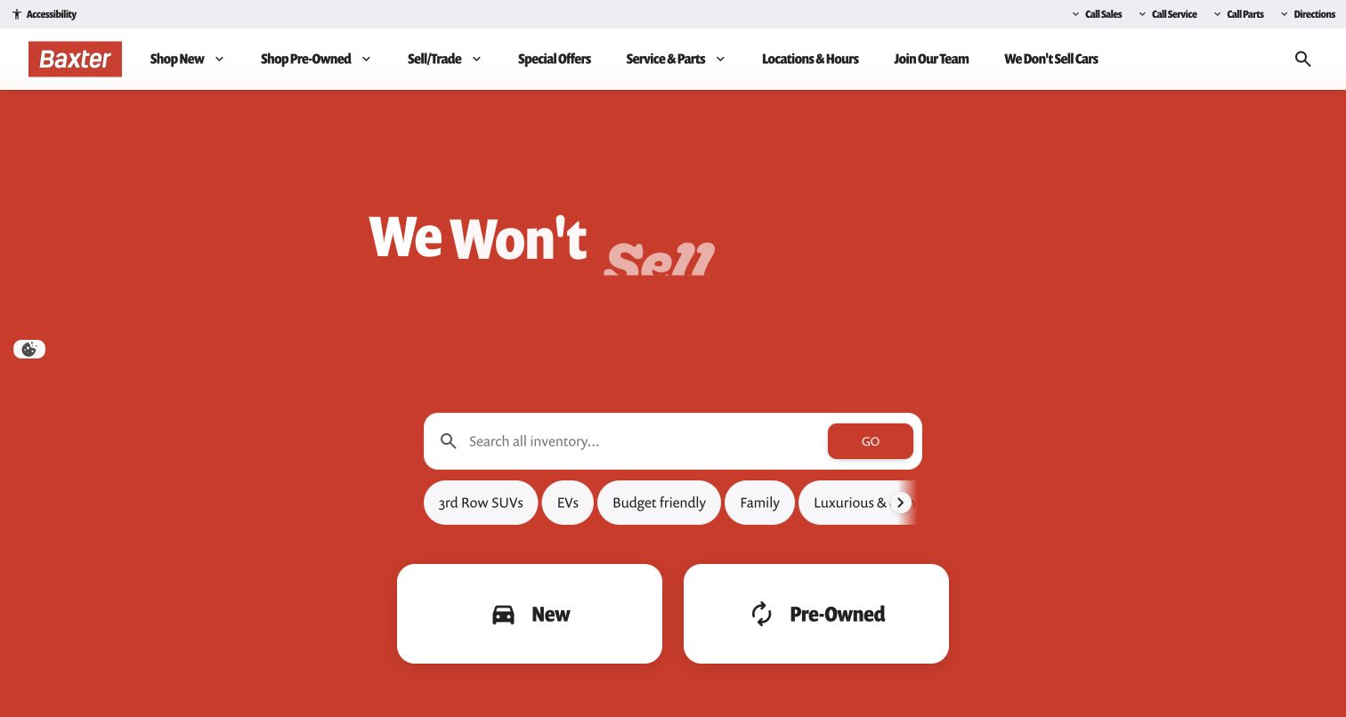
Baxter uses a solid red opening with large animated campaign wording, a centered search field, and a row of shopping shortcuts. Visible shortcuts include third-row SUVs, electric vehicles, budget-friendly options, and family needs. Two large cards distinguish new from pre-owned inventory below. The header retains selling, service, locations, and contact utilities. The screenshot captures the campaign wording mid-animation, showing why the functional search should stand independently of decorative motion.
What you can learn
Give broad shopping shortcuts explicit inventory definitions and preserve a conventional search route. Make the main task understandable before animated text completes, and test the opening with motion reduced or unavailable.
Pros
The new and pre-owned cards provide clear, large choices for shoppers who prefer a familiar inventory division.
Need-based shortcuts offer a useful entrance for visitors who have requirements but no make or model in mind.
Cons & considerations
Labels such as budget friendly need clear criteria and current results so they do not become vague promotional categories.
Animated headline fragments can be confusing in a paused or reduced-motion state unless the essential message is also available as stable text.
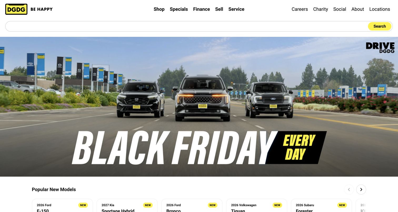
DGDG keeps its header largely monochrome, using yellow for the identity and search action. A wide seasonal campaign shows three vehicles outside a dealership setting, and a row of popular new-model cards begins immediately below. Main shopping, finance, selling, and service links are separated from company information. The page moves from a broad group campaign toward concrete models, which can help shoppers who need inspiration before choosing filters.
What you can learn
Connect promotional artwork to current inventory and provide a plain-text equivalent for its key message. Let model cards introduce real choices, with availability and location context supplied before the visitor commits to a detailed inquiry.
Pros
The popular-model row starts translating the broad campaign into specific vehicles near the opening view.
Separating customer tasks from company links makes the header easier to scan as two purposeful groups.
Cons & considerations
Campaign lettering embedded in imagery needs an accessible equivalent and a responsive treatment that preserves the message.
A visually blank search field needs a clear accessible label and useful instruction even when placeholder text is absent.
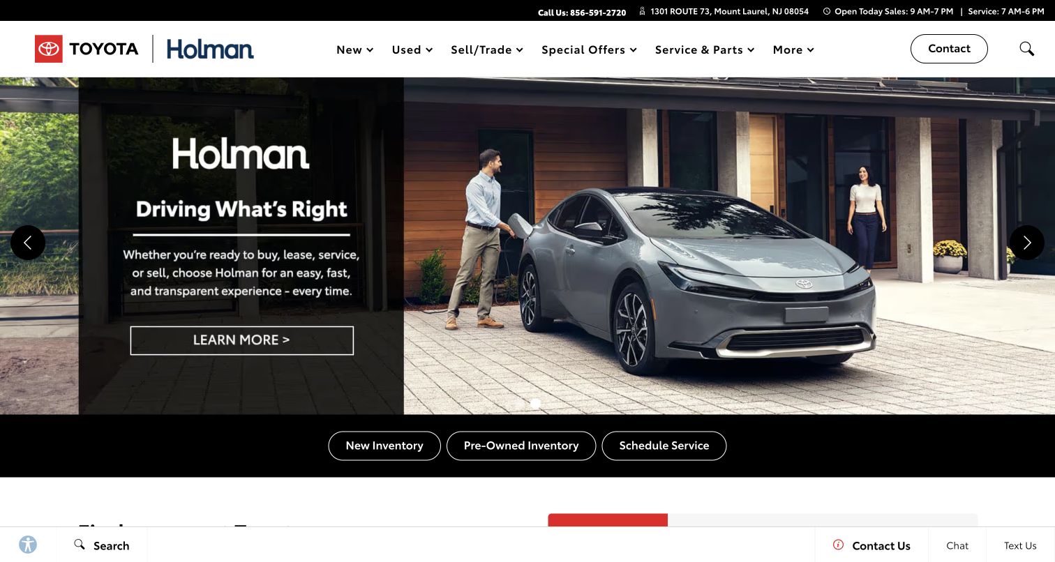
Holman Toyota pairs both manufacturer and dealer identities in a white header, with local address, phone, and hours in a narrow strip above. A photographic campaign includes an explanatory dark panel and an outlined action. Three separate buttons below lead to new inventory, pre-owned inventory, and service scheduling. The composition gives local practical context before the visitor enters a sales or maintenance journey.
What you can learn
Keep location and department information attached to the task shortcuts. Make the three common routes work independently of the rotating campaign, and verify that a service appointment and a vehicle inquiry receive different, accurate confirmation states.
Pros
The address and separate sales and service hours help visitors assess the relevant local destination before contacting the dealership.
The three shortcuts preserve straightforward inventory and maintenance access beneath the broader brand message.
Cons & considerations
A generic learn-more action needs destination context so visitors know whether it explains the dealership or a specific offer.
The persistent lower contact bar should be tested against form controls and mobile keyboards so it does not conceal the next action.
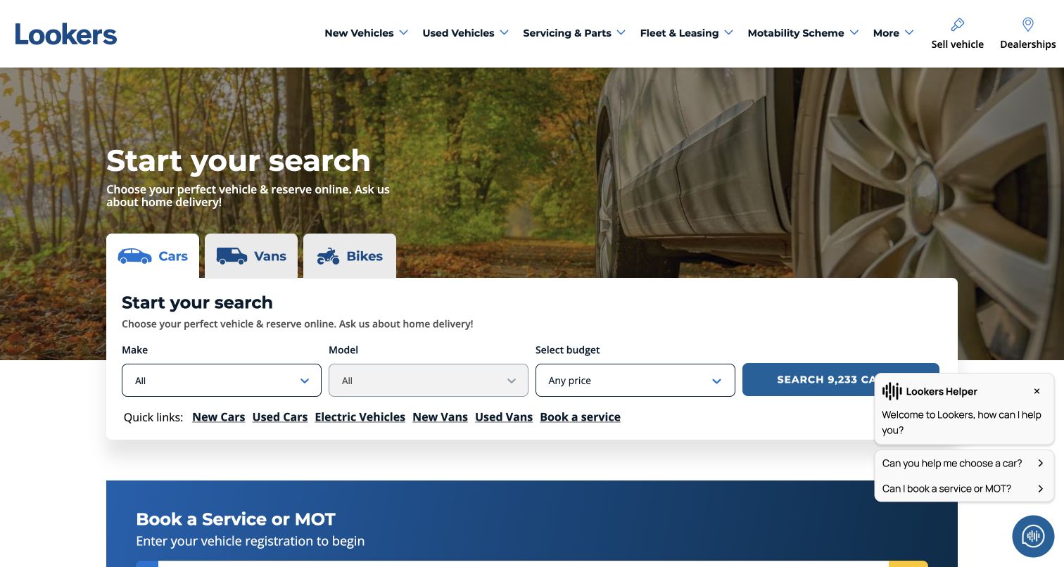
Lookers puts cars, vans, and bikes into prominent tabs above a white search panel. Make, model, and budget form a short initial filter set, followed by a result button. Quick links below connect new, used, electric, and service routes. The lower screen begins a service-booking section, while a helper panel occupies the right side. The useful pattern is a clear vehicle-type decision before more detailed filtering.
What you can learn
Separate vehicle categories when they need different search fields or customer expectations. Preserve the selected category through results and return visits, and keep service booking visible without allowing an assistance widget to cover the search action.
Pros
The tabs make major catalog divisions explicit before visitors start choosing a make or model.
The short filter set offers a manageable first step while quick links support common alternative tasks.
Cons & considerations
The captured helper panel overlaps the result area, showing the need to test assistance placement against the primary search control.
Budget filters require clear meaning and units; the interface should distinguish total price from any later payment illustration.
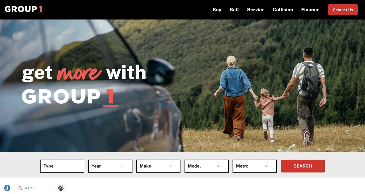
Group 1 uses a black header with short labels for buying, selling, service, collision, and finance. A large family-and-vehicle photograph introduces the brand, followed by a horizontal search row for type, year, make, model, and metro area. The red search action echoes the identity. The metro field is the important practical addition: it connects a broad group presentation to a geographically relevant inventory search.
What you can learn
Include location in the search model early when stock spans many stores. Keep the selected metro visible on results and detail pages, and explain any transfer or distant-location options before a visitor assumes a vehicle is nearby.
Pros
The concise task labels make the main customer journeys easy to distinguish without reading a long navigation hierarchy.
The metro selector gives shoppers a way to narrow a group-wide catalog using practical geographic context.
Cons & considerations
A broad family image does not explain inventory or service differences, so the next sections need concrete information.
Five horizontal fields require a clear mobile order and adequate labels rather than a compressed desktop arrangement.
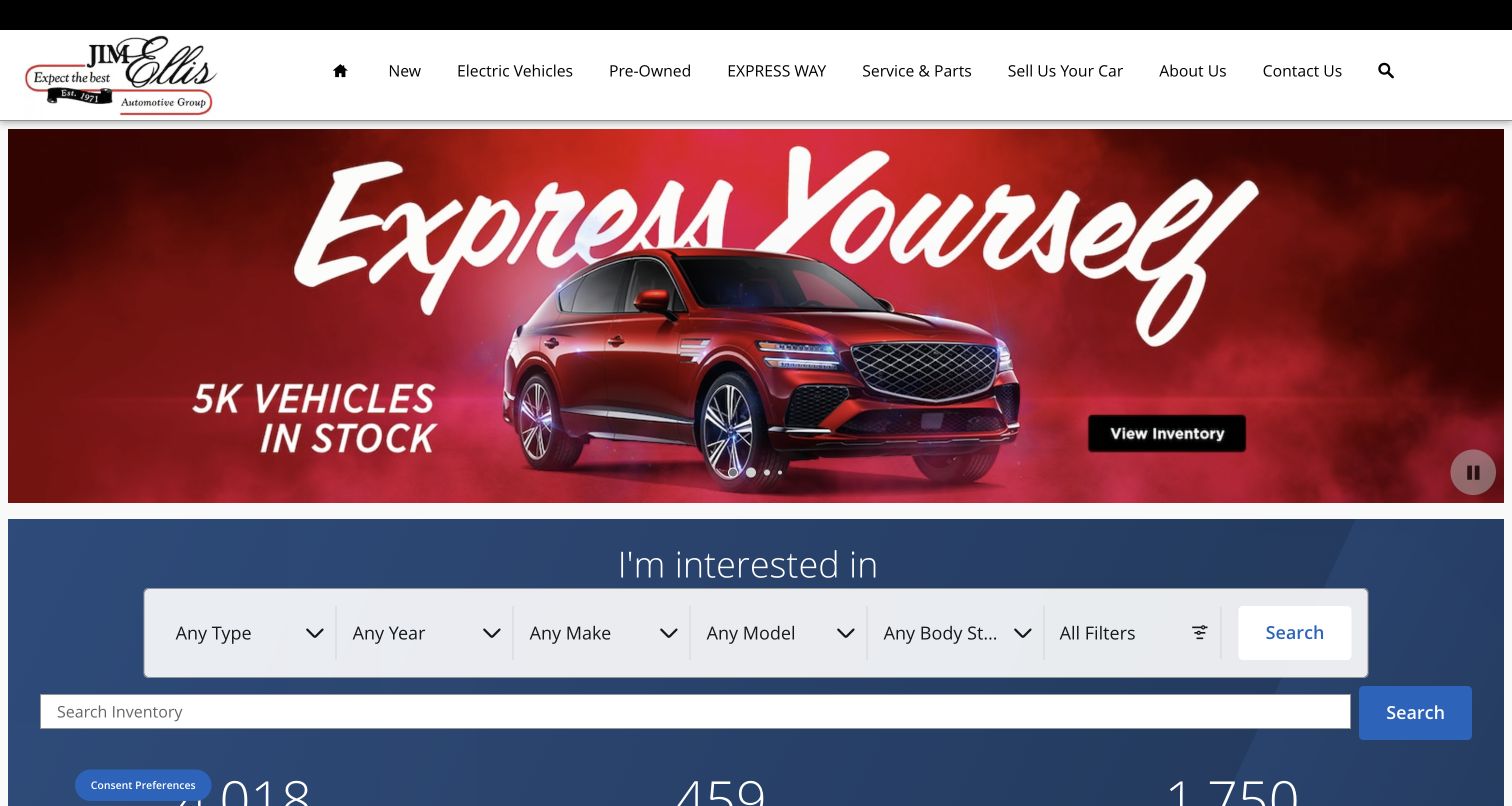
Jim Ellis places a red vehicle campaign above a blue inventory-search region. The campaign includes a captured stock claim and a direct inventory action. Below it, a structured filter row is followed by a separate keyword field. The navigation distinguishes new, electric, pre-owned, service, selling, and company routes. The design provides both guided and direct search, but their relationship needs to remain understandable as shoppers move between them.
What you can learn
Explain whether keyword search replaces or combines with selected filters. Preserve the resulting state and avoid showing inconsistent counts between campaign, search, and inventory pages. Keep promotional stock claims connected to the same maintained source.
Pros
The dedicated blue search region separates practical controls from the more expressive campaign artwork above.
Electric-vehicle navigation gives visitors a specific browsing route alongside conventional new and pre-owned categories.
Cons & considerations
Two adjacent search methods can create uncertainty unless the interface shows which values will affect the results.
Wide campaign lettering and numerous filter fields need distinct responsive layouts rather than simply shrinking together on phones.
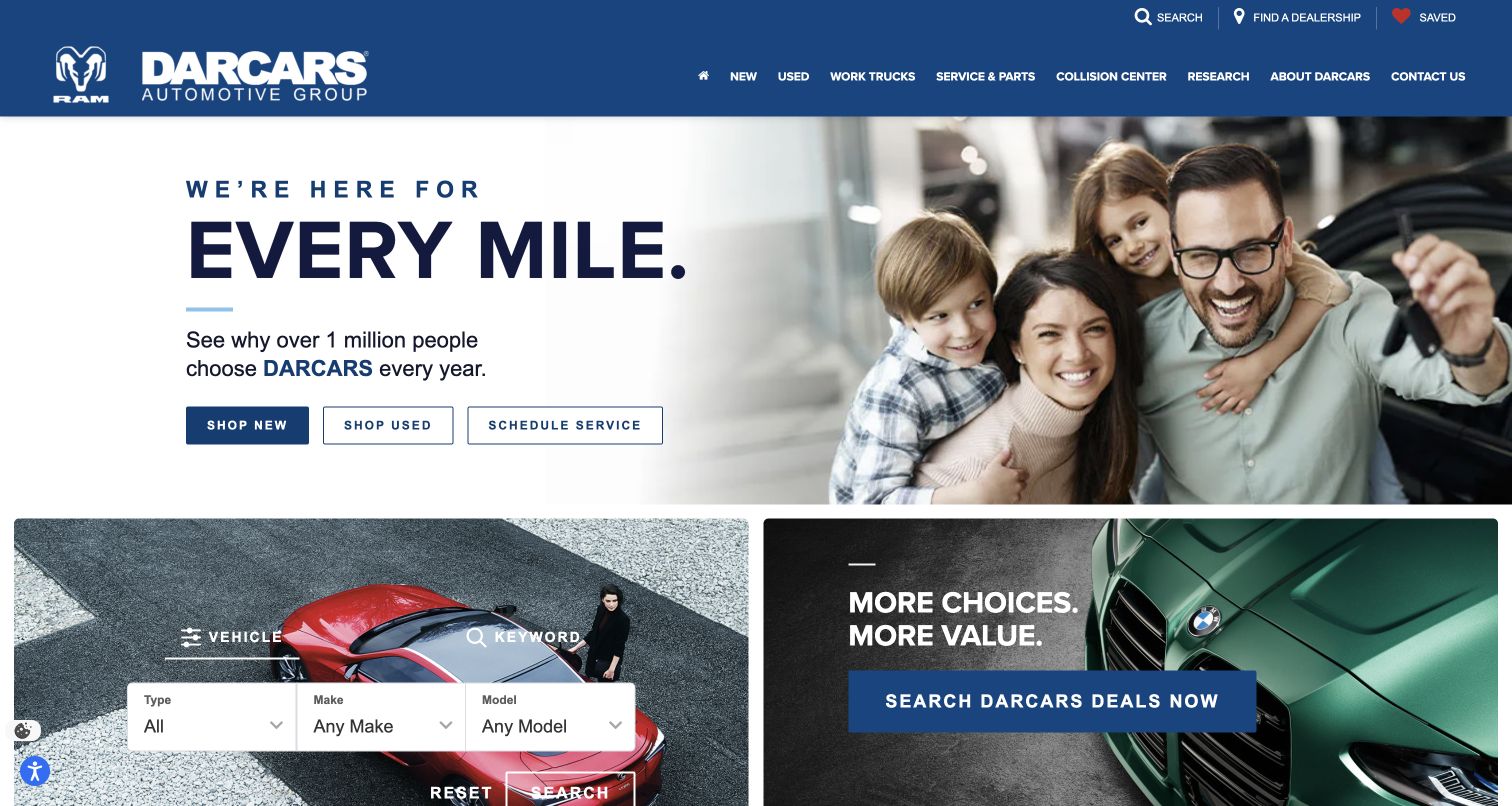
DARCARS pairs a family photograph with a large service-oriented headline on white. Three buttons distinguish new vehicles, used vehicles, and service scheduling. Beneath the hero, a vehicle-search panel sits beside a promotional deal card. The blue header includes dealership discovery and saved items as utilities. This composition lets a broad relationship message lead while offering specific tasks before the visitor reaches the more detailed inventory controls.
What you can learn
Use a small set of primary tasks to bridge the brand introduction and detailed catalog. Keep service scheduling distinct from sales inquiries, and preserve the selected dealership as shoppers move from group pages to individual vehicles.
Pros
The three hero buttons offer clear destinations for both prospective buyers and existing vehicle owners.
The following search panel gives shoppers a more precise route after the initial task choice.
Cons & considerations
Broad customer-volume claims need maintained supporting context and should not substitute for useful local dealership information.
The search and deal panels need an explicit mobile order so a campaign does not interrupt a visitor already trying to filter vehicles.
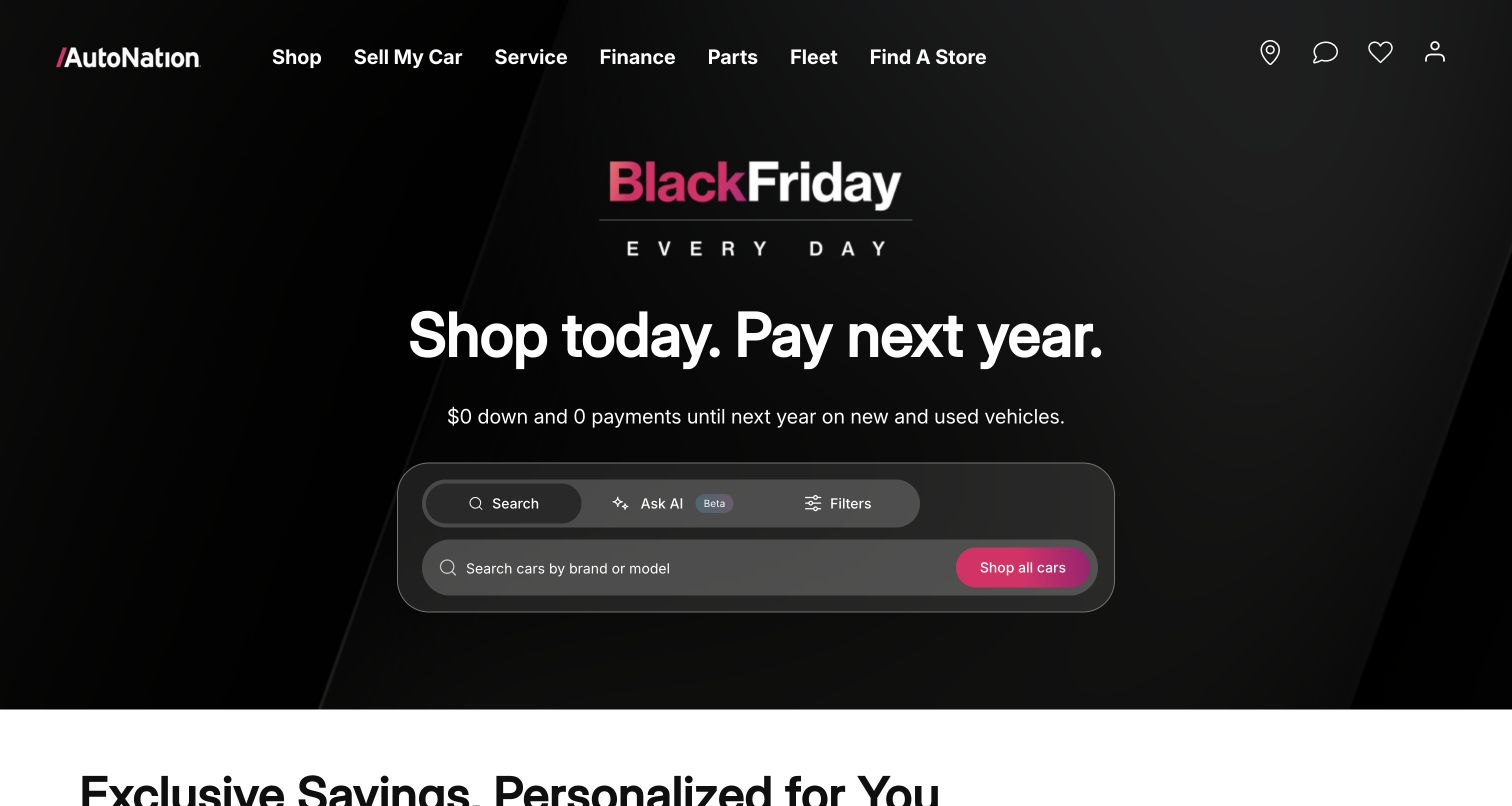
AutoNation's dark opening uses a seasonal promotion above a compact search module. The module offers conventional search, an AI-labeled beta option, and filters, with a clear all-cars action. The header separately exposes selling, service, finance, parts, fleet, and store discovery. The saved view establishes those interface choices, without demonstrating the assistant’s capabilities or validating the promotion’s financial terms. The useful design question is how multiple discovery methods remain understandable within one small area.
What you can learn
Keep a reliable conventional search route beside experimental assistance. Explain what each mode accepts and show how its output maps to actual inventory, while placing the relevant offer details near any promotional claim.
Pros
The search modes are visibly grouped, making them recognizable alternatives within the same inventory task.
The header provides practical nonshopping routes for service, parts, and store discovery despite the campaign’s strong emphasis.
Cons & considerations
An AI label alone does not explain accuracy, data use, or whether suggestions reflect current vehicle availability.
A payment-related campaign needs readable conditions and clear destination context rather than relying on a large headline alone.
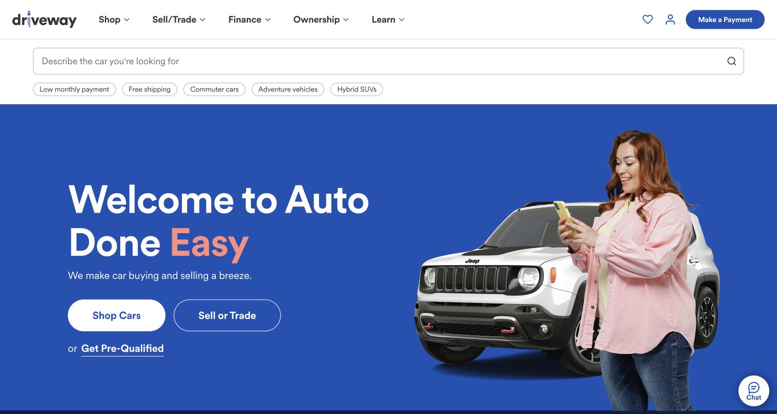
Driveway places a broad descriptive search field and suggested shopping themes above a blue hero. The hero separates shopping from selling or trading, with a smaller prequalification route underneath. Ownership and learning remain in the navigation, while a payment shortcut serves returning customers. The image of a person using a phone reinforces the online-service positioning. The structure gives different customer tasks distinct entrances before asking for detailed information.
What you can learn
Separate discovery, selling, ownership, and financing-related steps in both navigation and confirmation language. Explain when a visitor is merely browsing, requesting an estimate, or entering an application, and preserve the selected vehicle across those handoffs.
Pros
The two prominent hero actions clearly distinguish finding a car from selling or trading an existing one.
The payment shortcut acknowledges returning customers without making them navigate through the acquisition campaign.
Cons & considerations
Suggested categories such as low monthly payment need transparent assumptions and should not conceal the vehicle’s total-price context.
A descriptive search field needs useful no-result and ambiguous-query states so broad requests lead to understandable inventory choices.
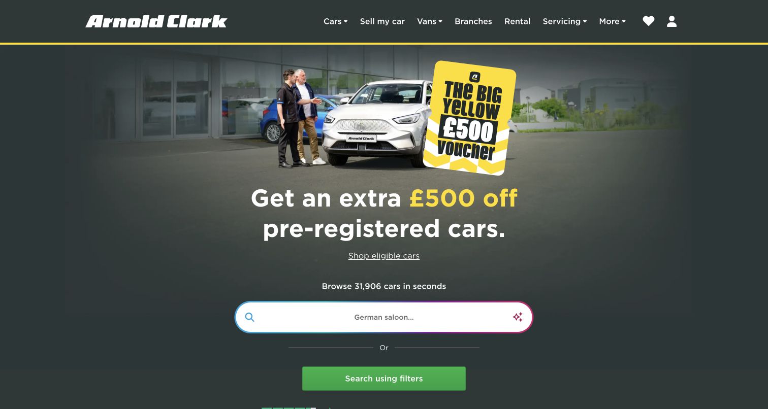
Arnold Clark uses a dark green opening with a yellow promotional graphic, a specific captured offer, and an eligible-cars link. Below, a large search field presents a natural-language example, followed by a separate button for searching with filters. The header keeps branches, rental, servicing, and selling available. The design makes a new discovery method prominent while preserving a familiar structured alternative for visitors who prefer explicit criteria.
What you can learn
Keep assisted search optional and explain the results in terms of actual filters or inventory attributes. Tie promotional eligibility to a clearly defined result set, and retain conventional browsing for visitors whose request is not understood.
Pros
The eligible-cars link gives the campaign a more specific destination than a generic shopping action.
A separate filter button provides a clear fallback for shoppers who do not want to use the large descriptive search field.
Cons & considerations
A dynamic example in a search field should not replace a persistent accessible label or clear instructions.
The captured discount is time-sensitive; campaign artwork and linked inventory need coordinated updates so eligibility does not become ambiguous.
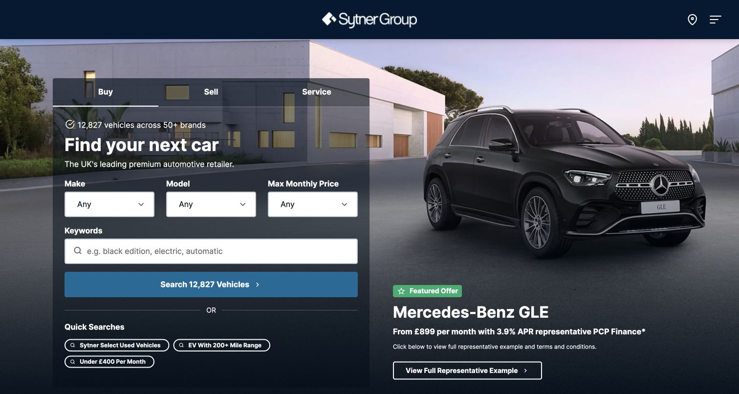
Sytner places a substantial dark search panel over the left side of a vehicle photograph. Buy, sell, and service tabs organize the panel, while the buying view includes make, model, monthly-price selection, keywords, and quick searches. A featured vehicle offer occupies the right side with a separate route to its representative example. The layout gives functional search and a premium campaign parallel roles without treating them as the same decision.
What you can learn
Use task tabs only when each exposes a complete, understandable journey. Keep payment-related filters explicit about their assumptions and preserve a route to total price, vehicle details, and the full offer explanation before a shopper proceeds.
Pros
The three task tabs separate buying, selling, and maintenance within one recognizable interface region.
The featured offer includes a clearly labeled destination for its detailed example rather than only a promotional action.
Cons & considerations
A large search panel over photography needs careful phone reflow so labels, quick searches, and results remain readable.
Monthly-price shortcuts can be misleading without clear context for the terms and assumptions that produce the displayed range.
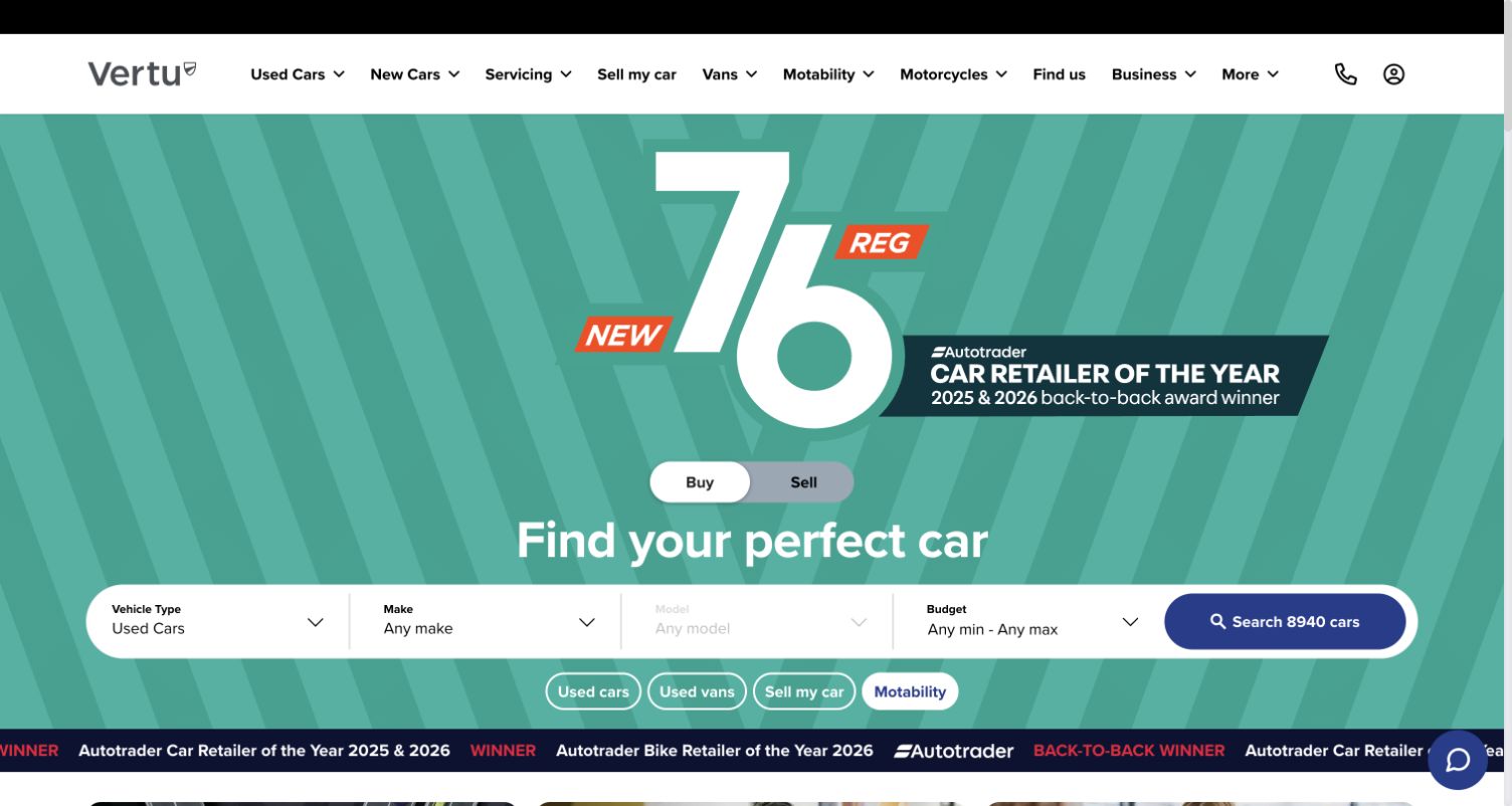
Vertu uses a turquoise campaign surface with a large registration graphic and an award statement. A buy-or-sell switch sits above the main search, which groups vehicle type, make, model, and budget. Quick links offer used cars, used vans, selling, and Motability, while the main navigation covers additional services and vehicle categories. The layout combines a strong campaign identity with a practical search area, although several layers compete for attention.
What you can learn
Keep the selected task and vehicle type unmistakable when a campaign occupies the same space. Explain category eligibility and budget meaning in the destination flow, and ensure promotional recognition has a maintained source beyond the artwork.
Pros
The buy-and-sell switch makes two major customer intentions visible before the visitor completes search fields.
The broad search bar gives common filters a consistent surface beneath the campaign rather than scattering them across the image.
Cons & considerations
A large registration graphic, award line, shortcuts, and moving recognition strip can overwhelm the actual shopping task.
Vehicle-type and budget controls need clear small-screen labels when the horizontal form is reorganized into a vertical sequence.
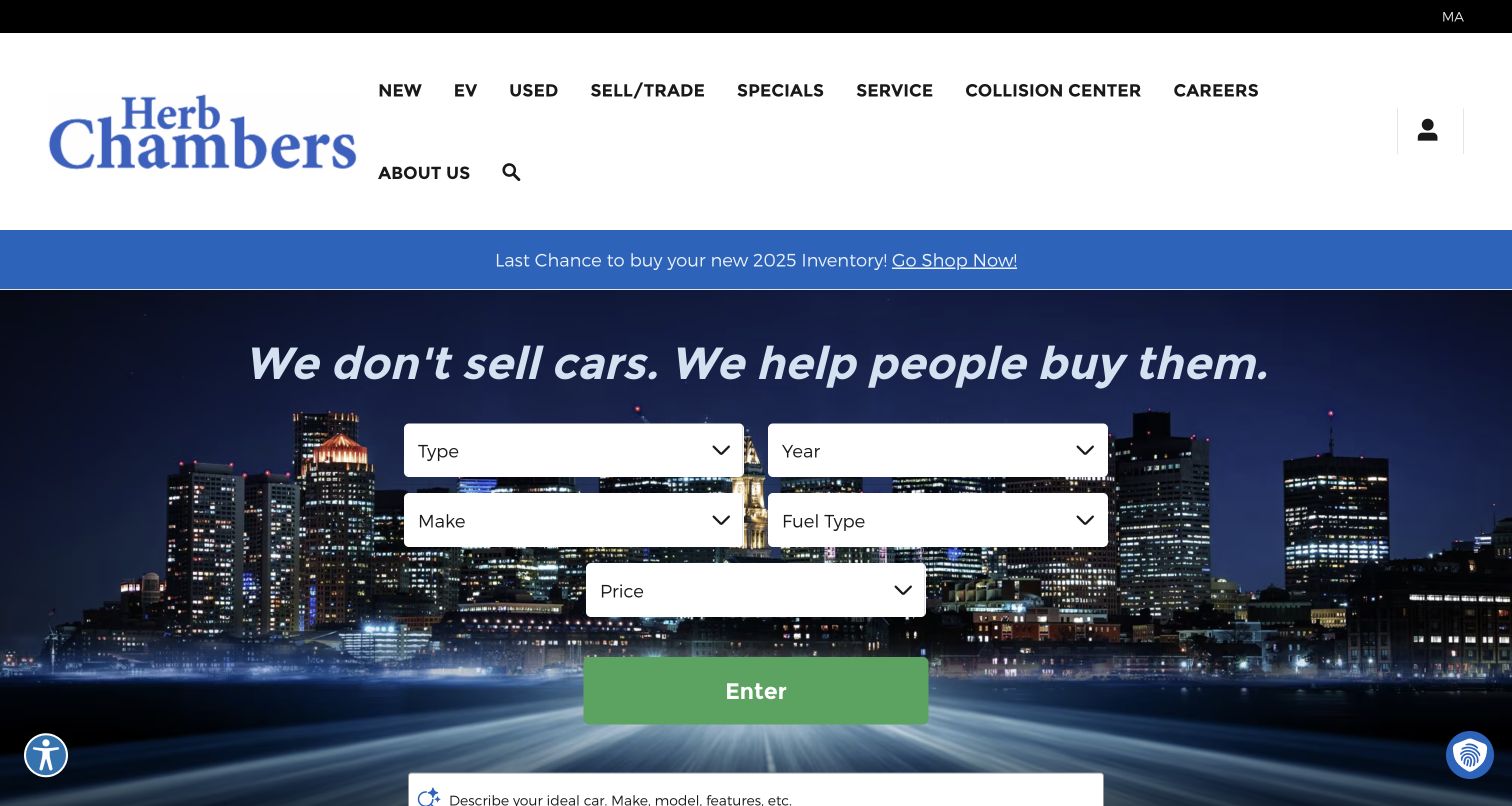
Herb Chambers places a substantial white header above a blue campaign strip and a nighttime skyline. A centered form offers type, year, make, fuel type, and price, ending in a large green action. The navigation distinguishes electric vehicles, service, collision, and selling alongside ordinary inventory. The skyline gives regional atmosphere, while the filter form provides a concrete starting task. The captured lower edge also begins a descriptive-search field.
What you can learn
Choose whether the first search should be structured or descriptive, then explain how the alternative relates to it. Keep the region and selected location visible on results, and use an action label that describes the outcome more clearly than a generic entry instruction.
Pros
The large white fields stand apart from the detailed skyline, giving the form a recognizable place in the opening.
Fuel type appears as an explicit filter alongside conventional vehicle attributes, supporting a practical comparison criterion.
Cons & considerations
The tall header and promotional strip consume space before shoppers reach the search controls on shorter screens.
A generic action label gives less feedback than a specific search instruction or current result count tied to the selected criteria.
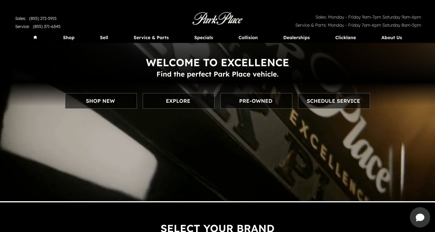
Park Place uses a black header with separate sales and service numbers and hours. A dark close-up automotive scene supports a short welcome message and four outlined actions for new vehicles, exploration, pre-owned stock, and service scheduling. The next section begins brand selection. The composition maintains a premium visual tone while keeping common customer tasks visible before a visitor chooses a manufacturer or dealership.
What you can learn
Let the premium visual treatment support practical information. Keep department contacts distinct, explain broad exploration links, and preserve a route to the relevant location as visitors move from brand selection to inventory or service.
Pros
Sales and service contact details are separated, helping visitors choose the appropriate department before making a call.
The service shortcut sits beside inventory actions, acknowledging that existing owners may arrive with a maintenance task.
Cons & considerations
The broad exploration action needs a descriptive destination so visitors can distinguish it from shopping new or pre-owned stock.
Fine outlined controls over dark moving imagery need careful contrast and focus testing across frames and responsive crops.
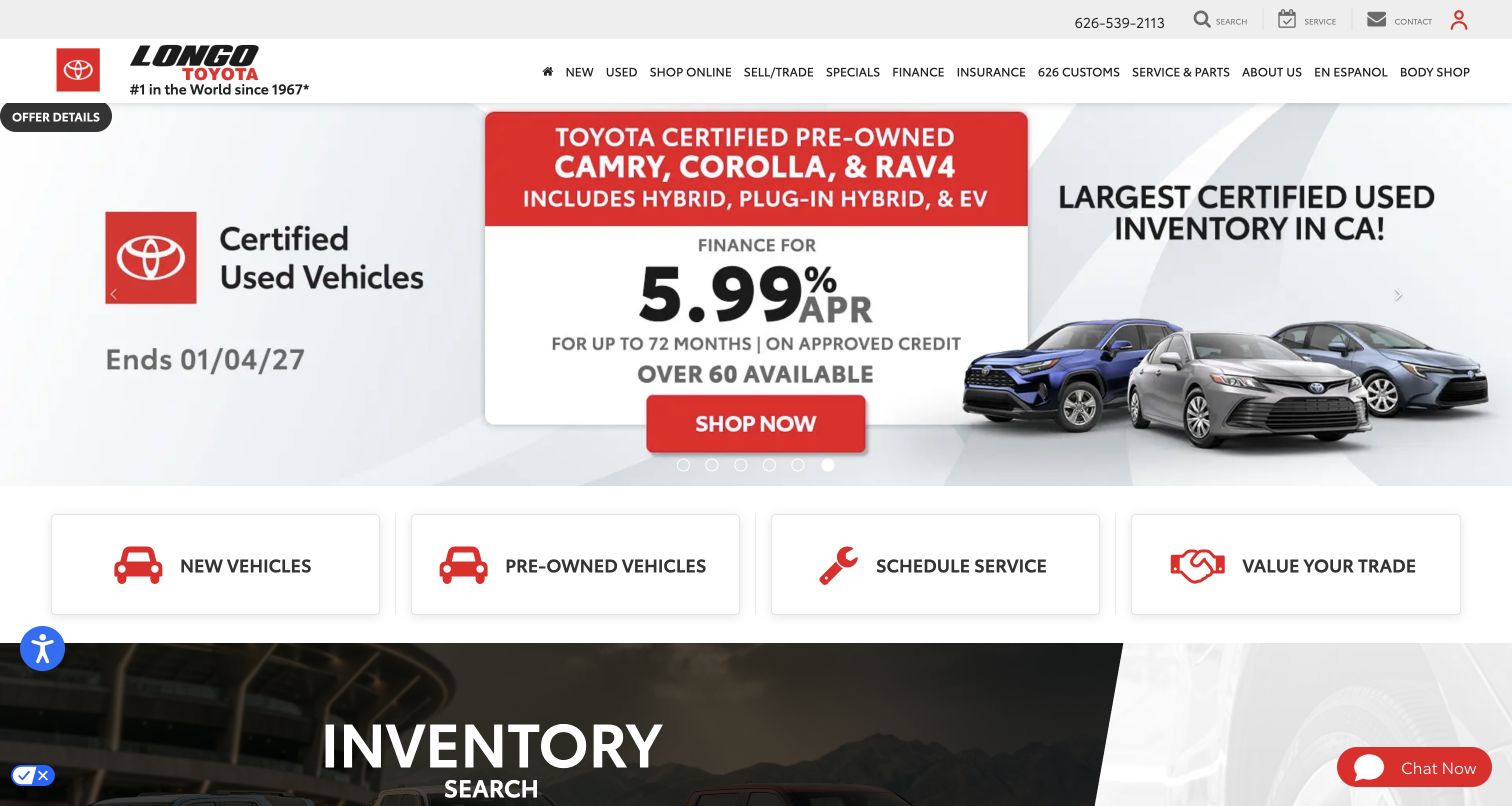
Longo Toyota presents a dense certified-used-vehicle campaign beneath a compact header. The captured slide includes named models, financing-related details, an end date, and a shopping action. Four large cards below separate new vehicles, pre-owned vehicles, service scheduling, and trade valuation. The design gives a promotion substantial room while preserving a stable set of everyday routes. This review examines presentation rather than verifying the offer, eligibility, inventory claim, or financing terms.
What you can learn
Keep campaign details connected to their full explanation and current eligible inventory. Preserve the four basic task routes when offers change, and test whether the smallest conditions remain readable on phones without relying on text baked into artwork.
Pros
The large task cards provide clear alternatives for visitors whose needs differ from the currently featured promotion.
An offer-details control gives the campaign a visible route to additional context beyond its large headline and action.
Cons & considerations
Dense financial and eligibility information in campaign artwork can become difficult to read when the image scales down.
Numerous header categories and floating utilities need a priority plan so they do not obscure search or service controls on mobile.
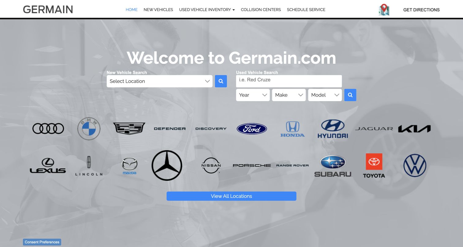
Germain divides the opening search into two columns: a location selector for new vehicles and keyword plus structured fields for used vehicles. A large set of manufacturer logos appears below, followed by an all-locations button. The background shows dealership activity under a pale overlay. This is a useful example of matching the search entrance to the inventory model rather than forcing every vehicle into one identical starting form.
What you can learn
Explain why new and used inventory begin differently and preserve location context after the first choice. Keep manufacturer logos accompanied by accessible names, and ensure the all-locations route helps visitors recover when they do not know the appropriate brand or store.
Pros
The separate new and used search areas make their different initial requirements visible before a visitor begins filtering.
The all-locations button offers a practical alternative to selecting a manufacturer from the broad logo field.
Cons & considerations
White text over a pale photographic overlay needs careful contrast review, particularly for smaller search labels.
A large logo grid may require a text-based or grouped alternative on phones so brand discovery does not become excessive scrolling.
Plan the dealership website around real customer tasks
Map the inventory lifecycle
Identify the authoritative inventory source and the staff responsible for corrections. Define how new arrivals, reserved vehicles, sold vehicles, price changes, missing photographs, and unavailable feeds appear online. Test those states before launch. A polished search experience depends on the consistency and freshness of its records, not just the number of filters.
Design a small useful filter set
Start with the criteria customers use most often and expose advanced choices progressively. Keep labels attached to controls, show active selections, and provide a useful no-results state. W3C’s form-label guidance explains why control names should be programmatically associated with their inputs; a changing placeholder alone should not carry the search instructions.
Specify every handoff and receipt
Document what happens when someone requests a test drive, asks about a vehicle, starts a trade estimate, or books service. Identify the receiving team, required context, expected response, and authoritative confirmation. Preserve the selected vehicle and location across an external integration. After an uncertain submission, reconcile its status before asking the visitor to repeat it.
Give campaigns an expiration and an owner
Keep offer copy, dates, eligible inventory, conditions, and the destination page together in the editorial process. Provide meaningful text outside promotional artwork. If a carousel is used, implement clear keyboard controls and a way to pause motion, following W3C’s carousel guidance. Review all responsive crops and the smallest meaningful terms before publication.
The editing job behind the design
Choose tools around inventory accuracy and staff workflow
Begin with the systems that own inventory, customer inquiries, service appointments, and dealership information. Evaluate integrations using actual records and ordinary staff tasks: correcting a trim, removing sold stock, updating department hours, and finding a submitted inquiry. Require a clear data owner and visible failure behavior for each handoff. A visually attractive search should not conceal a stale feed or lose the vehicle a customer selected.
Let editors change campaigns and local content while protecting structured inventory facts and operational rules. Keep stock identifiers, location records, and image metadata consistent across the site. Add chat, valuation, analytics, or assisted search only when it serves a defined task and has an owner. Public-page technology observations can identify some frontend resources; they do not reveal a dealership’s complete CRM, inventory backend, or submission handling.
Our WordPress website examples offer a separate look at publishing approaches. A visible platform label is evidence for that named page, not a guarantee that the same system will suit your requirements.
Before the public launch
Car dealership website launch checklist
Check vehicle identifiers, specifications, photographs, price context, location, and status against the authoritative inventory source.
Test new, reserved, sold, incomplete, and unavailable-feed states.
Preserve selected filters, region, and vehicle details when visitors move between results, detail pages, and inquiries.
Separate buying, selling, service, parts, and collision tasks with literal labels.
Confirm department-specific contact details, opening hours, addresses, and map destinations.
Keep offers, conditions, eligibility, dates, and destination inventory consistent.
Test form labels, errors, keyboard navigation, text enlargement, and mobile control sizes.
Review notices, chat, sticky contact bars, and campaign overlays together on short screens.
Verify test-drive, inquiry, and service confirmation behavior using authorized test data and endpoints.
Assign ownership for inventory corrections, campaigns, integration failures, and staff follow-up.
These checks are a project checklist, not a performance, legal, security, or accessibility certification. Test real journeys with the people responsible for the website before making claims about the result.
Sources & editorial method
How this collection was selected and reviewed
The saved random target was twenty-five examples, selected before research. This guide reviews twenty-five distinct official dealership, dealer-group, or direct-retail properties using direct browser captures from November 4, 2026. Each screenshot was visually inspected and retains its exact source URL, actual timestamp, dimensions, and attribution. Some captured states include privacy notices or assistance widgets; reviews describe their visible effect. No real inquiries, reservations, credit applications, payments, or service bookings were submitted. Technical associations require separate public evidence and do not establish hidden business systems.
Each example links to its actual source page. Screenshots are direct browser captures with their own capture dates; moving imagery, announcements and live designs can change. The notes describe observable design choices and conditional tradeoffs, not measured traffic, conversion results, service quality, or accessibility conformance.
Technology labels use public page metadata, asset evidence, or explicitly cited platform documentation. Platform documentation is not a complete current deployment audit. A component reference may be legacy or unused; it is not a complete backend inventory. Unknown stacks are omitted. These sites are editorial examples, not our client portfolio.
Written, Edited and Curated are separate editorial records, not timestamps advanced by a rebuild. Website designs and imagery belong to their owners. See our editorial standards or suggest a correction.
Questions worth asking
Car Dealerships website design questions
Should a dealership homepage lead with search or a campaign?
Choose based on the primary visitor task. A broad dealer group often benefits from a clear inventory and location entrance. A local dealership can combine a campaign with practical contact, inventory, and service routes. Keep the essential task available even when the campaign changes or an image fails to load.
How should a group website handle inventory across many locations?
Make geography explicit and preserve it through the journey. Show the relevant dealership on results and vehicle details, explain distant-stock options where offered, and let the visitor change the selected region. A large group-wide count is less useful than a relevant list with accurate location and availability.
What should happen when a vehicle is sold?
Update the authoritative record and reflect that state promptly across search, detail, and inquiry entrances. Explain the change on a saved or shared vehicle page and offer relevant alternatives. Avoid leaving a visitor to discover during a later conversation that the displayed vehicle was already unavailable.
Does a dealership need an AI search assistant?
Only if it improves a demonstrated discovery problem and can be maintained against actual inventory. Preserve conventional search and filters, explain what the assistant can do, and show how suggestions relate to vehicle records. A visible AI label is not evidence of accurate stock, pricing, or suitability.
How should a site present financing-related promotions?
Keep the relevant explanation and assumptions close to the promotion, and provide a clear route to complete offer details. Make total-price and payment-related views distinguishable. The dealership’s responsible team should review the actual terms and applicable requirements; another site’s campaign is not a policy template.
Borrow a useful search or service pattern, then connect it to accurate inventory, clear local information, and a process your dealership team can reliably complete.