Jewelry photography creates interest. A useful store also answers what a piece is made from, how it fits, what it costs and when it can arrive.
A visitor buying an everyday necklace has different questions from someone commissioning an engagement ring or choosing a gift. Organize the store around these real tasks. Keep product type, material, size and service information available alongside campaigns, rather than requiring shoppers to understand a collection name before finding a suitable piece.
Use this collection to compare product photography, on-person scale, gifting routes and the relationship between online shopping and store assistance. The reviews examine visible design choices. They do not independently authenticate gemstones, appraise jewelry, verify sourcing claims or endorse the retailer’s workmanship.
Before the examples
What makes good jewelry store website design in 2026?
Show the piece at more than one useful scale
Pair a clear object photograph with an on-person view and explicit dimensions. Include the clasp, setting, back and fastening where they affect the choice. Photographs should make proportions easier to understand without implying that a styled model is a reliable sizing guide for every customer.
Make material and customization distinctions literal
Keep solid metal, plating, gemstone type, stone origin and finish in structured product information. Separate ready-to-ship pieces from made-to-order or engraved work. Explain which selected options change the price, lead time and return terms before the visitor reaches payment.
Treat gifting and assistance as real shopping paths
Offer gift options that can be filtered by price, recipient or occasion without hiding the standard catalog. Put gift packaging, delivery estimates, resizing, repairs and appointment details near the relevant decision. An appointment button should identify what service the visitor is booking and whether it is online or in a store.
The collection · 28 examples
28 jewelry store websites worth studying
Compare how each storefront connects close product detail, human-scale imagery, collections and practical purchase information. A luxury campaign and a small independent jeweler can share a useful hierarchy without sharing a production budget.
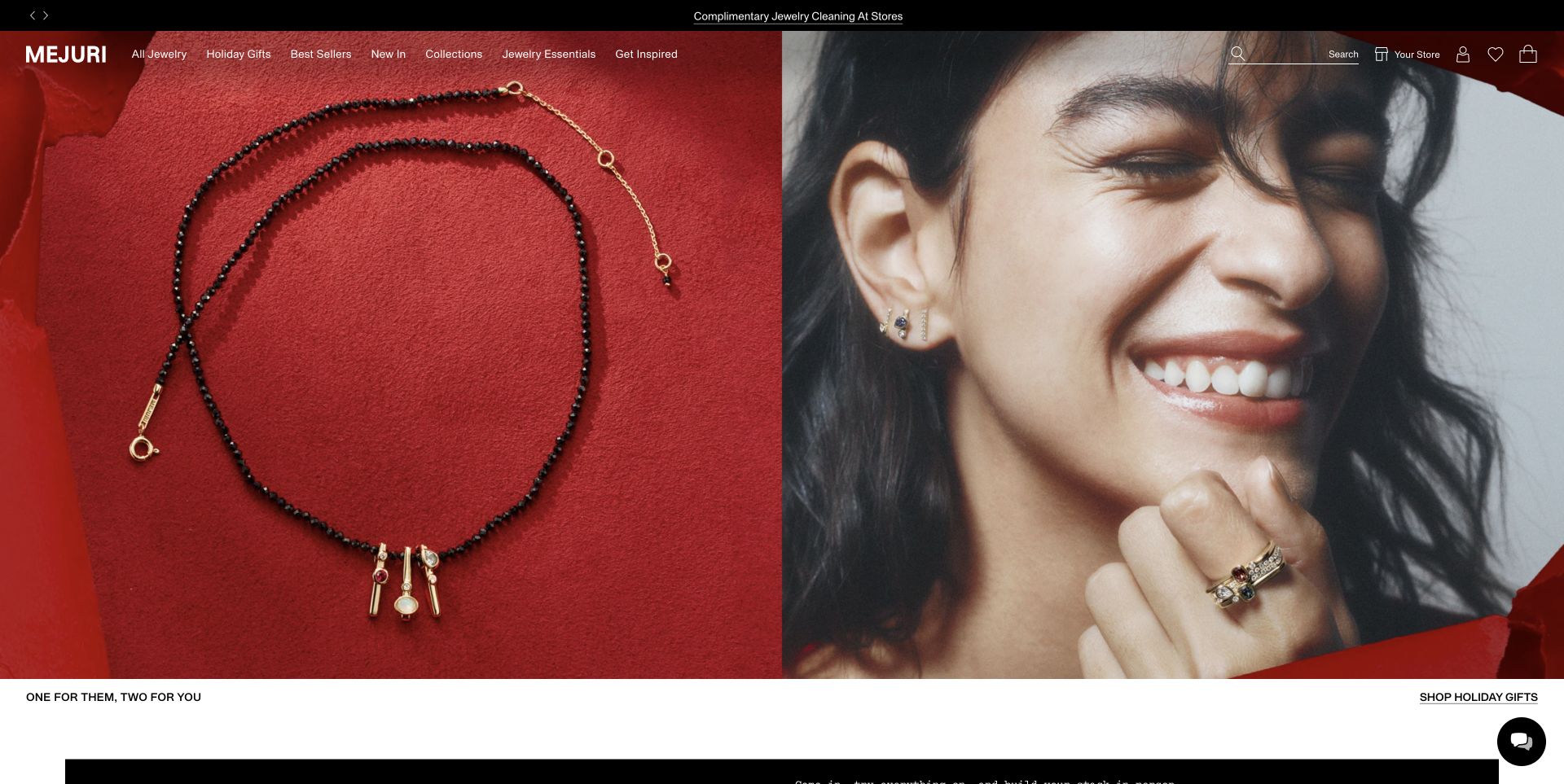
Mejuri pairs a necklace photographed against red fabric with a close portrait showing several pieces worn together. The two halves answer different visual questions: one exposes the object, while the other provides a sense of scale and styling. A narrow service message sits above the main navigation, and the holiday shopping link is placed on a separate white strip below the imagery. Search and store access remain in the header. The screenshot is the existing November 2 capture, so its seasonal campaign is a dated design reference rather than a promise about today’s assortment.
What you can learn
When selling small objects, combine an unobstructed product view with a human-scale photograph. Keep material, dimensions and purchasing details available through the product route; atmospheric styling alone cannot explain what the customer will receive.
Pros
The product and portrait photographs perform complementary roles instead of repeating the same view.
A distinct shopping strip gives the image-led introduction an explicit next step.
Cons & considerations
White navigation over changing imagery needs checking against every campaign crop.
A large campaign image delays direct comparison of prices, materials and individual product options.
Earlier cited evidence retained; no current scan result. References may be embedded or legacy—not a complete backend inventory.
Platform source: Official platform or first-party project source. Sanity association is scoped to Mejuri’s commerce website/app content and reusable presentation modules. The source is linked for its implementation description; no case-study performance figures are adopted as this review’s own findings. Platform evidence is separate from the direct website screenshot and is not a complete current infrastructure audit.
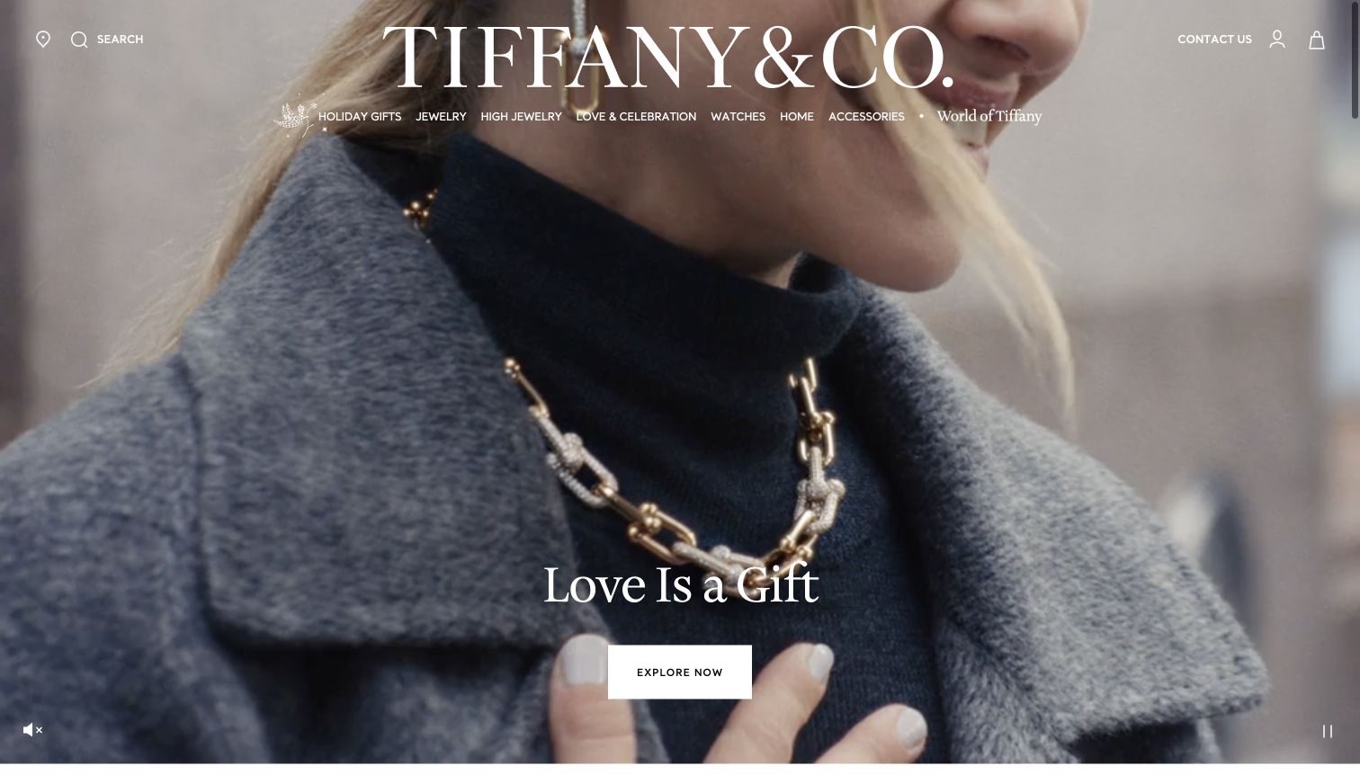
Tiffany's opening uses a full-width film beneath an oversized white wordmark. The captured frame shows a substantial chain necklace against a dark knit and gray coat, giving the jewelry scale and a familiar wearing context. The seasonal headline and a white exploration button sit low in the center. A compact navigation row separates jewelry, high jewelry, celebrations and watches, while contact and store controls remain at the edges. The design puts atmosphere first, but the close framing still allows the featured chain to remain a meaningful product subject.
What you can learn
Luxury storytelling is most useful when the jewelry remains visible within the scene. Preserve a clear route to categories and human assistance, and make motion controls easy to find for visitors who prefer to pause a campaign.
Pros
The necklace is large enough to communicate its scale and silhouette.
The white central button remains distinct from the textured clothing behind it.
Cons & considerations
The broad exploration label gives little information about its destination.
White navigation over changing film backgrounds needs careful contrast management.
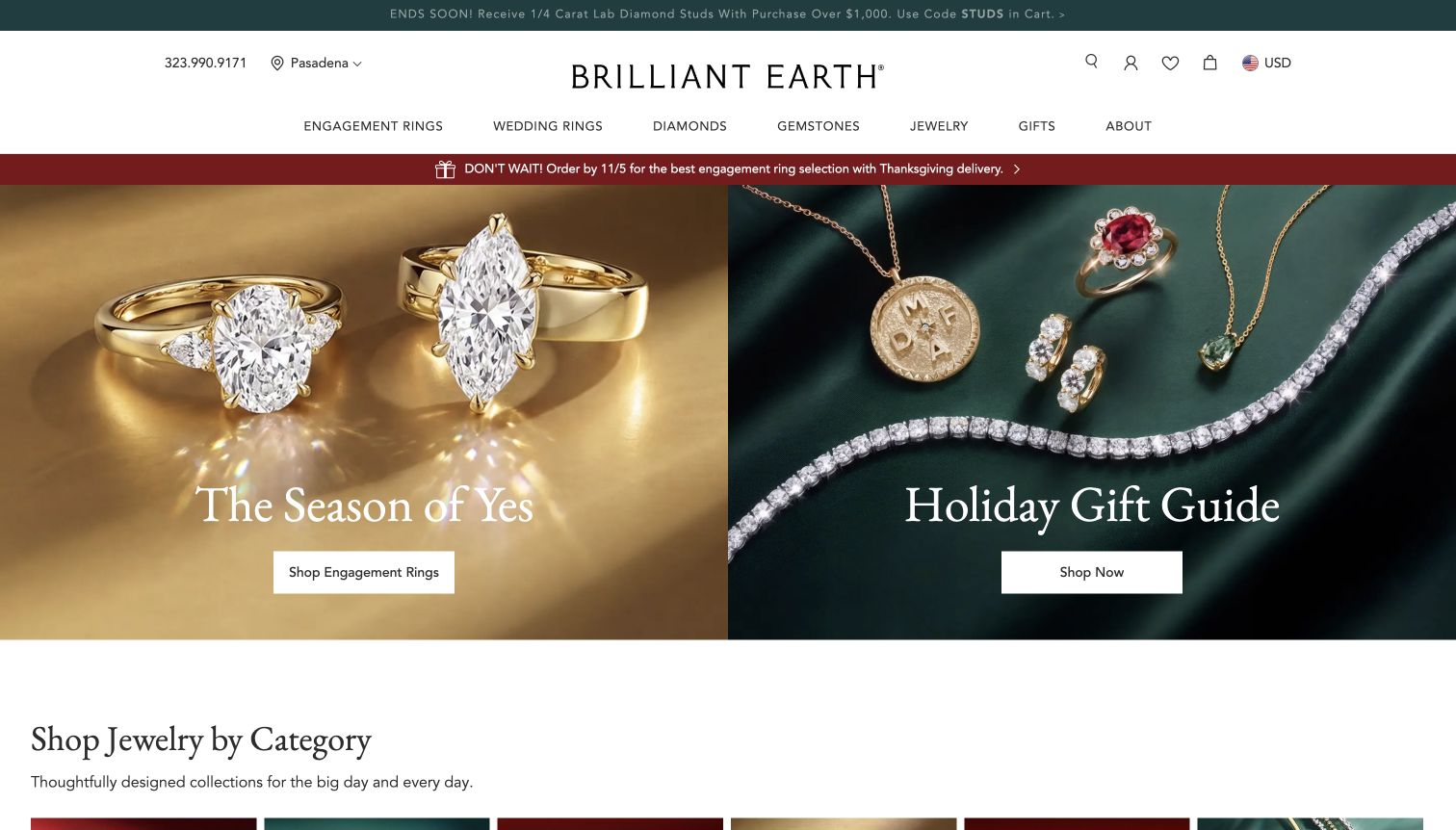
Brilliant Earth divides the main campaign into two equal photographic panels. Large engagement rings sit against a gold background on the left, while necklaces, earrings and a bracelet are arranged on dark green fabric on the right. Each panel has its own headline and white button. The header separately exposes engagement rings, wedding rings, diamonds and gemstones, and a delivery reminder sits immediately above the imagery. The arrangement makes the distinction between a considered ring purchase and broader gift browsing clear before a visitor needs to open a menu.
What you can learn
When customers arrive with fundamentally different intentions, give those intentions equally clear starting points. Use close product photography to explain the assortment, and place delivery or timing information near the campaign it affects.
Pros
The two-panel composition makes engagement and gifting choices easy to compare.
Visible product details communicate more than a purely atmospheric lifestyle scene.
Cons & considerations
Multiple promotional strips compete with the otherwise calm photography.
The gift panel's generic shopping label is less descriptive than the engagement-ring action.
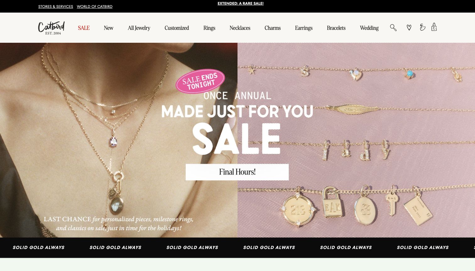
Catbird combines a close view of layered necklaces on a person with rows of delicate chains and charms on pink fabric. A large central sale message bridges the two halves, with a bright sticker-like deadline and a white action bar. The cream navigation uses compact category labels, while black bands above and below frame the campaign. The two image treatments are complementary: one communicates how several pieces look together, and the other makes small pendants and personalized forms easier to distinguish. The presentation keeps the store's playful character even during a strong promotion.
What you can learn
Pair wearing context with a more orderly product arrangement when small jewelry details matter. A sale can retain the brand's personality, but the offer should not overwhelm the pieces or obscure the distinctions between customization options.
Pros
The paired photographs explain both layering and individual charm shapes.
Customized jewelry has a direct place in the primary navigation.
Cons & considerations
Several urgency statements compete in the same central area.
Large sale lettering covers some of the jewelry that would otherwise help comparison.
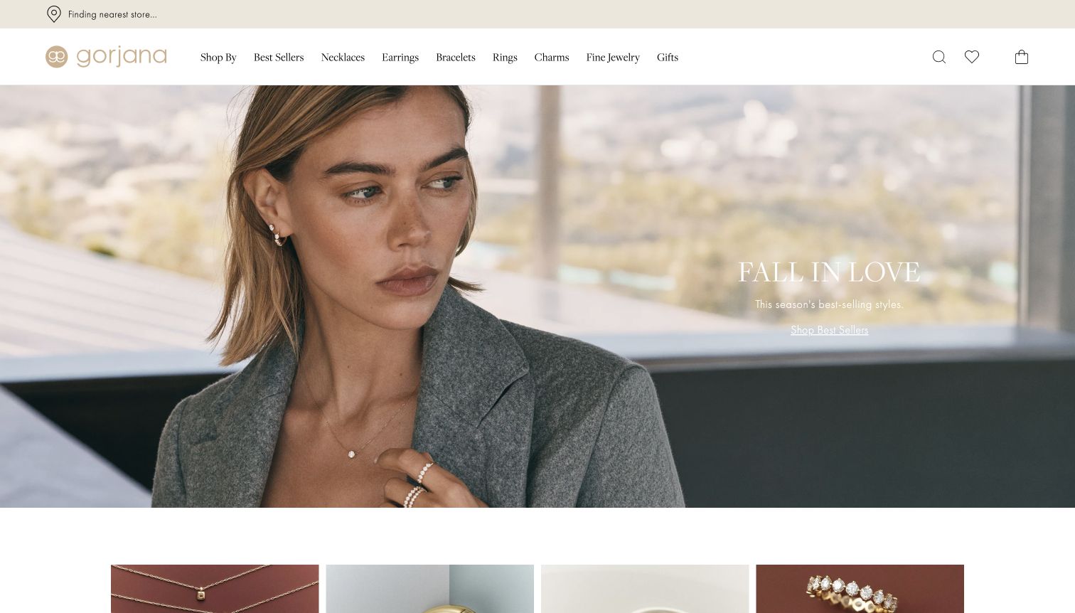
Gorjana uses a soft, daylight portrait with a gray jacket, small earrings and delicate necklaces. A short seasonal statement and underlined best-sellers link sit in the open right side of the image. The pale gold wordmark and white header keep the surrounding interface subdued. Necklaces, earrings, bracelets, rings and charms are directly available in the navigation, and the top of a photographic product row appears below the hero. The image sells an understated way of wearing the jewelry rather than a dramatic occasion, giving the opening a distinct everyday tone.
What you can learn
A quiet portrait can establish an accessible styling direction, but small jewelry requires supporting close-ups further down the page. Keep the category navigation concrete so visitors can move directly from inspiration to the type of piece they want.
Pros
The outfit and close portrait provide natural scale for delicate pieces.
The exposed product categories give shoppers straightforward alternatives to the campaign.
Cons & considerations
White campaign text has limited separation from the pale window background.
The small jewelry details are harder to inspect than the model and clothing.
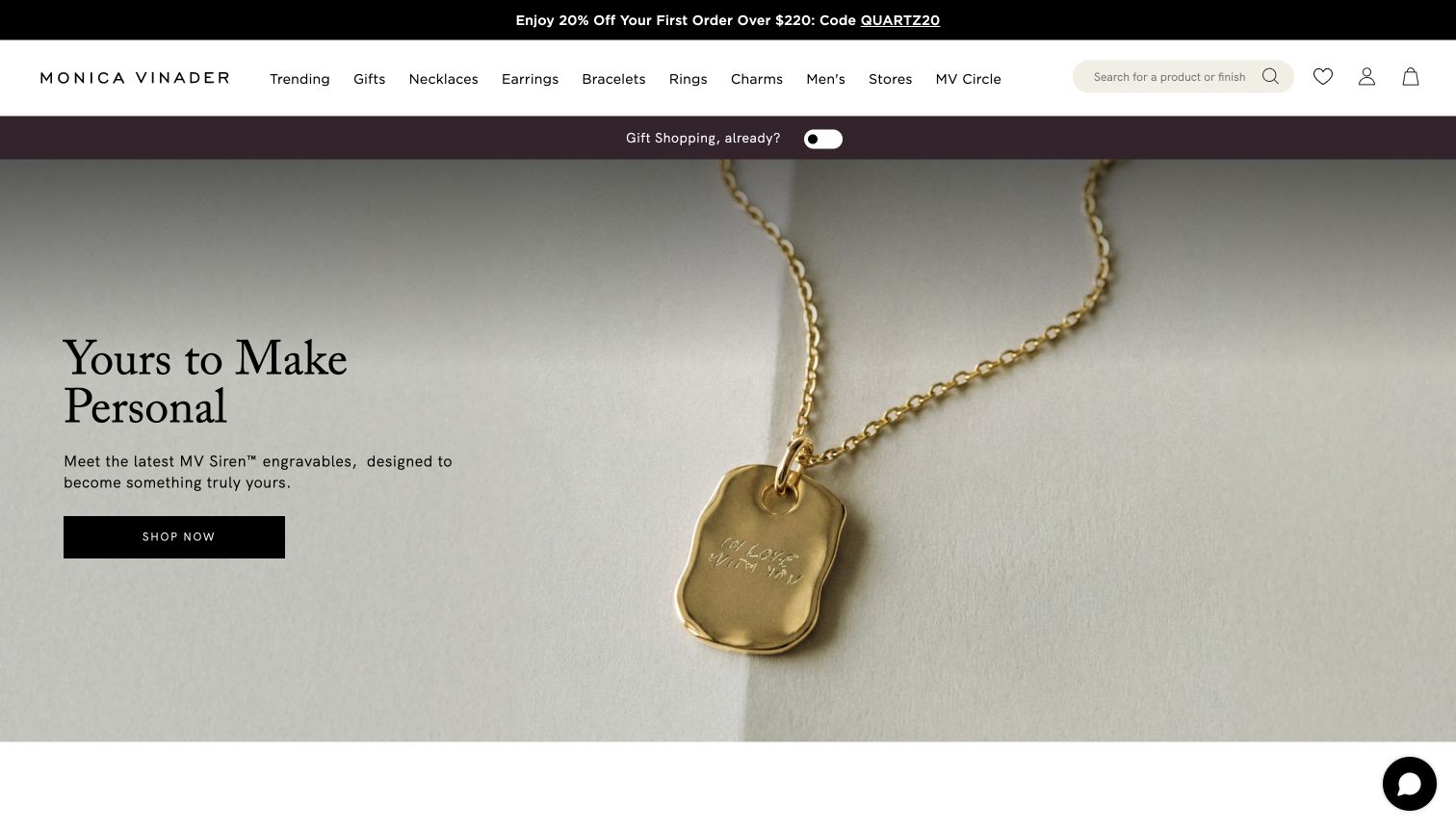
Monica Vinader presents a single gold pendant at large scale on a softly textured pale background. The irregular pendant outline and engraved message are visible beside a short personalization headline and a black shopping button. A gift-shopping toggle occupies its own colored band above the image, while a wide search field invites queries by product or finish. The direct jewelry categories remain in the white header. This opening connects the customization promise to a concrete example, avoiding the need for visitors to imagine what an engraved piece might look like.
What you can learn
Show the result of a personalization service clearly before introducing its options. Keep the example large enough to read, and make material, finish and gift-oriented shopping routes easy to reach from the same opening.
Pros
The enlarged pendant makes the engraving proposition tangible.
The search hint communicates that finish is a useful way to browse.
Cons & considerations
Several narrow header bands reduce the space available to the main product image.
The generic shopping button does not explain whether the next page begins customization.
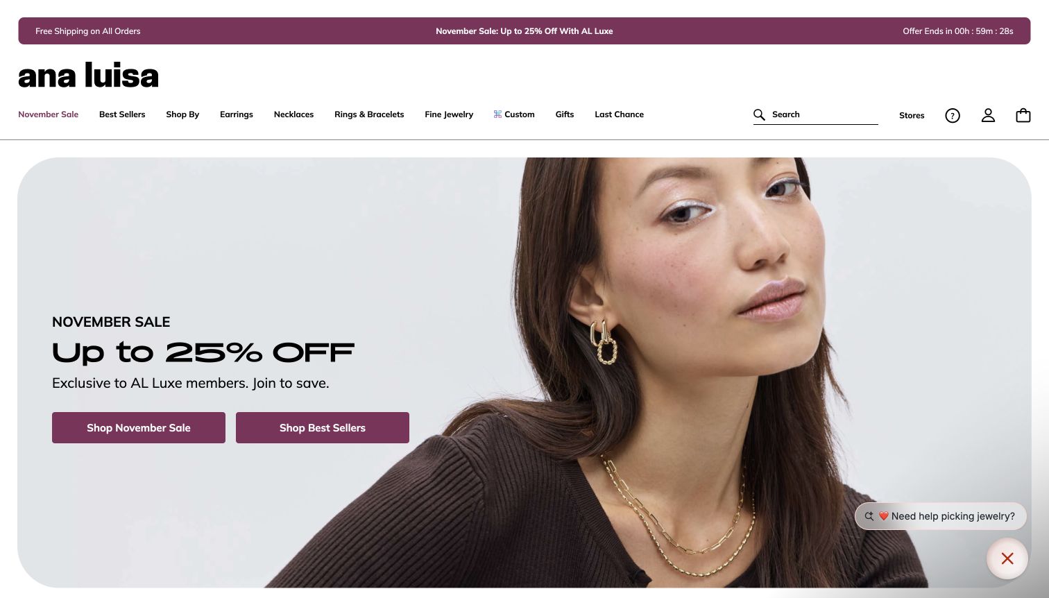
Ana Luisa places a pale portrait campaign inside a large rounded rectangle, with sale copy and two plum buttons on the left. The model's earrings and layered necklaces remain visible on the right. A matching plum announcement bar reinforces the promotion above a spacious black-and-white header. The main offer states that the discount is for the store's membership program, and the two actions distinguish sale browsing from best sellers. The strong rounded geometry and bold wordmark give the store a more casual visual character than many traditional jewelry boutiques.
What you can learn
Keep promotional eligibility beside the offer instead of leaving it for checkout. Distinct sale and best-seller routes can serve different shoppers, while consistent color and shape help the campaign feel integrated with the rest of the storefront.
Pros
The membership condition is visible in the main campaign copy.
The two shopping buttons separate promotion-led and popularity-led browsing.
Cons & considerations
The countdown and repeated sale message create substantial promotional pressure.
The lifestyle photograph does not provide close inspection of each necklace or earring.
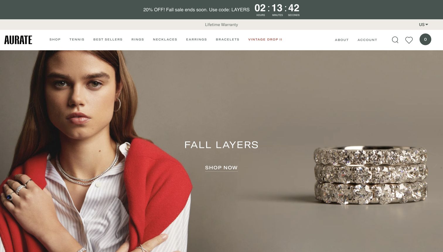
Aurate splits its opening between a portrait wearing several pieces and a close view of three diamond bands. A neutral taupe background links both halves, while the model's red garment provides the strongest color accent. The short layering headline and underlined shopping action occupy the center. Above, a sale countdown, warranty statement and compact navigation form three distinct bands. The enlarged rings are useful because they turn the general idea of layering into a visible arrangement, while the portrait supplies an example of jewelry worn with ordinary clothing.
What you can learn
Use a product detail and a wearing example together when the campaign is about combining pieces. Keep service reassurance visible, but prevent promotional bands from taking more visual priority than the jewelry and its shopping route.
Pros
The enlarged ring stack shows how multiple bands sit together.
The warranty message is easy to locate above the main navigation.
Cons & considerations
The countdown occupies more visual weight than the small shopping link.
The broad layering headline does not identify which pieces belong to the promoted selection.
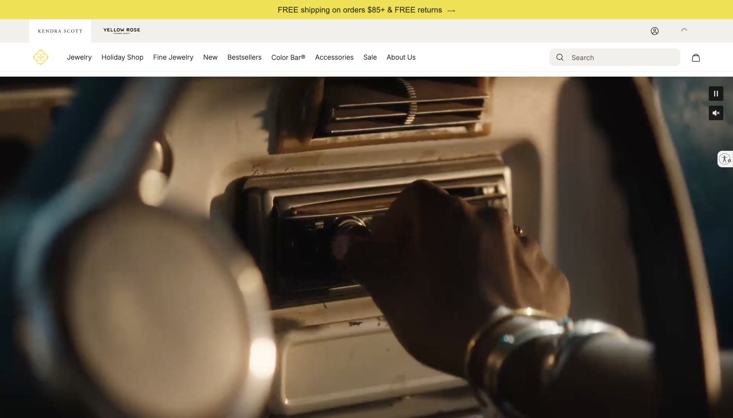
Kendra Scott separates its main brand and Yellow Rose into tabs above a practical category row. A yellow service strip gives shipping and returns a highly visible position, and an exposed search field sits beside the product navigation. The large film below shows jewelry within an everyday lifestyle scene; the captured frame centers on a hand and wrist near a car stereo. Pause and audio controls are visible at the right edge. The surrounding interface does much of the functional work while the campaign supplies mood and movement.
What you can learn
If the hero is a lifestyle film, the header needs to carry clear shopping and service information. Expose motion controls, and ensure key jewelry categories remain available without requiring the viewer to wait for a particular scene or message.
Pros
The brand tabs distinguish the related shopping identities before browsing begins.
Search and concrete categories remain available above the film.
Cons & considerations
A single film frame can reveal little about the jewelry assortment.
The opening campaign gives less immediate product guidance than a static product-led panel.
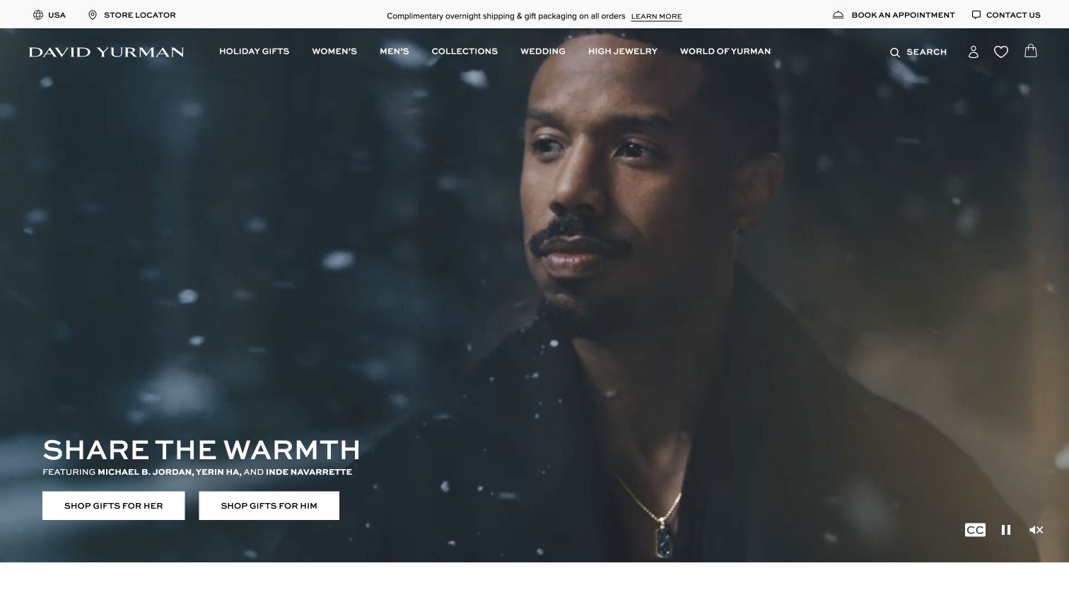
David Yurman uses a dark winter film with a close portrait and a visible necklace. White campaign text and two rectangular gift buttons sit at the lower left, directing visitors toward gifts for her or him. The top utility strip keeps stores, appointments and contact assistance visible, alongside delivery and packaging information. The primary navigation overlays the film below that strip. The opening connects a polished brand story to practical service routes, which matters when visitors may want to inspect or discuss an expensive piece before making a decision.
What you can learn
Make the bridge between online inspiration and personal assistance explicit. A cinematic opening can remain useful when audience-specific shopping buttons and appointment routes are visible, rather than leaving every visitor with one broad discovery action.
Pros
The two gift buttons turn the campaign into clear shopping paths.
Appointment and contact routes are prominent in the utility navigation.
Cons & considerations
The dark portrait does not reveal the necklace's finer construction details.
Overlay navigation must maintain readable contrast throughout the moving background.
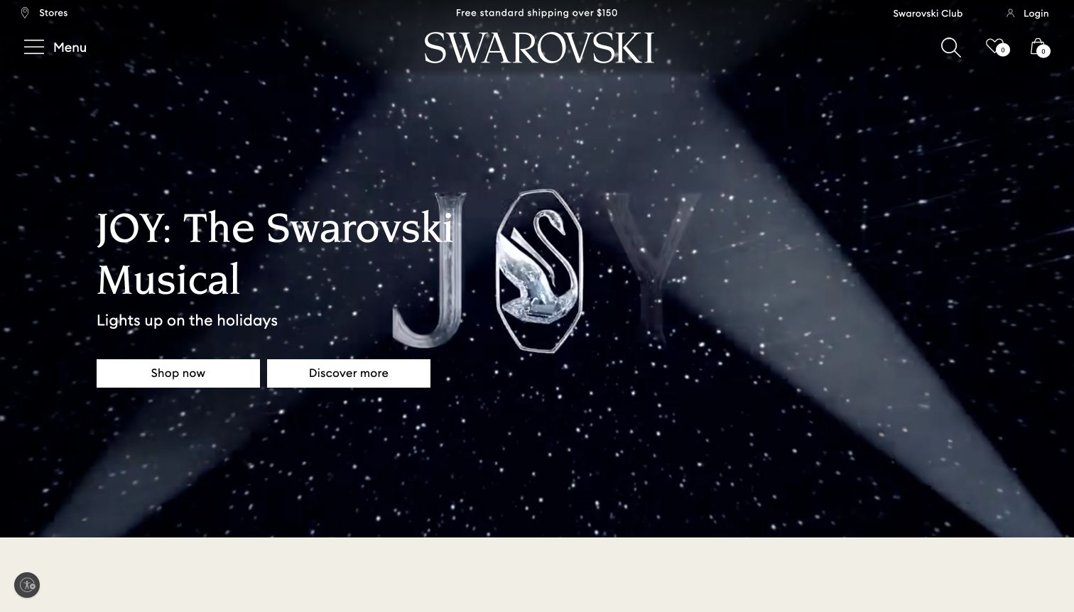
Swarovski opens with a dark theatrical scene, spotlights and a crystal-like campaign emblem. A large serif headline sits on the left above two white buttons, one for shopping and one for discovering the campaign. The centered wordmark and small utility icons overlay the scene, with the broader catalog behind a menu control. The composition treats sparkle and spectacle as the primary visual language. It also acknowledges two different visitor intentions: someone ready to browse products and someone interested in the seasonal story that frames them.
What you can learn
Separate an editorial campaign destination from the commercial collection when both are important. Theatrical imagery can establish a memorable mood, but visitors should still be able to reach product categories quickly without interpreting the whole story.
Pros
The two buttons distinguish shopping from campaign exploration.
The dark scene gives the white typography and controls strong visual separation.
Cons & considerations
The opening shows little detail about the actual jewelry assortment.
The collapsed menu adds a step for visitors who want a specific product category.
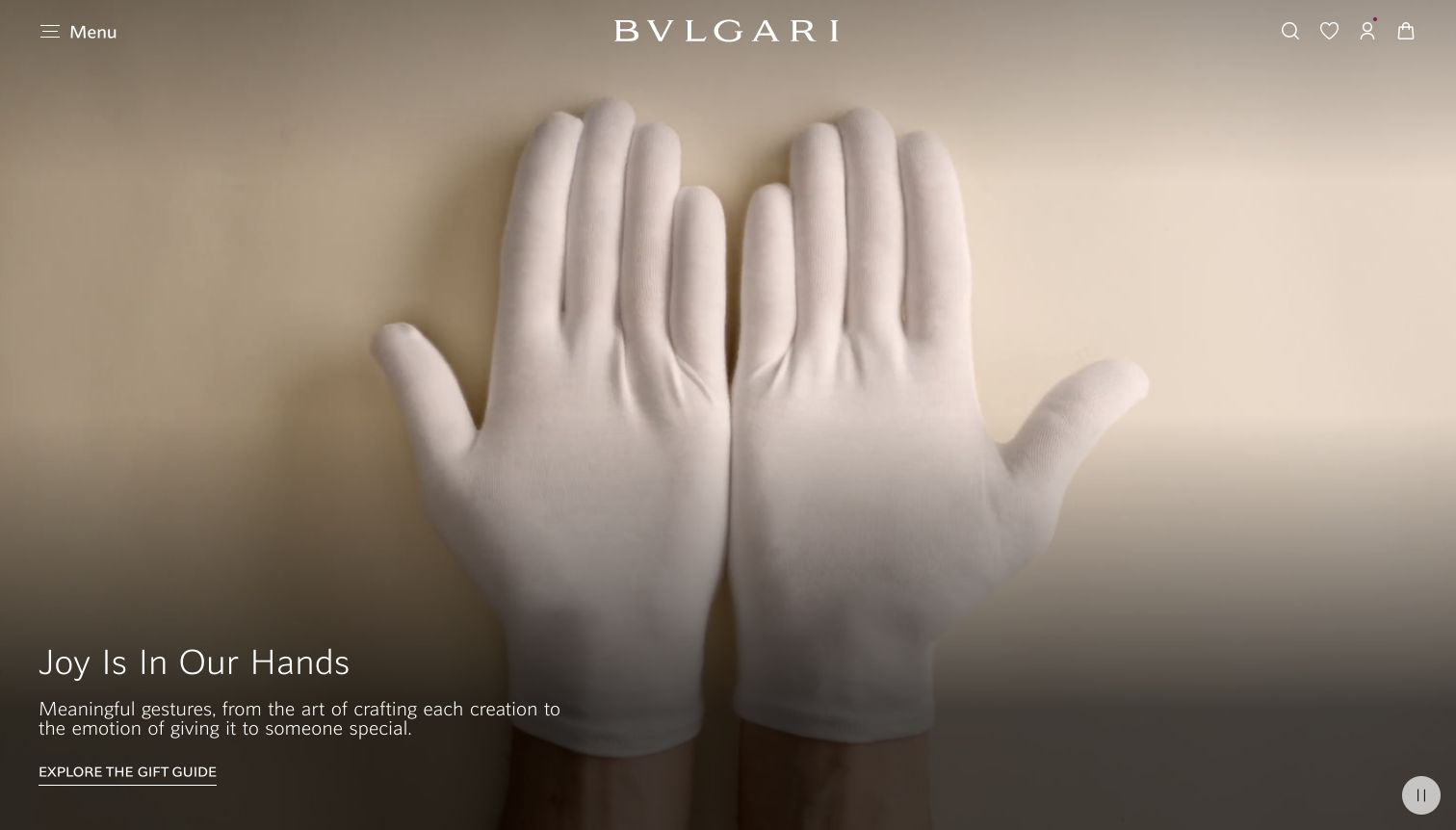
Bulgari's captured opening shows white-gloved hands against a warm pale surface. A short headline about giving and a brief explanation sit over a darker lower-left area, followed by an underlined gift-guide link. The logo, menu and utility icons are exceptionally restrained. The film's subject shifts attention toward handling and craftsmanship rather than presenting a conventional row of products. A circular pause control at the bottom right provides a visible way to stop the movement. The result is an atmospheric entrance whose function depends heavily on a small number of navigation targets.
What you can learn
A craft-focused film can communicate care, but it should connect quickly to concrete objects and services. Keep the campaign action descriptive and the motion control visible, particularly when a full-screen composition delays the product catalog.
Pros
The gift-guide link gives the atmospheric story a recognizable destination.
The visible pause control supports visitors who prefer a still page.
Cons & considerations
The captured opening does not show a specific piece of jewelry.
The very sparse navigation requires extra exploration to understand the assortment.
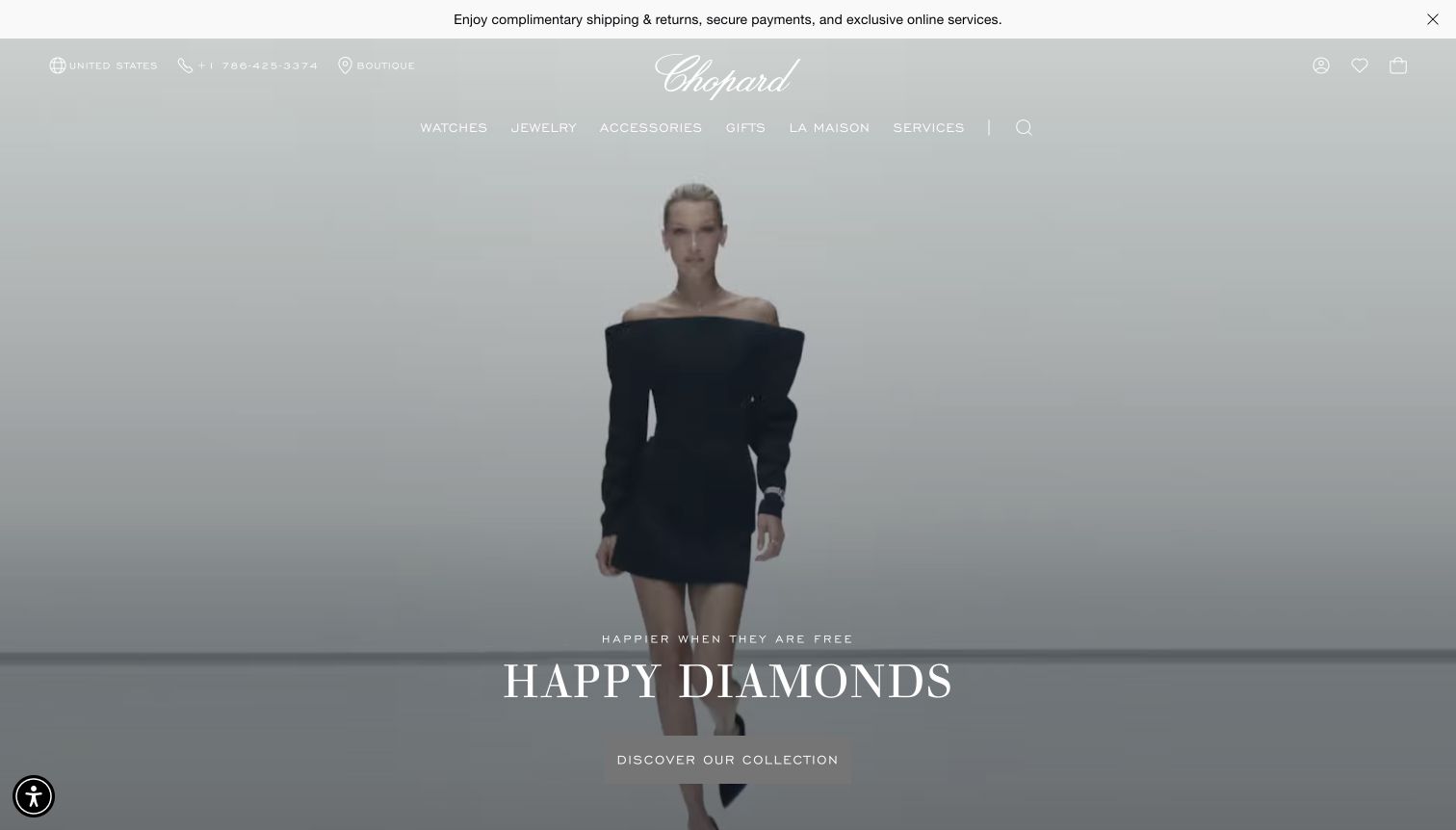
Chopard centers a model against a pale minimal background, with the collection name and discovery button aligned low in the frame. A handwritten-style wordmark and slim white navigation overlay the film. Watches, jewelry, accessories, gifts and services are exposed as separate destinations, while boutique and telephone access remain near the upper edge. The absence of a busy set gives the composition a calm editorial quality. However, the wide framing emphasizes the figure and clothing more strongly than the jewelry, making the named collection the main clue to the products being promoted.
What you can learn
A collection film benefits from a clear name and a stable discovery route. Pair wide editorial scenes with detailed product content nearby, and ensure light typography remains readable when the film's background is also pale.
Pros
The named collection provides a more specific destination than a generic seasonal message.
Product and service categories remain exposed above the film.
Cons & considerations
The wide framing makes individual jewelry details difficult to inspect.
Light navigation and text can lose contrast against the pale moving background.
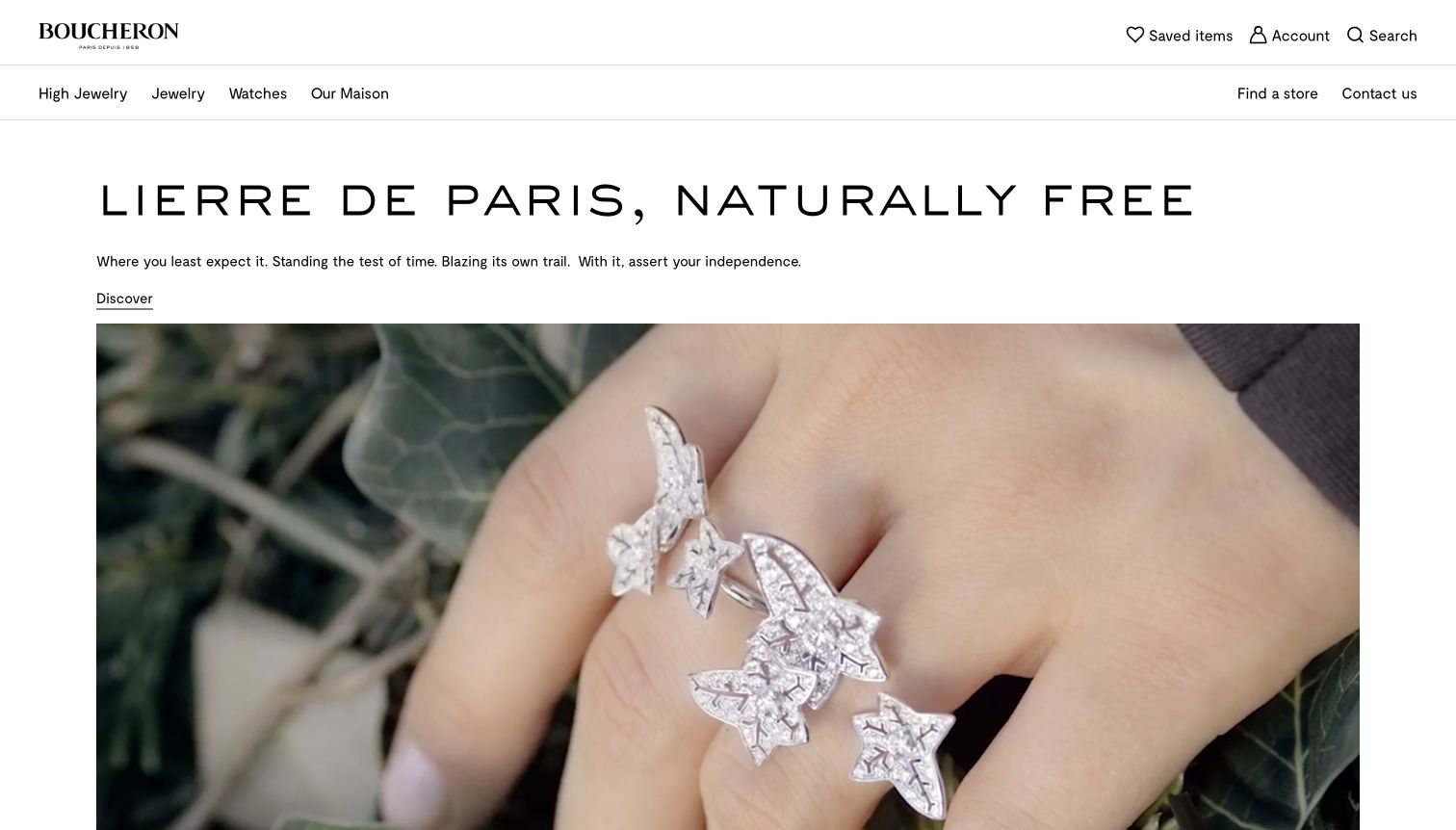
Boucheron places the collection headline, a brief statement and an underlined discovery link in a white text area before the large image. The captured film frame then shows a sculptural leaf-like ring across a hand, with greenery behind it. The two-row header distinguishes broad collections from saved items, account tools, store finding and contact. Unlike an all-over image hero, this arrangement keeps the introductory text independent of the moving photography. It also gives the unusual piece sufficient scale to show its silhouette and the way it crosses the fingers.
What you can learn
Separate explanatory text from moving imagery when readability is central to the collection story. Use close wearing views to show the scale of sculptural jewelry, and make store or contact routes available for pieces that may require consultation.
Pros
The white introduction remains readable regardless of the film frame.
The hand close-up communicates the ring's scale and unusual structure.
Cons & considerations
The large introductory area delays the product image within the first view.
The discovery link offers no immediate indication of price or purchasing availability.
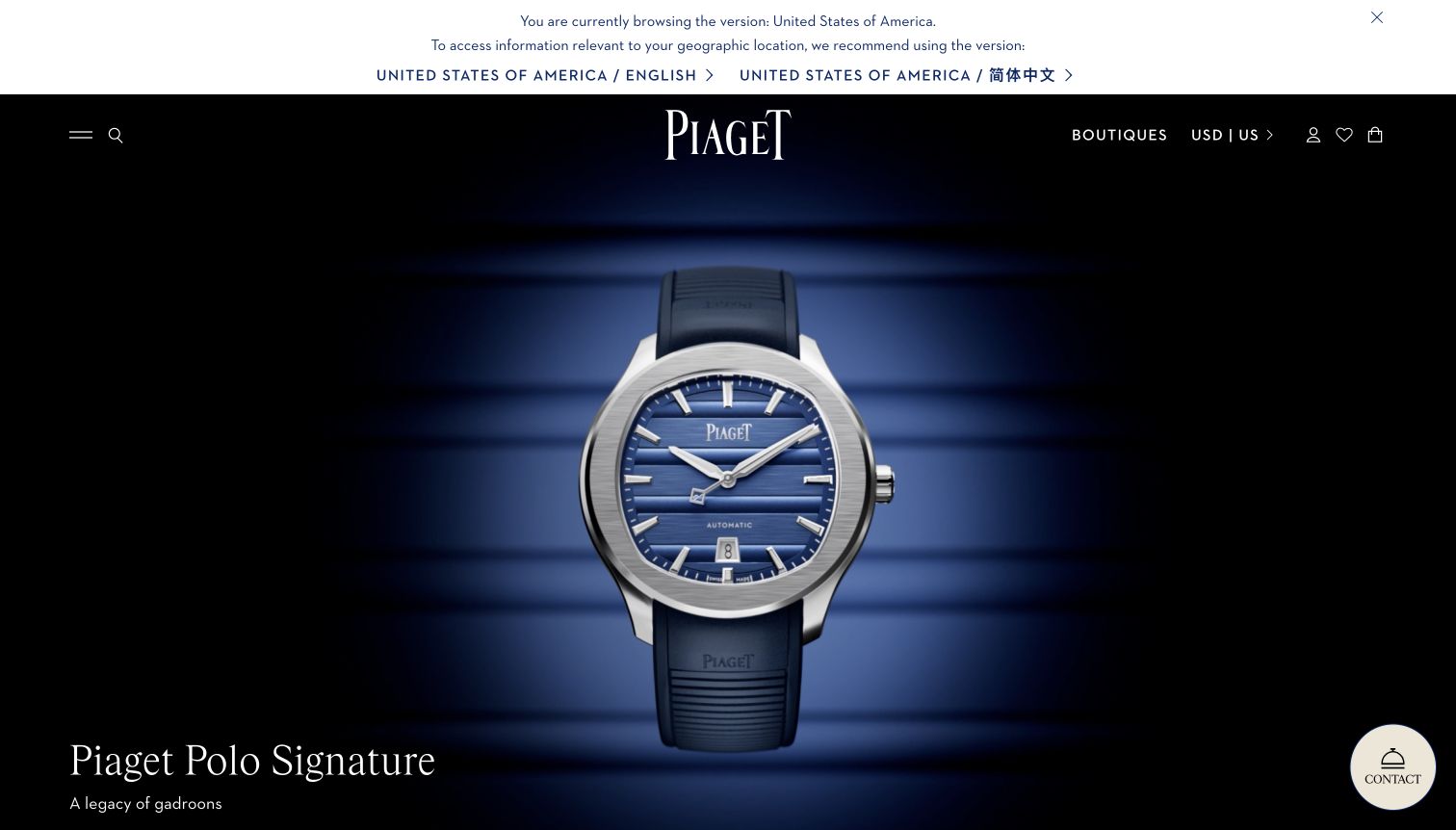
Piaget's opening centers a blue-dial watch against a dark blue background with horizontal bands that echo the dial. The collection title sits low on the left, while the centered logo, boutique route and utility controls remain at the top. A circular contact control occupies the lower-right corner. This is a watch-led opening within a house that also sells jewelry, so its value for a jewelry-store design study is the disciplined presentation of one detailed object and the visible route to personal help. The image gives the dial and case generous scale.
What you can learn
Use a controlled backdrop to make one intricate object legible, and repeat a subtle product motif in the composition only when it reinforces the object. A mixed watch-and-jewelry catalog should still provide easy access to its other product families.
Pros
The large centered object makes the dial and case easy to examine.
Boutique and contact routes support a considered luxury purchase.
Cons & considerations
The watch-led opening does not immediately demonstrate the jewelry assortment.
The collapsed menu requires another action to discover the broader product taxonomy.
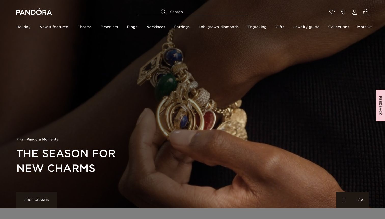
Pandora's dark seasonal film shows a bracelet being handled at close range, with several colored and metallic charms visible together. The lower-left headline names the charm collection, and the nearby action leads directly to charms. Across the top, the navigation exposes bracelets, rings, necklaces, earrings, engraving and a jewelry guide rather than hiding all choices behind one menu. A wide search line sits above those categories. The composition is useful for a product family whose appeal depends on how individual pieces combine on a bracelet, while the surrounding navigation supports shoppers looking for something else.
What you can learn
Show collectible pieces together when their relationship is part of the buying decision. Keep a direct collection action beside that image, and give shoppers visible educational or customization routes for choices that may require more explanation.
Pros
The close wearing view makes the combined effect of several charms understandable.
Engraving and jewelry guidance are discoverable in the primary navigation.
Cons & considerations
The dark film reduces the clarity of some smaller charm details.
The long navigation row creates substantial information density above the campaign.
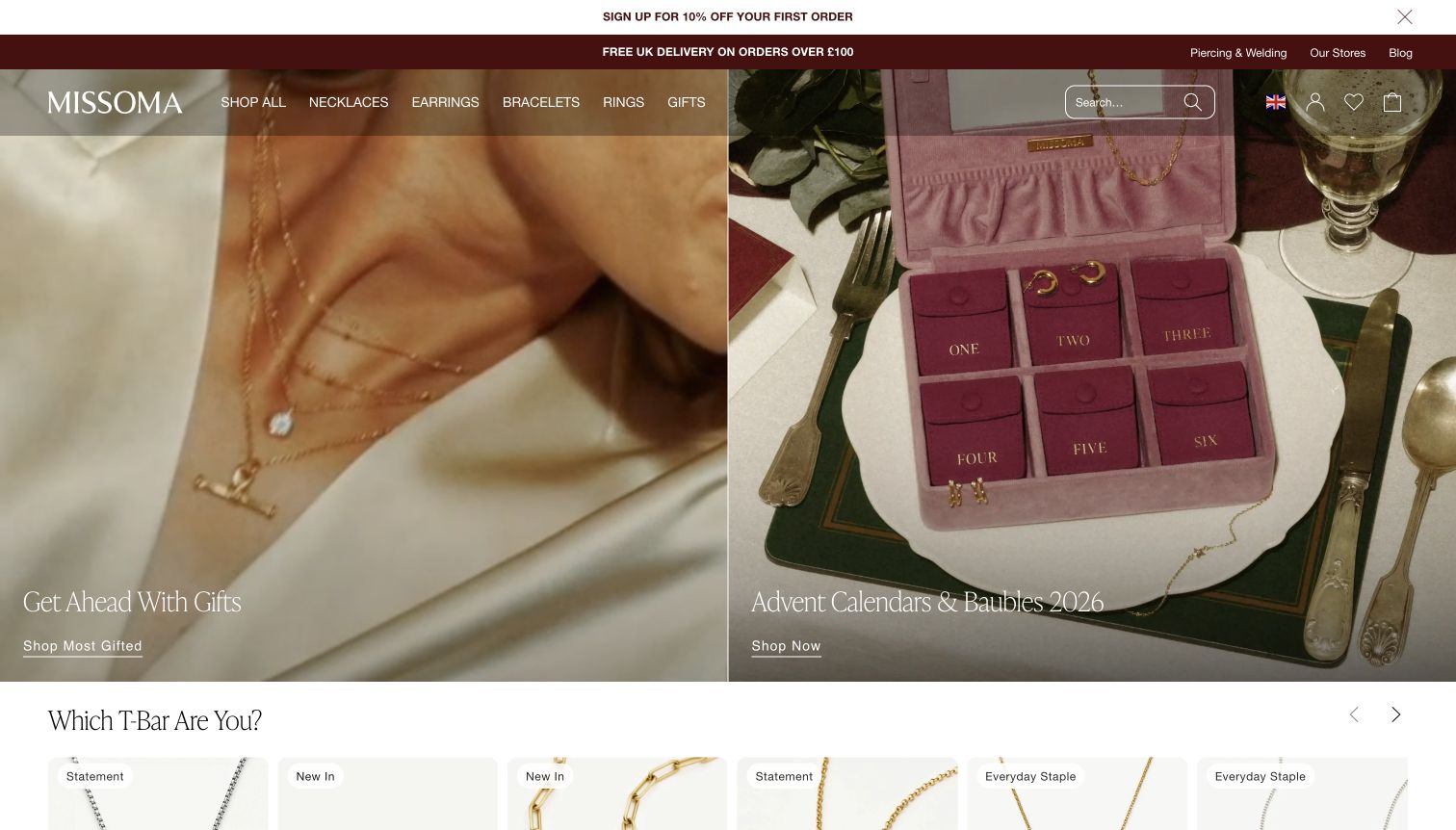
Missoma's UK storefront divides the opening between layered necklaces worn against a pale shirt and a pink presentation case arranged on a dining table. Each half has its own lower-left label and underlined shopping link. The next section begins with a question about T-bar styles and a row of products, creating a transition from seasonal inspiration to a specific design family. The transparent navigation and burgundy service band connect visually to the warm campaign palette. This regional view also keeps its UK delivery context explicit in the header rather than leaving visitors to discover it later.
What you can learn
Use separate panels when packaged gifts and individual pieces represent different shopping paths. Follow the broad campaign with a more concrete product comparison, and keep the storefront's regional shipping context visible so expectations remain clear.
Pros
The paired images distinguish a wearable jewelry selection from a packaged gift format.
The following T-bar section gives the seasonal opening a practical product continuation.
Cons & considerations
White links over photography need careful contrast across every crop.
Multiple announcement bands reduce the space available to the initial product story.
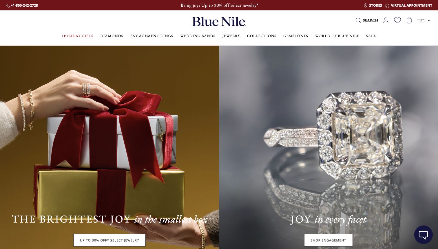
Blue Nile gives half of the opening to hands holding wrapped gifts and half to an enlarged engagement ring reflected on a cool surface. The warm red-and-gold gift scene contrasts clearly with the silver-toned ring image. Each panel has its own caption and white shopping action near the bottom. The centered wordmark sits above a detailed category row, while telephone help, stores and virtual appointments occupy the top utility strip. The ring photograph offers substantial visual detail, and the gift photograph shows jewelry worn on hands and wrists rather than using packaging alone.
What you can learn
Different shopping intentions can share one opening when photography and actions make the split explicit. Support high-consideration purchases with visible human-help routes, and keep each panel's text readable without covering the product's defining details.
Pros
The contrasting panels clearly separate general gifts from engagement shopping.
Telephone and virtual appointment routes are visible before product selection.
Cons & considerations
The panel actions sit close to the bottom of the initial viewport.
The gift-side promotion may distract from shoppers seeking neutral product guidance.
Visible tech stack
Referenced on the public page
Google Fonts
OneTrust
Public source checked November 3, 2026. References may be embedded or legacy—not a complete backend inventory.
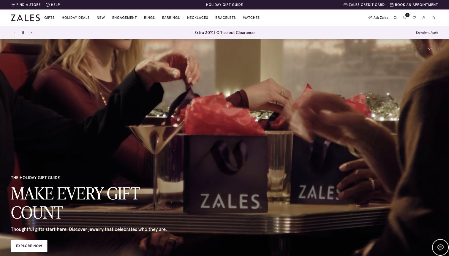
Zales opens with a film of people exchanging branded gift bags around a table. The lower-left headline, supporting sentence and white exploration button remain over a dark portion of the scene. The header provides direct categories for engagement, rings, earrings, necklaces, bracelets and watches, while store finding, help and appointments occupy a separate utility strip. A pale promotion band divides those controls from the campaign. The design uses the social act of giving to establish the season, leaving the navigation to communicate the actual breadth of the jewelry assortment.
What you can learn
A gift-exchange story can make a broad retailer feel approachable, but it needs nearby product categories and service routes. Keep the main action readable throughout the film and ensure customers can bypass the campaign when they already know the kind of jewelry they need.
Pros
The dark lower-left area supports a readable campaign message and button.
Store finding and appointment booking are exposed alongside the online categories.
Cons & considerations
The opening film emphasizes bags and people more than detailed jewelry views.
The extra promotion strip adds another competing message before the main campaign.
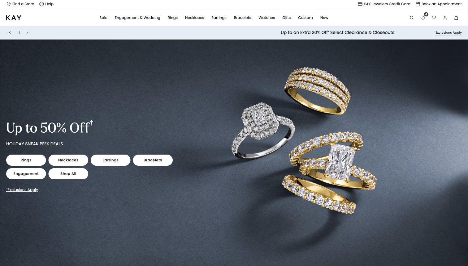
Kay combines a dark blue product photograph with a large promotional headline on the left. Several rings float at different angles on the right, making metal color, stone shape and band width visible. Beneath the offer, six white pill-shaped buttons expose rings, necklaces, earrings, bracelets, engagement and the full selection. The top navigation includes both standard jewelry categories and custom work, with store and appointment tools in a separate utility row. The campaign therefore acts as a small shopping directory rather than sending every visitor through the same sale landing page.
What you can learn
A broad promotion becomes easier to use when its categories are available directly inside the campaign. Keep qualification links close to the offer, and show enough product variety to help visitors understand what the selection may contain.
Pros
The category buttons offer several direct paths from the promotion.
Large ring photography provides useful differences in silhouette and metal tone.
Cons & considerations
The sale message dominates the opening before any product-selection guidance.
The repeated category choices in header and hero can feel visually redundant.
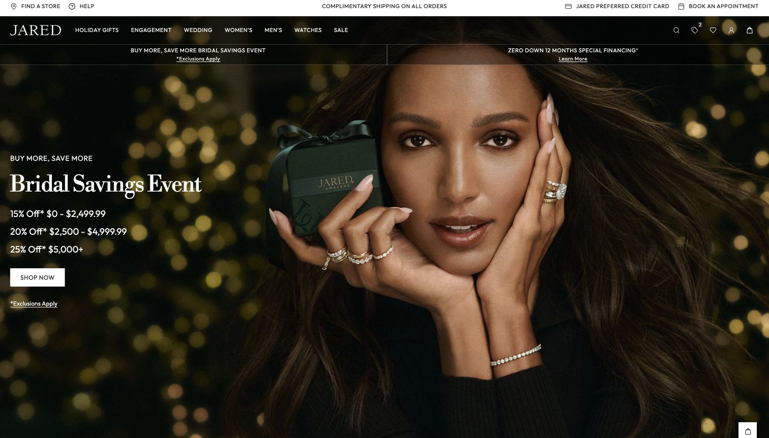
Jared uses a close portrait with rings on both hands, a bracelet and a small branded box against a dark, softly lit background. The left side presents a bridal savings event with three spend thresholds, a white shopping button and an exclusions link. The main navigation overlays the image, while a white utility strip keeps store finding and appointment booking visible. This treatment gives the offer more detail than a single percentage headline, while the portrait shows several pieces worn together. The dark background also creates a consistent setting for the white promotional text.
What you can learn
When an offer changes by purchase amount, display the tiers together so shoppers can understand the structure without opening another page. Pair that information with clear exclusions and a useful product image, while preserving routes to personal assistance.
Pros
The three offer tiers are visible together beside the campaign action.
The portrait shows the scale of multiple rings and a bracelet when worn.
Cons & considerations
Financing and savings messages compete in the narrow bands above the hero.
The broad shopping button does not identify which bridal categories qualify.
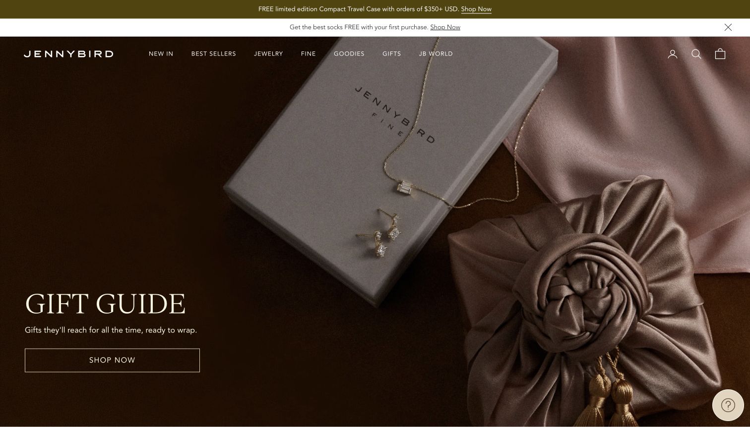
Jenny Bird stages a necklace and earrings on a branded box beside a softly tied fabric package. Brown and muted pink tones create a warm, restrained gift scene, while the headline and wide outlined shopping button occupy the darker left side. The white navigation overlays the image and separates new arrivals, best sellers, jewelry, fine pieces and gifts. Two narrow announcement strips sit above it. The jewelry remains visible, but the packaging receives equal visual importance, showing the visitor how the pieces might arrive or be presented as a gift.
What you can learn
For a gifting campaign, include packaging when it helps explain the experience beyond the object itself. Keep the jewelry large and bright enough to inspect, and make the route from the scene to the gift selection explicit.
Pros
The presentation box and fabric wrapping make the gifting context tangible.
The dark left side provides a calm area for the campaign text and action.
Cons & considerations
The delicate pieces occupy relatively little space within the large photograph.
Two announcement strips add competing incentives above an otherwise restrained composition.
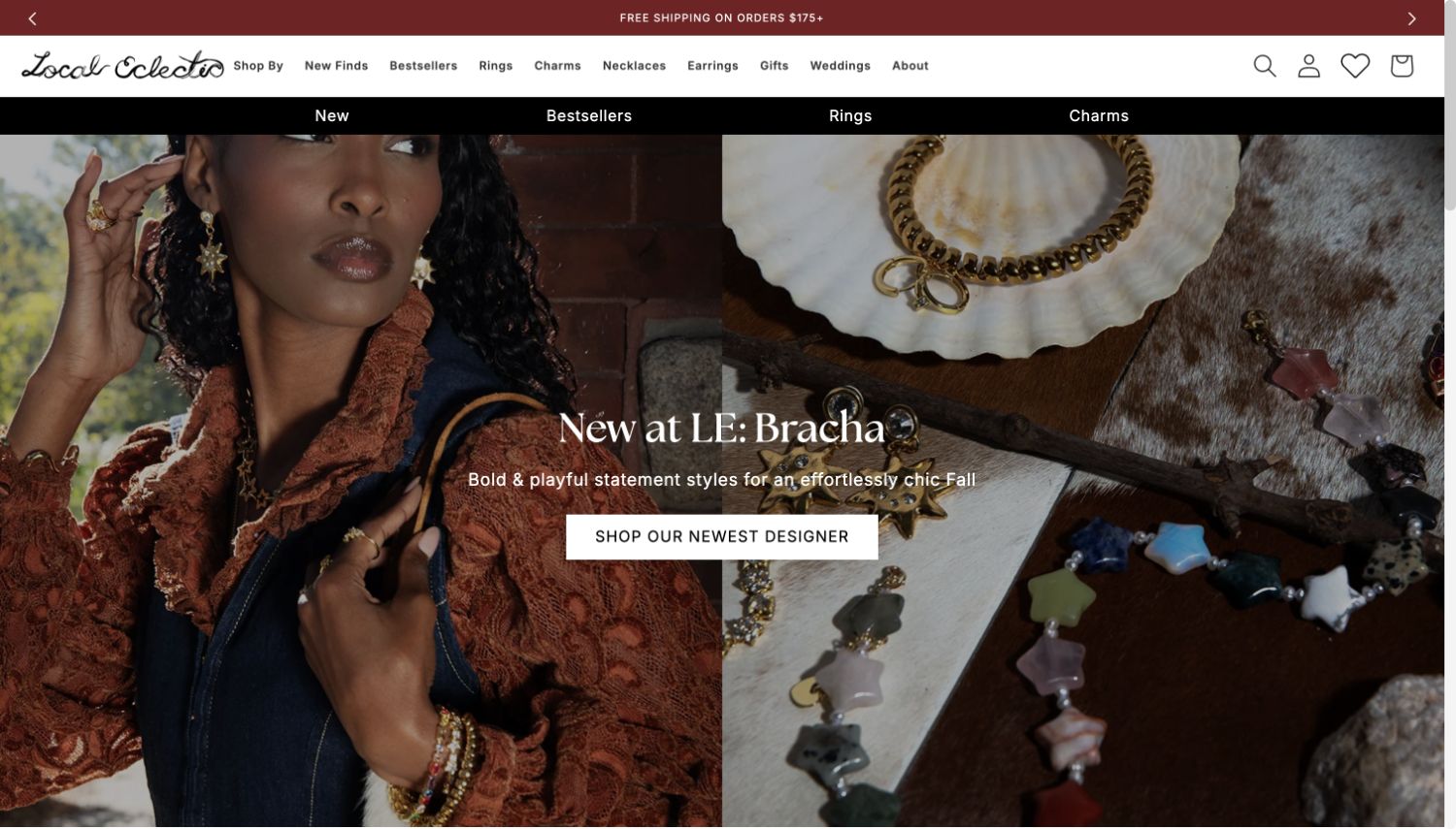
Local Eclectic introduces a named designer with a split composition: a person wearing bold earrings, rings and bracelets on the left, and a tabletop arrangement of colorful pieces on the right. The central headline and white button identify the new designer as the campaign destination. A compact primary navigation is followed by a black shortcut row for new pieces, best sellers, rings and charms. This opening communicates the store's role as a curator rather than presenting the assortment as one uniform house collection. The paired images also show how the playful forms look both individually and when styled together.
What you can learn
A multi-designer store should make the designer identity and shopping destination explicit. Combine styling with a clear view of the objects, and use category shortcuts to support customers who prefer browsing by piece rather than by designer.
Pros
The campaign names the designer and gives that selection a dedicated action.
The two image treatments reveal both styling context and colorful product details.
Cons & considerations
The repeated shortcut row adds navigation density above the image.
The central text crosses a visually busy boundary between two photographs.
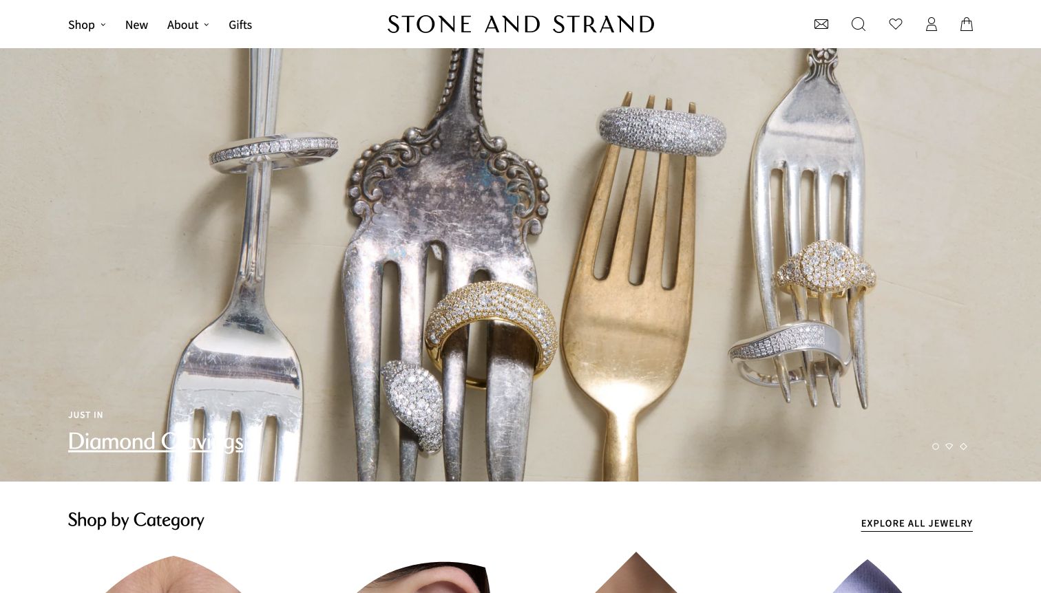
Stone and Strand arranges diamond rings across antique-looking silver and gold forks on a pale surface. The unusual props create a playful still life while keeping several ring silhouettes visible at large scale. A small new-arrivals label and underlined collection title sit near the lower left, with understated carousel indicators opposite. The header uses only a few broad navigation labels around a large centered wordmark. Immediately below the campaign, a shop-by-category heading and an all-jewelry link create a more conventional browsing route. The sequence balances an expressive opening with practical catalog access.
What you can learn
Unexpected props can make product photography distinctive when they do not hide the product's shape. Follow the editorial image with clear category navigation, and ensure a small text action remains readable against reflective or pale surfaces.
Pros
The still life shows several ring shapes clearly within one coherent composition.
A category section begins directly below the campaign.
Cons & considerations
The pale underlined campaign title has uneven contrast over the silver props.
The broad header labels reveal less assortment detail before the shop menu is opened.
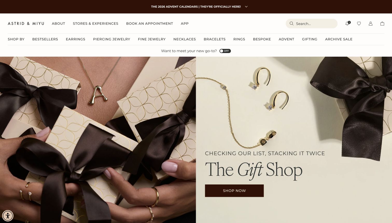
Astrid and Miyu pairs a close wearing view with gift boxes on the left and a clean arrangement of small gold pieces on the right. The gift-shop headline and dark rectangular button sit in the pale lower-right area. Above, separate header rows distinguish brand information, stores, appointments and the app from product categories such as piercing jewelry, fine jewelry, necklaces and bespoke pieces. The consistent black ribbons, cream packaging and warm metal tones connect both image halves. The opening makes gifting concrete without removing the service-oriented parts of the business from view.
What you can learn
Use packaging and wearing images together to explain both the gift and the object inside it. Keep appointment-based services distinct from ordinary product categories so visitors can understand whether they are shopping for a piece or planning an experience.
Pros
The paired images provide both personal scale and an unobstructed product arrangement.
Stores and appointment routes are visible before the product navigation.
Cons & considerations
Several header rows occupy a substantial part of the initial screen.
The generic gift-shop button does not explain the breadth or price range of the selection.
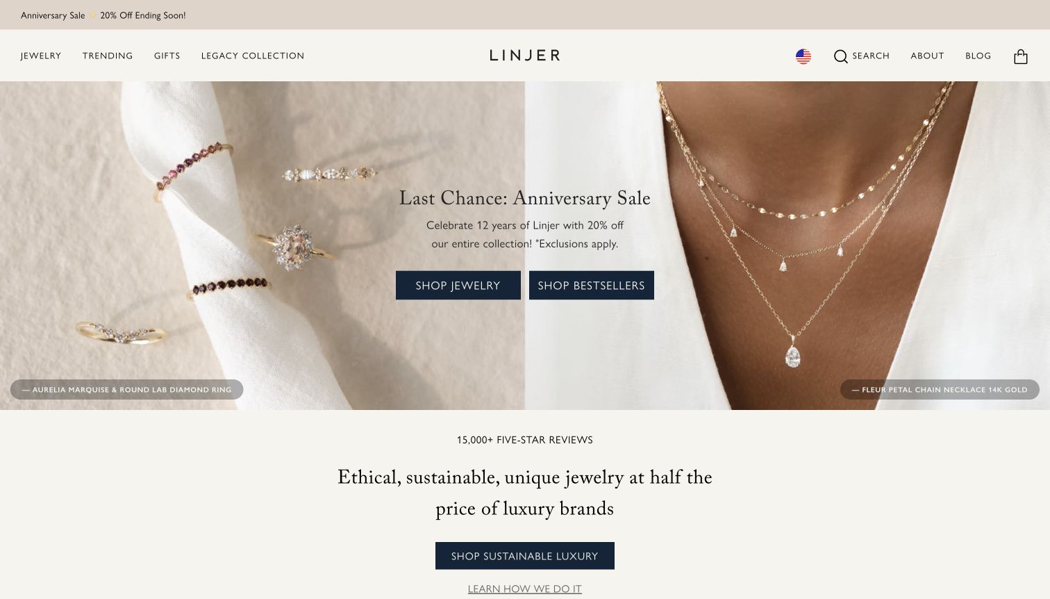
Linjer divides its opening between rings arranged on a ribbon and layered necklaces worn with a white shirt. Small labels identify featured pieces at the bottom of each image, while the central promotion offers separate routes to jewelry and best sellers. Below, a pale section presents the brand's value proposition with a shopping button and an explanatory link. The header is relatively restrained, with broad collection routes and visible search. The product labels are a useful detail because they connect an editorial image to specific merchandise rather than leaving the visitor to guess which piece is featured.
What you can learn
Name products shown in a campaign when visitors may want to find that exact item. Keep broad value claims linked to supporting explanation, and use the opening imagery to demonstrate the product rather than relying entirely on promotional language.
Pros
Small product labels make the featured jewelry easier to identify.
The value section includes an explanatory route alongside its shopping action.
Cons & considerations
The centered offer overlaps the boundary between two different photographs.
Broad ethical and pricing claims need supporting detail beyond the opening statement.
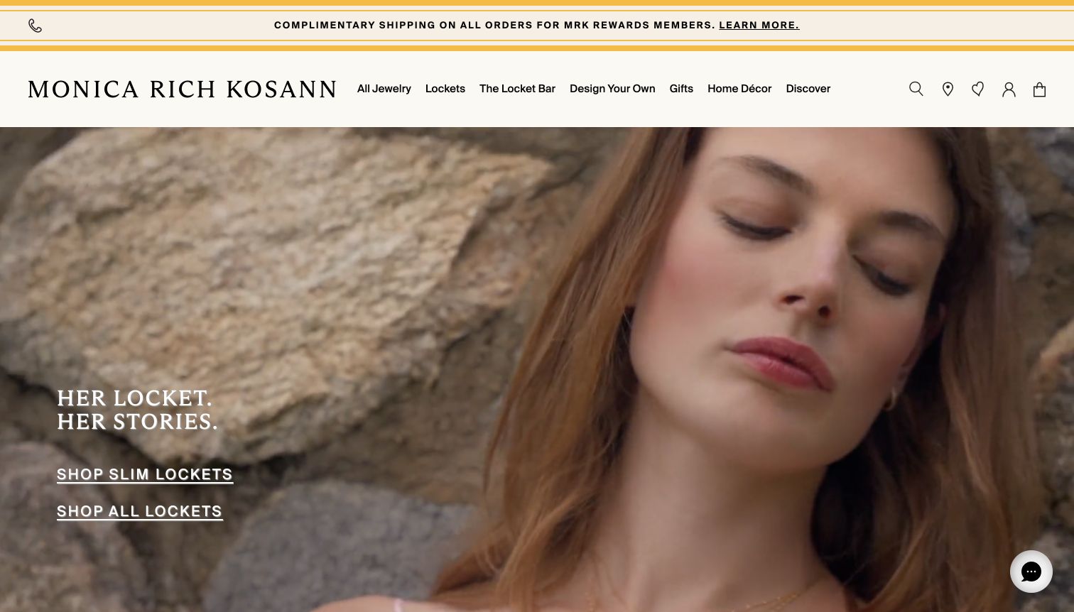
Monica Rich Kosann uses a close portrait film to introduce its locket collection, with a short story-focused headline and separate links for slim lockets and all lockets. The cream header gives lockets, a locket bar and designing a piece distinct positions in the main navigation. A warm yellow-edged service strip frames the top of the page. The campaign is more personal than technical, but the two locket links make the signature product family clear. The navigation reinforces that focus by treating customization as a central part of the store's identity.
What you can learn
If one product family defines the business, make it unmistakable in both the campaign and navigation. Personal storytelling can establish emotional context, but follow it with product close-ups and clear explanations of customization choices.
Pros
The two locket links provide specific alternatives within the signature collection.
Design-your-own and locket services are exposed in the primary navigation.
Cons & considerations
The close portrait can give the face more attention than the jewelry.
Underlined campaign links provide little immediate information about locket sizes or materials.
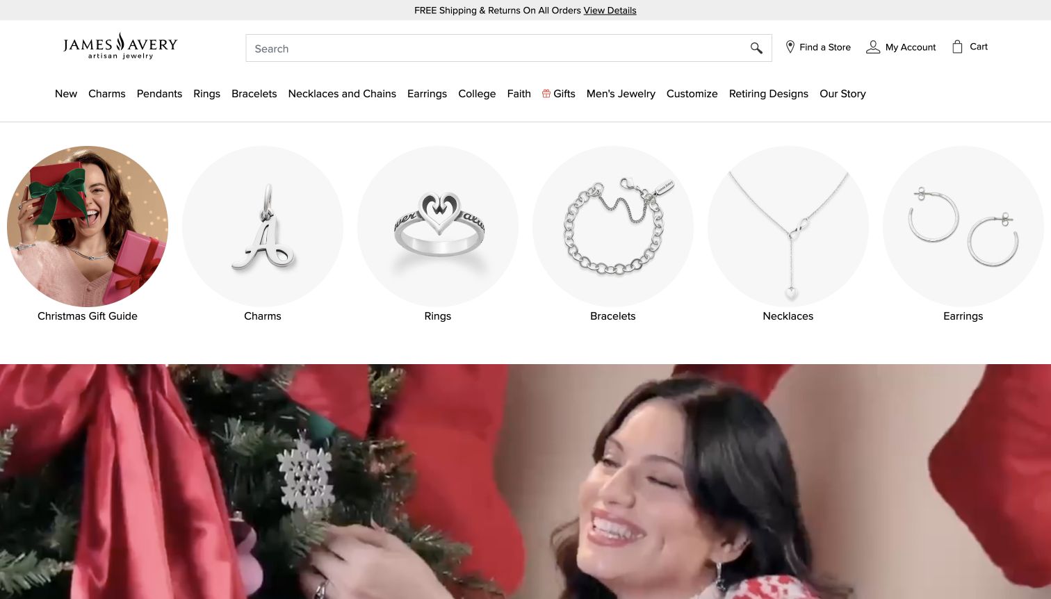
James Avery places six large circular category images beneath a wide search field and a detailed text navigation. A gift guide, charms, rings, bracelets, necklaces and earrings each receive a clear image and label. The seasonal film begins only after that directory, so a visitor can choose a product type without first interpreting the campaign. The product images use a consistent pale background and mostly silver-toned pieces, keeping the row visually orderly. Store finding and account tools remain beside search, while the main navigation also exposes customization, faith and college-themed shopping.
What you can learn
Put concrete category choices ahead of a broad campaign when the assortment is a primary reason people visit. Use consistent image treatment and readable labels, and retain search for shoppers who already know a design or product name.
Pros
The large category images make the assortment understandable immediately.
Search and store finding are prominent alongside the brand identity.
Cons & considerations
The visual directory and text navigation repeat several of the same choices.
The category row takes enough space that the seasonal campaign begins below the opening midpoint.
Build a product record before arranging the homepage
Define required fields for dimensions, materials, stone details, sizes, variants, care, packaging and fulfillment. Record the source and owner of claims about origin or certification. If a detail is unavailable, resolve it with the business instead of filling the space with an attractive but unsupported description.
Map gifts, custom work and ordinary purchases separately
Write the steps for buying an in-stock piece, ordering an engraved item and arranging a consultation. Identify when a size selection, personalization preview or staff response is needed. The interface should explain the handoff and retain entered choices if a customer moves between product and help information.
Make the photography brief repeatable
Specify a consistent background, close-up detail, on-person reference and accessible description for every product family. Plan mobile crops before commissioning a campaign. Keep the original files and usage permissions with the product record so future additions match the catalog without copying another store’s artwork.
The editing job behind the design
Choose commerce tools that preserve product accuracy
Start with the complexity of variants, stock and custom orders. A standard commerce platform may suit a focused catalog, while appointment scheduling or ring configuration may require additional systems. Test those integrations against actual products and staff processes; a visually polished configurator is not useful if it loses a selected size or quotes an inaccurate lead time.
Let editors update campaigns while protecting structured product facts and fulfillment rules. Keep product data, store information and service content connected without duplicating them across landing pages. Any analytics, search, review or personalization service should have a defined purpose and an owner responsible for its ongoing accuracy.
Our WordPress website examples offer a separate look at publishing approaches. A visible platform label is evidence for that named page, not a guarantee that the same system will suit your requirements.
Before the public launch
Jewelry website launch checklist
Check materials, stone descriptions, measurements and variants against the product record.
Show a clear product view and useful scale reference with readable alternative text.
Test size selection, engraving, unavailable combinations and the displayed price.
Explain delivery, gift options, resizing and return conditions before checkout.
Test appointment booking and identify the location or remote service explicitly.
Review keyboard navigation, image zoom, color contrast and campaign crops on a phone.
Assign an owner for stock, service details, seasonal deadlines and supporting claims.
These checks are a project checklist, not a performance, legal, security, or accessibility certification. Test real journeys with the people responsible for the website before making claims about the result.
Sources & editorial method
How this collection was selected and reviewed
This selection reviews distinct official jewelry storefronts through direct browser captures and original design analysis. Each example keeps its observed URL, capture date and regional context. The reviews examine visible imagery, navigation, shopping routes and service presentation; seasonal campaigns may change. Redirecting aliases count as one property, and technical claims require separately recorded public evidence.
Each example links to its actual source page. Screenshots are direct browser captures with their own capture dates; moving imagery, announcements and live designs can change. The notes describe observable design choices and conditional tradeoffs, not measured traffic, conversion results, service quality, or accessibility conformance.
Technology labels use public page metadata, asset evidence, or explicitly cited platform documentation. Platform documentation is not a complete current deployment audit. A component reference may be legacy or unused; it is not a complete backend inventory. Unknown stacks are omitted. These sites are editorial examples, not our client portfolio.
Written, Edited and Curated are separate editorial records, not timestamps advanced by a rebuild. Website designs and imagery belong to their owners. See our editorial standards or suggest a correction.
Questions worth asking
Jewelry Store website design questions
Should a jewelry homepage begin with a campaign or products?
Either can work if the next shopping step is clear. A campaign can introduce a collection or occasion; product cards can help visitors compare a focused range. Keep search, familiar categories and service information available whichever approach leads.
How can a jewelry store communicate scale online?
Use explicit measurements, a close product view and an on-person photograph. Explain adjustable lengths and available sizes. Do not rely on an enlarged photograph alone, because the size of the object on a screen has no fixed relationship to its physical dimensions.
What needs to appear before a personalized order is added to the bag?
Show the selected text or options, any price change, expected lead time and the relevant return restrictions. Provide a way to review and correct the entry. The business should verify these rules for its own products rather than copy another retailer’s policy.
Does every jewelry store need virtual try-on?
No. Accurate dimensions, several photographs and accessible assistance may answer the important questions. Evaluate a try-on tool only when it addresses a demonstrated need, works on customers’ devices and clearly explains the limits of the preview.
Borrow the relationships between imagery, product facts and service. Build them with your own pieces, accurate descriptions and a buying process your team can support.