Footwear shoppers need to understand how a shoe looks, what it is intended for and whether the available fit is appropriate for them.
Footwear brands often sell a wider identity through sport, fashion, work or outdoor imagery. The storefront still needs to answer practical questions about models, sizes, widths and intended use. Keep those paths steady when the homepage changes to a new athlete, season or collaboration.
The collection includes specialist shoe labels and manufacturers whose footwear sits inside a larger sporting or apparel range. Study how the campaign connects to product discovery. The reviews do not independently test comfort, durability, traction, medical suitability or environmental claims.
Before the examples
What makes good footwear manufacturer website design in 2026?
Make activity and fit useful ways into the range
Use categories customers recognize, whether they start with running, work, sandals, boots or everyday wear. Connect audience labels to useful product choices without assuming they explain fit. Show which sizes and widths exist for the selected model and distinguish an unavailable option from one the product never offers.
Show construction as well as styling
Pair on-foot or outfit imagery with clear side, outsole, upper and fastening views. Identify materials and intended use in product text. A close photograph can help visitors inspect a feature, but it cannot demonstrate waterproofing, grip or comfort without supporting information.
Support the uncertainty of buying fit online
Provide model-relevant sizing guidance, measurement instructions and clear return or exchange routes. Explain how regional size labels relate to the available product instead of assuming one universal conversion. Keep help accessible without forcing customers to abandon the size they were considering.
The collection · 18 examples
18 footwear manufacturer websites worth studying
Compare focused footwear openings with broader sport and lifestyle campaigns. Look for a dependable route from atmosphere to the relevant model, practical product detail and a clear fit decision.
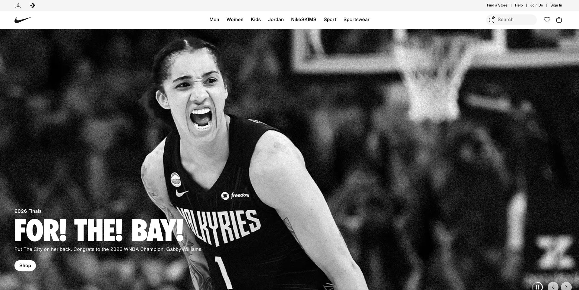
Nike’s retained November 2 storefront capture gives almost the entire opening to a monochrome basketball photograph. A compact headline and shopping button sit in the lower left, while a white navigation band keeps audience and sport categories separate from the campaign. Search, saved items and the bag are visible without entering the story. The approach makes the brand’s sporting context immediately recognizable, but the actual shoes are not the opening subject. This is useful inspiration for campaign hierarchy, not evidence of a particular shoe’s construction or athletic performance.
What you can learn
Treat editorial campaigns as an entrance to the footwear catalog, with stable routes for visitors who already know their sport, size or model. A campaign can be expressive while product selection and fit guidance remain literal and predictable.
Pros
The white header gives essential shopping controls a consistent visual home.
A single large photograph and short action avoid competing campaign messages.
Cons & considerations
Visitors researching shoes must take another step before seeing model differences.
The photograph and overlaid copy need alternative crops and contrast checks on smaller screens.
Public source checked November 3, 2026. References may be embedded or legacy—not a complete backend inventory.
Platform source: Official Next.js showcase. The reviewed page loads Next.js assets. React is identified through Next.js, a React framework; this is a framework relationship, not a separate claim about an independently inspected React bundle. Platform evidence is separate from the direct website screenshot and is not a complete current infrastructure audit.
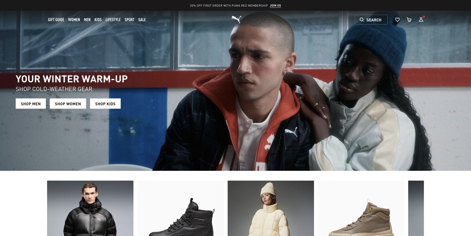
PUMA’s existing US capture opens with two people in a winter setting and three clearly separated shopping buttons for men, women and kids. The next row already shows cutout products, including boots, so the lifestyle scene leads into merchandise within the opening viewport. The centered logo and sparse header keep the campaign broad, while search remains plainly labeled on the right. This balance is relevant to footwear manufacturers whose shoes sit inside a larger clothing range. The image records the November 2 campaign; the review does not treat its promotion or product availability as a current guarantee.
What you can learn
Connect a seasonal scene to actual merchandise quickly. Give visitors a predictable route by audience or use, then show enough product detail to move beyond the mood without forcing them to interpret a lifestyle photograph.
Pros
Three audience routes make the opening shopping choice explicit.
Visible product cutouts begin the transition from campaign photography to comparison.
Cons & considerations
A combined apparel and footwear campaign can hide shoe-specific fit information.
White header elements require care when a new photograph has lighter areas behind them.
Public source checked November 3, 2026. References may be embedded or legacy—not a complete backend inventory.
Platform source: Official platform or first-party project source. Sanity association is scoped to PUMA’s website and app marketing/e-commerce content across regional storefronts. The source is linked for its implementation description; no case-study performance figures are adopted as this review’s own findings. Platform evidence is separate from the direct website screenshot and is not a complete current infrastructure audit.
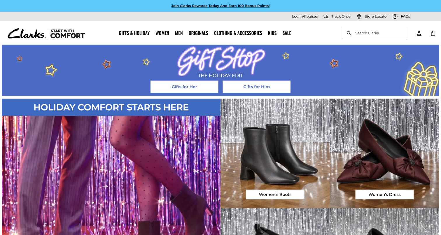
Clarks places a seasonal gift banner between its main navigation and a split product collage. The captured boot and dress-shoe images have plain category buttons, allowing visitors to move from festive styling to a recognizable type of footwear. Search occupies a dedicated outlined field rather than an icon alone. Order tracking, the store locator and FAQs sit in a separate utility row. The November 3 screenshot is busy but clearly separates shopping and service tasks, which matters for a footwear range with several audiences and a large legacy catalog.
What you can learn
Use campaign decoration to frame categories customers already understand. Keep fit help, order support and store information in consistent locations, and label category photographs with words rather than expecting the image to explain every destination.
Pros
Literal boot and dress-shoe labels give the seasonal collage useful shopping destinations.
Search and service links remain visible independently of promotional artwork.
Cons & considerations
Multiple header and promotional rows leave less room for products on a small screen.
A gift-led opening needs a clear path for shoppers buying for a specific fit or everyday use.
Earlier cited evidence retained; no current scan result. References may be embedded or legacy—not a complete backend inventory.
Platform source: Official Algolia customer implementation case. Official Algolia case documents Search and Recommend in Clarks’ international commerce rebuild. The US regional storefront is shown as design context for the documented programme, without claiming a live audit of regional feature deployment. This is an attributed case-study association reviewed on 2026-11-03, not a current homepage-backend or full-stack audit. Platform evidence is separate from the direct website screenshot and is not a complete current infrastructure audit.
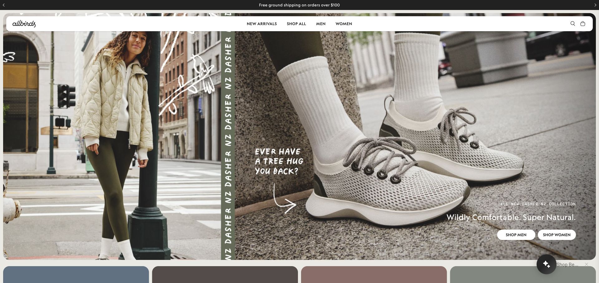
Allbirds’ retained capture combines a full-body street photograph with a much larger close view of the shoe on a foot. The two images communicate outfit context and construction details at different scales. A rounded white navigation bar sits inside the campaign frame, with only a few shopping choices. Handwritten annotations and a vertical product-family label make the composition feel editorial rather than like a conventional product grid. The campaign is a November 2 observation; claims printed in the artwork belong to the retailer and are not independently tested by this design review.
What you can learn
Show footwear both in use and close enough to inspect its shape. If a campaign makes material or comfort claims, link to specific product information and evidence instead of expecting the visual treatment to substantiate the claim.
Pros
The enlarged shoe image provides useful visual detail beside the lifestyle photograph.
A short navigation reduces competition with the campaign composition.
Cons & considerations
Decorative handwriting and vertical labels need readable alternatives on narrow screens.
A small set of broad shopping links may add steps for visitors seeking a precise model or fit.
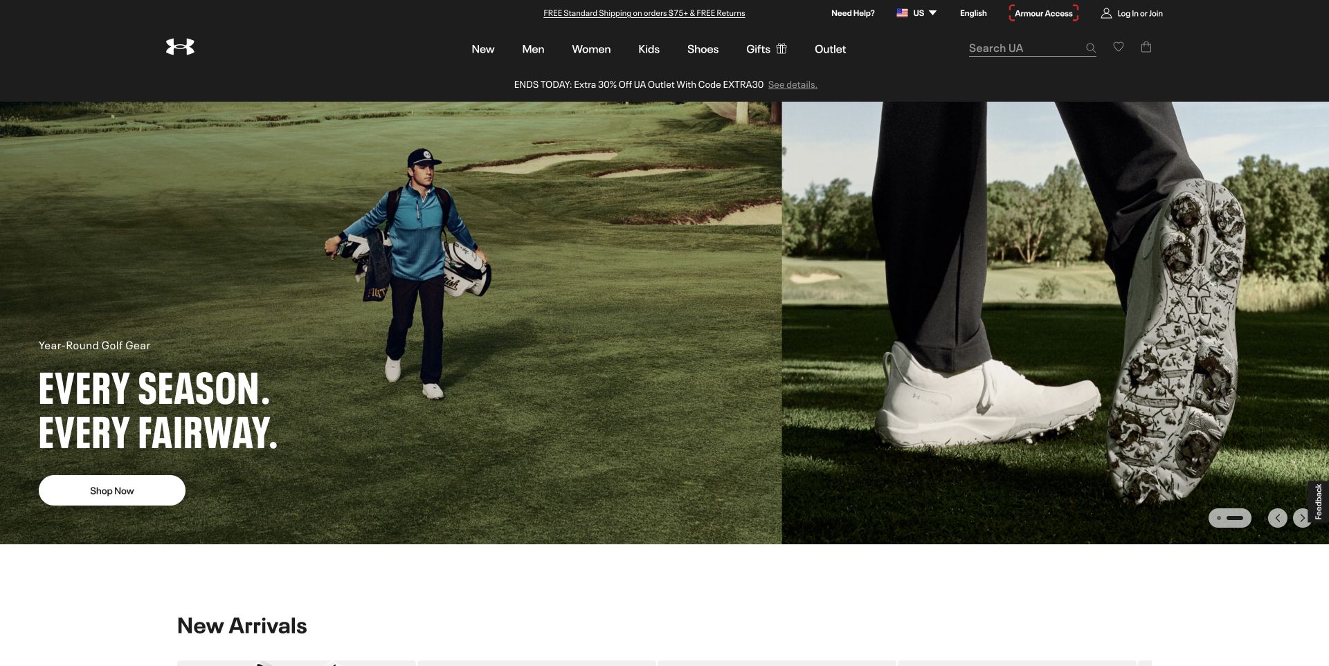
Under Armour’s existing capture gives one side of the hero to a golfer walking a course and the other to a close view of golf shoes. This pairing connects the activity to a visible product feature without turning the introduction into a specification table. A dark header contains a direct Shoes link, audience categories and a labeled search field. The campaign’s shopping button is separated from the header, and the beginning of a New Arrivals section is visible below. The retained November 2 image offers a specific layout reference, not an evaluation of traction, waterproofing or sporting performance.
What you can learn
For activity-specific footwear, pair the situation with a product view that explains what shoppers should inspect next. Provide direct routes to size, surface compatibility and technical details without presenting a lifestyle scene as proof of performance.
Pros
The close product image makes footwear relevant even within a wider apparel brand.
A direct Shoes navigation item serves visitors who want to bypass the campaign.
Cons & considerations
A single-sport hero can feel irrelevant to shoppers visiting for other activities.
Multiple announcement and navigation rows create a substantial header before the product story.
Public source checked November 3, 2026. References may be embedded or legacy—not a complete backend inventory.
Platform source: Observed public page assets. The reviewed page loads public /_next/static/ JavaScript assets. This identifies its Next.js frontend, not its CMS, hosting contract, or every corporate property. Platform evidence is separate from the direct website screenshot and is not a complete current infrastructure audit.
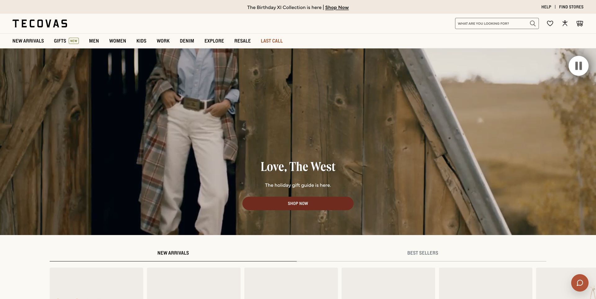
Tecovas’ retained November 2 image opens with a wide rural scene, a short centered seasonal message and one broad shopping button. Above it, the navigation separates men, women, kids, work and resale, while store discovery stays visible in a utility strip. A substantial search field asks a plain shopping question. The frame communicates the brand’s western setting, but it does not show a detailed boot comparison in the opening. That makes it useful for studying atmosphere and catalog access together, provided a new site also supplies practical fit and construction information beyond the campaign.
What you can learn
Let specialist identity appear in photography and typography while keeping shopping vocabulary familiar. For boots, support the next step with clear sizing, shaft and toe information, care guidance and genuine store assistance rather than more campaign slogans.
Pros
Store access and search are easy to distinguish from seasonal storytelling.
Work and resale have their own navigation positions instead of disappearing inside a generic shop link.
Cons & considerations
The opening scene postpones close inspection of the footwear itself.
A wide centered video composition needs a deliberate narrow-screen crop and a readable text alternative.
Public source checked November 3, 2026. References may be embedded or legacy—not a complete backend inventory.
Platform source: Official platform or first-party project source. Sanity association is scoped to Tecovas’ merchandiser-controlled storefront content with Shopify Hydrogen. The source is linked for its implementation description; no case-study performance figures are adopted as this review’s own findings. Platform evidence is separate from the direct website screenshot and is not a complete current infrastructure audit.
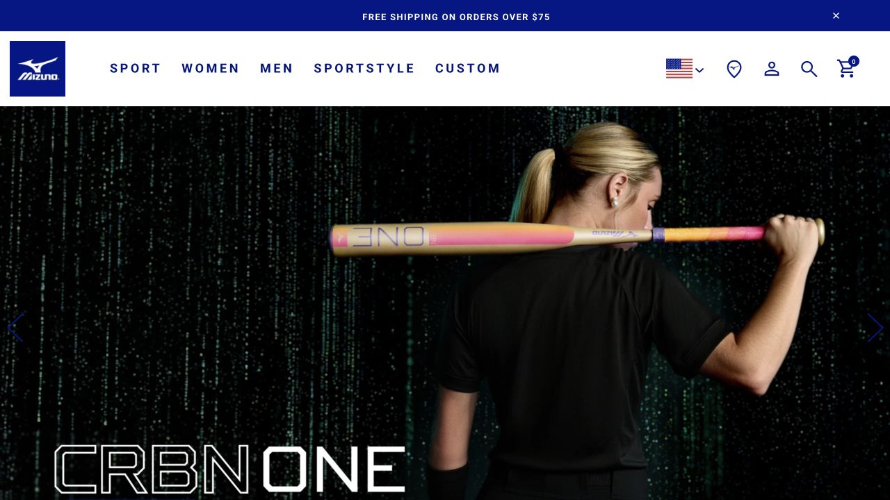
Mizuno’s retained US screenshot is led by a baseball-bat campaign rather than a shoe. A white header separates Sport, Women, Men, Sportstyle and Custom, with region, account, search and cart controls at the right. This is a useful counterpoint in a footwear-manufacturer collection: the company’s broader sporting range shapes the storefront entrance, so shoe shoppers rely on the category system to reach their goal. The November 2 capture documents that particular campaign and does not establish the current menu contents or performance of any item.
What you can learn
When footwear is one part of a multisport range, test whether a visitor can reach the appropriate shoes without following the current homepage promotion. Organize by both activity and audience where useful, and avoid letting every campaign redefine the catalog.
Pros
A restrained header keeps the product taxonomy separate from the dramatic campaign image.
Sport and Sportstyle distinguish different shopping intentions at the top level.
Cons & considerations
A non-footwear opening adds a step for people arriving specifically for shoes.
Large promotional artwork offers little immediate help with shoe models, width or fit.
Earlier cited evidence retained; no current scan result. References may be embedded or legacy—not a complete backend inventory.
Platform source: Primary platform or implementation reference. The official case directly links the US storefront and documents BigCommerce commerce with Contentstack content delivery. The association applies to the named public property; it is not a complete technology inventory or an edition/version audit. Platform evidence is separate from the direct website screenshot and is not a complete current infrastructure audit.
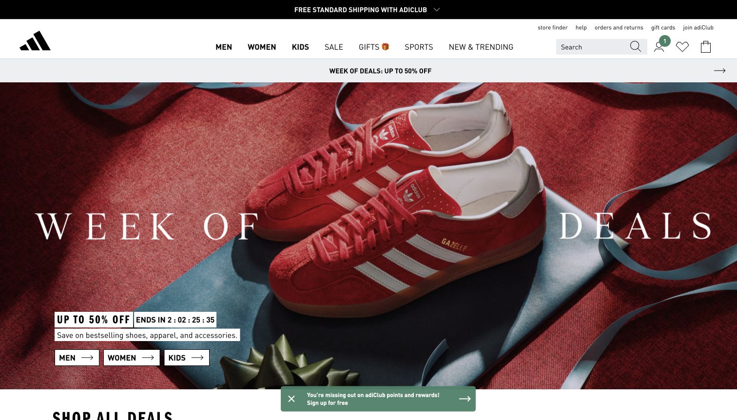
The adidas opening uses a red shoe and a textured red backdrop as a single strong visual field. A blue ribbon gives the photograph a gift context without adding another illustration style. White campaign lettering stretches across the composition, while the offer, countdown and three audience buttons stay grouped near the lower left. Above it, a white navigation band separates everyday shopping categories from the seasonal message. The composition places the recognizable shoe silhouette ahead of explanatory copy, making the sale feel connected to a real product rather than a generic discount graphic.
What you can learn
Build a promotion around a distinctive product photograph and keep the offer's next steps in one predictable place. Audience buttons can shorten the journey, but a countdown should remain secondary to a readable price or discount explanation.
Pros
The monochrome backdrop makes the shoe and ribbon feel like one coherent campaign.
Separate men, women and kids buttons give the broad promotion practical destinations.
Cons & considerations
Very large decorative campaign lettering consumes room that could explain exclusions.
The sale-first opening offers little help choosing a shoe by sport or fit.
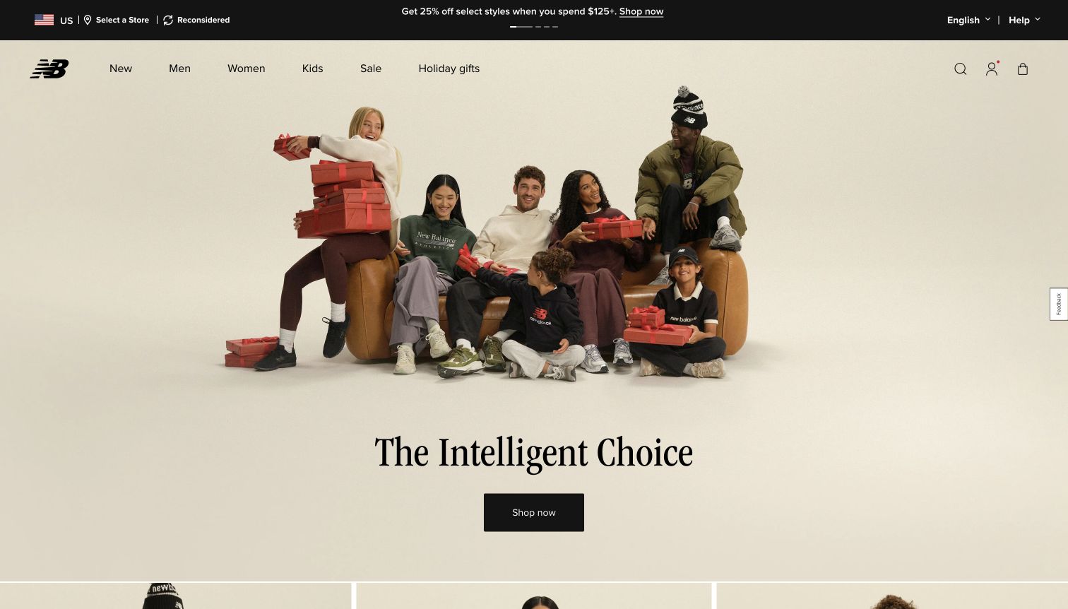
New Balance gives most of the opening to a warm domestic photograph with several people, a sofa and gift boxes. Shoes appear within ordinary outfits rather than isolated on a technical stage. Below the photograph, a large serif statement and a compact black shopping button sit on a pale cream field. The header is comparatively quiet, with a red mark and straightforward links for new products, men, women, kids, sale and gifts. This division lets the image establish a seasonal mood while the text beneath it delivers the brand message in a separate, uncluttered area.
What you can learn
A lifestyle image can explain who a footwear collection belongs with, but it needs an obvious shopping route outside the photograph. Use a quieter text panel to preserve readability and give the campaign a clear end point before the next section begins.
Pros
The domestic scene provides useful styling and gifting context.
The cream text area gives the main statement and button generous contrast.
Cons & considerations
The broad shopping button does not identify a particular footwear collection.
Product details and differences between the visible shoes remain difficult to assess from the lifestyle image.
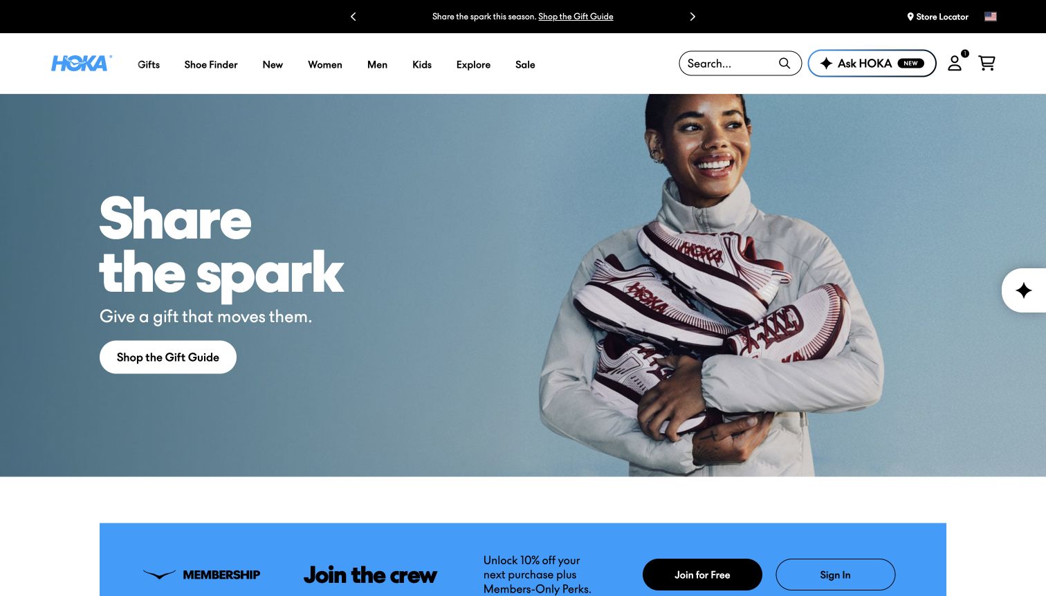
HOKA pairs a saturated blue background with a smiling person holding a tall stack of shoes. The gift message occupies the open left side, leaving the footwear and expression unobstructed on the right. A rounded white gift-guide button is the single prominent campaign action. In the header, the shoe finder has its own position alongside audience categories and new arrivals, providing a more functional route for shoppers who are not choosing a gift. The beginning of a differently colored membership section is visible below the hero, clearly separating the next marketing message from the main campaign.
What you can learn
Give seasonal visitors an approachable starting point while keeping a fit-oriented tool in the primary navigation. A strong background color can support a simple composition, provided the text remains readable and the product itself is still recognizable.
Pros
The person and stacked shoes make the campaign warm without losing the product category.
A visible shoe-finder route supports shoppers with more specific needs.
Cons & considerations
The stacked arrangement shows variety but little about individual shoe construction.
The hero's gift guide requires another step before a shopper can compare products.
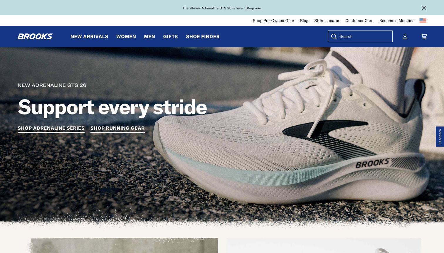
Brooks places a large close-up of a light running shoe against a textured outdoor surface. The shoe occupies the right side while the left keeps a short support-focused headline, the named shoe family and two underlined shopping links. A blue header and pale utility strip create a clear boundary above the photograph. Unlike a broad holiday collage, this opening gives the visitor one product story to understand, with the shoe's mesh, side structure and sole visible at substantial scale. The second shopping link acknowledges running apparel without making it compete with the footwear image.
What you can learn
When a shoe family is the campaign's subject, show its construction clearly and identify the family in nearby text. Keep related apparel available as a secondary route, and ensure underlined links have enough visual weight to be found against photography.
Pros
The close photograph makes material and structural details easy to inspect.
The shoe-series and running-gear links separate two useful shopping intentions.
Cons & considerations
The opening does not explain how the featured shoe differs from other support options.
Underlined text actions are less visually assertive than the oversized product photograph.
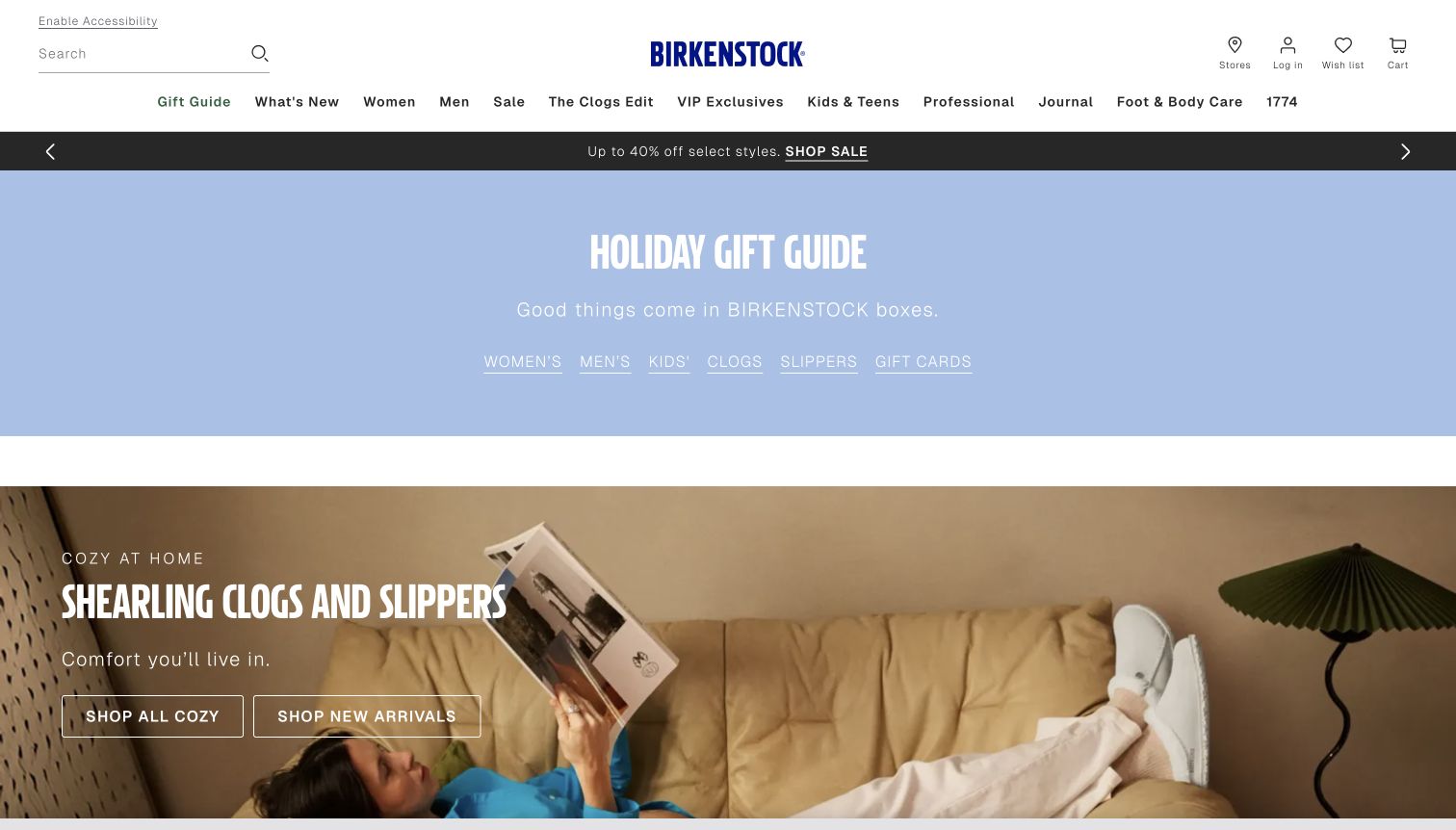
Birkenstock opens with a centered blue gift-guide panel containing links for women, men, kids, clogs, slippers and gift cards. The next full-width section moves into a warm living-room photograph and introduces shearling clogs and slippers with two outlined buttons. The white header includes a search line on the left, the blue wordmark in the center and a long navigation row beneath. This sequence is useful because the initial seasonal section behaves like a small directory rather than requiring visitors to interpret the lifestyle campaign. The contrasting blue and earthy photographic palette also distinguishes navigation from mood.
What you can learn
Use a short seasonal directory to expose meaningful destinations before asking visitors to engage with a campaign image. Keep category names concrete, and give collection imagery enough product detail to support the comfort or material story stated beside it.
Pros
The gift-guide links offer several direct routes without opening a menu.
The living-room scene makes the cozy collection's intended use understandable.
Cons & considerations
The lengthy primary navigation may require careful adaptation on smaller screens.
Two large seasonal sections push individual products and prices below the opening view.
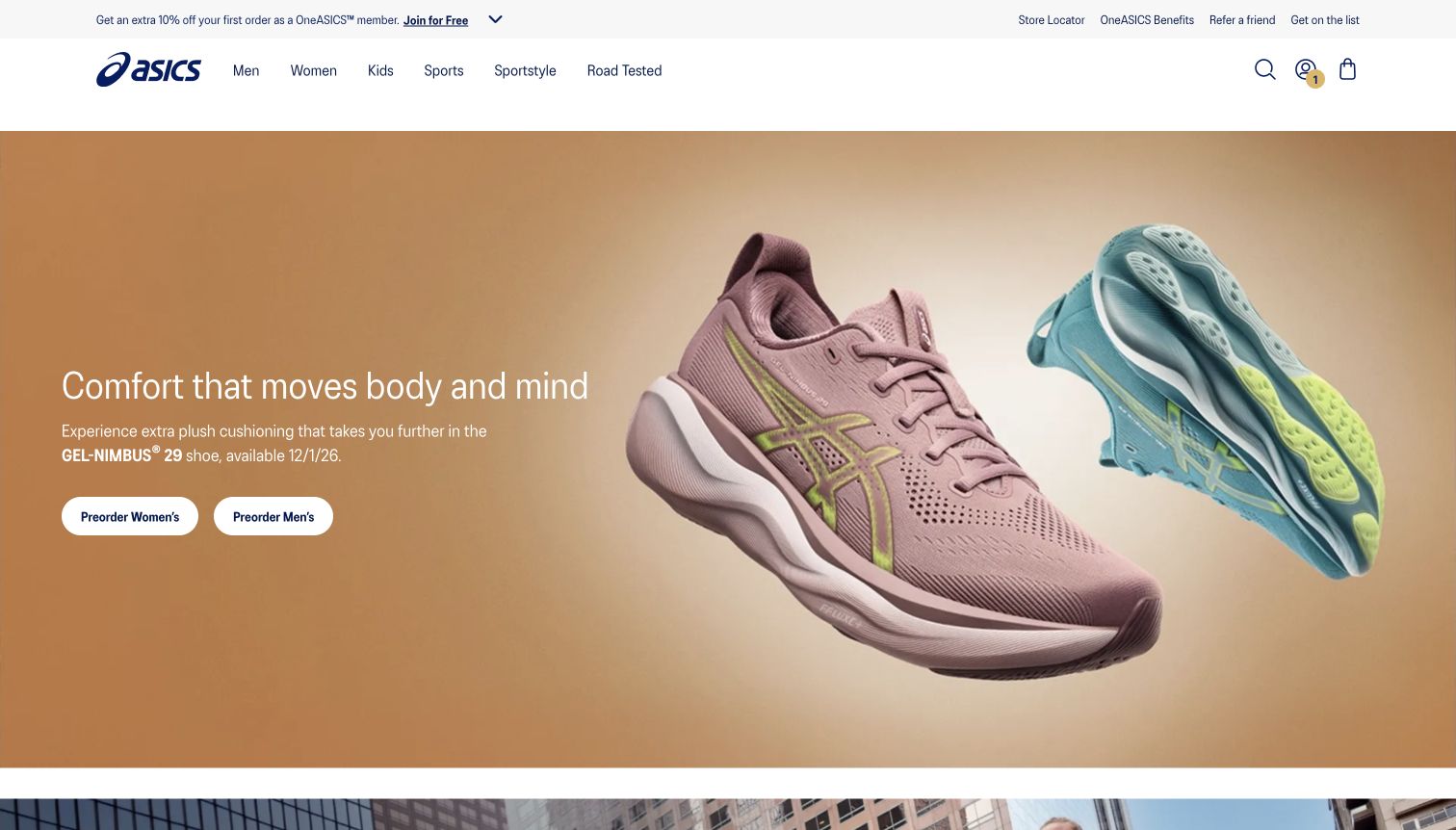
ASICS uses two floating shoes against a warm neutral gradient: one shows the upper and side profile, while the other exposes much of the outsole. A short comfort message occupies the left side, followed by the model name, availability information and separate preorder buttons for women and men. The header is spare enough that the product photography remains the central subject. The contrasting shoe colors improve separation without introducing a separate decorative motif. This is a focused launch composition that gives the viewer tangible construction details and a clear indication that the next action concerns a forthcoming product.
What you can learn
A footwear launch can use complementary angles to explain more than a single dramatic profile. Put availability language next to the action, and label preorder buttons explicitly so the campaign does not imply immediate delivery.
Pros
The paired angles reveal both upper construction and outsole treatment.
The buttons clearly distinguish preorder intent and audience.
Cons & considerations
The comfort claim is prominent while its supporting technical explanation remains brief.
Visitors seeking a different shoe type must move back to the navigation or continue down the page.
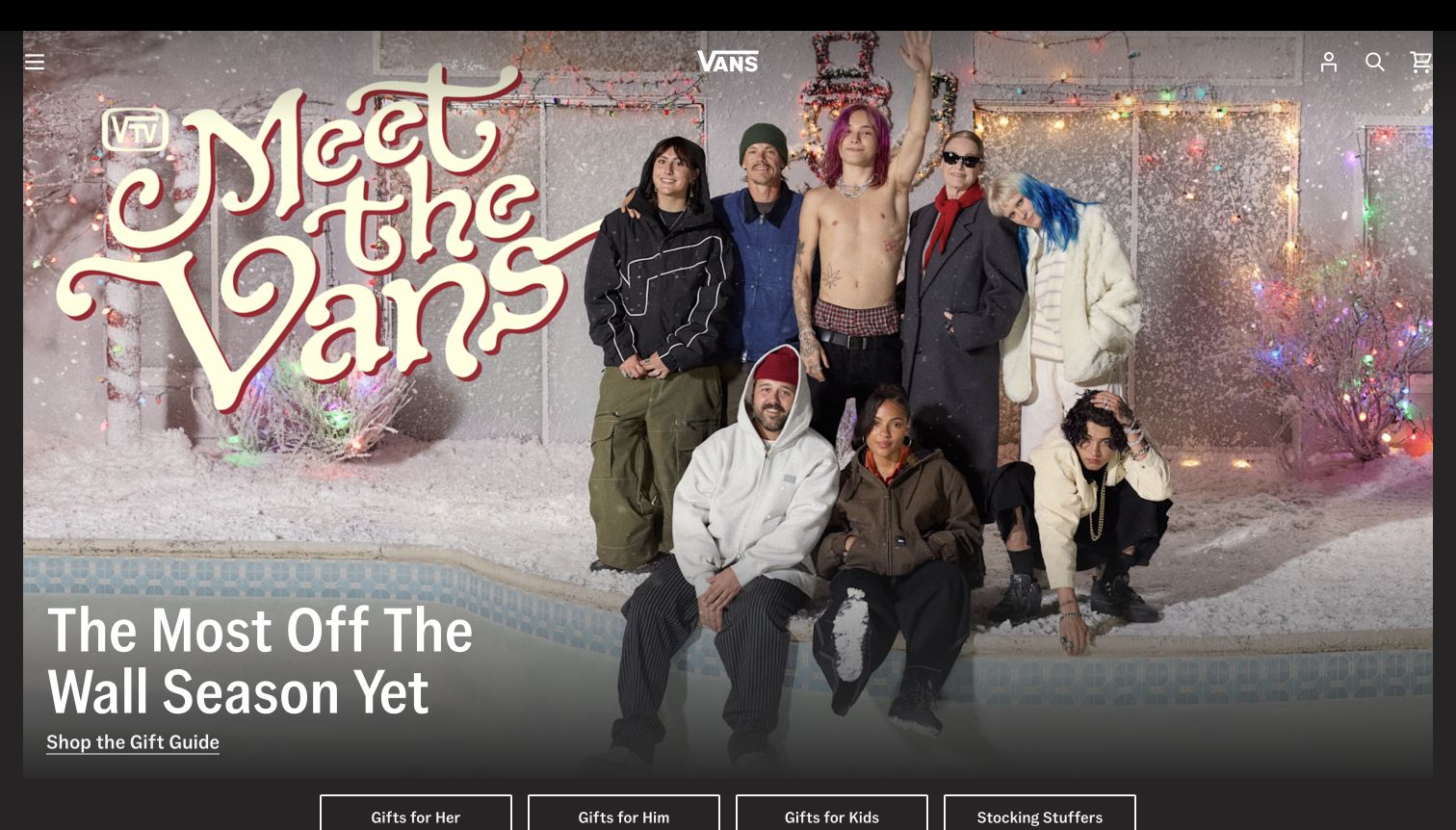
Vans turns the opening into a group portrait set in a decorated, empty swimming pool. Oversized retro lettering forms part of the photograph, while the campaign heading and gift-guide link sit over a darker lower edge. The central white logo and small utility icons are overlaid at the top, with the main navigation placed behind a menu control. A row of outlined audience and gift-category buttons begins below the photograph. The presentation is deliberately immersive: people, styling and setting communicate the brand atmosphere before visitors see a conventional product grid or detailed category list.
What you can learn
An immersive campaign works best when the shopping exits remain visible at its boundary. Separate editorial identity from functional navigation, and use a consistent darkening treatment where text crosses a busy photograph.
Pros
The scene gives the campaign a distinctive personality and recognizable setting.
The lower gift-category buttons translate the broad story into useful shopping choices.
Cons & considerations
The collapsed desktop menu hides the full footwear taxonomy on arrival.
Individual shoe details are secondary to the people and seasonal setting.
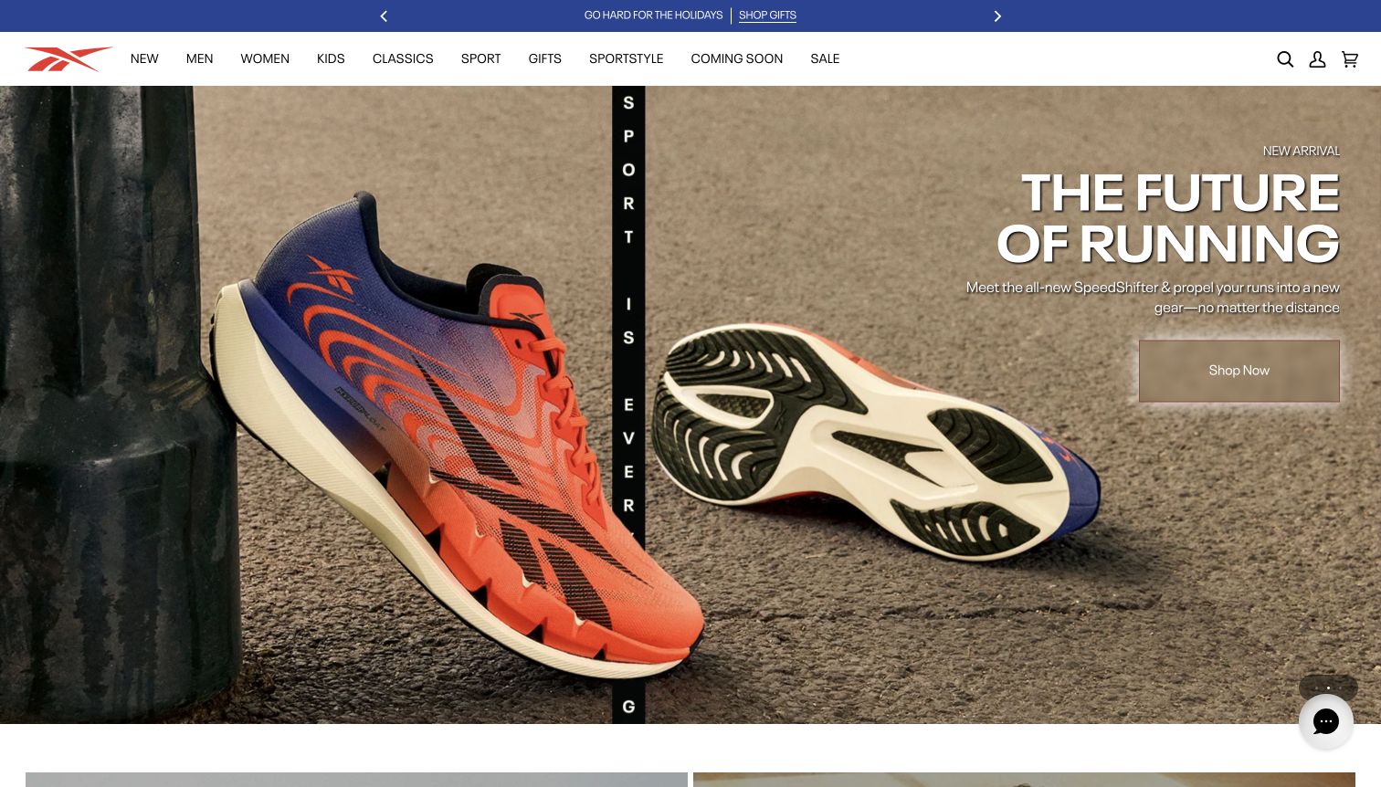
Reebok's captured opening shows two views of a colorful running shoe on a textured surface, with one upper-facing shoe and one outsole-facing shoe. A large running headline and a restrained rectangular shopping button sit on the right. The white navigation row above exposes sport, classics, gifts and sportstyle alongside the audience categories. Small slide indicators at the lower right show that the feature is part of a carousel. The composition uses scale to make the footwear the main visual argument, while the relatively narrow announcement strip keeps the promotional header separate from the product story.
What you can learn
Large product photography can carry a launch message when different angles contribute different information. Keep carousel controls discoverable, and avoid relying on a rotating slide as the only place where an important product or offer can be found.
Pros
The upper and outsole views show complementary aspects of the shoe.
The primary navigation exposes both sporting and lifestyle shopping routes.
Cons & considerations
Carousel rotation can change the featured message before a visitor finishes reading.
The short supporting copy leaves detailed performance distinctions for a later page.
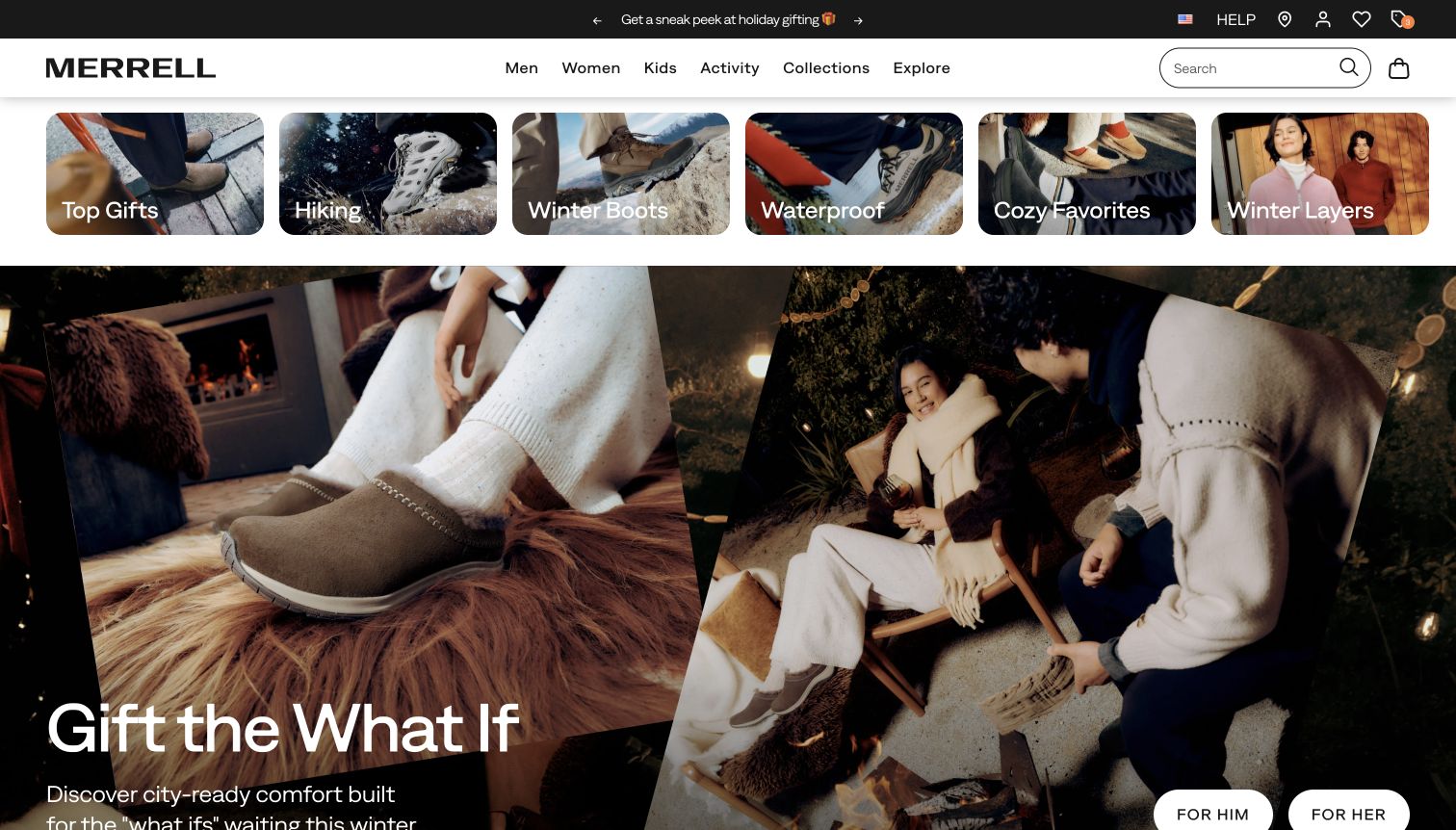
Merrell places a row of six photographic category cards directly beneath its main navigation. Hiking, winter boots, waterproof products and cozy favorites are recognizable before the large campaign begins. Below that row, a split lifestyle image combines a close view of slip-on footwear with a social winter scene, accompanied by a large gifting headline and audience buttons. Search remains an exposed field in the white header. The category cards are particularly useful because they describe practical conditions and uses, giving visitors a direct alternative to the seasonal campaign without requiring a menu interaction.
What you can learn
Use real product or activity imagery to make important use cases visible immediately. A seasonal campaign can follow those shortcuts, but its text and buttons should stay inside a readable area instead of depending on the edge of a large photograph.
Pros
Weather and activity shortcuts expose useful catalog distinctions at first glance.
The split image connects a footwear detail to an everyday wearing situation.
Cons & considerations
The hero's lower text and actions sit close to the initial viewport boundary.
The many photographic shortcuts compete for attention before the main campaign message.
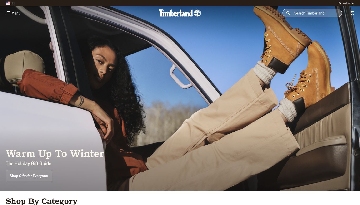
Timberland fills the opening with a person reclining across a car doorway, putting the familiar wheat-colored boots high on the right side of the frame. A winter headline and outlined gift button sit over the quieter lower-left area. The white wordmark and search control overlay the photograph, while a small menu label holds the broader catalog navigation. The top of a shop-by-category section appears immediately below the hero. The unusual pose gives the boots prominence without isolating them from an outfit, and the blue sky provides contrast against the warm leather.
What you can learn
A signature product can anchor a lifestyle campaign when the composition deliberately directs attention to it. Keep an exposed search route and an obvious next section so visitors who arrive with a specific product need are not confined to the campaign narrative.
Pros
The pose makes the boots visually dominant while retaining styling context.
Search stays visible even though the main catalog menu is collapsed.
Cons & considerations
The collapsed navigation adds a step for visitors browsing by product category.
The broad gift action offers little guidance on fit, construction or winter performance.
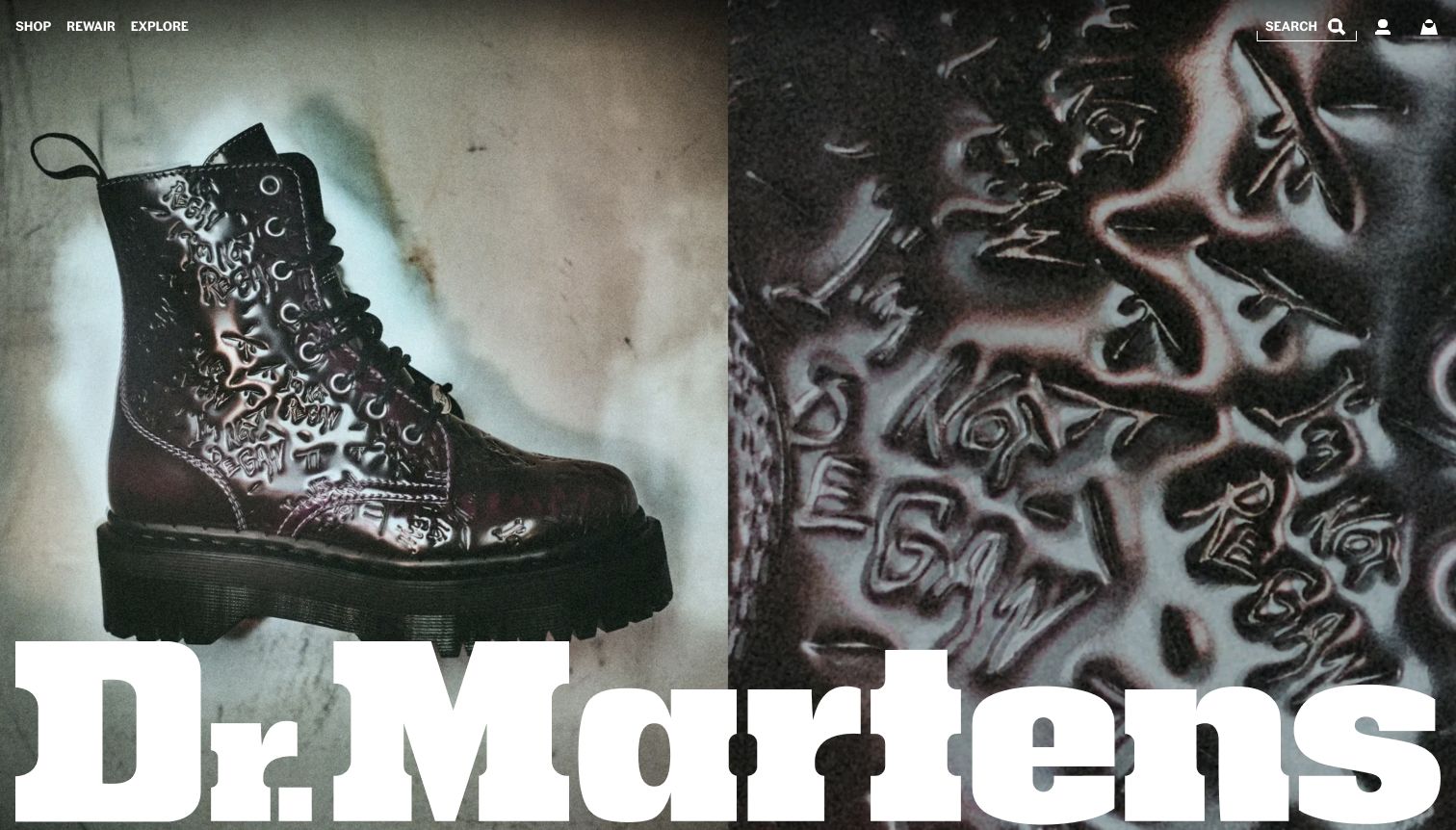
Dr. Martens uses a split image to show an embellished platform boot on the left and a close view of its surface treatment on the right. The enormous white brand name spans the lower portion of the opening, making typography part of the composition rather than a small header signature. Shop, ReWair and Explore sit in a compact upper-left navigation, with search and account utilities opposite. The first view concentrates on the collaboration's visual character, especially the reflective markings, eyelets and heavy sole. It behaves more like a campaign poster than a conventional store directory.
What you can learn
For an expressive collaboration, pair the complete product silhouette with a meaningful detail view. Keep the shopping route easy to find, and check that oversized brand typography does not cover the very construction details the campaign is trying to emphasize.
Pros
The paired photographs reveal both the boot silhouette and its unusual surface treatment.
The limited primary navigation keeps the campaign visually uncluttered.
Cons & considerations
The oversized wordmark covers a substantial portion of the lower photograph.
The opening offers little immediate information about price, sizing or availability.
Plan a footwear site around actual selection tasks
Separate product families from campaign names
Model the underlying shoe, available variants, activity, fit information and replacement versions. Link temporary collaborations and seasonal edits to those records. Visitors returning to a known model should not have to learn the current campaign vocabulary to find it.
Write a specific sizing and exchange journey
Collect the business’s approved measurements and model-specific advice. Explain the measurement method and the limits of any recommendation. Test choosing a width, changing a regional size label and exchanging an unsuitable pair; the help text and operational process should agree.
Create an evidence-aware product brief
Record who supplied material, performance and environmental statements and what product they cover. Keep the support for those statements with the editorial record. Choose photography that explains visible features without turning a running scene or landscape into proof of an untested benefit.
The editing job behind the design
Choose a commerce system that handles fit and variants clearly
Evaluate the complete combination of color, size, width and regional availability before choosing a commerce setup. Search and filters should expose the product choices accurately, while the inventory system remains responsible for stock. Avoid forcing editors to encode fit information only in campaign images or free-form marketing copy.
A separate content system can help a brand publish sport stories, care guides and seasonal campaigns, but it should not create a second source of product truth. Test how size guides, store information and support links remain connected when products change. A public storefront audit identifies observable components, not every system behind manufacturing or retail operations.
Our WordPress website examples offer a separate look at publishing approaches. A visible platform label is evidence for that named page, not a guarantee that the same system will suit your requirements.
Before the public launch
Footwear website launch checklist
Verify each model’s available sizes, widths, colors and regional labels.
Test activity, category, model-name and size-based product discovery.
Show useful product angles and an on-foot reference with descriptive text.
Keep model-specific fit advice and exchange conditions near the size decision.
Check that unsupported variants and unavailable stock have distinct messages.
Review mobile campaign crops, product zoom, focus states and size controls.
Verify the scope and source of performance, material and environmental claims.
These checks are a project checklist, not a performance, legal, security, or accessibility certification. Test real journeys with the people responsible for the website before making claims about the result.
Sources & editorial method
How this collection was selected and reviewed
The selection uses distinct official footwear-manufacturer storefronts, including broader sports brands. Each review describes an observed capture and preserves its original date and regional URL. A manufacturer’s non-footwear campaign is evaluated as a catalog-navigation choice, with its subject described accurately. The analysis covers visible presentation and shopping routes; technical claims require separately recorded public evidence.
Each example links to its actual source page. Screenshots are direct browser captures with their own capture dates; moving imagery, announcements and live designs can change. The notes describe observable design choices and conditional tradeoffs, not measured traffic, conversion results, service quality, or accessibility conformance.
Technology labels use public page metadata, asset evidence, or explicitly cited platform documentation. Platform documentation is not a complete current deployment audit. A component reference may be legacy or unused; it is not a complete backend inventory. Unknown stacks are omitted. These sites are editorial examples, not our client portfolio.
Written, Edited and Curated are separate editorial records, not timestamps advanced by a rebuild. Website designs and imagery belong to their owners. See our editorial standards or suggest a correction.
Questions worth asking
Footwear Manufacturer website design questions
Should footwear navigation start with audience or activity?
Use the structure that matches the actual range and customer tasks. A specialist running brand may emphasize activity and model families; a broad label may need audience, product type and activity together. Test whether shoppers can reach the right shoe without following the current campaign.
Can a size recommendation replace a size guide?
No single recommendation will remove all uncertainty. Provide the measurement method, relevant model guidance and an understandable exchange process. If a tool estimates fit, explain what information it uses and avoid presenting its answer as a guarantee.
Which product photographs are most useful?
Choose angles that answer questions about shape, upper, sole and fastening, then add an on-foot or outfit view for context. Keep important details visible at mobile sizes. Use separate text for material and performance information that cannot be established by appearance.
How should a multisport brand promote footwear?
Keep direct footwear and activity routes available even when the hero promotes another product. A campaign can represent the wider brand, while the navigation and search serve visitors who arrived with a specific shoe or sport in mind.
Take the useful relationship between campaign, catalog and fit support. Apply it to your own models and claims with product information that stays reliable as the season changes.