A gallery website should communicate the program and help someone understand where, when and how to engage with it.
An exhibition visitor, an artist researcher and a prospective collector need related but different information. A quiet presentation can make artwork the focus, yet dates, locations, titles and practical routes still need to be explicit. Minimal design works best when the underlying records are carefully structured.
This collection includes commercial galleries and a public art gallery as an institutional counterpoint. It compares website presentation and program navigation, not artistic merit, market value or provenance. Gallery exhibitions, outside museum shows, archives and works offered for sale should remain distinguishable.
Before the examples
What makes good art gallery website design in 2026?
Put exhibition context beside the artwork
Pair an exhibition image with the artist or title, dates and venue. Identify upcoming, current and past programs accurately. A large installation photograph may create atmosphere, but it should not require a hover action or a second page simply to discover where the exhibition takes place.
Connect artist, exhibition and work records
Give artists stable profiles that lead to relevant exhibitions, publications and approved background material. Keep artwork titles, dates, media and dimensions consistent where published. Distinguish a work shown for context from one available for inquiry without suggesting availability from an image alone.
Respect the practical visit and inquiry
Make addresses, opening hours, access information and contact routes easy to locate for each venue. Explain appointment-only periods and installation closures. Label collecting inquiries and general visitor questions so they reach the appropriate team without asking for unnecessary personal information.
The collection · 22 examples
22 art gallery websites worth studying
Look at how each gallery gives images space while preserving the identity, date and location of the program. Different approaches suit an international multi-venue calendar, a focused commercial gallery and a public collection with learning and visiting responsibilities.
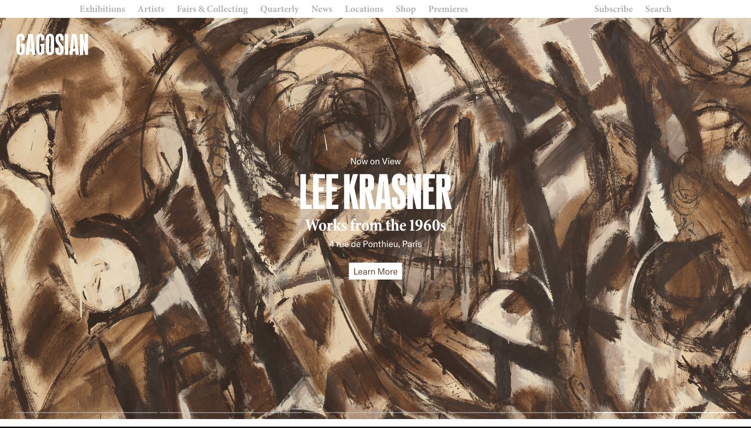
Gagosian fills the opening with a closely cropped Lee Krasner painting and centers the artist, exhibition subtitle and Paris address over it. The narrow white navigation bar separates practical routes from the artwork, while the condensed gallery mark occupies the upper left of the image. A compact Learn More button gives the composition one clear destination. The carousel also showed very different exhibition treatments during observation, including a yellow split layout, so this is a flexible campaign surface rather than a fixed neutral template.
What you can learn
Let each exhibition have a distinct visual treatment while preserving the location and destination in predictable positions. Test every artwork crop with its overlaid text: the white lettering in this particular painting competes with pale and dark brushwork, making its legibility uneven.
Pros
The artist and physical address appear together before the visitor opens an exhibition.
A distinct action sits directly beneath the exhibition information.
Cons & considerations
White text crosses a detailed image with variable contrast.
The compact pale navigation is less prominent than the exhibition artwork.
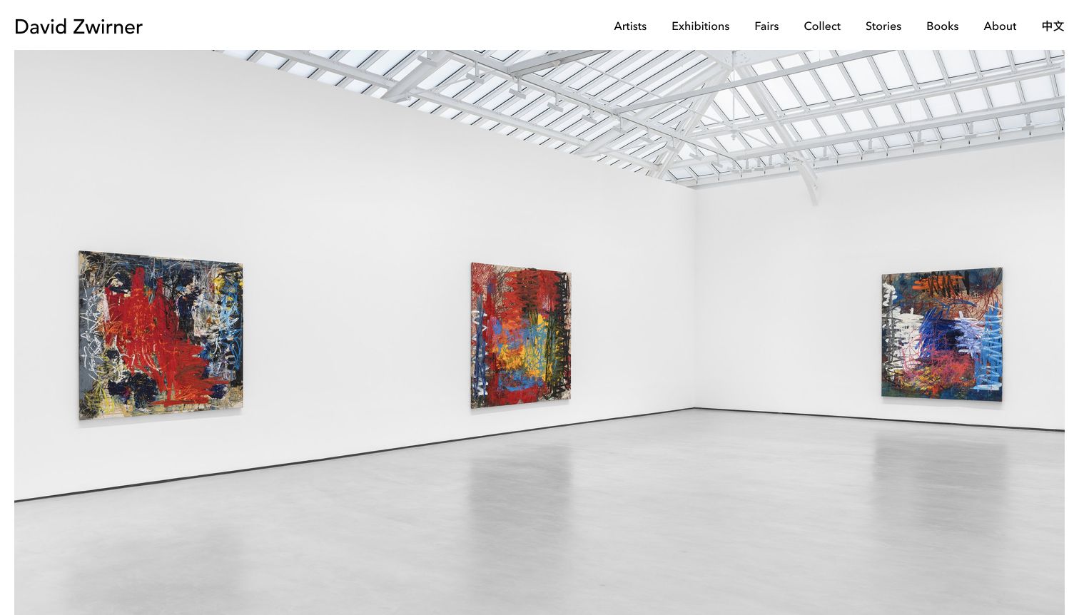
David Zwirner opens with a wide installation photograph surrounded by a small white margin. The image preserves the gallery ceiling, floor and three paintings, allowing a visitor to understand the relationship between works and architectural space. A simple top row places the gallery name at the left and Artists, Exhibitions, Fairs, Collect, Stories, Books and About at the right. In this captured carousel state, the image occupies the entire remaining viewport and the exhibition caption falls below it. The ordinary subscription and privacy overlays were dismissed before the final capture.
What you can learn
Use installation photographs when spatial relationships matter, but give their artist and location a persistent caption within the opening view. A large photograph can establish atmosphere without explaining which exhibition is shown; the visitor should not need to infer that information from the art itself.
Pros
Unobstructed installation photography communicates artwork scale and physical context.
The navigation separates exhibition discovery from collecting and editorial content.
Cons & considerations
The artist, venue and dates are not visible alongside the captured image.
The first visit presented two overlays before the gallery view was clear.
Hauser & Wirth uses a two-level white header: a centered wordmark and search above a complete navigation row. Beneath it, the captured hero shows a birthday cake from the Rashid Johnson presentation, with a large artist name, subtitle, dates and the Wooster Street location in white. An outlined Explore Now control sits below the metadata. The image gives the exhibition a memorable visual identity, while the lower edge exposes carousel navigation and progress marks. Learning, Books and Ursula appear alongside exhibitions, making the wider publishing program visible immediately.
What you can learn
Pair expressive exhibition media with a stable information hierarchy. Artist, title, dates and venue form a useful sequence, but all four must remain legible throughout the motion. Provide visible control over any automatic media so people can read the information at their own pace.
Pros
The exhibition title, date range and specific venue are available together.
The complete navigation makes educational and publishing material discoverable.
Cons & considerations
White lettering overlaps the bright cake and candles in the captured frame.
The large header and full-height media leave little other content visible.
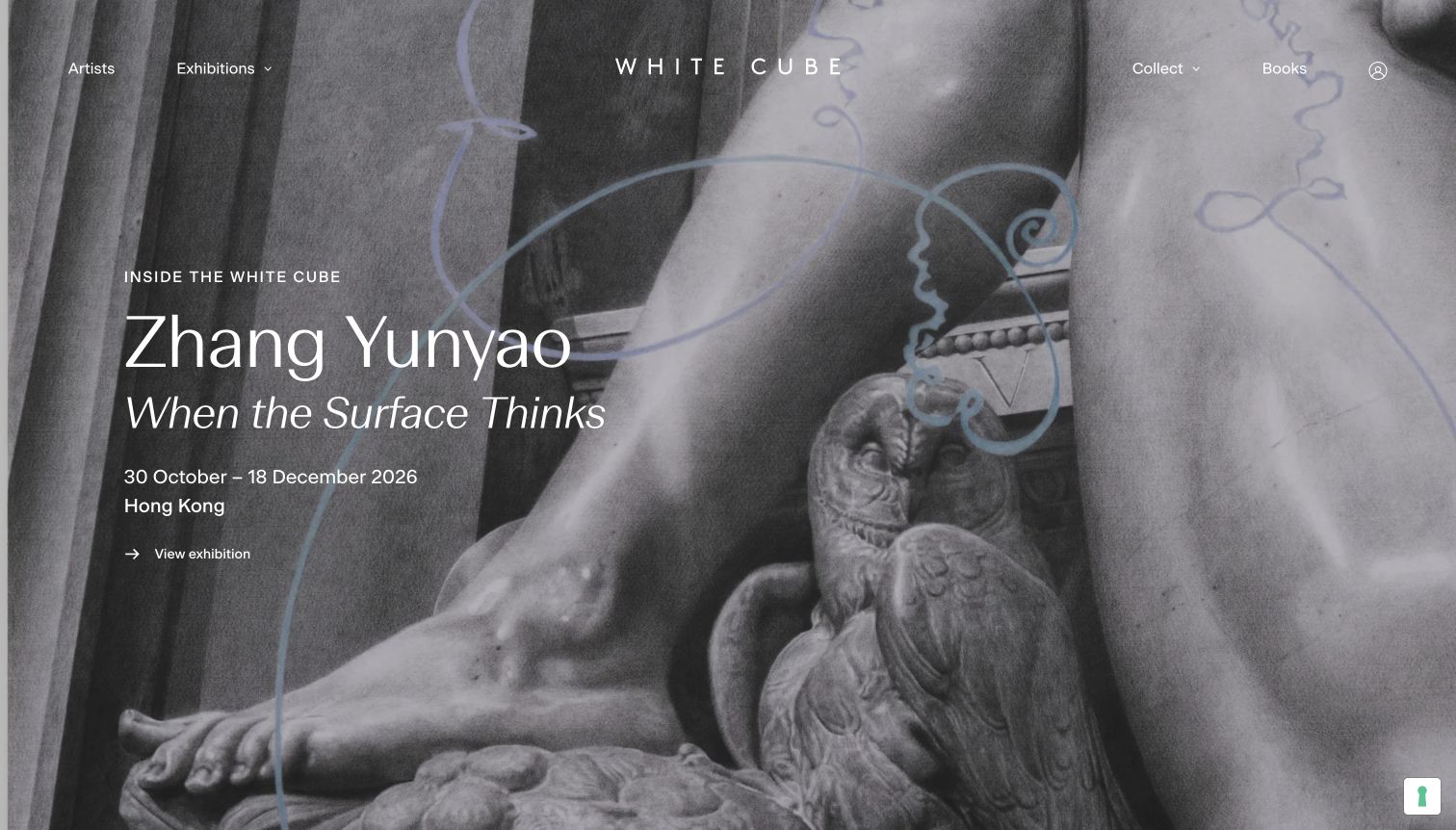
White Cube overlays a monochrome artwork with a left-aligned exhibition caption. The captured Zhang Yunyao presentation combines a large artist name, italic title, date range, Hong Kong location and a small arrow link. The centered spaced wordmark and sparse navigation stay within the image, with collecting and books on the right. There is no separate promotional card competing with the artwork. The gray tones and generous space around the caption produce a quiet, coherent first screen, although the pale text still depends on the chosen artwork crop.
What you can learn
Build the exhibition caption as a complete informational unit, then place it where the image offers enough tonal separation. Artist and title can vary typographically without sacrificing the practical date and city. Retain a clearly labeled destination even when the whole image can be explored.
Pros
Dates and city remain directly attached to the exhibition name.
The italic title creates hierarchy without introducing another color or panel.
Cons & considerations
Overlay navigation depends on contrast against each artwork.
Visit logistics beyond the city require another page or further scrolling.
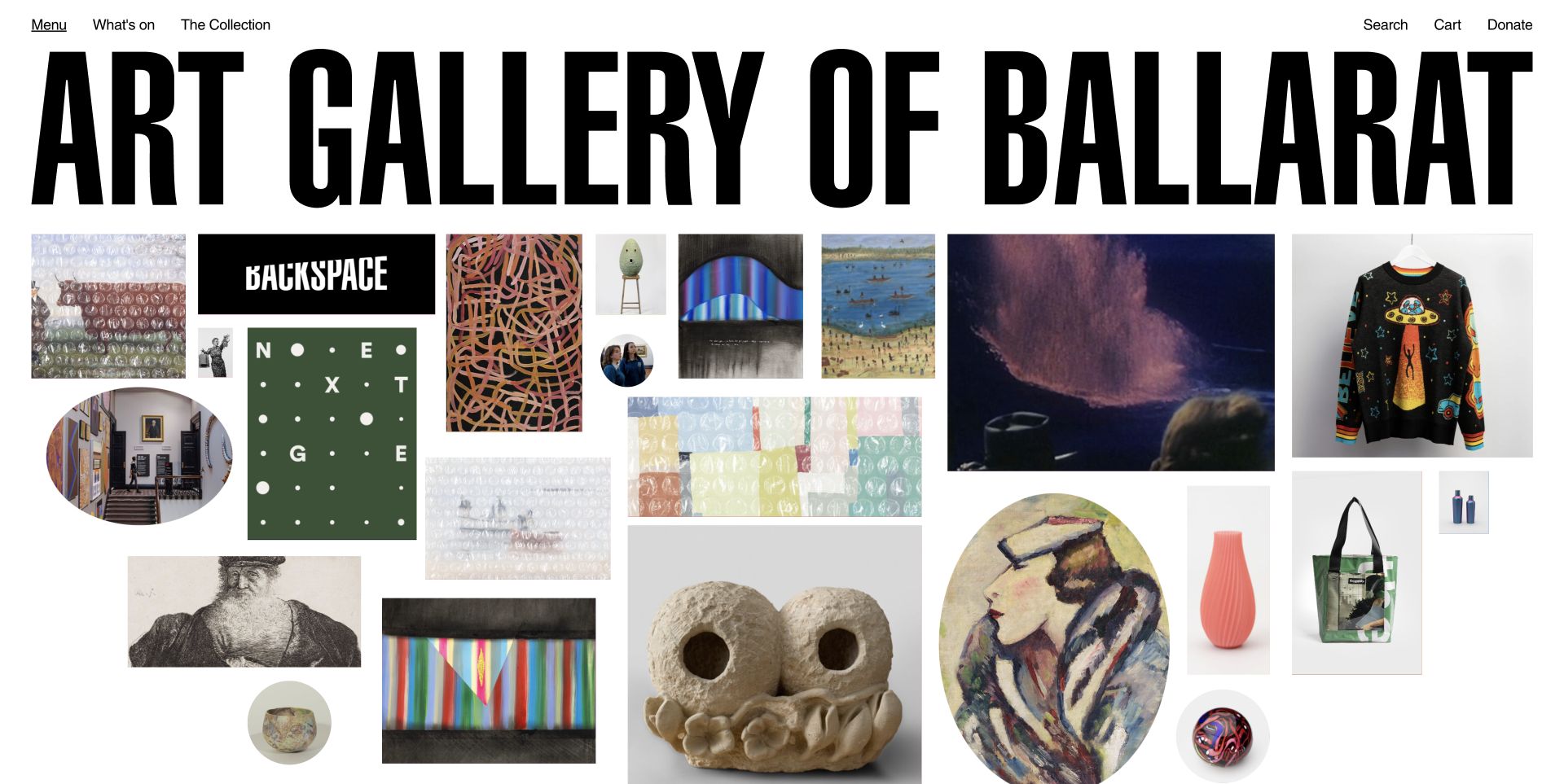
Art Gallery of Ballarat stretches its bold black name across nearly the full width of the captured page. Below it, artworks, installation details, a portrait, graphic program tiles and shop objects form an uneven visual wall. Rectangular and circular crops vary the rhythm without a repeated card frame. A quiet top row separates menu, program and collection links from search, cart and donation. The large identity and dense field of imagery communicate variety immediately, but most individual objects do not have persistent captions visible in this opening.
What you can learn
An exploratory image arrangement still needs a dependable content structure. Keep the distinction between artwork, program and shop item available in text and ensure essential labels can be reached without hovering. Maintain practical visiting and collection routes outside the image field so someone with a specific purpose does not have to inspect every tile.
Pros
The varied sizes and crops accommodate very different kinds of art and gallery material.
Program and collection links remain separate from shopping and support actions.
Cons & considerations
The enormous gallery name uses substantial vertical space before the collection begins.
Uncaptioned imagery makes destinations and object context harder to predict from this static opening.
Public source checked November 3, 2026. References may be embedded or legacy—not a complete backend inventory.
Platform source: Official WordPress.org Showcase. WordPress.org Showcase documents the official Art Gallery of Ballarat website. Source association reviewed 2026-11-01; not a complete current infrastructure audit. Platform evidence is separate from the direct website screenshot and is not a complete current infrastructure audit.
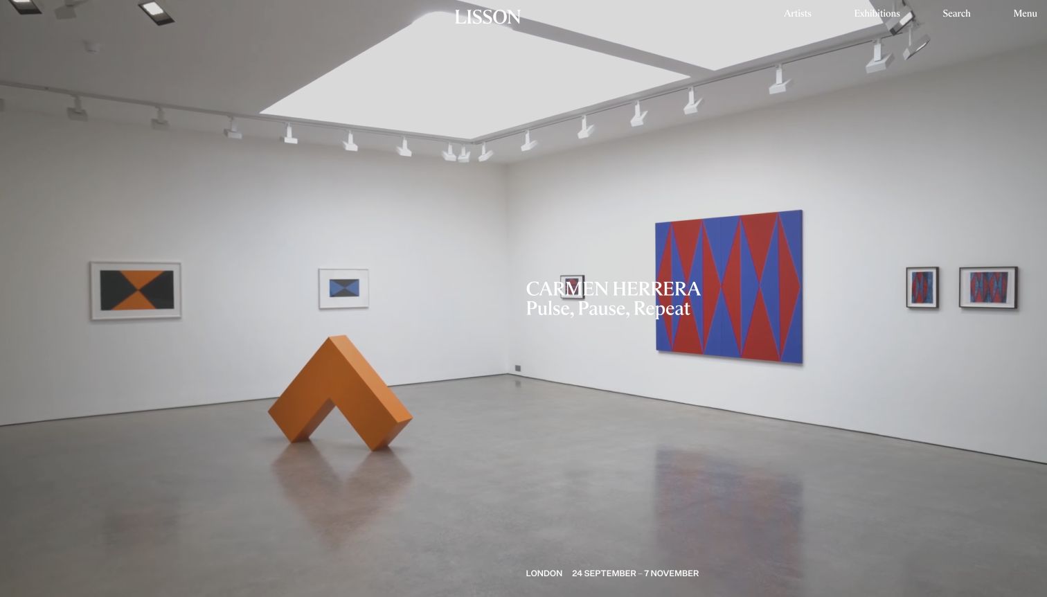
Lisson’s opening shows a spacious Carmen Herrera installation with geometric paintings and an orange floor sculpture. A centered serif wordmark sits above the scene, while Artists, Exhibitions, Search and Menu occupy a thin top line. The artist and exhibition title appear near the center, and London with the date range sits at the bottom. During observation the viewpoint moved through the room, so the final image documents one moment of a changing background. This brings physical scale into the first screen while keeping most of the artwork unobstructed.
What you can learn
Separate stable exhibition information from a moving spatial presentation. The bottom location line is useful, but central white captions should be tested across every camera position. A static alternative or explicit motion control would help visitors who want to inspect the works without visual movement.
Pros
The room view communicates the relationship between paintings and sculpture.
City and date range have a consistent position along the lower edge.
Cons & considerations
Central white text crosses pale gallery walls and loses contrast.
Only a small set of practical routes is exposed before opening the menu.
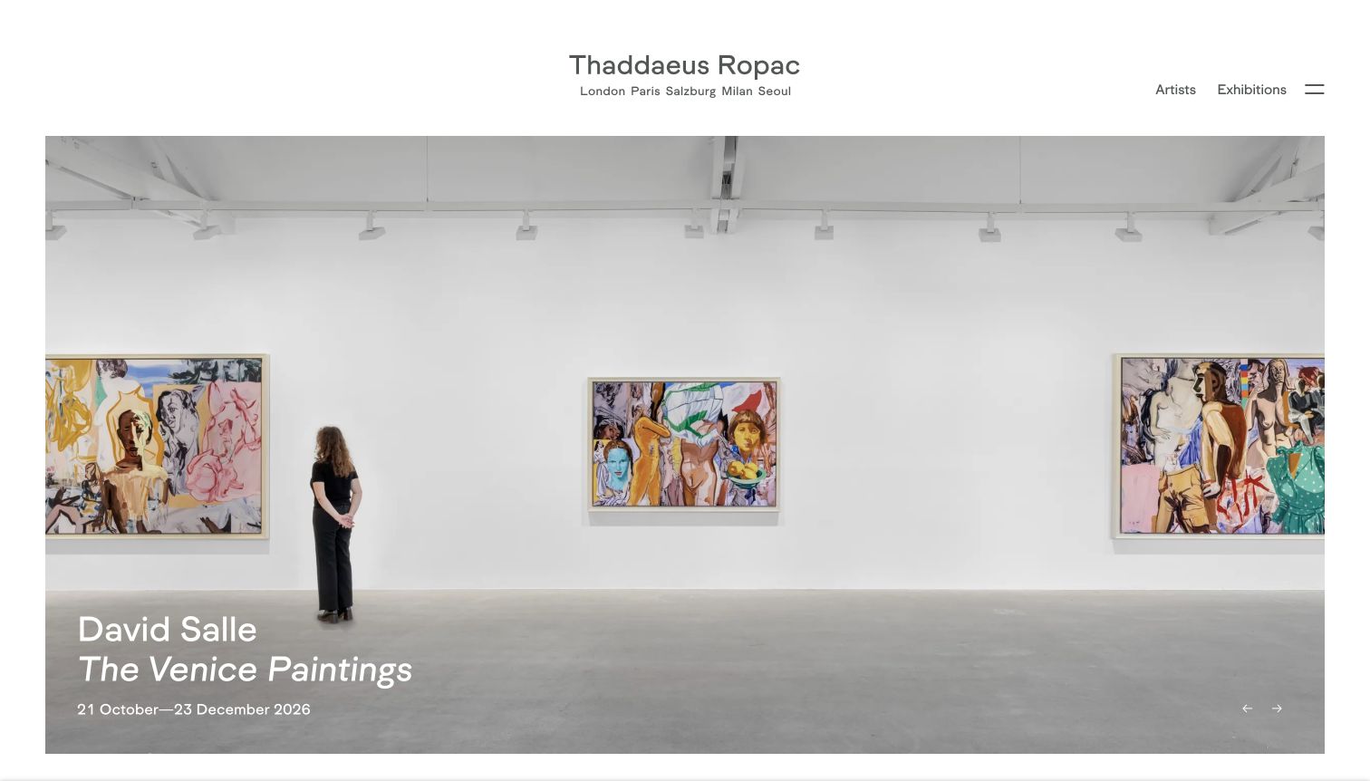
Thaddaeus Ropac leaves a generous white header above a large framed installation photograph. Its centered name is followed by London, Paris, Salzburg, Milan and Seoul, immediately establishing the gallery’s geographic scope. The captured David Salle slide places the artist, italic exhibition title and dates in the lower left of the image, with small navigation arrows at the lower right. A visitor standing in the photographed room provides a useful scale reference. Artists and Exhibitions remain exposed beside a compact menu rather than being buried inside it.
What you can learn
Use the header to establish the organization and the image caption to identify the current exhibition. A list of gallery cities is helpful context, but each featured show also needs its specific venue; the captured caption provides dates while leaving that location decision to the destination page.
Pros
The installation photograph includes a human scale reference.
The typography distinguishes artist, exhibition title and date range clearly.
Cons & considerations
The featured exhibition caption does not display its specific city in this view.
Small arrows offer limited explanation of the other carousel content.
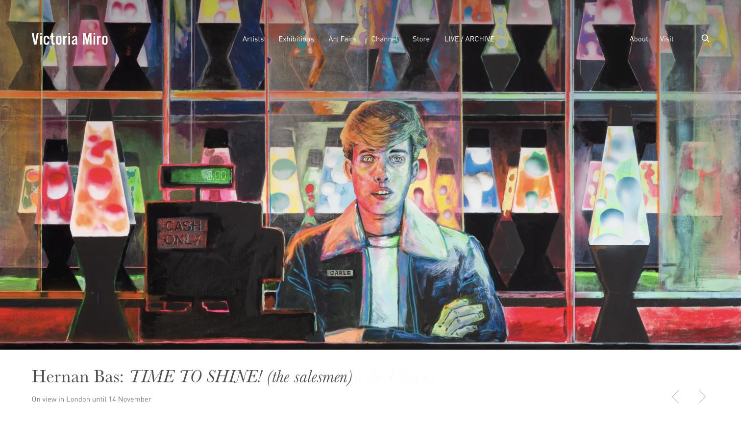
Victoria Miro gives a colorful Hernan Bas painting most of the opening screen, then puts the exhibition caption in a white strip beneath it. The serif artist and italic title are followed by a smaller line stating that the show is in London and runs until November 14. The top navigation remains over the painting and includes a distinct LIVE / ARCHIVE route along with exhibitions and the store. Pale carousel arrows sit within the caption strip. The white information band keeps the detailed title away from the busy lava-lamp imagery.
What you can learn
Separate the caption from visually dense artwork when readability matters more than a fully immersive cover. Preserve a stable baseline for location and dates beneath the title, and make carousel controls visible enough to identify without searching. Navigation over the artwork still needs contrast checks even when the caption is protected.
Pros
The white caption area makes the long exhibition title readable.
Visit and About are exposed directly in the top navigation.
Cons & considerations
Thin white navigation overlaps a highly detailed painting.
The pale slideshow arrows are easy to miss against their white background.
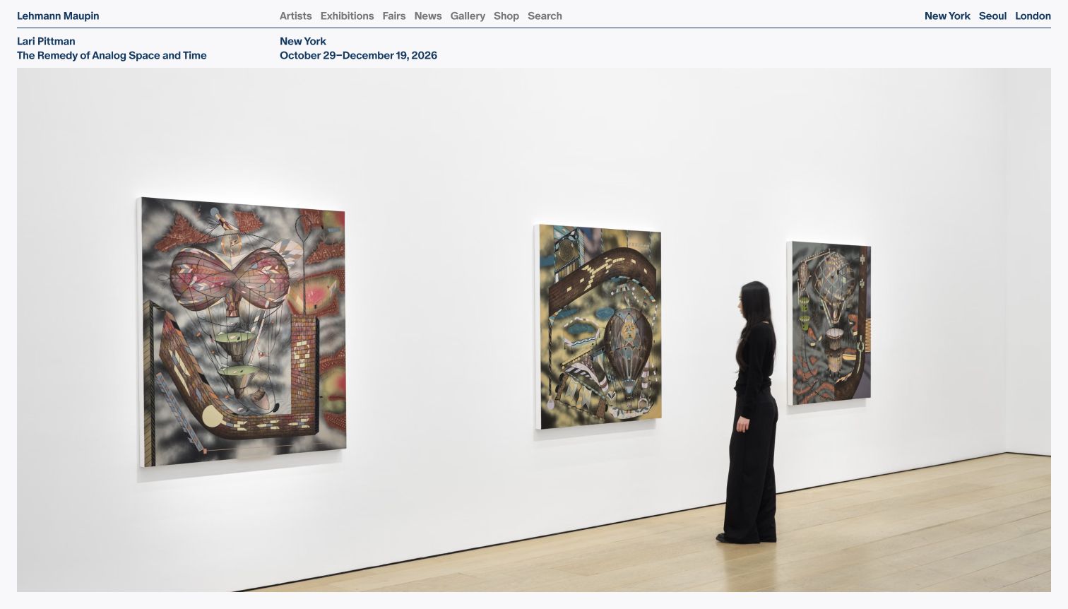
Lehmann Maupin uses a compact two-row composition before its large installation image. A thin line separates the gallery navigation from the exhibition information: Lari Pittman and the title sit on the left, while New York and the date range occupy a neighboring column. The photograph then shows several works with a visitor for scale. Dark blue text, tight spacing and a light background make the page feel editorial rather than cinematic. City links in the top right give the gallery’s physical locations a more visible role than many image-led examples.
What you can learn
Place the exhibition’s practical metadata outside the artwork when clarity is the priority. A small aligned band can communicate artist, venue and dates without consuming much space, but give the type enough size and breathing room for visitors who cannot comfortably read a tightly packed header.
Pros
Artist, title, city and dates are visible before the photograph.
The installation view gives useful scale without covering paintings with captions.
Cons & considerations
Small closely spaced navigation requires careful reading.
The initial visit displayed both a consent dialog and a newsletter popup.
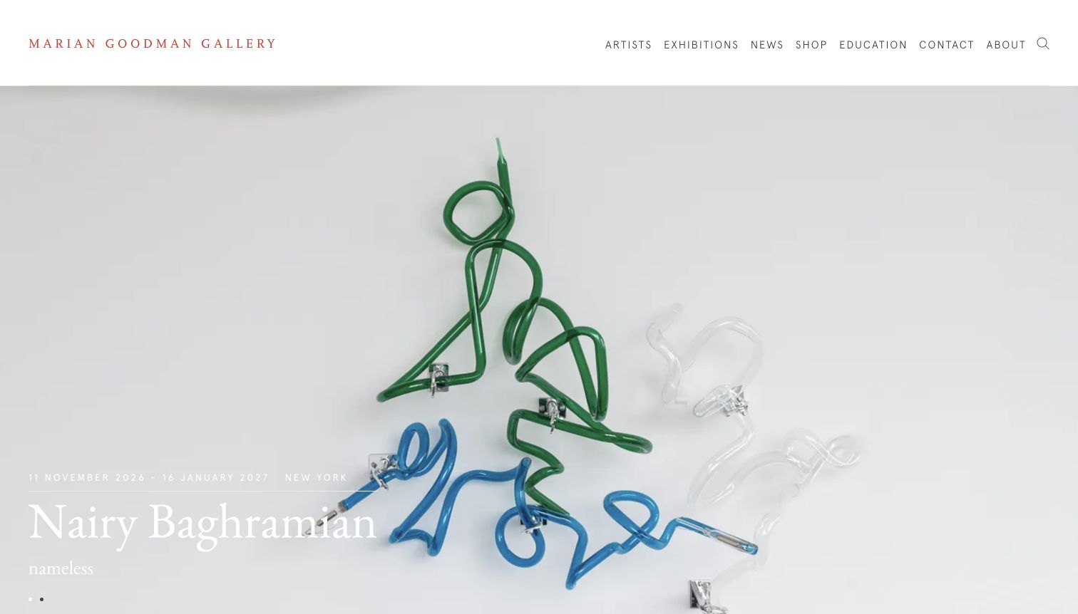
Marian Goodman Gallery uses a spacious white header, a fine red serif wordmark and a widely spaced navigation row. The captured cover shows a sculptural installation with green and blue forms against a pale wall. Its lower-left caption names Nairy Baghramian, the exhibition title, New York and a date range. Small dots indicate another slide. The artwork is allowed to occupy nearly all of the screen beneath the header, but the thin white metadata becomes difficult to read on the pale installation photograph.
What you can learn
A restrained brand system can let the exhibition carry the color, but typography still needs a dependable background. Preserve the red wordmark’s visual distinction while giving practical information a darker caption area or other contrast support. Small carousel indicators should supplement a comprehensible exhibition list, not replace it.
Pros
The clean header gives the gallery identity a stable, separate area.
The opening combines artist, title, dates and city in one caption.
Cons & considerations
White exhibition text has weak contrast over the pale installation.
The small slide dots reveal little about the other featured show.
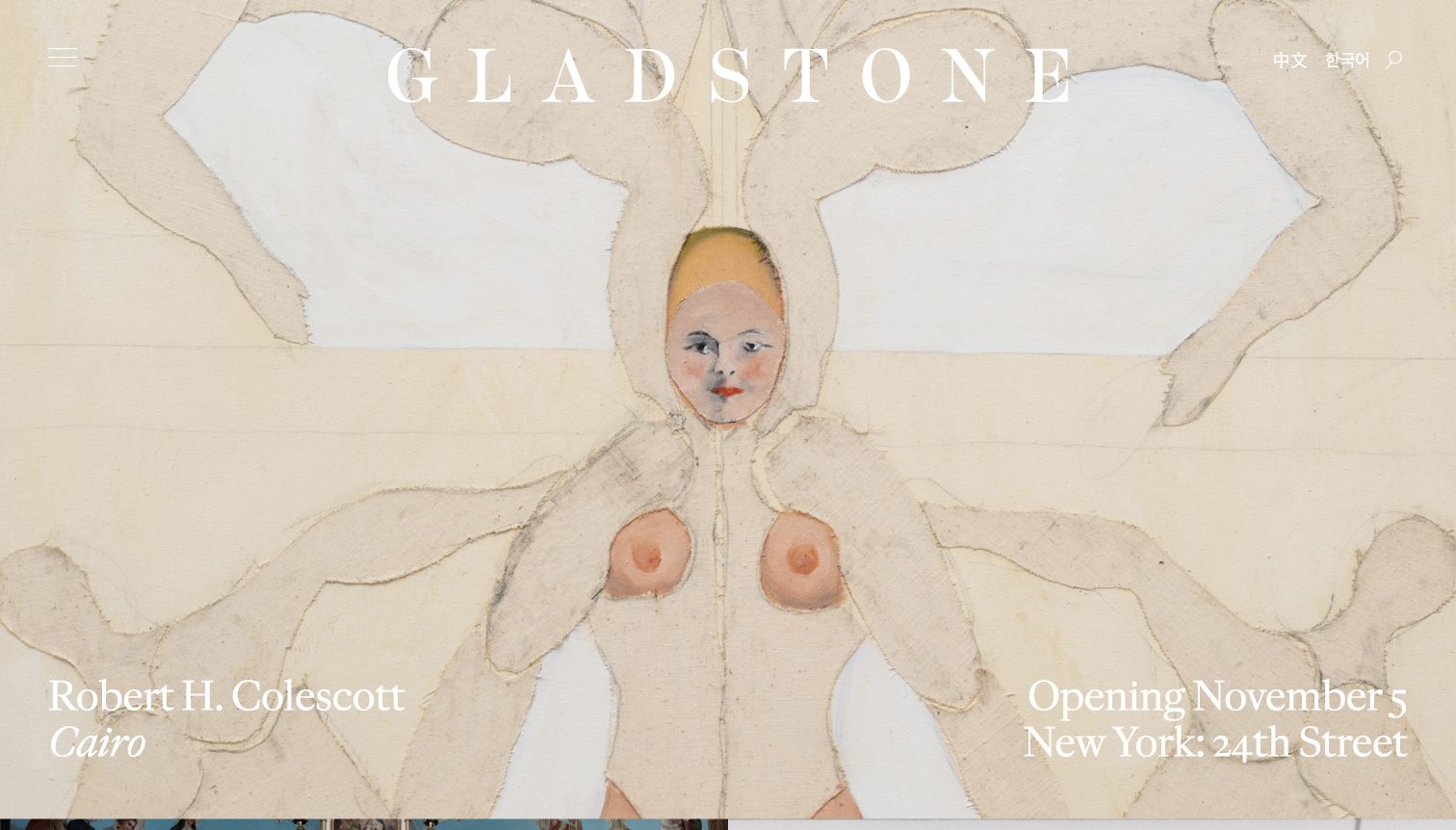
Gladstone places a very large, widely spaced serif wordmark across a pale artwork. A small menu icon occupies the upper left, while Chinese, Korean and search controls sit at the upper right. The Robert H. Colescott caption appears at the lower left and the opening date with New York’s 24th Street venue at the lower right. This splits artist information from visiting information without introducing panels. During the DOM review, several public location links pointed to a development hostname; those destinations were not followed and are a routing limitation to avoid copying.
What you can learn
A two-corner caption can balance the artwork and give location equal importance, provided the contrast holds. Audit actual destination links as carefully as the visual composition: polished presentation does not compensate for a location link that sends visitors toward an unintended development host.
Pros
The opening date and specific New York venue are clearly grouped.
Language routes are visible before opening the navigation menu.
Cons & considerations
The pale artwork weakens contrast for the white wordmark and captions.
Several observed location links targeted a development hostname.
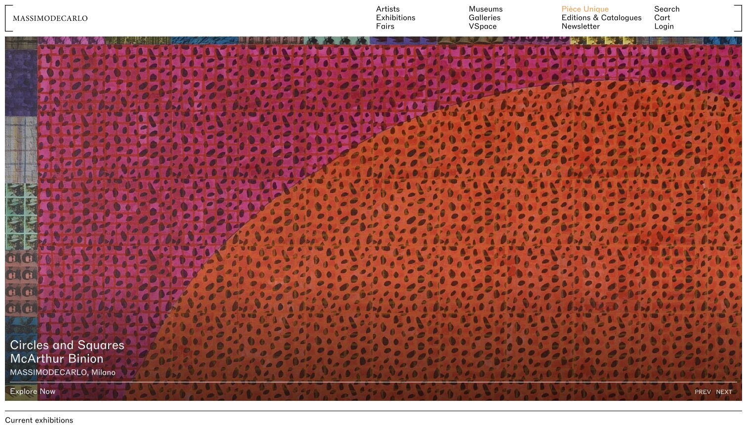
MASSIMODECARLO uses a compact white header divided into short link columns, with fine bracket-like corner marks around the composition. The captured McArthur Binion artwork fills the screen with orange, pink and patterned marks. A lower-left caption identifies the exhibition, artist and Milan gallery, while Explore Now sits below a thin horizontal rule. Previous and Next appear on the opposite side of that rule. The next Current exhibitions heading is just visible beneath the image, connecting the campaign to a broader program list.
What you can learn
A directory-style header can expose many destinations without a large navigation bar, but group them by visitor intent. Keep the exhibition caption short and give the practical destination a stable edge. Fine rules can organize the page effectively when their contrast remains strong enough on colorful artworks.
Pros
The header exposes exhibitions, galleries, editions and digital programs together.
The lower rule separates the main action from the exhibition caption.
Cons & considerations
Small stacked navigation links make scanning more demanding.
The patterned image competes with the small white exhibition metadata.
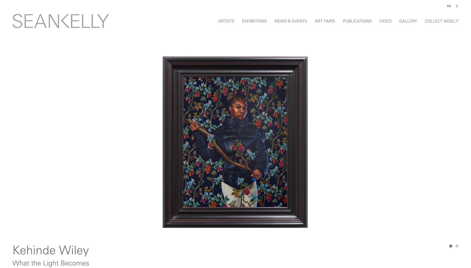
Sean Kelly opens with a large light-gray wordmark and a slim navigation row, then centers a framed Kehinde Wiley portrait on a generous white background. The full frame is visible, preserving the work’s object-like presence instead of cropping it into a background. The artist name and exhibition title begin below the image, with two small carousel dots to the right. Publications, Video and Collect Wisely appear among the navigation routes, suggesting several forms of engagement beyond the exhibition listing without adding promotional clutter to the image area.
What you can learn
Show an artwork’s full boundaries when the frame, format and object proportions matter. Place the artist and exhibition metadata close enough that they remain visible together with the image on common screens. A restrained palette can support close looking, but essential labels should not become faint merely to preserve a quiet aesthetic.
Pros
The complete frame remains visible with ample space around the work.
The image is free of promotional text or interface overlays.
Cons & considerations
The light-gray navigation has limited visual emphasis.
Dates and visiting details fall below the captured opening view.
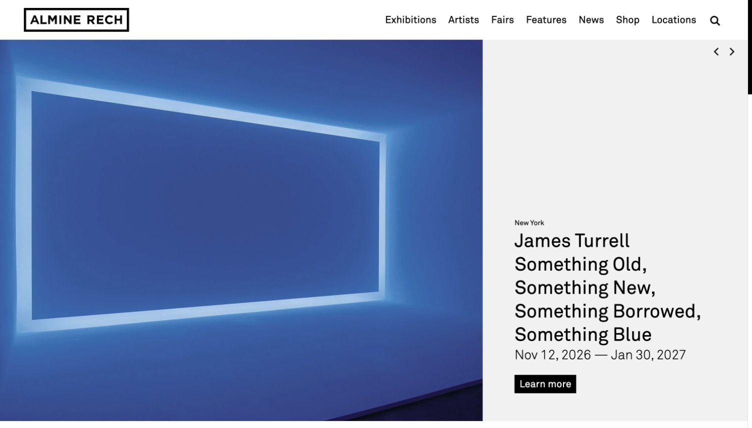
Almine Rech divides its hero into a large image on the left and a pale-gray information column on the right. The captured James Turrell slide shows a blue light work beside New York, a long exhibition title, dates and a black Learn more button. The title wraps across several lines but remains readable because it never overlaps the artwork. A bold outlined wordmark and straightforward navigation sit above both panels. Small left and right controls appear at the top of the text column, maintaining a consistent location even as the artwork changes.
What you can learn
Reserve a dedicated text area for long exhibition titles and practical details. This protects readability across very different works and makes the action easy to find. Set limits for title length and responsive wrapping so that the date range and action do not disappear below the fold on smaller screens.
Pros
The title and date range maintain strong contrast independent of the artwork.
The separate text panel accommodates a lengthy exhibition name.
Cons & considerations
The title occupies much of the available text column.
The carousel controls are small relative to the dominant image and headline.
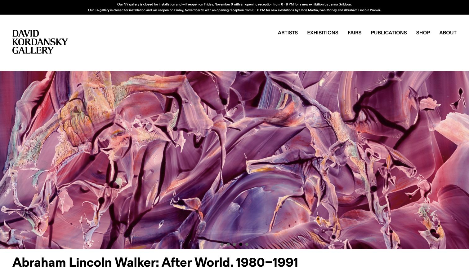
David Kordansky Gallery places two short closure and reopening notices in a black strip at the very top. A substantial white header follows, with a stacked serif wordmark and direct Artists, Exhibitions, Fairs, Publications, Shop and About routes. The final captured slide shows a close crop of purple painted texture, with the Abraham Lincoln Walker exhibition title beginning below it. This combines practical operational information with a dramatic image. The capture was made after closing a small mailing-list popup through its visible dismissal control.
What you can learn
Give temporary visitor information a clear place above the exhibition program, especially when the physical galleries are closed for installation. Keep those notices short but readable. A dramatic artwork crop should also connect to an artist caption within the opening view so visitors know what they are looking at.
Pros
The header warns visitors about installation closures and reopening dates.
The stacked wordmark is distinctive without adding color over the artwork.
Cons & considerations
The operational notices use very small text in a narrow strip.
The large header and image push much of the exhibition caption below the fold.
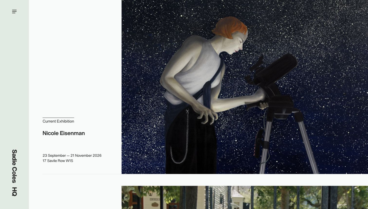
Sadie Coles HQ uses a narrow pale-green rail at the left, with a menu icon near the top and the gallery name rotated vertically near the bottom. The main area divides each exhibition into a white information column and a large image. In the captured Nicole Eisenman entry, Current Exhibition, artist, dates and the Savile Row address sit beside the artwork instead of over it. The next image begins below, establishing a vertical sequence of exhibitions. This arrangement gives each show its own information area while keeping the gallery identity continuously distinct.
What you can learn
Use an exhibition row when visitors need to compare several shows without a carousel. Keep the information column wide enough for dates and addresses, and preserve its relationship to the adjacent image as the page narrows. A distinctive identity rail should not make basic navigation hard to locate.
Pros
Artist, date range and street address remain readable beside the image.
The visible next row makes the continuation of the program apparent.
Cons & considerations
The gallery name requires reading a vertical orientation.
Most navigation destinations are hidden behind a small menu icon.
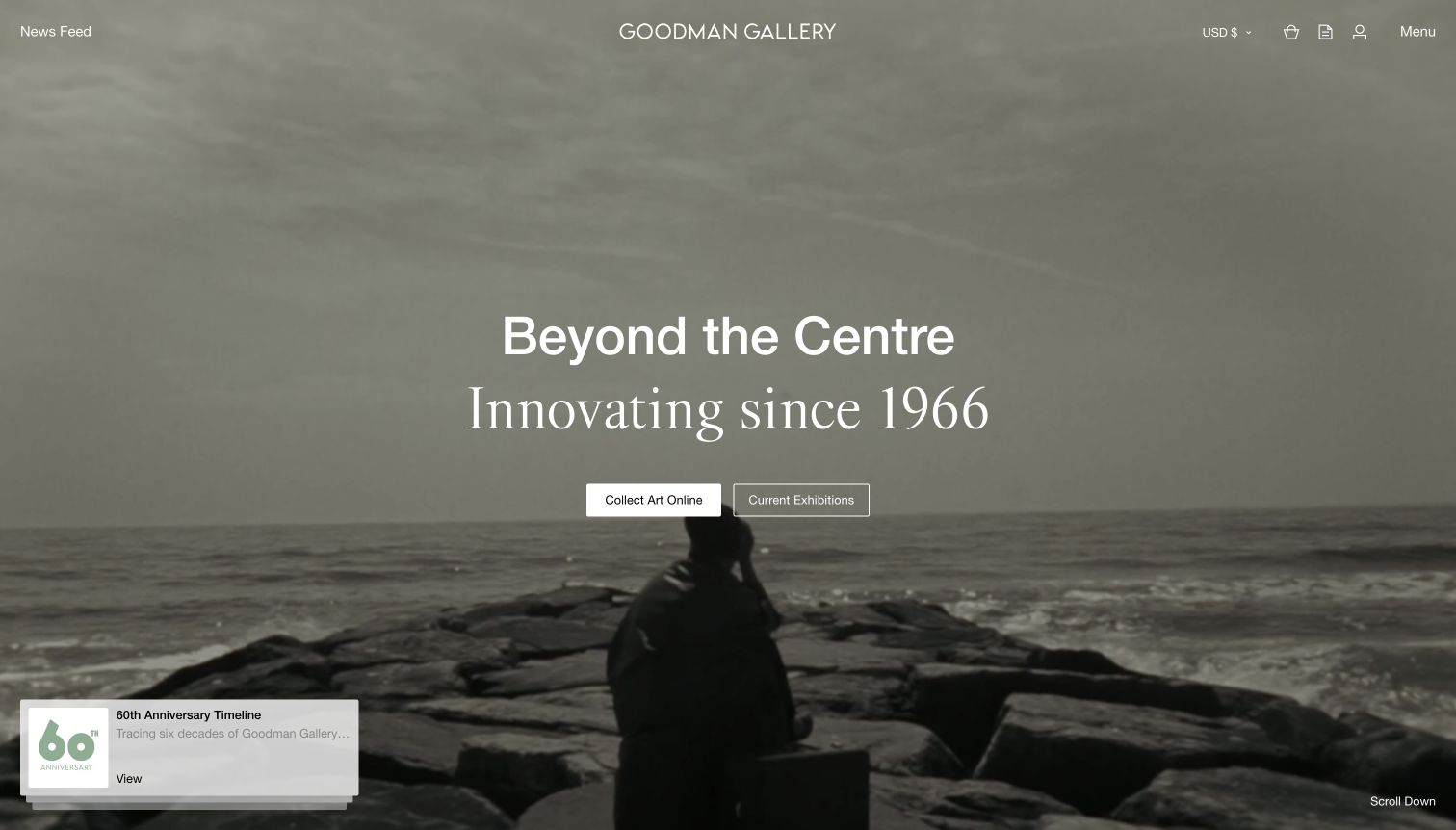
Goodman Gallery opens with moving documentary imagery under a dark translucent treatment. The central headline combines a contemporary sans-serif phrase with a large serif line about the gallery’s history, followed by separate Collect Art Online and Current Exhibitions buttons. A small anniversary timeline card sits in the lower left, while a scroll cue appears at the lower right. The header includes a news feed, currency selector and account-related icons alongside the menu. The result introduces the gallery as an ongoing institution rather than leading with only one exhibition.
What you can learn
Use a broad institutional introduction when the gallery serves several visitor goals, then offer clearly different routes into the program and collection. Keep historical claims supported elsewhere and ensure that animated background footage does not distract from the action choices. Utility icons need understandable labels beyond their visual shapes.
Pros
Collecting and exhibition discovery have distinct, adjacent actions.
The timeline card gives the historical message an explicit destination.
Cons & considerations
The opening does not identify a specific exhibition or artist.
Several header utilities rely primarily on small icons.
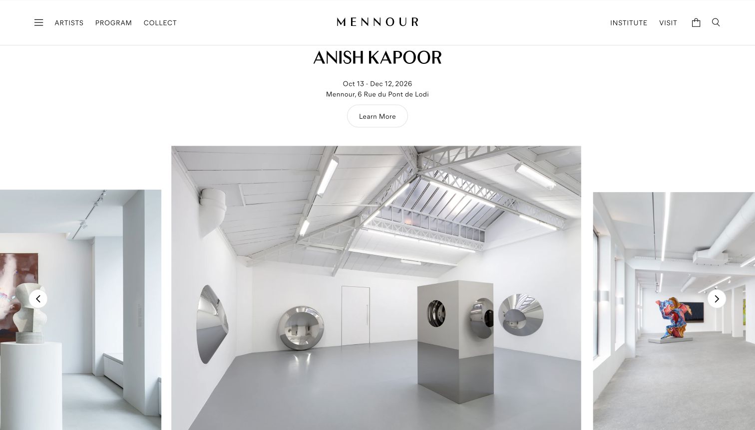
Mennour keeps its wordmark centered in a thin white navigation bar, with artist and program routes on the left and Institute and Visit on the right. Beneath it, the Anish Kapoor heading, dates, Pont de Lodi address and rounded Learn More control form a centered block on white. Three installation images extend across the page, with the middle image larger and neighboring images partly clipped. The artwork and its reflective surfaces remain free from text. Circular arrows sit over the outer images to indicate further movement through the sequence.
What you can learn
Place exhibition metadata above a photographic sequence when the viewer needs both orientation and multiple spatial views. The central image should read as the active focus, while partial neighbors communicate continuity. Make the sequence’s behavior clear so visitors know whether the arrows change viewpoints, works or separate exhibitions.
Pros
The address and dates remain on white above the images.
Different installation views provide spatial context without overlay captions.
Cons & considerations
Clipped neighboring images can make the sequence’s boundaries ambiguous.
The small outlined action has less emphasis than the large photographic area.
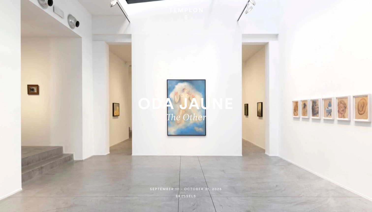
Templon’s captured cover shows a bright gallery interior with framed works distributed across several walls. The artist Oda Jaune and an italic exhibition title sit in the center, with dates and Brussels near the lower edge. The white wordmark is very small against the pale room and the navigation is largely reduced to a menu control. The displayed date range ends on October 31, before this November 4 capture, so the image documents a featured presentation rather than evidence that the exhibition is currently open.
What you can learn
A visually quiet cover still needs readable labels and accurate exhibition status. If a past exhibition remains featured, identify it as an archive or recent presentation rather than relying on the date alone. Contrast should be tested on the lightest areas of an installation photograph, where white captions can disappear.
Pros
The installation view reveals the arrangement of several works in the room.
City and date range are included in the opening composition.
Cons & considerations
The featured date range had already ended at the time of capture.
White identity and title text lose contrast against the bright walls.
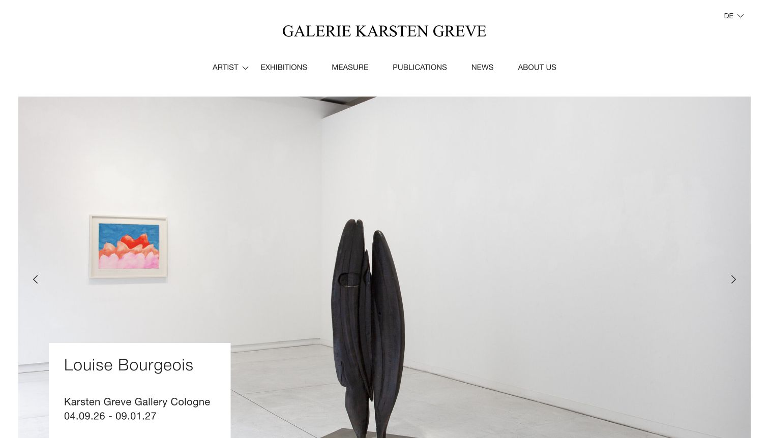
Galerie Karsten Greve uses a centered serif wordmark, a spacious white header and a compact navigation row above its installation image. The captured Louise Bourgeois presentation includes a tall dark sculpture and a framed work, with a white rectangular caption overlapping the lower left. That caption groups the artist, Cologne gallery and date range in dark text, preserving readability even against a pale room. The page’s language control displays DE, while some visible labels in the browser are English; this capture records that observed presentation without changing language settings.
What you can learn
A simple caption panel is a dependable way to preserve exhibition information over installation photography. Keep artist, venue and dates together and ensure the panel does not cover the work’s important features. Consistent language labels are also part of navigation clarity, particularly for galleries operating in several countries.
Pros
The white caption panel gives the exhibition metadata dependable contrast.
The full installation image preserves a sense of the sculpture’s scale.
Cons & considerations
The large header consumes space before the exhibition image begins.
The displayed language indicator and some visible labels are inconsistent.
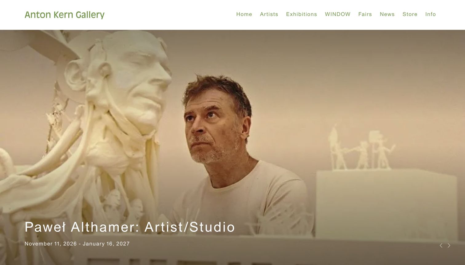
Anton Kern Gallery uses muted green lettering in a clean white header, then fills the opening with an artist working beside a sculpture. The lower-left caption introduces Paweł Althamer and the Artist/Studio exhibition, followed by its date range. Small arrows at the lower right suggest additional featured material. The warm documentary image gives the visitor a person and a working environment before a formal list of artworks. The navigation includes a distinct WINDOW route along with exhibitions, fairs, news, store and information, exposing a named program without a separate promotional card.
What you can learn
Use studio imagery when the artist’s process is a useful starting point, but preserve the practical exhibition context. Dates are visible here, while location requires another step. Descriptive program names and clear venue labels help visitors connect a compelling image to an actual visit or a deeper artist page.
Pros
The artist and working environment make the exhibition introduction personal.
The date range is readable beneath the main caption.
Cons & considerations
The opening caption does not state the physical venue.
The purpose of the WINDOW navigation label is not explained in the first view.
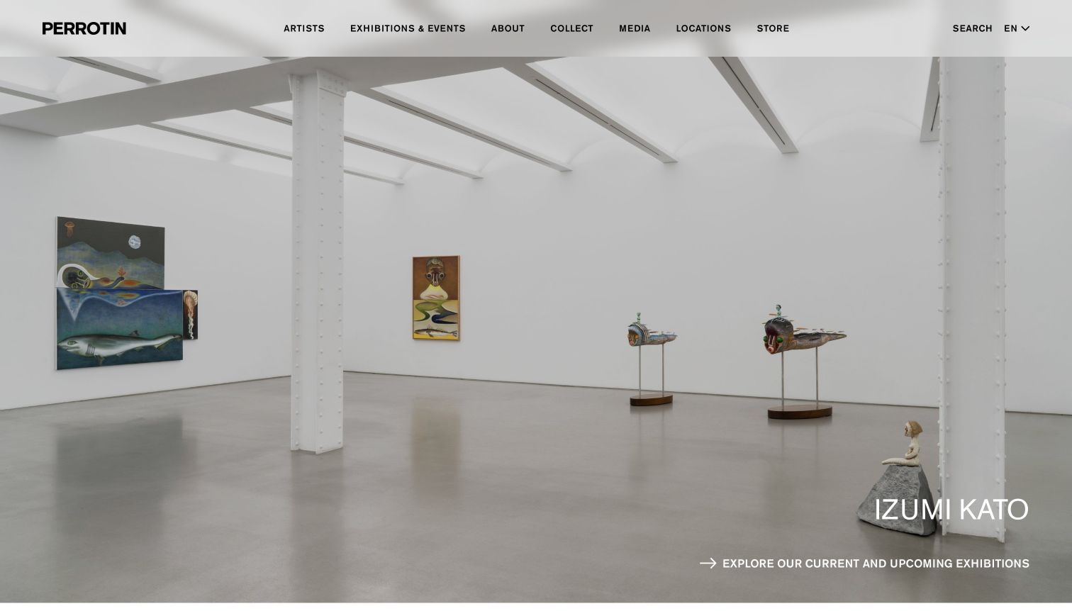
Perrotin opens with a wide installation photograph, a translucent light header and a bold compact wordmark. The current captured image shows works by Izumi Kato in a spacious room, with the artist name near the lower right. Beneath it, an arrow and a long explicit label invite visitors to explore current and upcoming exhibitions. Artists, events, collecting, media, locations and the store remain directly visible across the header. This makes the image a gateway into the broader program rather than requiring the viewer to interpret an unlabeled full-screen artwork.
What you can learn
Label the next step in terms of the visitor’s task. An explicit route to current and upcoming exhibitions helps distinguish a program overview from a single featured artwork. Keep the artist identification near the image and add venue or date context when the feature represents one particular show.
Pros
The main action clearly describes the exhibition overview it opens.
The installation image remains mostly free of text and promotional overlays.
Cons & considerations
The featured artist caption lacks venue and date information in this view.
The long lower action label requires sufficient width to remain readable.
Plan a program that remains useful after an exhibition closes
Define a clear exhibition lifecycle
Decide what moves a show from forthcoming to current to archive, including venue time zones and installation days. Give staff a review queue for automatic changes. Retain useful installation views and texts after closing rather than erasing the program’s history.
Collect image context and permissions together
Store the artist, title, date, medium, dimensions, photographer credit and approved usage terms with the image where applicable. Record crops and alternate views intentionally. Avoid relying on a filename to preserve attribution or using an attractive detail without identifying its relationship to the work.
Separate institutional and commercial tasks
Map visits, education, press, collecting and shop purchases to appropriate destinations. A museum exhibition involving a represented artist is not the same as a gallery show. Use clear content types so the homepage can feature both without confusing location, organizer or availability.
The editing job behind the design
Choose connected publishing that the gallery can maintain
A structured CMS should relate artists, works, exhibitions, venues, publications and news without copying the same information into many pages. Support drafts, credits and scheduled review. A visual grid can vary widely while its underlying records remain consistent and searchable.
Large artwork images require responsive sizes and careful cropping. Keep captions and key exhibition facts as readable page text. Treat collection-management, inventory, online sales and mailing systems as separate integrations with explicit ownership and a reliable inquiry fallback.
Our WordPress website examples offer a separate look at publishing approaches. A visible platform label is evidence for that named page, not a guarantee that the same system will suit your requirements.
Before the public launch
Art gallery website launch checklist
Verify artist names, exhibition titles, dates and venue relationships.
Check image permissions, artwork captions and photographer credits.
Review current, upcoming and archive transitions against actual opening days.
Confirm each location’s hours, appointment rules and visitor contact details.
Test galleries, captions, focus states and navigation without hover or a mouse.
Assign owners for availability inquiries, institutional news and outdated program labels.
These checks are a project checklist, not a performance, legal, security, or accessibility certification. Test real journeys with the people responsible for the website before making claims about the result.
Sources & editorial method
How this collection was selected and reviewed
The collection focuses on distinct official gallery websites and clearly identifies the public-gallery example. Reviews examine visible exhibition, artist, collection and visitor presentation. They do not establish artwork availability, authenticity, provenance, value or the quality of the represented program.
Each example links to its actual source page. Screenshots are direct browser captures with their own capture dates; moving imagery, announcements and live designs can change. The notes describe observable design choices and conditional tradeoffs, not measured traffic, conversion results, service quality, or accessibility conformance.
Technology labels use public page metadata, asset evidence, or explicitly cited platform documentation. Platform documentation is not a complete current deployment audit. A component reference may be legacy or unused; it is not a complete backend inventory. Unknown stacks are omitted. These sites are editorial examples, not our client portfolio.
Written, Edited and Curated are separate editorial records, not timestamps advanced by a rebuild. Website designs and imagery belong to their owners. See our editorial standards or suggest a correction.
Questions worth asking
Art Gallery website design questions
Is a nearly empty homepage a good gallery design?
Restraint can support the artwork, but visitors still need enough context to identify the program and find practical information. Assess the image, title, date and venue together rather than treating whitespace as the goal.
Should captions appear only on hover?
Essential information needs an equivalent route for touch and keyboard users. Persistent captions, clearly labeled detail pages or accessible controls can preserve a calm layout without depending on a pointer gesture.
Can museum news and gallery exhibitions share one feed?
They can share a visual system when each record clearly identifies its type, organizer, venue and dates. Do not let an outside museum exhibition appear to be taking place at the gallery.
Does every artwork image need a price or inquiry button?
No. Some images document past exhibitions or illustrate editorial material. Add a commercial action only where it matches the gallery’s actual process, and distinguish an availability inquiry from a confirmed purchase.
Make room for the art and keep its context close. A dependable program archive, careful image records and clear visiting routes give a restrained design lasting usefulness.