A compelling riding photograph starts the conversation; useful model and ownership information helps someone continue it.
Visitors may arrive knowing a precise model, comparing different riding disciplines or wondering which size and configuration to explore. A manufacturer’s website needs to serve those starting points without assuming everyone understands its model naming system. Dealer-led sales and direct purchasing also require different next steps.
The examples span performance, utility and folding bicycle brands. Reviews examine public presentation and navigation, not ride quality, safety, component suitability or product availability. A dramatic campaign or published specification is not a substitute for appropriate product and fit advice.
Before the examples
What makes good bicycle manufacturer website design in 2026?
Connect model names to a recognizable riding purpose
Explain whether a family is intended for road, gravel, mountain, commuting or another use before asking visitors to compare unfamiliar codes. Use meaningful differences between models and builds. A technically rich catalog still needs an approachable starting point for someone who has not memorized the range.
Make comparison and fit information consistent
Give model pages comparable fields for available sizes, geometry, build components and relevant dimensions. Identify units and model years. Explain how to get fit help instead of treating a height selector as a guarantee, and keep specification changes synchronized with regional availability.
Keep buying and ownership routes visible
A visitor may need a dealer, test ride, direct order, replacement part or older manual. Give each a clear route and identify the market served. Do not let a new-model launch hide support for bicycles already in use or imply that every dealer carries every configuration.
The collection · 21 examples
21 bicycle manufacturer websites worth studying
Compare how these brands move from riding identity to a useful product decision. The most transferable patterns connect campaigns to model families, then support comparison, dealer contact and long-term ownership.
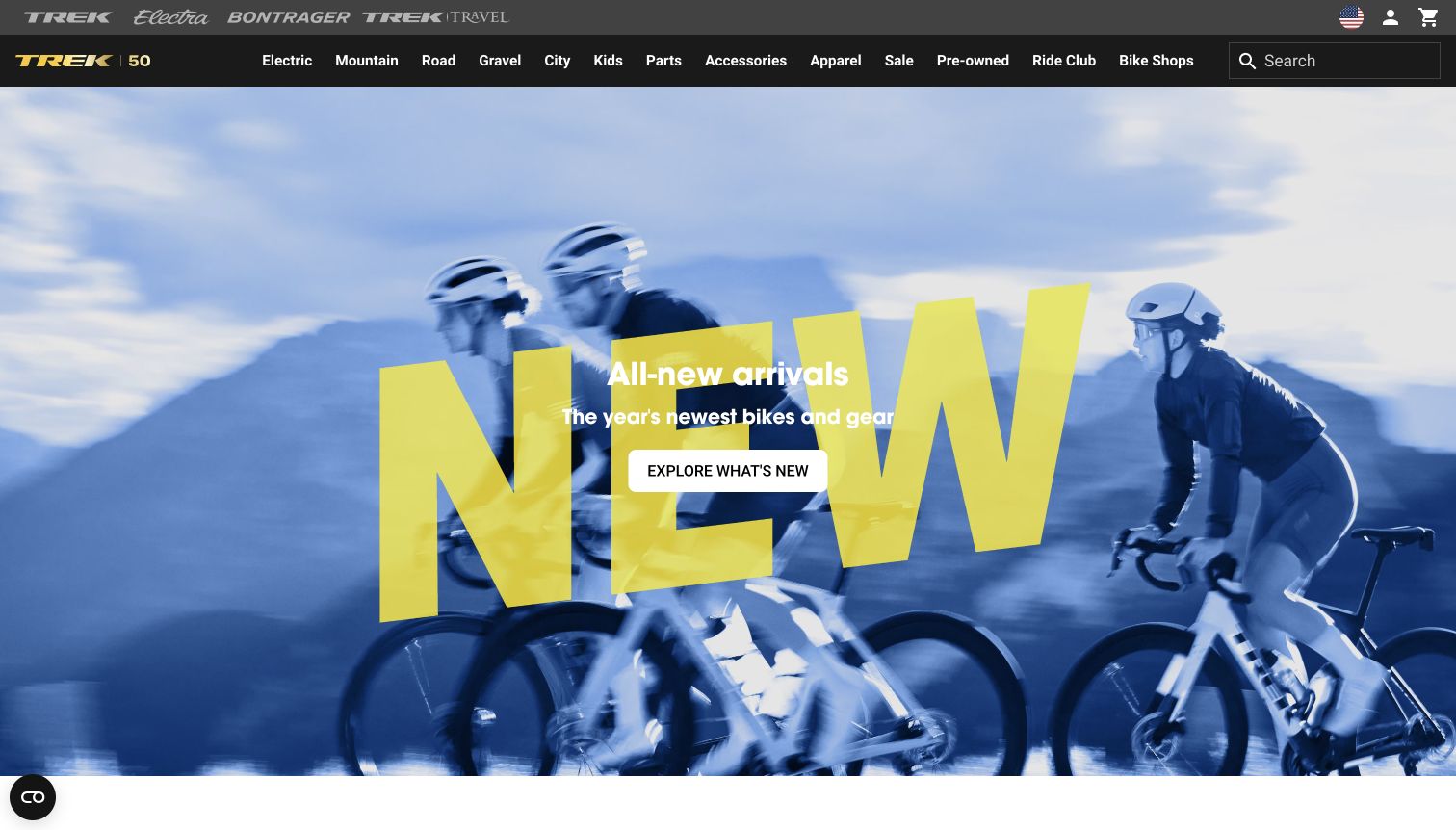
Trek uses two dark navigation levels above a blue-tinted cycling photograph. The upper strip separates Trek, Electra, Bontrager and travel, while the main row exposes electric, mountain, road, gravel, city, children’s bikes and several gear categories. A large yellow graphic sits behind the new-arrivals message, with a white action centered over the riders. The campaign is visually forceful, but visitors can still bypass it through the visible category links or search. The captured page is the United States English route returned by the public homepage.
What you can learn
Keep enduring shopping routes visible while seasonal campaigns change. A broad catalog benefits from explicit riding categories and a persistent search field, but the header should distinguish brand-family links from product categories so that visitors understand when they are changing destinations. Product discovery should remain possible without interpreting the campaign image.
Pros
Riding categories are directly available without opening a menu.
The new-arrivals action stands out clearly against the blue and yellow image.
Cons & considerations
The two navigation levels contain many competing destinations.
Large graphic lettering adds visual energy without explaining a particular bicycle.
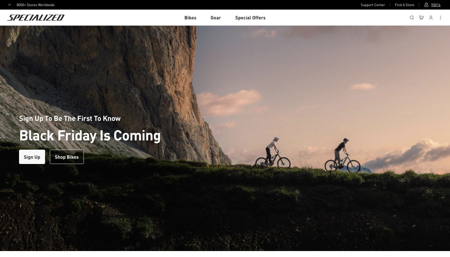
Specialized limits its main navigation to Bikes, Gear and Special Offers, with search and account utilities at the right. A narrow dark strip above provides support and store-finding routes. The hero uses a wide landscape with riders under a rock face, and places a seasonal signup message on the darker left side. Sign Up and Shop Bikes provide two adjacent paths, allowing a visitor to browse without joining the mailing list. The captured state is the United States English homepage after its privacy panel was dismissed.
What you can learn
Use a small number of broad navigation choices when the product range can be explained at the next level. A campaign asking for email interest should still give a direct browsing alternative. Keep customer support and store finding easy to locate, especially when bicycles may require local fitting or service.
Pros
A direct Shop Bikes action sits beside the signup invitation.
Support and store finding remain visible in a separate utility strip.
Cons & considerations
The seasonal message precedes any specific product information.
The large landscape communicates riding atmosphere more than model differences.
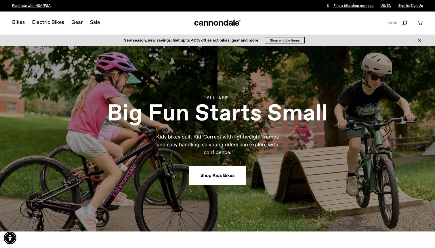
Cannondale’s homepage centers its wordmark in a white header, with Bikes, Electric Bikes, Gear and Sale on the left. A gray offer strip sits beneath it, while the main hero combines two photographs of children riding. The large headline and short supporting paragraph focus on the intended young rider, followed by a prominent Shop Kids Bikes button. Darkening the photographs gives the white copy a consistent place to sit. A bike-shop locator and the regional label remain available in the narrow black strip above the main navigation.
What you can learn
Lead with the rider’s needs when a campaign addresses a specific audience, then make the matching collection route explicit. Keep secondary promotions subordinate so they do not dilute that message. The image can establish use and scale, while fit guidance and model comparisons should follow before a visitor makes a purchase decision.
Pros
The action names the children’s bike collection directly.
Two riding scenes establish the campaign’s audience without requiring technical terminology.
Cons & considerations
The discount strip competes with the separate children’s-bike message.
Size and age guidance are not available in the opening view.
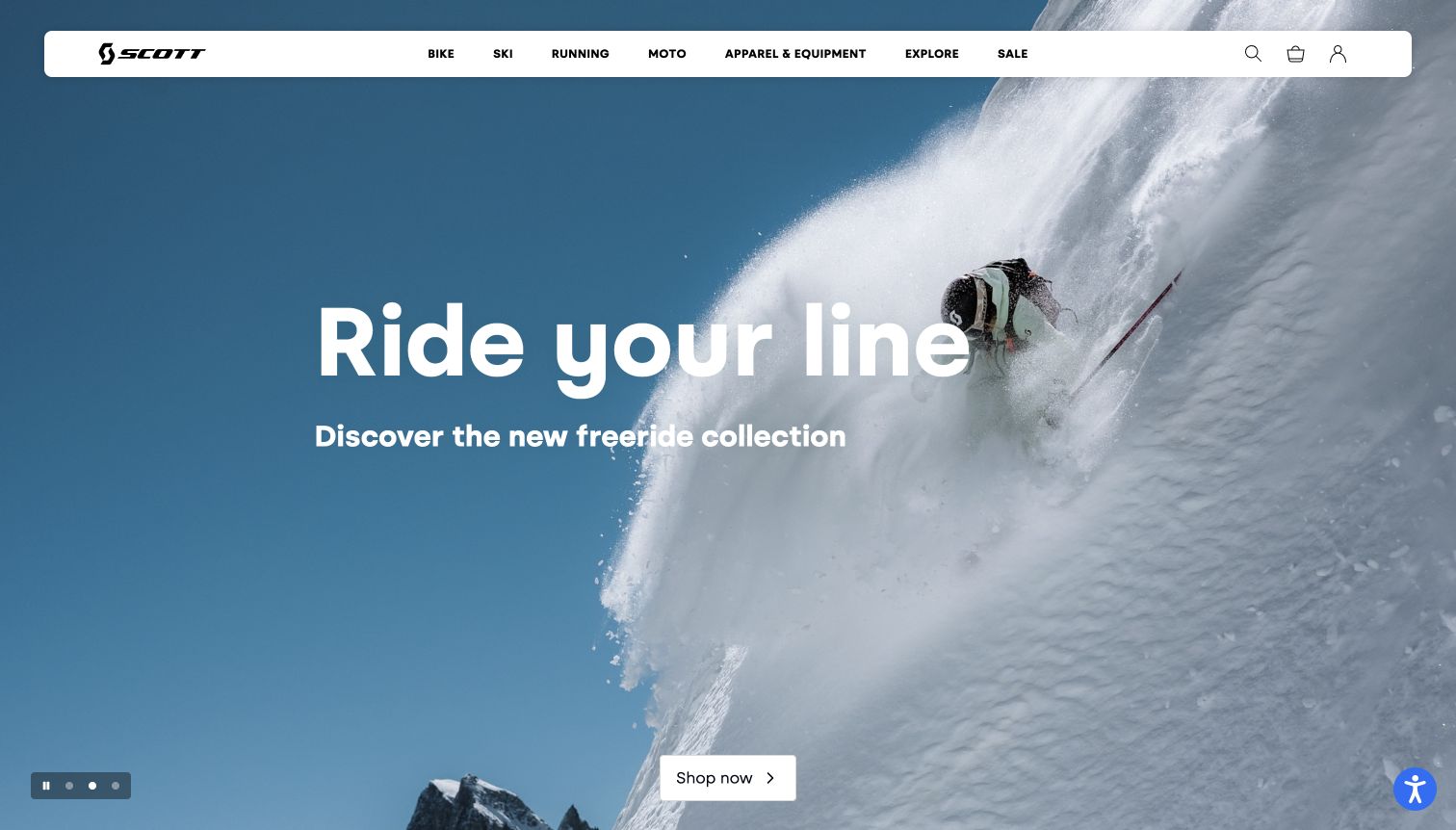
Scott’s captured homepage features a skier carving through snow beneath a large centered headline. A floating white navigation bar remains distinct from the full-screen photograph and exposes Bike, Ski, Running, Moto, equipment, editorial and sale routes. A small control cluster at the lower left indicates the hero slides and offers pause control, while the current action appears near the lower center. The page also contains bicycle features, including Spark DC and Sweep, but the final screenshot records the ski campaign rather than presenting it as bicycle-specific imagery.
What you can learn
A multisport manufacturer should make the bicycle route immediately recognizable even when a seasonal campaign promotes another discipline. A stable navigation bar can do that job, but first-time bicycle visitors still need a clear transition into relevant products. Motion controls help readers pause a campaign without changing the site’s underlying content.
Pros
The white navigation bar remains readable over the large photograph.
Bike is exposed as a direct top-level discipline alongside other sports.
Cons & considerations
The captured opening campaign does not show a bicycle.
The large seasonal hero delays comparison between individual bike models.
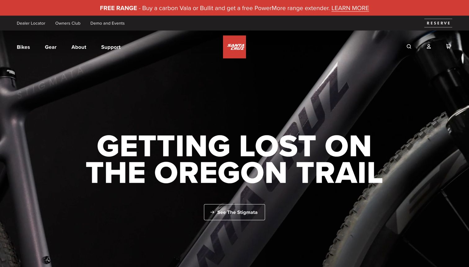
Santa Cruz uses a dark close-up of a bicycle frame and tire behind a large white riding-story headline. A compact outlined button names the Stigmata destination, connecting the broad Oregon Trail message to a specific model. The red square logo is centered above the image, while Bikes, Gear, About and Support sit at the left. Separate utility and promotion strips provide dealer, owner-club and event routes before the hero begins. The composition combines a material-focused product image with community and support destinations without making a technical specification claim.
What you can learn
Tie an evocative riding story to an unmistakable model name. Product close-ups can communicate form and finish, but a visitor also needs a route to the complete bike and its intended use. Keep support and dealer paths visible for ownership questions rather than forcing every visitor through the shopping campaign.
Pros
The hero action identifies the model even though the headline is editorial.
Dealer, owner and support routes are visible in the header area.
Cons & considerations
The close crop does not show the complete bicycle.
Several stacked header strips reduce space for the main product story.
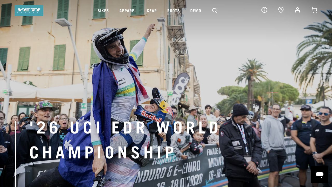
Yeti Cycles uses a crowded championship celebration as the entire captured opening. The rider, spectators and flags communicate a racing context before any bicycle specifications appear. Widely spaced white lettering crosses the lower-left photograph, while the turquoise logo supplies a compact brand accent at the top. Bikes, apparel, gear, roots and demo are explicit header labels; search, support, location, account and cart use icons on the right. The photograph creates a strong sense of participation, but its busy details remain behind both the navigation and the campaign title.
What you can learn
A riding community can be a useful introduction when the catalog route stays clear. Give a campaign a meaningful destination and retain a plain route to models for shoppers arriving with a specific question. Test overlay contrast against the actual image crop rather than assuming white type remains readable across every part of an event photograph.
Pros
The documentary image conveys the brand’s racing context without a collage of product cards.
The product, apparel and demonstration routes remain labeled above the campaign.
Cons & considerations
The opening provides no visible model comparison or fit information within the captured viewport.
Several important utility routes rely on icon recognition, while the light photograph challenges white navigation contrast.
Public source checked November 3, 2026. References may be embedded or legacy—not a complete backend inventory.
Platform source: Primary platform or implementation reference. The official case documents this bicycle brand's headless BigCommerce storefront and ZaneRay implementation. The association applies to the named public property; it is not a complete technology inventory or an edition/version audit. Platform evidence is separate from the direct website screenshot and is not a complete current infrastructure audit.
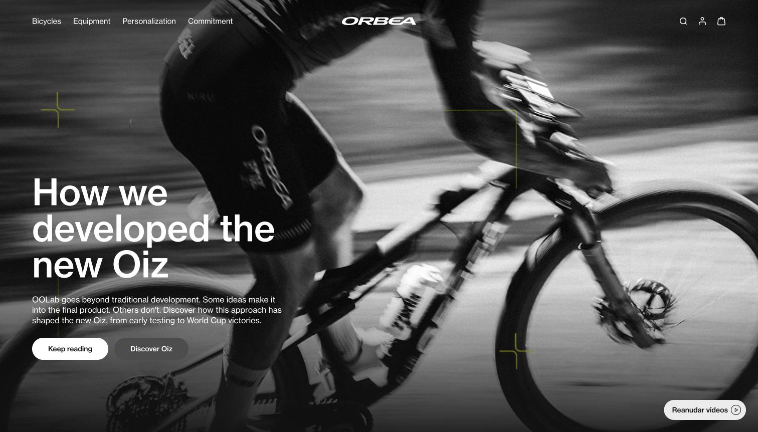
Orbea’s observed Spain-route homepage presents a black-and-white riding image behind a large left-aligned development-story heading. A short paragraph introduces the OOLab process, and separate Keep reading and Discover Oiz buttons distinguish the story from the model destination. The centered white wordmark and compact navigation cover bicycles, equipment, personalization and the brand’s commitments. The browser displayed English translations on this Spanish route; no language setting was changed. An optional region recommendation was dismissed normally, and the visible video control was used to pause the moving background before capture.
What you can learn
Offer a clear distinction between learning how a bike was developed and exploring the product itself. Editorial evidence can build understanding, but a model route should remain easy to find for visitors who already know what they want. Preserve a visible pause option for moving media and label regional content accurately.
Pros
Editorial and model destinations are separated into distinct actions.
The visible media control lets visitors pause the background.
Cons & considerations
Translated text and the Spanish route can create language inconsistencies.
The moving close-up gives limited information about the complete bicycle geometry.
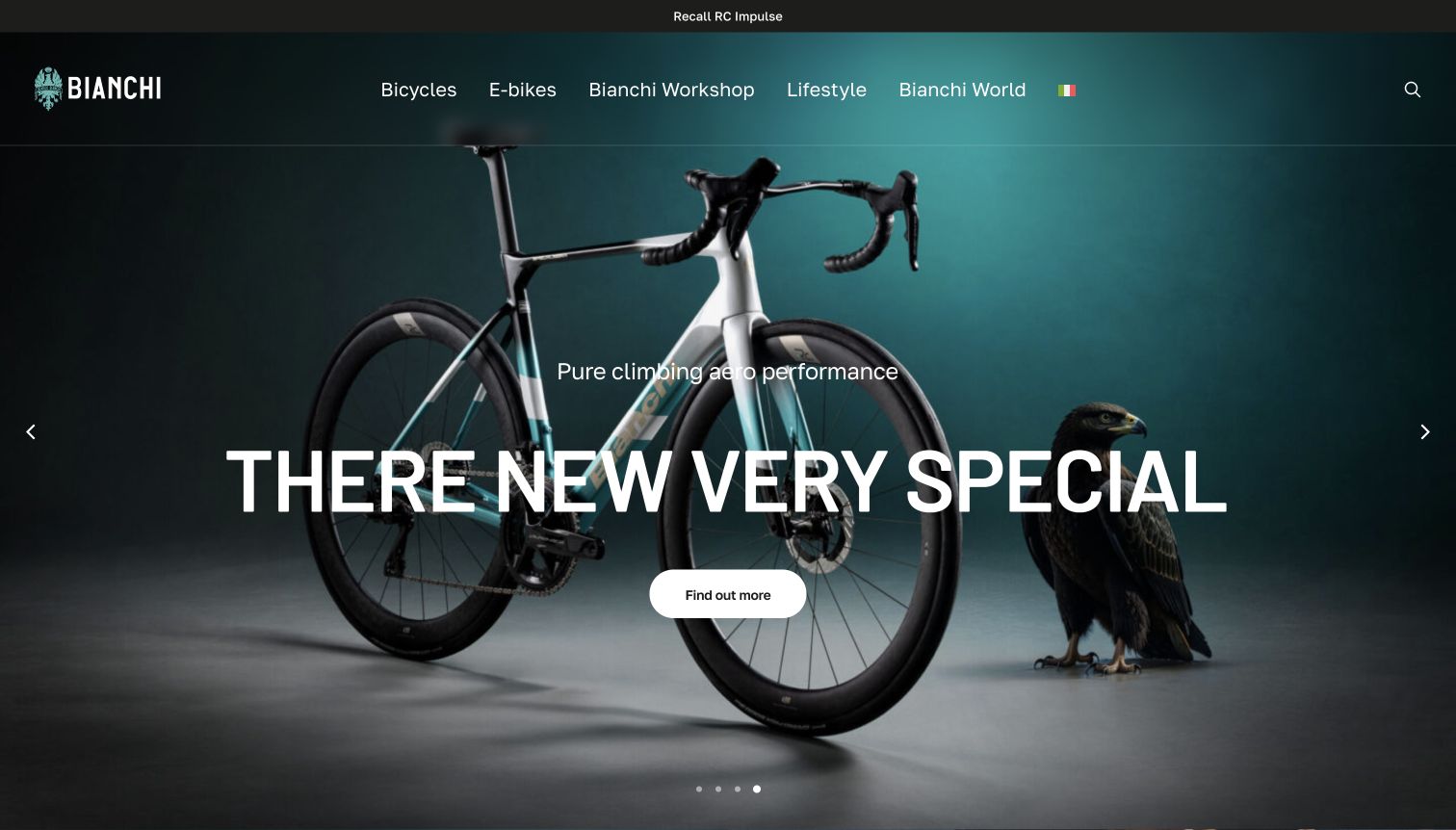
Bianchi’s captured hero places a complete road bicycle and an eagle against a dark teal studio background. The main heading, short performance-oriented line and rounded action sit over the product image, while the top navigation distinguishes bicycles, electric models, workshop, lifestyle and brand stories. A separate recall link occupies the narrow strip above the header. The source page uses Italian navigation in its DOM, while the browser visibly translated parts of the page into English, including an awkwardly rendered product heading. The capture preserves that real presentation rather than silently correcting its text.
What you can learn
Use studio imagery when the bicycle’s complete silhouette should be clear, but keep the model identity accurate across languages. Product names need protection from automatic translation. Service notices also deserve a stable, visible position so that a visually polished campaign does not conceal practical ownership information.
Pros
The studio composition shows the whole bicycle rather than only a component crop.
A recall route remains visible above the promotional content.
Cons & considerations
The observed translation distorts the main product heading.
Large overlaid text covers part of the bicycle’s frame and cockpit.
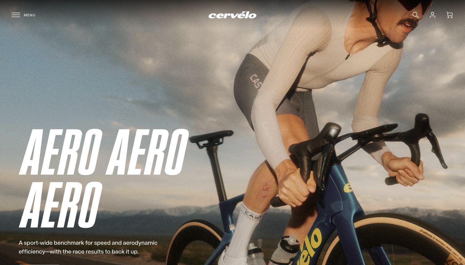
Cervélo’s opening uses a close rider photograph, a centered white wordmark and a large condensed italic headline on the left. The image emphasizes the rider’s position, cockpit and front of the bicycle rather than a complete product profile. Navigation is reduced to a labeled menu, search, account and cart controls, preserving a nearly uninterrupted image. A small supporting statement sits beneath the oversized headline near the lower edge. The DOM identifies an S5 destination below, but its action is outside the captured viewport, which limits immediate product discovery in this particular first screen.
What you can learn
A strong performance identity can establish audience quickly, but the primary model action should remain visible with the headline. Keep supporting claims concise and link them to actual evidence on the destination page. A dramatic rider crop is useful atmosphere, while model comparison still requires clear product views and specifications elsewhere.
Pros
The condensed headline gives the campaign a distinct sporting character.
The labeled menu and sparse utility controls keep the image uncluttered.
Cons & considerations
The model action is below the captured viewport.
The tight photograph hides much of the bicycle’s full form.
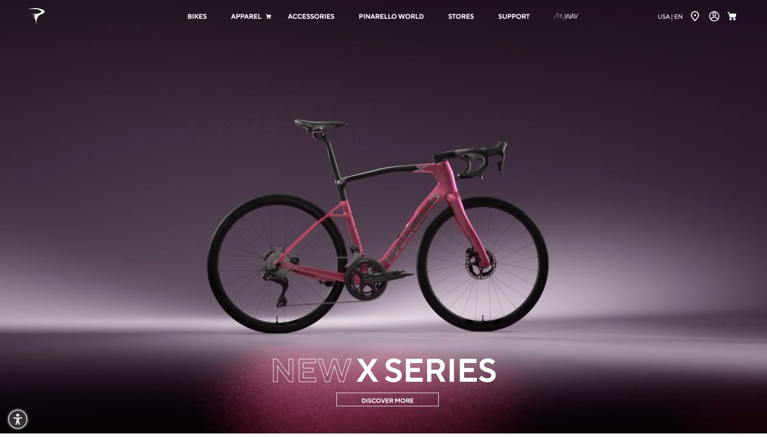
Pinarello centers a complete pink road bicycle against a deep purple studio background. The lower part of the image introduces the X Series with a mix of outlined and solid white lettering, followed by a compact Discover More button. The slim header exposes Bikes, apparel, accessories, brand stories, stores, support and customization, while the United States English label sits beside utility icons. The final capture is unobstructed after the ordinary cookie and newsletter presentations were resolved. The product remains the focal point, with very little copy competing for attention.
What you can learn
A studio reveal works best when the product name and next step stay closely attached to the bicycle. Preserve the complete silhouette and use lighting to separate it from the background. The next page should explain which rider the series serves, because a name and a glamorous image alone do not establish fit or use.
Pros
The complete bicycle is visible without an environmental distraction.
Stores and support remain available alongside the product navigation.
Cons & considerations
The opening provides little explanation of the series’ intended riding use.
The small outlined action is less prominent than the product name.
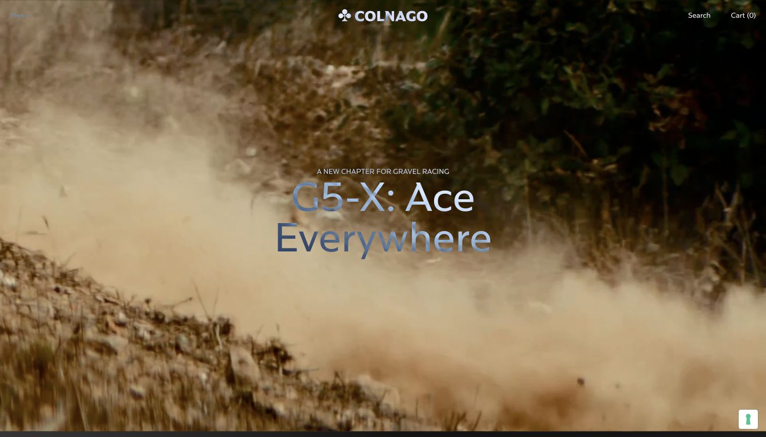
Colnago’s captured homepage uses a dusty trail scene as the background for a centered G5-X message. The wordmark sits at the top center, with a very small Menu label at the left and Search and Cart at the right. A short line identifies gravel racing before the large model message, establishing the campaign’s intended discipline. In the saved video frame, dust and landscape dominate and the bicycle is not visible. The cookie and newsletter panels were dismissed through their normal controls before the image was saved.
What you can learn
Cinematic campaigns need a stable product identity even when individual frames contain little recognizable equipment. Keep the model and discipline legible throughout the sequence, and make the destination clear enough that viewers do not have to wait for another frame. A still product image nearby can complement the atmosphere of film.
Pros
The model name and gravel-racing context appear together.
The minimal header gives the campaign substantial visual space.
Cons & considerations
The captured frame does not show the bicycle itself.
The small menu label has weak contrast against the changing background.
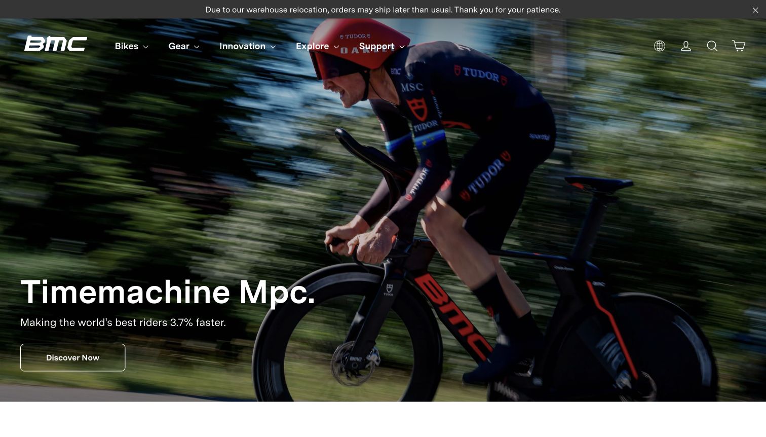
BMC places a narrow warehouse-relocation notice above its main hero, making a potential shipping delay visible before browsing begins. The hero shows a rider in an aerodynamic position with the Timemachine Mpc name, a short performance claim and an outlined Discover Now button at the lower left. Bikes, Gear, Innovation, Explore and Support remain visible across the transparent header. The photograph communicates the model’s riding context strongly, but the numerical performance claim in the screenshot is treated here as on-page marketing, not as an independently verified product result.
What you can learn
Keep operational notices visible even when they complicate a premium campaign. Product claims that use precise numbers should lead to clear supporting methodology and conditions. The first screen can establish model identity and riding context, while the destination should explain the evidence and help visitors compare appropriate configurations.
Pros
The shipping-delay notice is visible before a shopper enters the catalog.
The model name and discovery action remain grouped in the lower left.
Cons & considerations
The numerical performance claim lacks supporting detail in the opening view.
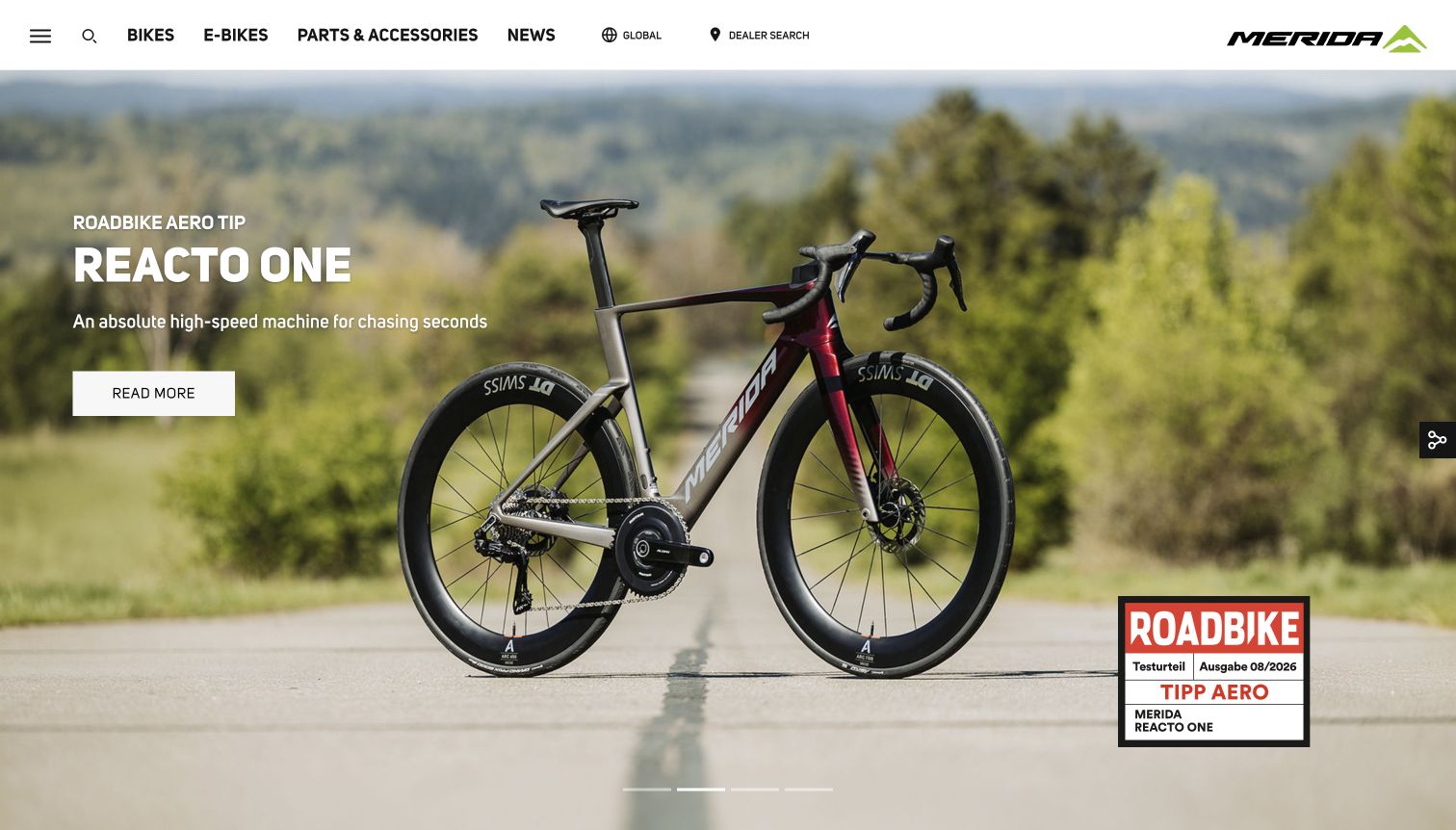
Merida’s international homepage presents a Reacto One bicycle in a roadside landscape, with the complete frame and wheels visible. The left-hand caption names the model and provides a short riding-oriented statement followed by Read More. A magazine-style review badge sits at the lower right, while the white header separates bike categories, news, the global-region label and dealer search. The optional region prompt explained that the global range differs by country; it was dismissed without switching regions. No local availability or specification claim is inferred from this global presentation.
What you can learn
Show the full bicycle when a model’s form matters, and distinguish independent review context from the manufacturer’s own copy. A global catalog should keep regional availability limitations clear. Dealer discovery belongs near product browsing so visitors can resolve local questions without treating a worldwide campaign as a stock promise.
Pros
The full bicycle is visible at a useful scale against a quiet landscape.
Dealer search and the global-region indicator are exposed in the header.
Cons & considerations
The review badge provides little context until its related material is opened.
The global model presentation does not establish local availability.
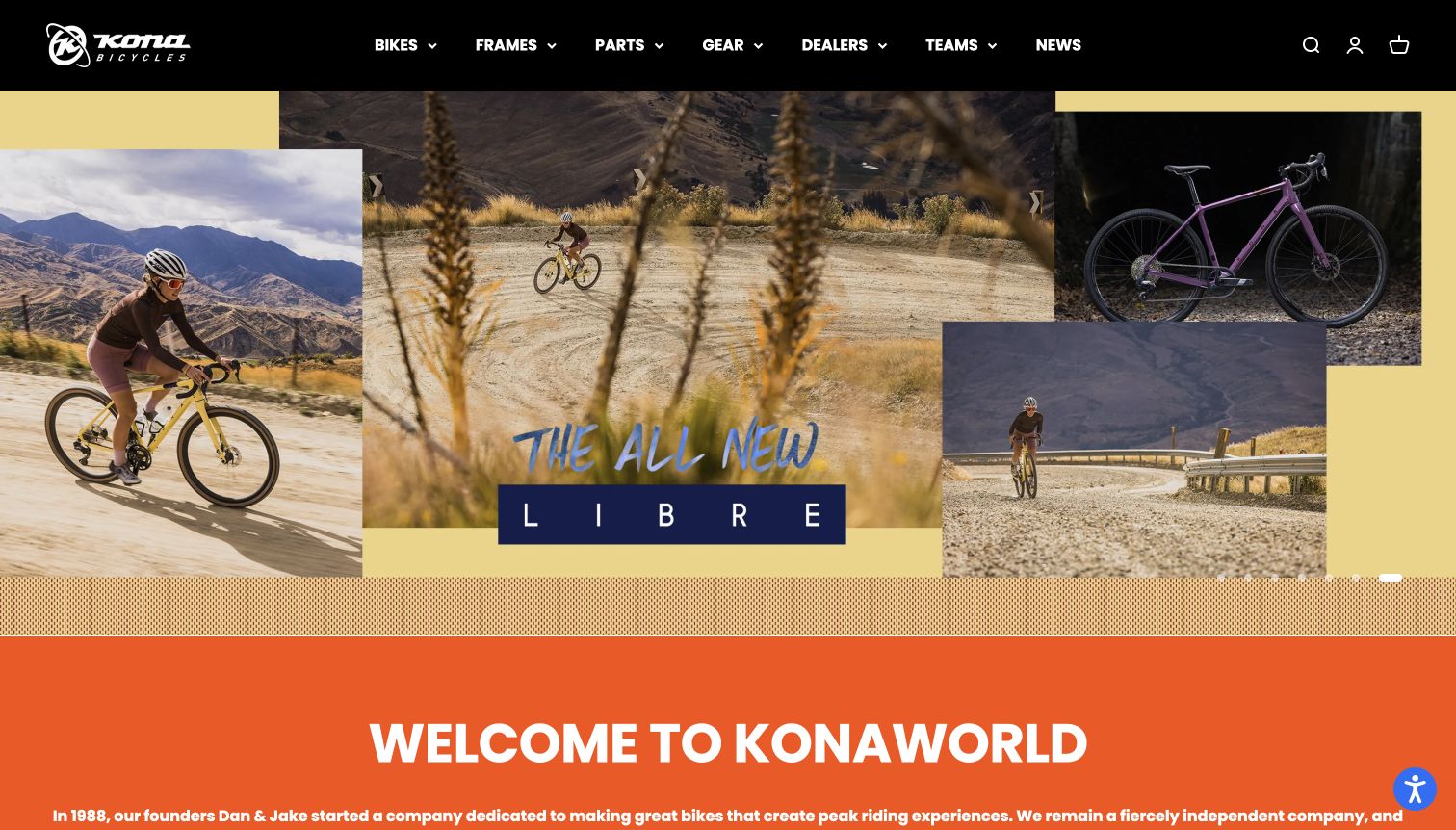
Kona’s final captured slide combines several photographs of the Libre: a product view, a rider on gravel and wider landscape scenes. A warm yellow background and loose blue lettering frame the model name, while a black navigation bar exposes bikes, frames, parts, gear, dealers, teams and news. Beneath the campaign, an orange welcome section starts immediately, establishing a more conversational brand tone. The collage gives the viewer both product form and riding context without placing a long technical description over the images. The normal region and privacy prompts were closed before capture.
What you can learn
Use multiple image scales to connect a bicycle to its environment and the people riding it. The model name should remain a readable anchor within a lively collage, and a clear action should explain where the visitor goes next. Informal visual language can coexist with precise dealer and support navigation.
Pros
The collage combines a complete product view with actual riding contexts.
Frames and dealer routes are visible beside the main bike category.
Cons & considerations
The campaign does not expose a clearly labeled action in this captured slide.
Several competing images can dilute attention to individual product details.
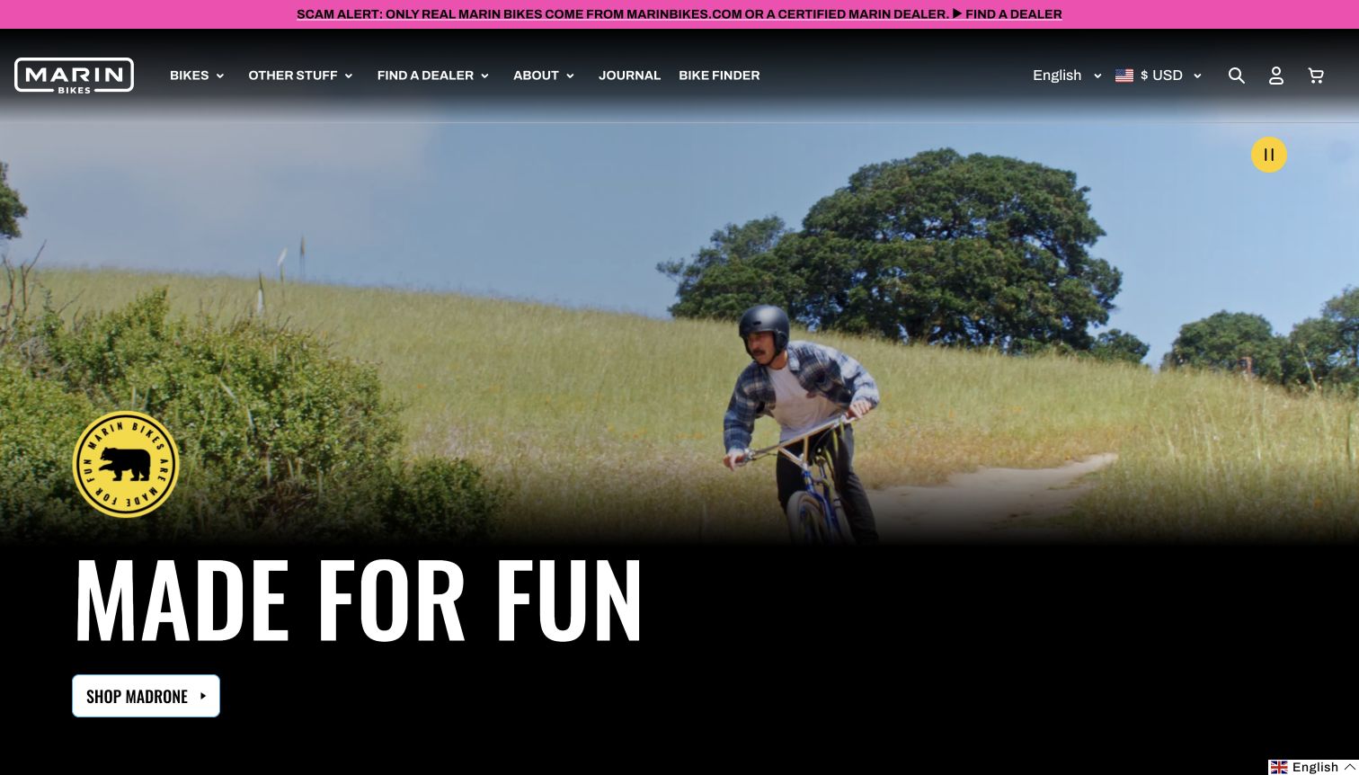
Marin uses a bright pink dealer-authenticity notice above a dark navigation bar. The main image shows a rider on a dirt trail, with a yellow badge and large condensed headline over a black gradient at the bottom. A white Shop Madrone button identifies the featured model, while Bike Finder and Find a Dealer remain visible in the header. A yellow pause control appears near the upper right of the hero, making the moving presentation controllable. The visual language feels energetic without requiring the visitor to understand suspension or geometry terminology first.
What you can learn
Combine an approachable riding message with clear help for choosing a bicycle. A bike finder and dealer route can support visitors who recognize the desired experience but do not know the model range. Keep motion controls obvious and ensure any fraud or authenticity notice gives a practical path to verified sellers.
Pros
The model action is readable against a solid dark area.
Bike Finder and dealer discovery are available directly in the header.
Cons & considerations
The broad enjoyment message does not explain the model’s specific capabilities.
The vivid warning strip competes with the yellow and white campaign elements.
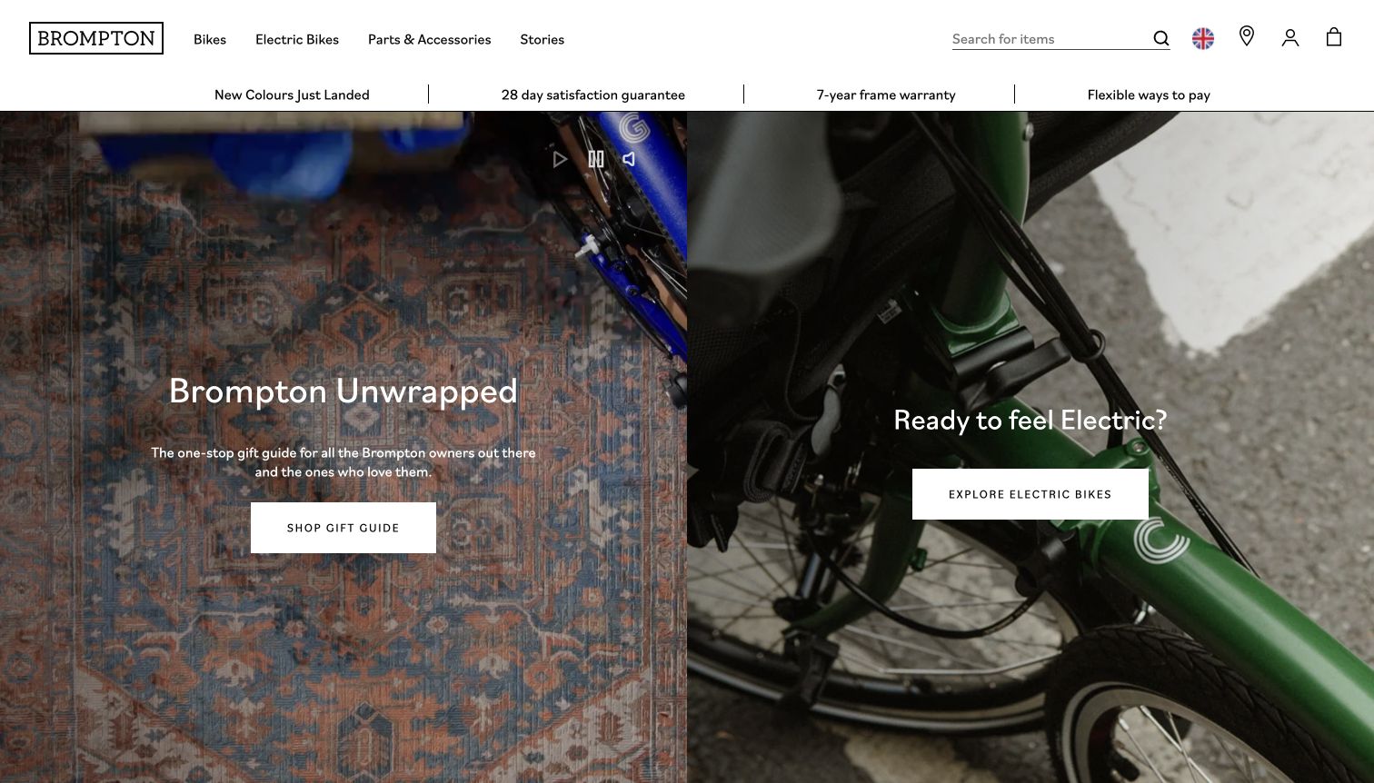
Brompton divides the opening into two equal photographic panels. The left introduces a gift guide for owners and their friends, while the right directs visitors to electric bicycles. A white header keeps bikes, electric bikes, accessories and stories visible beside a search field and store locator. A separate benefits row sits between the navigation and images. The left panel exposes video controls, and both panels use white rectangular actions with clear destination labels. The captured page is the UK homepage, with its existing region indicator preserved.
What you can learn
Separate audience tasks when the homepage serves both existing owners and people choosing a bicycle. Equal panels can make the two routes easy to understand, provided their labels explain the distinction. Benefits and warranty statements should link to detailed terms rather than being treated as unconditional promises from a short header line.
Pros
Gift discovery and electric-bike browsing have distinct labeled actions.
Search and store finding remain visible above the campaign panels.
Cons & considerations
Two equally weighted campaigns give neither route a clear priority.
Darkened close-up imagery reveals little about a complete folded bicycle.
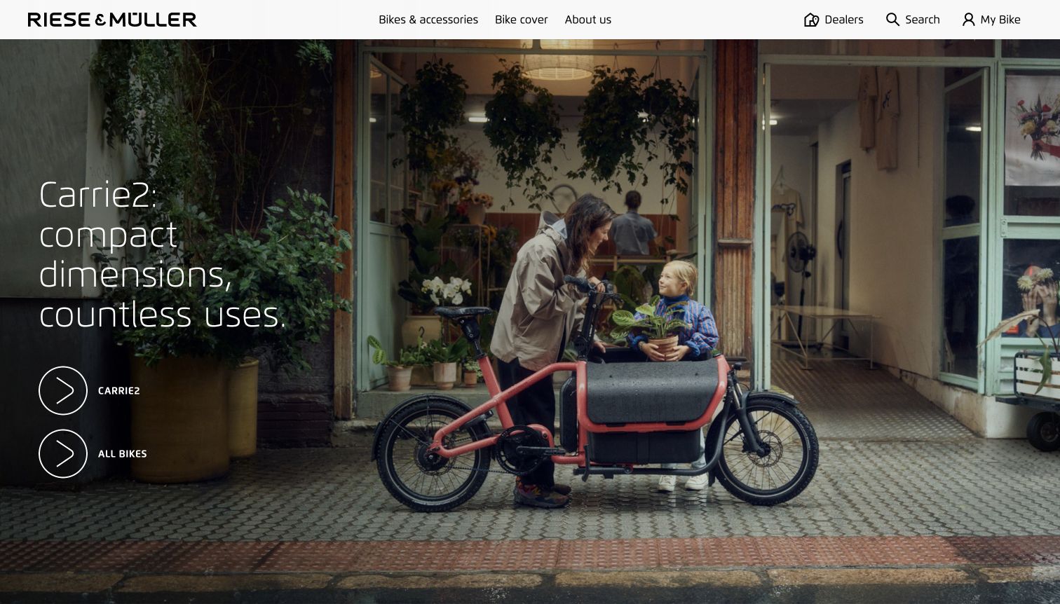
Riese & Müller’s homepage shows a compact cargo bicycle outside a flower shop, with an adult and child using the front carrying area. A thin white headline at the left introduces Carrie2 through its dimensions and range of uses, while two large outlined circular arrows lead to the model and all bikes. The white header separates bicycles, coverage services, company information, dealers, search and the owner area. The complete cargo bicycle is visible in context, making its layout easier to understand than a component close-up or an abstract lifestyle photograph.
What you can learn
Use a realistic setting to explain an unfamiliar bicycle format, then distinguish the featured model from the wider catalog. A cargo bike’s capacity, dimensions and permitted passenger arrangements require specific product information beyond an appealing family photograph. Keep dealer and ownership routes accessible for the practical questions that follow initial interest.
Pros
The image makes the cargo layout and everyday setting understandable.
Separate actions distinguish the featured model from the complete range.
Cons & considerations
The opening offers no numerical dimensions or carrying limits.
Thin white headline text crosses a detailed storefront background.
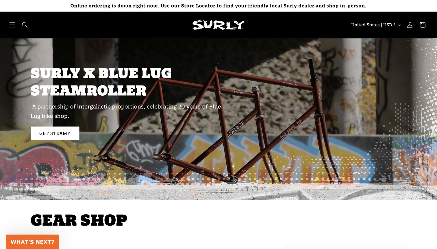
Surly places a clear notice above its black header stating that online ordering is unavailable and directing visitors to local dealers. The hero then introduces the Blue Lug Steamroller collaboration using a bare frameset photographed under a bridge, heavy white type and a compact action. A rough printed border reinforces the brand’s visual character, and Gear Shop begins directly below the image. The final capture follows dismissal of a newsletter flyout. The page is useful as a design example, but its public notice prevents treating the visible cart or product routes as evidence of working online checkout.
What you can learn
Explain service interruptions before shoppers invest effort in selecting products. Keep the alternative buying route explicit and consistent with the rest of the page. A distinctive collaboration campaign can still work during an outage, provided calls to action do not promise an ordering capability the site currently says is unavailable.
Pros
The ordering interruption is stated prominently at the top.
The photographed frameset clearly communicates the collaboration’s physical product.
Cons & considerations
Online purchasing was explicitly unavailable at capture time.
The playful main action is less descriptive than a direct product-collection label.
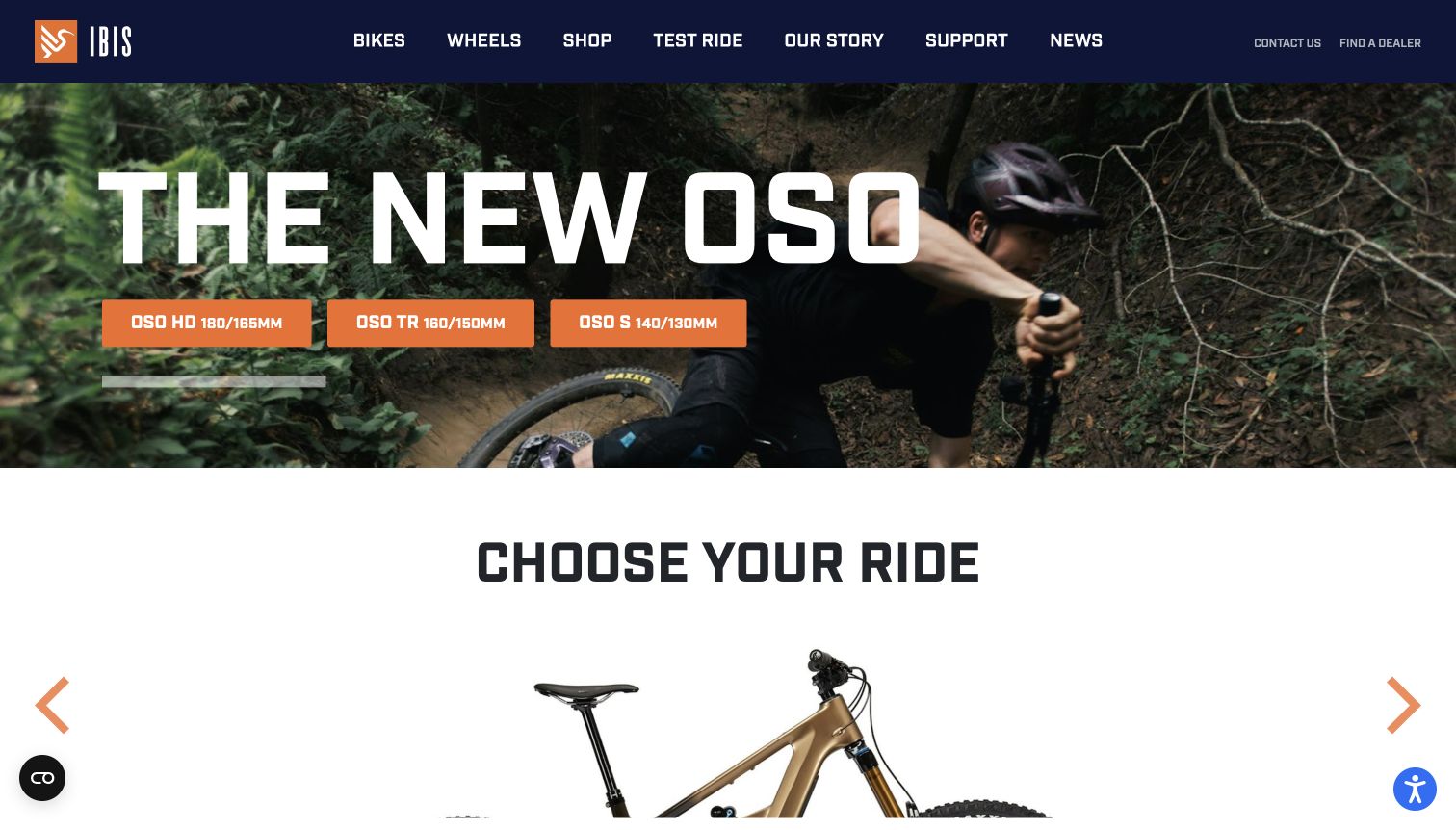
Ibis places a large Oso headline over a rider photograph, then offers three orange buttons naming the HD, TR and S variants with paired travel numbers. A dark navy header exposes bikes, wheels, shopping, test rides, the brand story, support and news, with dealer finding at the far right. The next Choose Your Ride section begins within the same screen, connecting the launch campaign to the wider catalog. Orange accents consistently identify actions against the dark image and white lower section. This is a more explicit product-choice interface than a single generic discovery button.
What you can learn
When variants share a model family, expose the differences in a repeatable comparison format. Numbers can help experienced riders scan, but explain what they measure and connect them to riding use for newcomers. A test-ride route is a useful complement to technical comparison, especially before a high-consideration purchase.
Pros
The three variant actions make the model family’s options visible immediately.
Test Ride and dealer discovery sit alongside the product navigation.
Cons & considerations
Paired travel numbers assume familiarity with mountain-bike terminology.
The oversized headline covers a substantial portion of the riding image.
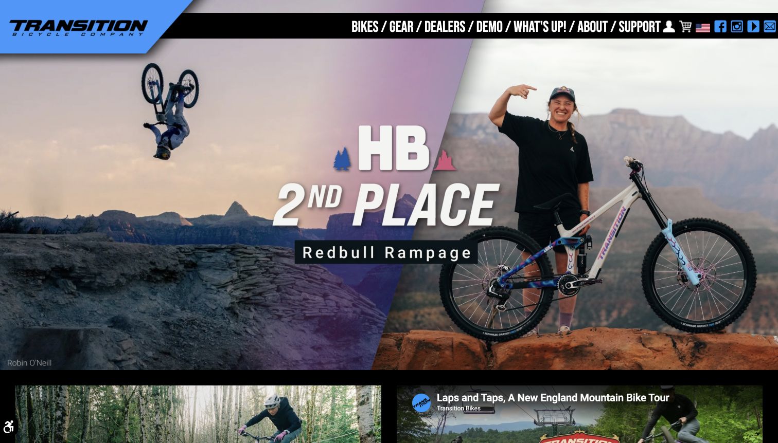
Transition’s homepage uses an angled blue logo panel and a tightly packed black navigation strip. The captured feature combines an aerial riding photograph with an athlete portrait and bicycle, using large competition-result lettering across the center. Below it, additional riding and video content begins in a grid, connecting the main story to a continuing editorial program. Bikes, dealers, demos and support remain visible in the header alongside social icons. This design leads with community and athlete activity; the displayed event result is recorded as page content rather than independently verified competition reporting.
What you can learn
Connect athlete stories to understandable product and demo routes so interest can become informed exploration. A strong community identity can attract returning visitors, but newcomers should not need to know an athlete’s initials or event history to find an appropriate bicycle. Dense navigation needs enough spacing to remain readable.
Pros
Demo and dealer routes are visible beside the bike category.
The feature combines riding action with a clear bicycle and athlete portrait.
Cons & considerations
The headline assumes familiarity with abbreviated athlete identity and the event.
Condensed navigation and many adjacent icons make the header crowded.
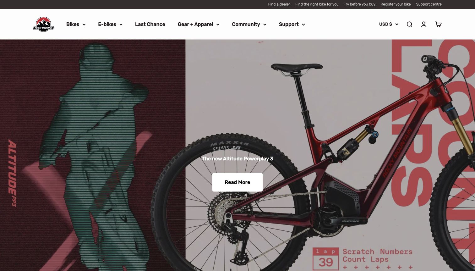
Rocky Mountain uses a white catalog header below a slim utility row with dealer finding, bike selection, test rides, registration and support. The captured hero combines a large red Altitude Powerplay bicycle with a stylized rider image and poster-like graphics. A short model caption and white Read More button sit near the center, while the bike extends beyond the right edge of the frame. The page initially displayed newsletter and update invitations; both were dismissed without subscribing. The result emphasizes the launch while retaining several useful routes for choosing and owning a bicycle.
What you can learn
Keep buying assistance and ownership support visible around a major launch. Model campaigns should explain the destination clearly and avoid relying entirely on graphic text inside an image. A complete product view nearby can help visitors inspect proportions that a deliberately cropped poster composition leaves out of the opening screen.
Pros
The utility row covers selection, test rides, registration and support.
The white model action contrasts clearly with the darker campaign image.
Cons & considerations
The bicycle is cropped at the right edge of the hero.
Two initial promotional prompts interrupted the first view before dismissal.
Plan the model range and the ownership archive together
Create a durable model and build structure
Separate the bicycle family, model year, frame platform and purchasable build where those distinctions exist. Determine which fields change by region. This prevents a name reused across years from sending an owner to the wrong manual or a shopper to an unavailable specification.
Decide what a comparison must answer
Choose the differences that help your audience narrow a decision, such as riding use, fit range and component configuration. Keep marketing language separate from measured specifications. Test comparison tables on a phone and provide a route to expert advice for questions the table cannot settle.
Preserve useful information after a model retires
Assign ownership of manuals, service references, replacement-part guidance and archived specifications. Use stable model-year URLs where practical. Mark retired products clearly without removing information that an existing owner may still need.
The editing job behind the design
Model product data before choosing the storefront treatment
A product information system or structured CMS can keep model, build, geometry and region records connected. Decide where the authoritative specifications live and how they reach dealer tools and the public site. Avoid embedding critical dimensions only in decorative images or downloadable brochures.
Direct commerce, dealer locators, customization and test-ride requests create different integrations. Show which service receives the visitor and provide a useful alternative if it is unavailable. Public framework evidence does not establish the technology behind a manufacturer’s private product or dealer systems.
Our WordPress website examples offer a separate look at publishing approaches. A visible platform label is evidence for that named page, not a guarantee that the same system will suit your requirements.
Before the public launch
Bicycle manufacturer website launch checklist
Confirm model years, specifications, size ranges and units with the product team.
Check product comparisons across different builds and narrow screens.
Verify market-specific buying, dealer and test-ride destinations.
Connect current and retired models to the correct manuals and support records.
Assign owners for unavailable products, changed components and stale retailer information.
These checks are a project checklist, not a performance, legal, security, or accessibility certification. Test real journeys with the people responsible for the website before making claims about the result.
Sources & editorial method
How this collection was selected and reviewed
The examples are official bicycle-manufacturer websites rather than multi-brand retail shops. Reviews describe the captured public design and information structure. Product performance, fit, availability and servicing suitability are outside the review; regional and capture-date context remains attached to each example.
Each example links to its actual source page. Screenshots are direct browser captures with their own capture dates; moving imagery, announcements and live designs can change. The notes describe observable design choices and conditional tradeoffs, not measured traffic, conversion results, service quality, or accessibility conformance.
Technology labels use public page metadata, asset evidence, or explicitly cited platform documentation. Platform documentation is not a complete current deployment audit. A component reference may be legacy or unused; it is not a complete backend inventory. Unknown stacks are omitted. These sites are editorial examples, not our client portfolio.
Written, Edited and Curated are separate editorial records, not timestamps advanced by a rebuild. Website designs and imagery belong to their owners. See our editorial standards or suggest a correction.
Questions worth asking
Bicycle Manufacturer website design questions
Should a bicycle homepage show bikes or riders?
Either can work when the next step is clear. Riding imagery can establish intended use and brand character, while isolated product images help comparison. Link a campaign to the relevant model family and keep catalog access obvious.
Does every specification belong on a product card?
No. Show the few differences needed to choose a promising model, then provide consistent detailed specifications and geometry on the model page. Avoid cards that become unreadable miniature data sheets.
Should a dealer-led brand add a buy button?
Only when the linked journey is accurately described. Label dealer search, availability inquiry and direct purchase differently so a shopper understands whether the action finds a retailer or places an order.
What should happen to discontinued model pages?
Retain useful ownership information and clearly mark the model as retired. Keep the correct year, manuals and support routes available rather than silently replacing the page with a newer bicycle.
Let the photography communicate the riding experience, then give the catalog enough structure to support a confident next question. Preserve the same care for existing owners after the launch campaign ends.